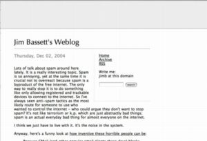
Playing around with the page design. Feedback welcome. It is supposed to look something like:

Looks good--is this CSS?
On Firefox/Windows, the font size on your name is smaller than in the screenshot. It looks fine but maybe not as dramatic. Also, on this comment page the text of the comment overlaps the grey area at the top of the page. It doesn't look bad but may not be what you intended. I can make a screenshot if you want to see it.
Thanks. The comment pages are messed up for me too, I hadn't even thought to look.
And yeah, I made the name smaller.
Okay, the comments should be fixed now. I hadn't really thought about them when I made this design. Might have to reconsider some things.
This uses some CSS, but also has a table in it (which doesn't mean it's not CSS, but maybe something like "isn't pure tableless CSS".) Pretty much like all the other templates here.
I'm still seeing this:

D'oh. I fixed it if you click through to an old comment, but forgot that the newcomment script is a separate thing. I made the change there now also.
Looks good now. I notice you've lost your nav bar on the comment pages. It's two steps to get back to the Tree front page.
looks nice. I miss the blue sky though, for what it is worth.
|
- jim 12-04-2004 8:15 pm
Looks good--is this CSS?
On Firefox/Windows, the font size on your name is smaller than in the screenshot. It looks fine but maybe not as dramatic. Also, on this comment page the text of the comment overlaps the grey area at the top of the page. It doesn't look bad but may not be what you intended. I can make a screenshot if you want to see it.
- tom moody 12-05-2004 6:15 pm
Thanks. The comment pages are messed up for me too, I hadn't even thought to look.
And yeah, I made the name smaller.
- jim 12-05-2004 6:19 pm
Okay, the comments should be fixed now. I hadn't really thought about them when I made this design. Might have to reconsider some things.
This uses some CSS, but also has a table in it (which doesn't mean it's not CSS, but maybe something like "isn't pure tableless CSS".) Pretty much like all the other templates here.
- jim 12-05-2004 6:34 pm
I'm still seeing this:

- tom moody 12-05-2004 6:37 pm
D'oh. I fixed it if you click through to an old comment, but forgot that the newcomment script is a separate thing. I made the change there now also.
- jim 12-05-2004 6:50 pm
Looks good now. I notice you've lost your nav bar on the comment pages. It's two steps to get back to the Tree front page.
- tom moody 12-05-2004 7:04 pm
looks nice. I miss the blue sky though, for what it is worth.
- selma 12-10-2004 10:41 pm