|
Lorna Mills and Sally McKay
Digital Media Tree this blog's archive OVVLvverk Lorna Mills: Artworks / Persona Volare / contact Sally McKay: GIFS / cv and contact |
View current page
...more recent posts
I liked the first third of Morvern Callar better than most movies I've seen. The camera plays good games with focus and planes of light. The morality is odd, if not amibiguous, and the storyline strikes an unusual balance between horrific and tender.
BIG TIME SPOILERS BELOW:
She leaves her boyfriend's corpse (a suicide) lying in the apartment for days and doesn't tell anybody that he's dead. Next to the body is a blinking christmas tree that emits a loud, low electrical buzz. The lights are cozy and warm looking, while at the same time flashing like some kind of code-red alarm indicator.
She goes to a debauched Scottish party with her friends and dances, smokes, gets fucked up, gets laid. She goes to her flourescent-lit job at the supermarket. Everytime she comes home the body is stil there and the cozy tree lights are still blinking on and off.
She puts her own name on her dead boyfriend's novel and sends it in to the publisher.
Eventually she strips down to her underwear and chops up the body in the bathtub. Somehow this scene is neither camp nor horror.
She hikes up into the mountains with the body in a back pack and buries him. Then she goes off to Spain on the dead guy's funeral money.
That was enough story for me. The film goes on and it's pretty good but the remarkable strange edginess of the beginning fades away into a more familiar type of tale. Still I recommend it a lot - and the mannered, playful camera is really great all the way through.
|
1967 Mason Williams Edward Ruscha Patrick Blackwell | 2000 Corinne Carlson Karen Henderson Marla Hlady |
In 1967 three sexy smart artist guys threw a Royal Typewriter out of a Buick Le Sabre and carefully recorded the results. In 2000 three sexy smart artist gals threw a Macintosh Plus Computer out of a Ford Econoline and recorded the results in exactly the same fashion.
The Royal Road Test had a major impact on me when I was a student, and my copy of the book is probably the third thing I'd grab in a house fire (after the two cats). Three guys take on technology, using a flash machine (car) to wreck a clunky one (typewriter). A personal mobility machine to wreck a personal expression machine. Their 'test area' is a piece of roadside in Nevada that looks like US nuclear test sites. Governments throw atoms around and blow stuff up, create mushroom clouds, wreck the lives of millions, and threaten the planet with extinction. We little people can get in our cars and throw typewriters. The captions are wry and the whole 'test' is conducted with poignant, deadpan humour. The epigraph reads:
"It was too directly bound to its own anguish to be anything other than a cry of negation; carrying within itself the seeds of its own destruction."
As our technological equipment supersedes itself, it is perfect that Carlson, Henderson and Hlady redid the Road Test. And I love that it was girls this time who threw the damn machine and watched it smash.
Indulge me in a Dave Hickey-esque hiccup. Why is it still the case that the classier the art, the harder it is to spot the gallery from the street?
|
Before: Ydessa Hendeles Art Foundation, 778 King St. W, Toronto, ON, Canada |
After: Ydessa Hendeles Art Foundation, same location, after I zapped it with my people-are-smart-so-let-them-see-the-damn-art supersonic ray gun. |
A lot of the best art shows I've ever seen were in this place. So I feel pretty lucky that I know where/what it is.
Vandals! Buckingham Palace's head gardener reportedly in tears after Bush's "choppers" wrecked the joint. (thanks to rick for the link!)
City Beautification Ensemble started colourizing urban fixtures a couple of years ago. Lately they seem to be concentrating their efforts on bike parking. I like them because they really are trying to make things look nice. At first they were pretty slap-dash, and there'd be big messy overspray around everything they did. They got some complaints and then fixed up their methods! Very responsive and responsible for a gang of lads with buckets of paint. Apparently their website is 2% complete.
I like yellow bikes because for a small annual fee you can have access to these plucky little well-oiled one-speeders whenever you like. I picked one up the other day while out on errands. The hard part is bringing them back to the hub on time, cause they are so much fun to ride.
QUIZ: Hey all you who went to art school! Remember this crazy shit?
name that author...
"The painter is concerned with representing solely what can be seen. These points, if they are joined one to the other in a row, will form a line. With us a line is a figure whose length can be divided but whose width is so fine that it cannot be split. Some lines are called straight, others curved. A straight line is drawn directly from one point to another as an extended point. The curved line is not drawn straight from one point to another, but rather looks a drawn bow. More lines, like threads woven together in a cloth, make a plane."

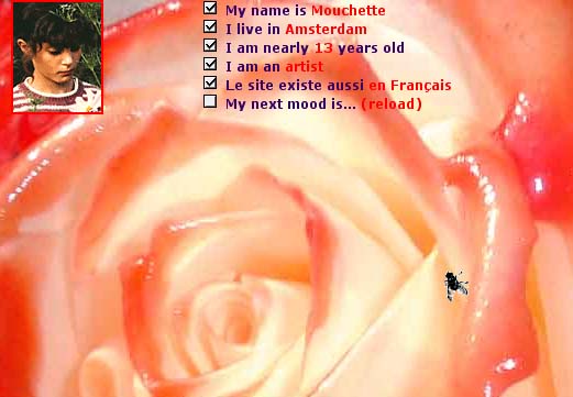
Mouchette is a really successful online persona: a sad, creepy little girl based on the 1967 film by Robert Bresson. The website has been around for years and years and as far as I can tell the identity of the people behind the persona is still unknown. My favourite thing about Mouchette is the email. There's lots of places to make comments on the site, and having done this I periodically receive email such as the one below:Dear Sally McKay,
Last time we met in private, on a page that I made for you alone. We shared that brief moment just once in our lives, never again will you see that page. But now I made a new private page for you only:
http://mouchette.org/to/you?Sally_McKay,4e45bf9966bd2cc144256fd0e74f33b9
Look everywhere, the page has some secrets inside
I can't wait to have you click on me again,
*bisou*
Mouchette
The page I was taken to was incredibly disconcerting. Too-close-up pink skin, panting little girl breath, and a bar you could pull that showed an image of raw muscle tissue underneath. When I tried to go back a second time I got the message:the page you are looking for is not hereI'm not comfortable with the child suicide, sexuality and violence. But being comfortable is not what Mouchette is about, she's provocative and she knows it. There's a forum for sending Mouchette hate mail that is also unnerving in it's brutality. But panning through the random painful angry posts, made me think about the genuine challenges of free communication in public space. People ain't always pretty.
you won't ever see it again
I like it when Lisa Neighbour works with monsters. Her piece in the current group show by Persona Cantare is an eight-foot high drawing of The Hulk, made with macraméd ecletrical cords that power two green lightbulbs for the eyes. Lisa had been working with power cords and interesting light bulbs for a while. The Hulk is my favourite. The big pop monster icon is a great foil for the artsy-crafty hippy reference of the macramé. And I do find something monstrous in the fact that so much cord, and so much work, is embedded in a line of current that is only lighting two small bulbs. There's a scary store of unused energy in the piece that is mounting and waiting to blow. Lisa's last piece, for Persona Volare ( the 1999 incarnation of P.Cantare), was a wall full of cheap-ass ugly coffeecups and rocks for smashing them. Which we did, in a sort of fun-house art catharsis.

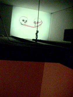
Another piece in the show that I like is Chantal Rousseau's sweet, little, ceiling video installation (above). You have to climb up a ladder and poke your head up into the cobwebs through a gap in the tiles. There you'll see an animation of skulls licking each other and bouncing around, flickering in the corner behind the ducts.
Rebecca Diederichs' piece, (a gorgeous collaboration with her late husband, Reid) really has my brain gears going. But she is a good friend and co-art-conspirator so I will write more in depth about her work at a later date.
From His Master's Voice:
Stanislaw Lem If we lived a billion times more slowly, and correspondingly longer, if a second - in this fancy - equaled an entire century, we would certainly conclude that the continents of the globe were processes, seeing with our own eyes how changeable they were, for they would be moving before us no less than waterfalls do, or ocean currents. And if, on the other hand, we lived a billion times faster, we would conclude that the waterfall was an object - because it would present itself to us as something highly immobile and immutable. The difference between "object" and "process," therefore, gave no need for concern....
No Media Kings is a blog/website by Jim Munroe. There's a lot going on here and his fabulous CD zine, Novel Amusements, is fodder for a future post. Today I'm interested in the stuff he's writing about games:"In his documentary about Counter-Strike (Sierra, 2000), Carter tries to make a connection between videogames and martial arts. I think he fails at this, but he makes a valiant and genuine attempt to communicate what he knows to be true: that despite how bloody, violent and pointless the military first-person shooter looks to people on the outside, the game had a positive impact on his life.He's talking about Tim Carter, who I saw present at Digifest in Toronto last year. I find the guy scary as hell. Too much talk about 'brotherhood' and 'honour'. But Jim's not scared of the dark side, and I very much appreciate his investigative curiosity and allegiance to freaks. Jim Munroe is like a kinder, gentler Dave Eggerers, a prolific rockstar personality embedded deep in the politics of indymedia. Go look at his site - there's something for everyone.
When I face the challenge of explaining that there's more to punk than pokes the eye, that there's a rich vein of politics, creativity and philosophy running through a subculture founded on negativity and antagonism, at some point I have to abandon the intellectual arguments and just say it helped me. It may be fucked up, but so am I, and it gave me a way to live and think that let me focus my energy instead of having it cook me alive."
The Weathermen Underground is an interesting documentary. I won't go into the details of the history, since most of you probably know all about it anyhow ( I didn't, but I'm an ignoramus). There's a good review here that will fill you in. In a nutshell: they were an extremely radical group of white, middle-class kids who blew up buildings in the early 70s to protest Vietnam. It's an ethically conflicted story, and the film gets its strength from allowing that complexity to exist. Interviews with the now grey-haired members of the group show their own genuine confusion, pride, and regret.
The main objective of the Weathermen Underground was to make the violence of the Vietnam war visible at home. Interestingly, the documentary itself starts with the most brutal and devastating Vietnam footage that I have ever seen. It was the third instance I've noted in a few days, where someone has intentionally undertaken to impart horriffic imagery as a thoughtful means of expressing anti-war sentiment. Mike Davis's excellent article about an American unit in Vietnam is packed with sad, awful, grisly detail (Thanks to Tom for that one). The other is an art project at samplesize.ca posted by curator Wayne Baerwaldt in which we are confronted with images of a murdered, dismembered corpse. Says Baerwaldt:
Will one or more corpse resemble images associated with the rape of Nanking? Anything in colour? Which colours, what kind of detail, anything emotional about the representation?Maybe there's an urge to show each other horror that is not so different from the agenda of the Weathermen. 1969 seems like a very long time ago. Homosexuality and women's liberation were still exotic. People had unprotected sex. A lot of it. And some people still believed in the transformative powers of violence. But the current climate of frustration and helplessness against the American war in Iraq provides a window back in time to the extremes of rage and hate that young Americans felt about the bombing of Vietnam. I was too young and I don't remember it. But I'm starting to get the picture.

Some readers may not know of Andrew J. Paterson, which is a darned shame. His recent Pleasuredome video and performance night rocked the house. It was a live-action retrospective, in which Andy interspersed and overlapped seven live monologues (seven! with costume changes!) with video and super 8 film, dating from the early 80s to current works in progress.
Andy Paterson abhors the oversimplification of polarities, and the term "false binarism" is a favourite of his. Yet duality is a big feature in much of his work. A cultural bureaucrat named "A" discusses anarchy and other matters over the telephone with an identical cultural bureaucrat named "B" (both played by Andy, of course). Their argument is circular, but the circle doesn't close. By presenting two positions, Andy opens up the territory for many (maybe infinite?) points of view.The cultural bureaucrats:
B: How can you honestly believe that anarchy is capitalism? How many anarchists do you know, on a conversational level?
A: Enough. Look, B, since capitalists would prefer that government play as minimal a role as possible with regards to private or "free" enterprise, and anarchists advocate the elimination of government, then anarchy would seem to be the ultimate extension of the free market principle.
B: If there's no government there can be no government regulation of free trade, right?
A: Precisely, B.
B: But the anarchists I know are socialists. They advocate the breakup of large nations into smaller intelligible and accountable units.
A: That's not anarchy, that's democracy!
B: But they don't believe in elections ..."The cop:
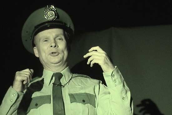
"My job is to weed out illegal or underground economies, not only to stop them in process but also to prevent them from even being imagined. I am on duty to keep incompatible languages apart from one another. You cannot have incompatible languages competing for public space ..."The driver:Andy Paterson's mind is complicated and sometimes hard to follow, but the man is a generous and charismatic entertainer, and the door to his ideas is pretty wide open. Summing up Andy's stories does them no justice, because it's their very layered interconnectedness that gives them clout. Pay attention, and you'll find yourself firing neurons you never knew you had. That said, I will try to name a few themes: exchange and commodity, public space, media and language, class and mobility, oppression, censorship, bad puns, mental illness, more bad puns, music, art, math, and history.
"Here in my car
we won't get very far
because I cannot drive
and neither can you
so there ..."
(sung to the tune of Gary Numan's "Cars")
For a recent online project by Andrew J. Paterson click here.
For videos and information look at VTape's excellent catalogue.

Micah Lexier
Kelly Mark
Daniel Olson
Kelly Mark's magazine-style art website, samplesize.ca is well worth a few visits (and participation! send in the writing, folks). On a recent browse, I really enjoyed Micah Lexier's Group Show 1. Minimalism that includes scary Ulay and Marina Abramovich but leaves out boring ol' Donald Judd. Conceptual art that includes the wonky Daniel Buren and omits the often pompous Joseph Kosuth. Now that's my kind of curation! This simple series of images resonates deep, giving background warmth to a kind of contemporary art that sometimes feels cold and bleak. While Daniel Olson is not on Lexier's list, I'd say that Olson, Lexier and Kelly Mark are three Candian artists with a particularly keen eye for understatement. They all take their minimalism seriously but they don't leave out the fun stuff. Lexier is the driest of the three, and the sense of quiet resignation I sometimes get from his art has turned me away in the past. His curation on samplesize, however, gives me some new thoughts about locating his work as a fine-tuned practice that is gentle yet precise. I was particularly happy to see a work by Eric Cameron: that sad-eyed, Quentin Crisp-like art history prof with a shaky hand, and an art practice that makes your skin crawl as he delicately and persistently coats objects with layer upon layer of white acrylic, nudging them into monstrous shapes that slowly grow ever larger as their true forms morph into obliteration.
Eric Cameron
I've been in USA for 2 months and therefore pondering cultural differences on either side of the border. One big difference is beer. Art types, intellectuals and urbanites in USA are scared of beer drinkers. As my friend Kris says, "Beer to me means football and date rape." Well, we have football and date rape here in Canada too, but somehow or other beer here also means art openings, christmas cheer, paddling a canoe, open mike poetry readings, hockey and just about anything else where people do stuff in a group. Imagine my relief to get home! And my surprise and delight to find out that a beer magazine paid for by our national beer store has sprung up during my absence!

Here's an excerpt from issue #1 of chill:
Trailer Park Boys Speak*(*if you don't know who the Trailer Park Boys are then you aren't watching enough Candian-content tv. click here.)
Chill: Would you be willing to clean up your act and stay out of jail so you don't sully Bubbles reputation like Jimmy Carter's idiot brother did?Ā
Ricky: I don't understand what the f--- the word "sully" means.Ā So because whoever asked this question decided to use big fancy school words that I haven't learned yet, I can't f---ing answer that.
Julian: Lots of people in jail have friends in politics. I think people will take us for who we are. We don't plan on trying to cover up anything. Cover-ups always turn into sh--storms, politicians should just try being honest.
And while I'm on the topic of loveable hosers:
Jack Black's star is rising (for better or worse) and we should remember to listen to Tenacious D once in a while ...you know, that it's-not-exactly-all-a-joke mock hard rock band that Black started with Kyle Gass. Crank it, listen, laugh, and rock out. It's inane boy stuff, but their 6th track, F--- her Gently, has a decidedly feminist bent. It's absolutely my favourite song with the word "Sally" in it. click for lyrics. (CAUTION: they really use a lot of swears)