...more recent posts
Class #8
Divshare looks like a good image host: http://www.divshare.com/tour for those of you who haven't found one.
For now on, instead of relative pathnames to local folders, I want you to use absolute pathnames in your HTML files. Anther thing to note about a lot of free image hosts is that they have a storage limit. I want you to start thinking about how to compress files that you've created in Photoshop or EasyGif Animator. Remember when you post stuff, the end user has to wait for it to load in their browser. All good artists take limitations and make them look like they were on purpose.
Today we stay with photoshop and EasyGif animator. So lets look at what some artists have done with paint programs (On Thursday we start with Flash.)
Andrew Paterson
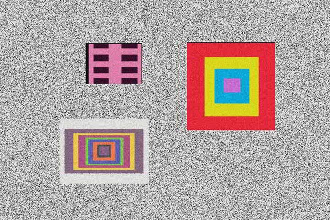
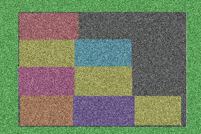
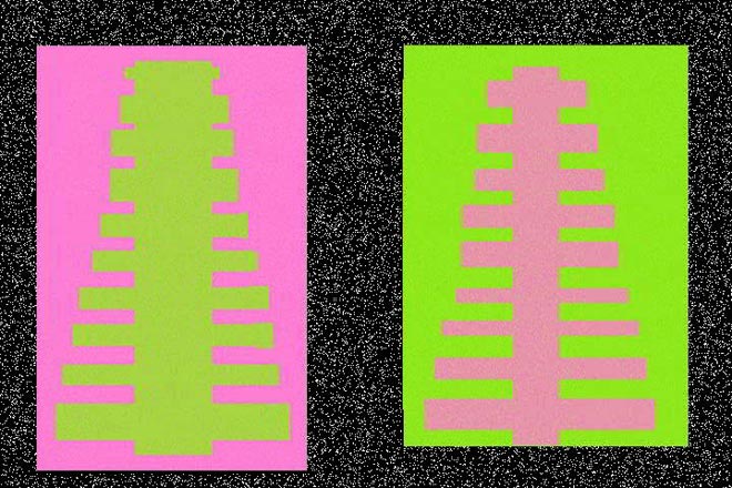
Stills from Rectangle World 2006 digital video
Dyan Marie: http://www.dyanmarie.com/
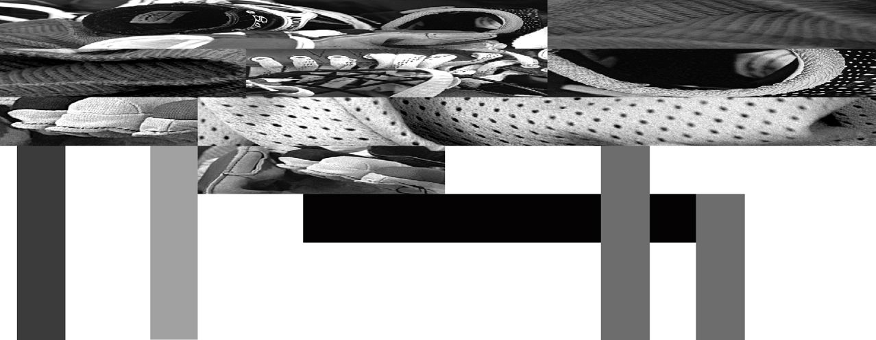
House for Teenage Hockey Player 1999 from Subjected to Change: Armatures for Standing Up
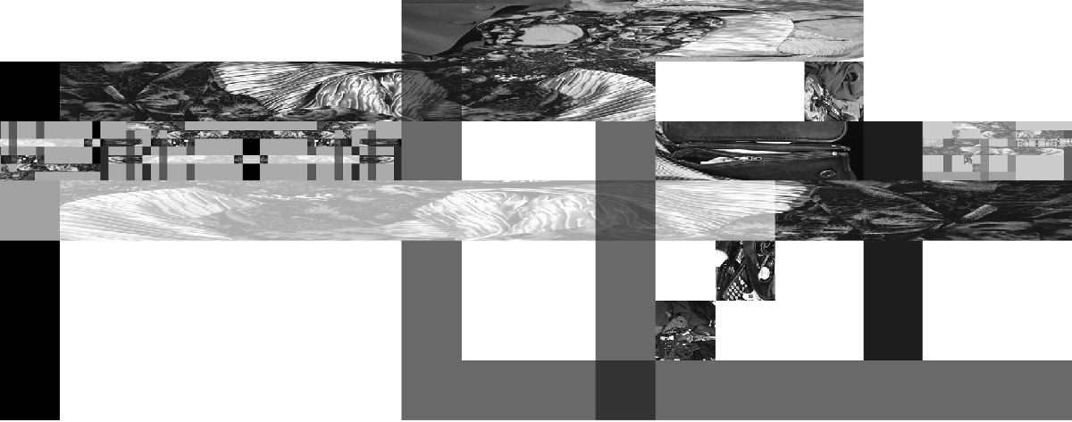
House for Established Bussiness Woman 1999 from Subjected to Change: Armatures for Standing Up
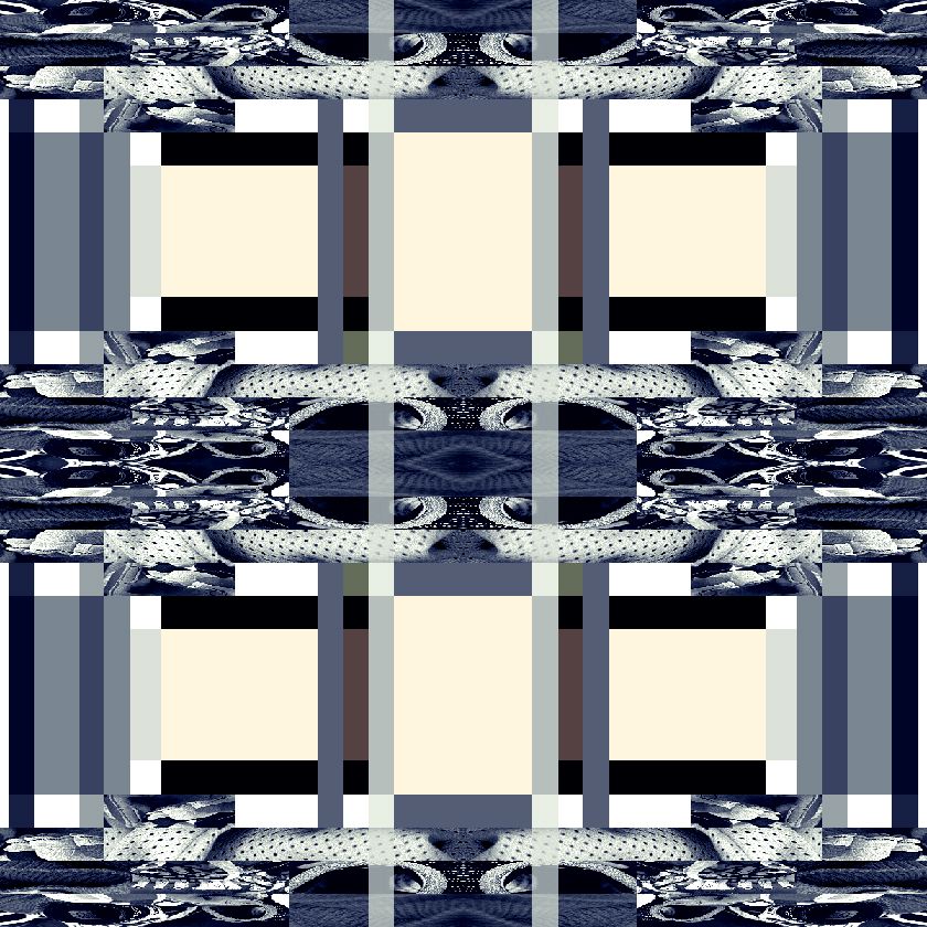
Window for Teenage Hockey Player House 1999 from Subjected to Change: Armatures for Standing Up
http://gooooooooooooooooooooooooooooooooooooooooooooooooooooogle.com/javiers/
http://www.mariaeisl.com/
http://aboutfoo.com/~robmyers/art/smileys/
http://www.fakeisthenewreal.org/ via http://www.digitalmediatree.com/tommoody/?30568
http://www.onehundredpixels.com/
http://joe-biden.ytmnd.com/ (there is no good reason to include that it just made me laugh)
http://www.petracortright.com/Landscape-5-15-05.html
http://www.travesssmalley.com/blog/
http://www.loshadka.org/wp/?author=14&paged=2
http://www.loshadka.org/wp/?author=8
http://happytimesforkids.com/pics1.htm
http://www.loshadka.org/wp/?p=680
Some commentary from VVoi on this work: http://new-art.blogspot.com/2008/05/less-art.html
http://fffff.at/borna/
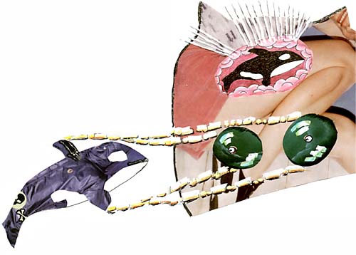
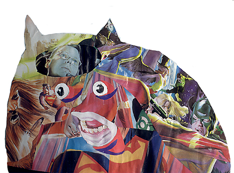
(Sally McKay)
http://indoor-oak.org/
http://supercentral.org/lk/
http://candicebreitz.net/
http://ccca.finearts.yorku.ca/mikidot/photo/nobadart2008/pages/01.html
A collection so perfect that we are unworthy to screw with it: http://www.nepaldog.com/NEPAL_DOG/908postcard.html#11
And some good reading on collections/piles: http://teamschwartz.powweb.com/Pile/c1p1.html
Animated Gifs:
http://iheartphotograph.blogspot.com/2008/08/opening-tonight-young-curators-new.html
http://www.eyebeam.org/reblog/archives/2004/09/post_2.html
http://physics.ucsc.edu/groups/condensed/moseley/crystal_structures/index.html
http://www.rhizome.org/events/gifshow/
http://www.digitalmediatree.com/sallymckay/?35618
http://www.boullet.com/black/pages/booksonline.htm
http://www.boullet.com/black/pages/growth.htm
http://slecht-lands.livejournal.com/115664.html
http://slecht-lands.livejournal.com/112585.html
http://slecht-lands.livejournal.com/108742.html
http://slecht-lands.livejournal.com/76019.html
http://www.loshadka.org/wp/?p=857
http://theageofmammals.com/research/?p=23
http://www.clubinternet.org/
I realize that my definition the other day really sucked so I looked it up on wikipedia and got this: "Dither is an intentionally applied form of noise, used to randomize quantization error, thereby preventing large-scale patterns such as contouring that are more objectionable than uncorrelated noise."
Is that not perfectly clear?
How about this one:
http://en.wikipedia.org/wiki/Floyd-Steinberg_dithering
Does this one help? http://en.wikipedia.org/wiki/Error_diffusion
My sucky explanation is begining to sound pretty good now. (though I don't really remember what I said)
OK this will help:
http://webstyleguide.com/graphics/dither.html, http://notlost.blogspot.com/2008/08/dithering-for-low-bit-depth-lcds-with.html (but I like obvious dithering!)
Now back to work, we are going to look at z space (as opposed to x and y) for depth
grab a few backgrounds preferable with a landscape (it can have objects in it): http://glenmullaly.blogspot.com/2008/04/vintage-animation-back-and-fore-grounds.html
http://animationbackgrounds.blogspot.com/
Open up the file in Photoshop and make two layer copies,
In the lessons folder copy the photoshop file log_3.psd and look at how the layers have been altered. Use your brains and do it to your chosen image
When that's done, copy and open up the ani.psd file
Now select edit in imageReady and prepare to listen to my curses because this is a most awkward tool and you'll find flash a bit easier to animate in, but it also doesn't have the wonderful filter potential that Photoshop has, so you will have to witness my battle with this program, I will fight to the death and take you all with me.
FUCKSOCKS! (that means watch and listen)
The little trick I discovered with the animation window is to select the animation frame first, then look at your layers window. You'll see the visible layers that make up your animation frame, at this point it's safe to turn layers on and off. When you want to make the next frame, select the animation frame first, not a layers frame.