View current page...more recent posts
Class #6: technical opportunism (part 1)
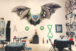
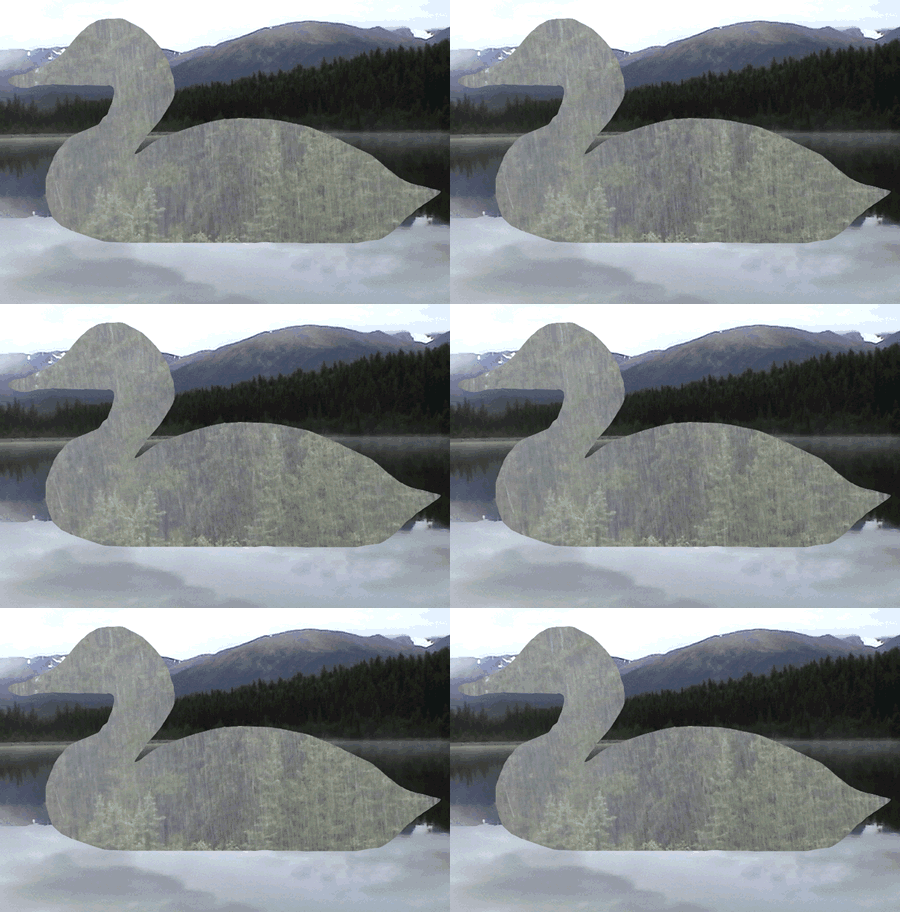
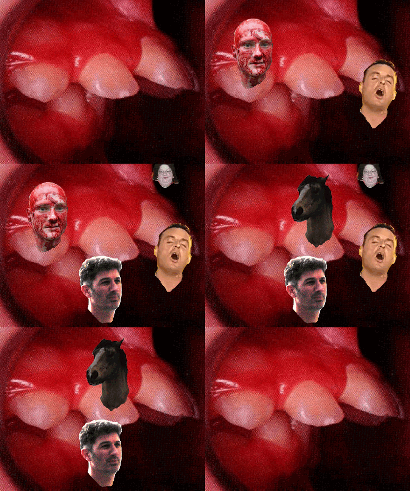
 mock up of proposal for a Turner Prize entry from b3ta
If you look in the lessons folder on the server, you should see all the installers for the softwares we have downloaded up to now. These machines are wiped clean on restart so everytime you install one, it is like the first day of an evaluation period. Today we'll need alleycode installed, so do that now if I'm still loading images onto your systems. if you brought a firewire for your video cell phone, try downloading some images right now. If it's a wireless, you can get Paul to help you. (security issues)
We are going to do the instructable first today, since I don't know how long this will take you.
Photoshop/HTML showdogs:
- due to licensing costs they still have CS2 loaded on the student machines. (they might eventually just skip CS3 and wait for CS4) This doesn't matter one bit. I started you on simpler imaging tools for a reason. Software always changes, you'll never be totally up to date, but you can hone your problem solving skills and that makes it easier to update tools later
-this software was a prerequisite for this class, but in reality everyone uses a dense program in their own way. So don't worry about your skill level right now. If you like using a program, you'll get more comfortable eventually. Plus you can achieve the same results many different ways with the available tools.
- worked with a musician once who never used the contrast slider, he preferred the tools for levels because he understood them. This did not stop me from making fun of him.

- so anyway, forgive me if you know all this already, but I have to do it with you
1) open up the image of yourself in Photoshop.
2) go to
view in the upper menus and change your screenmode to standard screenmode, then go to
window and de-select all the windows except for layers, Navigator, options and tools. (keep your image up there too) click '
m" on your keyboard, and you won't accidentally crop or erase something right now. (while your at it click
v, l, w,c, k, j, b, s, y, e, g, r, o, a, t, p, u, n, i, h, and z and look at the floating vertical tool bar) Click
m again.
3) select the one layer that's named
background and make a copy of it in your layers panel. Name it
work
4) now save the file and it will save as a
.psd.
5) just for clarity in this semi-militaristic exercise, I'll ask you to crop the image so that you don't have a huge ground behind your portrait. For images that came out of the video camera, you'll notice that there might be some interlacing lines, if you don't like them go to
filter, select
video and
deinterlace to get rid of those lines, play with the options to see how your picture might change. you don't have to deinterlace at all, it's an aesthetic decision that you get to make. (more info in deinterlacing here:
http://en.wikipedia.org/wiki/Deinterlacing)
6) hit
b for brush, double click the foreground colour icon on the tool bar (black and white squares) and select a very sexy colour. ('cause you're worth it) Paint out your background. The results may be more interesting if we don't colour out the back ground, but you can always go back again later and play with that option. For the moment humour me. (but feel free to play with any of your brush options right now)
b/t/w doesn't that navigator window suck? I can show you an easier way to magnify right now.
7) Now the picky part, and we can do it a few ways:
-Press
control R to see the rulers.
-Click on the top ruler or the left ruler and drag a guides out, create a grid of guides.
-OR Choose View > New Guide. In the dialog box, select Horizontal or Vertical orientation, enter a position, and click OK. (i just copied that from the help files, this shit takes too long to write myself)
-Another way is to deselect the eyeball icons on the layers box and you should have a ready made grid background. If not go to the
edit menu, then
preferences, then
transparency and gamut and change the size of the grid ground and eyeball the guide placement from there.
- make your grid (minimum 100 cells, those of you who are really comfortable can make a grid with 200 cells) out of guide lines, then lock the guides.(under
view menu)
SAVE
8)
NOW Select the Slice tool,(
k) and click Slices From Guides in the options bar that appears for the tool. Lock your slices.
SAVE
9) (copied and edited from help files)
You can view slices in Photoshop, the Photoshop Save For Web dialog box, and ImageReady. (we will ignore ImageReady today)
The following characteristics can help you identify and differentiate between slices:
-Slice lines Define the boundary of the slice. Solid lines indicate that the slice is a user slice or layer-based slice; dotted lines indicate that the slice is an auto slice.
-Slice colors Differentiate user slices and layer-based slices from auto slices. By default, user slices and layer-based slices have blue symbols, and auto slices have gray symbols.
(ignore for our purposes)
-In addition, ImageReady and the Photoshop Save For Web dialog box use color adjustments to dim unselected slices. These adjustments are for display purposes only and do not affect the color of the final image. By default, the color adjustment for auto slices is twice the amount of that for user slices.
(really really ignore for today)
-Slice numbers Slices are numbered from left to right and top to bottom, beginning in the upper left corner of the image. If you change the arrangement or total number of slices, slice numbers are updated to reflect the new order.
(nope, we won't do that today)
-Slice badges The Web Content palette uses a number of badges, or icons, to indicate certain conditions, and these icons also appear in the document itself.
(check out the help files for the icon list)
10) Slices are a pretty powerful feature and they allow us to save the individual slices and will also create a table in HTML for them
(we don't care about that feature today, because we do not want a table)
11) Now we can select our slices and save them as over 100 individual GIFS:
Do the last thing of the following: (again this comes from the photoshop help files, so I wanted you to see the options that we aren't using)
-Select the Slice Select tool and click the slice in the image. When working with overlapping slices, click the visible section of an underlying slice to select it.
-Select the Slice Select tool, and Shift-click to add slices to the selection.
-Select the Slice Select tool, and click in an auto slice or outside the image area, and drag across the slices you want to select. (Clicking in a user slice and dragging moves the slice.)
-
Choose File > Save For Web. In the dialog box, use the Slice tool to select a slice.
12) This is where it gets fun, because you get to choose from a lot compression options that will effect the final product.
-check out all the presets for gif files. You have options to compress the number of colours, and change the dithering.
You can use the slice tool in this window to select all the gifs and apply the same presets to them, when you save, the program will generate the gif filenames with the grid numbers.
-the more fun thing to do is to select different clusters and apply different compression and dithering presets to them. When you save, just save the selected. Unfortunately the program will take you out of the
web save screen, so for multiple and varying grid selections, you have to go back from the
file menu.
Do it.
When everyone's ready we'll go to these next steps
13) Take your folder full of images to the deskstop just so we don't have to deal with dozens of pathnames.
14) Open up
alleycode and a new HTML file.
(delete the preset scripts that it opens with, we don't need them right now)
15)save the new file to your desktop, and not in your images folder, remember all the pathname stuff I taught you.
16) use the image tag and fill in your pathname info like I did for my local version <img src="/myimages/bats_01.gif">

17) now copy and paste that script several times on the same line change the numbers on the file names that photoshop generated for you:
<img src="/myimages/bats_01.gif"><img src="/myimages/bats_02.gif"><img src="/myimages/bats_03.gif"><img src="/myimages/bats_04.gif">> (and so on)


See what is starting to happen? Without the <br> we don't have a line break only a wrap (same as a word wrap in a text program) Make sure that there are no spaces between the image tags too
18) open the completed file in your browser, play with the window size and congrats, we just de-mystified another tech trick from a smart artist.
http://oliverlaric.com/b.htm (if you screwed up, it might be interesting, so save that alleycode file and copy the scripts to a new file and check for line breaks and spaces between tags.)
(note that Laric might have divided up his initial image pixel by pixel, or else pixelated the image before he gridded it to give that appearance, figure it out for yourselves. Doesn't matter. What a freak.)
You might even hate him now after we just picked his work apart with all this tedious procedure, that's what Universities do best and I'm happy to help.
But I doubt you've damaged the medium or my own admiration for his practise in any way, because good artists have been leaping through all these tricks using them when needed, exploiting their screw-ups, looking at each other's source codes
During the work period try it again with an irregular grid, smaller or larger cells, play with compression and dithering, spaces between the tags in your HTML, try different sorts of images, you might bring something new to what everyone else might think of as 'the last word.'
Please put a copy of today's exercise in your folder on the server
b/t/w:
http://www.artfagcity.com/2008/09/22/the-five-principles-of-new-media/#comments, fun post and exchange here. Seems like at least one commenter would not agree with me and many others about compression, artifacts and energetic opportunism. And to that, sometimes, the only appropriate response is:
I hate the way you make art too.
Part 2 just links, I'll flesh some of this stuff out later when I clean up these pages.
some more about collections:
- many collections can elevate items that might be weak on their own.
- apply this to
http://www.vvork.com/ and you begin to see the problems that some people have with their project.
- on the upside, collections of great work magnify each other's qualities.
http://www.loshadka.org/wp/?p=897 (did I show this one already? doesn't matter, I love dogs)
http://www.loshadka.org/wp/?p=708
http://www.loshadka.org/wp/?p=334
http://www.loshadka.org/wp/?cat=59&paged=2 (I really, really love this top collection)
http://www.loshadka.org/wp/?p=183
http://www.loshadka.org/wp/?p=115
I WANT TO SEE ALL OF THE NEWS FROM TODAY
http://www.aloalo.co.jp/nakazawa/portfolio/pdf/op110sentence2.html
http://www.photo.sittcomm.sk/kate_postcards.htm
http://www.nationalphilistine.com/alternumerics/index.html
http://home.nc.rr.com/tuco/looney/acme/acme.html (not quite web art, totally better)
http://www.whatihaveread.net/ (not an artist, but a physicist out of Colorado)
http://www.tinypineapple.com/nursebooks/ (Nurse Books!)
http://www.davidshrigley.com/list_photographs.html
http://www.babyanimalz.com/
http://www.rapunzelsdelight.com/
What differences do you see between an artists' collection project and an archive, if any?
You've already noticed that I've been grabbing stuff out some surf clubs:
http://www.loshadka.org/wp/,
http://www.supercentral.org/wordpress/,
http://www.nastynets.com/?what=yes,
http://doublehappiness.ilikenicethings.com/,
http://www.spiritsurfers.net/,
http://hardlandheartland.blogspot.com/,
http://lordsofapathy.blogspot.com/ Most of the individual artists have their own sites and you can generally get the URL's from the members links on the front pages of most of them.
I find everyone's work to be more alive in the surf club, probably because even though a surf club is still a controlled context, it seems truer to the web than most pristinely designed individual artists' sites. I also noticed that surf clubs don't function that differently than the traditional artists' exhibiting collectives that we like so much here. Unmoderated by curators, and a variety of other gatekeepers and the artists end up driving it themselves, to mixed results, but when it's good, it's very good.
Marisa Olson's recent essay on surf clubs & found photography:
http://www.wordswithoutpictures.org/main.html?id=276 (more on her work for another class) You'll already be familiar with some of her links, and this essay is a very good read.
-I have often pondered the question of how lost does something have to be before it's found
Now for your sexy surf club:
Joe McKay cooked up the official masthead GIF. But he lost it when he emailed it to me but then I found it
in an email, so now I'm claiming at least 50% authorship

- I'll mail you the final URL this week, the page will be public, but we won't post the URL anywhere right now, so that you can get comfortable.
- Login required to post, not to view (set up a google account if you haven' already. Pick a screen name for your account, because it will be public.)
- no censorship, unless something gets libelous and legally actionable, any other problem posts will be converted with
http://lolinator.com:80/ Because kitteh speak always takes the sting out of death threats.
- this is actually a slightly unfair set-up for you, you should be able to choose your own collaborators just like the big smart kids in NYC. With 70 posters this is going to look more like an image board than a surf club, but Joe likes the "we are making art" stance that a surf club gives, so what the hell
- might add a lolinator flag so that you get to decide what posts will be converted to kitteh. (No we won't because you'll be converting all of them, what were we even thinking)
- you need to get an image host, since the University's servers aren't set up for barbarians like you.
- Laura Britt Greig is putting the finishing touches to the software.
- if we have any issues with uninvited posting, Laura can set up password protection, but we'll avoid it for now.
- if you are successful at the end of this experiment no one will want to be in a surf club ever again. Surf clubs will be so over. You have the chance to spoil it for everyone on the web.
Addendum to class #5
A few links we discussed at that I didn't include previously:
http://slecht-lands.livejournal.com/117471.html (now that I've shown you screen capture tools you can figure out one of a few ways to make this sort of animation)
When we were discussing
THE PORN:
http://thankgodforconceptualart.com/index.php?/projects/me-and-my-girlfriend/ I told you about a similarity in structure by Kelly Mark in her captured series:
http://www.ireallyshould.com/captured.html
This goes to the truth of a
comment by
Christopher Brayshaw on a
simpleposie thread about the clusters of similarities that are produced on
VVORK:
"[...] subject-based content is distinct from artistic subjectivity. The Bechers don't own "water towers" any more than Jeff Wall owns "light boxes." Subject without subjectivity is meaningless on its own. Take the recent chess works; chess is a subject -- shared template -- that many different subjectivities are worked out in relation to. But many of those subjectivities begin from aesthetic positions that don't bear any relationship to each other, outside of the nominally similar forms. Curators who organize shows about subjects (hot rod art, garden art, red art) instead of subjectivities are mailin' it in."
OK, now carry on with the important work of putting a marquee tag around everything we see.
07th Aug 2008Sirmione
Sirmione (Lago di Garda), 20080807, HTML, 350 x 390 pixels
Class #5 when we will finally destroy art once and for all.

After blithering on last class about how these seemingly cacophonous artists sites are really sophisticated design products. Not designed in the commercial sense, but designed in the sense that images are placed with intention, I have to swallow my words because of the best art site in universe:
http://yvettesbridalformal.com/index.htm (via
artfagcity) especially since it's not an art site, it really is a bridal wear site. Perhaps proving that everyone can make something that looks like art at least once. Perhaps also showing how close web-based art can ride with everything else on-line.
- This institution has tech and IT staff protecting their systems, but you don't. We will discuss how to protect your own systems from a web-based part practise.
- don't download exe files you don't understand, Google to find out exactly what something is from one of hundreds of tech communities who see this sort of crap and warn each other about it all the time.
When the site is ready for
The Royal Society of Intertubes, our Surf club that we are doing with Joe McKay's class in California, you will have to log in with your email address, get yourself a yahoo, gmail or hotmail account specifically for that (and for spam whenever you give it away for anything on-line).
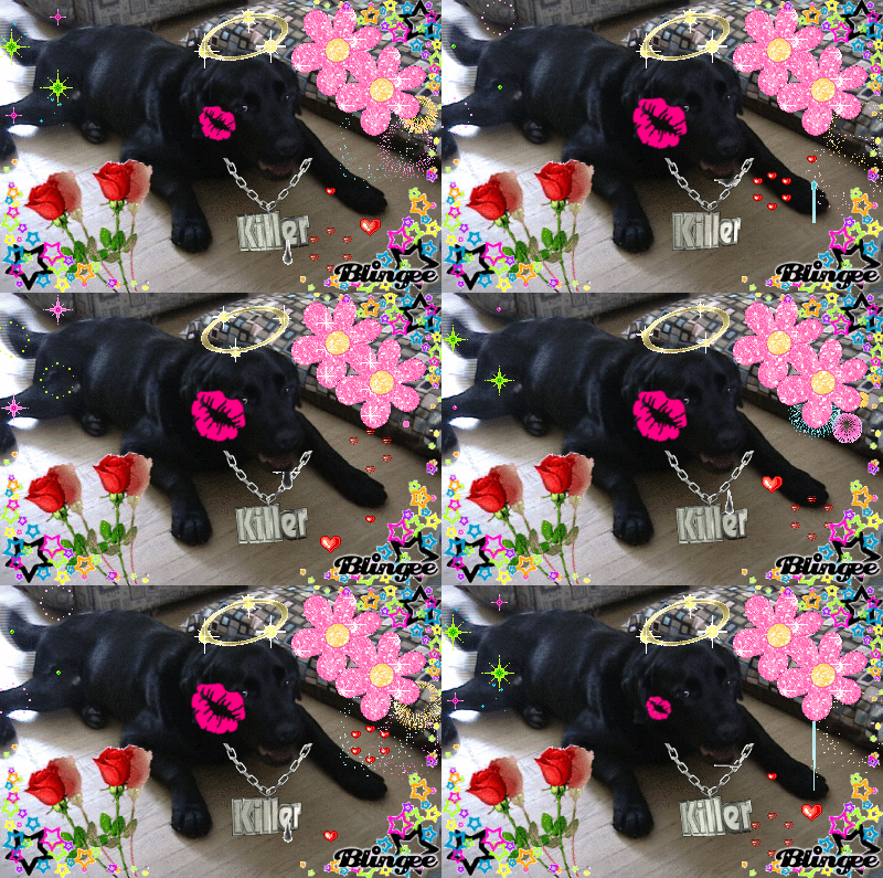
Some of you took to blingee (
http://blingee.com/) last class, here's some from Olia Lialina
http://art.teleportacia.org/exhibition/blingee/ (don't forget to read her two essays, and way more on her later, she's amazing)
- good time to discuss what and why and how sites like this get made, why and how user interface decisions are made.
Some more links to collections of stuff, the bar gets raised even higher for this assignment:
http://www.typingservice.org/index.html
http://www.unbehagen.com/fascinum/
http://oliverlaric.com/b.htm
http://www.vvork.com/?p=6535#comments
LINK FOR PORN VIDEO: http://thankgodforconceptualart.com/index.php?/projects/me-and-my-girlfriend/ (of course you'll watch this)
Spirit Surfers have some great collectors:
http://www.spiritsurfers.net/monastery/?p=258
http://www.spiritsurfers.net/monastery/?p=229
http://www.spiritsurfers.net/monastery/?p=241
http://www.spiritsurfers.net/monastery/?p=575
http://www.spiritsurfers.net/monastery/?p=187
http://www.spiritsurfers.net/monastery/?p=477 (I'd count this one as a collection, how about a set of multiples. Never mind, it's nice)
http://www.spiritsurfers.net/monastery/?p=169 (I have a large scale photo of a garbage dump by
Warren Quigley hanging over my mantle at home)
http://www.spiritsurfers.net/monastery/?p=133
http://www.spiritsurfers.net/monastery/?p=38
And while we are at Spirit Surfers, check out this marquee animation,
http://www.spiritsurfers.net/monastery/?p=427. they don't have to run at the speed of light to be interesting. The attributes for setting the speed are here:
http://www.html-reference.com/MARQUEE.htm. I remind you of this since it appears that you will use that damn tag for everything until the day you die.
We are going to play with a screen capture tool today.
Now lets rip some youtubes, and later produce some of our own video clips.
Take 10 minutes to find a very short, preferably silent, youTube video that you want to download:
http://www.youtube.com/watch?v=YF_6JvJTQoE
got to
http://www.ripzor.com/youtuberipper.html and enter the URL of the video you selected.
What you have now is an FLV file, without an flv player you can't view it, and you probably won't be able to edit it in any of the video editors on your machine. So now go to
http://www.ripzor.com/flvconverter.html to download an FLV converter. We want to change this youtube flash video to an .avi file that we can dick around with. If the original downloaded file does not have an extension .flv, add it.
Open the converter software, and select your file and select .avi in output options. Save the new file to your desktop. Now you should have an avi that you can open and edit in windows video editor or any editing software. I hope that you're happy now. we can easily make some GIFS from this by selecting frames saving them as bitmaps, converting the bitmaps to gif in an image editing software and importing them to a GIF editor or else Photoshop, but I don't want to start on an intense animation with Photoshop class until lesson 6. (when you'll also try to make digital pogs:
http://mikesdigitalpogpage.com/)
Now for a screen capture utility, we're going to try out Camtasia. Also today, pass my video camera around, those with cell phones can try to download their videos or images with a firewire connection. Lots of problem solving for all of us.
More links for end of class if there is time:
http://www.loshadka.org:80/wp/?p=630 JavaScript, but think about how you now know how to do it with an animated GIF
http://www.loshadka.org/wp/?p=148
http://nastynets.com/?p=1274
http://nastynets.com/?p=1236
http://www.newrafael.com/

An addendum to class 4, these are the additional links we spoke about (I was going to do them at a later class but you were all so demanding):
http://aleksandradomanovic.com/
http://oliverlaric.com/
I also figured out the clever way Oliver did these moving pixel portraits:
http://oliverlaric.com/pixel/christophpriglinger.htm. He gridded off the original image and created a small GIF of each grid square, reassembled them in one long line of 'img src' tags and excluded any line breaks. Simple and brilliant. Once we start the photoshop instructionals you can make some of each other, and we'll see if I'm right . We're in a tiny perfect open-source universe here.
We will still discuss Olia Lialina's site at another time, so I won't include the link since we were just looking at her opening page.
 Class #4
A few loose ends I should tie up from last class since we got sidetracked with youTube hacking.
First of all, I meant to show you some of links to work that show some different collection strategies (some more successful than others):
http://doublehappiness.ilikenicethings.com/?p=173
http://doublehappiness.ilikenicethings.com/?p=504#comments
http://doublehappiness.ilikenicethings.com/?p=911
http://doublehappiness.ilikenicethings.com/?p=1307#comments
http://www.sweetgifs.com/?pg=1
http://nastynets.com/?p=470
http://nastynets.com/?p=566#comments
http://doublehappiness.ilikenicethings.com/?p=53
http://www.digitalmediatree.com/tommoody/?31122(space bloom)
http://www.digitalmediatree.com/sallymckay/ovvlvverk/pageback/42653/
I'm raising the bar ever so slightly as each class goes on.
I'll repeat that the
collection assignment will be one of two final assignments.
minimum 25, max 50.
Lists of things that are invested with meaning or interest for you. Must be compelling for you or it won�t be for me.
You can go as low brow or high brow as you want . (No kitteh animations with earphones. That's the only rule. All other kittehs are acceptable.) You will have to find an interesting way to place this collection on an html page, a way that is somehow works with what you're showing us.
Another search method for your collection assignment:
Go to an on-line language translator,
http://babelfish.yahoo.com/translate_txt, get translations for your keyword in several languages and try all of those languages with a Google image search.
http://images.google.ca/imghp?hl=en&tab=wi the results will always be different. Try other search engines, for example
http://www.dogpile.com/ is an aggregate of a bunch of diferent search engines. Every engine has its own search algorithm that is going to yield different results.
Last class I meant to talk more about tables. you've probably discovered them already on that three schools tutorial page:
http://www.w3schools.com/html/html_examples.asp. They are totally counter intuitive, a major pain and one of the main reasons why Dreamweaver exists. However, Dreamweaver doesn't give us enough control as artists, that's why we've been hand-scripting stuff in this class
One row and three columns:
<table border="1">
<tr>
<td>100</td>
<td>200</td>
<td>300</td>
</tr>
</table>
so here's an example of an artist clearly using tables (yes back to Chris Ashley because he always surprises me with something wonderful)
http://looksee.chrisashley.net/archives/756
If we strip the images we have this underlying structure (I added a border and left spaces between the coloured cells into show it better, but it only seems to work in IE):
As I mentioned in a previous class, go to the three schools link, find the tables tutorials and insert your own images in, you'll start to get an intuitive understanding of how you can make them work for you.
Now we can look at a seemingly more cacophonous page:
http://jpegmess.org/1.html. by an artist from Chicago named Robert Wodzinski.
Mess is deceptive, this is very sophisticated work, and for those who love
"more is more" there's a lot you can learn from looking at what he's doing. Remember we are talking about 2D pictorial space, you learned about composition in your foundation year.
I'd make the same point about the surf club double happiness that many of you have already seen in other sample links:
http://doublehappiness.ilikenicethings.com/
These artists are all well aware of how they're placing their posts within the framing device that they all agreed on. They're currently in a show at vertexList
http://www.vertexlist.net/ in Williamsburg, Brooklyn.
Tom moody posted some images from the installation:
http://www.tommoody.us/archives/2008/09/13/double-happiness-at-vertexlist/
I partially agree with Tom's assertion:"Taste and restraint are concepts they have no use for, making them the most lifelike of the surf clubs."
But I think they show an incredible amount of taste in their choices for the installation. (They aren't throwing shit in a pile)

It also reminds me of fastw�rms' Donkey@Ninja@Witch that some of you may have seen last year at the AGYU.
Now lets get to the insanely fun stuff. GIFs: Graphics Interchange Format you can read about the technical history here:
http://en.wikipedia.org/wiki/GIF
from Moody's post at artfagcity (
http://www.artfagcity.com/) -
http://www.artfagcity.com/2008/08/05/img-mgmt-psychotronic-gifs/#comments
"Animated GIFs have evolved over the last several years into a kind of ubiquitous �mini-cinema,� entirely native to the personal computer and the World Wide Web. Almost anyone can make one and almost every browser will read them. (From Wikipedia: �the Graphics Interchange Format is an 8-bit-per-pixel bitmap image format that was introduced by CompuServe in 1987 and has since come into widespread usage on the World Wide Web due to its wide support and portability.�)
In other words, no YouTube compression, no wait time, no subscriptions or proprietary formats to view, and they can be made in the most elementary and cheap imaging programs (free if you search for open source). GIFs are the purest expression of the democratic web and along with JPEGs and PNGs comprise its most authentic visual language.
As an artist I am attracted to this medium and have been making and posting GIFs for several years. This mini-cinema can be �scaled up� for galleries and film festivals but it�s equally fun to surrender it to the big pool of home-made creations that circulates on the Web. It�s gratifying to find GIFs you made yourself circulating on the pages of strangers months or years later. I don�t consider this �mail art��it is too chaotic and lacks that practice�s genre rules. At the same time I do consider it a legit and underexamined form of post-studio art."

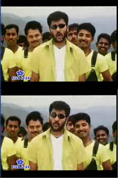
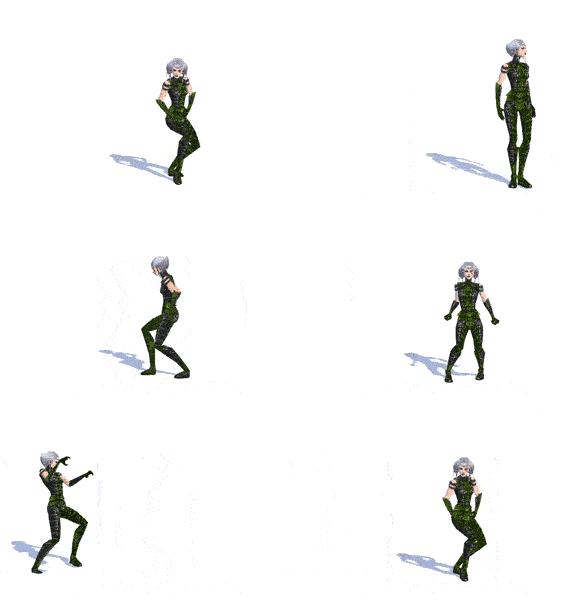
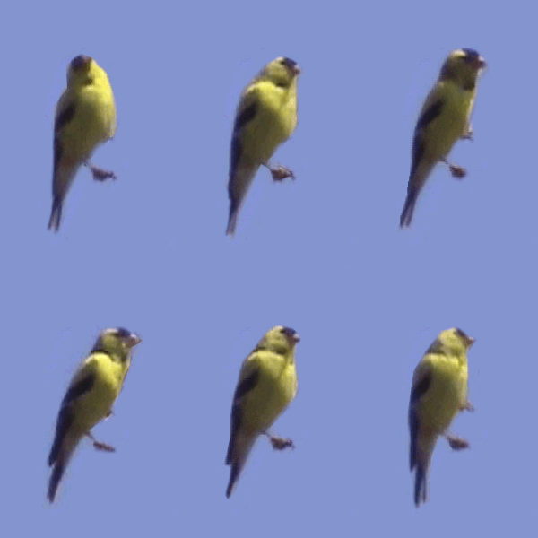
This is the gif I first saw On Tom Moody's blog that indicated to me that there was some wonderful stuff going on created by people were weren't neccessarily thinking of themselves as artists.

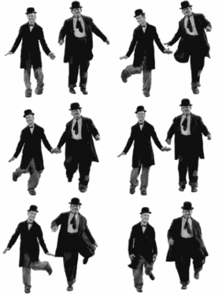
(this one's pretty great too. Can't remember where I found it)
Her too.

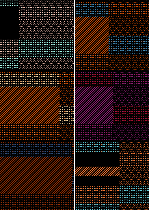
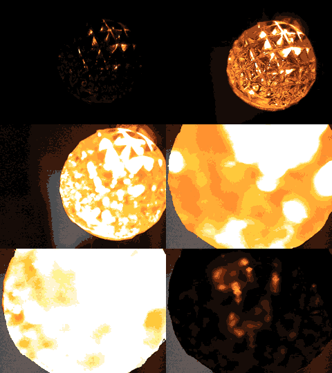
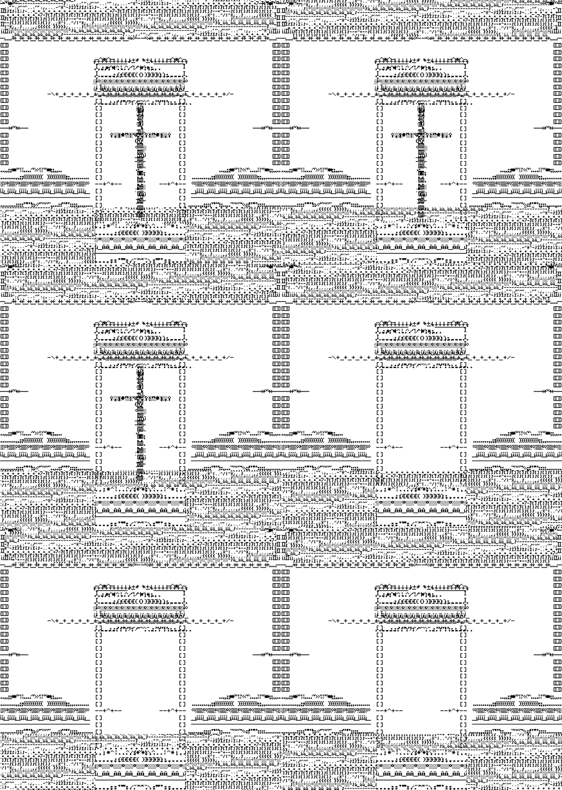
Below are animations by Sally McKay that got me excited about making them myself:





We made so much fun of this one:
http://www.digitalmediatree.com/sallymckay/comment/37805/

For more graphic based animations, Tom Moody's archive is a good reference for you:
http://www.tommoody.us/archives/category/animation-others/
Today we are going to download a simple gif animator program (If Paul wasn't able to get to it):
http://www.blumentals.net/download/
then right click this wankerman animation and save it to your hard drive:

Simple is deceptive there is a lot you can do with this program.

animation by Petra Cortright


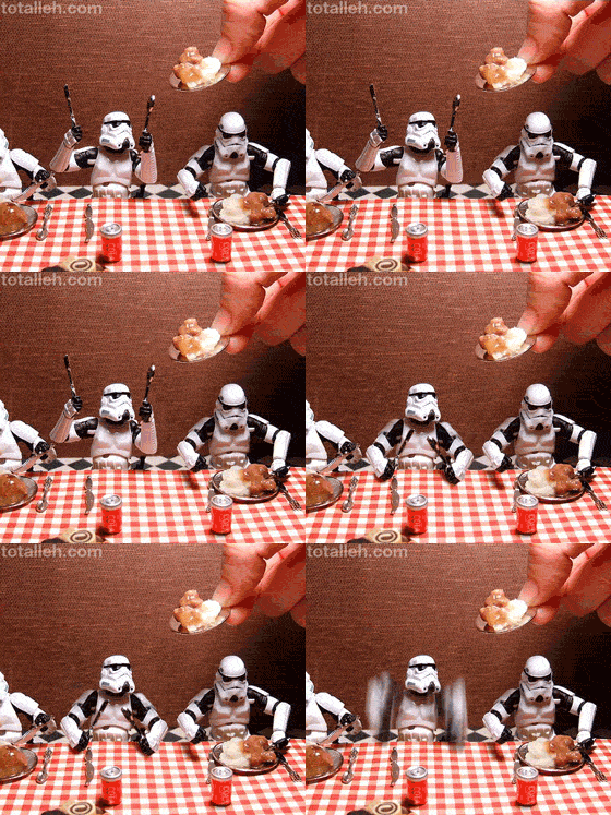
(can't remember where I got these, so I don't have an artists' credit)
