View current page...more recent posts
addendum to class 7
Miklos Legrady informs me that he was working with stereo imagery on-line in 1992
http://cprr.org/Museum/technical.html
He wrote these technical notes to help people
freeview 2x stereo images that are shown on the Central Pacific Railroad Photographic History Museum.
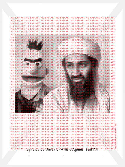
He also sent me paper of terrific research that he did on iconoclastic art that included this:
Please tear down this poster as soon as you see it !
2000? - On Stuart Brisley's website you can select one small field of a big picture. The selected field is sent to you by e-mail and it is - permanently - deleted on the original. The accompanying e-mail says:
Hi. - Here's your Image::copy 32x32 artwork that you chose. Keep it safe, it's the only copy that exists, as the spot you chose on the image has now been blacked out. Feel free to come back and get some more free art. http://www.ordure.org/ - Regards, Rosse.
Here's a direct link to the page of free art.
http://dump.ordure.org/image::copy/
class #7 - tacky web faux pas
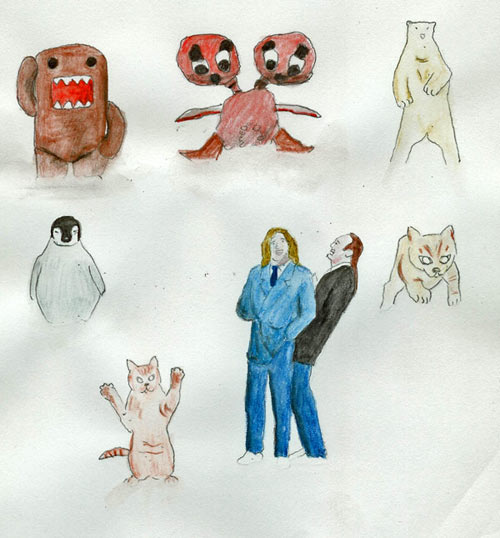
 found image with the file name: my-memes-2.jpg http://en.wikipedia.org/wiki/Meme
 (HA HA This is a University and I'm not ashamed to use wikipedia HA HA.)
You'll probably recall this
post and thread that I showed you in the intro class (there was a waiting list, so I thought I'd try to weed some of you out, but you little pervs stuck around). There's more!


This is all a hilarious riff on a shock site called goatse, some info here:
http://en.wikipedia.org/wiki/Goatse and if you absolutely must see the source image , they are stored everywhere now, but here is the site:
http://goatse.cz/ (note my warning ...and then the wedding ring). A little side note, according to
this blog, it would be prohibited by US law to post the original image. We are not even going to discuss or look at
bathtub girl.
-what I like about this is the variety of stuff that people come up with in response to an intentionally provocative and gross image.
- some stuff can collapse with inner-laughter (to paraphrase Joseph Beuys).
- like I've mentioned before, it's not a formula for every provocation you'll see on-line, because sometimes you do stumble onto truly awful soul rotting crap that you can't un-see once you've looked.
- an anatomy of viral imagres and techniques or how these riffs get rolling with anyone welcome on for the ride
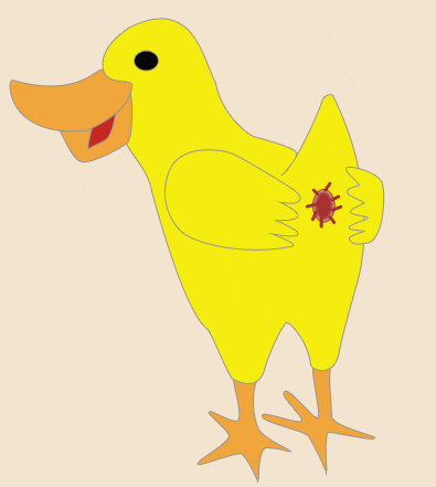
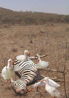
Speaking of evil ducks:


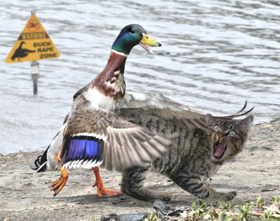
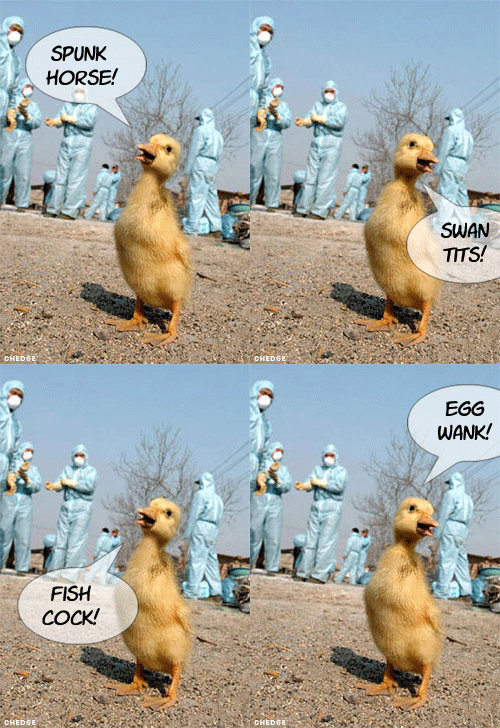
Speaking of more evil ducks:
http://ccca.finearts.yorku.ca/mikidot/photo/evil_ducky_preview/index.html Miklos Legrady jumps in and out of digital media (like all of us) and I found his decisions with the captions on his evil ducky series to be disconcerting, but I'm starting to get it. And of course, fastwurms have been dicking us around with the cheesy captions and innuendo ridden titles for years:
http://www.digitalmediatree.com/sallymckay/?44921
Check out more of Miklos Legrady's other projects:
http://ccca.finearts.yorku.ca/mikidot/start/index2.html

Onwards, today we look at cheap tricks and formulas that spread like wildfire, because they are easy and the results appeal to us. And ultimately we'll continue to weasel our way around presets and formats (something we'll look at at a later class are artists who have thought about this in a more formal way, but this is a studio class and we are greedy)


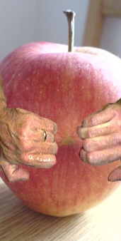
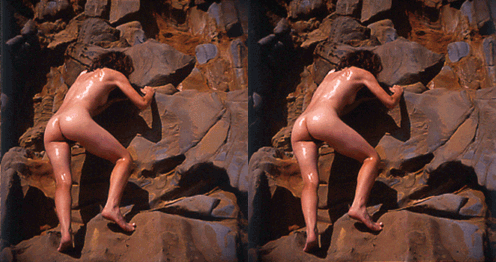
 I found this nudie on some guys site, he's defined his whole damn photographic practise with this stuff. This one is called "Moist and Dry" and I think that title could be the most delightful combination of earnest cluelessness and slimy sexual innuendo that you will ever encounter
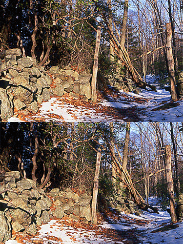
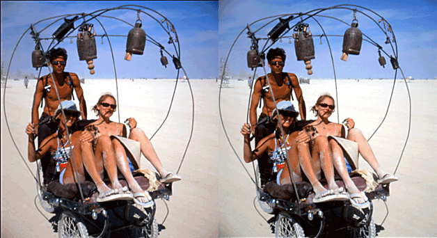
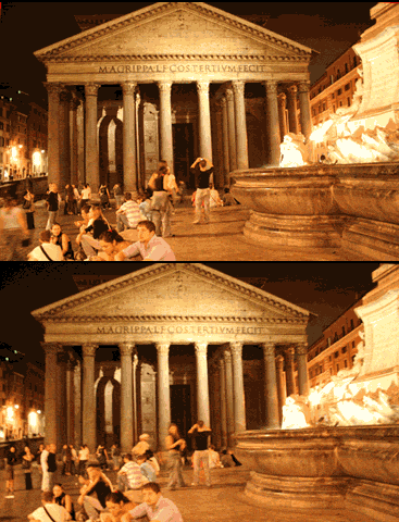
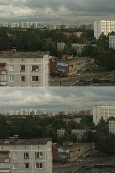
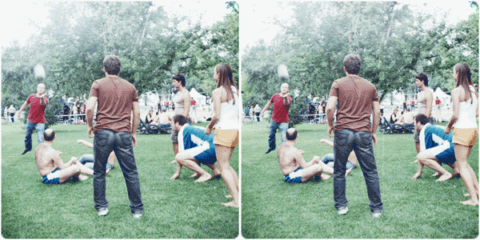
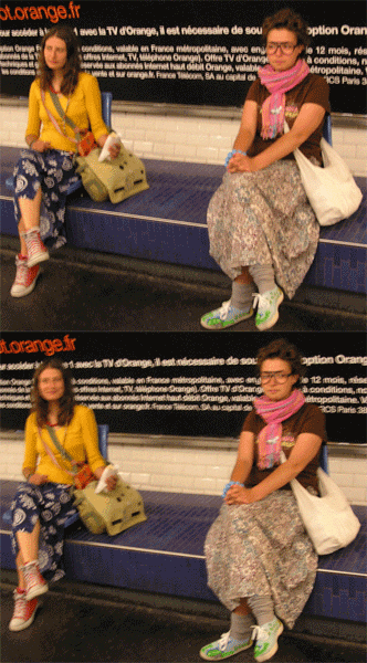
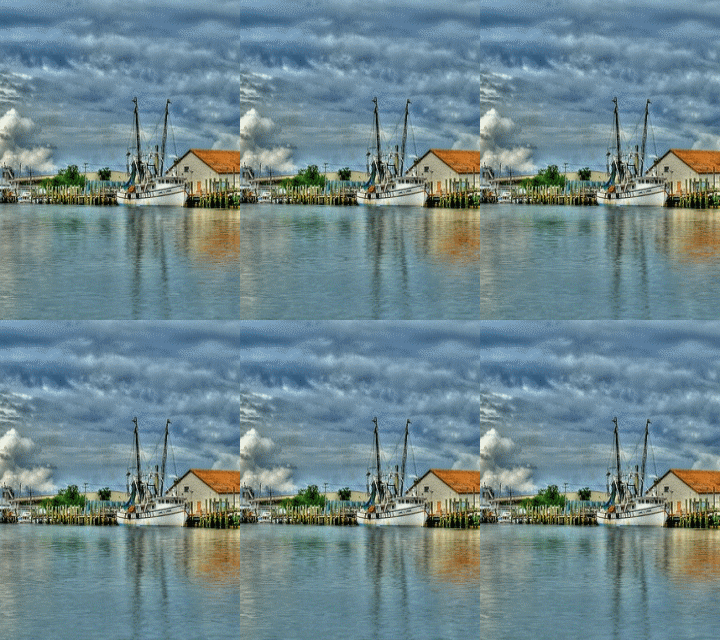
- there's a pop history to stereo renderings (wiggly stuff really), all sorts of viewing devices prior to these current cheesy digital anmiations. It started with early photography in the 19th century, basically two different views, left and right eye, combined to give the illusion of depth. (and there is how-to for it. Yay.
http://graphicssoft.about.com/library/uc/oransen/uc_stereo.htm)
One more that was circulating a lot a while back:
http://www.moillusions.com/2006/08/stereo-dino-optical-illusion.html

don't dismiss it, I found this one really compelling.
(remember nothing really ever gets made unless it's desired, you don't have to be secretive about stuff you sort of love)
http://www.digitalmediatree.com/sallymckay/?45133


- in a gallery context we had to adopt an ironic posture to a lot of this stuff. It would be ridiculous to expect you to use this stuff on-line without some irony, but avoid a relentlous posture of superiority, it's disingenuous and it'll make your art tedious. It's also a lot more interesting trying to understand why people like the stuff that they do.
- (you can make an argument, as an artist, for anything you choose and need to use.)
So onto some Photoshop. b/t/w you don't need photoshop some artists are doing
damn nice stuff with earlier paint programs.
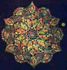
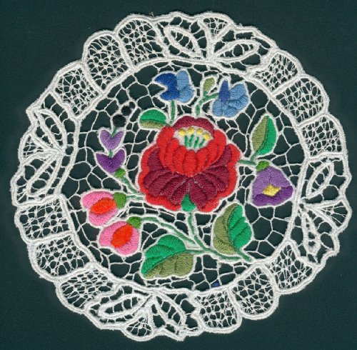
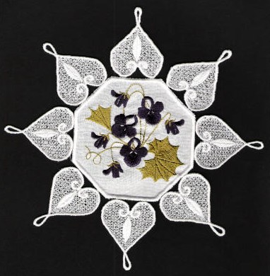
So here's some doileys, grab one:


or you can find or crochet your own (basically some circular detailed form, a photo source will be more interesting for you right now)

or grab some seashell art:
http://seashell-art.com/dana/index.php?page=shop.browse&category_id=6&option=com_virtuemart&Itemid=1 That might work
Because we are going to get spiritual and make animated mandalas with distortion filters and rotation tools and whatever else we can find as an intro to animating in photoshop and imageReady (I've changed my mind four times about how to teach this in a way that doesn't leave you thinking that the software presets and methods are the only way to make interesting work, so bear with me, I have a plan):


 Open up your image in hotoshop, make sure to open your layers
Ctrl R for rulers
Use pull down guides to find the center of the image, then pull down the guides to find the center of the file
 we'll center stuff for now, but you don't have to since you might like wonky results. Erase the background if you want
copy your layer and select the top layer
Go to the Filters menu > distort > spherize Humour me right now.
Move the slider on the spherize dialogue box You have an animation right there and we already have a tool to grab it fast. Anyone?
- I give away an oh so exciting secret right here. (that you should be able to guess anyhow)
otherwise play around with any distortion filter changing subsequent copies of layers either incrementally or exponentially.
explore the Edit menu > Transform tools too.
save for web as a gif, use any compression setting that you want to try
Open your GIF and note the speed, there are limitations to this method, prior to imageready, you'd have to import the file into a gif animator and set frame delays but now we can make stuff in imageReady with a few more tools
Open the single image Photoshop again save a new file with only one layer, (your starting layer from the old animation)
Open animation window
- tweening instruction, for spatial changes and image changes
To save that animation, you can export the animation frames as files, unoptomized and assemble them in our easyGIF animator OR you can save as optimized OR if your layers match the animation frames you can select edit in photoshop and save for web to save as a GIF (I had problems with that last option)
Note that when you go back to photoshop only the Pshop layers that you created appear.
so try saving an animation all those ways and compare the results
There's a lot more complexity in this software than we are touching upon today. We'll do several other classes in this and try to fill in the gaps

addendum to class 6
First of all, in the addendum to class 5, when I had used the marquee tag on a Chris Ashley HTML drawing (because I think its totally hilarious to do that to his work), the tag wouldn't close because of some CSS script I had left in there, so the upshot was that all the posts on the page below it were marqueed as well, but only in firefox, and I work in IE at home because of clients. Anyway I was very touched that two of you actually apologized for not being able to read the lessons. And so, I forgive you all for not being able to read rapidly moving marqueed text.
Next thing, I was in awe of the fact that you all worked for over two hours straight doing this exercise the hard way. I was also in awe of the fact that instead of trying to get away with the bare minimum, many of you went absolutely mental with the uneven grids, and over 300 cells. I approve of mental.
Neil came the closest to figuring out an easier way to do this when he tried to search the text in the ordinary text editor. Though it didn't quite work, I gave it some thought later, and what might work is this (and some of you had tried it and almost got your results faster):
When saving for web, save all the cells as HTML and images.
If you have changed the compression options for individual cells, for that mix and matched look, make sure to select custom settings and for the slices option, all slices, photoshop will actually remember those different compression settings for each cell.
Some of you already know that what it produced was a table in HTML, and we didn't want that, but we do now.
Go to view > source in the firefox browser menu. Save the file as a .txt
Class #6: technical opportunism (part 1)
 mock up of proposal for a Turner Prize entry from b3ta
If you look in the lessons folder on the server, you should see all the installers for the softwares we have downloaded up to now. These machines are wiped clean on restart so everytime you install one, it is like the first day of an evaluation period. Today we'll need alleycode installed, so do that now if I'm still loading images onto your systems. if you brought a firewire for your video cell phone, try downloading some images right now. If it's a wireless, you can get Paul to help you. (security issues)
We are going to do the instructable first today, since I don't know how long this will take you.
Photoshop/HTML showdogs:
- due to licensing costs they still have CS2 loaded on the student machines. (they might eventually just skip CS3 and wait for CS4) This doesn't matter one bit. I started you on simpler imaging tools for a reason. Software always changes, you'll never be totally up to date, but you can hone your problem solving skills and that makes it easier to update tools later
-this software was a prerequisite for this class, but in reality everyone uses a dense program in their own way. So don't worry about your skill level right now. If you like using a program, you'll get more comfortable eventually. Plus you can achieve the same results many different ways with the available tools.
- worked with a musician once who never used the contrast slider, he preferred the tools for levels because he understood them. This did not stop me from making fun of him.

- so anyway, forgive me if you know all this already, but I have to do it with you
1) open up the image of yourself in Photoshop.
2) go to
view in the upper menus and change your screenmode to standard screenmode, then go to
window and de-select all the windows except for layers, Navigator, options and tools. (keep your image up there too) click '
m" on your keyboard, and you won't accidentally crop or erase something right now. (while your at it click
v, l, w,c, k, j, b, s, y, e, g, r, o, a, t, p, u, n, i, h, and z and look at the floating vertical tool bar) Click
m again.
3) select the one layer that's named
background and make a copy of it in your layers panel. Name it
work
4) now save the file and it will save as a
.psd.
5) just for clarity in this semi-militaristic exercise, I'll ask you to crop the image so that you don't have a huge ground behind your portrait. For images that came out of the video camera, you'll notice that there might be some interlacing lines, if you don't like them go to
filter, select
video and
deinterlace to get rid of those lines, play with the options to see how your picture might change. you don't have to deinterlace at all, it's an aesthetic decision that you get to make. (more info in deinterlacing here:
http://en.wikipedia.org/wiki/Deinterlacing)
6) hit
b for brush, double click the foreground colour icon on the tool bar (black and white squares) and select a very sexy colour. ('cause you're worth it) Paint out your background. The results may be more interesting if we don't colour out the back ground, but you can always go back again later and play with that option. For the moment humour me. (but feel free to play with any of your brush options right now)
b/t/w doesn't that navigator window suck? I can show you an easier way to magnify right now.
7) Now the picky part, and we can do it a few ways:
-Press
control R to see the rulers.
-Click on the top ruler or the left ruler and drag a guides out, create a grid of guides.
-OR Choose View > New Guide. In the dialog box, select Horizontal or Vertical orientation, enter a position, and click OK. (i just copied that from the help files, this shit takes too long to write myself)
-Another way is to deselect the eyeball icons on the layers box and you should have a ready made grid background. If not go to the
edit menu, then
preferences, then
transparency and gamut and change the size of the grid ground and eyeball the guide placement from there.
- make your grid (minimum 100 cells, those of you who are really comfortable can make a grid with 200 cells) out of guide lines, then lock the guides.(under
view menu)
SAVE
8)
NOW Select the Slice tool,(
k) and click Slices From Guides in the options bar that appears for the tool. Lock your slices.
SAVE
9) (copied and edited from help files)
You can view slices in Photoshop, the Photoshop Save For Web dialog box, and ImageReady. (we will ignore ImageReady today)
The following characteristics can help you identify and differentiate between slices:
-Slice lines Define the boundary of the slice. Solid lines indicate that the slice is a user slice or layer-based slice; dotted lines indicate that the slice is an auto slice.
-Slice colors Differentiate user slices and layer-based slices from auto slices. By default, user slices and layer-based slices have blue symbols, and auto slices have gray symbols.
(ignore for our purposes)
-In addition, ImageReady and the Photoshop Save For Web dialog box use color adjustments to dim unselected slices. These adjustments are for display purposes only and do not affect the color of the final image. By default, the color adjustment for auto slices is twice the amount of that for user slices.
(really really ignore for today)
-Slice numbers Slices are numbered from left to right and top to bottom, beginning in the upper left corner of the image. If you change the arrangement or total number of slices, slice numbers are updated to reflect the new order.
(nope, we won't do that today)
-Slice badges The Web Content palette uses a number of badges, or icons, to indicate certain conditions, and these icons also appear in the document itself.
(check out the help files for the icon list)
10) Slices are a pretty powerful feature and they allow us to save the individual slices and will also create a table in HTML for them
(we don't care about that feature today, because we do not want a table)
11) Now we can select our slices and save them as over 100 individual GIFS:
Do the last thing of the following: (again this comes from the photoshop help files, so I wanted you to see the options that we aren't using)
-Select the Slice Select tool and click the slice in the image. When working with overlapping slices, click the visible section of an underlying slice to select it.
-Select the Slice Select tool, and Shift-click to add slices to the selection.
-Select the Slice Select tool, and click in an auto slice or outside the image area, and drag across the slices you want to select. (Clicking in a user slice and dragging moves the slice.)
-
Choose File > Save For Web. In the dialog box, use the Slice tool to select a slice.
12) This is where it gets fun, because you get to choose from a lot compression options that will effect the final product.
-check out all the presets for gif files. You have options to compress the number of colours, and change the dithering.
You can use the slice tool in this window to select all the gifs and apply the same presets to them, when you save, the program will generate the gif filenames with the grid numbers.
-the more fun thing to do is to select different clusters and apply different compression and dithering presets to them. When you save, just save the selected. Unfortunately the program will take you out of the
web save screen, so for multiple and varying grid selections, you have to go back from the
file menu.
Do it.
When everyone's ready we'll go to these next steps
13) Take your folder full of images to the deskstop just so we don't have to deal with dozens of pathnames.
14) Open up
alleycode and a new HTML file.
(delete the preset scripts that it opens with, we don't need them right now)
15)save the new file to your desktop, and not in your images folder, remember all the pathname stuff I taught you.
16) use the image tag and fill in your pathname info like I did for my local version <img src="/myimages/bats_01.gif">

17) now copy and paste that script several times on the same line change the numbers on the file names that photoshop generated for you:
<img src="/myimages/bats_01.gif"><img src="/myimages/bats_02.gif"><img src="/myimages/bats_03.gif"><img src="/myimages/bats_04.gif">> (and so on)


See what is starting to happen? Without the <br> we don't have a line break only a wrap (same as a word wrap in a text program) Make sure that there are no spaces between the image tags too
18) open the completed file in your browser, play with the window size and congrats, we just de-mystified another tech trick from a smart artist.
http://oliverlaric.com/b.htm (if you screwed up, it might be interesting, so save that alleycode file and copy the scripts to a new file and check for line breaks and spaces between tags.)
(note that Laric might have divided up his initial image pixel by pixel, or else pixelated the image before he gridded it to give that appearance, figure it out for yourselves. Doesn't matter. What a freak.)
You might even hate him now after we just picked his work apart with all this tedious procedure, that's what Universities do best and I'm happy to help.
But I doubt you've damaged the medium or my own admiration for his practise in any way, because good artists have been leaping through all these tricks using them when needed, exploiting their screw-ups, looking at each other's source codes
During the work period try it again with an irregular grid, smaller or larger cells, play with compression and dithering, spaces between the tags in your HTML, try different sorts of images, you might bring something new to what everyone else might think of as 'the last word.'
Please put a copy of today's exercise in your folder on the server
b/t/w:
http://www.artfagcity.com/2008/09/22/the-five-principles-of-new-media/#comments, fun post and exchange here. Seems like at least one commenter would not agree with me and many others about compression, artifacts and energetic opportunism. And to that, sometimes, the only appropriate response is:
I hate the way you make art too.
Part 2 just links, I'll flesh some of this stuff out later when I clean up these pages.
some more about collections:
- many collections can elevate items that might be weak on their own.
- apply this to
http://www.vvork.com/ and you begin to see the problems that some people have with their project.
- on the upside, collections of great work magnify each other's qualities.
http://www.loshadka.org/wp/?p=897 (did I show this one already? doesn't matter, I love dogs)
http://www.loshadka.org/wp/?p=708
http://www.loshadka.org/wp/?p=334
http://www.loshadka.org/wp/?cat=59&paged=2 (I really, really love this top collection)
http://www.loshadka.org/wp/?p=183
http://www.loshadka.org/wp/?p=115
I WANT TO SEE ALL OF THE NEWS FROM TODAY
http://www.aloalo.co.jp/nakazawa/portfolio/pdf/op110sentence2.html
http://www.photo.sittcomm.sk/kate_postcards.htm
http://www.nationalphilistine.com/alternumerics/index.html
http://home.nc.rr.com/tuco/looney/acme/acme.html (not quite web art, totally better)
http://www.whatihaveread.net/ (not an artist, but a physicist out of Colorado)
http://www.tinypineapple.com/nursebooks/ (Nurse Books!)
http://www.davidshrigley.com/list_photographs.html
http://www.babyanimalz.com/
http://www.rapunzelsdelight.com/
What differences do you see between an artists' collection project and an archive, if any?
You've already noticed that I've been grabbing stuff out some surf clubs:
http://www.loshadka.org/wp/,
http://www.supercentral.org/wordpress/,
http://www.nastynets.com/?what=yes,
http://doublehappiness.ilikenicethings.com/,
http://www.spiritsurfers.net/,
http://hardlandheartland.blogspot.com/,
http://lordsofapathy.blogspot.com/ Most of the individual artists have their own sites and you can generally get the URL's from the members links on the front pages of most of them.
I find everyone's work to be more alive in the surf club, probably because even though a surf club is still a controlled context, it seems truer to the web than most pristinely designed individual artists' sites. I also noticed that surf clubs don't function that differently than the traditional artists' exhibiting collectives that we like so much here. Unmoderated by curators, and a variety of other gatekeepers and the artists end up driving it themselves, to mixed results, but when it's good, it's very good.
Marisa Olson's recent essay on surf clubs & found photography:
http://www.wordswithoutpictures.org/main.html?id=276 (more on her work for another class) You'll already be familiar with some of her links, and this essay is a very good read.
-I have often pondered the question of how lost does something have to be before it's found
Now for your sexy surf club:
Joe McKay cooked up the official masthead GIF. But he lost it when he emailed it to me but then I found it
in an email, so now I'm claiming at least 50% authorship

- I'll mail you the final URL this week, the page will be public, but we won't post the URL anywhere right now, so that you can get comfortable.
- Login required to post, not to view (set up a google account if you haven' already. Pick a screen name for your account, because it will be public.)
- no censorship, unless something gets libelous and legally actionable, any other problem posts will be converted with
http://lolinator.com:80/ Because kitteh speak always takes the sting out of death threats.
- this is actually a slightly unfair set-up for you, you should be able to choose your own collaborators just like the big smart kids in NYC. With 70 posters this is going to look more like an image board than a surf club, but Joe likes the "we are making art" stance that a surf club gives, so what the hell
- might add a lolinator flag so that you get to decide what posts will be converted to kitteh. (No we won't because you'll be converting all of them, what were we even thinking)
- you need to get an image host, since the University's servers aren't set up for barbarians like you.
- Laura Britt Greig is putting the finishing touches to the software.
- if we have any issues with uninvited posting, Laura can set up password protection, but we'll avoid it for now.
- if you are successful at the end of this experiment no one will want to be in a surf club ever again. Surf clubs will be so over. You have the chance to spoil it for everyone on the web.
Addendum to class #5
A few links we discussed at that I didn't include previously:
http://slecht-lands.livejournal.com/117471.html (now that I've shown you screen capture tools you can figure out one of a few ways to make this sort of animation)
When we were discussing
THE PORN:
http://thankgodforconceptualart.com/index.php?/projects/me-and-my-girlfriend/ I told you about a similarity in structure by Kelly Mark in her captured series:
http://www.ireallyshould.com/captured.html
This goes to the truth of a
comment by
Christopher Brayshaw on a
simpleposie thread about the clusters of similarities that are produced on
VVORK:
"[...] subject-based content is distinct from artistic subjectivity. The Bechers don't own "water towers" any more than Jeff Wall owns "light boxes." Subject without subjectivity is meaningless on its own. Take the recent chess works; chess is a subject -- shared template -- that many different subjectivities are worked out in relation to. But many of those subjectivities begin from aesthetic positions that don't bear any relationship to each other, outside of the nominally similar forms. Curators who organize shows about subjects (hot rod art, garden art, red art) instead of subjectivities are mailin' it in."
OK, now carry on with the important work of putting a marquee tag around everything we see.
07th Aug 2008Sirmione
Sirmione (Lago di Garda), 20080807, HTML, 350 x 390 pixels
