...more recent posts
Class #10
your daily gifs:
http://www.roglok.net/?p=152,
http://jeffbaij.com/misc/31.html,
http://ominousmoo.com/clint/anim-gif/link.gif,
http://www.animated-teeth.com/ (found some great links on http://delicious.com/network/wizardishungry/animatedgif ),
http://www.maximumsorrow.com/layout/meditation.gif,
http://lal-blog.blogspot.com/,
http://www.paperrad.org/,
http://woahlohan.ytmnd.com/
Joe McKay's list of what artists do with the web (abbreviated):
1. As a place where artists promote their “real world” work.
The site acts as a slide sheet and resume for self promotion. [in case you haven't noticed, this is most definitely NOT what this class is about, you don't take a printmaking course to print exhibition invitations, or an art history course to write up your own C/V]
2. The site acts like a more traditional "white space" gallery.
Harwood - Mongrel Tate, http://gallery9.walkerart.org/, http://www.sfmoma.org/espace/espace_overview.html
3. Where the art starts offline but there is a web component that's important to reach the intended audience.
http://www.critical-art.net/ http://www.safetygearforsmallanimals.com/SGSA.html
4. where artist use the medium itself to mess with the ideas of what the internet should be.
http://www.exonemo.com/ http://www.jodi.org/. http://map.jodi.org/
5. where artists use social networking / web 2.0 tools and the culture of digital society itself as a medium for making art.
Tom moody, Double Happiness, Loshadka, nasty nets
6. People who never intended to make art, but it has "become" art over time, or some of us artists consider it art. [Joe is some of us]
All Your Base, Fensler Films
MORE!!!
Recycle it article by Ed Halter
http://theageofmammals.com/lecture/ps.html lecture by Guthrie Lonergan
http://momoshowpalace.com/EMPM3.html,
http://www.harmvandendorpel.com/bison.htm,
When you have time, look at this source, it's simple (download the images, you probably know enough now to rebuild it): http://www.mathwrath.com/
More Flash work: http://www.coldvoid.com/,
http://www.harmvandendorpel.com/horse.htm,
http://www.harmvandendorpel.com/pingpong.htm,
http://www.harmvandendorpel.com/sleepwalker3.htm,
http://www.harmvandendorpel.com/sleepwalker1.htm,
http://www.harmvandendorpel.com/resurrections.htm,
http://nathanhauenstein.com/cavevid-fs.html,
From Flash, you can also dump to video and upload to youTube or vimeo or wherever you want, (you can also use it to help make animated gifs for a smaller file size): http://www.newrafael.com/sites/cigarette/
Class #9
Assignment deadlines:
Due October 21: a web page or multiple web pages using as many of your
Have a good reason to use stuff. http://www.seecoy.com/matrYOshki.html
On-going until November 27: The group blog project. This is worth 20% of your mark, and don't try to slip in a bunch of blog posts on the last week. Participate, pay attention to what other people are doing. GET POSTING. Remember don't post huge image files, use HTML to size things up, its more interesting anyway, it's a pain to wait for a page like that to download.
Due November 27: a page or multiple pages representing a jpegs of a group show, with your own work included. This is worth 20% of your final mark This doesn't have to be your digital work, a jpeg of drawing, paintings, installations, performance whatever. Four or more artists will constitute a group show, including yourself. Give it a title, and remember when you are curating other artists into this web show their work has to be credited - name, title, medium and size (if the size info isn't available don't worry, since lots of artists get away with "mixed media" and "dimensions variable" if there are too many to list) It's a chance to think about what artists you admire, that you believe you can hold your own with. Also doesn't hurt to find out how hard curating a good show can be.
Due November 27: Collection project, minimum 25, max 50 items. Collect things that are invested with some interest and meaning for you. Must be compelling for you or it won’t be for me. Low brow or high brow as you want. I've shown you a lot of artists collection projects. One thing is that though the collection must be submitted on a HTML page, that doesn'ty mean you can't generate the images yourself, scan or photograph or video if you want. This is worth 30% of your final mark
When you look at this stuff, I want you to be more impressed by the decisions these people make as artists, not their tech skills. Trust me, programming is easy compared to making art.
http://www.losamigosdelaimagen.com/EV021/EV021.html, http://www.stevenread.com/node/541
http://www.bordamedia.com/proun/
http://www.newrafael.com/
http://www.messhof.com/
http://www.wimdelvoye.be/ opening page for an artist web site. I don't think this really works with what he has on the actual site.
Today we open Flash and learn a few of the paint tools and how to organize Flash assets so that you can easily animate or program actions for them (or eventually decide you hate programming but at least you can learn to prep files real nice for the programmer, whoever she may be.)
But first you get to play some games.
Class #8
Divshare looks like a good image host: http://www.divshare.com/tour for those of you who haven't found one.
For now on, instead of relative pathnames to local folders, I want you to use absolute pathnames in your HTML files. Anther thing to note about a lot of free image hosts is that they have a storage limit. I want you to start thinking about how to compress files that you've created in Photoshop or EasyGif Animator. Remember when you post stuff, the end user has to wait for it to load in their browser. All good artists take limitations and make them look like they were on purpose.
Today we stay with photoshop and EasyGif animator. So lets look at what some artists have done with paint programs (On Thursday we start with Flash.)
Andrew Paterson
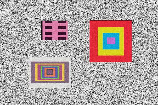
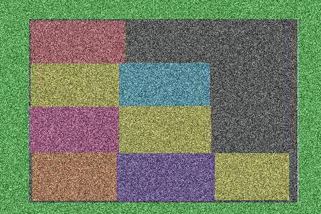
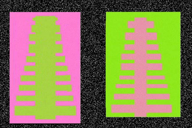
Stills from Rectangle World 2006 digital video
Dyan Marie: http://www.dyanmarie.com/
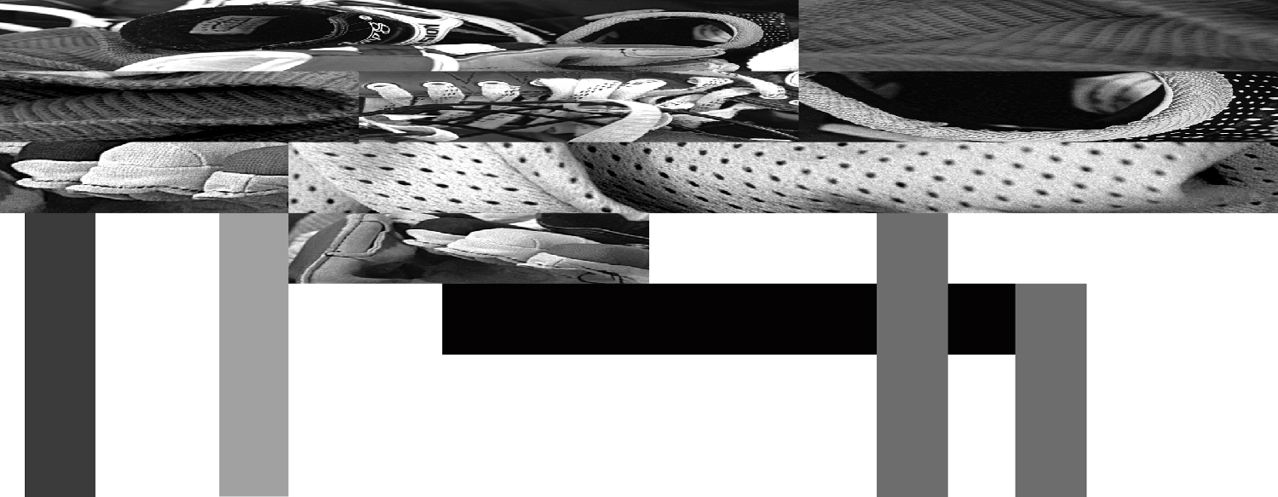
House for Teenage Hockey Player 1999 from Subjected to Change: Armatures for Standing Up
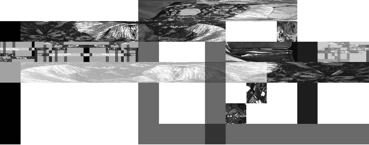
House for Established Bussiness Woman 1999 from Subjected to Change: Armatures for Standing Up
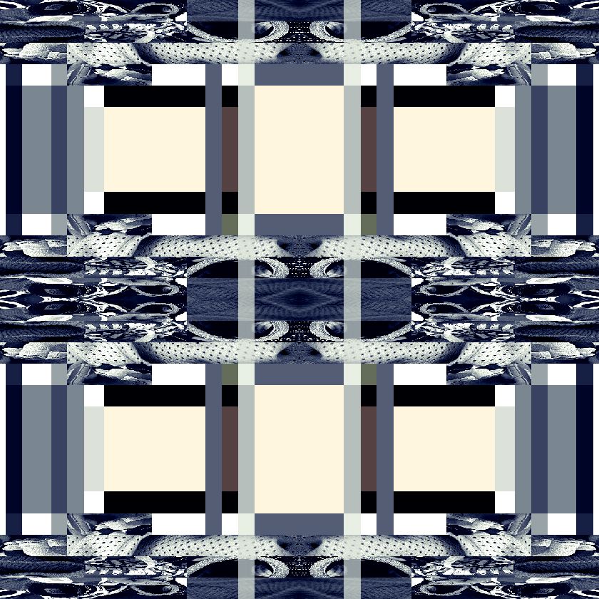
Window for Teenage Hockey Player House 1999 from Subjected to Change: Armatures for Standing Up
http://gooooooooooooooooooooooooooooooooooooooooooooooooooooogle.com/javiers/
http://www.mariaeisl.com/
http://aboutfoo.com/~robmyers/art/smileys/
http://www.fakeisthenewreal.org/ via http://www.digitalmediatree.com/tommoody/?30568
http://www.onehundredpixels.com/
http://joe-biden.ytmnd.com/ (there is no good reason to include that it just made me laugh)
http://www.petracortright.com/Landscape-5-15-05.html
http://www.travesssmalley.com/blog/
http://www.loshadka.org/wp/?author=14&paged=2
http://www.loshadka.org/wp/?author=8
http://happytimesforkids.com/pics1.htm
http://www.loshadka.org/wp/?p=680
Some commentary from VVoi on this work: http://new-art.blogspot.com/2008/05/less-art.html
http://fffff.at/borna/
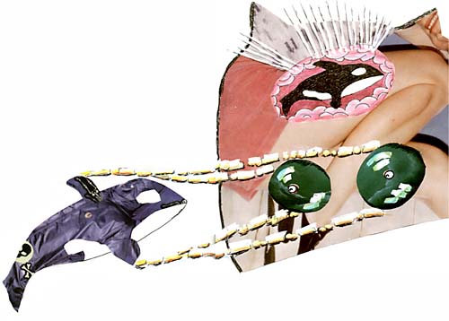
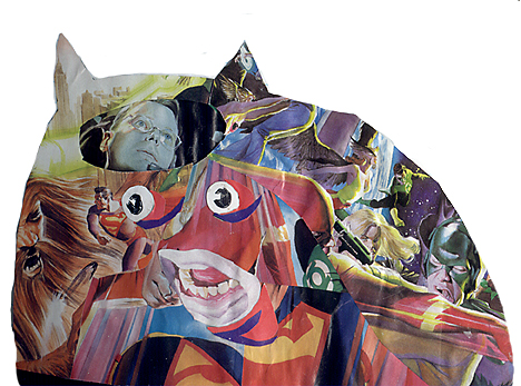
(Sally McKay)
http://indoor-oak.org/
http://supercentral.org/lk/
http://candicebreitz.net/
http://ccca.finearts.yorku.ca/mikidot/photo/nobadart2008/pages/01.html
A collection so perfect that we are unworthy to screw with it: http://www.nepaldog.com/NEPAL_DOG/908postcard.html#11
And some good reading on collections/piles: http://teamschwartz.powweb.com/Pile/c1p1.html
Animated Gifs:
http://iheartphotograph.blogspot.com/2008/08/opening-tonight-young-curators-new.html
http://www.eyebeam.org/reblog/archives/2004/09/post_2.html
http://physics.ucsc.edu/groups/condensed/moseley/crystal_structures/index.html
http://www.rhizome.org/events/gifshow/
http://www.digitalmediatree.com/sallymckay/?35618
http://www.boullet.com/black/pages/booksonline.htm
http://www.boullet.com/black/pages/growth.htm
http://slecht-lands.livejournal.com/115664.html
http://slecht-lands.livejournal.com/112585.html
http://slecht-lands.livejournal.com/108742.html
http://slecht-lands.livejournal.com/76019.html
http://www.loshadka.org/wp/?p=857
http://theageofmammals.com/research/?p=23
http://www.clubinternet.org/
I realize that my definition the other day really sucked so I looked it up on wikipedia and got this: "Dither is an intentionally applied form of noise, used to randomize quantization error, thereby preventing large-scale patterns such as contouring that are more objectionable than uncorrelated noise."
Is that not perfectly clear?
How about this one:
http://en.wikipedia.org/wiki/Floyd-Steinberg_dithering
Does this one help? http://en.wikipedia.org/wiki/Error_diffusion
My sucky explanation is begining to sound pretty good now. (though I don't really remember what I said)
OK this will help:
http://webstyleguide.com/graphics/dither.html, http://notlost.blogspot.com/2008/08/dithering-for-low-bit-depth-lcds-with.html (but I like obvious dithering!)
Now back to work, we are going to look at z space (as opposed to x and y) for depth
grab a few backgrounds preferable with a landscape (it can have objects in it): http://glenmullaly.blogspot.com/2008/04/vintage-animation-back-and-fore-grounds.html
http://animationbackgrounds.blogspot.com/
Open up the file in Photoshop and make two layer copies,
In the lessons folder copy the photoshop file log_3.psd and look at how the layers have been altered. Use your brains and do it to your chosen image
When that's done, copy and open up the ani.psd file
Now select edit in imageReady and prepare to listen to my curses because this is a most awkward tool and you'll find flash a bit easier to animate in, but it also doesn't have the wonderful filter potential that Photoshop has, so you will have to witness my battle with this program, I will fight to the death and take you all with me.
FUCKSOCKS! (that means watch and listen)
The little trick I discovered with the animation window is to select the animation frame first, then look at your layers window. You'll see the visible layers that make up your animation frame, at this point it's safe to turn layers on and off. When you want to make the next frame, select the animation frame first, not a layers frame.
addendum to class 7
Miklos Legrady informs me that he was working with stereo imagery on-line in 1992 http://cprr.org/Museum/technical.html
He wrote these technical notes to help people freeview 2x stereo images that are shown on the Central Pacific Railroad Photographic History Museum.
He also sent me paper of terrific research that he did on iconoclastic art that included this:
Please tear down this poster as soon as you see it !Here's a direct link to the page of free art. http://dump.ordure.org/image::copy/
2000? - On Stuart Brisley's website you can select one small field of a big picture. The selected field is sent to you by e-mail and it is - permanently - deleted on the original. The accompanying e-mail says:
Hi. - Here's your Image::copy 32x32 artwork that you chose. Keep it safe, it's the only copy that exists, as the spot you chose on the image has now been blacked out. Feel free to come back and get some more free art. http://www.ordure.org/ - Regards, Rosse.
class #7 - tacky web faux pas
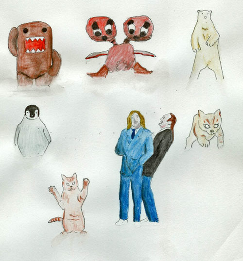
found image with the file name: my-memes-2.jpg
http://en.wikipedia.org/wiki/Meme (HA HA This is a University and I'm not ashamed to use wikipedia HA HA.)
You'll probably recall this post and thread that I showed you in the intro class (there was a waiting list, so I thought I'd try to weed some of you out, but you little pervs stuck around). There's more!

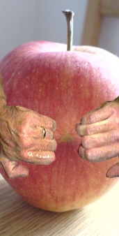


This is all a hilarious riff on a shock site called goatse, some info here: http://en.wikipedia.org/wiki/Goatse and if you absolutely must see the source image , they are stored everywhere now, but here is the site: http://goatse.cz/ (note my warning ...and then the wedding ring). A little side note, according to this blog, it would be prohibited by US law to post the original image. We are not even going to discuss or look at bathtub girl.
-what I like about this is the variety of stuff that people come up with in response to an intentionally provocative and gross image.
- some stuff can collapse with inner-laughter (to paraphrase Joseph Beuys).
- like I've mentioned before, it's not a formula for every provocation you'll see on-line, because sometimes you do stumble onto truly awful soul rotting crap that you can't un-see once you've looked.
- an anatomy of viral imagres and techniques or how these riffs get rolling with anyone welcome on for the ride
Speaking of evil ducks:
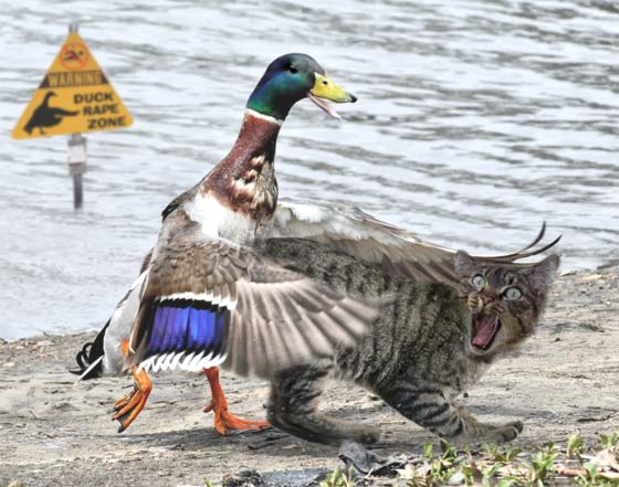


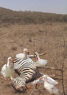

Speaking of more evil ducks: http://ccca.finearts.yorku.ca/mikidot/photo/evil_ducky_preview/index.html Miklos Legrady jumps in and out of digital media (like all of us) and I found his decisions with the captions on his evil ducky series to be disconcerting, but I'm starting to get it. And of course, fastwurms have been dicking us around with the cheesy captions and innuendo ridden titles for years: http://www.digitalmediatree.com/sallymckay/?44921
Check out more of Miklos Legrady's other projects: http://ccca.finearts.yorku.ca/mikidot/start/index2.html
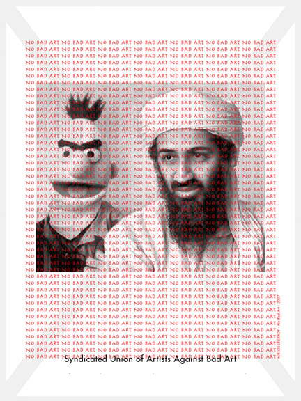
Onwards, today we look at cheap tricks and formulas that spread like wildfire, because they are easy and the results appeal to us. And ultimately we'll continue to weasel our way around presets and formats (something we'll look at at a later class are artists who have thought about this in a more formal way, but this is a studio class and we are greedy)
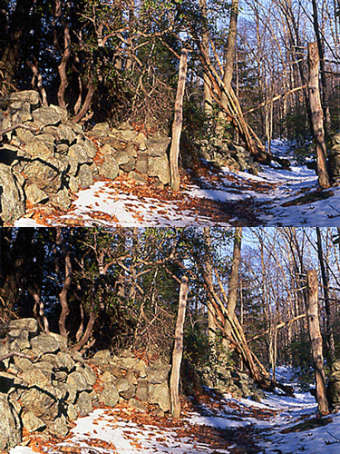



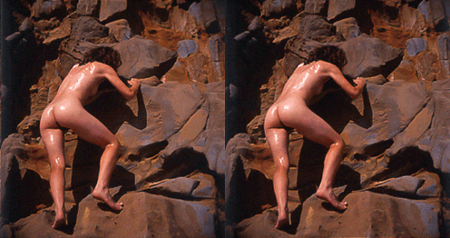
I found this nudie on some guys site, he's defined his whole damn photographic practise with this stuff. This one is called "Moist and Dry" and I think that title could be the most delightful combination of earnest cluelessness and slimy sexual innuendo that you will ever encounter
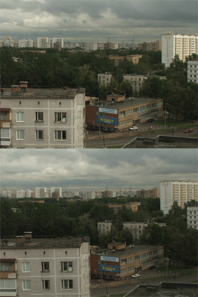
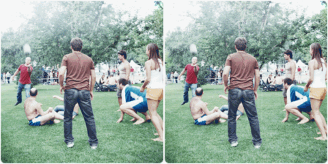
- there's a pop history to stereo renderings (wiggly stuff really), all sorts of viewing devices prior to these current cheesy digital anmiations. It started with early photography in the 19th century, basically two different views, left and right eye, combined to give the illusion of depth. (and there is how-to for it. Yay. http://graphicssoft.about.com/library/uc/oransen/uc_stereo.htm)
One more that was circulating a lot a while back: http://www.moillusions.com/2006/08/stereo-dino-optical-illusion.html

don't dismiss it, I found this one really compelling.
(remember nothing really ever gets made unless it's desired, you don't have to be secretive about stuff you sort of love) http://www.digitalmediatree.com/sallymckay/?45133
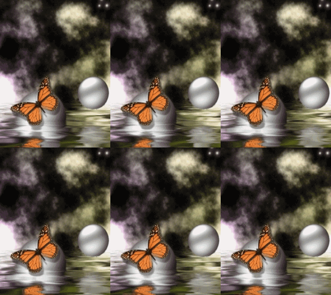


- in a gallery context we had to adopt an ironic posture to a lot of this stuff. It would be ridiculous to expect you to use this stuff on-line without some irony, but avoid a relentlous posture of superiority, it's disingenuous and it'll make your art tedious. It's also a lot more interesting trying to understand why people like the stuff that they do.
- (you can make an argument, as an artist, for anything you choose and need to use.)
So onto some Photoshop. b/t/w you don't need photoshop some artists are doing damn nice stuff with earlier paint programs.
So here's some doileys, grab one:
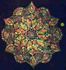
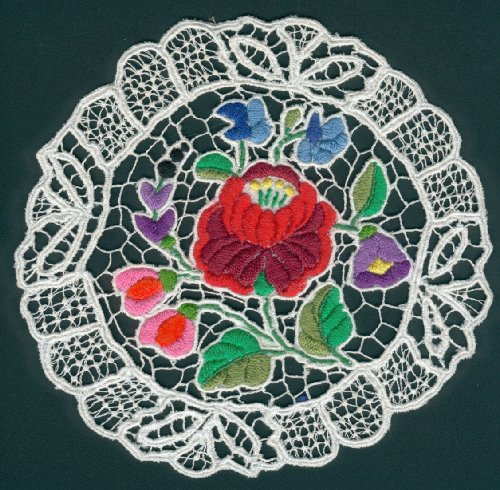

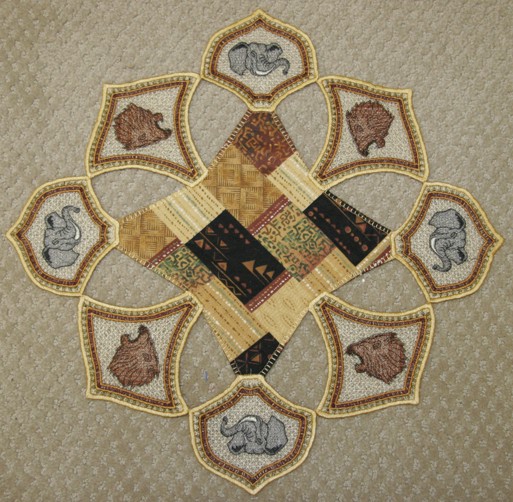
or you can find or crochet your own (basically some circular detailed form, a photo source will be more interesting for you right now)
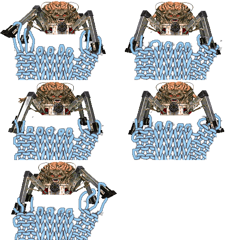
or grab some seashell art: http://seashell-art.com/dana/index.php?page=shop.browse&category_id=6&option=com_virtuemart&Itemid=1 That might work
Because we are going to get spiritual and make animated mandalas with distortion filters and rotation tools and whatever else we can find as an intro to animating in photoshop and imageReady (I've changed my mind four times about how to teach this in a way that doesn't leave you thinking that the software presets and methods are the only way to make interesting work, so bear with me, I have a plan):


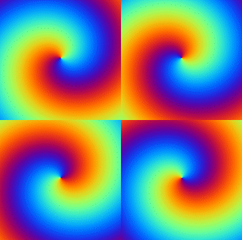
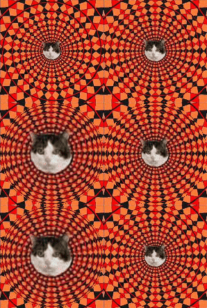
Open up your image in hotoshop, make sure to open your layers
Ctrl R for rulers
Use pull down guides to find the center of the image, then pull down the guides to find the center of the file we'll center stuff for now, but you don't have to since you might like wonky results. Erase the background if you want
copy your layer and select the top layer
Go to the Filters menu > distort > spherize Humour me right now. Move the slider on the spherize dialogue box You have an animation right there and we already have a tool to grab it fast. Anyone?
- I give away an oh so exciting secret right here. (that you should be able to guess anyhow)
otherwise play around with any distortion filter changing subsequent copies of layers either incrementally or exponentially.
explore the Edit menu > Transform tools too.
save for web as a gif, use any compression setting that you want to try
Open your GIF and note the speed, there are limitations to this method, prior to imageready, you'd have to import the file into a gif animator and set frame delays but now we can make stuff in imageReady with a few more tools
Open the single image Photoshop again save a new file with only one layer, (your starting layer from the old animation)
Open animation window
- tweening instruction, for spatial changes and image changes
To save that animation, you can export the animation frames as files, unoptomized and assemble them in our easyGIF animator OR you can save as optimized OR if your layers match the animation frames you can select edit in photoshop and save for web to save as a GIF (I had problems with that last option)
Note that when you go back to photoshop only the Pshop layers that you created appear.
so try saving an animation all those ways and compare the results
There's a lot more complexity in this software than we are touching upon today. We'll do several other classes in this and try to fill in the gaps