...more recent posts
Back in Class #6 we used simple HTML and the Photoshop slices tool to create user animated windows similar to Oliver Laric's Moving Pixel Portraits. All of you came up with some very unique results that I didn't expect. I wanted to post a sample here so I used Maggie Curtis's finished piece. First of all since there are so many separate GIFs being loaded, the piece has a way of animating in. This is a temporary effect because of your internet connection, and they get faster all the time. (It would be interesting to figure out how to reproduce that effect on purpose without losing the user window movement) (I don't think we could marquee into tables and still have the effect with the window re-sizing)
To play with the effect, click here and resize your browser window. (the table tags in the post above might prevent this effect on the front page)
In the version above, Maggie left a space between each image tag, (remember there were no new line tags in this project we did.)
I took the space out to see how that would work
You can compare the two versions side by side.
Class #10
your daily gifs:
http://www.roglok.net/?p=152,
http://jeffbaij.com/misc/31.html,
http://ominousmoo.com/clint/anim-gif/link.gif,
http://www.animated-teeth.com/ (found some great links on http://delicious.com/network/wizardishungry/animatedgif ),
http://www.maximumsorrow.com/layout/meditation.gif,
http://lal-blog.blogspot.com/,
http://www.paperrad.org/,
http://woahlohan.ytmnd.com/
Joe McKay's list of what artists do with the web (abbreviated):
1. As a place where artists promote their �real world� work.
The site acts as a slide sheet and resume for self promotion. [in case you haven't noticed, this is most definitely NOT what this class is about, you don't take a printmaking course to print exhibition invitations, or an art history course to write up your own C/V]
2. The site acts like a more traditional "white space" gallery.
Harwood - Mongrel Tate, http://gallery9.walkerart.org/, http://www.sfmoma.org/espace/espace_overview.html
3. Where the art starts offline but there is a web component that's important to reach the intended audience.
http://www.critical-art.net/ http://www.safetygearforsmallanimals.com/SGSA.html
4. where artist use the medium itself to mess with the ideas of what the internet should be.
http://www.exonemo.com/ http://www.jodi.org/. http://map.jodi.org/
5. where artists use social networking / web 2.0 tools and the culture of digital society itself as a medium for making art.
Tom moody, Double Happiness, Loshadka, nasty nets
6. People who never intended to make art, but it has "become" art over time, or some of us artists consider it art. [Joe is some of us]
All Your Base, Fensler Films
MORE!!!
Recycle it article by Ed Halter
http://theageofmammals.com/lecture/ps.html lecture by Guthrie Lonergan
http://momoshowpalace.com/EMPM3.html,
http://www.harmvandendorpel.com/bison.htm,
When you have time, look at this source, it's simple (download the images, you probably know enough now to rebuild it): http://www.mathwrath.com/
More Flash work: http://www.coldvoid.com/,
http://www.harmvandendorpel.com/horse.htm,
http://www.harmvandendorpel.com/pingpong.htm,
http://www.harmvandendorpel.com/sleepwalker3.htm,
http://www.harmvandendorpel.com/sleepwalker1.htm,
http://www.harmvandendorpel.com/resurrections.htm,
http://nathanhauenstein.com/cavevid-fs.html,
From Flash, you can also dump to video and upload to youTube or vimeo or wherever you want, (you can also use it to help make animated gifs for a smaller file size): http://www.newrafael.com/sites/cigarette/
Class #9
Assignment deadlines:
Due October 21: a web page or multiple web pages using as many of your
Have a good reason to use stuff. http://www.seecoy.com/matrYOshki.html
On-going until November 27: The group blog project. This is worth 20% of your mark, and don't try to slip in a bunch of blog posts on the last week. Participate, pay attention to what other people are doing. GET POSTING. Remember don't post huge image files, use HTML to size things up, its more interesting anyway, it's a pain to wait for a page like that to download.
Due November 27: a page or multiple pages representing a jpegs of a group show, with your own work included. This is worth 20% of your final mark This doesn't have to be your digital work, a jpeg of drawing, paintings, installations, performance whatever. Four or more artists will constitute a group show, including yourself. Give it a title, and remember when you are curating other artists into this web show their work has to be credited - name, title, medium and size (if the size info isn't available don't worry, since lots of artists get away with "mixed media" and "dimensions variable" if there are too many to list) It's a chance to think about what artists you admire, that you believe you can hold your own with. Also doesn't hurt to find out how hard curating a good show can be.
Due November 27: Collection project, minimum 25, max 50 items. Collect things that are invested with some interest and meaning for you. Must be compelling for you or it won�t be for me. Low brow or high brow as you want. I've shown you a lot of artists collection projects. One thing is that though the collection must be submitted on a HTML page, that doesn'ty mean you can't generate the images yourself, scan or photograph or video if you want. This is worth 30% of your final mark
When you look at this stuff, I want you to be more impressed by the decisions these people make as artists, not their tech skills. Trust me, programming is easy compared to making art.
http://www.losamigosdelaimagen.com/EV021/EV021.html, http://www.stevenread.com/node/541
http://www.bordamedia.com/proun/
http://www.newrafael.com/
http://www.messhof.com/
http://www.wimdelvoye.be/ opening page for an artist web site. I don't think this really works with what he has on the actual site.
Today we open Flash and learn a few of the paint tools and how to organize Flash assets so that you can easily animate or program actions for them (or eventually decide you hate programming but at least you can learn to prep files real nice for the programmer, whoever she may be.)
But first you get to play some games.
Class #8
Divshare looks like a good image host: http://www.divshare.com/tour for those of you who haven't found one.
For now on, instead of relative pathnames to local folders, I want you to use absolute pathnames in your HTML files. Anther thing to note about a lot of free image hosts is that they have a storage limit. I want you to start thinking about how to compress files that you've created in Photoshop or EasyGif Animator. Remember when you post stuff, the end user has to wait for it to load in their browser. All good artists take limitations and make them look like they were on purpose.
Today we stay with photoshop and EasyGif animator. So lets look at what some artists have done with paint programs (On Thursday we start with Flash.)
Andrew Paterson
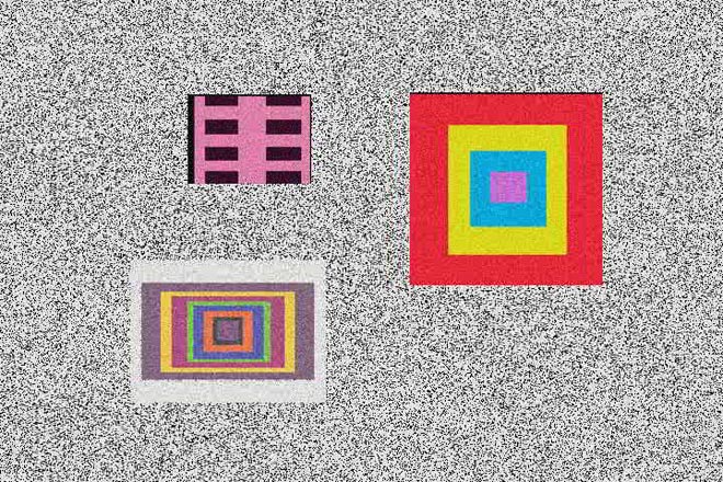
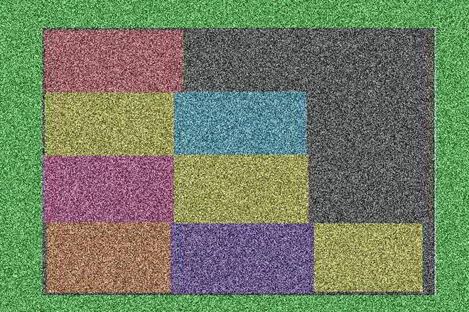
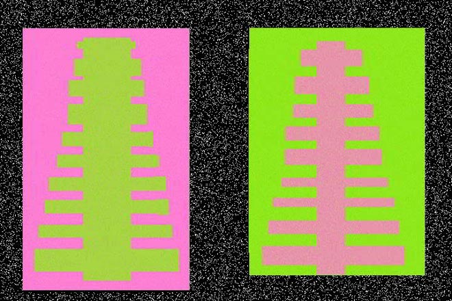
Stills from Rectangle World 2006 digital video
Dyan Marie: http://www.dyanmarie.com/
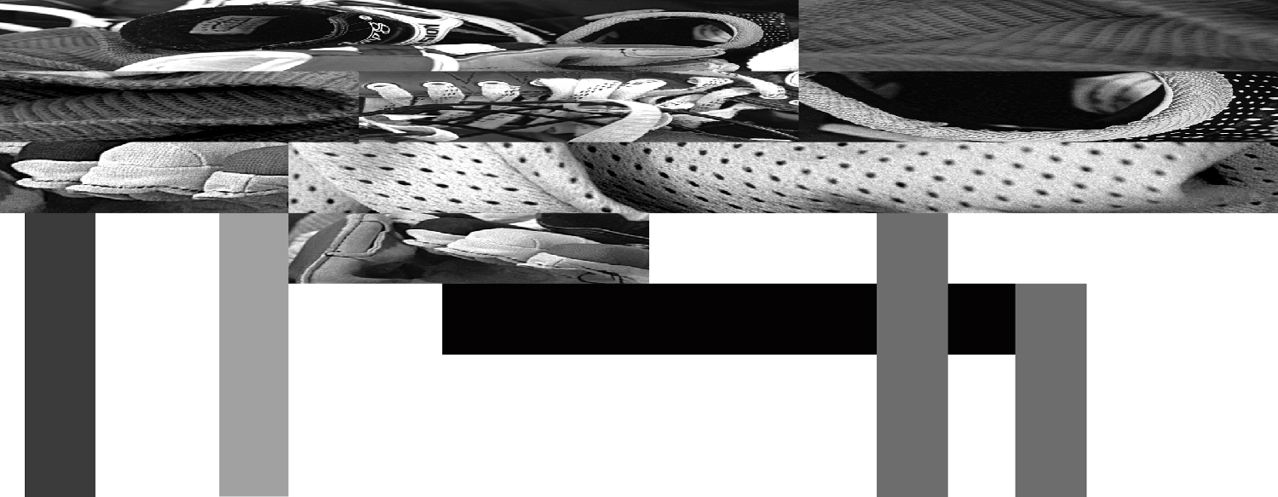
House for Teenage Hockey Player 1999 from Subjected to Change: Armatures for Standing Up
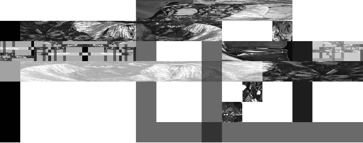
House for Established Bussiness Woman 1999 from Subjected to Change: Armatures for Standing Up
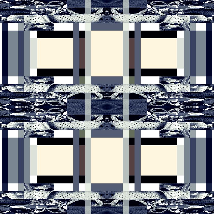
Window for Teenage Hockey Player House 1999 from Subjected to Change: Armatures for Standing Up
http://gooooooooooooooooooooooooooooooooooooooooooooooooooooogle.com/javiers/
http://www.mariaeisl.com/
http://aboutfoo.com/~robmyers/art/smileys/
http://www.fakeisthenewreal.org/ via http://www.digitalmediatree.com/tommoody/?30568
http://www.onehundredpixels.com/
http://joe-biden.ytmnd.com/ (there is no good reason to include that it just made me laugh)
http://www.petracortright.com/Landscape-5-15-05.html
http://www.travesssmalley.com/blog/
http://www.loshadka.org/wp/?author=14&paged=2
http://www.loshadka.org/wp/?author=8
http://happytimesforkids.com/pics1.htm
http://www.loshadka.org/wp/?p=680
Some commentary from VVoi on this work: http://new-art.blogspot.com/2008/05/less-art.html
http://fffff.at/borna/
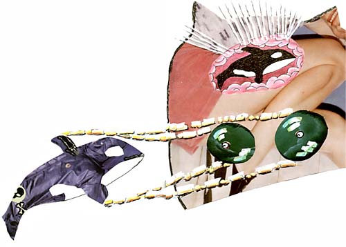
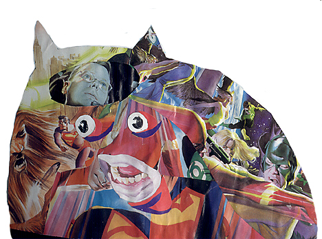
(Sally McKay)
http://indoor-oak.org/
http://supercentral.org/lk/
http://candicebreitz.net/
http://ccca.finearts.yorku.ca/mikidot/photo/nobadart2008/pages/01.html
A collection so perfect that we are unworthy to screw with it: http://www.nepaldog.com/NEPAL_DOG/908postcard.html#11
And some good reading on collections/piles: http://teamschwartz.powweb.com/Pile/c1p1.html
Animated Gifs:
http://iheartphotograph.blogspot.com/2008/08/opening-tonight-young-curators-new.html
http://www.eyebeam.org/reblog/archives/2004/09/post_2.html
http://physics.ucsc.edu/groups/condensed/moseley/crystal_structures/index.html
http://www.rhizome.org/events/gifshow/
http://www.digitalmediatree.com/sallymckay/?35618
http://www.boullet.com/black/pages/booksonline.htm
http://www.boullet.com/black/pages/growth.htm
http://slecht-lands.livejournal.com/115664.html
http://slecht-lands.livejournal.com/112585.html
http://slecht-lands.livejournal.com/108742.html
http://slecht-lands.livejournal.com/76019.html
http://www.loshadka.org/wp/?p=857
http://theageofmammals.com/research/?p=23
http://www.clubinternet.org/
I realize that my definition the other day really sucked so I looked it up on wikipedia and got this: "Dither is an intentionally applied form of noise, used to randomize quantization error, thereby preventing large-scale patterns such as contouring that are more objectionable than uncorrelated noise."
Is that not perfectly clear?
How about this one:
http://en.wikipedia.org/wiki/Floyd-Steinberg_dithering
Does this one help? http://en.wikipedia.org/wiki/Error_diffusion
My sucky explanation is begining to sound pretty good now. (though I don't really remember what I said)
OK this will help:
http://webstyleguide.com/graphics/dither.html, http://notlost.blogspot.com/2008/08/dithering-for-low-bit-depth-lcds-with.html (but I like obvious dithering!)
Now back to work, we are going to look at z space (as opposed to x and y) for depth
grab a few backgrounds preferable with a landscape (it can have objects in it): http://glenmullaly.blogspot.com/2008/04/vintage-animation-back-and-fore-grounds.html
http://animationbackgrounds.blogspot.com/
Open up the file in Photoshop and make two layer copies,
In the lessons folder copy the photoshop file log_3.psd and look at how the layers have been altered. Use your brains and do it to your chosen image
When that's done, copy and open up the ani.psd file
Now select edit in imageReady and prepare to listen to my curses because this is a most awkward tool and you'll find flash a bit easier to animate in, but it also doesn't have the wonderful filter potential that Photoshop has, so you will have to witness my battle with this program, I will fight to the death and take you all with me.
FUCKSOCKS! (that means watch and listen)
The little trick I discovered with the animation window is to select the animation frame first, then look at your layers window. You'll see the visible layers that make up your animation frame, at this point it's safe to turn layers on and off. When you want to make the next frame, select the animation frame first, not a layers frame.
addendum to class 7
Miklos Legrady informs me that he was working with stereo imagery on-line in 1992 http://cprr.org/Museum/technical.html
He wrote these technical notes to help people freeview 2x stereo images that are shown on the Central Pacific Railroad Photographic History Museum.
He also sent me paper of terrific research that he did on iconoclastic art that included this:
Please tear down this poster as soon as you see it !Here's a direct link to the page of free art. http://dump.ordure.org/image::copy/
2000? - On Stuart Brisley's website you can select one small field of a big picture. The selected field is sent to you by e-mail and it is - permanently - deleted on the original. The accompanying e-mail says:
Hi. - Here's your Image::copy 32x32 artwork that you chose. Keep it safe, it's the only copy that exists, as the spot you chose on the image has now been blacked out. Feel free to come back and get some more free art. http://www.ordure.org/ - Regards, Rosse.