View current page
9 matchs for dennis+hollingsworth:
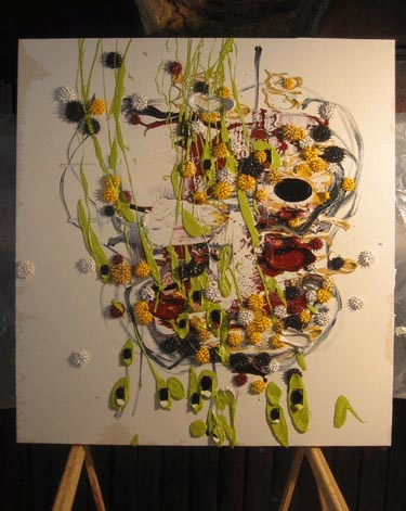
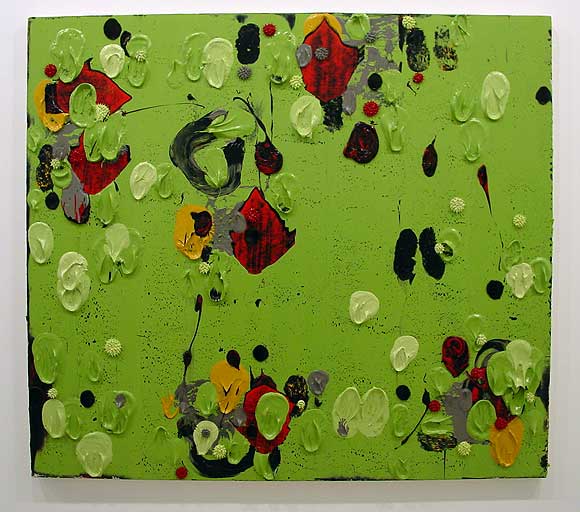
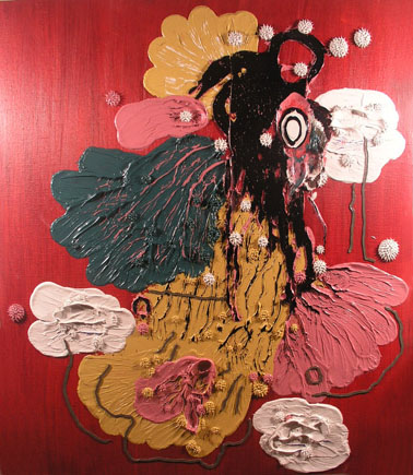
Dennis Hollingsworth's paintings have been mentioned here a few times. What follows is an attempt to describe the work and answer some criticisms of it.
Let's start by saying what it definitely isn't:
"just about paint"
That's like saying that The Rite of Spring is just about musical notes. If you think the canvases are some dull, said-a-million-times statement about materiality, as some commenters have suggested, please look again and remember that the whorls, blobs, and explosions are not mere accidents but also a record of events shaped by a human consciousness. Not a vision of an animate cosmos as literal as, say, Blake's, but still a teeming universe of suggestive contours and textures, thwarting powers of speech--a morphed mashup of animals, ghosts, genetic mutations, war wounds, and impossibly tangled plant life, at least in this viewer's art-prompted reckoning.
One could say in '80s jargon that his thick paint is a hyperrealized version of past expressionist art--a Baudrillard term meaning roughly "on steroids." But to call it pornographic, as one commenter did, rather ignores the joyful, non-synthetic element. The artist says the work is an "affirmation of paint" after the negation of the post-Modern years. But does that make it Modernist? If so, it's closer to surreal, abject side of Modernism that Clement Greenberg and other 20th Century critics tried to edit out of history. The colors may be joyful, but the sea urchin-like blobs that cling to everything seem vaguely alien and parasitic. The intricate cutting and slicing of organic forms suggests an anatomist's inner burrowing.
And lastly you have the linguistic side of Hollingsworth's work--a hermetic system of recurring elements (which have names--see Scott Speh's review) that serve as a private lexicon in a state of perpetual breakdown and reshuffling. This recombinant practice hews closer to postmodernism than the Modernism that forever proclaimed its abstract vocabularies as new and scientifically derived. Hollingsworth's work is aware of nonrepresentational conventions and builds on the limited vocabularies of Peter Halley, Jonathan Lasker, et al, who in turn built on the Abstract Expressionists. Yet ultimately his fearlessness to engage in actual, dense, convoluted, expressionistic (or expression-like) paint handling gives him a richer and more varied range of iconography than those predecessor "deconstructors."
Update: Revised in Feb. 2009.
Dennis Hollingsworth has posted a thoughtful reply to my post about a recent painting of his. He also responds to some of the comments about his work after that post, which ranged from complimentary to dismissive to WTFBBQ? To answer queries about the physical creation of his paintings, he offers an annotated photo of his studio tools. These reminded me of an interesting exhibit a few years ago at Apex Art in NYC, curated by Charles Goldman, called "Making the Making," where Goldman presented an array of the actual home-built devices used by artists to make their work. The variety of people's creative methods, as reflected in the eccentric and/or scrupulously precise objects on display, suggested an alternative form of discourse, approaching the level of art itself. It's an esoteric subject, but unlike, say, the museological presentation of writer's notes or musical notation, or even the how-tos of movie F/X, visual artists make this behind-the-scenes stuff so there's a higher chance it will have intrinsic visual interest, or even a reflexive function. Hollingsworth's "daubers" of wrapped, stained cloth, and the origami pincers he uses to create his sea-urchin-like "monads" might have been a nice addition to Goldman's show.

New Dennis Hollingsworth painting. It's a beaut. I like the suggestion of a head, the unfinished Ryman-esque quality of the edges, and the physics-flouting, flying-off-the-canvas dynamism of the paint. The sensuousness of that thick buttery substance communicates even in pixel form. Yum.

Just got back from Dennis Hollingsworth's opening at Nicole Klagsbrun in Chelsea, where I took this pic of one of Hollingsworth's paintings, and met the artist for the first time. Nice guy, but I knew that from his blog (still a comparative rarity--a generous walk around his life and studio). The photo makes the piece look small, but this is about 4-5 (?) feet wide. I like Dennis's work and have enjoyed watching it evolve on the Web. Nothing like seeing the real thing, though. I think you can get from the photo how sumptuous it is. What you don't get is the complex interplay of layers, and the gritty, gestural quality that invokes Pollock as well as taggers. These aren't facile paintings, you sense a lot gets scraped off before they start working. Earlier posts on Hollingsworth are here and here.

One recurring theme in the Rhizome.org blog panel tonight that is contradicted by Dennis Hollingsworth's blog: the idea that the art world always seeks to mystify and restrict access to the creator's output. Hollingsworth shows with Nicole Klagsbrun in New York and his work gets out there, as in, it's collected. He's a terrific painter and I thoroughly enjoyed the last show I saw at Klagsbrun. Complex stuff in the poMo ab-ex tradition, more seductive and paint-loving than, say, Jonathan Lasker (who I also like). Yet here Hollingsworth is on the web, letting you in on his studio process, both the physical making of paintings and his thinking about them. The above image is my slight cropping of a studio snapshot. More images are found in his post. He's a natural, talkative blogger and his step-by-steps are a gift to fans. Some artists protect their processes like trade secrets--Hollingsworth's openness shows his confidence that only he can make these paintings, and that online discussion only adds to their value, in the pure as well as commodity sense.
The research paper on art blogs by Danish student Marie Omann, mentioned in an earlier post, has been published in PDF form on the MTAA blog. It's certainly relevant to the Rhizome.org panel on arts blogging tonight. I was flattered to see how much of her research came from posts and comments here, as well as to see all the input from the MTAA blog and Sally McKay's blog. Also on the MTAA site are questions posed to tonight's panelists by Rhizome Director of Technology Francis Hwang, and T.Whid's replies. I feel like I've been answering them all week so I'll save more specific replies for "meat space," as we unromantically call it. But here's just a quick recap of the last few posts on tonight's four panelists: who they are, what they do, and an attempt to make some connections through annoyingly brief summaries. (Oh, and before I forget, painter Dennis Hollingsworth also has posted answers to Marie Omann's questions on his blog. Dennis, no one said tonight's panel was going to be about "How can we use blogging in the artworld?")
David F. Gallagher
1. Photoblog of his own photos, and links to his big-media articles about blogging and other topics.
2. Subject of photoblog is New York City streets, but also travels elsewhere. Going to Italy with him vicariously was very enjoyable.
3. Interesting relationship between the photos as stand-alone art and the photos as components in a ongoing narrative. Occasionally the lines of his activities cross, as in his Slate article on the photoblogging phenomenon.
T.Whid
1. Photoblog documents activities of artist team MTAA (T. Whid + M.River), plus rants on politics and other subjects.
2. I'm shamefully undereducated on MTAA's total production, which is net art or new media work combining video and programming within a conceptual art framework--so I bluffed my way through a discussion of one recent piece and we had some back and forth about it on our weblogs.
3. According to M.River, the MTAA blog "has been designated to be 'not an artwork' but may contain some things that are artworks."
Kabir Carter
1. Sound blog that eschews recorded sound in favor of terse, poetic descriptions of sounds.
2. Subject is urban environment--New York City streets but occasionally other locations (e.g., someplace with beach sand and manatees). Incorporates "moblogging"--contemporaneous recording and posting to the Net of real world events through cell phones/handheld devices.
3. Blogging appears to be broken into discrete projects--bloglets? They are art, as opposed to documentation or work-in-process for something else. Net art using the blog medium, for want of a better description.
Tom Moody
1. Blog is documentation of ongoing studio production. Art objects (mostly abstraction, but occasionally portraits and dumb cartoons) made with the computer, but also music, animated .GIFs, and initial tentative stabs at video.
2. Blog veers wildly into narratives and rants on other subjects--politics, movies, electronic music, science fiction, etc. Oh, yeah, and art criticism.
3. The blog is not art but art often appears on the blog. Which explains the appearance of more medium-specific (browser-oriented) work such as animated GIFs since the blog began in 2001.
What is an art blog? 3
Chris Ashley has some questions/comments addressing the previous post. Taking them in order (now it reads like an interview):
Is it just me or did you rewrite th[e] post, and include more quotes?
I did a slight rewrite (I often tinker with posts after they're up; if it's substantive I put an UPDATE notice at the bottom).
Now that I look closer, it's funny to notice that the staples [in your piece] aren't big heavy staplegun-type staples used for stretching canvas; they look thin, like from an office stapler. Am I wrong? If I'm right, it's a sign, along with the office-standard colored copy paper, telling me that this "painting" has white collar origins. Did you photocopy this on the job? [...]
When I showed this body of work in the late 90s I used the phrase "corporate tramp art" in the press release but none of the writing picked up on that. Let's just say the work was an attempt to make lemonade, psychologically, out of an astringently toxic permatemp gig that has since mercifully ended. I'm doing similar work elsewhere (which is more enjoyable), so I feel I must add, "Of course no company supplies or materials were used." (The staples are actually light duty staples from an old Swingline gun.)
I'm interested in this quote from [yester]day: "...I do value the physical work (too)..." You've said in the past (Nov. 30, 03), "I like painting OK but I'm sick of the 'romance of paint.'" I'm curious, then, about this comment from a few days ago,"The only reason I'm pulling this out now is I reached a point with the computer-painting where I want to see more real world grit, and this older work is all about grit." I guess I'm wondering about what is the difference between the grit and romance, is paint always romantic, and what would paint add or detract from your recent work?
By "real world grit" I was referring to the legal pad, office paper, product boxes and such that I've incorporated into the work. For a while I've been working solely with computer-printed inkjet imagery and started thinking I needed to mix it up more with found stuff. The older work did a lot of layering between found and not-found.
[A]s I get back into painting after a hiatus (a long story), I am (and yes, I'm a "he") trying to figure out what I'm doing, what I want, where I'm going, and what I'm doing in the HTML drawings that is generalizable to other work. What I'm taking first from the HTML work is an approach to subject matter, a serial or a series approach, intentional transparency and overlay, a kind of gesture, and the notion of figure vs. field. And in my trying to figure this out I'm finding that it's really useful to post the drawings that I'm doing, to put them out for me to see, and for others, too. My weblog is, for me, a studio, a wall on which to post the work and reflect on it, a place for feedback, if I'm lucky, as well as a place to archive the work, write about art, link to interesting things, build arguments and interests over time.
This is the same thing I value in [your] weblog. I've also been paying attention to Dennis Hollingsworth's weblog, which I first found out about here, as well. I'm surprised that more artists don't use their weblogs as real workspaces for their art; most that I've seen are in the classic mold of a place to write, link, and gossip- journal-like spaces. What I don't see often enough are webloggers who mine their past posts, reflect on where they've been and where they are now, connect dots, and build a corpus of work. Am I missing others who are doing this?
As for painting, I have no plans to do it--I'm more interested in the problem-solving of how to make interesting, resonant, stand-alone objects with the computer, printers, photocopiers, etc., and intertwining that practice with purely online things like animated GIFs. There's more than enough there for a career. And for what it's worth, I much prefer your HTML drawings to the scanned sketches: the latter are "one step removed," but even more than that, having to work within the rigid cyber-parameters really toughens up and enlivens your output, for me. The online drawings seem very "now," whereas the sketches seem like a step back, even when I like the imagery. (Just so you know, I'm as bad as an ex-smoker about trying to talk people out of painting.)
As for art blogging, we discussed this issue a while back but I didn't address your comments specifically. I'll give my thoughts and then I'll post someone's slightly cynical (but thought-provoking) formulation from the previous round. First, the web is strewn with the carcasses of dead weblogs; it takes a particular kind of personality to keep posting, artist or no. Secondly, the web will mirror life: some artists will treat the contents of their studios like precious trade secrets and won't let anyone in while others will be very open.
In the previous round, artist and blogger twhid sent around a batch of questions about artists' blogging from someone researching the issue in Europe. In an email sent around to the group of initial respondents (which I'm publishing without permission and will remove if asked), Dyske Suematsu wrote:
There are probably many reasons contributing to the lack of interest in blogs in the art world. Here are some I can think of.I agree with some parts of this and disagree with others. It sounds a bit bitter, but there's a lot of truth there, there are definitely class things about the art world worth despising. I'm amused by the collectors who made piles in the tech sector seeking refuge in the art world as "the place of the sacred handmade."
1. Blog is a product of popular culture, and fine art is a product of high culture. Using blogs would devalue or take away this mystique of fine arts.
2. Many fine artists are not so computer savvy, and many among them are deliberately that way in order to distinguish themselves from the ordinary people who have to sit in front of computers all day at work. Artists need to keep the facade of being special and exceptional. They can't be doing what everyone else is doing.
3. Blatant self-promotion is looked down on in fine arts. Although the success in fine arts is largely defined by your skills for self-promotion, you must do so covertly. The Web in general is now seen as a marketing tool, and because of this, many artists, especially famous ones, do not bother building websites, much less Weblogs.
4. Artists could devalue their own work by speaking or verbalizing. Good artists are not necessarily good critical thinkers. If they were good at writing, and if writing is conducive to what they want to say, they probably would just write, instead of making something visual.
5. Fine art mainly caters to the taste of the upper class. The people of the upper class do not read weblogs. They are not so computer savvy either, because they can afford not to learn anything about computers; they just hire people to take care of computer-related tasks. In their homes, they often hide computers using elaborate pieces of furniture. They find them distasteful.
Later he added:
6. Fine arts is an interest of the privileged upper class. The rich and powerful do not like anything in which money cannot give them an advantage. Even for something as common as movies, they can arrange private, advanced screenings. For music, they can get prime seats at live concerts. Purchasing fine arts is the ultimate exercise of their privileges. For web-based art, however, they have no advantage. Absolutely anyone can view Net art from any computers. Digital art does not allow them to feel special and privileged, which is the main reason why they buy art in the first place. So, if you want to be a successful gallery-based artist, you need to address these upper-class concerns, and stay away from the interests of Philistines.
Painter Dennis Hollingsworth has a blog, which combines personal journal-style writing with documentation of his painting process, images and details of work, etc. Scott Speh's critical commentary on Hollingsworth was previously excerpted here.
artisforthepeople.com isn't a blog but rather art, meant to be consumed via the medium of the web. The site is anonymous as to authorship, but the man in the cooking show videos looks suspiciously like Ludwig Schwarz, who I mentioned here. Dallas never looks more abject than in his videos and photos.
An online column by Scott Speh called "Hot Commodities" deserves a look. Unusual for an art scene where everyone has an opinions about shows they don't see, Speh actually gets off his ass, goes to exhibits, and then writes frank, funny reports about them. Unlike the art mags, there's no commercial agenda or behind-the-scenes string-pulling, just honest, off-the-cuff opinionmongering. His review of Dennis Hollingsworth's show at Nicole Klagsbrun excellently captures the nuances of this abstract painter's hard-to-nail work:
The Voice said [it] looked like cheesy hotel art at first - this is part of the appeal. Like [Laura] Owens he toes that bad/good line. Plus he can paint in the old romantic sense of pushing colored mud around a canvas. But it's not all intuition and action painting - he does have a strategy, a formula if you will, that gives the work a sort of steely logic keeps me from yawning. In addition to the historical technique, alla prima, a wet into wet impasto type application, he uses a number of signature techniques - he calls some of them monads, bulldozers, flings and pillows - that sees him pulling starburst-like strings from globs of paint, squeezing pigment straight from the tube - then carving a flat edge off the top of these ribbons, and trowelling and excising geometric shapes. I'm a sucker for straight from the tube pure color and juxtaposing high key and putrid, ugly color.Here's another tidbit, from his review of Wolfgang Tillmans' last show at Andrea Rosen:
Artforum describes [Tillmans'] installation techniques as similar to the way teenagers decorate their bedrooms, "scattering unframed photos across the wall, mixing huge and tiny" etc. Oh, I don't think so. Has this writer ever seen a teenager's room? Perhaps he'd like to go home to Ohio with me and check out my 16-year-old sister's floor to ceiling collage - not an inch of free wall space.and last, this quip about Rita McBride at Alexander & Bonin:
Shiny greenish-grey minimalist sculptures cast from video games or ATMs. I told the desk jockey "that one ATM isn't working." She didn't think I was funny.
