View current page
22 matchs for optidisc:
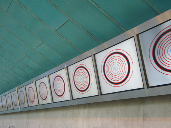
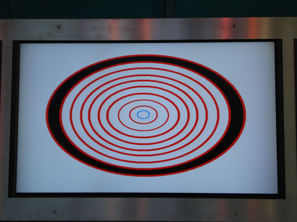
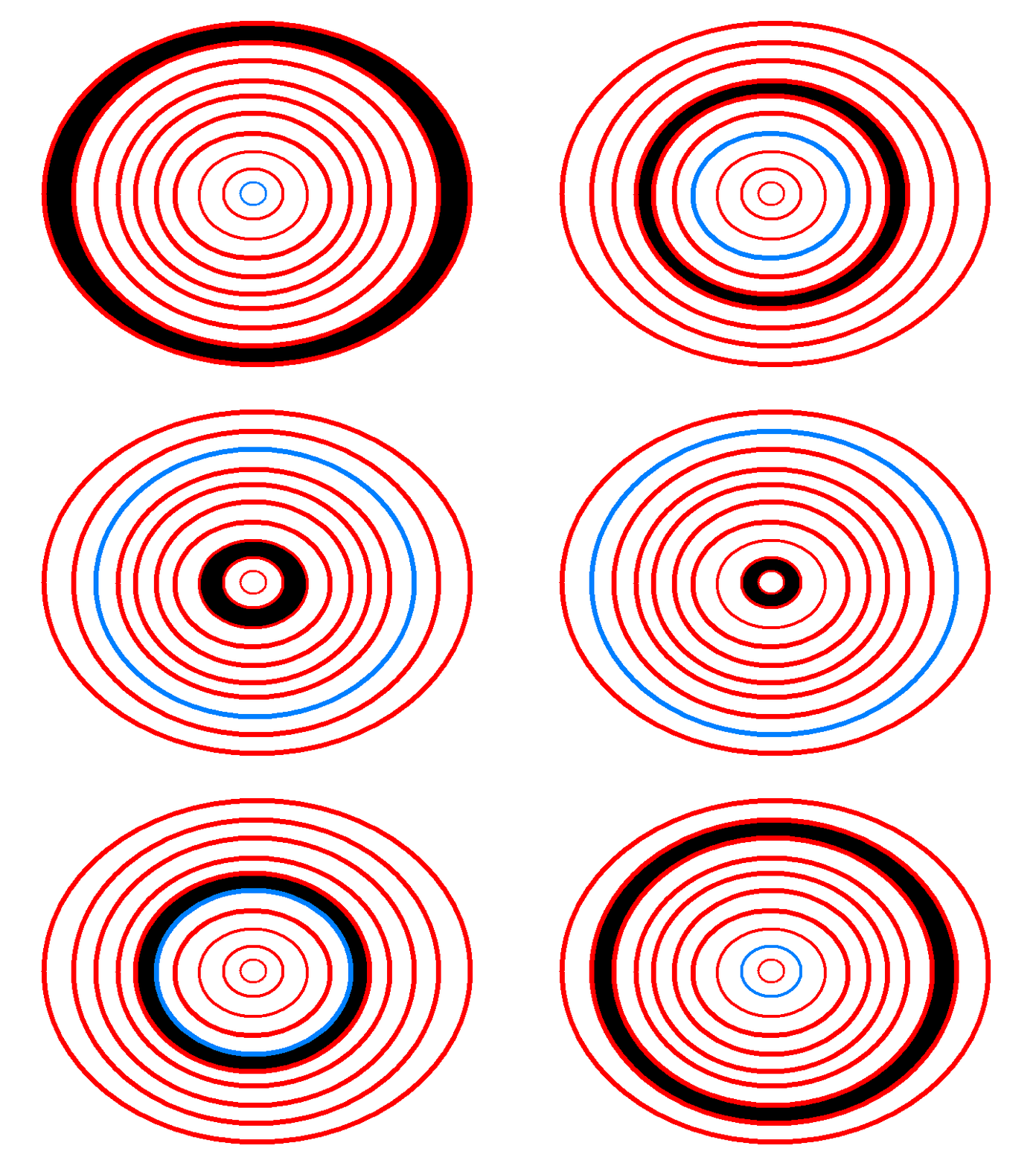
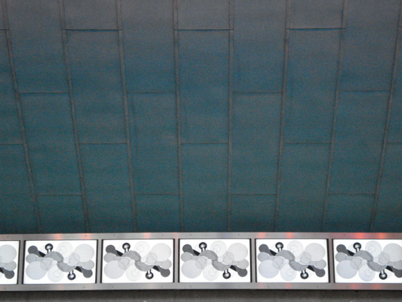
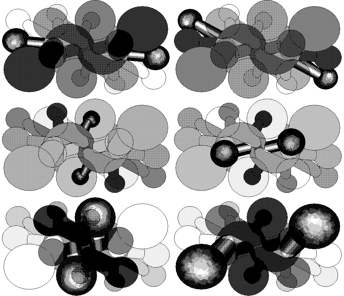
Documentation of my work in the "Fresh NY" show at Threshold Art Space, Perth, Scotland. Eleven of the 22 screens are shown. Photos by exhibition curator Anne Barlow. The OptiDisc GIF below is reduced; clicking on image shows the actual size (of the GIF--the screens are much larger).
return to main site
So, art in Miami 2006: a brief recap. It was this:
versus this:
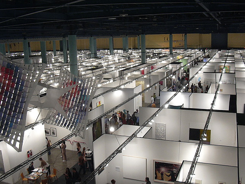
(Apologies to Paddy Johnson for the polemical use of her photos. The point is that the small, scurrying mammals of the New Art were defiantly underfoot as the dinosaurs munched their last wads of eucalyptus. Or put another way, that the starship Voyager navigated through Borg Space despite the latter's overwhelming hegemonic force. Also, thanks to Johnson for including this blog and my artMovingProjects show in her 2006 best of the web wrap-up. She's one of that rare tribe of artist/critics willing to wade in and critique both the gallery world and the web world, or perhaps attempt to knock their mutton heads together.)
(Also check out her worst of the web '06, which includes such deserving topics as Banksy, Lonelygirl15, and a certain artnet writer who will never be mentioned by name here.)
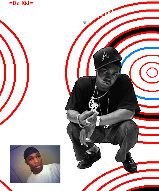
I've been making screenshots of my OptiDisc GIF when it appears as as a background image or avatar on MySpace, LiveJournal, or other blogs or message boards. Not because I care about the hotlinking (which is how I find it--any use of the bandwidth of the image shows up in stats--the hit is pretty minimal) but as kind of a sociological project. As in, how many different contexts is this artwork applicable in? Besides homepages, it seems to be very popular as an avatar on automobile forums (!). About a third of the time there is some caption like "Your eyes are getting heavy..." I have over 30 uses of the GIF preserved, from around the Net--unfortunately the screen grabs are only stills and don't show it in its full pulsating glory. Eventually I'll put them up on a separate blog page. The sameness-in-diversity aspect is pretty intriguing. (Or diversity-in-sameness?) Not all of them are as good as Da Kid's:

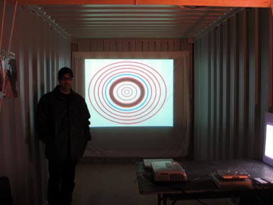
Aron Namenwirth of artMovingProjects, in the gallery's shipping container at the DiVa (Digital and Video Art) Fair this year in Miami. In the background is my DVD OptiDisc.
Update: The photo above is by Paddy Johnson, using Namenwirth's camera. Aron has posted more photos here.





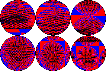

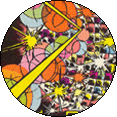

Digital Pogs from the collection of Michael Bell-Smith. T to b, l to r: Matt Smear, Michael Bell-Smith, Jeff Sisson, John Michael Boling, Paper Rad, Matt Smear, Michael Bell-Smith, Sarafina Engfer (2). The ones below are all by me, except the blond "parade lady" which is my pog of a Thorrific photo.
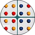









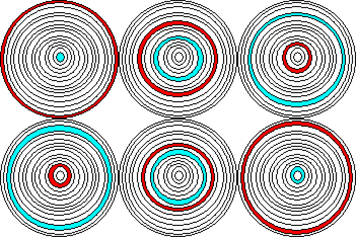
Updated: backgrounds are now transparent so the discs are round against a colored background--finally figured out how to do that this morning--takes a long time with the clumsy tools I'm using.
Update 2: fixed bad image tag--OK now, bloglines?
The critics (i.e., other artists) take aim. Referencing the interview Paddy Johnson did with Michael Bell-Smith and me, Joe McKay recently posted a comment that applies to the discussion about LCDs, CRTs, projections, and the like. (He didn't actually taking potshots in it--the remarks were some of the most supportive writing I've gotten.) I've tacked it on to my post-interview follow-up to Mike's last comment in the interview, as if it were a real conversation and not some cobbled-together thing.
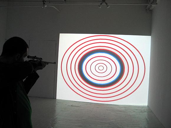
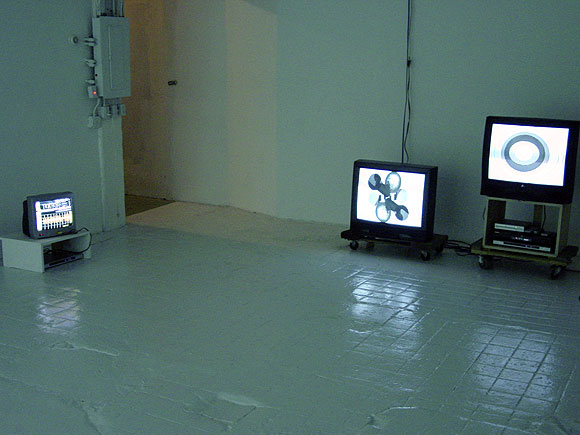
MBS: [...] The work in the [Foxy Production] show was created with a gallery in mind and I wanted it to feel that way. Rather than playing off the tensions of bringing new media into the gallery - as I feel Tom has with his show I wanted it to feel like a natural fit, again, like maybe this is just how we make art these days.The photo at the top of Marcin Ramocki, artist, vertexList gallery proprietor, and sharpshooter, is courtesy artMovingProjects. Below is my installation shot showing the TVs in my just-closed exhibition.
I dont think flat screens in a gallery feel especially high tech. For me theyre less loaded than traditional TVs/monitors (which feel consciously lo-tech), high end CRT NTSC monitors (which tie into a history of video art in the gallery) or large projections (which feel cinematic or as Tom pointed out, aggressive).
For me, the containment of wall-mounted flat screen monitors is about putting the work on a physical and spatial par with painting, drawing or photography. I think creating that kind of familiar physical relationship between the viewer and the work may serve to combat the tech gap: at the very least the viewer knows how to deal with the piece on a physical level. [...]
TM: These are good points. I want to add that, although I recently did a blog post called "Showing new media work in a gallery: what's at stake," that isn't the main content of my show, any more than Mike's content was his delivery system. The gear I used is to deliver the strongest statement--which is to say, to get the most out of the pulsing abstractions, repurposing of a Star Trek sensor as a "simulacratracker" (as one commenter described it), and the embarassing acting out (or faux acting out) of Guitar Solo (which actually is on a tiny flat screen). I've argued with a couple of people about my use of tube TVs instead of LCDs for three of the pieces. I chose the tubes because they deliver a punchy image, punchier to me than what I'm seeing on flats these days. Tubes aren't that "retro"--J&R Music and Video still has a wall of CRTs for sale as an alternative to the wall of LCDs. I know, it won't last, but we're talking about the present. Translating animated GIFs from a computer to a single dedicated image on a TV adds an element of the unexpected, and a gritty texture I like. These choices aren't just to emphasize "new media in the gallery"--although that's definitely an aspect of the content.
Joe McKay: Tom, I felt your CRTs and DVD players had content. It took a minute to figure out what was wrong, but you just don't see home made GIFs on T.V. When I see a CRT I still think "T.V." - when I see a flat panel, I think monitor, be it video, computer or tv as its input. It made your show interestingly disquieting.
In a sense, the DVD froze the GIFs in time. I liked the presentation of Michael's work but the fact that they were playing off of computers made me wish that some of the content was being dynamically created and not just loops. But I can understand his decision, it is "computer art" so why not have it play off of a computer? It keeps the work from being "just a video", and is way easier for a collector to get her/his head around.
When I saw your show I felt that the projection was in conversation with the Ecstasy show, (even though I'm pretty sure you didn't see it, it was up in LA).
I felt your piece was a deliberately low tech attempt at sensory overload. The big problem with Ecstasy was the fact that every piece was expensive, and expensive looking. What I enjoyed about both yours and Michael's show was the humor, something that's in short supply in a lot of digital media.
"Each pattern has the maximum complexity and 'resonance' for the minimum number of frames."
 Paddy Johnson is interviewing me and Michael Bell-Smith this week about our shows; I hope you'll check it out.
 "Geeks in the Gallery" is a three part discussion with artists Michael Bell-Smith and Tom Moody, which will run on Art Fag City from Monday June 12 Wednesday, June 14, 2006. A recurring theme of the talk is how technology informs artistic production, as both artists have individually exhibited work usually described as New Media, yet also seem somewhat skeptical of "tech art." Moodys "Room Sized Animated GIFs" at artMovingProjects in Brooklyn is comprised of animated GIFs projected or displayed on variable sized CRT monitors/tube televisions, plus a looping movie of the artist performing a computer-fabricated (but realistic-sounding) "guitar solo." The show dates are May 5th June 25, 2006; it can also be viewed online on the artist's site. Bell-Smith's exhibit "Focused, Forward" closed last week at Foxy Production Gallery and included digital animations steeped in the aesthetics of '80s and '90s video games, a print depicting collaged patterns that create a virtual Tower of Babel, and a game table-like video sculpture with a simulated radar graph of birds circling over the White House. Show dates were April 27 June 3, 2006; it can be viewed online at foxyproduction.com. [...]Some thoughful comments were made in response to my "preview remarks" about the interview and the general topic of "showing new media art in the gallery." I've replied to a couple of those, in the comment(s) to this post--anyone is welcome to chime in about that ongoing thread or the interview.
L.N.R., reBlogging at Eyebeam, makes the observation about the preview remarks: "Self indulgent, but interesting questions."


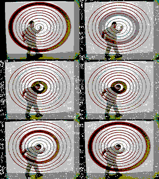
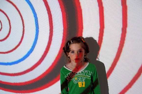
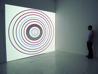
My grandmother went to see my show at artMovingProjects and was transformed into a seven-year-old. (Photo courtesy artMovingProjects.) But seriously, Phase Two of the show is happening Friday night: the music lecture/performance. The plan is to keep the installation up and intact for those who haven't seen it, and just set up a table with my gear. I've adapted some pieces for live performance, which means turning knobs with a meaningful look on my face while the computer does most of the work. I might shake a little bit, too. Also, I'll be showing bigscreen versions of some of my videos, including "Ninja Elements," "Exit Maurice," "Sensor Readings," "End Notes (w/ jimpunk)," and "Guitar Solo." In between pieces I'll be talking about drum machines and "visual artists invading music." The photo below, taken at the opening, is from Tintype (M.River's photo blog). More seniors regressed into tots through the power of the OptiDisc.
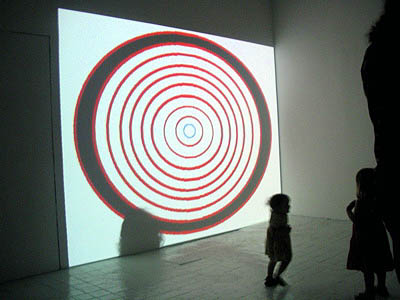
Tom Moody, "Room Sized Animated GIFs," artMovingProjects, NYC. Checklist (with links to Internet versions) and work as installed in the gallery (projected and on assorted monitors)
1. OptiDisc, DVD-R, projection dimensions variable
2. Double Centrifuge, DVD-R
3. Eyeshades, DVD-R
4. Guitar Solo, DVD-R, music by the artist
5. Sensor Readings, DVD-R, music by the artist
Installation Photos

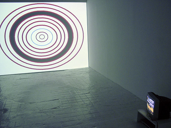

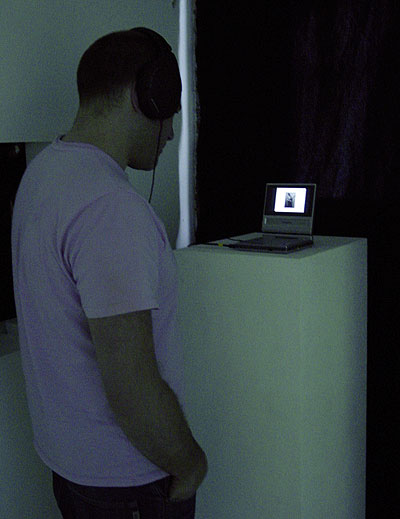
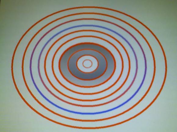
Thanks to whoever sent me this cellphone pic of the OptiDisc installation. This was in my inbox when I got home from the opening last night.
Draft checklist for my exhibition at artMovingProjects, opening Friday, May 5.
1. OptiDisc, DVD-R, projection dimensions variable
2. Double Centrifuge, DVD-R
3. Eyeshades, DVD-R (see above)
4. Guitar Solo, DVD-R, music by the artist
5. Sensor Readings, DVD-R, music by the artist
We began installing my show at artMovingProjects yesterday. I'm approaching this as an experiment and a reality check. The gallery consists of one large-ish white box room, so the decision was made some time ago to show my video work and not my 2-D work (drawings and paintings made with the computer). For reasons of light levels you can't have projected video in the same room with overhead-lit pieces--the two would cancel each other out.
It's ironic to be talking about "my video work" because until a few months ago it didn't exist. I had been doing animations and short films for the Web but never thought much about putting them in a physical space. But I was getting asked to submit videos to things, so I've been scaling up existing vids and thinking more about scale in making new ones.
Up until recently I'd only seen much of this work on the computer or a small TV monitor. Now we're going through the process of seeing how things look large and hearing how the sound works in a big room. It's premature to say where we'll end up Friday, but it's looking like less-is-more is the order of the day. Probably the show will feature only pieces with no sound, and the music lecture performance thing on May 19 will emphasize the "music video" pieces.
The silent pieces are on the peaceful hypnotic looping side--this OptiDisc one is looking like a likely centerpiece. Coincentally Google Images just archived the Net version recently and it's been getting a lot of traffic. The music vids, where my own tunes have some visual accompaniment, are aggressive beyond my hopes on a big scale, as in rock and roll. "Exit Maurice," "Sensor Readings," "End Notes," and "Guitar Solo" do more than "hold the room"--they pretty much grab it by the throat. I'm tempted to have one of these be the "centerpiece," but am kind of leery of videos with soundtracks in a gallery that play over and over. As in, I usually hate it. Still thinking about this.
Internet
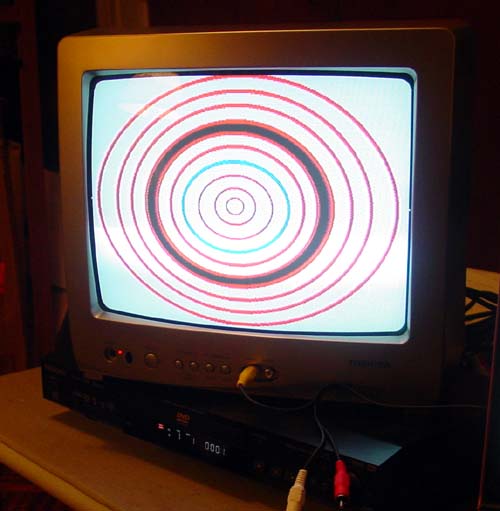
Non-Internet
"I like the ones on the Internet better."
"That's not the point--the shots on the bottom are just documentation of pieces that can never be experienced on the web, just as net art always flops in the gallery setting."
But seriously, I'm pretty happy with the DVDs I just burned (these flared-out shots notwithstanding), inspired by Paul Slocum's work for the Dallas show. Picked up that Toshiba TV on clearance for 74 bucks. The LED Grid is an HTML piece--a found GIF remixed to blink at different rates. I used a capture program to convert it to a video file, then burned the file to DVD, which is then set for chapter repeat in the player. For the OptiDisc piece, the same capture program played the original GIF 12 times to make the video, also set on chapter repeat. I like Paul's idea of burning several animations to one DVD and then having several TVs going at once. Now I know how to do it and don't have to bug my friends so much.
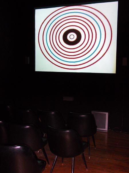
Went to see
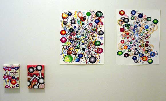
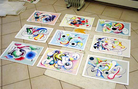
Getting ready to ship work to Dallas for the 2-person show I'm in with Saskia Jorda at and/or gallery. All the above are now wrapped and boxed and ready to go out tomorrow. The exhibit opens January 28. Besides these objects, I'll be showing a couple of videos ("Guitar Solo" and "OptiDisc") and animated GIFs. The GIFs will be looping on small (?) TVs and are being captured from my animation log and burned to DVD by Paul Slocum (thanks, Paul), who is running the space with Lauren Gray. The two are also in the band Tree Wave, featured in the movie 8-Bit, which I've been talking about. I like this kind of long distance gallery interaction. I've done a few shows where I emailed BMP files and they were printed on the exhibiting end. People do this kind of thing every day in their jobs, but it might not be "special" enough or have sufficient "aura" for many conservatarians in the art world. Well, too bad.

Tomorrow, December 11, is the opening of
The press release for an upcoming show I'm in called
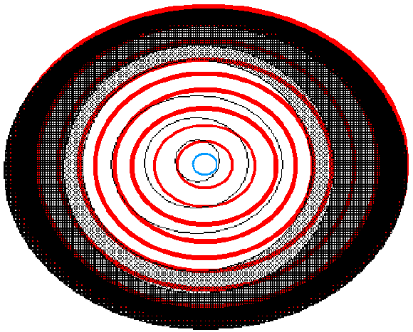
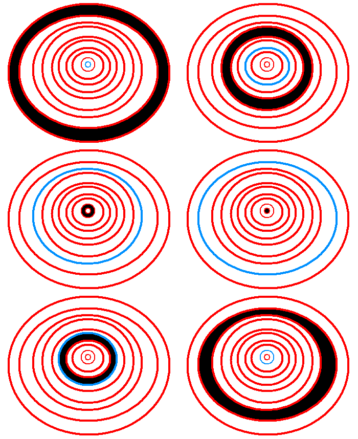
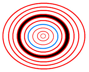
Thor Johnson sent this mashup of the OptiDisc GIFs posted earlier. Thanks! It looks like a 3-D image before you put the glasses on. Just saw the DVD prototype of this GIF and am pleased by how it came out--very minimal, clean and dumb. On a 20 inch Sony screen, it's everything I wish TV was. No Bill O'Reilly, no Tim Russert, just a cheap but elegant hypnodisc. It loops
Pulsating optical disc internet sketchbook!
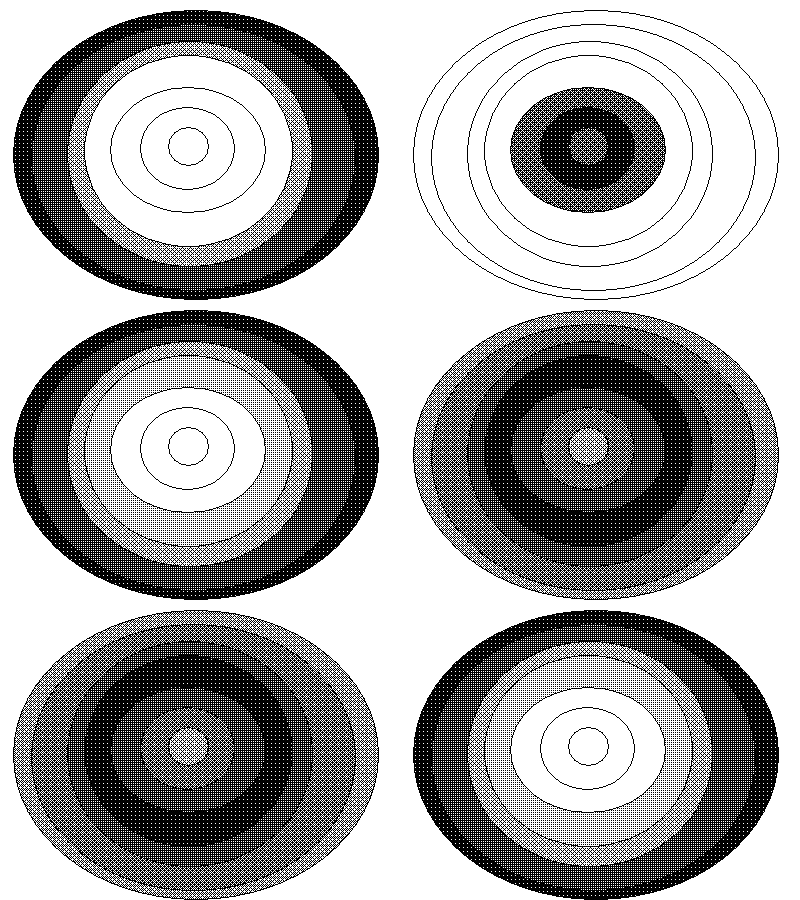
I have to pick one of these [to burn to DVD, as described in the previous post], and soon:
Number 1 (previously posted)Then I have to redo this one so it's less crunchy:
Number 2 (more oval 1)
Number 3 (more oval 2)
Number 4 (crunchy enlargement of gif posted over a year ago)
Number 5 (similar to Number 1 but more regular)
Number 5A (even more regular--smaller center hole--think this one's the keeper)
Enlarged Black and White (Crunchy)More will probably be posted as I continue to obsess and procrastinate.
I've been working on scaled-up versions of my animated GIFs for some upcoming gallery shows. Here's one called OptiDisc, which is a bit too large to put on the blog. Some interesting, and some aggravating, issues arise when you start thinking about converting Net Art type product to Video Art type product. Aggravating as in you have to redraw stuff you thought you''d finished. Another alternative is to convert the small files to vector files, which can then be safely enlarged without turning to pixely mush. That seems fetishistic to me, going to that length to preserve the character of something everyday and ephemeral--the cult of MacPaint. But I could (shudder) end up doing it. Big ups to Paul, Matthew, joester, Sally, and others who have helped as I lurch through this process.
