View current page
49 matchs for paintbrush:


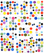
GIF grid by eyekhan
Based on my MSPaintbrush "Waves" drawing.
I've said this before.
I hate the MSPaint spraycan tool.
Even though I learned some new tricks from Travis such as how to make the spray a wider range of sizes, it doesn't change the fundamentally unaesthetic look of that dot dispersion pattern.
After the subtleties of MSPaintbrush (Paint's superior predecessor that Microsoft ruined), it's like painting with acrylics after learning oils.
With the previous drawing I did everything I could think of either to use the spray proactively or to divert attention from it.
1. Made the surface illusion very flat since you can't depth-model convincingly with that uniform fake pointillist pattern.
2. Tried to think of a surface that's naturally granular, such as "lunar dust."
3. Varied the width of the spray and used some big, fanning sweeps as kind of a wash or glaze--fuggedaboutit.
4. Saved it as a .GIF from the native .BMP to add more of a "grid feel" via the dithering of those grays.
5. Used a blue "intrusion" pattern (an homage to Houston painter Perry House) to confuse the read of the image.
I'm still stuck with that dead-ass, rectangular dot grain. Yeuuchh. (I like the drawing, though.)
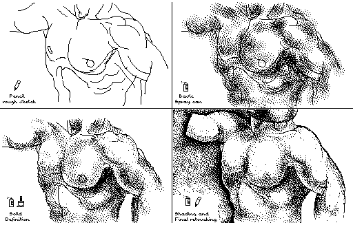
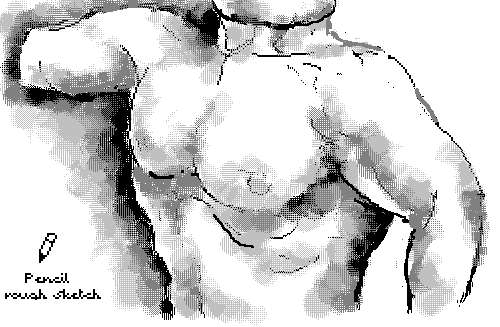
the top image Guthrie found and posted to Nasty Nets. The bottom is a panel I redrew in MSPaintbrush (Paint's more sophisticated ancestor). I mean, kitsch is kitsch but anyplace to show off some Paintbrush "skillz."
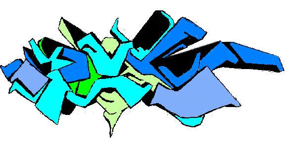
My MSPaintbrush version of the Dex graffiti mural I posted earlier--drawn freehand from the photo. I tried to compensate for the steep angle of the wall in the original shot, but as you can see it still recedes on the left. Oh, well, regardless, I'm bad. Unfortunately I don't know what the tag signified originally and I guarantee I don't now.
Animated GIF sketchbook, Return of the
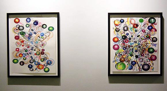
I'm in a show next month dealing with the theme of place, including virtual places (more specifics to follow). I'm proposing an artwork that has no "center," in the sense that it is located in several media without any clear hierarchy. I'm going to use the two pieces that were done for my show at And/Or Gallery earlier this year (above--photo courtesy the gallery) and exist as framed works on paper made with a home computer (the old MSPaintbrush program, with multiple passes through the printer). Those pieces are an "incarnation" of the work. They were documented step by step on my blog, so another "incarnation" would be a list of URLs in the title card indicating the ongoing Web presence of the works. Lastly, there would be time-lapse videos of the original documentation photos, continously looping DVDs playing on TVs or monitors in the gallery. Here's a "sketch" of the animated GIF that would become one of the vids (a sketch because it will change somewhat): [2.6 MB .GIF]
I'll update with the other "sketch" once it's completed.
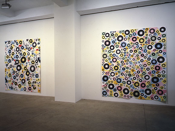
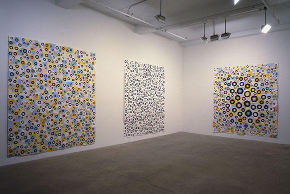
Installation views of (top to bottom, left to right) Greater, Jump, Exhibit 11, White Room, and Bulge; each is MSPaintbrush, photocopies, linen tape [along seams on the reverse], 88 X 78 inches. From my solo exhibit at Derek Eller Gallery, New York, NY, 1998. (photos by Bill Orcutt)
back to main site
From the comments:
Why, if there are so many interesting things in this [Cory Arcangel] interview and also this excerpt, the discussion will always start with "I like Flash", "Flash ain't bad", "I like Flash", "it is a tool" etc?? ... i have seen this with 98% of all articles where Flash is mentioned.I also especially hate the "smudge tool."
Strangely, Photoshop is still out of this circle. Photoshop is also mentioned here, but never anybody jumps in and says it sucks or it is gr8 or just a tool or whatever. Actually Photoshop is mentioned everywhere and never such strong opinions as about Flash pop up.
Let's change that! Who will start?
- drx (guest) 3-31-2006 3:15 am
Allow me to say as strongly as I think you'd like to hear, I hate Photoshop. I hate its characteristic '70s airbrushed look, I hate the "bicubic mush" from resizing (your term, drx, and it's great--I'm thankful Paul Slocum told me about "nearest neighbor" resizing or I'd be screwed with these pixeled bitmaps I do), I hate all those "artistic" paintbrushes, I hate the instantly recognizable effects ("mezzotint," "craquelure"), I hate the lazy "surrealist collages" people make with Photoshop, I hate working with layers, I hate the un-intuitive interface, I hate Adobe, which has criminalized the gray area of intellectual property disputes, I hate the constant upgrades that add features no one needs (I'm still using a version of 5 that came bundled with a scanner)--I mainly use Photoshop for cropping and maybe tweaking the contrast of a photo for the blog. I hate making art with it.
- tom moody 3-31-2006 3:40 am
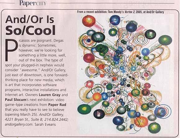
MSPaintbrush in the news again...
It began in a lonely office cubicle in White Plains, NY...long weekends of overtime...a man had a vision that this lowly program could be used to make art...the vision spread...
Yeah, yeah, just BS'ing around. Thanks again to Paul and Lauren for making this show in Dallas happen and for making it so fun to do. I learned a lot working with them, and look forward to continuing collaborations and projects in cyberspace and elsewhere.
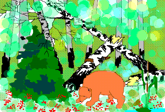
This lovely bear in the woods image was made with MSPaintbrush--the old one, pre-Paint, the one I use, but never this lyrically. Travis found it in this gallery (I couldn't view it in Firefox, had to switch to IE). He's been digging up some great drawings made with these simple paint programs.
On the opposite end of the Internet art content spectrum, check out Karl Klomp's glitch videos ("It seems much of his glitch output, and very tasteful it is too, comes via repurposing video mixers or even burning DVDs with 'impossible bitrates' for challenged DVD players to read," says dataisnature) and prints.
Meanwhile, back in the real world, looks like the Whitney is rehashing Gordon Matta Clark and the spirit of '68 again, based on this Times review of the 2006 Biennial and other reports. I promise to keep my mouth shut and mind open till I see it, but till then, I'm groovin' on that bear.
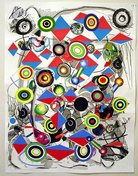
Cannibalized some older pieces to make this. Lots of scissoring and X-acto knifing. Dimensions are 24 1/2 X 19 inches; it's ink on paper--all rendered with the "vintage" program MSPaintbrush, printed, cut into pieces (repeatedly), and linen-taped on the back in a network resembling a nest of bricolage spiderwebs.
A friend emailed to say he finds the synth sounds I'm using to be a little too much like factory presets--what come packaged with the instrument before any user programming. He says he's not sure if it's "the lack of layering, or that they're dry and don't have many filter/pitch/mod/etc controls." He likes the "Guitar Solo" video, though. I replied:
Thanks for the suggestions. I haven't made any pretense on the page of using anything other than presets. My feeling is MSPaintbrush is one big preset, and your suggestions would be like telling me I should use more layering and effects in Photoshop, to try to be more naturalistic and painterly. Not saying I'm not listening and won't absorb some of [the ideas in your email], but I like things straightforward and stupid. The guitar solo was a total one-off, I had just bought Kontakt and started turning as many knobs as I could find--it started getting distorted. The piece got more interesting when I started chopping the notes up and repeating them in a Wav editor. There's really no layering. It's just off the shelf distortion and brute surgery.
But I'm interested in the compositions being some basic, minimal, easily apprehended structure as opposed to building up a lot of texture in the sound. In "Clip City" I meant to contrast the subtle drumming with that dorky keyboard arpeggio I wrote and played absolutely dry on the Sidstation. The thought of doing a fluid, Basic Channel type drum track appealed to me, but then I just rebelled. The only analogy I can come up with is bad painting. Why would you want to do something bad when you can do something well? (A dealer once asked me that.) On "Permanent Chase" I added a little chorus effect to soften the Sid, but it's totally preset city. I really like the sounds those Swedish guys programmed! I've been lurking on some electronic music chatboards and am amazed by some of the complex things people are doing with drum programming etc. But I find the glitchy granular sound overrefined and boring. My favorite techno music is blindingly obvious. I think maybe I don't care about layering and quantizing because I like to hear all the instruments, and I like machines to sound like machines. Kraftwerk always appealed to me because it was wind up music, like looking at the inside of a watch and seeing how the gears move.
My friend replied that part of his confusion about the music was "that it's kind of sitting somewhere between german trance and a more minimal conceptual sound work, and I guess my personal preference would be for it to be a little more one way or the other." I'm abbreviating his comments, which were fairly detailed in how the music could go in either direction. I appreciate the suggestions but I'm resisting, as I explained in my emailed reply:
I guess my feeling is "german trance" and "minimal conceptual sound work" are both known genres, with their own sets of conventions, but the space between the two is maybe not to so mapped out. I'm not just trying to turn your criticism into a compliment. I think all my best work occupies that awkward middle ground between "failed commercial art" and "conceptualism with imagery too stupid to look at."
Where I'm still a little uncertain is, do I really need to learn to make good trance with all those subtleties you mentioned, or is it possible to fail at it for artistic purposes with only a working half-knowledge?
Part of me would like to be a club star with German girls putting their hands in the air, which is maybe why the music gets better without being entirely there as dance music. I keep working at it because I like it.
But trance is basically a dead art form. What is the point of getting really good at it?
Sounds like maybe the one that's bugging you the most is "Lysergic Interlude"? Those are definitely presets, from the Linplug Alpha softsynth: one is called "club run." I can hear everything you're criticizing about its lack of subtlety, but at the end of the day I just like that wind-up music box feel. (I subtitled it "Ice Cream Dude Sells E" because it sounds like an ice cream truck to me.) And there's almost nothing conceptual about it.
Anyway, I know the music's not perfect. I'm just leery about improving it too much because I don't know how relevant or valid "good" techno is at this point. I also feel the deconstructive art things (with sustained loops etc) are either too familiar or not fun. (Not saying [your piece you described in the email] is bad--I'm sure it's great.) There was a lot of finesse in the music in the Whitney's BitStreams show but not one composition had a beat or a melody. My hope is to keep working in the middle ground and a few good things will emerge from that process
And is if that wasn't enough, I added in a later email:
The bigger philosophical issue for me is the same issue I faced as an visual art student years ago. I had a teacher who left a note in my portfolio at semester-end saying I needed to "face very squarely" whether I was a cartoonist or an artist, because he saw the former winning out most of the time. Arguably he was right and that's why I [am where I am today], ha ha. As for making "good" techno--part of me wants to, but part of me wants to stay innocent and incorporate the misconceptions, fixes and workarounds of the self-taught musician into the final product, which loiters irritably halfway between trance and conceptual art. (The musical equivalent of my paintings, maybe.) BTW, the recent songs that matter the most to me are "Posse on Greenwich," "Glitch Western," and "Robollywood," none of which are actually that trancy.
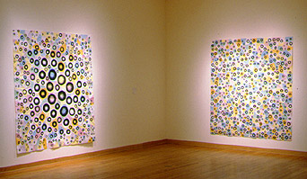 An excerpt from the interview Cory Arcangel did with me at Rhizome.org [dead link - see below]:
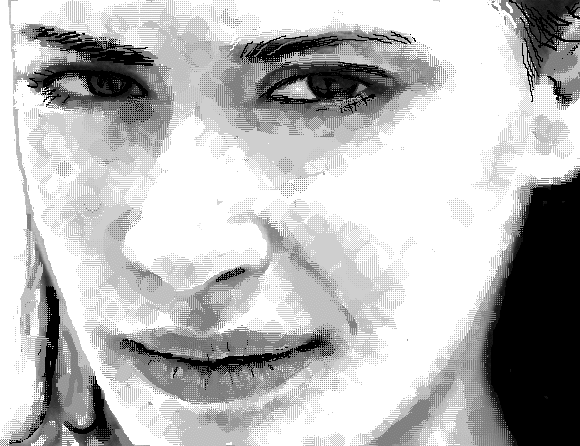
 "The computer still has the shock of the new, or the shock of the bad in some cases. Art world folks know painting, photo, and printmaking lore, but are less secure--myself included--knowing what constitutes talent on the computer as opposed to some easy-to-do technical trick. I thought because everyone had Paint or the equivalent on their computer and had at least made a mark or spritzed the spraycan, they could see that I was doing something more ambitious with it. I was thinking of this guy in New Mexico who made perfect perspective drawings using an Etch a Sketch. If I could draw La Femme Nikita from scratch on this toy program and actually have people (well, guys) say she's hot, then a landmark would be achieved for both Paintbrush and the computer. The problem is I drew her so realistically people assumed I was running a photo though a pixelating filter.
"When I talk about craft on the blog, just to make it clear, I'm not talking about drawing ability but things like mosaics and needlepoints that relate to the computer on a much more fundamental image-making level, the grid level. I love the cross-stitch patterns and beadwork you can find online based on MSPaint drawings. In the late '90s I was impressed by the writing of cyberfeminist Sadie Plant, who opened up for me a whole organic, non-analytical way of looking at computation. She traces digital equipment back to one of its earliest uses, as punchcards for looms, and talks of the internet as a distributed collaborative artwork akin to traditionally feminine craft projects At the time I was drawing and printing hundreds of spheres at work and bringing them home, cutting polygons around them, and then taping the polygons back together in enormous paper quilts. In my press release for the Derek Eller show we called it 'corporate tramp art.'"
Update: New Link to Cory's interview with me.
Shoutback Dept., No. 1. Thanks to Marius Watz for his nice post on the Generator.x blog, published in connection with a conference and exhibition in Oslo examining the current role of software and generative strategies in art and design. Check out some of Marius' interactive abstractions here; they are seductive to look at, fun, and actually use the computer's image-making capabilities in way that lets the machine do some of the thinking, as opposed to my low-tech simulacra.
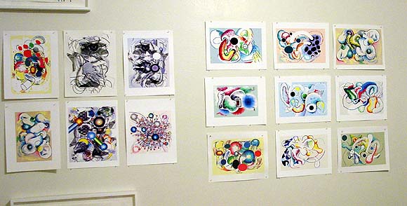
Working on presentation of these wormy vortex drawings. The physical, printing-and-display part is boring. Most of these are test prints, eventually they'll all be on Epson's 100% rag paper, which is a neutral surface, surprisingly not arty-looking at all. And framed like the pieces cropped at the top and bottom of the photo. (Computer work done in an ordinary program like MSPaint or Paintbrush becomes more problematic when you treat it like a sacred museum object, I swear it's not just for retail reasons. Evidence of a certain financial commitment to what's perceived to be cultural ephemera. Plus they just look more embodied, and therefore more interesting in person.) After printing a couple I noticed the inked outlines were mushy--not crisp like they're supposed to be. Was it the ink bleeding into the rag paper? No, my new-ish printer defaults to "edge smoothing." I can't believe I just realized this. Drawings done in pixel-y programs should have sharply pixeled edges, so they look like what's on the screen. Edge smoothing gives everything that "resampled in Photoshop" look--ugh. Not acceptable.
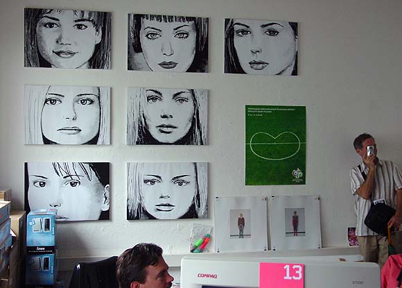
Some pieces of mine hanging in the curator's office at Lothringer Dreizehn, an art space located at Lothringer Strasse 13 in Munich. The curator, Courtenay Smith, originally showed the work in her gallery homeroom. Hand drawn using the old computer program MSPaintbrush, the images of what I would call everyday media women were shown a couple of times in New York in the late '90s. I emailed a set of .BMP files to Smith in 2000 and she printed them on a medical plotter and "stretched" (i.e., folded) the paper on canvas stretchers. Her set actually looks better than the ones I printed here in the States.
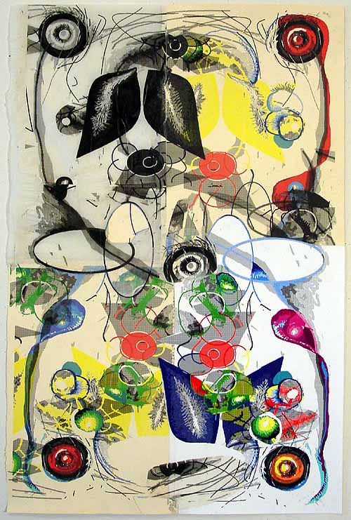
Zipatone Omniverse, 2005--this piece will be donated to the Dieu Donne Papermill (accent agu over the e in Donne screws up my RSS) for its annual benefit. Quite a challenge to figure out a way to incorporate their fine handmade artist's paper into my usual slacker vibe. I settled for practically destroying a couple of sheets in the printer and then trying to salvage them with tape and glue stick. This piece really looks handmade (and kind of "1930s surrealism") to me--even though all the drawing/markmaking was done in MSPaintbrush.
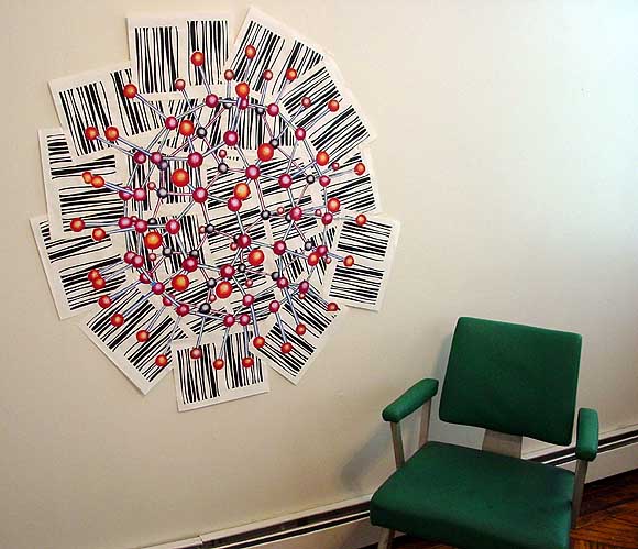
Finished the piece started over the July 4 weekend, finally. That's it above, posing with a chair. Below is the back, showing the strips of canvas-colored, gummed cloth tape that hold all the paper pieces together. The buckyball is an Epson print of a scan of a transparency of a handpainted buckyball I made years ago. The background xerox sheets are an Op art-like pattern I drew in MSPaintbrush--they would make a continuous wavy field if trimmed and arranged in a grid.
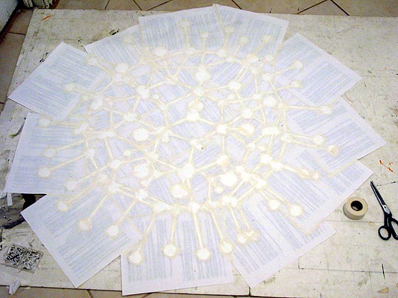
Today I cannibalized an older piece that wasn't working, going after it with scissors and an X-acto knife (woo).
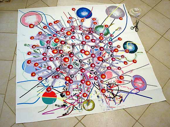
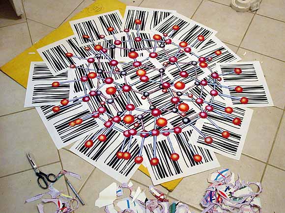
Approximately 5 CDs later (actually LPs, mostly prog rock), the shearing was done and a new background was in place. Now the real work starts--the whole thing has to be cut into pieces and taped back together in a mosaic/quilt that looks exactly like this. (Strips of cloth framers' tape will be applied on the back, along the seams.) Those bar code things are xeroxes of an op art pattern I made in MSPaintbrush and only used once, for a small piece.
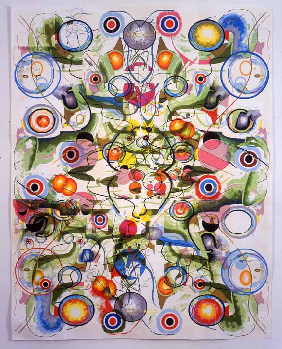
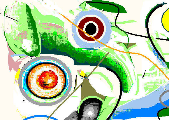
This is a piece from 2003 called Swarm (53 1/2" X 41 1/2"). Just getting around to scanning the transparency [taken by Bill Orcutt!]. A larger version is here. Photos showing how it was made are here. It's all drawn with MSPaintbrush and run through the printer multiple times. A detail (flipped vertically) of one of the overlaid drawings is below:
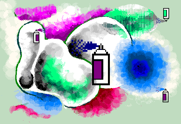
Spraycan (MSPaintbrush drawing)
(Edited slightly). Thanks to everyone who came to the opening of ART)@*!(WORK. The group show takes place in an office cube farm on the 16th floor of a building at 520 8th Avenue (between 36th and 37th). I carried out my plan which was to sit in a cubicle drawing pictures on the computer and shooting the shit with people. Neither the cube ambience nor the business casual attire was particularly ironic in my case--it's pretty much how I dress and live, now, but especially in 1995-2000, the time period in my working life I was "channeling" in the performance by using an old computer, Windows 98, and MSPaintbrush as my main drawing tool. I did a rendering of Chloe Sevigny based on an artnet photo by Nancy Smith I downloaded earlier in the day (at home), got panicky that the drawing looked like garbage, saved it and started making spheres. About a half hour later I booted it back up and found it was a passable likeness! so I kept it on the screen. The picture still needs work but I have 42 more hours to sit in the space, so this shouldn't be a problem. Expect also some photos and commentary on some other artists' work in the coming weeks. (Another slight update: I'm the only artist in the show treating this like a residency and working in the space full time after the opening. A few others are popping in for a bit of a temp work.)
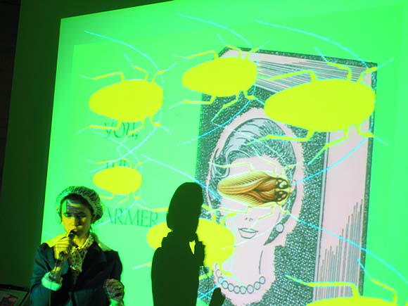
Around 8:00 pm Irene Moon did a live performance on the theme of social and antisocial insects (more specifically the scientific paper "Building Web-Based Interactive Keys to the Hymenopteran Families and Superfamilies" from Moon's work life as an entomology grad student) with electronic music, video, shoutouts to E.O. Wilson, and one major costume change from weird Bee-Woman zombie tourguide to southern-accented "Pleasant Planarian." "Fly Me to the Moon" was rendered in a well, drone, interlaced with factoids about insect eating and mating habits. At the end of the gig, everyone in the hive rubbed their forelimbs together and buzzed appreciatively. (Photo of Irene Moon from the Carbon Records website.)
j asked if I was going to do sound-related work in connection with my upcoming performance piece of sitting in an office cubicle making art for
Yesterday one of the organizers politely but nervously asked me if I still have an, um, job these days. The answer is yes! Where I work now isn't so physically different from this "art project" and my past jobs; it is more demanding, though. We could talk about it, but let's just say blogging about my perma (as opposed to permatemp) gigs is not part of my long-term survival plan as an artist. (But
Opening in a few days is a show I'm in called "ART)@*!WORK" (the characters vary each time it's typed), taking place in a 16th floor office suite at 8th Ave and 36th Street. Artists in this group exhibition will do installations, etc., in the cubicles of this formica-heavy unrented space. The last tenant sold mobile phones or something (still checking on that--it wasn't what I originally posted). Here's how I'm describing my piece:
Tom Moody, "Office Reality: Channeling My Art Life from 1995-2000," performance work, 2005. Moody will keep "office hours" while the exhibition is open (Tues 9-5; Sun. 12-6 from May 10 to 31), and will sit and draw on an old computer. Portraits, abstract art, and tasteless cartoon imagery will be pinned up in his cubicle as he works. All will be drawn using MSPaintbrush (precursor to Microsoft Paint); Moody's attire will be "business casual."I should have photos of my "work space" up soon. Here's a summary of the press release:
ART*!(%WORK, 520 Eighth Avenue Between 36th and 37th Street. Suite 1602; opening reception with live performance by Irene Moon May 10 2005 7-9 p.m; regular "office" hours: Tuesdays 9-5 and Sundays 12-6
May 2005, New York CityIgnivomous, a non-profit arts organization dedicated to nurturing and developing new genres, art forms and mediums presents ART!@*<>WORK, an art exhibition exploring the tension between the art of doing work and the work of doing art.
This show will take place in the cubicles of a midtown Manhattan office space. Fifteen artists will transform and exhibit projects inspired by the act of doing work and the spaces created for working. Visitors will be invited to explore and interact with the space during "office hours."
ARTISTS' WORK INCLUDES: Cat Mazza (microRevolt) recreating corporate logos with knitting, machines, and needlepoint; Sabrina Gschwandtner sewing thread and paper drawings on the machine installed in her cubicle; LoVid and Douglas Repetto producing patchwork of videos generated by an installation of work clothes and electronic office supplies; Evan Greenfield and Erika Somogyi creating a shrine to lost free time out of Sculpey clay and wax; Tony Luib transforming his cubicle into an abstract environment using office supplies; Michelle Rosenbergs installation will create a space for daydreaming; Yoav Bergner replacing the offices furniture with his own artisan and conceptual furniture; Elana Langer installing an audio piece compiled of field recordings taken from local office spaces; N.I.N.E launching a new addition to their urban exploration game HERE "I Hate My Work"--visitors will be invited to take part in the game throughout the show; Irene Moon presenting a 4 tall microscope as well as photographs and a video animation from her MS thesis in entomology; Brian Alfred will show a collage entitled Cubicles with a replication of all the tools used to make the work out of paper; Tom Moody installing an old computer and drawing during visiting hours portraits using the outdated software Paintbrush; Bengala will include their personal experiences from their jobs in a mixed media installation.
Recipes
Lately I've been cable-surfing the Food Network and digging its sundry cooking "how-to" shows, especially the Japanese version of Iron Chef. [insert long-winded exegesis of show.] Technologically based arts need their equivalent; in fact visual artists lag behind chefs in the eclectic "mixing it up" aesthetic of current haute food prep. Musicians fare somewhat better in this regard because music software and gear matured sooner than imaging software and gear (i.e., it's been "there" longer to jack with), but both music and art improve when practitioners think outside the (software) box, that is, think like Iron Chef Sakai. I'm not saying I do this all the time, but certainly my instincts are to mix media and in the spirit of the food shows, I offer the following recipes for a recent animation (top) and musical effort (bottom). Eventually I'll write a Dogma-like manifesto that codifies these practices as the only right way to make art, but right now I'm still exploring and I haven't reached the really pedantic stage yet.
Example 1
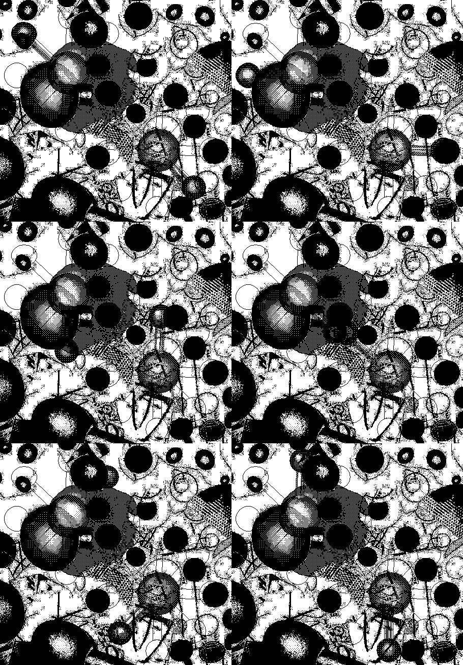
"Abstraction with Two Centrifuges" (2004), animated GIF
Drawings in MSPaintbrush are printed out at different sizes (100% to 600%), cut up with (real) scissors, taped back together in a scrambled collage.Example 2
That piece is finished. The GIF above is a spinoff work, no pun intended.
Collage is photographed with digital camera, detail is cropped and enlarged in Photoshop, converted to greyscale, run through the threshold filter.
In MSPaint, photoshopped image is converted to black and white fill patterns under "image attributes." (MSPaintbrush won't do this without destroying the original image). New fill patterns and the "centrifuge molecules" are added in MSPaintbrush. Saved 8 times, each save becomes a frame, with a different stage of the spinning molecules.
Frames are animated in a GIF building program. Uploaded to web, border is added in html.
"One to Thirty" [6.8 MB .mp3]. The following discussion is pretty brand-intensive, and I apologize for that, but one point I guess I'm trying to convey is that no one piece of software or hardware "makes" the piece; it's mostly in the process.
A factory-programmed tune from the Korg Electribe Amkii (B04 "Techno 12") is slowed down from 125 to 99 bpm. Audio is run through a standard hardware mixing board at low volume. The MIDI out is played by another synth, the Sidstation (a factory preset patch called P73 "Pyramid"), also plugged into the board.The common point of both works is using a combination of programs, effects, changes in resolution, etc. to build up some kind of credible texture. The overall goal is to give sound and image creative integrity beyond their source programming. These recipes are mostly technical. There are content issues arising at various stages of the process, verbalized internally but ultimately best left for the individual to articulate (or not).
The Sid basically only reads one sustained note and some noise, everything else is filtered out.
That note plays over and over as pattern B04 cycles, and is bent in real time with a variety of knobs: (i) the Sid's continuous controllers, changing the cutoff filter and pitch, and (ii) the dials on an analog filter called the Mutator (see below).
All of the above sounds are recorded into the computer through the mixer. But first, the board sends and returns audio from both synths to the Mutator, which uses some sophisticated envelope controls to twist and interweave the two instruments in real time.
An audio part is recorded using an analog to digital recorder (I forget which): about a 7-minute .wav file of the knob-twiddling performance. The file is then edited down to 4.5 minutes in a .wav editor called GoldWave: redundant and/or out-of-tune parts are snipped out.
The .wav file is imported into Cubase, a sequencer program. The tempo track is set at 99 bpm.
The drum riff is a sample that ships with Beatburner, a (virtual) rhythm module plugged into Cubase. Several were tried before I arrived at this one--I may have added some effects processing to it, but probably not. I also tried a MIDI drum part playing various samples. Beatburner plays this drum and bass riff at 99 bpm and it's a decent fit with the existing audio.
Content-wise, what I had in mind was a contradiction between the one, bent note, which is sort of airy Steve Reich minimalism, and the "slammin'" forward movement of that dancefloor beat. No dropouts, crescendos or other dancefloor tricks were used. The piece is still pretty energetic, and might pass for drum and bass, although most of these dance tropes are pretty cliche at this point. [skip long-winded exegesis]
MSPaintbrush vs. MSPaint: A Refresher
Some kid out there on the internet mentioned my artwork and told his readers that I "apparently use MSPaint." In context, the "apparently" reads like a slightly disdainful qualifier, as in, "I can't see it myself, and in any case I don't think it's a particularly great use of MSPaint, but that's what the guy says--I'm just telling you." Of course I don't share the ambivalent feelings but do think it's time to trot out an earlier post where I explained the difference between MSPaintbrush (which rules) and MSPaint (which I use occasionally even though it's inferior).
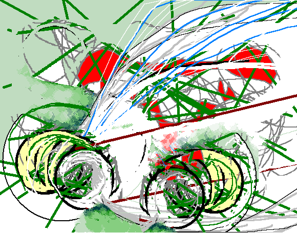
Bug7, MSPaintbrush
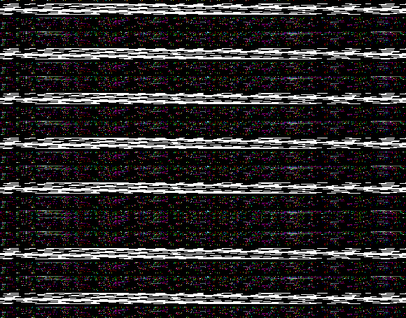
Surge Drawing (Black Stripes), MSPaintbrush
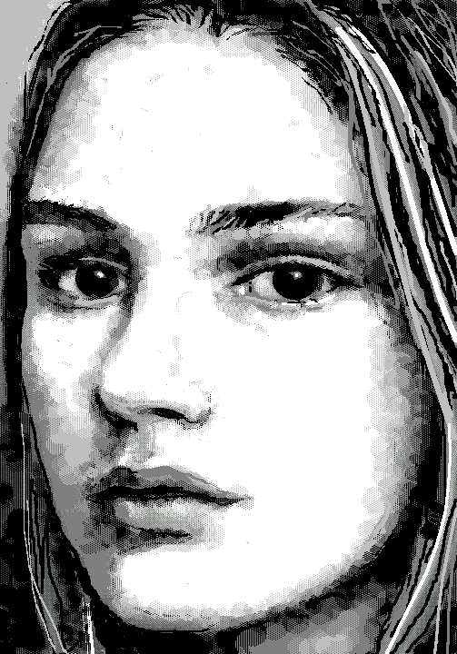
New York Times Ad Model (2002), MSPaintbrush drawing
|  |
 |  |
 |  |
| 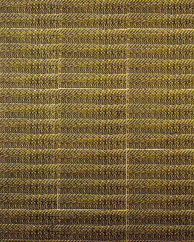 |
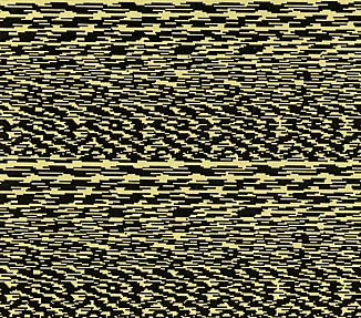
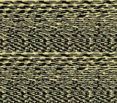
When I sent a drawing from the MSPaintbrush program on my computer to the network printer, the printer routinely sent back a message announcing that the job was finished. This caused a slight power surge, and I discovered that if I was sending another drawing to the printer at the exact same moment, the signals would cross and the second image would get "zapped," printing out as a uniquely garbled geometric pattern. I actually learned to time to the split-second when to send the drawing to get a good "scramble."
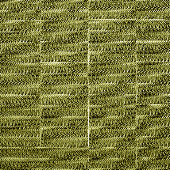
I made multiple photocopies of the scramble-pattern and joined them in a grid, applying linen tape to the back of the paper and then folding the paper around a painting stretcher and stapling it on the back. The result is a rather elegant, minimal quasi-painting born out of the drudgery of the modern office (during periods of official "down time," of course). The differences in color in these web pictures are just discrepancies among the scanner, slide, and digicam images used to make them.
I started thinking about this work again after the recent interview where jenghizkhan said "I started making music by scratching CD's [as in hiphop, turntable scratching] that I made from digital noise samples (similar to modem tones). I got the samples from saving the screwed up files that my computer sequencer would spew out when it crashed (which was all the time in the beginning). The scratching occurs sometimes at a super subtle and slow rate so that I can draw out all the tones that make up the white noise of digital streaming information."
That got me thinking about visual equivalents to those kinds of sounds, and the interest that exists across disciplinary lines in digital by-products, especially down at the "molecular level."
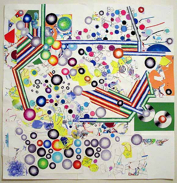
Expanded version of a piece I did last year; I added about 8 inches to the what used to be the top and turned the format from a rectangle to a square. I'm calling it Van Der Graaf Flux; the whole thing is meandering conceptually and may not be finished (meandering being, I think, the subject matter). It has some Russian constructivist elements. Those spinning disc things over on the right are a design I saw years ago in a Popova (?) painting depicting rolls of silk in a silk mill, seen end-on; I've recycled it quite a bit. All the imagery is drawn in MSPaintbrush and MSPaint; the paper is repeatedly run through the printer, cut apart with scissors, and taped back together; the back of the piece is a dense network of linen tape holding the whole thing together. See? Kind of ugly, but here it is (flipped).
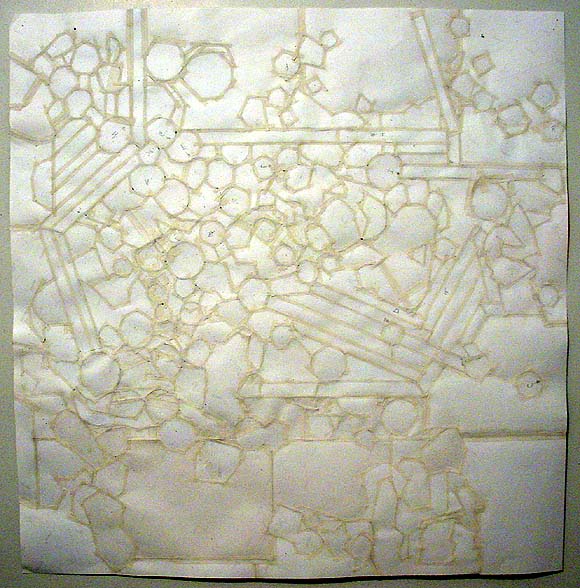
Here's a macro detail, which should banish any remaining illusions that this piece is "computer-slick":


MusicWorks for Macintosh was one of the first music software programs for home consumption (ca 1984); it takes up a whopping 69K of memory. I still use it: it acts as a primitive sequencer, letting me cut and paste loops that I write into some kind of coherent (hopefully catchy) song or composition. It gets a nice, unsophisticated video game sound, with about 10 "instruments"--e.g., piano, organ, trumpet (uggh), chime, synth 1, synth 2--and controls for the attack and decay as well as tremolo and vibrato. The pieces I did in '88, when the computer was relatively new, are more structured (i.e. songlike) than the most recent stuff, which is more "tracklike" and features found sound (other folks' lock grooves from turntables, etc.). A new composition will be posted soon, something I'm pretty happy with--a score for another artist's video--that's more in the '88 spirit.
Unfortunately the ancient Mac SE I run MusicWorks on seems to be dying; it takes longer and longer to save and I've lost some work. I like this little music program a lot--it's sort of the aural equivalent of MSPaintbrush, which I'm also fixated on--and I'm hoping it can be run on the newer Macs. If it can I'll plunk down and buy one.
several more new drawings here (click thumbs for enlarged versions).
Here's a detail of Double Molecule, the animated .GIF in the post above. I'm putting up this close-up photo to show conclusively, I hope, that my recent animated .GIFs, installations, and works on paper are NOT HAND PAINTED. They are drawn in MSPaintbrush, a very old but very digital program, then printed, cut out with scissors, and collaged and/or pinned up on the wall. For the animated .GIFs they are photographed in crude stop motion. I realize that shrunk down to a small scale & fuzzed out by compression, they look like little painted maquettes but I assure you nothing could interest me less. I like painting OK but I'm sick of the "romance of paint." Hence I am "painting" in a readily available electronic/digital medium. The animations are just an extension of my usual 2-D practice. Thanks to K. and J. for pointing out that I haven't been making this as clear as I need to. Now if I could only make the animation this bright...
F-Factor 2, MSPaintbrush painting, ink on paper, 55" X 50" (rotated 90 degrees counterclockwise)
(the "Xtreme detail" .gif is perversely titled "The hiphop years." If you don't see it in the larger piece, don't worry, it's very small and cut off by the top edge.)
Zerg Moderne, MSPaintbrush drawing, 2003.
On a lighter note, below is a drawing called Gray Couple on Sofa. Both images can be clicked on for larger views.
Mark suggests a connection to the Springfield Knowledgeum in my recent (ongoing) painting--"where science is explained with brightly colored balls." I missed that Simpsons episode but it sounds just about right. I also made this "Jack Kirby Mandala" as an aid to help me visualize whirled peas, I mean the painting. I found the image at Comiclopedia (thanks to artnotes): it's from a 1982 Kirby comic and the text brings tears to my post-adolescent eyes: "FOR EVERY INDIVIDUAL LOSS, LEGIONS POUR FORTH!!! THE HIVE BELOW HAS BEEN RESTLESS--MULTIPLYING!"
Jim was over last night and asked for a demonstration of my mouse-drawing acumen on MSPaintbrush. The image below, based on the DVD cover for Kiki's Delivery Service, was drawn freehand while he and Bill watched, so now I have witnesses to this valuable skill-set:
I've started a new painting that's in my typical hybrid (virtual/non-virtual) style of working on the computer: making a drawing in MSPaintbrush, flipping and reflipping the image, printing it out, drawing some more, overprinting (running the previously-drawn pages through the printer again), taping the pages together, adding and subtracting elements with scissors and tape, etc. A step-by-step demo, documenting the process with a digital camera, is going on here.
Fudge Factor, 2002, ink on paper, linen tape, 35 1/2" X 27" (this recent piece of mine--done in MSPaintbrush with a lot of overprinting and collaging--has been flipped and rotated for easier browser viewing--sorry if the file loads a bit slowly).
I was talking to an artist in her 40s about abstract art, and she was saying that the next generation doesn't get it--that abstraction's a historical curiosity at this point, because it's not seen as having content. Or that the content issues discussed from the 1940s to the 1980s with respect to it (existentialism, phenomonology, Freudian psychology, semiotics) mean nothing to younger artists.
Yet earlier I was talking to an artist in his 20s who is interested in rave videos and psychedelia. That's abstraction, isn't it? Presumably most of the isms I just mentioned could be applied to the orgiastic, visionary, opting-out-of-politics-as-usual spirit of the music underground. The part of abstraction that younger artists aren't talking about, and no decent artist of any age should be talking about, is the idea that a work's formal qualities are ends in themselves. That's a historical, Greenberg-era aberration. And as for anyone who thinks art has to have a neatly extractable soundbite message to be meaningful, you need to get a life.
Paintbrush vs. Paint
MSPaintbrush is a 165K graphics program that shipped with Windows prior to 1995. Bill Gates & crew did not create it; as with many of their products they acquired it, in this case by buying a company called ZSoft. When Windows 95 came along, Microsoft supposedly "improved" the product and changed the name to MSPaint: it's still part of the Windows accessory package. As an artist I greatly prefer Paintbrush to Paint, and was lucky to track down an abandonware version so I can keep using it (to draw portraits, molecules, and the like).
What are the differences? In Paintbrush the zoom requires less steps to activate. You can also zoom out to see the entire image, which for some reason you can't do in Paint. Paintbrush has more brush, spray, and eraser sizes. A newly-pasted image in Paintbrush has a clear background, so you can immediately see how it layers over an existing image; in Paint the default is opaque. Paintbrush colors are customized with simple, easy-to-use RGB sliders, as opposed to Paint's "color picker" spectrum, which, again, requires more steps.
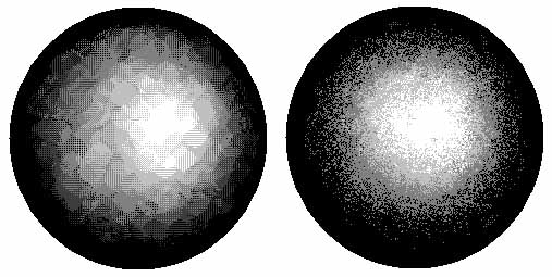
But the most crucial difference, for me, is the output of the "spraycan" tool. In Paintbrush (see sphere at left) it's like crosshatching; the effect is much more volumetric and seductive, once you get the hang of using it. Paint (sphere at right) has a fast, user-friendly, point-and-spray dot-dispersion pattern, but to me it looks like bad 70s airbrush art.
It's more of struggle to blend from dark to light in Paintbrush using those crosshatch dots (each is a spritz of the spraycan). I can see where the Microsoft techies thought they were improving the program, and for most people they probably were, but I like the grittier, clumsier feel of the crosshatching compared to the smoother pointillism, and even more important, the ability to create rich, intermediate grays. By eliminating the struggle they greatly reduced the potential beauty of the finished image.
Yes, I've used this cereal box and milk bottle before, but never in a corner piece! The bottle, by the way, is Hershey's chocolate milk. When you strip off the gaudy outer packaging (and it takes a while, the plastic wrap is tough) you discover this pristine, white, lathed-looking cylinder underneath. The atoms and "bonds" I draw in MSPaintbrush, print, individually cut out with scissors, then map-pin to the wall.
I guess my interpretation of this body of work would be as follows. A sort of cargo cult worships consumer packaging. In a bastardized version of science, their mystics try to chart the invisible bonds between products, and link the packaging to the larger world. The symbolic byproducts of this research become like graffiti tags, which the cult sticks on walls as territorial markers or signs of their faith.
On my "miscellaneous page" I've critiqued some anime-style drawings by Krystal Ishida, an artist based in the UK who I discovered surfing around the net. Her work has enthusiasm and punch, and I don't care if she's still in the learning stages: she works harder than a lot of mature artists I know. Also, I'm interested in what makes a good web drawing, and in the post I discuss some of the aesthetics of using low-fi vs. "upgraded" software.
Also, on my technodiary page I discuss a recent release by Beige Records artist Paul B. Davis.
A couple of new pages have been added to my artwork archive: a selection of drawings made with MSPaintbrush, and "Volume Two" of my work from 77-96, concentrating mostly on abstraction. Also, I've added a page for posts on electronic dance music called technodiary. The picture essay I began several months back on "Video Games and Contemporary Sculpture" has been expanded and added to my writing archive.
The following is some historical info on early paint programs, from Dan Rose's DOS® Abandonware
PC Paint - © 1984 Mouse Systems Corp.
This may be the original DOS "paint" program. It is also one of the earliest mouse-driven graphics apps. CGA was the main video format of this time and color graphics were a premium luxury. Using 4-color CGA, this app can make both color and monochrome graphics. It saves files in PIC format and comes with 15 fonts. This version was released on two 360K floppies.
Total installed size: 453K
Microsoft Paintbrush 2.0 - © 1987 Microsoft Corp.
Before Paintbrush became a standard feature in Windows 3.x a company called ZSoft Corp. owned the program which was called PC Paintbrush. Microsoft later bought Paintbrush from ZSoft and called it, what else? Microsoft Paintbrush. They soon ported the DOS program to their Windows GUI and later changed the name to Paint when it was ported to 32-bit Windows. This version was released on two 360K floppies. Total installed size: 564K
UPDATE: Link was out. Fixed now. And fixed again.
UPDATE 2: And fixed again. The guy keeps changing his URLs. And screenshots.
My painting archive has recently been revamped. I've created thumbnail pages for the year 2001 and the years 1996-1999, so clicking through the slideshows is less of a stab in the dark. Most of the actual artwork, by the way, is done using Paintbrush, a kind of toy program that shipped with Windows pre-'95 (the current version, MSPaint, is vastly inferior). Raw material in the form of spheres, dots, and scribbles is printed out on the EPSON 2000P and then assembled by hand into collages with a quirky physical presence, unfortunately not always translatable into jpegs. I'm interested in combining outdated styles (cubism, AbEx, color field painting) with outdated computer technology to create weirdly ahistorical hybrids, clunky but (hopefully) ingratiating.
Below, left:
Michael Jackson Invincible CD cover, 2001
Below, right:
Tom Moody, La Femme Nikita (detail)
MSPaintbrush drawing, 1999
Below is an new piece done with MSPaint, Paintbrush, Adobe PhotoDeluxe, scissors, and linen tape. The title is Compound JA, the dimensions are 22 1/2 X 18 inches, and it's ink on matte paper (the polaroid I scanned makes it look greyer than it is). Since taking this photo, I've added a few more polka dots, but the polaroid changes it so radically the details don't matter much. A close-up can be found in the comments to this post, or in a slide show (in progress) of some other recent pieces I've done.
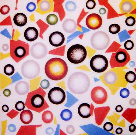
The image below is an 18 x 18 inch piece of mine called Aggregating, 2001. The spherical elements are drawn with MSPaint and Paintbrush and printed on an EPSON 2000P on archival matte paper; the flat areas of color are also printed on the EPSON. The paper is cut into fragments, rearranged and patched together with strips of linen tape (on the back). The whole thing, slightly rumpled and bowed, hangs with pushpins on the wall. This piece will be on view in the Momenta Art benefit exhibition, 72 Berry St, Brooklyn, from April 1 - 22, and will be reinstalled at White Columns and raffled off on April 24. (And assuming your computer will stretch it to fill an entire screen--as opposed to just tiling it--the jpeg makes dandy desktop wallpaper!)
