View current page
Here are the maximum 50 results for tommoody:
Blogging, phase 2.1
Please come visit me at my new blog home at tommoody.us. As of this month, I will no longer be posting new content to digitalmediatree.com/tommoody. Comments are still open here (unless closed due to spam).
The newsreader feed for the new blog is this rss address. Or this one.
The blog you are reading commenced Feb 2001 and culminated, more or less, with BLOG, the exhibition, where it was shown in a gallery as a performance work. That exhibition ended last month, so the past few weeks' posts have been "transitional."
I am keeping all my Digital Media Tree pages online and will be updating many of them (resume, archives, etc)--this is a friendly transition and I look forward to continuing to work with the Tree.
The new blog does not currently have a comment feature enabled but that could change as I adapt to my new environment. Comments have been an important of the current blog and I'll be discussing that more at the new turf.
A parting plug: please check out the CD I just released with earcon (John Parker) at CD Baby, titled Scratch Ambulance. We're really proud of it and think you might enjoy it.
Update, 2013: I hid comments on this blog due to the steady drip of link spam. They were quite active from 2001-2007, trust me, and have all been archived. I may turn them back on periodically to settle an argument about what went down in these dynamic years of the utopian blogosphere. --TM
Update, 2021: CDBaby bit the dust (abandoning all its artists) so I removed that link. Scratch Ambulance is available from many fine mp3-mongers.

painting by Cynthia Hurley (hat tip mm)
At tommoody.us I just put up some new music, and a post about the '60s beatnik TV horror show host Ghoulardi. It's kind of an experiment, to work with a different format and post items without comments.
Update: More posts have since been added.

An interview with musician and animator Silicious, by Petra Cortright, commissioned by Rhizome.org, is on the Rhizome front page*. Earlier posts on Silicious are here.
I love the music of Silicious' video Georg: like slowed down Giorgio Moroder with call and response vocals, ringing telephones, etc.
Update: Just noticed that Rhizome tabbed the interview "ironic." That is way off base--this is very sincere and emotional work, and I believe Petra and others are sincerely interested in it. "Visionary," "playful," expressionistic," non-status quo," "angsty," "political," "disturbing" are the words I would use. Or "freakedelic," to use Daniel's term.
Update, 2011: The Rhizome link has been changed to http://rhizome.org/editorial/2007/jul/14/interview-with-silicious/
"Grow a Brain 2" [mp3 removed -- a remixed version of this track is now on Bandcamp]
Some nasty drum and bass for a nice summer's day.
Update: A couple of minor tweaks designed to take even more advantage of the (extremely) basic melodic content!
In a previous post I mentioned my and John Parker's Scratch Ambulance CD was being marketed through iTunes. This led to a friendly email wondering why I'd changed my mind about iTunes. I haven't!
The company we used to press the CD also helps the artist market the work through a number of different indie and non-indie sources, one of which is iTunes. It's gonna be a couple of weeks before it's available.
I still don't have iTunes on my computer and still dislike it. I just don't dislike it enough to prevent a few pennies possibly coming my way by withholding my music from it.
I've never used a portable stereo type device (headphones hurt my ears) but I also like the idea of DRM-less sound files being freely distributable outside a monolithic single-company scheme.
On my computer I have Winamp, which takes files from my own foldering system.
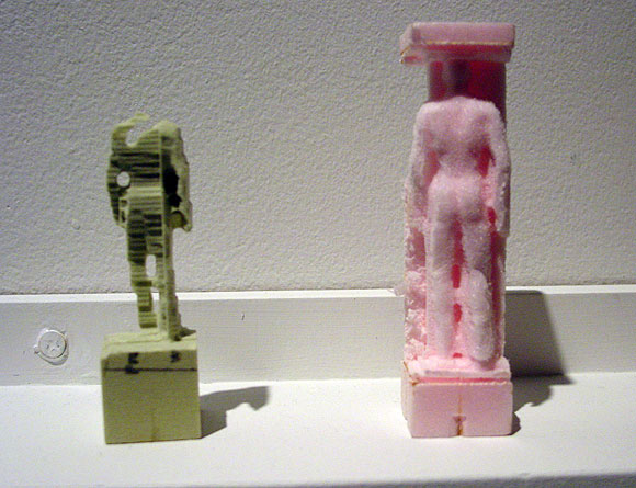
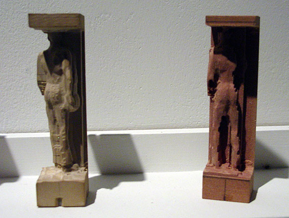
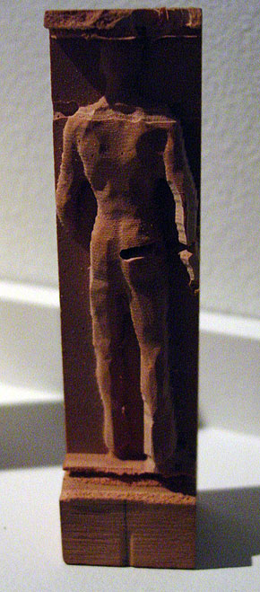
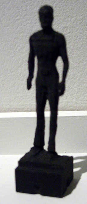
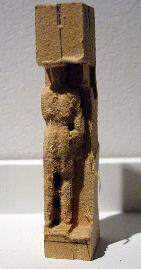
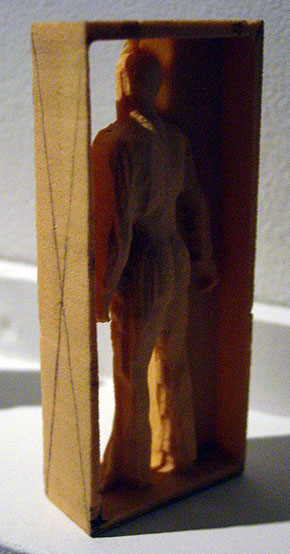

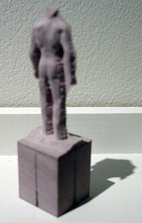
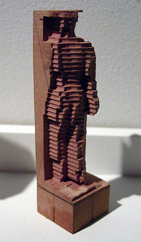
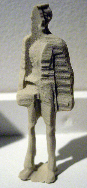
Figures by Mike Beradino at vertexList, Brooklyn, NY (show ended yesterday). An abject and rather intriguing response to Karin Sander and others working with rapid prototyping (3D printing) technology. These are made using some kind of (modified?) CNC milling, a reductive technique, but according to the gallery, extrusion (additive) techniques are also employed. Beradino puts different materials (styrofoam, wood, etc.) into the mill for computer guided laser carving, and there is also hand carving on some of the figures, I'm told. Instead of Sander's little everyman and everywoman miniatures, which relate to "life," Beradino's model is an avatar downloaded from the virtual world du jour Second Life--originally a smooth, Silver Surfer style humanoid--along with whatever artifacts and extraneous data come with the 3-D image file. Hence the cubes and frames attached to the figure and imperfect or grotesque forms. Beradino's statement suggests he takes steps to exacerbate the digital noise (see below).
(sorry about the odd sizes/focuses of my photos and the sketchiness of the info--these are rough notes and can be revised/corrected)
Karin Sander's work circa 1998 was always discussed in terms that exalted technology and the rigorousness of her process;
 this text from i8 Gallery in Iceland [dead link to text removed], for example, could be from a tech start-up's prospectus:
Karin Sander's 1:10 is a series of three-dimensional figures that are essentially reproductions of people, fully dressed, rendered one-tenth life-size in plastic acrylic. Each figure was created by a three-step process that begins with an elaborate, 360-degree computer-driven scanning apparatus that uses up to twenty cameras to produce a 3D data file describing in minute detail the appearance, posture, and clothes of the sitter. After seeing the scan represent-ed as a 3D wire model on a computer monitor, the sitter can have the technicians redo it. The final, sitter-approved data file is then sent to another company, which uses it to produce the actual 3D figure by feeding the data into a computer-driven extruder that sprays out thin layers of plastic acrylic, each representing a horizontal cross-section of the subject's body. When the figure is finished, it is sent to an airbrush technician, who colors it according to snapshots made by technicians at the time of the original scan. Curiously, at no point in this process is Sander herself physically present. Other than accepting or (very rarely) rejecting the final product, she chooses to make no decisions concerning how the sitters will be depicted. Some subjects arrive with suitcases of clothes at the company in Kaiserslautern, Germany, that does the original scans. What they wear and how they are depicted is wholly their decision, not the artist's.Beradino seems more interested in how the tech breaks down: "My works are physical recursions, between the digital and physical. These recursions are similar to a feed back loop such as a microphone next to a speaker. The speaker output signal becomes the input of the microphone and so on and so on. An object is created then digitized then produced then digitized then produced." This introduction of random, subjective, "wild" variables into a process that's supposed to be about creating near-perfect copies is much appreciated by this viewer, as is the celebration of the do-it-yourself factor, in contrast to the oppressive '80s/early '90s art model of mediating between corporate teams as a form of social sculpture with a well crafted collectible bauble as a result. Sander's work was considered paradoxically human or humanistic for all its mediated facture. Beradino's figures also have a quality of melancholy or pathos but it is the pathos of the cyborg, and a failed one at that, a reading only implicit (or repressed) in the Sander, which for all its rigor involved a fair amount of tweaking by "professionals" to get "right."


Details of photos from the blog Anaba a while back--the subject is an "outsider artist" mural done in the employee break room of a chain grocery store in upstate NY, depicting the history and future of life on Earth. (It took me two years to figure out how to enlarge and save flickr photos--duh.) My earlier post on this is here. Great use of color, as L.M. noted. Very anime-like. Regarding the third photo down, it's hard to imagine that an intelligence will rise 200,000,000 years hence to rival the one that put Kraft Crumbelievable and Ocean Spray high fructose in schools.
Update: the comments have an etymology of the vampire bats eating a whatsit image at the top. Demanding a clear chain of attribution from the first vampire bat to the last break room, the commenter asks why I didn't give the mural artist's name. Here's what I wrote two years ago:
It's beautiful work, but I'll let Anaba tell you its location and the name of the creator. I know we all fantasize about fame and fortune allowing people to quit their day jobs, but employers aren't Medicis (at least for very long). Projects like this usually exist only in the tiniest cracks of the ownership society. So why am I blabbing? Probably the same reason Anaba is: I want you to see those human-sized vampire bats eating that wolf-lizard, and the scrofulous Lovecraftian obscenity on the right engulfing that forest of fleshy pseudopods, which could be prescient glimpses of the future of life on Earth, or a stark allegory of present day emotions. (Not mine, of course!)
The following article about group blogs, blogging-as-performance, and an emerging digital aesthetic or anti-aesthetic was published in the Irish Times for July 2, 2007:
Beyond Art and Design
Haydn ShaughnessyI wonder how many artists agree with this statement. "I reached a point as a critic and as an artist when it seemed like to be a painter everyone had a studio trick that they kept to themselves to differentiate their work." So says Tom Moody, one of the Web's more influential art bloggers and practitioners.
It seems to me honest and accurate and applies not just to painting. Everywhere we turn we're being asked to differentiate ourselves, not just as artists but through what we wear and how we do our jobs. Moody is speaking though for a generation who feel liberated by new technology, for a group that has gone beyond the frustration of trying to find minor points of uniqueness. Up until a week ago his was the first blog to be exhibited as an artwork at artmovingprojects in Brooklyn, New York. Artmoving projects made Moody's blog a live installation. Even if you haven't embraced blogs yet you'd be tempted to say: Wow, with or without exclamation mark! The blog as installation is yet another example of how virtual, simulated and real environments are blurring.
On his blog a few days ago Moody provided a shortlist of group art blogs (see below), the online equivalent of the cooperative studio. These groups collectively raise an important question about the aesthetics of art born digital.
"As a painter I felt there was no ground left to be broken," says Moody. "And we're faced with these other digital tools which are new and have a lot of potential but don't, we don't, have any kind of aesthetic."
A loose aesthetic for digital art is emerging though? What norms, practice, and social and visual aspirations might inform digital art? I had Tom on the phone recently chewing over that issue.
A growing number of artists are using blogs to display their work (we recently featured Chris Ashley here on Convergence Culture, an artist who blogs an image a day). The Internet allows artists to connect quickly with each other and one result of that is they create cooperative blogs, just like some choose to open cooperative galleries. But as Tom Moody points out the chemistry of cooperation can be better. There's little financial overhead and there's no sense that cooperation is a necessary evil. But here's the interesting part.
In posting to a group blog, says Moody, you make a judgment about the work you would not like to show on your own blog. [1]
Through that act you are implicitly helping to form an aesthetic. It's not that you post to the group blog work you are not identified with at all. But you are saying something about your choices.
The underlying statement is that the artist has different artistic identities. Somewhere in the judgment about where your work belongs lie unarticulated statements about the nature and purpose of digital art. This emergent theory of digital aesthetics absolutely suits the medium. The judgments are not articulated but they are out on show.
The lack of an aesthetic is not the only problem facing digital artists. Galleries are reluctant to exhibit their work because as yet there are few collectors and no secondary market. And there is a suspicion. A digital art work when reproduced on paper can be reproduced indefinitely. Old fashioned prints created by master printers were at least authenticated by a third party. The unease that galleries and collectors feel are important practicalities.
Just like conceptual art thirty years ago digital art needs bold collectors who will buy knowing that a selection of these works will grow exponentially in value. But to be attracted that far, you sense a collector needs to know there are underlying disciplines at work, purpose and coherence that is at least comparable with their previous experience, a sense that a generation of artists, rather than the odd maverick, is pushing the medium, and confidence that the practitioners are not simply going to fade away..
To get that far the artists themselves need to start articulating the kind of purpose that resonates with a sense of destiny. Many digital artists, or performance artists who use digital media to get works into print, recoil from the idea that they can game themselves up into a "movement". Nonetheless when I put it to Tom he acknowledged: "More and more. I think the artists I'm working with and collaborating with are moving in the same direction."
Another problem for the digital artist is that many of the tools of the trade were created for designers Microsoft Paint [2] and Photoshop are two prime examples. Websites that showcase art made from these tools, particularly the influential Rhizome, an atheist's Bible of new media art, are to Moody's way of thinking, pushing a design aesthetic rather than an artistic one. [3] I'm not wholly sure that I agree with him, or that digital art should separate itself from design, but the point proven is that articulating the digital aesthetic is still a work in progress.
Group art blogs:
http://www.supercentral.org/wordpress/
http://doublehappiness.ilikenicethings.com/ [4]
References courtesy Tom Moody: http://www.digitalmediatree.com/tommoody/
Artmovingprojects: http://www.artmovingprojects.com/
Rhizome: http://www.rhizome.org/
MY NOTES/AFTERTHOUGHTS TO THE ABOVE:
1. I can't take credit for this line of thought. It was first articulated by Nasty Nets member Marisa Olson on her blog: "[Nasty Nets has] been a nice place for me to follow thoughts I might otherwise censor or drop, and to make and post work I'd not likely post elsewhere..." The idea that an anti-aesthetic emerges from everyone on the site doing this is something I've kicked around with various members.
2. MSPaint isn't really a program designers use, it's an amateur program that ships with every edition of Windows. Adobe Illustrator would be a better example.
3. Whoops--if I said that it's not what I meant. Rhizome is an art site. Rhizome and Eyebeam often feature projects on their reBlog pages that I consider more in the nature of design problems (robot alarm clocks that roll away from you when you try to hit snooze, to use an example from Eyebeam). But it isn't accurate to say that Rhizome "pushes a design aesthetic rather than an artistic one." If anything, it's the notions of conceptual art embodied in digital practice that I find problematic, when they take the form of what some of us have called XYZ art.
4. Not all of these blogs--or individual posts on the blogs--are based on an aesthetic of "what I don't show on my own blog." Everyone has different motivations for what and where they post and I make no claim to speak for everyone on these sites.
On the National Symphony's program of videogame music* at the Kennedy Center in Washington DC, here are the
RAVE REVIEWS!* "Live orchestral music with cutting-edge video screen visuals from Halo, Mario, Zelda, Warcraft, Metal Gear Solid, Kingdom Hearts, Sonic, Everquest II, God of War, Medal of Honor, Myst, Tron, and a classic arcade medley from Pong to Donkey Kong" [hat tip shm]
Los Angeles Times: "A GROUNDBREAKING SHOW! Video game music has come a long way from monotone bleeps to full-blown orchestral, choral, and opera arrangements. This fully choreographed tribute highlights the best games and their best features, whether it's the full choir accompanying Halo or the light show complementing Tron."
USA Today: "This spectacle is just the latest sign that songs written for the interactive gaming world are blasting out of consoles and into the mainstream!"
The Washington Times: "Video games are attracting serious composing talent!"
MTV.com: "If your idea of a hot Saturday night is a few hours of Xbox and a trip to the local Pink Floyd laser-light show, then Video Games Live is your dream date!"
Keywords: adolescent impulse dig dug
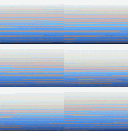


remix of work by Oliver Laric. A full size version (too big for the present page) is here.
not intended for RSS readers
More on the Rhizome 2007-2008 Commissions, from the comments:
The part of your post that bothered me was where you talked about ShiftSpace. This is a great project. The trend of Web 2.0 has been to wrest order from the chaos of the early web; ShiftSpace is a project that intends to re-inject this spirit of anarchy. For example, the comment criticizing your writing ("how long has your criticism sucked") was removed from this page; ShiftSpace would allow this comment to remain on the page for other users to see. It could be read as a critique of the increasingly moderated Wikipedia, and it's attempt at "authoritativeness"; it's infused with nostalgia for the early web when people produced their own messy pages instead of buying into the myspace prefab system; it's a classic example of a "not just art" project. [...]
- anonymous (guest) 6-24-2007 7:28 pm
With much of this art the proposal is the work. Once you've come up with your sentence explaining the tech innovation and how it benefits others you're done.
[...]
The comment criticizing my writing ("how long has your criticism sucked") was fictional. [...] You assumed it was real and I deleted it--interesting.
-tom moody [6-24-2007 8:03 pm, 6-24-2007 8:13 pm]
I would agree that "the proposal is the work" if I wasn't aware of how many artists do a terrible job of writing about their work. Those sentences usually end up being a pale reflection of the work. [...]
- anonymous (guest) 6-24-2007 8:32 pm
The goals of ShiftSpace do indeed sound worthwhile and noble but I have to confess I'm not very interested in art as sociopolitical activism, especially when the success of the project is presumed in the proposal.
I'm as concerned as the next person about the constrictions of these social networking sites but feel the way to approach them is to go elsewhere, and if there's no elsewhere then lobby for more elsewhere.
It feels like a contradiction to apply for a grant to an institution so you can be an anarchist, especially when the steps of your anarchy are carefully planned out and result in another ordered system.
- tom moody 6-25-2007 8:51 am
(previous comment self-edited for tone, substance--ShiftSpace would reveal my first draft--great)
- tom moody 6-25-2007 8:53 am
More commentary on the 2007-2008 Rhizome.org commissions Considered as XYZ Art post. People aren't offering any specific examples of where the analysis fails, they're mostly just telling me to shut up.
you could also apply the XYZ method to art criticism: take artwork X, apply categorization schema Y, produce art review Z.
- anonymous (guest) 6-21-2007 3:52 pm
You could, but some specifics would help.
I'm not sure there are any categorization schema any more except the old reliable, "mere description."
- tom moody 6-21-2007 4:46 pm
Right. Then why are you using the XYZ schema to critique art? As a critical process, it is more reductionist than the creative processes that you are criticizing.
- anonymous (guest) 6-21-2007 5:12 pm
Well, we disagree, there.
I'm flattered if you think XYZ is a critical methodology, or as you say "categorization schema."
I think the point of your comments is that it would be better not to question the Rhizome commissions.
Either that or there are so many other ways of critiquing them being articulated out there that mine should be disregarded as the weakest alternative.
R--i-i-ight.
- tom moody 6-21-2007 6:02 pm
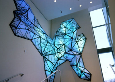
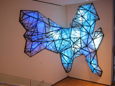
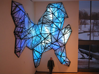
Stephen Hendee, The Eye, New Britain Museum, New Britain, CT, USA, 2005
points of comparison to the Nathaniel Stern work in the previous post:
-specifically evokes "wireframe" computer model (or "invokes" in the case of Stern, who uses the word in his title)
-reproduces wireframe outlines as an actual object
-"problematizes" computer drawing with surrealist invention, deformation
-use of materials such as tape and foamcor (Hendee) and rope (Stern) suggests folk-like or cargo-cult-like reification or fetishization of high technology
-inverts the idea of a computer as effortless and airy through the conspicuous employment of hand labor
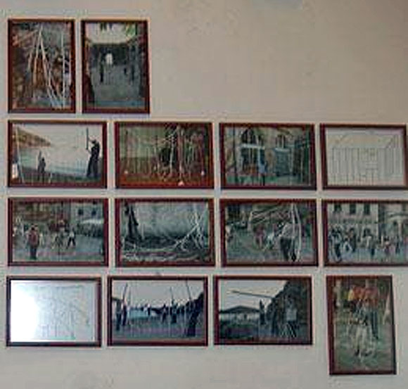
Apologies for the aggressive enlargement and resulting blurriness and artifacts in this photo by Joy Garnett. It's an installation of some photos of a performance work by Nathaniel Stern called The Wireframe Series: Sentimental Construction #1. Some clearer photos are here. This blog had its own wireframe aesthetics series a few years back so the topic is of interest. Paddy Johnson has little use for Stern's piece in her review of it today but it merits a stab at a long distance defense. The idea is to haul an Oldenburgized version of a 3-D computer drawing (what might be called "giant soft building outline") out into the streets of Dubrovnik and photograph people erecting it in the style of an Amish barn-raising. Thus hard becomes soft, virtual becomes actual, private becomes public. The sculpture is not of itself interesting--it is activated through its contact with people (like certain objects by Franz West or Helio Oiticica that were meant to be carried or worn) and by being photographed. In the photos, the softened or molten outlines of the rope building become a classic surrealistically "problematized" image, re-envisioning something hard and artificial as pliable and organic. They also represent a regression or devolution of the CAD-generated modernist box by being juxtaposed against the cobbled streets of an older Mediterranean city, and by their handling by real live human beings. Looks good from this side of the Atlantic and this side of the computer screen.
The post on the Rhizome 2007-2008 commissions as XYZ Art (reblogged here, thanks cpb) elicited the following response:
Don't see how XYZ relates solely to these types of new media projects. Painting, sculpture, photography, many mediums use a trial-error process similar to science. For instance one commonly develops a style or signature process (the algorithm), often paying big gradschool dollars for it, then alters X strokes or colors, looks at the Z surface, changes X some, then goes for the super awesome Z for the finish. - ssrAnd my reply:
That's funny, but we're not talking about a trial-error process. It's more like one application: a single transformation of something into something that "helps others."
The art world equivalent would be a conceptual art work, something like Meg Cranston's Who's Who by Size, University of California Sample, 1994, where different fabric-covered sculptural stacks (Z) represent the number of inches of shelf space (X) that a subject (Edgar Allen Poe, Elvis Presley, etc) has in a college library. The algorithm or (Y) is assigning a fabric to the subject (Anna Pavlova in ballet slipper satin, etc) and making the stacks. The work has a point, and one point only, to show intuitively that "size matters" in assessing one's historical reputation. (I got this example and some of the description from the book Deep Storage, ed. by Ingrid Schaffner and Matthias Winzen.)
Grad schools turning out cookie cutter painting is rather a different issue.
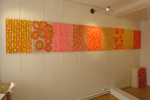
David Szafranski, installation view from a recent show in Montmartre, Paris, with Trish Nickell.
Click on image for larger view. Szafranki's allover, iterative ideas and feeling for pattern excel, and he also knows his way around the materiality of painting--how to use surface accidents proactively, etc. The work is confident but unpretentious, employing glue, spraypaint, and the flocking-like substance normally used to denote grass on architectural models (the dark parts of these).
Rhizome.org 2007-2008 Commissions* Considered as XYZ Art
"once a process (i like to say algorithm) Y is set up, you can mess about trying to figure out what X you can put in to get what Z, and then what's the best Z, and then what X will give it to you..." (Paul B. Davis on the XYZ tendency in computercentric art). That tendency crosses over from the digital/new media realm (Rhizome) to by-the-numbers conceptual art in the gallery world (VVork). Common features are a distinct grammar of subject-verb-object and a noble or socially useful goal. It is especially prevalent in tech art, which tends to mimic the scientific method's successful means of getting results. Once the "experiment" is performed, voila, Art.
1.) AddArt Member Selection
by Steve Lambert with Evan Harper
AddArt is a Firefox extension (Y) which replaces advertising images on web pages (X) with art images from a curated database (Z).
2.) Ebay-Generator
by Ubermorgen.com (Alessandro Ludovico and Paolo Cirio)
Ebay-Generator (Y) will generate songs (Z) based on the public data mined from Ebay sellers and buyers (X). Users' rating, sold objects, times and frequency of transactions and other data will be automatically transformed into a structured text, which a supercollider-application will use to generate music and lyrics.
3.) ShiftSpace - An OpenSource Layer Above Any Website
by Dan Phiffer and Mushon Zer-Aviv
While the Internet's design is widely understood to be open and distributed, control over how users interact online has given us largely centralized and closed systems. ShiftSpace is an Open Source platform (Y) that attempts to subvert this trend by providing a new public space on the web. By pressing the [Shift] + [Space] keys, a ShiftSpace user can invoke a new meta layer (Z) above any web page (X) to browse and create additional interpretations, contextualizations and interventions using various authoring tools.
4.) The Wrench
by Knifeandfork (Sue Huang and Brian House)
The Wrench will recast Primo Levi's The Monkey's Wrench (X) into a mobile phone text-message exchange between participants and an artificially-intelligent agent (Z). Taking place over the course of a week, the dialogue is not pre-determined; it employs Knifeandfork's nonlinear narrative software engine (Y). The system is intended to present a convincingly human agent within a realtime plot progression. The AI will have specific, dynamic narrative goals for each interaction, designed to intertwine the lives of the character and participant through the ubiquitous yet restrictive communication channel of text-messaging.
5.) zHarmony Member Selection
by conglomco.org (Tyler Jacobsen & Kim Schnaubert)
zHarmony is an addition (Y) to Rhizome that will combine the Compatibility Matching System of online relationship services like eHarmony with Rhizome's existing database of artists (X). zHarmony will produce a unique artist profiling system that can automatically match artists with like-minded collaborators (or groups of collaborators) based on multiple points of compatibility (Z).
Borderline XYZ projects:
6.) Eavesdropping
by Jack Stockholm
Eavesdropping is a networked audio system (Y) designed for guerilla performance (Z) to raise awareness of our ambient communication in public spaces (X). This project highlights the intentionality and exhibitionism of bringing our private actions into the public sphere.
7.) VF, Virta-Flaneurazine-SL, Proposal for Clinical Study Member Selection
by Will Pappenheimer and John Freeman
Virta-Flaneurazine-SL is a potent programmable "mood changing" drug (Y) for Second Life (SL). A member of the "Wanderment" family of psychotropic drugs; when ingested it automatically causes the bearer (X) to aimlessly roam the distant lands of SL for up to a full day. As the prograchemistry takes effect, users find themselves erratically teleporting to random locations, behaving strangely, seeing digephemera and moving in circuitous paths (Z). Many users report the experience allows them to see SL freed from its limitations as a fast growing grid of investment properties.
Non XYZ projects:
8.) Phrenology
by Melanie Crean with Chris Sugrue and Paul Geluso
Phrenology will investigate the perception of space, whether real, virtual or imagined, though writings created by incarcerated women in a workshop the artist will teach at Bedford Hills Correctional Facility. The piece will consist of a series of 360 degree photographic panoramas that interconnect through text included in the environments. Viewers will be able to move through the different environments to read the women's writing in a form of spatial poem, accompanied by an experimental sound track based on the text. [a possible (Y) might be the traditional interpretative function of the artist but that doesn't count as an "algorithm"--the use of prison texts is a typical (X)]
9.) Jellotime.com
by Rafael Rozendaal
JelloTime.com will be a website with a single flash animation. You will see a green plate with a red Jello dessert. When you touch the jelly with your mouse, it "wobbles." It will shake and make a strange sound, the more you pull it, the more it will shake. I really want to emulate the feeling of jelly, something between solid and liquid. A feeling that is very familiar in real life that might seem strange on a computer screen. [not XYZ. more like just (X)]
10.) Remote Instructions
by Lee Walton
Remote Instructions is a web-central project that will utilize both the communication capabilities of the web and spectatorship of its users. From a central hub, Lee Walton will collaborate with strangers globally via the web and orchestrate a series of video performances that will take place in real cities, neighborhoods, villages and towns around the world. A Remote Instructions website will be created to host video projects and promote networking among collaborators. [too complicated to be XYZ. sounds like a lot of work, and the only person with the big picture view will be the artist]
11.) Second Life Dumpster
by eteam
In Second Life each avatar has a trash folder. Items that get deleted end up in that folder by default. The trash folder has to get emptied as often as possible, otherwise the avatars performance might diminish. But, where do deleted things end up? What are those things? Second Life Dumpster will explore these questions by starting and maintaining a public dumpster in Second Life for the duration of one year. [this is not XYZ because it is open-ended and asks questions without knowing what the answers are. it is the second of two commissions involving Second Life, the "Active Worlds of the '00s"]
Update, 2011: The Rhizome link has been changed to http://rhizome.org/editorial/2007/jun/15/rhizome-2007-08-commissions-announcement/. Please note these are elsewhere called the 2008-2009 Commissions.
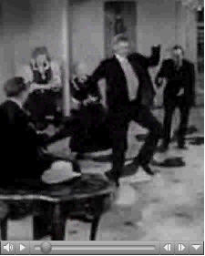
"Hoedown" [28 MB .mp4]
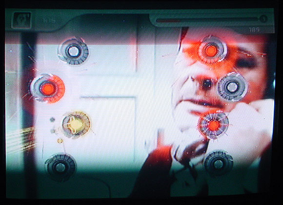
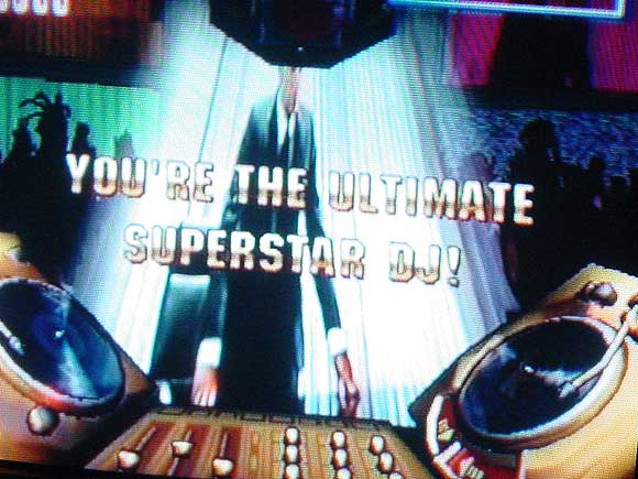
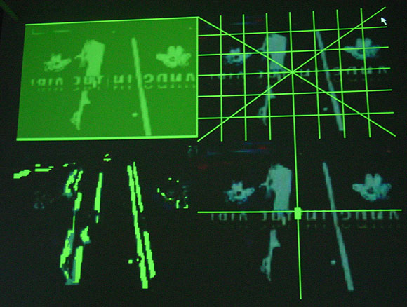
My photos of JODI's installation Composite Club at vertexList. The exhibit closes today--go if you can! Efrain Calderon Jr explains the art here; in a nutshell, it repurposes a game-related video camera (coupled with motion recognition software) called an "Eyetoy," designed to turn a child into a human joystick or data glove. As the kid moves head, arms, and torso, the camera reads the motion and a videogame makes countermoves, keeping the child physically active and away from the Doritos bag. Instead of kids, JODI has aimed the Eyetoy on films ranging from cyberpunk classics to Sophia Loren/Marcello Mastroianni romances. The movements of those films trigger video game actions, which are simultaneously layered over the films. Yes, this means you can watch Darth Vader play an anime ping pong player, but such one-to-one matchups happen only intermittently. (The bottom photo, a moving projection on the gallery wall, shows the various formal attributes the camera reads while the movie plays--screen position, light/dark values, etc. The top two are screenshots of "games" in progress.)
JODI (Dirk Paesmans and Joan Heemskerk) are the most painter-like artists working with computers and video today. Imagine Robert Rauschenberg using such tools at the time he did his "combines"--his work was called Neo-Dada and bridged Abstract Expressionism and Pop and that's essentially what JODI does now, with their densely layered amalgam of Japanese videogame weirdness and cult film cinematography, dissolving and mutating before your eyes. The conceit of the "the movie playing the game" isn't always comprehensible in these clips but for me this is a feature, not a bug. Art isn't about rubbing one ordered system up against another to get a third, but rather achieving an energized chaos that reveals something about the initial ordered systems, a la a Burroughs cut up. This revelatory randomness launches Composite Club beyond the pat realm of XYZ new media art. The artists use software like an auto-destructing Jean Tinguely painting machine and let chance processes do the work. They then discerningly edit motion captures of game play to make "best of" DVDs. The results are stunning--as good as anything you'll see in the galleries these days.
An earlier discussion, on why JODI isn't showing with one of the Manhattan cyber-galleries, is here.


Marisa Olson Collections 2: Knives




Marisa Olson Collections 3: Knots
Two fairly active threads on Cory Arcangel, Paul B. Davis, and matters BEIGE: the conversation starts here and seems to be continuing here. So far Paddy Johnson's questions from last fall--about Untitled Translation Exercise in particular--aren't being answered, although some good points have been made overall. Once again some fairly persistent commenter(s) are avoiding the issues and accusing me of personal belligerence and hostility. This rather proves my point that the discussion around BEIGE these days isn't about issues but about declaring for or against certain artists. We need to get over this.
Update: A couple of comments about UTE have been made since I posted.


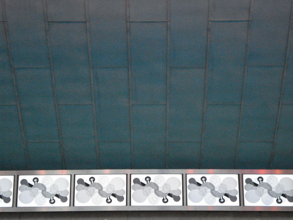
Belatedly posting my tourist photos from the National Museum of the American Indian on the Mall in DC. Forgot to bring the USB cable for my camera when posting from the road--this was almost like getting snapshots from the drugstore after the trip. That's beadwork in the top picture--I love the calmness and focus of the pattern. Below is the sci fi ceiling of the space-hogging but dramatic atrium. The outside is kind of spacy too but it's adobe-oid so it's not too anomalous. One supposes the atrium mimics an igloo but its lines are predominantly modernist. [Friends, family in DC please don't be mad if I didn't reach you--this was a brief stopover on the way down to Charlottesville for my college radio station reunion.]
Update: We're discussing the premises of the museum here.
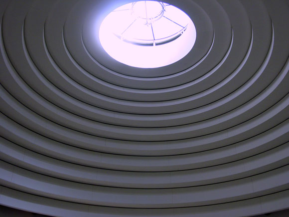
Reporting from Washington DC. Checked out the newest addition to the Smithsonian's museums on the Mall: the National Museum of the American Indian. Dramatic yellow adobe modernist building with the obligatory giant atrium, nice for the architect's portfolio but hogging much of what could have been exhibit space. Some wonderful collections of objects such as a show of women's apparel with intricate beadwork and concentric rings of elks' teeth (only two of such teeth per elk, so the more rings the mightier the woman's husband's hunting prowess, according to the video). Unfortunately most floors gave prominence to exhibition design over artwork, presenting crowded mazes of computer-generated text-and-photo spreads and interactive video terminals. Actual artifacts, darkly lit against darker backgrounds, tended to be swallowed up in these seas of typography. Other problems: vague and blandly worded themes ("our people," "our universes"), no clear timelines or sense of geography, avoidance of any kind of overall narrative history. Haven't researched the politics of how the museum came together and what kinds of compromises had to be made (either among tribal interests or to sidestep the U.S.'s sordid past of mass native American disenfranchisement), but the murkiness of the design seemed purposeful. Not to overlook the simple problem of "too many cooks" in the layout or the ever-ascendant tendency of designers to think they're artists and overwhelm the actual artwork on display.
Belatedly posted photos here.
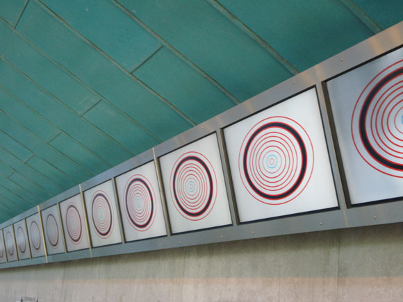
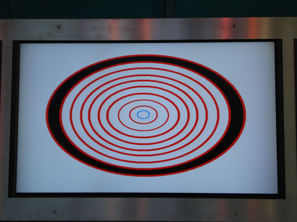
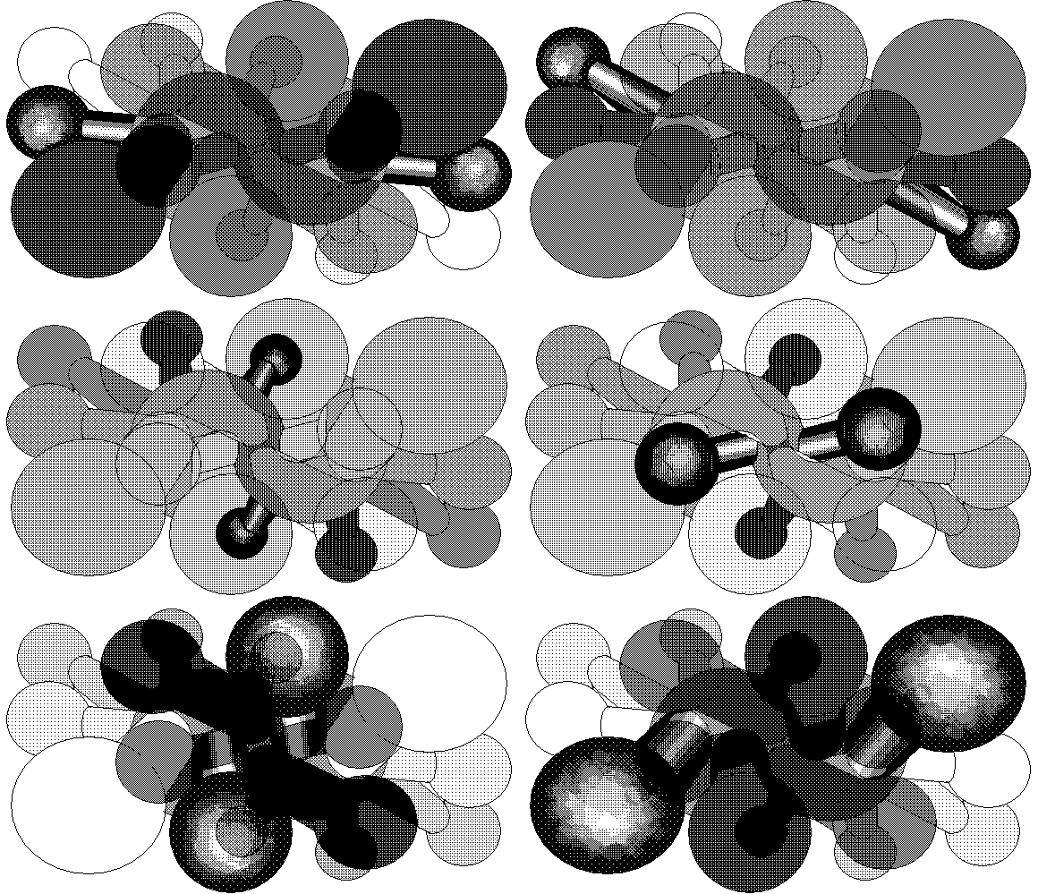
Documentation of my work in the "Fresh NY" show at Threshold Art Space, Perth, Scotland. Eleven of the 22 screens are shown. Photos by exhibition curator Anne Barlow. The OptiDisc GIF below is reduced; clicking on image shows the actual size (of the GIF--the screens are much larger).

return to main site
"Sacred Elephants" [mp3 removed]
This song has several variations: "Piano Three Hands" was the first. This is a Reaktor-ified version with fairly active percussion.
Update: Remixed and reposted in 2013.
In the comments to her blog Paddy and I have been discussing a post about a Jerry Saltz review of Walid Raad a while back.
Paddy thinks that might have been one-upmanship, but of who? The point of exposing Jerry's "money graf" was so you could read what he said about Raad without all the BS around it.
Raad has been questioned here before.


GIFs by Charles Westerman, based on ones I posted earlier (these are enlarged and may fuzz out on Macs, too bad)
Westerman's web page is here.
Update: The fuzziness that was once only a problem for hapless Mac users has now spread to Firefox 3. By default the command to enlarge an image now means "tastefully fuzz out for the rubes."
Update 2: After all browsers including IE 8 and Firefox 3 followed the inferior Apple "involuntary anti-aliasing" model I decided to remake these GIFs as they were originally seen on non-Apple computers.


From the vault: TV static GIF grid, 2003. I posted this earlier today with some links to other artists doing things with fake TV static GIFs but I decided to stop being so damn nice all the time. And let's face it, the idea's been around and has been pretty thoroughly done. I like the way this one interacts across the borders of the grid--it suggests some hidden magic eye message. I find it very hypnotic, myself.
This grid has vertical white stripes on Bloglines, and probably any site that reproduces it that uses CSS and ignores my html commands for it not to have spaces. CSS stands for "clients so stupid"; it's a design language that adds spaces around things because it assumes you don't know what you want for your own web page. If someone else's art you're reblogging specifies no spaces, you have to add a command telling it to ignore the spaces it is putting in. Genius! (The future of the web makes me shudder.)
The unifying themes of this blog and the artwork depicted here (mine and others') are stated on my main page. That statement was written in 2001 and has only been tweaked slightly since.
I believe any serious artist these days deals with information technology because that's what makes the world go round (at least till the fuel and food runs out and our society resembles New Orleans post-Katrina). The cult of "painting and sculpting" (and the collectors who support it to the tune of billions) is either about burying heads in the dirt or actively denying this prevalent reality through some imagined return to the medieval.
But tech art also has its cult--futuristic assumptions that drive advertising, design, and consumption. That's why the artwork is low-tech here and why mute molecular forms, synthetic cubism, and '80s-style computer graphics are constant themes--all are utopian forms where the bloom is off the flower (kind of like the DHARMA initiative).
Guthrie Lonergan has identified two types of artists using information tech--hackers and "defaults" artists. I'm in the latter camp, using programs pretty much as they were intended and in ways that "blend in" with the wider Web the way a Pop artist's work blended in with commercial culture. The underlying intent is still art, but doesn't announce itself in the language of academic conceptualism or overt geekspeak.
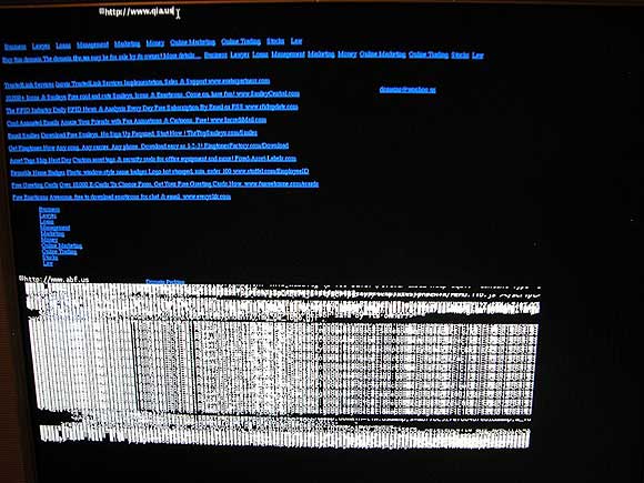
Student essays on JODI's current New York exhibition, from the vertexList blog. Efrain Calderon Jr.'s is especially thorough and helpful and does not read as if it were written at gunpoint. And here are some shots of the JODI opening, also from the vertexList blog. Looking forward to seeing the show this weekend.
A few months back a NY cyber art dealer made a comment here expressing regret that the dealer's space could not show JODI "because of the lack of support for this type of work." In fact, none of Manhattan's supposedly computer-specializing galleries stepped up, despite JODI's cred and long history as Dadaist hacker artists. Fortunately two galleries saw an opportunity: vertexList in Brooklyn and And/Or Gallery in Dallas, which are hosting simultaneous, feed-connected JODI shows. My understanding is that sales of unique and editioned works have been made at both venues, so, so much for that "lack of support."
Update: In the comments, VONA says, "JODI has shown at Pace and a big solo show at Eyebeam in the last few years. Its somewhat of a distortion to imply, as I feel this post does, that they are locked outside a commercial art realm." My reply:
Eyebeam is a non-profit space--not sure how that show was in the commercial realm. As for the Pace exhibit--that's one group show, not much of a commitment. As discussed here, Pace seems to have flubbed that installation, projecting the wrong DVDs on a cross-shaped wooden construction built specifically for another video work.Update 2: Turns out the issue with VONA wasn't that I was distorting the record but that new media artists need to "forget" showing in Chelsea (still the key to wider art world recognition, last I heard--not a guarantee but the place that collectors, curators and writers tend to go to to see art) and I wasn't sufficiently respectful of this aspiration of VONA's.
Anyway, the point of this post is JODI's doing fine in the commercial realm, with galleries outside of Manhattan.


GIF grid by eyekhan
Based on my MSPaintbrush "Waves" drawing.
Thanks to ArtCal for the nice advance listing on the "Blog" opening tonight. I will be there and plan to do some "live posting." As explained in this earlier thread on the methodology of the piece:
I see this performance as a lot like the cubicle group show I was in, where I sat in the cube and worked at the computer in my business casual attire: on the opening night, but also during "office hours"--in other words, every day the space was open I came in and worked. The unrented office where that show was held had no net connection and I was channeling "my working conditions circa '95" so I posted about it during non office hours. For BLOG I will also be working during gallery hours, but from home--the posting will be the work, not about the work. (Or both, if I'm feeling "meta.")As for the "how do you sell this?" question:
[...]
I'm going to be performing with changing content, graphics, etc. Not really any different from what I normally do but with an awareness of a specific, physical audience, what will work on the gallery's screen, how to explain to a reader not physically in the gallery what I'm doing and why.
Also I will post any documentation the gallery sends me of how the blog screen appeared on a given day, whether or not anyone looked at it, etc. The gallery will also save each day's posts as documentation.
[T]his'll be structured as a "classic" economic exchange. An agreed amount of funds for an editioned disc with the data for the show (html files for each day's posts plus associated files--images, etc.) and a certificate authenticating the work and the size of the edition.Also, besides the edition, the "terminal" (pedestal/keyboard stand, gear) will be offered as a stand alone work, with the month's posts and associated files burned on a dedicated hard drive.
As for the press release's statement, "For the first time a blog is shown in a gallery space," commenters in the thread mentioned some possible precedents but no serious documentation was put forward of a previous, month long performance work called "Blog." As stated in the thread, I'm open to having a "beef" with anyone on this issue. On some level mine is a protest piece: that blogging has made no serious inroads into the rigid gallery/museum/art mag system of evaluating art and must be physically present in a gallery to have "cred." But it is also the second generation of "net art"--a much more casual and un-self conscious use of available technology as a content delivery system. It may seem paradoxical to say a blog bearing the artist's name is un-self conscious but the scope of this blog has always been bigger than talking about my cat (if I had one). Commenters keep the place lively and interesting, for me and I think others.
Samurai Quotes from Ghost Dog.
From the Vault: Ghost Dog review(s) and license plate screen shots. (Some serious link rot rectified!)
Completely off topic, but essential: the last 10 or so seconds of every episode of the first season of Star Trek: The Next Generation, assembled by Paul Slocum (Caution: Wesley Crusher in oversized natural fabric (?) top)
An earlier post incorrectly stated that Minus Space ("Reductive Art") had added a blog to its website; in fact it has a page of texts in reverse chronological order that it's calling a "log". The page has no permalinks, no comments, no RSS feed, no content management system that I can see (a la Word Press or Blogger). It appears to just be a list.
Yet Minus Space was included by ArtKrush in a recent article on "Art Blogs" and appears on the ArtKrush link list as an "art blog." Maybe ArtKrush can correct that Minus Space is not a "blog" but a "site" a la the dot com era.
Update: The more closely one looks at Minus Space, the more unclear what it is. Not only is it not a "blog," it appears to be a gallery that is repping "reductive artists." Or was, because now the site says "MINUS SPACE IS NOT ACCEPTING SUBMISSIONS AT THIS TIME." Submissions for what? They appear to have a physical "project space" that is intermittently open, which may or may not be the same as the online project space. In the past they sent out email notices of online exhibitions but those are not maintained in any kind of archive. They have a page of "Minus Space Artists" consisting mostly of links to the artists' personal websites (some don't link to anything). If it's a real space gallery it's not much of one and if it's a virtual gallery it's not much of one either. And it's not a blog. So, what is Minus Space?
Update 2: Also this bit of dubious puffery from the site. The end of the ArtKrush article reads: "Check out the complete list of our favorite art, architecture, design, photography, and new media blogs" with a link to over a 100 blogs. The Minus Space press page presents this citation as a quote: "'Favorite Art Blog' --artkrush.com." Bit of a stretch, that.
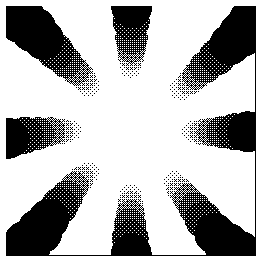
Thanks to Rhizome for reblogging* this recent sketch. I like what happened when the image resized--the center got white hot and edges became black holes. It's more of a graphic this way, but a mysterious one, I think.
Someone asked if the recent uptick here in drawings and animations was because I was showing the blog in the gallery. That hasn't started yet--end of next week. This blog is a place for my artwork and if I had more discipline I would just draw and post sound files. I post text because (a) some images don't look good adjacent to each other and it helps to have a buffer of some kind, but the buffer can't just be filler so I have to write something cogent, and (b) I'm verbose and have to talk about things (even though it means sometimes people get "insulted.") The writing helps me think through what I'm doing and ties it into a larger context of stuff I like and don't like. [/pure egotism]
Update, 2011: The Rhizome link has been changed to http://rhizome.org/editorial/2007/may/9/sketch-monochrome-gradient/.
Irritants of the Day.
1. Jonathan Lethem's descriptions of art in Fortress of Solitude. Don't know if the Abraham Ebdus character is based on Lethem's father, or if Lethem's father is an artist, but the book feels like an elaborate revenge by a son who essentially hates art against a father wholly dedicated to it. Lethem knows just enough about his subjects to be dangerous. He can imitate the style of an Artforum review, describe an avant garde film screening, or string together a narrative of what is happening in an abstract painting or film well enough to make these things sound completely pointless and ridiculous. The book is filled with fake reviews, of art, music, etc--no one can respond to these because they are pure fiction, straw men for the writer's contempt. Lethem has a vicious wit--one wishes it could be turned on people and things that deserve it (Republican politicians, Judith Miller, etc)
2. Minus Space. If Lethem's imagined world of form-only art existed it might be found on this space. A website devoted to "reductive art"? Surely "reduction" is just one technique or strategy an artist might use to get at some significant content--not an end in itself. One might as well create a blog called Blue and only blog blue things. Yet in fact a longstanding cult persists around this "reduction," which has little to do with minimal art practices as described by Robert Smithson or Sol LeWitt (or even Peter Halley) but instead provides a safe haven for late Greenberg disciples proudly entrenched in painting's own greatest area of competence--itself--while the world changes all around them. Not everything on Minus Space is that simplistic, they've added a fair amount of "painting as architectural critique" since the site's inception, but one yearns to pluck the better things one sees there out of the limited context. Many pieces are succulent but the photos are too small; half the time you're not sure what you're looking at and the pleasures you could get from staring at monochrome and shaped canvases are stanched.
Afterthought: Minus Space has changed in the last year or so. It added a blog [wrong--see here] but no longer hosts a deep archive of its past online exhibits. Instead it features links to artists' websites (some of which are Flash--yech.) A link I made to a show they put up online last year (Daniel Gottin) is now dead. Also, the site says it is no longer taking submissions. Perhaps "reductive art" as an organizing principle is petering out. Or Petering to the extent Halley is a mentor for any of these artists.
Update: This quote from Salon's Laura Miller, writing about Don DeLillo, also applies to Lethem: "The weaknesses of Falling Man are DeLillo's long-standing ones. Most of them spring from the fact that he is an essayist at heart, who presumably chose the novel because it is the most exalted and revered literary form of our time -- and DeLillo is not the sort of writer willing to risk being insufficiently exalted and revered." It's so stupid. But it does work. Lethem's Fortress was lauded as the Great American Novel because we need such novels and young writers to write them. Whether or not the form is outmoded or the best vehicle there is a myth machine, an industry, behind it. The art world equivalent is painting, which you have to do, no matter how bad or irrelevant, to be a playa.
ArtKrush has published a second installment of its "art online" series. (The first was here.) This blog is on the link list as a "new media blog." I'm down with that as long as new media means "the ism that follows and subsumes conceptualism in the history of art" but I do consider this an art blog. Art made with a PC, blog-in-a-gallery, and computercentric reviews notwithstanding, during the last six months the following have been discussed, depicted, or parodied on this page: Charles Ray, Judy Pfaff, Cindy Sherman, Ludwig Schwarz, Roxy Paine, Ryan McGinness, Sol LeWitt, Richard Woods, Kelley Walker, Klaus Mossetig, Allison Smith, David Moreno, Vincent Van Gogh, Triple Candie's "Limelight" exhibit, Miklos Suba, Chris Burden, Fiona Banner, Mark Dagley, Don Voisine, Marc Handelman, The Art Guys, Gary Hill, Doug Aitken, Elaine Sturtevant, Salvador Dali, Claes Oldenburg & Coosje Van Bruggen, Tony Conrad, Ralston Crawford, Ken Lum, Ivan Albright, John Pomara, Jackson Pollock, Matthew Geller.
Thanks much to imagineering for the commentary on the post here comparing Cindy Sherman film stills with webcammer T-shirt ninjas. She (Kristin Posehn) says she realized she "actually spent more time looking at the ninjas." Awesome!
There is a free-form use of text in the ninja pix that is almost like folk art. Even the most flippant text in contemporary art feels heavy in comparison, loaded with significance.Some of my own ruminations on the comparison are here and here. I like imagineering's take on the text part of the campics, which I didn't talk about at all. I may have something to add when I get a minute.
The ninjas are borrowing from print and television marketing models, which almost always have text together with imagery. The ninjas naturally include their own strap lines and slogans. Their pictures are participatory advertisements, not film stills. Maybe this subtly suggests a blurring: to communicate is now to publicize.


I posted these photos on May 2, 2003, a day after the "flight stunt," with the caption: "The photo above and left is from Agence France-Presse. As documented here, an AP story changed the wording of the banner to make the protestors sound more violent, or desperate, from 'Sooner or later US killers we'll kick you out' to 'Sooner or later US killers we'll kill you.' Hardly any US media ran the above photo, only AP's altered description." The photo on the left was taken in Fallujah, which the US subsequently flattened. Bush had his little jollies, but it does appear that sooner or later we're going to get kicked out. A chilling video of the aircraft carrier legions deafeningly but mechanically applauding Bush's propagandistic "Mission Accomplished" speech, with Bush's speech edited out, can be seen on YouTube (thx mark).
Four years ago, it seemed like it was only bloggers who thought the US war was wrong. The news media were 100% behind it, so millions of TV-dazzled people across the US were behind it, too. I had an argument with one of my cousins in Dallas when I told him I'd marched against the war. He said, "I've just gotta believe that the government has access to information we don't have and that they made the right decision." Steam was coming out from my collar but what could I say to convince him? "Well, I read a lot of blogs and you are one naive MoFo." Months after the Kay Report concluded that Iraq had no WMDs I was talking to a woman in NY who insisted Saddam was crafty and we just hadn't found where he had buried the weapons yet. It's taken Americans four years to conclude maybe the war wasn't a good idea but still Congress is afraid to end it and Bush and Cheney still haven't been impeached for lying us into it. It is Vietnam all over again.
VVork and XYZ Art
What follows are some comments from a thread about the blog VVork. The commenters are sort of picking on that blog, including me, but there are defenses of it as well. To the extent problems are being identified with a certain type of conceptual art and a certain type of digital art related to it (particularly as represented on the Internet), VVork is a convenient focal point. I've made all the commenters anonymous since this was a casual discussion and people might not have intended for these remarks to be elevated to "formal" status--the identities are all in the thread, I just want to get at the essence of the discussion. Slightly edited--if any commenter wants to amend what's said here let me know.
* VVork makes 'clever' very unappealing, like some disease that art catches when it gets on the Internet... It's usually: "hey, i did X to Y and now it's Z...get it??!" [T]he perfect example ... is that piece where its a choir singing the NASDAQ stock exchange graph as music... Who cares? Is there anything interesting going on beyond the punchline? (..well, perhaps in the larger context of the artist's other work [which we aren't made aware of]?) VVork's format/context is ideal for one punchline after the other.. It's like Boing Boing for conceptual art. Boing Boing is to real life what VVork is to art.. But why reduce others' art into little nuggets that can be easily thrown around and reblogged and put into other random contexts on the net just like any other Internet garbage (i.e. YouTube vids of cats and sloths)??
* VVork is popular because they show lots and lots of pictures of art from around the world without a bunch of commentary. I love that! It's kind of weird how rare it is. But the structure implies a promise it can't fulfill. Unlike, say, magazine editors, bloggers have neither the resources nor the mandate to represent outside of their own cultural constructs. I think the feeling of sickness comes from the fact that we feel like we are seeing some kind of general trend, but really its just some dudes posting pictures. There are masses and masses of other art options, not to VVork's taste, crowding in the wings. If they wrote on the work, the subjective filter would become explicit, but the unique aspect of the site would be gone. If they took submissions it might get closer to an evolutionary model, but without an editorial mandate it would make no significant difference. Maybe a post-your-own art wiki would do it.
* VVork is provincial in the sense that it conveys the impression, through its sheer relentlessness, that anybody in the world can be a player as long as you're making [the type of work we're discussing]. Getting seen on VVork [might be] an alternative to "moving to New York" (which people still do, in large numbers, sorry) but everything starts looking the same because of the lack of criticality within the vehicle itself. It's a blog, as you say, not the Global Museum of Great Art. Just because they are popular does not mean they are an institution that has a responsibility to anyone. As bloggers we are free to put in our two cents about their program and they are free to listen or not as they see fit.
* Seems to be two thingies going on here, one is vvork's presentation ... the other is the.. "X - Y - Z" style of archetype vvork art. the XYZ thing is, to me, natural to computers...the data comes in, who cares from where/as what, you can do something to it, and then the data goes out - also who cares to where/as what. so you wanna take stock market info [x] and turn it [y] into music [z], or you wanna use your atari joystick [x] to change the color and placement of text [y] on a tv screen [z] or you wanna take your whatever "physical computing" sensor interface [x] and use it to turn [y] lights on an off on a building [z]...it's like every single piece ends up being just an iteration of the same translation exercise. i suppose im describing something as much NYU ITP/MIT style art as vvork art, but regardless it's one of the reasons why i don't pay much attention to any of it...and i dont make that stuff [or any interactive art] cos i dont wanna to get stuck using the rest of my life in an attempt to make the "best" XYZ.
"Labyrinth Remixed" [2.8 MB .mp3]
Shorter, digitally rearranged version of ex-Happy the Man keyboardist Kit Watkins' instrumental prog anthem "Labyrinth" (1981). Took what I consider the "essential riff" (four variations of the same tune, plus a bridge) and jettisoned all the classical dynamics, theatrics, and buildups as well as expressive soloing. Reordered the riffs and overlayed them to make new counterpoint, thus turning a progressive rock song into a techno-prog song--kind of sped-up Philip Glass, what I always wanted to hear when I played this. Some excellent "real time" keyboard and drumming being massaged here--but I am interested in the song's "money shot"--structures of the sublime in their most compact form.
A few posts back a "wandering POV of a wandering POV" was discussed--a shaky, panning YouTube video documenting Linda Post's shaky, panning video perambulation through a cornfield. Here's another variation (thx AFC): John Michael Boling's YouTube of a video panning along a block of strip malls. The standard YouTube screen framing the action scrolls slowly from right to left using the "marquee" browser command, making its position on your screen in constant "slow and go" tension with the position of the camera's viewfinder. The video's continuous "tracking shot" is roughly panoramic, whereas the YT starts over at your screen's right as soon as it reaches the left side, creating what feels at times like an impossible folded space.
In both scenarios (James Kalm's Linda Post video isn't a piece per se but an inevitable meta extension of the Post), recursiveness is the watchword, in form (a picture within a picture) and in content: Post's video references cornfield tracking shots (from North by Northwest to Children of the Corn) and Boling's obliquely channels Ed Ruscha's Every Building on the Sunset Strip.
If we had an Adorno he might say such dual recursiveness is a distinguishing feature of 21st Century art, or at the very least Web 2.0 art.

Related / 2 / 3
Another for the XYZ Art list:
"Paul Pfeiffer's Live from Neverland video installation is divided into two separate videos: one soundlessly replaying footage of a televised statement in which Michael Jackson addressed the child-molestation allegations, and a second one featuring a chorus of 80 voices reciting Jacksons monologue in the manner of a Greek chorus. The two videos are brought into further correspondence by means of a subtle re-syncing of Jacksons facial gestures to match the spoken delivery of the chorus, down to every pause, inflection and nuance." (opening at The Project in NY on May 3)
File that one under "choir":
Choir sings NASDAQ average
Choir recites Jackson molestation monologue (or maybe that's ABC art--Jackson 5 joke)
etc
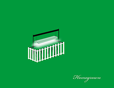
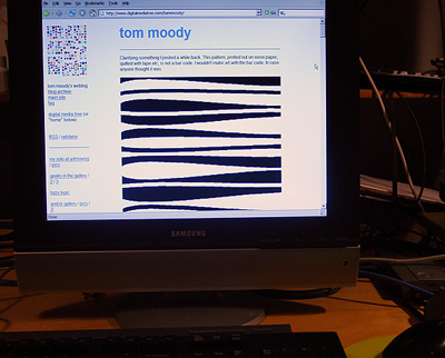
Next month artMovingProjects gallery in Brooklyn exhibits my blog. I'm in the project space; Zoe Sheehan Saldana appears in the main gallery with "an edition of 96 tobacco seedlings (Nicotiana tabacum Burley) under indoor lights," per the press release. More:
BLOGOpening May 19. More as the date approaches.
For the first time a blog is shown in a gallery space. Tom Moody has been posting art, music, animation, art criticism, political commentary, and found internet art on his blog at http://www.digitalmediatree.com/tommoody/ since Feb 2001. For this exhibition artMovingProjects will present his blog as a performance work. During gallery hours a computer terminal in the project space will be dedicated to whatever Moody posts. A mouse and keyboard will also be supplied if viewers want to leave a comment. Anything can happen, and anything can be said. This is an experiment in total freedom.
Been awaiting IMDb critic tedg's review of The Black Dahlia, since he "gets" De Palma and it doesn't disappoint. Many commentaries (including this one) talked about the "discovery of the body" scene and the casting of Mia Kirshner but tedg explains them best. First the body:
About 22 minutes into this there is a wonderful crane shot, probably done without artificial assistance, beginning five minutes which is the heart of the overly complex story. It sets up two apparently unrelated threads in the story that interweave from this point. It is of the front of a building where later there will be a shooting, moves up and over the building to look at a vacant lot behind where we see a woman making a gruesome discovery. She runs to the street alongside the building where we see the car of our two cops coming to park in front and engage in a shooting. We move in front of the car to a bicyclist, who plays no role in the story. He brings us to a couple walking down the sidewalk approaching the front of the building where they will encounter our cops. We come down to street height and listen in on their conversation.And Kirshner:
Its masterful. Even if you think everything that follows is a mess, its a glorious mess made glorious by our setting of the knitting needles.
But there's another joy here too. The story no surprise features a film within the film. It's the whole story, there, with elements of that internal film overlapping the main story in three or four significant ways. The star of this inner film, who also is our bisected victim is a character played by Mia Kirshner. She's so much more alive and real than anyone else in the main story, I can only assume it was deliberate and a truly thrilling risk. If you follow film, you'll know her very similar and hugely complex role in "Exotica," a landmark film.
"Art for All" [5.6 MB .mp4]
One afterthought on Cindy Sherman vs Webcammers: the comparison made the most sense in the earlier days of cams, when bandwidth and the "state of the art" limited the cammer to a series of still photos. Most of the journalistic focus in say, the late '90s, was on privacy issues and the pics were treated as straightforward documentary "slices of life" rather than what they also were--a string of self-composed photos placing form and content demands on the cammer. A series of fictions that may or may not have related to someone's actual life, and in the case of "sex worker" camming were home-run small businesses. Thus you had playacting, dressing up, and adventurous camera angles just to keep viewers interested, and the record of these performances was a series of individual photos that could be collected, separated from the main stream, passed around the net, etc. The difference between this and Sherman's untitled film stills was just a matter of highbrow vs lowbrow intent, a vastly different collector apparatus, and no critics willing to furrow their brows over the cammers. Some might say that's all the difference in the world but I think the gap is pretty small. In the age of MySpace intro videos Sherman's relevance fades because of the time element. Now instead of postModern tableaux vivants we have basement cinema that refers to other cinema.
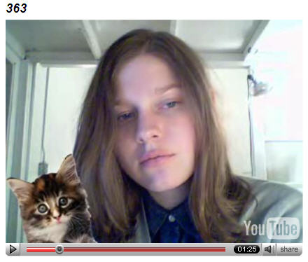
Petra Cortright's vvebkm (YouTube) - An Exchange from Paddy Johnson's Blog Comments - Cindy Sherman Reference Partially Explained
Paddy Johnson (Mar. 27, 2007):
Four days ago Tom Moody posted Petra Cortrights webcam video and since then Ive been struggling to articulate why the aesthetics of this piece of go beyond taking a few clip images from the web and slapping them on a video. Unlike a David Shrigley piece, which uses humor so obvious its value requires no explanation, a cam featuring a still figure, dancing pizzas, and falling snow to an electronic beat may require a little more discussion.
Probably the most amusing aspect of this work lies in the fact that its basically a documentation of a live performance, in which you watch someone concentrate on their computer screen for the duration of a song. I realize this comment tends to incite a host of responses most of which begin something to the effect of So why am I looking at this?, and while theres no response to this if you dont find the redundancies of web surfing that so many net artists like to highlight funny, theres also a level of virtuosity in the live arrangement of gifs etc, that needs to be called to attention. Cortrights webcam piece succeeds because her dancing pizzas are unexpected, and the snow and lightening seem almost delicately placed. I know it sounds ridiculous, but you have to spend a lot of time with these seemingly crappy images not only to gain a sensibility for how to use them, but how to read them. Its not that Cortright found the most exquisite buzzing bee and flower on the net, its that she thought to use it, and then did it so well. Its a skill very few people have.
27 Mar 2007 at 9:16 pm1--tom:
These icons may all be defaults that come with the webcam program or host. I dont know for sure. Cortright says in the comments i need to put more curated imagery into this but the defaults were still pretty good!! [Update - Make magazine editor Phillip Torrone plays with the same webcam in this YouTube in what seems more like an extended product promotion for logitech--thx paul)]
So the artistry is mostly in the timing, I think, plus the live nature of the performance, the choice of music (the ceephax is pleasantly spacy), and playing on our expectations of what a cam person is supposed to do. Instead of mugging, pouting, and otherwise playing directly to an imagined audience shes concentrating on the behind-the-scenes work of manipulating the images, which are not particularly sexy. The audience is still staring at her (and one commenter is rather hitting on her with that smile line) but shes only giving you her image and what she does. This relates to Marisa Olsons videos of herself listening to music, too, I think.
My great unwritten essay (or not so great) is on how the camgirl and camboy phenomenon relates to Cindy Sherman and her self-empowering use of her own image to act out media tropes (shes a millionaire and they...have lots of internet friends). Pieces like Cortrights are even more punk than thatas if Sherman were taking photos of herself loading and unloading the camera and setting up the lights instead of being the actress.
27 Mar 2007 at 10:00 pm 2--paddy:
Its true - the timing is done extremely well.
Im not sure Im understanding your comment on Cindy Sherman correctly. Are you saying that work like Cortrights is more punk than Shermans because theres a greater DIY element to it? If so, I suppose theres some element of truth to that, but I suspect Sherman was just as broke when she was in her twenties and making that work, and probably didnt have too much help past the necessities. Does the DIY aspect of it really add that much to this particular piece?
28 Mar 2007 at 12:13 am3--tom:
Punk in the sense of a guitarist keeping her back to the audience while playing rather than doing all the emotive face moves that say Im happy, Im in pain, look at me, love me. Here Cortright is looking down and working.
The early, classic Sherman work was DIY and done on the cheap. Its not her fault she got canonized so early and was forced ever thereafter to work with big budgets.
My point in bringing her up (I think) was how web cammers kind of do what she did early on instinctively. Its personal or self-centric photography, but still a series of media tropes (the working girl, the ingenue, Marilyn etc) Whereas Cortright isnt going thereshes a nerd pushing buttons to summon kitties and pizza slices and you just happen to be watching her.
28 Mar 2007 at 12:43 am4--paddy:
I really like that punk reference.
Interestingly, one of the things I was going to bring up in the post that got lost for whatever reason, was that the piece reminded me of how in the late 90s and early 2000 people would go see DJs spin, and various musicians working with electronics perform, and complain that it was totally dull watching people turn a few nobs for hours on end. Like any good net artist, Cortright knows that about a minute and a half of nob turning is fascinating - do much more than that and youve lost your audience. It makes me feel like the piece builds something positive into a tradition of performance that often suffered from some significant problems just a short time ago.
