View current page
4 matchs for wireframe+aesthetics:

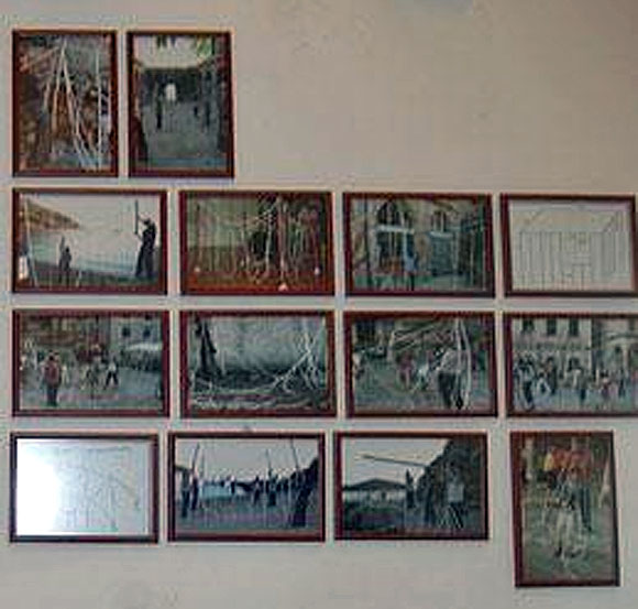
Apologies for the aggressive enlargement and resulting blurriness and artifacts in this photo by Joy Garnett. It's an installation of some photos of a performance work by Nathaniel Stern called The Wireframe Series: Sentimental Construction #1. Some clearer photos are here. This blog had its own wireframe aesthetics series a few years back so the topic is of interest. Paddy Johnson has little use for Stern's piece in her review of it today but it merits a stab at a long distance defense. The idea is to haul an Oldenburgized version of a 3-D computer drawing (what might be called "giant soft building outline") out into the streets of Dubrovnik and photograph people erecting it in the style of an Amish barn-raising. Thus hard becomes soft, virtual becomes actual, private becomes public. The sculpture is not of itself interesting--it is activated through its contact with people (like certain objects by Franz West or Helio Oiticica that were meant to be carried or worn) and by being photographed. In the photos, the softened or molten outlines of the rope building become a classic surrealistically "problematized" image, re-envisioning something hard and artificial as pliable and organic. They also represent a regression or devolution of the CAD-generated modernist box by being juxtaposed against the cobbled streets of an older Mediterranean city, and by their handling by real live human beings. Looks good from this side of the Atlantic and this side of the computer screen.
Left: my lo-res, "remixed" clip of Rebecca Allen's Kraftwerk video Musique Non Stop, a pop-cultural landmark from 1986. The video was actually completed in 1983-4; Allen visited Kling Klang studios and hung out with Ralf, Florian, et al in Dusseldorf. They shipped their dummy heads to New York and she did the computer modeling at the Institute of Technology there. No slouch, Allen is another pioneer figure sadly overlooked in the Whitney's lousy "BitStreams" exhibition. Check out her website, which now has streaming video of some of her other projects, including the video wall for the Palladium in 1985, Twyla Tharp's "Catherine Wheel" projections, and more recent work such as "Bush Soul #3" (no, not that Bush), where clever science fictional extrapolation manages to overcome the overall new age-y aura.
This is the third in an informal series of posts called "Wireframe Aesthetics." Part 1 (John Carpenter, Tron, Stephen Hendee) is here and and Part 2 (all Tron, all the time) is here.
Wireframe Aesthetics (Part 2). Above is a screen grab from the 20th Anniversary Tron DVD, specifically a "making of"
feature. This was probably an early test for the MCP (Master Control Program): it looks better exploded like that than it did in the finished movie, where it seemed pretty stiff. I learned a lot from the DVD, specifically how Moebius's production sketches dramatically spiced up the film's look, and how Sid Mead, the futurist designer who also consulted on Blade Runner, contributed cogent machine design (e.g., the light cycles and tanks). The computer graphics were divided among four different companies. In order to communicate the movements the filmmakers wanted (say, in the sequence where a Recognizer chases a tank), the animators hand-wrote numerical coordinates for the horizontal, vertical, and depth axes of each object, as well as variable factors such as pitch and yaw, on a sheet of paper, and the graphics shop keypunched the numbers in: 600 numbers translated into four seconds of film. The movie had approximately 20 minutes of computer-generated footage (including the "descent into the computer," the yes/no-speaking "bit," and other vignettes), all of which had to be painstakingly integrated with the backlit kodalith of the rotoscoped sequences. The "making of" featurette is tres corporate; the Disney execs interviewed basically fib and say the movie succeeded from the get-go, when in actuality the game outsold the film in '82. Absent is any mention of Wendy Carlos' lush electronic score, snippets of which are playing constantly in the background.
Wireframe Aesthetics (Part 1)
Escape from New York, 1981. John Carpenter couldn't afford wireframe computer simulation for his low budget film, so a model of New York City was constructed for the sole purpose of being photographed and rendered as a negative image. Escape from New York. Image as it appears in cockpit of Snake Plissken's glider. Still from Tron, 1982 (flipped vertically). Steven Lisberger's entirely computer-generated landscape set the standard for wireframe aesthetics. Critics often refer to this film with tongues in cheeks, but they do refer to it. Stephen Hendee, Inertial Field, 1998. Sculptor Hendee makes Tron-like walk-in environments with foamcore, electrician's tape, and backlighting, thus bringing the idea full circle, to a Carpenter-esque simulation of a simulation.
