View current page
7 matchs for xyz:
The following article about group blogs, blogging-as-performance, and an emerging digital aesthetic or anti-aesthetic was published in the Irish Times for July 2, 2007:
Beyond Art and Design
Haydn ShaughnessyI wonder how many artists agree with this statement. "I reached a point as a critic and as an artist when it seemed like to be a painter everyone had a studio trick that they kept to themselves to differentiate their work." So says Tom Moody, one of the Web's more influential art bloggers and practitioners.
It seems to me honest and accurate and applies not just to painting. Everywhere we turn we're being asked to differentiate ourselves, not just as artists but through what we wear and how we do our jobs. Moody is speaking though for a generation who feel liberated by new technology, for a group that has gone beyond the frustration of trying to find minor points of uniqueness. Up until a week ago his was the first blog to be exhibited as an artwork at artmovingprojects in Brooklyn, New York. Artmoving projects made Moody's blog a live installation. Even if you haven't embraced blogs yet you'd be tempted to say: Wow, with or without exclamation mark! The blog as installation is yet another example of how virtual, simulated and real environments are blurring.
On his blog a few days ago Moody provided a shortlist of group art blogs (see below), the online equivalent of the cooperative studio. These groups collectively raise an important question about the aesthetics of art born digital.
"As a painter I felt there was no ground left to be broken," says Moody. "And we're faced with these other digital tools which are new and have a lot of potential but don't, we don't, have any kind of aesthetic."
A loose aesthetic for digital art is emerging though? What norms, practice, and social and visual aspirations might inform digital art? I had Tom on the phone recently chewing over that issue.
A growing number of artists are using blogs to display their work (we recently featured Chris Ashley here on Convergence Culture, an artist who blogs an image a day). The Internet allows artists to connect quickly with each other and one result of that is they create cooperative blogs, just like some choose to open cooperative galleries. But as Tom Moody points out the chemistry of cooperation can be better. There's little financial overhead and there's no sense that cooperation is a necessary evil. But here's the interesting part.
In posting to a group blog, says Moody, you make a judgment about the work you would not like to show on your own blog. [1]
Through that act you are implicitly helping to form an aesthetic. It's not that you post to the group blog work you are not identified with at all. But you are saying something about your choices.
The underlying statement is that the artist has different artistic identities. Somewhere in the judgment about where your work belongs lie unarticulated statements about the nature and purpose of digital art. This emergent theory of digital aesthetics absolutely suits the medium. The judgments are not articulated but they are out on show.
The lack of an aesthetic is not the only problem facing digital artists. Galleries are reluctant to exhibit their work because as yet there are few collectors and no secondary market. And there is a suspicion. A digital art work when reproduced on paper can be reproduced indefinitely. Old fashioned prints created by master printers were at least authenticated by a third party. The unease that galleries and collectors feel are important practicalities.
Just like conceptual art thirty years ago digital art needs bold collectors who will buy knowing that a selection of these works will grow exponentially in value. But to be attracted that far, you sense a collector needs to know there are underlying disciplines at work, purpose and coherence that is at least comparable with their previous experience, a sense that a generation of artists, rather than the odd maverick, is pushing the medium, and confidence that the practitioners are not simply going to fade away..
To get that far the artists themselves need to start articulating the kind of purpose that resonates with a sense of destiny. Many digital artists, or performance artists who use digital media to get works into print, recoil from the idea that they can game themselves up into a "movement". Nonetheless when I put it to Tom he acknowledged: "More and more. I think the artists I'm working with and collaborating with are moving in the same direction."
Another problem for the digital artist is that many of the tools of the trade were created for designers Microsoft Paint [2] and Photoshop are two prime examples. Websites that showcase art made from these tools, particularly the influential Rhizome, an atheist's Bible of new media art, are to Moody's way of thinking, pushing a design aesthetic rather than an artistic one. [3] I'm not wholly sure that I agree with him, or that digital art should separate itself from design, but the point proven is that articulating the digital aesthetic is still a work in progress.
Group art blogs:
http://www.supercentral.org/wordpress/
http://doublehappiness.ilikenicethings.com/ [4]
References courtesy Tom Moody: http://www.digitalmediatree.com/tommoody/
Artmovingprojects: http://www.artmovingprojects.com/
Rhizome: http://www.rhizome.org/
MY NOTES/AFTERTHOUGHTS TO THE ABOVE:
1. I can't take credit for this line of thought. It was first articulated by Nasty Nets member Marisa Olson on her blog: "[Nasty Nets has] been a nice place for me to follow thoughts I might otherwise censor or drop, and to make and post work I'd not likely post elsewhere..." The idea that an anti-aesthetic emerges from everyone on the site doing this is something I've kicked around with various members.
2. MSPaint isn't really a program designers use, it's an amateur program that ships with every edition of Windows. Adobe Illustrator would be a better example.
3. Whoops--if I said that it's not what I meant. Rhizome is an art site. Rhizome and Eyebeam often feature projects on their reBlog pages that I consider more in the nature of design problems (robot alarm clocks that roll away from you when you try to hit snooze, to use an example from Eyebeam). But it isn't accurate to say that Rhizome "pushes a design aesthetic rather than an artistic one." If anything, it's the notions of conceptual art embodied in digital practice that I find problematic, when they take the form of what some of us have called XYZ art.
4. Not all of these blogs--or individual posts on the blogs--are based on an aesthetic of "what I don't show on my own blog." Everyone has different motivations for what and where they post and I make no claim to speak for everyone on these sites.
More commentary on the 2007-2008 Rhizome.org commissions Considered as XYZ Art post. People aren't offering any specific examples of where the analysis fails, they're mostly just telling me to shut up.
you could also apply the XYZ method to art criticism: take artwork X, apply categorization schema Y, produce art review Z.
- anonymous (guest) 6-21-2007 3:52 pm
You could, but some specifics would help.
I'm not sure there are any categorization schema any more except the old reliable, "mere description."
- tom moody 6-21-2007 4:46 pm
Right. Then why are you using the XYZ schema to critique art? As a critical process, it is more reductionist than the creative processes that you are criticizing.
- anonymous (guest) 6-21-2007 5:12 pm
Well, we disagree, there.
I'm flattered if you think XYZ is a critical methodology, or as you say "categorization schema."
I think the point of your comments is that it would be better not to question the Rhizome commissions.
Either that or there are so many other ways of critiquing them being articulated out there that mine should be disregarded as the weakest alternative.
R--i-i-ight.
- tom moody 6-21-2007 6:02 pm
The post on the Rhizome 2007-2008 commissions as XYZ Art (reblogged here, thanks cpb) elicited the following response:
Don't see how XYZ relates solely to these types of new media projects. Painting, sculpture, photography, many mediums use a trial-error process similar to science. For instance one commonly develops a style or signature process (the algorithm), often paying big gradschool dollars for it, then alters X strokes or colors, looks at the Z surface, changes X some, then goes for the super awesome Z for the finish. - ssrAnd my reply:
That's funny, but we're not talking about a trial-error process. It's more like one application: a single transformation of something into something that "helps others."
The art world equivalent would be a conceptual art work, something like Meg Cranston's Who's Who by Size, University of California Sample, 1994, where different fabric-covered sculptural stacks (Z) represent the number of inches of shelf space (X) that a subject (Edgar Allen Poe, Elvis Presley, etc) has in a college library. The algorithm or (Y) is assigning a fabric to the subject (Anna Pavlova in ballet slipper satin, etc) and making the stacks. The work has a point, and one point only, to show intuitively that "size matters" in assessing one's historical reputation. (I got this example and some of the description from the book Deep Storage, ed. by Ingrid Schaffner and Matthias Winzen.)
Grad schools turning out cookie cutter painting is rather a different issue.
Rhizome.org 2007-2008 Commissions* Considered as XYZ Art
"once a process (i like to say algorithm) Y is set up, you can mess about trying to figure out what X you can put in to get what Z, and then what's the best Z, and then what X will give it to you..." (Paul B. Davis on the XYZ tendency in computercentric art). That tendency crosses over from the digital/new media realm (Rhizome) to by-the-numbers conceptual art in the gallery world (VVork). Common features are a distinct grammar of subject-verb-object and a noble or socially useful goal. It is especially prevalent in tech art, which tends to mimic the scientific method's successful means of getting results. Once the "experiment" is performed, voila, Art.
1.) AddArt Member Selection
by Steve Lambert with Evan Harper
AddArt is a Firefox extension (Y) which replaces advertising images on web pages (X) with art images from a curated database (Z).
2.) Ebay-Generator
by Ubermorgen.com (Alessandro Ludovico and Paolo Cirio)
Ebay-Generator (Y) will generate songs (Z) based on the public data mined from Ebay sellers and buyers (X). Users' rating, sold objects, times and frequency of transactions and other data will be automatically transformed into a structured text, which a supercollider-application will use to generate music and lyrics.
3.) ShiftSpace - An OpenSource Layer Above Any Website
by Dan Phiffer and Mushon Zer-Aviv
While the Internet's design is widely understood to be open and distributed, control over how users interact online has given us largely centralized and closed systems. ShiftSpace is an Open Source platform (Y) that attempts to subvert this trend by providing a new public space on the web. By pressing the [Shift] + [Space] keys, a ShiftSpace user can invoke a new meta layer (Z) above any web page (X) to browse and create additional interpretations, contextualizations and interventions using various authoring tools.
4.) The Wrench
by Knifeandfork (Sue Huang and Brian House)
The Wrench will recast Primo Levi's The Monkey's Wrench (X) into a mobile phone text-message exchange between participants and an artificially-intelligent agent (Z). Taking place over the course of a week, the dialogue is not pre-determined; it employs Knifeandfork's nonlinear narrative software engine (Y). The system is intended to present a convincingly human agent within a realtime plot progression. The AI will have specific, dynamic narrative goals for each interaction, designed to intertwine the lives of the character and participant through the ubiquitous yet restrictive communication channel of text-messaging.
5.) zHarmony Member Selection
by conglomco.org (Tyler Jacobsen & Kim Schnaubert)
zHarmony is an addition (Y) to Rhizome that will combine the Compatibility Matching System of online relationship services like eHarmony with Rhizome's existing database of artists (X). zHarmony will produce a unique artist profiling system that can automatically match artists with like-minded collaborators (or groups of collaborators) based on multiple points of compatibility (Z).
Borderline XYZ projects:
6.) Eavesdropping
by Jack Stockholm
Eavesdropping is a networked audio system (Y) designed for guerilla performance (Z) to raise awareness of our ambient communication in public spaces (X). This project highlights the intentionality and exhibitionism of bringing our private actions into the public sphere.
7.) VF, Virta-Flaneurazine-SL, Proposal for Clinical Study Member Selection
by Will Pappenheimer and John Freeman
Virta-Flaneurazine-SL is a potent programmable "mood changing" drug (Y) for Second Life (SL). A member of the "Wanderment" family of psychotropic drugs; when ingested it automatically causes the bearer (X) to aimlessly roam the distant lands of SL for up to a full day. As the prograchemistry takes effect, users find themselves erratically teleporting to random locations, behaving strangely, seeing digephemera and moving in circuitous paths (Z). Many users report the experience allows them to see SL freed from its limitations as a fast growing grid of investment properties.
Non XYZ projects:
8.) Phrenology
by Melanie Crean with Chris Sugrue and Paul Geluso
Phrenology will investigate the perception of space, whether real, virtual or imagined, though writings created by incarcerated women in a workshop the artist will teach at Bedford Hills Correctional Facility. The piece will consist of a series of 360 degree photographic panoramas that interconnect through text included in the environments. Viewers will be able to move through the different environments to read the women's writing in a form of spatial poem, accompanied by an experimental sound track based on the text. [a possible (Y) might be the traditional interpretative function of the artist but that doesn't count as an "algorithm"--the use of prison texts is a typical (X)]
9.) Jellotime.com
by Rafael Rozendaal
JelloTime.com will be a website with a single flash animation. You will see a green plate with a red Jello dessert. When you touch the jelly with your mouse, it "wobbles." It will shake and make a strange sound, the more you pull it, the more it will shake. I really want to emulate the feeling of jelly, something between solid and liquid. A feeling that is very familiar in real life that might seem strange on a computer screen. [not XYZ. more like just (X)]
10.) Remote Instructions
by Lee Walton
Remote Instructions is a web-central project that will utilize both the communication capabilities of the web and spectatorship of its users. From a central hub, Lee Walton will collaborate with strangers globally via the web and orchestrate a series of video performances that will take place in real cities, neighborhoods, villages and towns around the world. A Remote Instructions website will be created to host video projects and promote networking among collaborators. [too complicated to be XYZ. sounds like a lot of work, and the only person with the big picture view will be the artist]
11.) Second Life Dumpster
by eteam
In Second Life each avatar has a trash folder. Items that get deleted end up in that folder by default. The trash folder has to get emptied as often as possible, otherwise the avatars performance might diminish. But, where do deleted things end up? What are those things? Second Life Dumpster will explore these questions by starting and maintaining a public dumpster in Second Life for the duration of one year. [this is not XYZ because it is open-ended and asks questions without knowing what the answers are. it is the second of two commissions involving Second Life, the "Active Worlds of the '00s"]
Update, 2011: The Rhizome link has been changed to http://rhizome.org/editorial/2007/jun/15/rhizome-2007-08-commissions-announcement/. Please note these are elsewhere called the 2008-2009 Commissions.


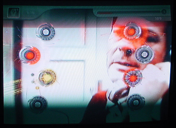
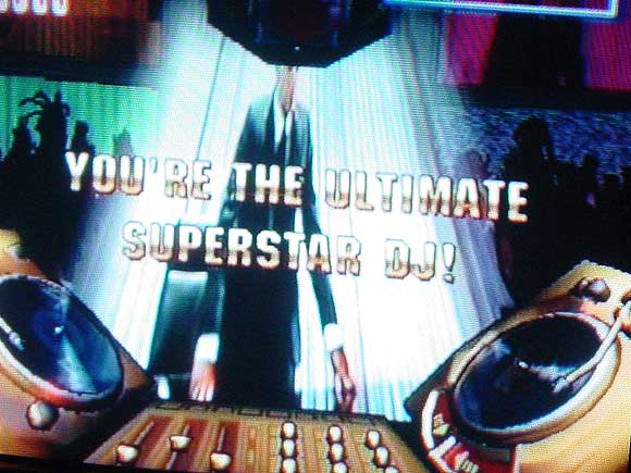
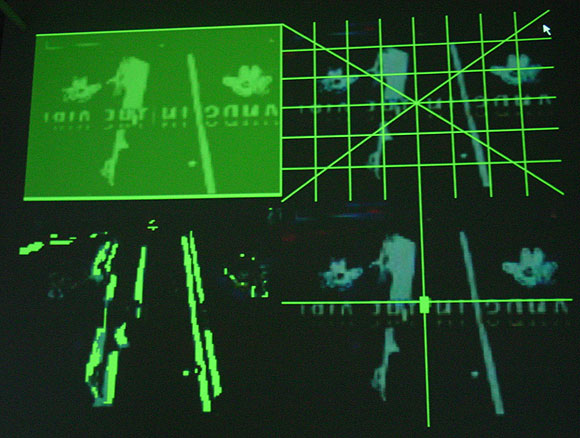
My photos of JODI's installation Composite Club at vertexList. The exhibit closes today--go if you can! Efrain Calderon Jr explains the art here; in a nutshell, it repurposes a game-related video camera (coupled with motion recognition software) called an "Eyetoy," designed to turn a child into a human joystick or data glove. As the kid moves head, arms, and torso, the camera reads the motion and a videogame makes countermoves, keeping the child physically active and away from the Doritos bag. Instead of kids, JODI has aimed the Eyetoy on films ranging from cyberpunk classics to Sophia Loren/Marcello Mastroianni romances. The movements of those films trigger video game actions, which are simultaneously layered over the films. Yes, this means you can watch Darth Vader play an anime ping pong player, but such one-to-one matchups happen only intermittently. (The bottom photo, a moving projection on the gallery wall, shows the various formal attributes the camera reads while the movie plays--screen position, light/dark values, etc. The top two are screenshots of "games" in progress.)
JODI (Dirk Paesmans and Joan Heemskerk) are the most painter-like artists working with computers and video today. Imagine Robert Rauschenberg using such tools at the time he did his "combines"--his work was called Neo-Dada and bridged Abstract Expressionism and Pop and that's essentially what JODI does now, with their densely layered amalgam of Japanese videogame weirdness and cult film cinematography, dissolving and mutating before your eyes. The conceit of the "the movie playing the game" isn't always comprehensible in these clips but for me this is a feature, not a bug. Art isn't about rubbing one ordered system up against another to get a third, but rather achieving an energized chaos that reveals something about the initial ordered systems, a la a Burroughs cut up. This revelatory randomness launches Composite Club beyond the pat realm of XYZ new media art. The artists use software like an auto-destructing Jean Tinguely painting machine and let chance processes do the work. They then discerningly edit motion captures of game play to make "best of" DVDs. The results are stunning--as good as anything you'll see in the galleries these days.
An earlier discussion, on why JODI isn't showing with one of the Manhattan cyber-galleries, is here.
VVork and XYZ Art
What follows are some comments from a thread about the blog VVork. The commenters are sort of picking on that blog, including me, but there are defenses of it as well. To the extent problems are being identified with a certain type of conceptual art and a certain type of digital art related to it (particularly as represented on the Internet), VVork is a convenient focal point. I've made all the commenters anonymous since this was a casual discussion and people might not have intended for these remarks to be elevated to "formal" status--the identities are all in the thread, I just want to get at the essence of the discussion. Slightly edited--if any commenter wants to amend what's said here let me know.
* VVork makes 'clever' very unappealing, like some disease that art catches when it gets on the Internet... It's usually: "hey, i did X to Y and now it's Z...get it??!" [T]he perfect example ... is that piece where its a choir singing the NASDAQ stock exchange graph as music... Who cares? Is there anything interesting going on beyond the punchline? (..well, perhaps in the larger context of the artist's other work [which we aren't made aware of]?) VVork's format/context is ideal for one punchline after the other.. It's like Boing Boing for conceptual art. Boing Boing is to real life what VVork is to art.. But why reduce others' art into little nuggets that can be easily thrown around and reblogged and put into other random contexts on the net just like any other Internet garbage (i.e. YouTube vids of cats and sloths)??
* VVork is popular because they show lots and lots of pictures of art from around the world without a bunch of commentary. I love that! It's kind of weird how rare it is. But the structure implies a promise it can't fulfill. Unlike, say, magazine editors, bloggers have neither the resources nor the mandate to represent outside of their own cultural constructs. I think the feeling of sickness comes from the fact that we feel like we are seeing some kind of general trend, but really its just some dudes posting pictures. There are masses and masses of other art options, not to VVork's taste, crowding in the wings. If they wrote on the work, the subjective filter would become explicit, but the unique aspect of the site would be gone. If they took submissions it might get closer to an evolutionary model, but without an editorial mandate it would make no significant difference. Maybe a post-your-own art wiki would do it.
* VVork is provincial in the sense that it conveys the impression, through its sheer relentlessness, that anybody in the world can be a player as long as you're making [the type of work we're discussing]. Getting seen on VVork [might be] an alternative to "moving to New York" (which people still do, in large numbers, sorry) but everything starts looking the same because of the lack of criticality within the vehicle itself. It's a blog, as you say, not the Global Museum of Great Art. Just because they are popular does not mean they are an institution that has a responsibility to anyone. As bloggers we are free to put in our two cents about their program and they are free to listen or not as they see fit.
* Seems to be two thingies going on here, one is vvork's presentation ... the other is the.. "X - Y - Z" style of archetype vvork art. the XYZ thing is, to me, natural to computers...the data comes in, who cares from where/as what, you can do something to it, and then the data goes out - also who cares to where/as what. so you wanna take stock market info [x] and turn it [y] into music [z], or you wanna use your atari joystick [x] to change the color and placement of text [y] on a tv screen [z] or you wanna take your whatever "physical computing" sensor interface [x] and use it to turn [y] lights on an off on a building [z]...it's like every single piece ends up being just an iteration of the same translation exercise. i suppose im describing something as much NYU ITP/MIT style art as vvork art, but regardless it's one of the reasons why i don't pay much attention to any of it...and i dont make that stuff [or any interactive art] cos i dont wanna to get stuck using the rest of my life in an attempt to make the "best" XYZ.
Another for the XYZ Art list:
"Paul Pfeiffer's Live from Neverland video installation is divided into two separate videos: one soundlessly replaying footage of a televised statement in which Michael Jackson addressed the child-molestation allegations, and a second one featuring a chorus of 80 voices reciting Jacksons monologue in the manner of a Greek chorus. The two videos are brought into further correspondence by means of a subtle re-syncing of Jacksons facial gestures to match the spoken delivery of the chorus, down to every pause, inflection and nuance." (opening at The Project in NY on May 3)
File that one under "choir":
Choir sings NASDAQ average
Choir recites Jackson molestation monologue (or maybe that's ABC art--Jackson 5 joke)
etc
