artwork archive
return to main site
weblog
View current page
...more recent posts
In the comments to an earlier post, a couple of people have been nice enough to help me with the ongoing issue of how to present work on the web. Sally (if I can paraphrase her) thinks a piece I posted earlier

should be shown cropped and sharpened, so that it reads more as a web-friendly graphic,

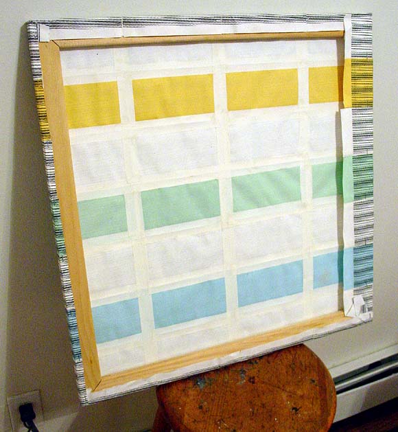
while Chris (if I can paraphrase him) was interested in what more documentation told him about the actual physical object. (The example below is the back of a different but similarly made piece.) "I like the simple use of materials- paper the colors found near a photocopier of any medium-sized office, and the linen tape, the bit of puckering. And what do you know?- it's a painting: a wooden stretcher and staples."

I'm actually not as intrigued as Sally by the grey zone between documentation of work and making some new, cyber-active form of it (again, paraphrasing)--in fact, I think the grey zone is a pain in the ass. You can choose to make things that demonstrably work best on the web (animated .GIFs, for example, or Chris's HTML drawings) but documenting physical work is basically a mundane, practical problem. Of course, new work ideas can be spun off from the process of documentation (and I like Sally's redo quite a bit), but I do value the physical work (too) and if the goal is to use the Web to make an end run around the gallery system, we really can't have the Web changing the meaning, or reading, of the objects on us.
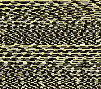
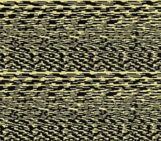
I posted this diptych a while back, and attempted to explain what was going on in the piece when someone asked what the hell it was. Apropos of a more recent discussion, I realize now that mere blabbery words are no substitute for a revealing, demystifying, letting it all hang out, kinda looks like shit back of the piece shot. I didn't want to do this before because it destroys the elegant aura I worked so hard to give this cheaply executed work. I don't know why I'm doing it now--you wouldn't see this in a gallery unless you took it down off the wall, why show it online? (By the way, the times I've shown these pieces publicly I've stretched a rectangle of silk behind the paper so no one can poke a finger through it--but I don't believe in glueing it down or pouring resin all over it to "collector-ify" it, a la Fred Tomaselli.)
|  |
 |  |
 |  |
| 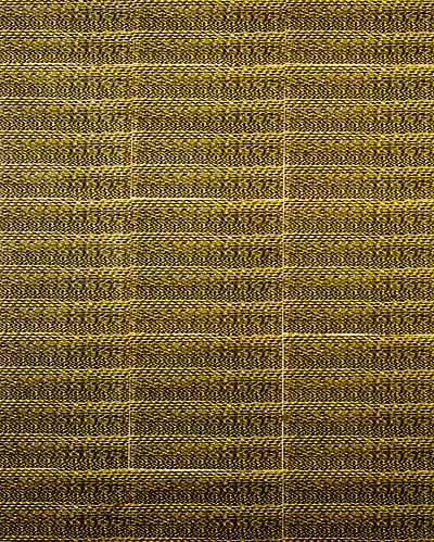 |
When I sent a drawing from the MSPaintbrush program on my computer to the network printer, the printer routinely sent back a message announcing that the job was finished. This caused a slight power surge, and I discovered that if I was sending another drawing to the printer at the exact same moment, the signals would cross and the second image would get "zapped," printing out as a uniquely garbled geometric pattern. I actually learned to time to the split-second when to send the drawing to get a good "scramble."
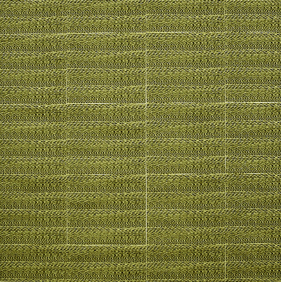
I made multiple photocopies of the scramble-pattern and joined them in a grid, applying linen tape to the back of the paper and then folding the paper around a painting stretcher and stapling it on the back. The result is a rather elegant, minimal quasi-painting born out of the drudgery of the modern office (during periods of official "down time," of course). The differences in color in these web pictures are just discrepancies among the scanner, slide, and digicam images used to make them.
I started thinking about this work again after the recent interview where jenghizkhan said "I started making music by scratching CD's [as in hiphop, turntable scratching] that I made from digital noise samples (similar to modem tones). I got the samples from saving the screwed up files that my computer sequencer would spew out when it crashed (which was all the time in the beginning). The scratching occurs sometimes at a super subtle and slow rate so that I can draw out all the tones that make up the white noise of digital streaming information."
That got me thinking about visual equivalents to those kinds of sounds, and the interest that exists across disciplinary lines in digital by-products, especially down at the "molecular level."

Tom Moody, Bulge, 1998 (left), and Exhibit 11, 1997 (right). Installation shot from "Ultra-Buzz," JCCC Gallery of Art, Overland Park, KS (exhibition with Karin Davie, Peter Hopkins, Fred Tomaselli, and James Siena).
