Tools and Media: Arcangel, Maeda, Salavon, Friedman
In the comments to a previous post, twhid made a distinction between the computer as a medium and the computer as a tool, which prompted me to discuss a work by John Maeda that I believe fails as both, as contrasted with Cory Arcangel's famous Nintendo Clouds piece, which succeeds as medium, tool, and content all rolled into one. And I also talked about Tom Friedman's and Jason Salavon's work. This post is a revised, expanded version with pictures. twhid's comment:
Perhaps people are confusing these two things: are you using the computer as a tool or as the medium?
When your friend states "the resulting visual product is what matters." This means he's using the computer as a tool to a visual end. In this sense it doesn't matter, he could be using a pencil or camera or computer or eggplants to get whatever sort of visual "product" he's after.
But if one is using a computer as the MEDIUM (not simply a means to a visual end) then it seems one should have an understanding of that medium. And it's arguable that to understand a computer as a medium you really need to be able to program it.
Then of course we can start talking about using computer networks as a medium... :-)
And my repl(ies):
I've been trying to keep the discussion confined to computer-made art that winds up in the "gallery discourse," or what's left of it. The use of programming in network-based art I consider a slightly different topic. As an example of the former, what is Cory Arcangel "after" in his Nintendo Clouds piece? If it's a big Barnett Newman field he probably could use eggplants (or blue squid ink) to make it. But it's more than that--it's a work where the computer is the tool, the medium, and (at least partially) the subject matter. It works on a pure visual level (a big expanse of seductive blue with wry found imagery), as a medium (the hacked cartridge as ambient video), and has something to say to hackers and non-initiates alike about the malleability of (digital) reality, through the subtraction of information from familiar game iconography. Whether someone could arrive at something that successful without a stitch of programming knowledge is one of the questions I'm asking.

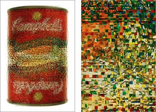
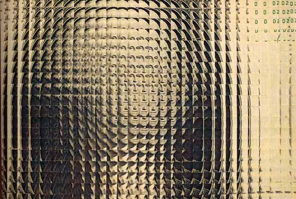
A piece that fails on all these levels is the above cibachrome print from 2002 by John Maeda, where he digitally sampled "all the Campbell's soup cans Warhol used" (as one review phrased it) and made a kind of iterative, vibrating composite. No doubt he did his own programming to realize this, but Tom Friedman, at Feature Gallery, had famously achieved a similar visual effect with a probabilistic dollar bill a couple of years before, using scissors and sheer patience. Friedman's was a well known piece in the art world, an analog design that evoked digital processes. Below is just a detail--the entire dollar is done like this, using actual cut up bucks, so the piece is about three feet long:

The subtle gradations between image "steps" are very trippy and disorienting, ditto seeing the familiar paper moneystuff on such a large scale. A similarly done self portrait by Friedman is online here (scroll down). As the accompanying text explains it, "Friedman dissected and re-configured 256 small, identical passport-style photographs into a large abstract self-portrait. The individual self-portraits were cut into 1/4-inch grids based on a series of nearly imperceptible 1/64-inch deviations. The 33,072 resulting squares were arranged, one by one, to create a large magnified, out-of-focus mosaic of the original image."
Maeda's soup can doesn't stretch in space but has the same hazy, micro-composite shimmer as Friedman's cut-up projects. (I don't actually consider Friedman's to be digital work, I bring it up to provide a context that previous discussion of the can has lacked.) Conceptually, and even more damning, the can is derivative of Jason Salavon, who has been making similar visual composites for years, through computer-derived averaging of like images (class pictures, Playboy Playmates, etc.) (And before Salavon, Nancy Burson...) Choosing Campbell's soup as subject matter is supposed to be "deconstructing" Warhol, one guesses, but it's a hackneyed reference. Both Salavon and Friedman know recent art history and the approximate place their work fits into it, whereas Maeda is a designer with art aspirations who admits to not following contemporary art (scroll down). Yet Maeda is showing at the London ICA and the Fondation Cartier as an artist, for reasons I don't entirely fathom (at least according to his 2002 catalog--I can't find any online reference to those shows, supposedly scheduled for 2003 and 2005, respectively).
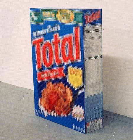
Other Maeda work is here (I like 1, 2, and 4 but then he starts to lose me). And below is another Friedman piece that puts the can to shame. It is not out of focus; it's actual cereal boxes cut up the same way the dollar is above:

Update, December 2005: The links above to the Maeda pieces on the Cristinerose website are dead, sorry. Maeda's work did in fact get shown at the Fondation Cartier.
Update, 2011: Maeda "Food" catalog reposted as PDF
I took an electronic music class while in university. The prof let some electrical engineer majors in on the fun. He had Moogs and moog-like devices. Not much in the way of keyboards or digital sequencers, but mostly analog tone/wave and envelope generators, controllable filters and such. It was all about abstract constructions of sound. (As in Subotnick, et al.)
It was very much "practice" oriented, with people hooking up various pieces of electronica to generate interesting sequences, and eventually larger pieces. He'd walk around the class/lab/studio listening to and commenting on our progress. In one of those walks, he commented that the engineers typically had the most complicated set ups to create the simplest (read: least interesting) sounds.
Some of this can be thought of as being top-down vs. bottom-up thinking. "I have an idea. How do I implement it?" vs. "I have a tool. What can I implement with it?"
The prof had a Fairlight, which was a revolutionary electronic insturment in its day. It's still very cool.. But his most interesting piece was created with a selection of various sized crowbars, a microphone, and reel-to-reel tape dubbing/effects.
I know the Fairlight well. Stewart Copeland had one, and used it on his mid-'80s album The Rhythmatist and in his soundtrack work (e.g., the score for The Equalizer.) I like those records a lot, and hate Sting for taking credit for the Police, the "sound" of which, to me, is Stewart Copeland's.
|
Tools and Media: Arcangel, Maeda, Salavon, Friedman
In the comments to a previous post, twhid made a distinction between the computer as a medium and the computer as a tool, which prompted me to discuss a work by John Maeda that I believe fails as both, as contrasted with Cory Arcangel's famous Nintendo Clouds piece, which succeeds as medium, tool, and content all rolled into one. And I also talked about Tom Friedman's and Jason Salavon's work. This post is a revised, expanded version with pictures. twhid's comment: And my repl(ies):
I've been trying to keep the discussion confined to computer-made art that winds up in the "gallery discourse," or what's left of it. The use of programming in network-based art I consider a slightly different topic. As an example of the former, what is Cory Arcangel "after" in his Nintendo Clouds piece? If it's a big Barnett Newman field he probably could use eggplants (or blue squid ink) to make it. But it's more than that--it's a work where the computer is the tool, the medium, and (at least partially) the subject matter. It works on a pure visual level (a big expanse of seductive blue with wry found imagery), as a medium (the hacked cartridge as ambient video), and has something to say to hackers and non-initiates alike about the malleability of (digital) reality, through the subtraction of information from familiar game iconography. Whether someone could arrive at something that successful without a stitch of programming knowledge is one of the questions I'm asking.
A piece that fails on all these levels is the above cibachrome print from 2002 by John Maeda, where he digitally sampled "all the Campbell's soup cans Warhol used" (as one review phrased it) and made a kind of iterative, vibrating composite. No doubt he did his own programming to realize this, but Tom Friedman, at Feature Gallery, had famously achieved a similar visual effect with a probabilistic dollar bill a couple of years before, using scissors and sheer patience. Friedman's was a well known piece in the art world, an analog design that evoked digital processes. Below is just a detail--the entire dollar is done like this, using actual cut up bucks, so the piece is about three feet long:
The subtle gradations between image "steps" are very trippy and disorienting, ditto seeing the familiar paper moneystuff on such a large scale. A similarly done self portrait by Friedman is online here (scroll down). As the accompanying text explains it, "Friedman dissected and re-configured 256 small, identical passport-style photographs into a large abstract self-portrait. The individual self-portraits were cut into 1/4-inch grids based on a series of nearly imperceptible 1/64-inch deviations. The 33,072 resulting squares were arranged, one by one, to create a large magnified, out-of-focus mosaic of the original image."
Maeda's soup can doesn't stretch in space but has the same hazy, micro-composite shimmer as Friedman's cut-up projects. (I don't actually consider Friedman's to be digital work, I bring it up to provide a context that previous discussion of the can has lacked.) Conceptually, and even more damning, the can is derivative of Jason Salavon, who has been making similar visual composites for years, through computer-derived averaging of like images (class pictures, Playboy Playmates, etc.) (And before Salavon, Nancy Burson...) Choosing Campbell's soup as subject matter is supposed to be "deconstructing" Warhol, one guesses, but it's a hackneyed reference. Both Salavon and Friedman know recent art history and the approximate place their work fits into it, whereas Maeda is a designer with art aspirations who admits to not following contemporary art (scroll down). Yet Maeda is showing at the London ICA and the Fondation Cartier as an artist, for reasons I don't entirely fathom (at least according to his 2002 catalog--I can't find any online reference to those shows, supposedly scheduled for 2003 and 2005, respectively).
Other Maeda work is here (I like 1, 2, and 4 but then he starts to lose me). And below is another Friedman piece that puts the can to shame. It is not out of focus; it's actual cereal boxes cut up the same way the dollar is above:
Update, December 2005: The links above to the Maeda pieces on the Cristinerose website are dead, sorry. Maeda's work did in fact get shown at the Fondation Cartier.
Update, 2011: Maeda "Food" catalog reposted as PDF
- tom moody 10-16-2004 11:47 pm
I took an electronic music class while in university. The prof let some electrical engineer majors in on the fun. He had Moogs and moog-like devices. Not much in the way of keyboards or digital sequencers, but mostly analog tone/wave and envelope generators, controllable filters and such. It was all about abstract constructions of sound. (As in Subotnick, et al.)
It was very much "practice" oriented, with people hooking up various pieces of electronica to generate interesting sequences, and eventually larger pieces. He'd walk around the class/lab/studio listening to and commenting on our progress. In one of those walks, he commented that the engineers typically had the most complicated set ups to create the simplest (read: least interesting) sounds.
Some of this can be thought of as being top-down vs. bottom-up thinking. "I have an idea. How do I implement it?" vs. "I have a tool. What can I implement with it?"
The prof had a Fairlight, which was a revolutionary electronic insturment in its day. It's still very cool.. But his most interesting piece was created with a selection of various sized crowbars, a microphone, and reel-to-reel tape dubbing/effects.
- mark 10-17-2004 6:06 am
I know the Fairlight well. Stewart Copeland had one, and used it on his mid-'80s album The Rhythmatist and in his soundtrack work (e.g., the score for The Equalizer.) I like those records a lot, and hate Sting for taking credit for the Police, the "sound" of which, to me, is Stewart Copeland's.
- tom moody 10-20-2004 8:18 am