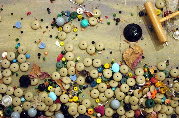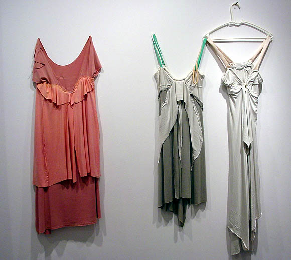


Went back in to look at Leif Ritchey's show today. The show is indeed overhung. Ritchey has one foot in the fashion world and his dresses are dresses, not sculptures. And beautiful, no? That's not to say they shouldn't be shown in a gallery, only that some effort should be made to establish a context. They lost oomph packed into a crowded room with the artist's paintings (not his strongest work) and assemblage sculptures. The sculptures, too, needed breathing room and context. These photos are my attempt to present the work in a more minimal way, at least as minimal as a blog page can be. The top two images are details, aiming the camera straight down at the horizontal surfaces of two different pieces. They are severely cropped, speaking of no context, but it was these areas that haunted me after the opening and this is my way of getting a good look at them. The image of the dresses is how I would present the dresses: Soho style, with a lot of white space around them so you can see them. I thought it was old or scavenged material but the gallery says no--it's just the way the artist handles and distresses the fabric(s).
Funny, that top image was the thing that stood out most to me at the crowded opening too!
for the sake of discussion, if the dresses are just dresses, then their design is at least half about how they fit the female form, right?. Shouldn't they be displayed on a mannequin or something, instead of flattened and stretched to almost 2-D by being hung like that? I think Andrea Zittel uses mannequins, doesn't she? anyway, the way they're hung suggests to me something more than just a dress, or an odd (or maybe bad) display choice. ;o)
The show had one dress on a mannequin, but the hanging ones worked better. Either way they needed to be in their own room or their own show with some space around them. As for the female form, the way they do it in fashion is to have sleek women walking around wearing the clothes, but then for sure no one would look at the art.
hahaha, :o) it actually makes more sense to me knowing that there was another one on a mannequin so you could at least get a sense of the form. This year it looks like I'm going to be making it to NYC a lot more frequently, so I'll actually get to see some of these interesting shows you're writing about!
The first two photographs of the assemblage surfaces kinda remind me of your computer-generated compositions. Shape and scale similarities perhaps?
(not having actually seen the show myself, checking in from out of town)
Hey, Kara--yeah, where'd you go? (Assuming you're the Kara I know.) Anyway, yes, I'm sure that's one reason I was drawn to those details. But I'm also drawn to the opposite of what I'm doing, which in Ritchey's case is Xtreme attention to the physical, material side of things.
Hey Tom - I finally found that elusive tenure-track teaching gig, down here at the College of Charleston in the sunny but deeply red state of SC. Let me know if you need a vacation. Call Laura and Eric for more details.
|
Went back in to look at Leif Ritchey's show today. The show is indeed overhung. Ritchey has one foot in the fashion world and his dresses are dresses, not sculptures. And beautiful, no? That's not to say they shouldn't be shown in a gallery, only that some effort should be made to establish a context. They lost oomph packed into a crowded room with the artist's paintings (not his strongest work) and assemblage sculptures. The sculptures, too, needed breathing room and context. These photos are my attempt to present the work in a more minimal way, at least as minimal as a blog page can be. The top two images are details, aiming the camera straight down at the horizontal surfaces of two different pieces. They are severely cropped, speaking of no context, but it was these areas that haunted me after the opening and this is my way of getting a good look at them. The image of the dresses is how I would present the dresses: Soho style, with a lot of white space around them so you can see them. I thought it was old or scavenged material but the gallery says no--it's just the way the artist handles and distresses the fabric(s).
- tom moody 1-17-2005 6:10 pm
Funny, that top image was the thing that stood out most to me at the crowded opening too!
- barry (bloggy.com) (guest) 1-19-2005 12:36 am
for the sake of discussion, if the dresses are just dresses, then their design is at least half about how they fit the female form, right?. Shouldn't they be displayed on a mannequin or something, instead of flattened and stretched to almost 2-D by being hung like that? I think Andrea Zittel uses mannequins, doesn't she? anyway, the way they're hung suggests to me something more than just a dress, or an odd (or maybe bad) display choice. ;o)
- paul (guest) 1-19-2005 6:24 pm
The show had one dress on a mannequin, but the hanging ones worked better. Either way they needed to be in their own room or their own show with some space around them. As for the female form, the way they do it in fashion is to have sleek women walking around wearing the clothes, but then for sure no one would look at the art.
- tom moody 1-19-2005 9:33 pm
hahaha, :o) it actually makes more sense to me knowing that there was another one on a mannequin so you could at least get a sense of the form. This year it looks like I'm going to be making it to NYC a lot more frequently, so I'll actually get to see some of these interesting shows you're writing about!
- paul (guest) 1-19-2005 11:18 pm
The first two photographs of the assemblage surfaces kinda remind me of your computer-generated compositions. Shape and scale similarities perhaps?
(not having actually seen the show myself, checking in from out of town)
- kara (guest) 1-20-2005 3:46 pm
Hey, Kara--yeah, where'd you go? (Assuming you're the Kara I know.) Anyway, yes, I'm sure that's one reason I was drawn to those details. But I'm also drawn to the opposite of what I'm doing, which in Ritchey's case is Xtreme attention to the physical, material side of things.
- tom moody 1-20-2005 5:57 pm
Hey Tom - I finally found that elusive tenure-track teaching gig, down here at the College of Charleston in the sunny but deeply red state of SC. Let me know if you need a vacation. Call Laura and Eric for more details.
- kara 1-31-2005 4:50 pm