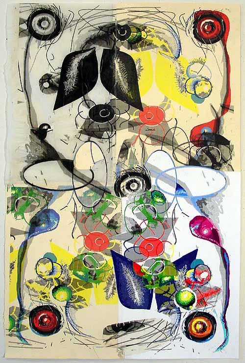
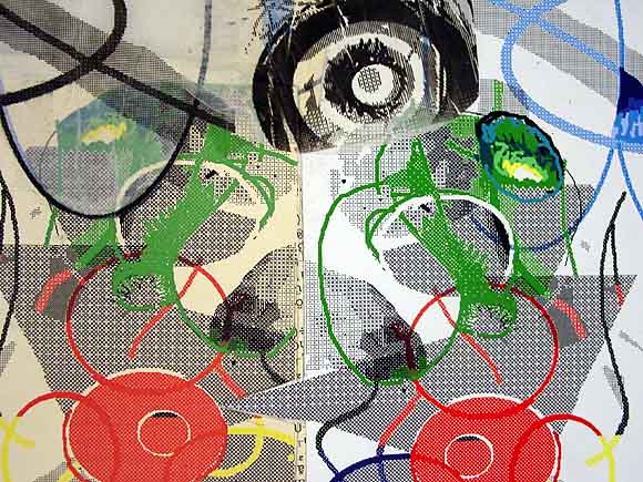
Tonight, Thursday, September 29, is the exhibition preview of original works created for Dieu Donné Papermill's 6th Annual Benefit. The artwork I made using their paper (uncharacteristically nice material for me, but I tore it up quite a bit in the printer) is depicted below, as well as a detail. The piece can also be viewed in a thumbnail index along with other donated works.

More info:This year's benefit auction, entitled Shangri-La, brings together over 120 artists who have generously donated original works created on Dieu Donné Paper.
AUCTION PREVIEW NIGHT
Thursday, September 29, 2005, 5:30-7:30pm
The Gallery at Dieu Donné Papermill
433 Broome Street, New York City
DIEU DONNÉ PAPERMILL’S ANNUAL BENEFIT: SHANGRI-LA
Thursday, October 20, 2005, 6-11pm
Live & Silent Auctions, Cocktails, Dim Sum
The Grand Harmony Restaurant
98 Mott Street, New York City
(between Hester Street & Canal Street)
VIEW LIVE & SILENT AUCTION ARTWORK
September 15-October 14, 2005
The Gallery at Dieu Donné Papermill
433 Broome Street, New York City 
I like it. I'll bet the paper looks great in person- what does this do differently than past recent work on more "common" paper? There's a neat kind of top and bottom almost-mirroring, and an almost but not quite left and right symmetry. The four quadrants- are these each a different piece of paper? This one is more... well, there's less of the kind of logo-like, game-like, less obviously computer drawn images, and it's more, uh, bucolic- it's those leafy shapes and the rougher drawing that do it. Similar kind of space in other drawings but this one is less geeky. In this view it looks like it's made with an entirely different kind of technology- lithography.
In person it does look like lithography. 90% of it is the paper. I'm surprised how much it changes the look of what I do normally. I knew those shapes were "leafy" and were tipping the whole thing towards the bucolic but I just rode with it, since this was kind of a piece for hire. Looking at the other work tonight, mine is one of the few done with the computer but it doesn't look out of kilter with the rest.
The artist on the Dieu Donne advisory board who invited me wanted to see what I could do with this exquisite handmade paper, knowing I was the lo-fi office materials guy. I feel I tried and failed to turn the paper into a Tom Moody, instead what I got was a Dieu Donne version of me. The result is nice and I'm proud of it but it kind of makes me appreciate the generic white and want to get back to it.
In an alternate universe to the one I'm living in I'm producing nice art and music and am slightly embarrassed by my popularity in the market. Uh oh, that sounds like whining, I guess all I'm saying is I do have some concept of how to make more wholesome, or at least non-geeky work, but some demon inside me always insists it be "difficult." Ugh, that sounds smugly avant garde, maybe it would be better to just say I want to make work like what I like to look at and listen to.
|
Tonight, Thursday, September 29, is the exhibition preview of original works created for Dieu Donné Papermill's 6th Annual Benefit. The artwork I made using their paper (uncharacteristically nice material for me, but I tore it up quite a bit in the printer) is depicted below, as well as a detail. The piece can also be viewed in a thumbnail index along with other donated works.
More info:
- tom moody 9-29-2005 8:02 pm
I like it. I'll bet the paper looks great in person- what does this do differently than past recent work on more "common" paper? There's a neat kind of top and bottom almost-mirroring, and an almost but not quite left and right symmetry. The four quadrants- are these each a different piece of paper? This one is more... well, there's less of the kind of logo-like, game-like, less obviously computer drawn images, and it's more, uh, bucolic- it's those leafy shapes and the rougher drawing that do it. Similar kind of space in other drawings but this one is less geeky. In this view it looks like it's made with an entirely different kind of technology- lithography.
- chrisashley (guest) 9-30-2005 2:20 am
In person it does look like lithography. 90% of it is the paper. I'm surprised how much it changes the look of what I do normally. I knew those shapes were "leafy" and were tipping the whole thing towards the bucolic but I just rode with it, since this was kind of a piece for hire. Looking at the other work tonight, mine is one of the few done with the computer but it doesn't look out of kilter with the rest.
The artist on the Dieu Donne advisory board who invited me wanted to see what I could do with this exquisite handmade paper, knowing I was the lo-fi office materials guy. I feel I tried and failed to turn the paper into a Tom Moody, instead what I got was a Dieu Donne version of me. The result is nice and I'm proud of it but it kind of makes me appreciate the generic white and want to get back to it.
In an alternate universe to the one I'm living in I'm producing nice art and music and am slightly embarrassed by my popularity in the market. Uh oh, that sounds like whining, I guess all I'm saying is I do have some concept of how to make more wholesome, or at least non-geeky work, but some demon inside me always insists it be "difficult." Ugh, that sounds smugly avant garde, maybe it would be better to just say I want to make work like what I like to look at and listen to.
- tom moody 9-30-2005 7:14 am