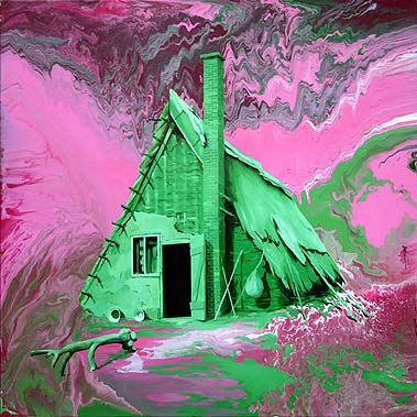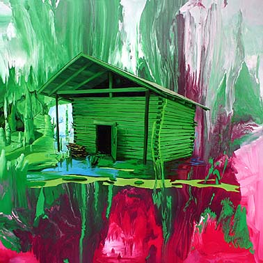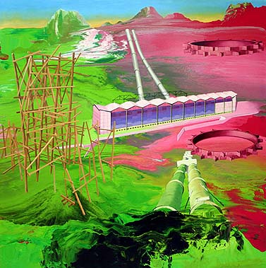


Paintings by Stephen Bush, from Melbourne, in an upcoming show at Goff + Rosenthal in NYC. Can't vouch for these in person because I haven't seen them yet but the jpegs are pretty dynamic. Like a more serious Martin Kippenberger, who also painted on top of those smeary, Helen Frankenthaler-by-way-of-the-carnival-booth abstractions. The post-industrial, Little House on the Prairie on Mars theme (at least in the top three) is intriguing, and you have to give props to any artist willing to stake an entire exhibit on pink and green.
I agree, they look like dynamic images. I think they make in interesting comparison to the work of Lisa Sanditz that's currently on view at CRG.
I like them both since I'm generally seduced by the combination of different types of paint application on one canvas when it's done with finesse.
Any thoughts on this comparison. Tom?
I like these images, what you describe as carnival-booth (very good analogy b/t/w), I usually describe as chemical paint handling.(something I have always enjoyed in some of Gerhard Richter's abstracts)
The other thing that is appealing to me is that they look like they were a total riot to paint! (A million varieties of painterly jollies can be had here)
As long as we're comparing jpegs, I prefer these jpegs to the Sanditz jpegs (I added a link to her online images in Aaron's comment). Sanditz is too busy, too Grandma Moses, too Laura Owens, too faux-naive. These Bush paintings rely on two opposed forms of paint handling, Sanditz many more: he puts more at risk. As you can tell, I'm not too into the whole Vern Dawson magic peacable childlike kingdom revival we're having as part of the art world's mass infantile regression.
Richter definitely painted stuff like the background; I think even he was alluding to how ultimate degraded this kind of "expressionist" painting is. I'm really the most interested in the foreground imagery. That kind of illustrator competence is rare and refreshing, and Bush seems to know what to do with it.
Caveat: I might not like the Bushes in person. I might like the Sanditz, but it's doubtful. Sorry to go after work you like hammer and tongs, Aaron, it just blurted out.
Wild and funny images! Top one's like from a Disney fable after a nuclear war. Haven't seen so much green since avocado stained the 70's, and Stephen uses it to much better effect.
I'm attracted to the foreground too. (that's where I get the most painterly jollies from myself) I disagree that the illustrator competence is rare, I know a lot of artists who possess that skill. (there is suddenly more of a contemporary audience for it, so we'll see more of it)
I also suspect that the work has a best-before-date on it. (I'll enjoy it now, before it goes sour on us)
Amazing work-- these have the look of computer images with a skewed pallette; sometimes you get effects like this by accident using the gimp or photoshop. Maybe that's what inspired the painter?
I wonder if it's difficult to get that realistic shading and perspective when painting using such an unrealistic pallette?
Tom, great sentence ending with the art world's childlike infantile regression. I agree with this as well as your quick take on the Sandiz work. Although, I encourage you to check them out in person.
Rather than Richteresque I find the backgrounds in these Bush paintings looks more like the decorative painting technique of marbleizing. I did mention that I think the images look dynamic, but I'm not convinced that there's real substance in placing an illustration on top of a skin of decorative painting. I might after seeing them, but I might also be tempted to add Bush into growing group of artists that are working in a style that could be called Neo-Rococo.
i noticed the (ancient and once secret technique of) marbleizing too.
That's partly what my carnival booth reference was meant to encompass. Maybe that was only in my head after seeing a marbleizing demonstration in Ye Colonial Williamsburg VA years ago. I see marbleizing and spin art as "kitsch things you can do with paint that resemble and therefore give the lie to Abstract Expressionism forty goddam years after the fact." I think G. K. is onto something with the computer comparison--Claire Corey's abstraction has some of these same elements but is an entirely synthetic art. She's working in a field with open ended possibility, that has great relevance to the culture at large because everything is becoming digital now, while Stephen Bush is trapped in a cul de sac of "deconstructing paint." At least with his backgrounds--for some reason his handling of what I can only think of foreground imagery seems fresher to me. The fanciful cabins, the gear shapes in the Martian tank farm, are drawn (yes, with paint) with real conviction and I would say joy. But I'm liking that aspect of them--the "joyful 'paint' handling"--as jpegs, several steps removed from the act of going to the gallery and having my eye crawl over the actual surface. Again, my fear is I might see something unconvincing at that level--bad edges, too-thin strokes--that would diminish these for me. I'd almost rather live with my mouse potato illusions.
Mouse potato! funny. I like these paintings. They remind me of this,
this,
this and this (which are all very cool), and also this and this (which I find a little tedious).
To which excellent list I would add this, but mainly for the title.
|
Paintings by Stephen Bush, from Melbourne, in an upcoming show at Goff + Rosenthal in NYC. Can't vouch for these in person because I haven't seen them yet but the jpegs are pretty dynamic. Like a more serious Martin Kippenberger, who also painted on top of those smeary, Helen Frankenthaler-by-way-of-the-carnival-booth abstractions. The post-industrial, Little House on the Prairie on Mars theme (at least in the top three) is intriguing, and you have to give props to any artist willing to stake an entire exhibit on pink and green.
- tom moody 10-09-2005 8:37 pm
I agree, they look like dynamic images. I think they make in interesting comparison to the work of Lisa Sanditz that's currently on view at CRG.
I like them both since I'm generally seduced by the combination of different types of paint application on one canvas when it's done with finesse.
Any thoughts on this comparison. Tom?
- Aaron Yassin (guest) 10-09-2005 10:08 pm
I like these images, what you describe as carnival-booth (very good analogy b/t/w), I usually describe as chemical paint handling.(something I have always enjoyed in some of Gerhard Richter's abstracts)
- L.M. 10-10-2005 12:20 am
The other thing that is appealing to me is that they look like they were a total riot to paint! (A million varieties of painterly jollies can be had here)
- L.M. 10-10-2005 12:26 am
As long as we're comparing jpegs, I prefer these jpegs to the Sanditz jpegs (I added a link to her online images in Aaron's comment). Sanditz is too busy, too Grandma Moses, too Laura Owens, too faux-naive. These Bush paintings rely on two opposed forms of paint handling, Sanditz many more: he puts more at risk. As you can tell, I'm not too into the whole Vern Dawson magic peacable childlike kingdom revival we're having as part of the art world's mass infantile regression.
Richter definitely painted stuff like the background; I think even he was alluding to how ultimate degraded this kind of "expressionist" painting is. I'm really the most interested in the foreground imagery. That kind of illustrator competence is rare and refreshing, and Bush seems to know what to do with it.
Caveat: I might not like the Bushes in person. I might like the Sanditz, but it's doubtful. Sorry to go after work you like hammer and tongs, Aaron, it just blurted out.
- tom moody 10-10-2005 12:46 am
Wild and funny images! Top one's like from a Disney fable after a nuclear war. Haven't seen so much green since avocado stained the 70's, and Stephen uses it to much better effect.
- Bill Gusky (guest) 10-10-2005 1:03 am
I'm attracted to the foreground too. (that's where I get the most painterly jollies from myself) I disagree that the illustrator competence is rare, I know a lot of artists who possess that skill. (there is suddenly more of a contemporary audience for it, so we'll see more of it)
I also suspect that the work has a best-before-date on it. (I'll enjoy it now, before it goes sour on us)
- L.M. 10-10-2005 1:21 am
Amazing work-- these have the look of computer images with a skewed pallette; sometimes you get effects like this by accident using the gimp or photoshop. Maybe that's what inspired the painter?
I wonder if it's difficult to get that realistic shading and perspective when painting using such an unrealistic pallette?
- G.K. Wicker (guest) 10-10-2005 4:05 am
Tom, great sentence ending with the art world's childlike infantile regression. I agree with this as well as your quick take on the Sandiz work. Although, I encourage you to check them out in person.
Rather than Richteresque I find the backgrounds in these Bush paintings looks more like the decorative painting technique of marbleizing. I did mention that I think the images look dynamic, but I'm not convinced that there's real substance in placing an illustration on top of a skin of decorative painting. I might after seeing them, but I might also be tempted to add Bush into growing group of artists that are working in a style that could be called Neo-Rococo.
- Aaron Yassin (guest) 10-10-2005 6:23 am
i noticed the (ancient and once secret technique of) marbleizing too.
- bill 10-10-2005 12:03 pm
That's partly what my carnival booth reference was meant to encompass. Maybe that was only in my head after seeing a marbleizing demonstration in Ye Colonial Williamsburg VA years ago. I see marbleizing and spin art as "kitsch things you can do with paint that resemble and therefore give the lie to Abstract Expressionism forty goddam years after the fact." I think G. K. is onto something with the computer comparison--Claire Corey's abstraction has some of these same elements but is an entirely synthetic art. She's working in a field with open ended possibility, that has great relevance to the culture at large because everything is becoming digital now, while Stephen Bush is trapped in a cul de sac of "deconstructing paint." At least with his backgrounds--for some reason his handling of what I can only think of foreground imagery seems fresher to me. The fanciful cabins, the gear shapes in the Martian tank farm, are drawn (yes, with paint) with real conviction and I would say joy. But I'm liking that aspect of them--the "joyful 'paint' handling"--as jpegs, several steps removed from the act of going to the gallery and having my eye crawl over the actual surface. Again, my fear is I might see something unconvincing at that level--bad edges, too-thin strokes--that would diminish these for me. I'd almost rather live with my mouse potato illusions.
- tom moody 10-10-2005 7:26 pm
Mouse potato! funny. I like these paintings. They remind me of this, this, this and this (which are all very cool), and also this and this (which I find a little tedious).
- sally mckay 10-10-2005 11:22 pm
To which excellent list I would add this, but mainly for the title.
- tom moody 10-10-2005 11:33 pm