Attack of the Clones


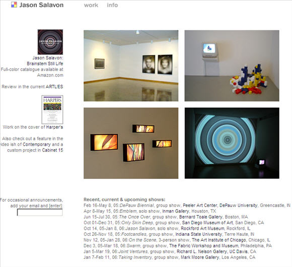
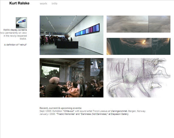
I like people that prefer the standard solutions instead of trying hard at being original. These are just two web pages that need to show some pictures and the latest exhibition dates. Task accomplished! Congratulations! Especially considering that many artists cannot get something like this right and instead have some small dots whizzing around that are connected with lines and funny mouseover sounds which are totally useless.
LOL! I agree, information is what people are after and it's better to let the information itself be entertaining (or not) and for "design" to get out of the way. So, starting tomorrow, I propose everyone use Salavon's template, which seems as workable as any!
oh brother...
By reducing your materials to almost nothing, your art attains a kind of purity.
Define your artistic identity.
Be single-minded. Make sure there is only one idea in each work. Strive for total clarity. Ambiguity makes everyone uncomfortable and is therefore not useful.
Refuse to be categorized.
We're talking about site design. What are you talking about, spd?
they're quotes from mr ralskes writings...
Whoops. I thought it was one of those "theory will be the ruin of art" guys being sarcastic. Sorry, spd, and thanks, rich.
"Ambiguity makes everyone uncomfortable and is therefore not useful."
Human factors engineering is an under-appreciated aspect of art.
|
Attack of the Clones
- tom moody 3-01-2006 6:39 pm
I like people that prefer the standard solutions instead of trying hard at being original. These are just two web pages that need to show some pictures and the latest exhibition dates. Task accomplished! Congratulations! Especially considering that many artists cannot get something like this right and instead have some small dots whizzing around that are connected with lines and funny mouseover sounds which are totally useless.
- drx (guest) 3-01-2006 7:28 pm
LOL! I agree, information is what people are after and it's better to let the information itself be entertaining (or not) and for "design" to get out of the way. So, starting tomorrow, I propose everyone use Salavon's template, which seems as workable as any!
- tom moody 3-01-2006 7:38 pm
oh brother...
By reducing your materials to almost nothing, your art attains a kind of purity.
Define your artistic identity.
Be single-minded. Make sure there is only one idea in each work. Strive for total clarity. Ambiguity makes everyone uncomfortable and is therefore not useful.
Refuse to be categorized.
- spd (guest) 3-01-2006 10:52 pm
We're talking about site design. What are you talking about, spd?
- tom moody 3-02-2006 12:27 am
they're quotes from mr ralskes writings...
- rich (guest) 3-03-2006 1:26 am
Whoops. I thought it was one of those "theory will be the ruin of art" guys being sarcastic. Sorry, spd, and thanks, rich.
- tom moody 3-03-2006 1:43 am
"Ambiguity makes everyone uncomfortable and is therefore not useful."
Human factors engineering is an under-appreciated aspect of art.
- mark 3-03-2006 3:03 am