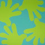
Carl Ostendarp wallpaper--based on a Dr. Seussoid painting of his from Google Images. Ostendarp once told me was interested in the work of painter Ralph Humphrey, and you can certainly see some connections. I'm not so wild about Humphrey's polychromatic, imagistic shaped canvases from the early '80s (especially the pebbly texture), but the more restrained work from the '60s and early '70s looks nice, from the website, at least. It occupies a territory somewhere between the Myron Stout/Leon Polk Smith school of abstraction and what would later be called "New Image" painting (Susan Rothenberg, Neil Jenney, et al). Ostendarp's wrinkle is adding more media-aware, boomer-centric cartoon iconography, such as these Dr. Seuss hands, to that milieu. His paintings are notable for their flatness and lack of inflection--the dry application of flashe paint on linen is antithetical to the buoyant, comedic imagery. Perhaps this contradiction is what led Marxist critic Joshua Decter to write the Artforum review that "destroyed Ostendarp's career" (at least that was the buzz circa 1995, when I first moved to New York). It may also just be that Decter had a lousy eye, a gift for tendentious review-writing, and too much damn power at the time.


If you are looking at this on Bloglines you will see vertical strips of white space between the columns. That is not intended; I know we can't control how browsers read html (or RSS) but I'm not too keen on automated blog readers that change images from the way they appear on their original pages. I'm happy if you're looking at this blog on Bloglines but want you to know that it's an inaccurate view of my page and recommend clicking through occasionally.
|
Carl Ostendarp wallpaper--based on a Dr. Seussoid painting of his from Google Images. Ostendarp once told me was interested in the work of painter Ralph Humphrey, and you can certainly see some connections. I'm not so wild about Humphrey's polychromatic, imagistic shaped canvases from the early '80s (especially the pebbly texture), but the more restrained work from the '60s and early '70s looks nice, from the website, at least. It occupies a territory somewhere between the Myron Stout/Leon Polk Smith school of abstraction and what would later be called "New Image" painting (Susan Rothenberg, Neil Jenney, et al). Ostendarp's wrinkle is adding more media-aware, boomer-centric cartoon iconography, such as these Dr. Seuss hands, to that milieu. His paintings are notable for their flatness and lack of inflection--the dry application of flashe paint on linen is antithetical to the buoyant, comedic imagery. Perhaps this contradiction is what led Marxist critic Joshua Decter to write the Artforum review that "destroyed Ostendarp's career" (at least that was the buzz circa 1995, when I first moved to New York). It may also just be that Decter had a lousy eye, a gift for tendentious review-writing, and too much damn power at the time.
If you are looking at this on Bloglines you will see vertical strips of white space between the columns. That is not intended; I know we can't control how browsers read html (or RSS) but I'm not too keen on automated blog readers that change images from the way they appear on their original pages. I'm happy if you're looking at this blog on Bloglines but want you to know that it's an inaccurate view of my page and recommend clicking through occasionally.
- tom moody 7-26-2006 8:56 pm