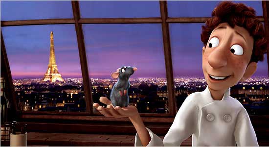
"Ratatouille is a nearly flawless piece of popular art," writes A. O. Scott of the New York Times, in a review accompanied by this picture:
Stephanie Zacharek in Salon calls it "one of the most beautiful animated pictures I've ever seen," in a review accompanied by this picture:
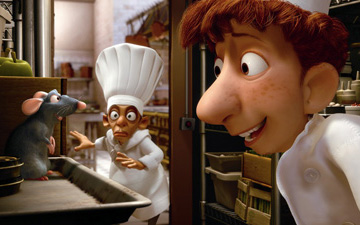
Any student or critic of art, popular or unpopular, knows why these statements are wrong and what's missing from these images and these movies (also Shrek, the Incredibles, Toy Story, and the rest): line. For reasons mostly of budget and a kind of unthinking rush to modernize, filmmakers have thrown out possibly the central tool in the history of visual expression, and replaced it with tricks of sfumato and chiaroscuro that give objects a rounded, "realistic" look but make everything in the frame bulbous and doughy. It would be like making music with no "attack transients" (sharp sounds at the beginning of notes that give them their texture and bite)--all music would become billowy and ersatz, like New Age music. Years after photography mooted realistic painting in the world of portraits and "scenes," these Tinseltown hacks persist in imitating photographic depth, using computer short cuts, and the results are often simply grotesque (see above--eyes without lashes that are merely encircled by reptilian lids).
It's not a fluke that Toy Story "pioneer" Jon Lasseter worships Japanese animator Hayao Miyazaki and has given his films a boost in the US. It's guilt from a fast food franchise owner at all the excellent cuisine he's displaced. Miyazaki is a poet of line.
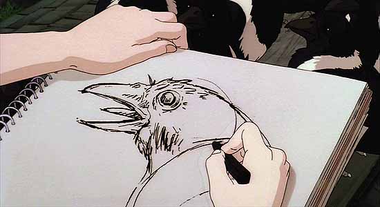
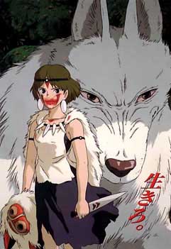
So expressive! Whereas Pixar and its offspring have the smooth, slightly frozen look of '70s album cover illustration done with an airbrush:
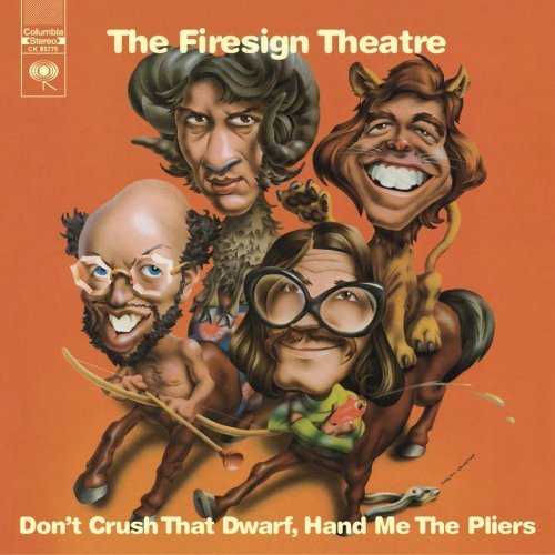
A topic for another day: the Pixar movies are also the embodiment of Disney Values. The plucky little guy triumphs over adversity and learns a valuable lesson. Whereas in real life plucky little guys have boots in their faces all over town, while the big entities (such as entertainment conglomerates) grow more and more dominant.
I think the problem in Hollywood is too many lines!
A little unrelated to the analysis above, but are these technical innovations invested at all in business practice? Does techy animation technique mediated by digital imaging lock out potential competitors by creating a new distinct class of animated / meta-animated film? Ie. Your hand-drawn short can't really be compared to this CG-driven short; they're two different animals. If popular animation becomes CG-animation de facto... well, the commercial landscape surely changes as well.
It's absolutely business driven, just as Hanna Barbera style animation replaced the old Disney style of animation because it was cheaper and mass audiences didn't know the difference.
I think at this point Miyazaki's studio is using a lot of CGI, and his work and Lasseter's are very comparable.
I'm talking more about taste than making some "we have to go back to the old ways" argument.
Robert Grossman no longer does the balloon animal style of art. He reintroduced line, probably because at the end of the day it's a more incisive and intelligent way to communicate.
My only hope with a post like this is to point out the absurdity of using terms like "most beautiful" in connection with these Peter Saul-like inflatable characters.
good post. you'll be even happier to know that these people treat LINE like a novelty. Or they'll say, "just have the renderer do it".... ala "toon" renderer.
These people are completely alien to me. I wanted to run screaming from that movie about the fish who needed to learn not to be so protective of his son. Lots of fish just eat their young.
There was one moment in The Incredibles that kind of surprised me--when the stretch woman kissed her husband and then rubber-banded over to an adjoining rooftop. There was something kind of physics-flouting about that. But the rest of the movie was all smug style and smug morals.
I've hated Pixar pretty much from the beginning. All that shiny plastic smoothness--that it's becoming "the norm" is as upsetting as George Bush and Dick Cheney becoming the norm.
In other news, the "animation" codec has been removed from Quicktime some time ago. It was a "lossless" codec that would conserve every pixel and was very good for line drawing animations or cool pixel videos. So now, many cartoons look crap on a computer coz the lines are blurred, as they are treated like photographic content. Pixar and Shrek stuff looks okay tho, loads of gradients. On some early DVDs it is also possible to see the shitty compression that is wrong for classic cartoons. (There were even some "remastered" video tapes of early cartoons that were remastered with methods used for photographic content, and they looked putrid.)
Welcome to the Smoothiverse, everyone.
Link to essay by John K of Spumco about digital de-enhancement of cartoons.
Cannot find the orginal list of badly remastered cartoons tho, it's a pain to search archive.org
just an FYI re: pixar
that might add to aforementioned amorphousness
know a fella that works at the pixar -- and the creation of each film is apparently a total collaboration: anyone can pitch anything at any time, from the secretaries to the president. so, the film is made as a sort of wiki document. of course there's a hierarchal control structure, but it's not the typical auteuristic/dictatorial film model.
and so, like most other democratically produced art forms, it comes out shitty. maybe the look is just reflected its amorphous bubble insides.
also heard michael graves at a lecture a short while ago and he was bitching about bubble buildings and the death of line in architecture.
thing is most 3D software tries to shed its polygonal ancestry, either by adding polygon count (to imitate roundness/smoothness) or working with splines or curves.
Yeah, we're mainly talking about the goals of software here--its value system.
Learning to paint a realistic 3-D still life in oils isn't that hard and it isn't that important. We don't need to have that level of detail because we have photography.
But the goal of these software shops is to render and model *everything*. It's where painting was several hundred years ago. Or it's like the early days of photography when they were still imitating the compositions of paintings. All the cool things we've learned about visual representation since art was freed from photography--Picasso, surrealist experiments, Op art, anime graphics, the "lo-fi" or glitch focus of many current artists--it doesn't happen in Pixar type animation. Or if it does, they find a way to render the "look" of it without ever stepping outside their software's frame of reference. It's ersatz, "grey goo" culture.
As for the democracy, my guess is if one of those secretaries pitched something like:
"a dystopian, Eraserhead type story where the character's mental breakdown is mirrored in the gradual dissolution of Pixar smoothness into abstract polygons and bitrot"
that suggestion would be ignored.
i get the sense that the democracy at pixar mostly shows up in the fart jokes...
there was a very pretty bit in a CG movie called Ice Age a few years back. One of the characters (a wooly mammoth) has a terrible flashback after running across some cave drawings. the drawings come to life but maintain their essential lineness. The whole thing is done without dialogue, and you realize that the wooly mammoth (who's now taken on the role of surrogate parent for a human child) had his own child killed by humans. so much for the circle of life! anyway, it's actually quite a poignant scene, and was done in a really smart, pretty, norman mclaren kind of way.
there are other cinema examples (the peter chung bit in Animatrix) and in games too (Viewtiful Joe a few years back was pretty amazing translation of comic book-type art to video game.)
I missed Ice Age--that's probably a case where they thought they could "get away" with rendering lines without otherwise breaking from the Smoothiverse.
I liked the "Beyond" episode of Animatrix. A lot of anime now has a good mix of CGI and drawing. My concern is Pixar has gone astray with this Smoothiverse thing and as long as they have stellar box office and critics calling "the most beatiful" it will be the norm, if it isn't already.
The Chung part of Animatrix was a good example of "all smooth"--he gets a pass from my griping because of Aeon Flux and his overall sick imagination--although Aeon is probably ultimately the better product for being so "drawerly"--a more direct pipeline to the Id.
thoughts and feelings on cell shaded 3d animation?
Hey Tom, I was just at the movies and saw a trailer for the new Simpsons movie. I've seen ads on the TV and computer but this was the first time on the big screen, and I gotta say it looked goooood. There were lines everywhere, (they are cunningly promoting their 2d-ness). I had not thought that the movie would look that good.
|
"Ratatouille is a nearly flawless piece of popular art," writes A. O. Scott of the New York Times, in a review accompanied by this picture:
Stephanie Zacharek in Salon calls it "one of the most beautiful animated pictures I've ever seen," in a review accompanied by this picture:
Any student or critic of art, popular or unpopular, knows why these statements are wrong and what's missing from these images and these movies (also Shrek, the Incredibles, Toy Story, and the rest): line. For reasons mostly of budget and a kind of unthinking rush to modernize, filmmakers have thrown out possibly the central tool in the history of visual expression, and replaced it with tricks of sfumato and chiaroscuro that give objects a rounded, "realistic" look but make everything in the frame bulbous and doughy. It would be like making music with no "attack transients" (sharp sounds at the beginning of notes that give them their texture and bite)--all music would become billowy and ersatz, like New Age music. Years after photography mooted realistic painting in the world of portraits and "scenes," these Tinseltown hacks persist in imitating photographic depth, using computer short cuts, and the results are often simply grotesque (see above--eyes without lashes that are merely encircled by reptilian lids).
It's not a fluke that Toy Story "pioneer" Jon Lasseter worships Japanese animator Hayao Miyazaki and has given his films a boost in the US. It's guilt from a fast food franchise owner at all the excellent cuisine he's displaced. Miyazaki is a poet of line.
So expressive! Whereas Pixar and its offspring have the smooth, slightly frozen look of '70s album cover illustration done with an airbrush:
A topic for another day: the Pixar movies are also the embodiment of Disney Values. The plucky little guy triumphs over adversity and learns a valuable lesson. Whereas in real life plucky little guys have boots in their faces all over town, while the big entities (such as entertainment conglomerates) grow more and more dominant.
- tom moody 6-30-2007 7:36 pm
I think the problem in Hollywood is too many lines!
- j in jc (guest) 6-30-2007 10:25 pm
A little unrelated to the analysis above, but are these technical innovations invested at all in business practice? Does techy animation technique mediated by digital imaging lock out potential competitors by creating a new distinct class of animated / meta-animated film? Ie. Your hand-drawn short can't really be compared to this CG-driven short; they're two different animals. If popular animation becomes CG-animation de facto... well, the commercial landscape surely changes as well.
- bxk (guest) 6-30-2007 11:16 pm
It's absolutely business driven, just as Hanna Barbera style animation replaced the old Disney style of animation because it was cheaper and mass audiences didn't know the difference.
I think at this point Miyazaki's studio is using a lot of CGI, and his work and Lasseter's are very comparable.
I'm talking more about taste than making some "we have to go back to the old ways" argument.
Robert Grossman no longer does the balloon animal style of art. He reintroduced line, probably because at the end of the day it's a more incisive and intelligent way to communicate.
My only hope with a post like this is to point out the absurdity of using terms like "most beautiful" in connection with these Peter Saul-like inflatable characters.
- tom moody 7-01-2007 12:13 am
good post. you'll be even happier to know that these people treat LINE like a novelty. Or they'll say, "just have the renderer do it".... ala "toon" renderer.
- boo! (guest) 7-01-2007 5:58 am
These people are completely alien to me. I wanted to run screaming from that movie about the fish who needed to learn not to be so protective of his son. Lots of fish just eat their young.
There was one moment in The Incredibles that kind of surprised me--when the stretch woman kissed her husband and then rubber-banded over to an adjoining rooftop. There was something kind of physics-flouting about that. But the rest of the movie was all smug style and smug morals.
I've hated Pixar pretty much from the beginning. All that shiny plastic smoothness--that it's becoming "the norm" is as upsetting as George Bush and Dick Cheney becoming the norm.
- tom moody 7-01-2007 7:00 am
In other news, the "animation" codec has been removed from Quicktime some time ago. It was a "lossless" codec that would conserve every pixel and was very good for line drawing animations or cool pixel videos. So now, many cartoons look crap on a computer coz the lines are blurred, as they are treated like photographic content. Pixar and Shrek stuff looks okay tho, loads of gradients. On some early DVDs it is also possible to see the shitty compression that is wrong for classic cartoons. (There were even some "remastered" video tapes of early cartoons that were remastered with methods used for photographic content, and they looked putrid.)
- drx (guest) 7-01-2007 4:56 pm
Welcome to the Smoothiverse, everyone.
- tom moody 7-01-2007 5:45 pm
Link to essay by John K of Spumco about digital de-enhancement of cartoons.
Cannot find the orginal list of badly remastered cartoons tho, it's a pain to search archive.org
- drx (guest) 7-01-2007 6:58 pm
just an FYI re: pixar
that might add to aforementioned amorphousness
know a fella that works at the pixar -- and the creation of each film is apparently a total collaboration: anyone can pitch anything at any time, from the secretaries to the president. so, the film is made as a sort of wiki document. of course there's a hierarchal control structure, but it's not the typical auteuristic/dictatorial film model.
and so, like most other democratically produced art forms, it comes out shitty. maybe the look is just reflected its amorphous bubble insides.
also heard michael graves at a lecture a short while ago and he was bitching about bubble buildings and the death of line in architecture.
thing is most 3D software tries to shed its polygonal ancestry, either by adding polygon count (to imitate roundness/smoothness) or working with splines or curves.
- j in jc (guest) 7-01-2007 9:41 pm
Yeah, we're mainly talking about the goals of software here--its value system.
Learning to paint a realistic 3-D still life in oils isn't that hard and it isn't that important. We don't need to have that level of detail because we have photography.
But the goal of these software shops is to render and model *everything*. It's where painting was several hundred years ago. Or it's like the early days of photography when they were still imitating the compositions of paintings. All the cool things we've learned about visual representation since art was freed from photography--Picasso, surrealist experiments, Op art, anime graphics, the "lo-fi" or glitch focus of many current artists--it doesn't happen in Pixar type animation. Or if it does, they find a way to render the "look" of it without ever stepping outside their software's frame of reference. It's ersatz, "grey goo" culture.
As for the democracy, my guess is if one of those secretaries pitched something like:
"a dystopian, Eraserhead type story where the character's mental breakdown is mirrored in the gradual dissolution of Pixar smoothness into abstract polygons and bitrot"
that suggestion would be ignored.
- tom moody 7-02-2007 2:52 am
i get the sense that the democracy at pixar mostly shows up in the fart jokes...
there was a very pretty bit in a CG movie called Ice Age a few years back. One of the characters (a wooly mammoth) has a terrible flashback after running across some cave drawings. the drawings come to life but maintain their essential lineness. The whole thing is done without dialogue, and you realize that the wooly mammoth (who's now taken on the role of surrogate parent for a human child) had his own child killed by humans. so much for the circle of life! anyway, it's actually quite a poignant scene, and was done in a really smart, pretty, norman mclaren kind of way.
there are other cinema examples (the peter chung bit in Animatrix) and in games too (Viewtiful Joe a few years back was pretty amazing translation of comic book-type art to video game.)
- j in jc (guest) 7-02-2007 5:50 am
I missed Ice Age--that's probably a case where they thought they could "get away" with rendering lines without otherwise breaking from the Smoothiverse.
I liked the "Beyond" episode of Animatrix. A lot of anime now has a good mix of CGI and drawing. My concern is Pixar has gone astray with this Smoothiverse thing and as long as they have stellar box office and critics calling "the most beatiful" it will be the norm, if it isn't already.
The Chung part of Animatrix was a good example of "all smooth"--he gets a pass from my griping because of Aeon Flux and his overall sick imagination--although Aeon is probably ultimately the better product for being so "drawerly"--a more direct pipeline to the Id.
- tom moody 7-02-2007 6:15 am
thoughts and feelings on cell shaded 3d animation?
- borna (guest) 7-03-2007 10:15 am
Hey Tom, I was just at the movies and saw a trailer for the new Simpsons movie. I've seen ads on the TV and computer but this was the first time on the big screen, and I gotta say it looked goooood. There were lines everywhere, (they are cunningly promoting their 2d-ness). I had not thought that the movie would look that good.
- joester 7-05-2007 9:27 pm