View current page
...more recent posts
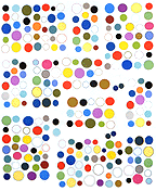
My painting archive has recently been revamped. I've created thumbnail pages for the year 2001 and the years 1996-1999, so clicking through the slideshows is less of a stab in the dark. Most of the actual artwork, by the way, is done using Paintbrush, a kind of toy program that shipped with Windows pre-'95 (the current version, MSPaint, is vastly inferior). Raw material in the form of spheres, dots, and scribbles is printed out on the EPSON 2000P and then assembled by hand into collages with a quirky physical presence, unfortunately not always translatable into jpegs. I'm interested in combining outdated styles (cubism, AbEx, color field painting) with outdated computer technology to create weirdly ahistorical hybrids, clunky but (hopefully) ingratiating.
In his book on rave culture, Generation E, Simon Reynolds bemoans the inadequacy of rock criticism to describe/interpret dance music: "The materials with which the techno auteur works--timbre/texture, rhythm, and space--are precisely the elements that rock criticism ignores in favor of meaning, which is extracted almost exclusively from close study of lyrics and persona. Rock critics use techniques borrowed from literary criticism or sociology to interpret rock in terms of the singer's biography/neurosis or the music's social relevance. Devoid of text, dance music and ambient are better understood through metaphors from the visual arts: 'the soundscape,' 'aural decor,' 'a soundtrack for an imaginary movie,' 'audio-sculpture.'"
If only visual arts criticism were concerned with talking intelligently about "timbre/texture, rhythm, and space"! Unfortunately art critics do the same thing with art that Reynolds says rock critics do with dance music: they ignore the perceptual phenomena and start hunting for texts. If they're not up to the job of supplying verbal equivalents for visual experience (and most of them aren't), they're likely to dismiss the art as vapid eye candy. Gradually artists, too, give up, and begin to make work with "text," either imbedded in the piece so critics can "discover" it, or overtly expressed so that it can be parroted in reviews. A sign of the mass resignation of artists to curatorial/critical preferences is the December Artforum cover, which shows thumbnails of the "Best of 2001." It is telling that out of fifteen images, the cover features only one painting (by Luc Tuymans) and one sculpture/installation (by Thomas Hirschhorn) and the rest of it's basically photography.
Writers feel more comfortable talking about photography because it's a storytelling medium, as well as the language of "the media." Yet some of the most interesting artworks being made are closer to electronic dance music--abstract, evocative experiences that one could spend days coming up with metaphors to describe. (Examples are some of the digital paintings discussed elsewhere this log; the logic even extends to more traditional abstract painting by Albert Oehlen, Carl Ostendarp, and Sarah Morris--all of whom have excellent shows up in Manhattan right now.) This isn't "stupid" work--if anything it's smarter because of the convolutions it goes through to defeat precise description. But that's its Catch-22; the better it succeeds in rendering the viewer speechless, the less likely it is to find an intelligent critical advocate.
