View current page
...more recent posts
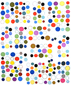
Filter House (detail, work-in-progress), ink on cut paper, product packaging, map pins, 60" X 50" X 2.5"
Paintbrush vs. Paint
MSPaintbrush is a 165K graphics program that shipped with Windows prior to 1995. Bill Gates & crew did not create it; as with many of their products they acquired it, in this case by buying a company called ZSoft. When Windows 95 came along, Microsoft supposedly "improved" the product and changed the name to MSPaint: it's still part of the Windows accessory package. As an artist I greatly prefer Paintbrush to Paint, and was lucky to track down an abandonware version so I can keep using it (to draw portraits, molecules, and the like).
What are the differences? In Paintbrush the zoom requires less steps to activate. You can also zoom out to see the entire image, which for some reason you can't do in Paint. Paintbrush has more brush, spray, and eraser sizes. A newly-pasted image in Paintbrush has a clear background, so you can immediately see how it layers over an existing image; in Paint the default is opaque. Paintbrush colors are customized with simple, easy-to-use RGB sliders, as opposed to Paint's "color picker" spectrum, which, again, requires more steps.
But the most crucial difference, for me, is the output of the "spraycan" tool. In Paintbrush (see sphere at left) it's like crosshatching; the effect is much more volumetric and seductive, once you get the hang of using it. Paint (sphere at right) has a fast, user-friendly, point-and-spray dot-dispersion pattern, but to me it looks like bad 70s airbrush art.
It's more of struggle to blend from dark to light in Paintbrush using those crosshatch dots (each is a spritz of the spraycan). I can see where the Microsoft techies thought they were improving the program, and for most people they probably were, but I like the grittier, clumsier feel of the crosshatching compared to the smoother pointillism, and even more important, the ability to create rich, intermediate grays. By eliminating the struggle they greatly reduced the potential beauty of the finished image.
Yes, I've used this cereal box and milk bottle before, but never in a corner piece! The bottle, by the way, is Hershey's chocolate milk. When you strip off the gaudy outer packaging (and it takes a while, the plastic wrap is tough) you discover this pristine, white, lathed-looking cylinder underneath. The atoms and "bonds" I draw in MSPaintbrush, print, individually cut out with scissors, then map-pin to the wall.
I guess my interpretation of this body of work would be as follows. A sort of cargo cult worships consumer packaging. In a bastardized version of science, their mystics try to chart the invisible bonds between products, and link the packaging to the larger world. The symbolic byproducts of this research become like graffiti tags, which the cult sticks on walls as territorial markers or signs of their faith.
