View current page
...more recent posts
Three exhibits currently up at 526 W. 26th in Chelsea take major steps in the ongoing project of materializing 1s and 0s (art world department). The installation view at top is Millree Hughes at Michael Steinberg (9th floor). No static picture could do this show justice because every surface is lenticular printed plastic (a kind of pseudo-hologram often seen on gag postcards) encoded with five distinct abstract paintings. Each painting reveals itself in turn as you walk past the piece, and you are always looking at a "transition state" where 2 or more paintings are visible. This idea was done in a very obvious way by the Op artist Agam in the '60s (using ribbed, painted panels), but Hughes' layering of multiple viewpoints is much more shimmery and fluid--like a screen dissolve in tangible form. Miraculously recuperating Spencer Gifts technology, the show rethinks how painting can be experienced, making the spectator a participant, much as in an exhibition of Minimalist sculpture. (The floor-pieces aren't sculptures, per se, but rather paintings in a variety of elevations, orientations, and groupings.) The tangles of abstract expressionist silhouettes are done in a Flash program, very much informed by old-school paint-handling but with stretching, resizing, and color-tweaking features unique to digital programs.
Claire Corey's show at Ten in One (3rd Floor) makes us question our commitment to touch and spontaneity, supposedly the last remaining hallmarks of painterly as opposed to photographic practices. At what point do we stop caring about "the hand" and "humanity" when machines can perfectly duplicate drips, smears, and other signifiers of studio passion--that is, when we can no longer trust our senses to connect us to another's experience? Abstraction has no equivalent to portraiture's "uncanny valley," where heightened similarities make us concentrate distractingly on differences. Corey also has a show up in Germany right now, with an essay well worth reading, placing her work in the context of postmodern AbEx and explaining how she removes it one more step, from imitating a machine look with paint processes to actually using the machine to make art. Shirley Kaneda & Co., watch out: the bar has been raised.
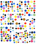
Ditto ChanSchatz, at Massimo Audiello (5th Floor). Thinking this work was done like Corey's, all with the computer, I was disappointed to learn they cheated and used paint. What I thought were airbrush and stencil effects are apparently just airbrush and stencil (if I'm wrong about this, please leave a comment). Even worse, they've got that damn conceptual back story, obligatory for all recent Columbia MFAs: They didn't just make paintings, they're quick to explain, they gave their friends* preference sheets and had them check off favorite shapes and color combinations. Their aversion to the Individual Genius Author is laudable, but at a certain point decisions have to get made, and I'd guess these paintings lost their committee involvement fairly early in the process. They're intelligent and compelling images (except for the cheesy portraits) in which the computer is obviously integrally involved at the design stage; they don't need to be legitimized with all the discourse about "information management," corporate branding, blah blah.
*A who's who of New York curators, critics, and artists. What a coincidence! Also the friends' names are in the titles of the pieces. Touching. *retch*
