View current page
...more recent posts
My review of the "Paradise/Paradox" exhibit at the College of New Rochelle, curated by Susan Canning, appears in the March issue of Sculpture magazine (print edition only). Here's a sample paragraph:
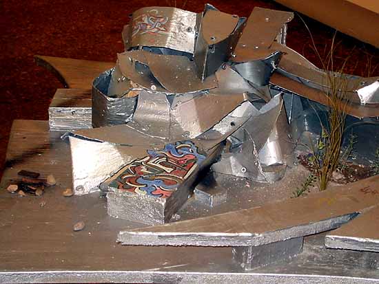
The three-dimensional work in the show is a curious mix of the hopeful, the cautionary, and the misguided. Recalling a 1950s model kit for high school biology students, Michael Joos Small Vitrine, 2000, presents a seated Buddha in clear cast plastic, with plastic bones and internal organs completely revealed. Conspicuously absent is the Holy Ones head, perhaps reflecting the ancient Zen wisdom that its the body part that gets us into the most trouble. And as if to prove Joos point, Colin Keefe shows us an overdetermined idea of Heaven, 2001, a seven-foot-tall model of a gyroscope-shaped space colony, which perpetuates, out among the stars, many of the foibles of 20th Century urban planning. On the inner surfaces of this partial Dyson sphere, living space in the form of hundreds of densely clustered high-rise buildings is segregated on two of the rings while the third is empty greenbelt. Another work of Keefe's, a drawing on a nearby wall, shows a series of barricaded enclaves separating city-dwellers from what appears to be unoccupied land. Yet if its truly empty, why have the barricades?1 Finally, Jason Middlebrook mocks present-day notions of heaven on earth with an entropic, post-apocalyptic re-envisioning of Frank Gehrys Guggenheim Bilbao design. The artist gets revenge on a pretentious architect by imagining the building partially collapsed, surrounded by weeds and rubble, and festooned with graffiti. (minor changes made in response to an editorial change to the original text)Below is the image of the Middlebrook piece that accompanies the review, Guggenheim Bilbao, Part II (2002, wood, paint, polystyrene, 34.25 x 52 x 39 in.). Behold Gehry's creation, as it deserves to be remembered:
1. No one seems to be sure what's going on in Keefe's work, exactly. On the reviews page on his website, Holland Cotter says it picks up the pieces of discarded utopian design, while Gary Michael Dault in the Toronto Globe says in so many words that it's winsomely dystopian. I'd say it's just plain dystopian.
UPDATE: The full text of this review is now online here.

