View current page
...more recent posts
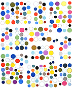
In the comments to an earlier post, a couple of people have been nice enough to help me with the ongoing issue of how to present work on the web. Sally (if I can paraphrase her) thinks a piece I posted earlier

should be shown cropped and sharpened, so that it reads more as a web-friendly graphic,

while Chris (if I can paraphrase him) was interested in what more documentation told him about the actual physical object. (The example below is the back of a different but similarly made piece.) "I like the simple use of materials- paper the colors found near a photocopier of any medium-sized office, and the linen tape, the bit of puckering. And what do you know?- it's a painting: a wooden stretcher and staples."

I'm actually not as intrigued as Sally by the grey zone between documentation of work and making some new, cyber-active form of it (again, paraphrasing)--in fact, I think the grey zone is a pain in the ass. You can choose to make things that demonstrably work best on the web (animated .GIFs, for example, or Chris's HTML drawings) but documenting physical work is basically a mundane, practical problem. Of course, new work ideas can be spun off from the process of documentation (and I like Sally's redo quite a bit), but I do value the physical work (too) and if the goal is to use the Web to make an end run around the gallery system, we really can't have the Web changing the meaning, or reading, of the objects on us.
