View current page
...more recent posts

Disc, 1999, ink, paper, linen tape, wood, 10" x 10"
Truth in advertising: what the back of a similar piece looks like.
"72%" Iraqi Turnout Figure Already Plunging
Reuters:
BAGHDAD, Jan 30 (Reuters) - Iraq's Electoral Commission backtracked on earlier estimates of voter turnout in the election, saying a previous figure of 72 percent "was just an estimate" and indicated the actual figure was lower.Whatever the final number ends up being, you can be sure the Bush Media will keep saying 72% ("More than in the US election! Incredible! Aren't we great?"). More words from wet blanket Juan Cole:
At a news conference, commission spokesman Farid Ayar called the 72 percent figure a "guess" and said maybe up to 8 million Iraqis voted, which would be a little over 60 percent of registered voters.
"Percentages and numbers come only after counting and will be announced when it's over ... It's too soon to say that those were the official numbers," he said. "The numbers are only guessing."
The Iraqis did not know the names of the candidates for whom they were supposedly voting. What kind of an election is anonymous! There were even some angry politicians late last week who found out they had been included on lists without their permission. (This is the part of the process that I called a "joke," and I stand by that.)ABC is reporting 44 people killed on election day. Bush, Rice, Rumsfeld, Cheney: great work. You can also count that they'll say the "high" turnout was an after-the-fact justification for the invasion, now that the other justifications have evaporated.
This thing was more like a referendum than an election. It was a referendum on which major party list associated with which major leader would lead parliament.
Many of the voters came out to cast their ballots in the belief that it was the only way to regain enough sovereignty to get American troops back out of their country. The new parliament is unlikely to make such a demand immediately, because its members will be afraid of being killed by the Baath military. One fears a certain amount of resentment among the electorate when this reticence becomes clear.
Iraq now faces many key issues that could tear the country apart, from the issues of Kirkuk and Mosul to that of religious law. James Zogby on Wolf Blitzer wisely warned the US public against another "Mission Accomplished" moment. Things may gradually get better, but this flawed "election" isn't a Mardi Gras for Americans and they'll regret it if that is the way they treat it.
UPDATE: Good post runs down Bush's history of resisting the cleric Ali Sistani's call for this election and gives Sistani, not Bush, credit for the Shiite turnout today. Bush is getting his sound and image bites but is working behind the scenes to keep a religious figure from running Iraq.
UPDATE 2: From Robert Fisk in Iraq, by way of James Wolcott: "The big television networks have been given a list of five polling stations where they will be 'allowed' to film. Close inspection of the list shows that four of the five are in Shia Muslim areas 'where the polling will probably be high' and one in an upmarket Sunni area where it will be moderate. Every working class Sunni polling station will be out of bounds to the press. I wonder if the television lads will tell us that today when they show voters 'flocking' to the polls."
As anticipated, the Bush Media are reporting a happy day of electing in Iraq that we're paying $200 billion for. I'll be looking around for some kind of reality check. tex, one of my favorite antiwar.com bloggers, has some scattered reports. This from reporter Chris Albritton on the all important "image spin":
I'm watching CNN International, and the shots of long lines and happy voters are almost all coming from Iraqi Kurdistan where the voters are motivated and the environment is (relatively) safe. The rub is that CNNi is not identifying the images as coming from Kurdistan; the only way I knew it was from up north was the single shot of someone waving a Kurdish flag. But if you don't know what the flag looks like (red, white and green bars with a yellow starburst in the center), as I suspect most Americans don't, you wouldn't know the context of these images. Shi'ites are also coming out in droves in the south. But Sunnis are staying home. I will be surprised if the Sunni vote hits double digits at this point.Albritton also reports:
Nine suicide bombs in Baghdad alone, with at least 20 dead. A bomb went off near the home of the Justice Minister. There are a number of outgoing mortars from my neighborhood in the last 10 minutes.And from Juan Cole:
Although the violence and attacks have been extensive and took place all over the country, the security measures put in prevented massive loss of life. Suicide bombers clearly could not get close enough to crowds to take a big toll.Which would be cool, but the point here is the white former elite wouldn't stand for it--they'd bide their time and then fight (or cheat) to regain power. But BushCo is only concerned about how it plays on TV today, so multinational companies can continue to operate in Iraq under cover of a "democratically elected government." Bottom line, whether it goes well or not, why in the world are we paying in lives and dollars to run another country's elections? Oh, sorry, I forgot: the "war on terror."
On the other hand, if the turnout is as light in the Sunni Arab areas as it now appears, the parliament/ constitutional assembly is going to be extremely lopsided. It would be sort of like having an election in California where the white Protestants all stayed home and the legislature was mostly Latinos, African-Americans and Asians.

This is all over left bloggerville, but must be passed on. From Salon's War Room: "Washington Post fashion columnist Robin Givhan doesn't think much of Vice President Dick Cheney's choice of attire for Thursday's commemoration of the 60th anniversary of the liberation of Auschwitz. Cheney's dressing down in a parka and ski cap, Givhan notes, was rather at odds with the solemnity of the event." Givhan's text:
"The ceremony at the Nazi death camp was outdoors, so those in attendance, such as French President Jacques Chirac and Russian President Vladimir Putin, were wearing dark, formal overcoats and dress shoes or boots. Because it was cold and snowing, they were also wearing gentlemen's hats. In short, they were dressed for the inclement weather as well as the sobriety and dignity of the event.
"The vice president, however, was dressed in the kind of attire one typically wears to operate a snow blower.
"Cheney stood out in a sea of black-coated world leaders because he was wearing an olive drab parka with a fur-trimmed hood. It is embroidered with his name. It reminded one of the way in which children's clothes are inscribed with their names before they are sent away to camp. And indeed, the vice president looked like an awkward boy amid the well-dressed adults.
"Like other attendees, the vice president was wearing a hat. But it was not a fedora or a Stetson or a fur hat or any kind of hat that one might wear to a memorial service as the representative of one's country. Instead, it was a knit ski cap, embroidered with the words 'Staff 2001.' It was the kind of hat a conventioneer might find in a goodie bag.
"It is also worth mentioning that Cheney was wearing hiking boots -- thick, brown, lace-up ones. Did he think he was going to have to hike the 44 miles from Krakow -- where he had made remarks earlier in the day -- to Auschwitz?"

You could almost feel sorry for him if he wasn't responsible for so many people getting killed. There is some difference of opinion on whether this happened because he and Lynne came from separate events, and she wasn't around to help him dress, or if this is just him being indifferent to "Old Europe." Weighing in on the side of arrogance, I'm reminded of the story of Cheney on the campaign trail ordering a bunch of vegetables from a farmer and then just handing him a ten dollar bill, without asking for the price.
Details from Michael Bell-Smith's video, Top of the World, at Foxy Production, in the group exhibition "GEO," which runs through February 8, 2005.

The video begins with an aerial perspective looking down on a videogame landscape (sort of reminiscent of the old Intellivision tank battle terrain, but it could be a lot of things from that era). Directional arrows invade the middle ground and...

...after passing over, under, and around each other they begin to dissolve into painterly sprays of pure pixelation--a gorgeous effect, but not too gorgeous. It looks like a specific set of commands to "break down" as opposed to a one-click Photoshop filter; don't know if any, or how much, custom programming was required and don't care particularly. Eventually the screen fills with a succulent allover abstraction that could be Monet's Water Lilies a la Bit-Rot.

This detail showing the initial breakdown into pixels probably looks fuzzy in Safari--another browser is recommended to see this scaled up image super-sharp.
In the gallery, the video is displayed on an LCD screen directly from the computer. My only quibble is I miss seeing this type of imagery on the big clunky CRT picture tube, as a similar work of Bell-Smith's was displayed last summer in the Infinite Fill Group Show. Ideally when he has a solo exhibit we can see his work with a variety of formats and hardware. Also recommended is a music piece on Bell-Smith's blog that is a kind of marathon sequencer ditty--curious to see what happens with that if it reaches the projected 74 minutes.
Still More Damn Metablogging
Just reading a New York Times article (linked to by Bill) that talks about how blogs are changing the design world because bloggers write from passion and editors and other trendspotters increasingly rely on them to suss out the new.* This hasn't happened in the art world, because galleries still don't know what blogs are. (Print magazines are figuring it out and thanks again to AinA.) One of the themes of the Rhizome "Blogging and the Arts" panel in Nov. at the New Museum was whether this thickheadedness on the part of art spaces was volitional. Most of the audience for that panel, I'd guess, came from the new media community, comprising folks making computer, internet, video, and multimedia art that is exciting and increasingly relevant as the world becomes more wired, but hard to commodify in the same way that galleries package and sell non-virtual artists.
Many in this cyber-community think the internet's openness and transparency threatens the gallery's traditional business of "creating the appearance of rarity or scarcity of objects in order to market them for high prices to an elite," as someone said that night. Yet at the same time the new media-ers ultimately want that gallery sanction--for the art world to say that what they do is not only art, but great art. My own response is there is no conspiracy, that the gallery world has certain habits of practice, which up till a few years ago included putting up shows, mailing out invitations, getting critics in, xeroxing the critics' clippings and mailing them to collectors, etc. but now includes dealing with the baffling and ever-changing world of websites and like it or not, blogs. Most overworked, underpaid gallery worker ants don't have the time, money, or energy to deal with this layer.
Having said all that, it's annoying that galleries don't acknowledge blog writing and still privilege King Print. I admit I only recently added blog references and hyperlinks to my personal resume, and it's going to be a pain to keep track of them as URLs change or heaven forbid disappear. But I think it's an important step. From the galleries' perspective, legitimation or verification of artists ought to be a two way street, or packet exchange or whatever: they rely on known critics to build the case for work, but they also endorse lesser-known critics by including them in their artists' clipping files. If an up-and-coming critic says something perceptive about a show that the mainstream media mavens missed, the gallery helps spread the word that that writer has a clue by listing their writing on the bio. Thus begins a cycle of mutual critical reinforcement, what the cynical might call a circle jerk, but nevertheless potentially scene-defining.
*The article goes on to talk about how manufacturers corrupt this process by giving bloggers freebies in exchange for plugs, but the art world isn't even to stage one of bloggers mattering yet.
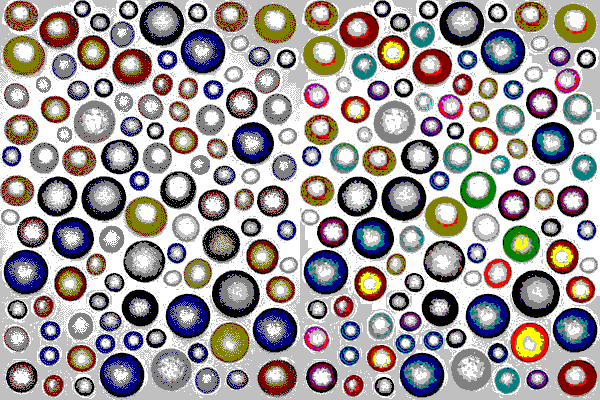
The cool people: the following U.S. Senators voted against the appointment of Condi "Mushroom Cloud" Rice, who is now the Secretary of State:
James Jeffords, Independent, of Vermont, and Democrats Mark Dayton of Minnesota, Barbara Boxer of California, Edward M. Kennedy and John Kerry of Massachusetts, Carl Levin of Michigan, Robert C. Byrd of West Virginia, Jack Reed of Rhode Island, Richard Durbin of Illinois, Daniel Akaka of Hawaii, Evan Bayh of Indiana, Frank Lautenberg of New Jersey and Tom Harkin of Iowa.These people know a liar when they see one, as do we, the hapless public.
This page joins in solidarity with all the others who oppose the Senate confirmation of Alberto Gonzales as Attorney General of the U.S. The memo he wrote approving the torture of U.S. military prisoners will eventually earn him a place in one of those netherworld resorts Dante excelled at describing, but in the meantime, let's do what we can to keep him out of high office. One thing I wonder is, why don't any mainstream, non-Fundamentalist churches (Episcopalians, Lutherans, etc.) speak out in protest that sexual humiliation, immersion in buckets of water, and other Inquisition-like horrors to elicit "information" has become the official policy of the U.S.? Were Jesus' teachings just about making people feel mellow? War or no war, this is bad for all of us.
As for the other evil shoo-in, James Wolcott has this to say:
Why is Barbara Boxer out there all alone asking the tough questions about Condi Rice's snail trail of deceit and fearmongering? She has the audacity to act as if the Senate actually has some traditional advise-and-consent role to play and for her pains is caricatured as a shrieking harridan on Saturday Night Live and a witch on talk radio. Boxer was terrific today on CNN, refusing to back down and reiterating her questions and objections regarding Rice with emphatic clarity while Sen Lugar mumble-mumbled some pathetic excuse-making about how Rice didn't deliberately mislead the country re Iraq's WMDs, she just did the best she could under the circumstances. Look, Biden and the rest of you Democratic punk-asses--get behind Boxer or get lost. She shouldn't be up there on the parapet alone, not with this wrecking crew trying to gear us up for war on Iran.
"Jay Jay's Apartment" (cool version) [mp3 removed]
"Jay Jay's Apartment" (nerdy version) [mp3 removed]

"The demon has materialized over Tokyo Bay!"
"Use the gamma beam--now!"
"It's not stopping--it seems to be eating the gamma radiation."
"We'll have to lure it back into the wormhole, using the gamma cannon as a decoy--move the ship into position, and on my signal..."
Great post from collision detection, re-re-blogged from Eyebeam:
Apparently Glad has scored a bit hit with its new ForceFlex garbage bags -- which can stretch to seemingly impossible dimensions, and thus contain the ever-greater volumes of nonrecyclable carcinogens the average American family craps out every day. ("Hey honey, Johnny doesn't like his Jungle Gym anymore!" "No problem, sweetie -- we'll just shove it inside a single ForceFlex garbage bag and send it off to the dump so Johnny's grandchildren can drink the entire goddamn thing 80 years from now when it leaches into the water table.")
Regarding the '90s pieces I just posted, Paul asks if x-eleven, the old school Dallas techno outfit that recently put its entire catalog up on the Net, got me inspired to go through my older work. The answer is not directly, I usually put up older things when I stumble across them looking for something else and they jibe with whatever I'm thinking about now, or possibly because they have nothing to do with that. I consider any painted pieces to be hopelessly retrograde and superseded and if I post them it's because I'm, well, let's just say proud of them for the time I made them.
A show recently opened in Brooklyn called "Decipher: Hand Painted Digital" that my work was considered for and...I don't know if rejected is the right word because the curator said all the artists had to live or have studios in Brooklyn. Oy. He added that subheading "hand painted digital" after the time of our discussions and I gotta say it's a bit unfair to the artists in the show who abandoned the security blanket of paint to paint in a new medium. Many of the included painters do use the computer in one or more steps of their work--to generate imagery, photo-process, possibly check out color combinations, I don't know--but there's nothing particularly "cyber" on the face of it. At its worst, "hand painted digital" suggests a painter trying to stay current or "hep" by painting digital, or digital-looking imagery, in his or her old style.
Back to x-eleven: I consider it to be J. S. Bach, not a period piece, though some of the technology and much of the motivation (make cool music for a rave, expand minds, get out of Arlington, TX) no longer exists per se. I'm just amazed by how complex and intense it is, and I suppose I mentally subtract out anything cheesy or dated. I do that with a lot of prog rock as well.
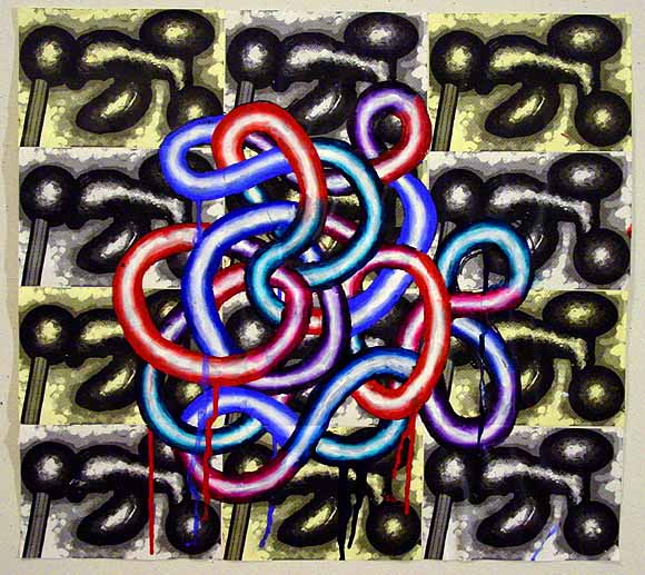
I think was done in '95--it's a transition between my painted and computer pieces.
A friend says he can't believe I paid money to see Assault on Precinct 13 (discussed in an earlier post). I told him what I really wanted to do was talk about the John Carpenter version, from 1976. I had actually written a "preReview" of the Ethan Hawke remake, but felt it was lame not to actually see it if I was going to bitch so much. So I sucked it up and paid. Anyway, my compare-and-contrast has been rewritten somewhat, beefing up the Carpenter tribute.
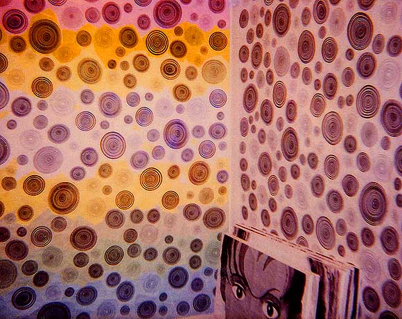
Another view of my 54th St. studio, circa 1999 (scan of polaroid), from the vault.
From Leonard Maltin's movie guide, 2010 edition:
Assault on Precinct 13: Before Sunrise (2005) ** D: Jean-Francois Richet. Ethan Hawke, Laurence Fishburne, Maria Bello, Ja Rule. Overwritten remake pads out John Carpenter's lean, mean low budget 1976 thriller Assault on Precinct 13 with Hollywood psychobabble and a host of added characters meant to broaden its appeal. Permanently perplexed slacker Ethan Hawke bores and overacts in the Austin Stoker role as a cop who must defend an abandoned police precinct building (and its accidental inhabitants) from a military-style assault by mysterious foes. Still playing Morpheus from the Matrix movies, Laurence Fishburne occasionally amuses as a prisoner temporarily housed in the building who joins in its defense.The original movie, a pulp masterpiece of the type that the Hollywood cool kids admire but always ruin by trying to recreate, flopped on release, reportedly running for 24 hours in a seedy Times Square theatre, but gradually acquiring a rep as Carpenter's star continued to rise with Halloween, The Thing, and so forth. A George Romero-style zombie film with a street gang as the zombies, the first Assault introduced one trapping of the urban crime genre that was years ahead of the curve: too broke to hire a composer, Carpenter invented the cool synthesizer-and-rhythm box score, of the type that later dominated the '80s--a minimal funk machine with a bass line we would now call "classic electro." (Carpenter says he was influenced by Led Zep's "Immigrant Song," which shorn of its viking narrative is proto-techno in its hypnotic simplicity). The Assault music is so good, still, that the DVD gives you an option to hear it with dialogue and sound effects muted.
Partly due to that hip-but-sinister score, partly due to Carpenter's narrative economy and budget-driven sense of visual priorities, and partly due to the '70s zeigeist of "society in freefall," the first movie gives you a sense of "being pulled towards some inevitable doom," as one fan put it. Slate critic David Edelstein, who generally sneers at Carpenter and still twits him 30 years later for the shocking child murder that begins the first Assault, praises the film's atmosphere of "free floating malevolence." Although Carpenter claims no sociological intent for the movie, one senses throughout that it is urban anomie and neglect as much as a relentless gang vendetta that besieges the characters inside a soon-to-be-closing police station, with no cavalry in sight.
The remake does away with the difficult, unforgettable opening murder scene and shifts the villainy from a street gang to "crooked cops," which is a cliche, but it does give the film its only subversive juice. Over the course of its too-long running time, the film's added assortment of Offbeat Ghetto Characters--or so the scriptwriters seem to imagine them--waste a lot of gendarmes in scary high tech riot gear and the audience is encouraged to root for that. In a time when our police forces seem bent on remaking themselves into the military wing of the Republican Party, and in anticipation of their eventual merger with private security contractors currently guarding the elite (or just if you hate armed authority figures), the counter-assault has a certain cathartic appeal, outside the film's lame blaxploitation-with-Ethan-Hawke context.
UPDATE: J. Hoberman, a fan of the original movie, likes the remake.
Chris Ashley, Untitled (Transit, Windows, Ribbons), 2005, HTML, 500 x 460 pixels
Most Condescending Art Critic Comment of 2005 (So Far)
Peter Schjeldahl, The New Yorker:
A leading exegete of theory on the scene, Craig Owens, hatched the keenest critique of East Village art, in one word: "Puerilism." (Why the slur's victims didn't promptly embrace it, on the model of "Fauvism," I don't know; maybe they lacked ready access to a dictionary.)More.
A bit slow in getting around to this, but please listen to the marvelous "Rodchenko in My Bauhaus," by Candy Chang [5.6 MB .mp3 - download is from the Red Antenna site which handles Chang's music]. This lascivious come-on set to a slinky electro beat abounds with visual art and design references, and is possibly the only song you will ever hear that rhymes "Moholy-Nagy" with "love collage," or entices the listener to "put your function in my form." You can check out other music by Chang at her website; songs are available for download from her Typography EP (the instrumentals "Bravo Futura" and "Telegram 41"), and the Impulse Sealer 12" ("My Radio Is So Casual"). I first learned about Chang hearing "Rodchenko" on Red Antenna's New Electric Policy 2 CD (which I play a lot), one of the last things I bought at Throb before it crashed and burned.
It must be said, I don't want New York electro to be over, because it's a great contribution to the world and a quantum leap over the old synthpop and new wave dance music, in that the technology is so much better now, and 20 years' knowledge of how to push amplified sound around makes all the difference. Anyway, sorry for that rant, be sure to check out those Chang instrumentals.
I cut another minute out of "Blues for DG" [mp3 removed], and it's better now, I think. Also, the piano version of "Reel for Omniverters" ain't half bad for a guy playing with three arms: [mp3 removed]. The synth version is here, possibly to be revised with better synths.
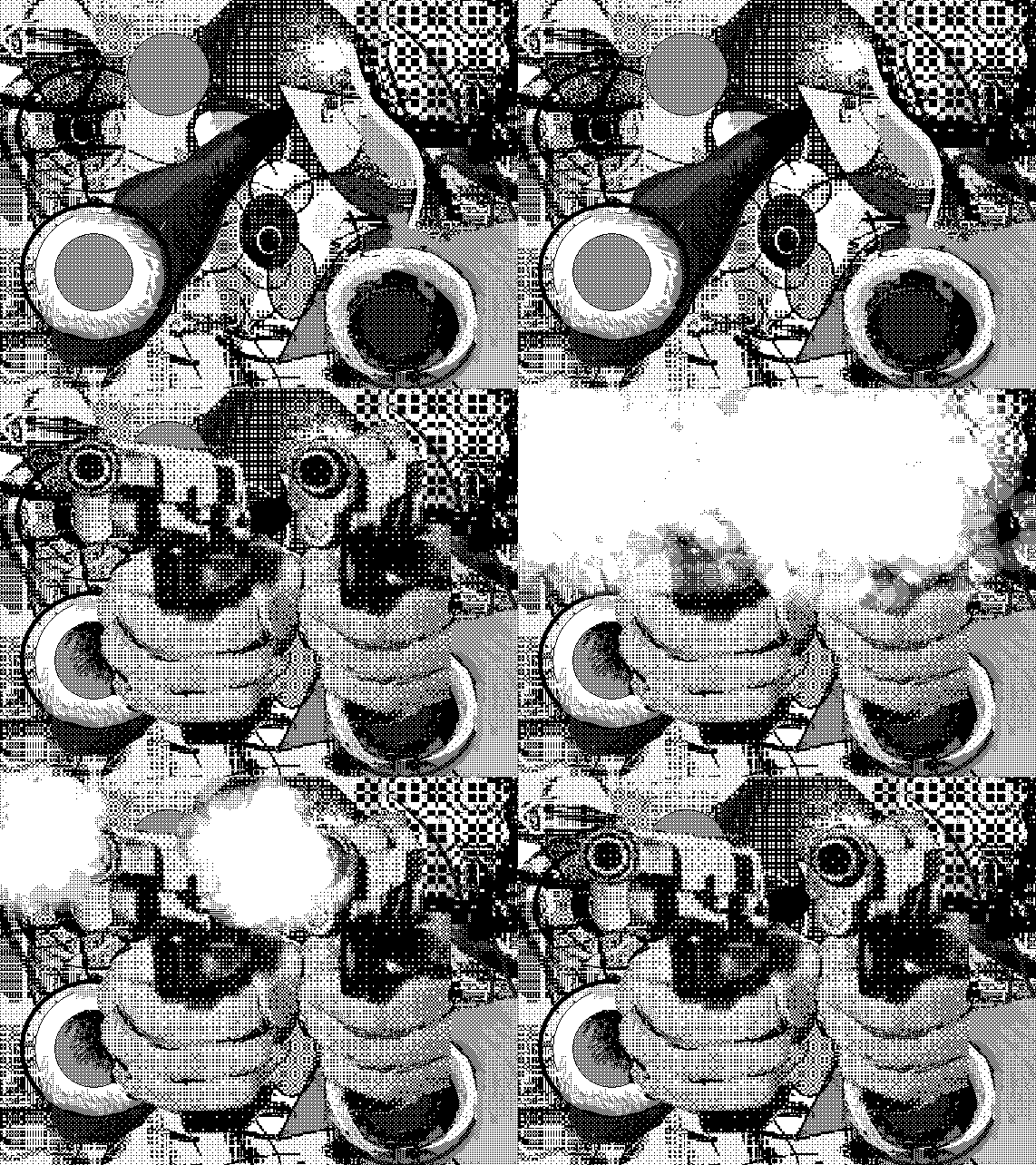
moody + jimpunk + rosenquist = cubism, large bits, violence
I received the following email about Jude Tallichet's upcoming show at Sara Meltzer and it's so brilliantly concise I present it intact:
Dear Friends,In the past Tallichet has done perfectly crafted models of historically resonant architecture--such as knee-high versions of the main Brasilia buildings painted jet black--with her own electronic music playing inside of them. For this show, the email above rather gets it across: Ezra Pound couldn't have done a better job of conjuring an art experience with a few well chosen words (on second thought, Donald Judd's straightforward descriptions are probably more on point). Linguists talk of "performatives," which, according to wikipedia are expressions such as 'I nominate John to be President', 'I sentence you to ten years imprisonment' or 'I promise to pay you back,' where the action the sentence describes is performed by the sentence itself. The paragraphs above almost transparently "perform" the art because you can see and hear it so clearly. Now to measure the show against the words.
January 20, a day that will live in infamy (2nd inauguration of youknowwho), also happens to be the opening date of my exhibition "Hiding in Plain Sight" at the Sara Meltzer Gallery. 516 West 20th Street, from 6-8pm. The show will run until February 19.
"Hiding in Plain Sight" will occupy Room 01, Room 02 and the Video Wall, and will feature four sculptures: a bear rug cast in aluminum, a bale of hay cast in bronze, a wagon wheel made of mirrors, and a campfire made of neon lights and plastic. I have also composed a sound track featuring the merged sounds of auctions and gregorian chants, and a video wall featuring "westerns" shot in Fort Lee, New Jersey during the early 20th century by Thomas Edison.
I hope you can see the show!
UPDATE, Jan. 20: Tallichet's art is carefully made and impressive to behold, so as well as you can visualize the above description, that's what the show looks like. We are somewhat in Koonsian scuba tank territory here, only with a theme of ersatz Americana perfectly timed for the swearing-in of an ersatz President. The essential fraud of westerns filmed in New Jersey combines with the PT Barnum curio in a series of deadpan surrealist audio, video, and sculptural works. Through the visual rhetoric of late Minimalism (in the exhibit's spare presentation and determined craftmanship), the art world is also implicated in this scheme of bogus experience. Excellent, thoughtful show.
Photos from the Wrecking Ball [dead link], a twice-monthly "Evening of Electronic Musical Debauchery and Mayhem" in Brooklyn. Top, Heat Sensor, three intense guys with laptops, who've gotten some ink recently working with hiphoppers MF Doom and King Ghidra. All glitchy texture and monotonously elegant looped beats, this was hard to stay focused on, except for occasionally ear-tickling Kruder & Dorfmeisterish atmospherics. Middle photo, Bubblyfish, incorporating 8-bit/gameboy [dead link] sounds organically into danceable techno. This could be pop music in Europe, and that's meant as a compliment (because I hear they have techno on the radio over there, and not just in car commercials). Her final number--begun and ended with a childlike pecking out of "Good King Wenceslas"--especially shined. Not pictured because the photo was overexposed: Man From Planet Risk's jenghizkhan, the most dissonant and "art," as opposed to arty, entry in the program. He had beats, but also skronky sounds resembling giant uncoiling springs overlapping in reverberating, Stockhausenlike crescendos. Also, like Bubblyfish, some pretty melodies wafting into the mix.
Heat Sensor
Bubblyfish (and speckly texture on the photo--sorry)
"Reel for Omniverters" [mp3 removed]
A friend commented that he likes the music I wrote for the Macintosh SE better than what I'm doing now, because what I'm doing now is "dance music." I disagree that anything written in the last six months is particularly danceable, although I use a lot of dance tropes because I love it. FWIW, "Reel for Omniverters" is more in the old style of writing, just with newer instruments.
Technical crap: this piece uses Cubase to control three synths, one "outboard" and two virtual. I spent a frustrating week trying to adapt my writing method to the Cubase environment and finally gave up. In Cubase, staff notes are contained within "parts" on a timeline, and you can't cut and paste notes, only parts. Which means constantly moving in and out of the parts to write. So what I did here was write the whole thing for piano in my notation program, which allows one to easily move notes around on any number of staffs, and then saved it as a MIDI file, which I imported into Cubase and used to play the instruments. So, why not just use the notation program to play the synths? Because it's limited to its own (conventional sounding) virtual instruments and its MIDI control isn't very good. Cubase is more compatible with the virtual instrument environment. Because the next step is to eliminate the use of Cubase's "house synths" and import (or control) better sounding ones.
UPDATE: Bonus--piano version [mp3 removed]



Went back in to look at Leif Ritchey's show today. The show is indeed overhung. Ritchey has one foot in the fashion world and his dresses are dresses, not sculptures. And beautiful, no? That's not to say they shouldn't be shown in a gallery, only that some effort should be made to establish a context. They lost oomph packed into a crowded room with the artist's paintings (not his strongest work) and assemblage sculptures. The sculptures, too, needed breathing room and context. These photos are my attempt to present the work in a more minimal way, at least as minimal as a blog page can be. The top two images are details, aiming the camera straight down at the horizontal surfaces of two different pieces. They are severely cropped, speaking of no context, but it was these areas that haunted me after the opening and this is my way of getting a good look at them. The image of the dresses is how I would present the dresses: Soho style, with a lot of white space around them so you can see them. I thought it was old or scavenged material but the gallery says no--it's just the way the artist handles and distresses the fabric(s).
A few quick movie notes. The Missouri Breaks ran on AMC last night. Marlon Brando in the granny dress yelling out "Smoked meat!" after he has torched the horse thieves' shack and burned a couple of them up is one of the stranger movie moments. His stalking and creative murder of the thieves (and his own eventual throat-slitting at the hands of good bad guy Jack Nicholson) looks back to the "weird late '60s/early '70s Western" tradition of Greaser's Palace and forward to the Jason Vorhees, Freddy Krueger school of meaningless '80s mayhem. Forgot that this was a Thomas McGuane script. God, he had good, short run in moviedom.
Watched The Aviator on the big screen yesterday looking for the tedg independent roving camera eye. You notice it in the scene where Howard Hughes and Katherine Hepburn first have sex. The camera precedes them into the study, has a look around, then turns back to find them already on the sofa langorously making out. The movie could be pitched as "The Carpetbaggers meets A Beautiful Mind." It's folded in the sense that we compare it to those other films and also complete it with our knowledge that Hughes will end as he does in James Ellroy's American Tabloid, an evil behind-the-scenes web spinner. (Webs literally begin appearing in the room in this movie.) Nauseating Hollywood mythmaking mingles with psycho soap opera throughout, but the flying scenes are bravura, especially the one where Hughes crashes the test plane into an upscale Hollywood neighborhood. Spoiler: the last lines--Hughes in a sweaty obsessive/compulsive fugue state, involuntarily mouthing the words "The Wave of the Future...The Wave of the Future..." do much to rescue the film from reassuring Ron Howard Land.

The previous post on the Arcangel + Paper Rad Super Mario Movie has been updated with some background info and technical detail. Above is the poster, compressed down to 66KB and stripped of the exhibit info and Deitch logo. This Flash-flavored image is more Paper Rad doing Beige, while the movie is more Beige doing Paper Rad. (Nerdy fan parsing.)


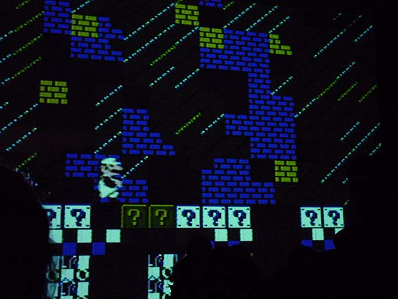
Above: bootleg over-the-crowd shots of Super Mario Movie, a wall-projected, altered Nintendo cartridge by Cory Arcangel and Paper Rad, tonight, Jan. 15, at Jeffrey Deitch. The image was impressively huge (16+ feet from floor to ceiling?) and the sound sublimely 8-bit-raspy. The plot: Mario's cartridge universe starts to break down because it's "been in a closet for 20 years." A blue creature takes him on a spiritual voyage via magic pixel carpet (the Paper Rad influence) culminating in a "rave" featuring some tasty allover patterns and intense gatling gun electro--I think it was right after the happy-hardcore smileys above, at any rate the screen text announced "This is the rave." Excellent work; hundreds of person hours of poking in sprites on the hacked cartridge paid off. It was nice to see the "twice the psychedelia" concept realized on such a large scale. (As discussed in this earlier post [scroll down], by generating the blinking geometric grids at the microchip level, as opposed to plugging values in some off-the-shelf lightshow program, Arcangel takes advantage of the cartridge's ability to sync up with the tv raster at a 60 lines per second refresh rate, which is twice as fast as video [32 lines per second]. Hence, twice the psychedelia.) As explained in a "making of" video at Deitch, the Paper Rad crew submitted drawings and animation routines that Arcangel then laboriously converted to code and burned on the cartridge's chip, but his artistic hand is prominent in it as well: the collaboration successfully melds the BEIGE and Rad sensibilities. (The source code is posted on the four walls of the gallery's front room for the geek-minded.)
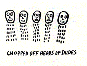
Below, a "deleted frame" that came to me via the miracle of the internet, but that bears a suspicious resemblance to Noah Lyon's "Chopped Off Heads of Dudes" and is captioned superheadsofstate.gif. Another internet authentication mystery and reminder of the grim world outside the cyber funhouse. Impeach Bush!

Bill found this wikipedia entry on fictional chemical substances. Everything you need to know about Adamantium, Balthorium, Cavorite, Dilithium, Illudium Phosdex, Kryptonite, Mithril, Upsidaisium, Vibranium, Thorium, Corbomite, Ferrocrete, Flubber, Herculite, Ice-9, Imipolex G, Plasteel, Puppeteer Hull Material, Scrith, Vespene Gas, and much, much more.
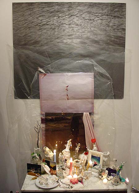
Leif Ritchey, ATM Gallery, 170 Avenue B, NYC, through Feb. 13. This work is probably the antithesis of what this page is into--it's in the vein of assemblage, expressionism, Rauschenberg, Cornell & combing through trashbins and thriftstores, as opposed to Minimalism, pop, artificiality, and the questionably sincere. Nevertheless one can't help but respond to many of the elegant, intimate aspects of Ritchey's installations and sculptures, which were described earlier here and which can be found lurking in crevices or down near the baseboards of this ATM show--abstract tangles of ripped and resewn bricabrac, accumulations of costume jewelry as intricate as Peter Greenaway place settings, a strip of fabric painted with a skunk stripe of plaster and curled inside a striped plastic box. The show could have been edited drastically, but again, that might be missing the point. A running theme of dresses hanging on hangars and wadded female apparel stuffed in boxes added a kink factor, or at the very least a Miss Havisham factor of faded, disappointed sexuality.* Dense accumulations of fetishistic found and altered objects invoke Michael Tracy, an ur-Catholic artist from the Texas border briefly in vogue in the 80s, and at worst, Arman's stuffing of detritus into Plexi cubes.
Insider detail: one might recognize the black and white photo in the piece above as the Felix Gonzales-Torres edition offered as a takeaway at the MOMA-Q(uee)NS opening a couple of years ago, still bearing traces of being rolled up and flattened, as most were.** The soul of Chelsea minimalism meets the essence of East Village maximalism, with the shrine of plaster-smeared objects providing an elegiac link.
Ritchey's video and music may actually be his most successful form of urban collage: the "Flatbush Windows" VHS described in the earlier post still haunts, and this track [mp3 removed] from a recent 4-song CD-R takes the noise jam into the realm of strolling big city cool. Think detuned portable radio, where every station plays house or funk.
*UPDATE: Learned on a return visit that Ritchey makes the clothing himself, and the show somewhat indiscriminately mingles his fashion work (which is quite good) with his assemblage work, hence my confusion. More on my second visit soon.
**UPDATE 2: A Major Art Personage visiting the gallery today didn't recognize the Gonzales-Torres until I dweebily pointed it out.
More pics, commentary, and discussion here and here.
Photo of the surface of Saturn's moon Titan, from the probe that (obviously) successfully penetrated the dense "smoggy" atmosphere today. I'm amazed--didn't expect to see anything that looked like a "surface." Not pictured is the alien from Tralfamadore who has been waiting centuries for his spare part to arrive (Vonnegut in-joke.)

Just a few notes on Cory Arcangel's show "Welcome 2 my
The show includes a number of new hacked Nintendo game cartridges - the work that Arcangel has become known for - and a number of new works in the medium of video. In the former group are a fully interactive Ipod® programmed for the Nintendo® system and an absurdly slowed down version of Tetris®. ["Slow Tetris" is one of those instantly funny titles--you pretty much get the piece in 3 syllables. It...is...very...slow. In the existential angst category are "Japanese Racing Game," which removes the racecar and obstacles and leaves only the pulsing white highway divider receding to infinity, and "Space Invader," which subtracts all the invaders except one pitiful, descending combatant.] In the latter group are "Sans Simon," a video of Simon and Garfunkel in which the artist uses his hand to hide Simon's presence [actually it's both hands in silhouette, cast by an unseen, insane person struggling to keep Simon's face blacked out as the camera changes angles and switches from closeup to long shot of the singing duo. Always one beat behind the cut and only marginally successful as censorship, these desperate moves were hilarious--everyone in the room was laughing, probably trying to envision the guy who hated Paul (or loved Art?) to this degree.] and "Geto Boys/Beach Boys" in which videos by the two eponymous bands are played side by side creating an oddly harmonic synchronicity.Good show--highly recommended. Arcangel has another exhibit opening Saturday night, a collaboration with Paper Rad at Jeffrey Deitch called "Super Mario Movie." (The old Super Mario, I gather, as opposed to 64.) The poster is here and Alex Galloway's text is here.
[...] Arcangel is interested in keeping the possibilities of collaboration open, as well as in continuing to reach out to other cultural fields for inspiration, fusing autonomous artworks with temporary and net-based actions. The show at Team, for example, marks the launch of Dooogle.com, a search engine which only yields results about Doogie Howser, M.D. [More "no exit" angst--no matter what you punch in the same 15,900 results for Doogie come up.] Also available is a new piece of software called T.A.C. (Total Asshole Compression), a program which increases the size of any file passed through it.
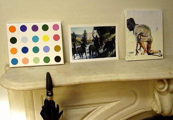
One should have no shame about buying bootlegs of art, if good ones are available. Eric Doeringer makes some of the best souvenirs of art world brand names: these above are all well crafted objets (respectively a painting, ink jet print and combo print & painting). Normally he sells them from a table out on 24th Street, but I acquired this group from his studio, where I got the added pleasure of seeing grids of almost-identical Currins, Yuskavages, and Peytons arranged as if on a production line, being readied to go with him to the next art fair. Most artists have been good sports about seeing their masterpieces hawked on the street like CDs or handbags. The exceptions are Sean Landers and Takashi Murakami, who told the artist not to peddle knockoffs of their work. See the removed Landers on Doeringer's website.
Over Christmas I watched my nephews explore every crook and nanny of the evil Super Mario 64. Evil because it may be the closest thing you'll experience to the waking nightmare of a paranoid schizoprenic, outside a clinical setting or bad drug experience. It's even worse because everything's so happy. Giant colorful blockheads materialize smiling out of nowhere to crush you, holes open up suddenly in the ground and dump you down zany slides into oppressive dungeons, slippery creatures who must be caught to restore "health" endlessly evade capture, and in each horrific, logically inverted world--Lethal Lava Land, Dire Dire Docks, and perhaps trickiest of all, the dreaded Shifting Sand Land--you are confronted with a twisted, barely comprehensible system of rules you must master to become "normalized."* I found the changing point of view fascinating, as the plucky plumber delved through deep 3-D space, with the camera acting as both player and narrator, a la Brian De Palma. One reviewer derides the camera work despite its innovation for 1996:
The biggest flaw in the gameplay is the camera angles from which you view the action. Nintendo obviously spent some time developing a 'smart-cam' to follow the action from useful angles, but it doesn't work as well as it should. Often your view of Mario is blocked by large objects. If you have the time you can usually rotate the camera manually, but that doesn't help when the thing blocking your view is the boss that you're fighting. There is a camera mode that follows directly behind Mario (the Mario butt-cam) but it's generally not a very good perspective. Jumping Flash solved this problem by relying on a 1st person perspective (and sky-high jumps), but that still wouldn't be a very useful angle for Mario. Unfortunately, the camera really just needs to be even smarter.Picky, picky gamers. I also found it intriguing that my nephews gravitated to this game released when they were toddlers. Just entering their teens (or 10s) now and accomplished Warcrafters, they have already cultivated a refined retro sensibility.
*In Shifting Sand Land I saw Mario "die" about 20 times as the players tried to master a particular trick--each time he clung futilely to the base of a pyramid before being swallowed by deadly quicksand.
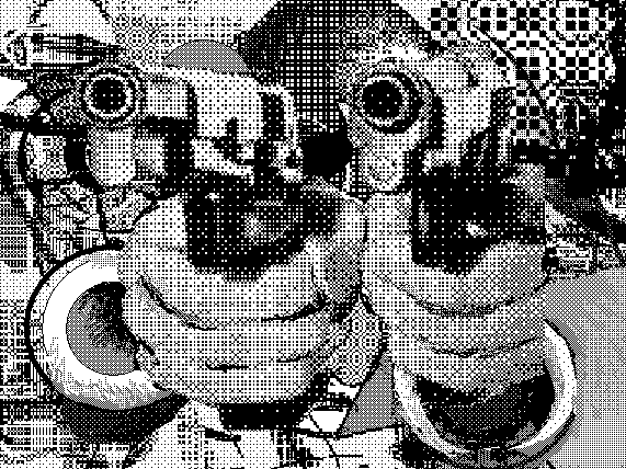
Thanks to jimpunk for adding to this, the pacifist version.
Also, see SCREENFULL's remix of a Duncan Hannah, returning the image to its original milieu plus more up-to-date cyber-abstract blowing up.
Tyler Green twits New York bloggers for not responding to these paragraphs from a Peter Plagens Los Angeles Times article:
L.A.'s contemporary art world is younger and hipper than New York's. [....] In L.A., the big competition seems to be among graduate-school studio programs rather than galleries; some students are scouted for gallery recruitment even before their master of fine arts theses shows have gone up. The ratio of big-time contemporary collector dollars to working young artists is greater in L.A. than anywhere else, including New York. Whenever I'm asked, I tell ambitious art students in the heartland to head west, not east, to try to get noticed.One West Coast blogger takes this as proof that L.A. has replaced NY as the center of the art world, something I wish I had a quarter for every time I'd read in an L.A. based publication. This business of evaluating a scene based on the energy of its graduate schools seems to me not very healthy, wherever the locale. The gauge should be not who produces the best work under faculty supervision but who stays with it over the years, and what they produce, rubbing shoulders with the largest number of fellow perserverers.
But many young L.A. artists also experience the career arcs of top models or fruit flies: about one season, if that. And nowhere in the country -- maybe the world -- is popular culture more expertly conceived, technologically amped, attractively packaged, and overwhelmingly pervasive -- even unto gallery art -- as in Southern California. A few weeks ago, I prowled around Otis College of Art and Design and thought that if they'd just present the sketchbooks and mock-ups from the toy design department as the fine arts theses shows, Santa Monica galleries would snap 'em up whole.
As for the alternative/rival/fellow traveler to New York in visual art--I believe that's Europe. An Atlantic (Euro-New York-Caribbean-African) vs Pacific (Cal-Asian) dialectic might be more interesting than the tired U.S. coastal rivalries.
Posting this live from Symantec Hell. Mac users please stop reading and keep your comments to yourself. I prefer my PC but this is the downside. Yesterday my Norton Internet Security and Antivirus switched off. I rebooted, ran security and antivirus scans, no bugs shown, but my assumption is some internet pest has found a way to turn off Norton and not allow the user (under "Options") to turn it back on. Call the 800 number, go through all the voice prompts, push 1 for "virus" (big mistake) and after 30 minutes get routed to an Indian call center. (A big fuck you to Symantec for screwing your own countrymen out of the shit wages they need.) The Indian gentleman asks me to do what I already did, which is run the security risks scan. I tell him it pulled up no threats, but I assume there's a threat because my Norton can't be turned on. He says he can't help me and will transfer me to a technician who "will help you get your Norton turned back on." That was 30 minutes of holding ago. Can anyone recommend a good security/antivirus product for the PC/Windows other than Norton?
FWIW I use Firefox for browsing and the firewall that came with Windows Service Pack 2 so I'm not completely naked here.
UPDATE: One of Thomas Friedman's shock troops of the capitalist future in Bangalore or wherever walked me through an uninstall/reinstall and Norton is back up now, with one lingering Live Update issue that may require yet another uninstall/reinstall. Total phone time: approximately 2.5 hours. At least they didn't charge me. Thanks, Paul, for the info on other companies. For the record I am not a prejudiced person but I believe American companies have an obligation to the communities that nurture them (meaning, provide basic needs and a good lifestlye for the executive class) not to export jobs.
My post on Cory Arcangel's opening at Team Gallery has been updated to reflect that the opening is Thursday, Jan. 13, not yesterday, Jan. 11. Sorry for the error.
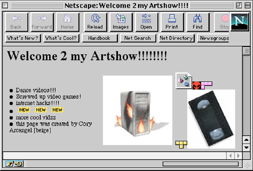
Cory Arcangel's show "Welcome 2 my
The show includes a number of new hacked Nintendo game cartridges - the work that Arcangel has become known for - and a number of new works in the medium of video. In the former group are a fully interactive Ipod® programmed for the Nintendo® system and an absurdly slowed down version of Tetris®. In the latter group are Sans Simon, a video of Simon and Garfunkel in which the artist uses his hand to hide Simon's presence, and Geto Boys/Beach Boys in which videos by the two eponymous bands are played side by side creating an oddly harmonic synchronicity.UPDATE: Jan. 13 is the opening date, not Jan. 11 as I originally posted.
[...] Arcangel is interested in keeping the possibilities of collaboration open, as well as in continuing to reach out to other cultural fields for inspiration, fusing autonomous artworks with temporary and net-based actions. The show at Team, for example, marks the launch of dooogle.com, a search engine which only yields results about Doogie Howser, M.D. Also available is a new piece of software called T.A.C. (Total Asshole Compression), a program which increases the size of any file passed through it.
A couple of sentences in the post on Steven Parrino have been revised to read:
One thing's sure: if Roberta Smith of the New York Times doesn't like your work, you'd be very lucky not to have her write your obit. Her tribute [to Parrino] is how shall we say...affectless? merely descriptive? The closest it comes to a value judgment is saying the work had a "relentless if oddly energetic punk nihilism," a collection of adjectives and adverbs that give off a nice crackle but probably cancel each other out.
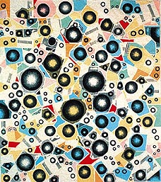
Greater (see below). This (upside down) image was saved from the website of a newspaper in Naples, FL, when the "post-hypnotic" exhibit traveled there. The review may still be up.
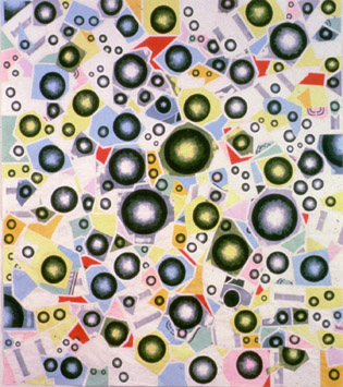
Greater, 1997, photocopies and linen tape, 88" X 78"
This slightly fuzzy image was saved from Illinois State University Galleries' "post-hypnotic" exhibition artists pages, which appear to have been taken down.
I've made a few changes to my main site page, including a new image. For years I used this installation shot of a couple of large pieces from the late 90s, but time and art march on. I had a more recent studio installation view up for a while--a semi-scatter of recent drawings--but a friend suggested it wasn't putting my best molecule forward, that it was a tentative hedge between a "messy studio" look and controlled, salon style hanging. That's probably right. Anyway, I changed the image tonight to a couple of more recent framed pieces that I guess are stronger. Sorry, I know this is boring. I also have been changing the fonts around on some of the main archive pages so they're more simpatico with this page. The overall site is really a mess now, with some pages understated*/serif and some aggressive/sans serif, a transition state from which it may never fully emerge.
*for someone at my html skill level, at least

Just reading about the suicide of Arkansas heart surgeon Jonathan Drummond-Webb. His "extraordinary success rate for repairing complicated defects in [infant] hearts the size of an adult's thumb -- and his flair with patients and their families -- had made him a surgical star. He came across as a hero in a four-part prime-time ABC documentary in 2002." The AP story makes you wonder what really happened. In his suicide note he railed against his co-workers at the hospital:
The 45-year-old surgeon left a profanity-laced suicide note in which he indicated he felt his work was underappreciated and ranted about colleagues at Arkansas Children's Hospital and at the Cleveland Clinic, where he formerly worked.But when interviewed, these co-workers didn't say, "Yeah, we suck." Instead they blamed...the deceased.
"Every day my living hell!!" the scribbled note read. "These people don't care. I have a gift to save babies. The world is not ready for me."
[C]olleagues said Drummond-Webb was his own toughest critic.I'd like to read more of Drummond-Webb's "ranting" about these guys. Maybe the hospital was an emotionally toxic work environment? Newspaper stories like this are frustrating, in that the survivors get to write the script.
"Some would say they saved 98 out of 100," said Arkansas Children's Hospital chief executive Dr. Jonathan Bates. "He looked at it and said, 'I lost two out of 100.'"
Anesthesiologist Dr. Mike Schmitz said that even in Drummond-Webb's incredible achievements, the surgeon "saw his own subtle imperfections."
"I knew well that much of his angst was internal, a small voice in the back of his mind that said, 'That's not good enough: I could have done better,'" Schmitz wrote in a tribute to Drummond-Webb in the hospital's in-house magazine. "That which helped make him such a gifted surgeon was also an incredible burden; a burden that at least for a few hours one night became unbearable."

Artist Bill Schwarz, who knew the late painter Steven Parrino well, posts some thoughts and corrections of the newsprint accounts of Parrino's life and untimely passing here. One thing's sure: if Roberta Smith of the New York Times doesn't like your work, you'd be very lucky not to have her write your obit. Her tribute is how shall we say...affectless? merely descriptive? The closest it comes to a value judgment is saying the work had a "relentless if oddly energetic punk nihilism," a collection of adjectives and adverbs that give off a nice crackle but probably cancel each other out. The New York Post obit supplied the info that Parrino was "a little bit of a loner" who "didn't like crowds or parties." The police told a friend of Parrino's they believe that his motorcycle hit a pothole on Kent Ave., just a block away from his studio. In other words, an accident that could happen to anybody, especially with New York sized potholes. Yet by saying he "lost control" of his cycle "returning from a New Year's Eve party in Williamsburg," Smith creates the clear implication that...well, what does that imply to you? A journalist can be perfectly factual and still smear through the omission of detail. Thus are "bad boy" legends born, one supposes.
Bill says: "Parrino's destruction of unsold paintings has a wholly different meaning from the destructive editing activities of precedential modernists like de Kooning and Baldessari." He doesn't elaborate, but I think what he's talking about was, Baldessari famously destroyed his early, painterly paintings before embarking on his career as a conceptualist, but it's a fair guess he hasn't destroyed much since then. Whereas Parrino constantly cannibalized unsold work to make new--it was evident right there in the rubble pile at your feet. This was a very cool thing. I had a hard time with the "signature" canvases conspicuously torn off the stretcher, wadded up, and rehung--they seemed angry about something not worth getting angry about, which is to say, painting on canvas. (I'm open to having my mind changed by a retrospective.) He did do some beautiful paintings in that style, though (see above) and his career commitment to The Dark Side in his video, music and zine-making was likewise exquisite. I remember he organized some event nights at Team that included a screening of Dario Argento's Suspiria and also introduced Shell to the art world. Also very cool.
He will be missed, New York Times notwithstanding.
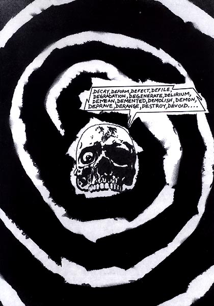
Writing about the black conservative columnist on the take from the Bush government to flak "No Child Left Behind," blogger Steve Gilliard, who is black, referred to the man as a "tom," meaning Uncle Tom. The people at the National Review, thinking they had a gotcha moment and had found a white lefty being racist, criticized Gilliard and steered many internet trolls his way. Gilliard, who has one of the sharpest tongues in the world of letters (see, e.g., his complete dismantling of Giuliani stooge Kerik), hit back hard, making merciless fun of the NR's googling skills and real, as opposed to trumped-up racism. Criticized by some that his harsh words don't "build dialogue" with conservatives (something this page gets, too) Gilliard responded:
I'm tired of people acting like these people can be reasoned with or talked to. They don't want to talk, they want to drive us away into a corner and ridicule our ideas.That's pretty much how I feel about people who voted for Bush last November, knowing what we all knew about how he lied us into war, approved torture as US policy (further endangering our soldiers), and unbalanced the budget to help rich cronies. The only dialogue I want to build with those voters is one where they say "I know, I fucked up, I'm sorry."
I'm not writing to make conservatives happy. I want them to hate my opinions. I'm not interested in debating them. I want to stop them.
Untitled (Charles Biederman)
2005, HTML, 500 x 460 pixels, by Chris Ashley
tedg, a great film critic of space and "folding," on Scorsese's The Aviator:
Martin Scorsese: My regular readers know that I have been very critical of his films. Sure, they are crafted well enough, but the world he created was not one worth visiting. His films until recently were of the Italian storytelling school which focuses on characters. Those characters do not inhabit their worlds as much as create them. Scorsese's camera, therefore, was affixed to people, almost by a visible thread.An earlier post on tedg is here.
But those of us who watch film seriously know that there is nothing but empty darkness just outside the camera's eye. There's no world, so there can be no God, or fate, or luck or whatever material you imagine fills the river of life. He knows it is a cheat as well and has said so. Just like many other fabulously successful filmmakers who know their work is hollow, in his later years he's tried to mature... to master a greater notion of creation.
"Gangs" was a success in this regard though an unfinished film because the Weinsteins pulled the plug. It marked a completely different approach to space and context, and I applauded it. Now he actually finishes a movie in the new style. Though this is a story of a man, it is no longer anchored to the man. The camera is now Orson Welles' camera with shots of the space with people in it. So obvious is some of this that when Hughes first retreats, he stays out [of] a room that inexplicably (and unhistorically) has strings tied from hither and yon from objects. Take another look at that room and see all of Scorsese's old camera angles. I think we can welcome Scorsese now as the best new filmmaker of the year. This is as much his story as Hughes'.
Cate Blanchett: Cate is one of three actresses alive who can fold her acting, meaning that she can simultaneously deliver two characters in the same motions. She's at the top of her game here (while Julianne is devolving with an apparently thick husband). Hepburn was an amazing actress, deeply untalented in the conventional measures but capable of engineering her surroundings to suit. Her engineering of the "Philadelphia Story" persona is Hollywood legend. She engineered a character that worked, then stepped into it. The old Scorsese would have hired someone like Streep to play Hepburn and lumbered around after her.
The new Scorsese allows Cate to flower and willingly supports the folding: an actress (Cate) playing a character (Kate) who is playing a character. You can see all the conduits of control, all the taut strings at two levels. God, what a great time to be alive!
Howard Hughes: The movie gave the impression that Howard simply inherited his money. No so. He was a brilliant engineer who famously codesigned systems and the engineering organizations to support them. While most of us were barfing at frat parties, he designed a drill bit (often credited to his father) that is still the standard in the industry, together with a set of screw connections that has since become the international standard. That's where the money came from. And though he went loopy toward the end, he ensured that 100% of his wealth (yes, all assets were sold) went to endow the world's largest private research institute.
This was a passionate engineer in a world of monopolistic thugs (Gates take notice), truly what we like to think the "free market" is all about. The movie also ignores a key movie connection: He always intended the "Spruce Goose" to be made of wood, and because all US manufacturing assets were committed, he designed a production system that allowed small businesses, even backyard groups, to make pieces that would be floated down rivers and successively be glued into larger parts. This (what he called the "packet production system") was the first serious research into what we today call "virtual enterprises."
When the war ended, he sent his virtual enterprise experts into his film business where they used the system (freely giving away details) to destroy the vertically integrated studio system. Nearly all movies today use his virtual enterprise approach and the Weinsteins (producers of this very film) are the current masters of the system.
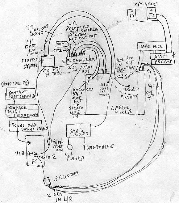
Music studio (a work in progress). I have almost everything depicted here and am gradually learning to work it all. I drew this to keep track of all the different cables but it's helping me conceptually. I find I'm not intimidated by Cubase (beginner set); it's just a fancier version of MusicWorks and the notation software I've been using--in fact all the big music and paint programs are just refinements of clunky interfaces from the 80s. I will have to spend some time learning to control the instruments with the sequencer, however. I got some good results with the Sid last night but the MIDI connections are imperfect. Still trying to find a balance between having basic studio competence and doing things "wrong," which can lead to good results. As for the lack of a musical keyboard in this setup: I actually prefer entering notes on an old-fashioned staff, that's a matter of choice. Making music player piano fashion perversely appeals to me and gives me a greater range than playing notes. This is not ambient or noise music I'm making, these songs have tunes, but I am more interested in composing and sound-sculpting than playing; it's posthuman in that sense.
Two Videos:

"Exit Maurice" (Quicktime video) [10.5 MB .mp4]

"Dancin' (Please Register)" (Quicktime video) [9.5 MB .mp4]
The first one plays as it loads, and the second one loads first, then plays, at least on my browser. Because of different software companies? (You could also right-click or option-click and save.)
"Blues for DG" [5.7 MB .mp3]. This is me tickling the synth ivories and slappin the skins roadhouse blues style. Not really, but it was done in real time bending notes and then edited down. I originally called it Blues for Donald because I was imagining variations on a few notes like his iterations of aluminum cubes out in Marfa, only bluesy, but I changed the title because I hate overt homages to past art and don't want it to be "about" the Judds. "DG" is a complete red herring.
UPDATE: Trimmed about a minute out of this.
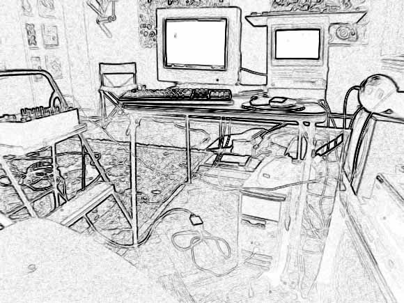
My music studio setup from a few months ago. I got the idea of using this particular Photoshop filter for a studio photo from a prog rock musician I admire, whose site is no longer online apparently. A line out from the Mac SE (the screen on the right) goes to the mixing board on the left (note improvised gear rack). Another line out from the PC (floor) also feeds into the mixer, and the audio is then routed back into the PC through the LP recorder box on the floor. The audio out from the PC was the voice of Microsoft Sam reciting numbers in German, gradually slowing down and changing pitch because there wasn't enough memory in the text reader. Beats came off a DIY drum program streaming off the internet. The SE, running MusicWorks, supplied a background jingle. I've recently started using off-the-shelf software and felt I needed to post this to establish my street (Povera) cred. I consider all this visual art, for any curator who thinks I've stopped working. This is why I probably won't apply for a Creative Capital grant: they'd never understand. I'm not sure I do.

Speaking of poor quality jpegs, Michael Bell-Smith steers us towards this page at a site called "fake is the new real." I've been enjoying the random collection of fey, twee, transmedial-type things on that site but one point of clarification should be that the jpegs assembled there (and sampled here) are good (as in beautiful) bad jpegs as opposed to good-bad (as in pathetic/funny) bad jpegs.



Bill saw a girl in Jersey City wearing a T-shirt that says "Von Bitch." More on the Von guy here.

Surfing around electronic music links yesterday. Throb.com has vanished. That was the site for a great record store where I bought a lot of vinyl from '99 - '03. Somewhere owner Load Rezenhand has a shop's worth of amazing inventory in storage--if I was rich I'd track him down and buy it all. One of the most helpful people at the store that I found early on was DJ Prozac. Incredibly knowledgeable, with discriminating taste and a strong point of view (until I found this Discogs link I didn't know his name or that he'd made these tracks). His taste was consistently harder, harsher, and more experimental than what I liked but he took pity on me and recommended more of the "beautiful" or seductive electro and tech-house I was looking for. He is friends with artist Meredith Danluck and through her he briefly became electronic music maven of the art stars. (Well, I'm told one relatively famous artist who used a Wolfgang Voigt composition in his work learned about him through Zach.)
Some survivors (more on all this later):
http://www.selwaymusic.net/
http://www.satamile.com/label.jsp
http://www.satelliterecords.com/live/index.php
Excerpts from "TEMP IS #173083.844NUTS ON YOUR NECK, or, Hacker Fashion: a Photo Essay," from the BEIGE Multimedia Gallery.
|  |
 |
|
| 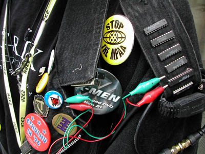 |
Images from "H2K2 - The Fourth Hackers on Planet Earth [H.O.P.E] Conference," July 12-14, 2002, New York City. Text by Paul B.Davis, photos by Cory Arcangel, fashion terminology and editing by Lauren Viera. More here.
Edward B. Rackley has been traveling in the Congo and has a report and some photos in the Old Town Review.
The human catastrophe of Eastern Congo is, for visitors, a bundle of numbness and raw nerves. In September, at the invitation of a British think-tank, I visited the unstable region to assess the causes of ongoing violence against civilians. With close to 15,000 peacekeepers on the ground, a transitional government anticipating national elections in six months, and well-funded efforts to disarm, demobilize and reintegrate combatants into civilian lifethe DDR processwhy are civilians still being killed with such impunity? Scores of interviews with humanitarian actors, UN staff, and Congolese revealed the usual suspects: predatory governance, uncontrolled armed groups, endemic impunity, and the inaccessibility of civilian populations due to ongoing combat.Read the rest here.
None of these factors is particularly well understood by outsiders; this opacity keeps the heart of darkness myth alive. For insiders, Africa remains a Dark Continent by sole virtue of its ability to generate degrees of suffering that surpass human comprehension. Unfettered anarchy it is not. Recent African crises have birthed a new truism: If it looks like anarchy, then you dont understand what you see. Eastern Congo fits the adage well: chaos and senseless tragedy are the inevitable, indelible impressions etched on any visitors memory. But behind the barrage of extreme scarcity, mute agony, and feverish suspicion is a clear pursuit of economic interest, a highly dexterous application of disorder as political instrument.

Here's what Paul Slocum's bad jpeg (see below) looks like as a cross stitch pattern, after running it through knitPro. Pretty good--I mean, bad. This works, no? Now, who's going to sew this?
UPDATE: From the comments: "The problem might be finding all those colors of thread. How many blues are in there?" One answer would be first to ascertain that all the blues could be reproduced using cyan, magenta, black, and yellow, and then to break open some Epson cartridges and use the pigments to make dyes for the thread. Just a thought.
Paul Slocum suggests using knitPro to upload bad JPEG images so they could be rendered as cross stitch or needlepoint projects. Good idea, but man, that would be difficult to pull off. My sense is the stitched piece would have to be both enormous and extremely detailed to show the horrible "bicubic mush" that results from poor compression (which only the extremely perverse are apt to find funny anyway). Nevertheless, I have a candidate: it's a late Op Art piece by Julian Stanczak on the Stefan Stux website [Since removed]. In real life those stripes are super hard-edged, but on the Web, well...
UPDATE: Here's Paul's draft of a proposed "bad JPEG" fiber art project. He has more to say about it in the comments. I'll be away from the computer for a while but the obvious next step is to run this through knitPro.

More opinions on what the Stanczak image suffers from would be welcome--Paul pegs it as a bad resolution issue rather than a too much compression issue. I realize it's hard if you haven't seen the actual painting, but assume it's a black and white image with razor sharp lines. The whole thing is out of focus but mushy spots with added color at regular intervals look like the type of thing you see when saving something too many times at the "low quality" setting. It's important to know why things are an utter failure at communicating.
UPDATE 2: Another comment, from Dan, persuasively identifies the problem with the Stanczak image as one of bad resolution, not bad compression, but it's academic now because Stux has removed the murky black and white pic from its website. A new show of Stanczak work opens soon so I'm sure it was because of that. For bad jpegs of famous Canadian paintings, please see this post on Sally McKay's weblog, which she explains was inspired by a now somewhat quaint 1953 article by George Elliot warning that art should not be shown on television. " A painting needs an intellectual presence before it can work its magic. Placing anything between the viewer and the painting kills the viewer ."
Dubious NY Times Op Ed of the Week. Here's what seems to be the gist of Simon Singh's argument regarding what he calls Albert Einstein's "greatest failure" (not really sure what Singh is saying--and if you thought the "failure" was E's inability to find the unified field theory you're wrong):
1. Albert Einstein published papers in the same year (1905) proving the existence of the atom, showing the validity of quantum physics and introducing special relativity. He was not a "perfect genius," however.Previous Dubious NY Times Op Eds:
2. We can learn much from his greatest failure, which was hypothesizing antigravity to justify his stubborn belief that the universe neither expanded or contracted.
3. We now know the universe expands after the big bang; Einstein eventually admitted his error.
4. Except it turns out he called it correctly after all. Scientists now believe that a propulsive force called "dark energy" makes the universe keep expanding instead of collapsing in a big crunch.
5. Except Einstein wasn't talking about an expanding universe but a steady state universe, one that just sits there, making his notion of antigravity seem not very applicable to the current model.
6. So we actually don't learn much from Einstein's being wrong. The reason he's a "better than perfect genius" is he admits his mistakes, which is a very good quality.
1. The tsunami had nothing to do with restoring balance to the ecosystem but it's really cool to talk about Gaia.
2. We shouldn't do something because it's right but because scientists have learned monkeys do it.
"Pops at 49" [mp3 removed]. Noisy, dirty micro-trance. If it was a car someone would write "wash me" on it. Pops commencing at :49 are pretty jarring but as Pee Wee Herman would say, "I meant to do that" (I think); gratuitous filter sweep at 1:49 takes you to climax, meaning the loud end of the song.
"XP Hardware Failure: Intro and Main Theme" [mp3 removed]
Made this awhile back and never put it up. Inspired by Clown Staples' immortal "Windows Noises," I did what many did on hearing that music--said "I could do that." Of course I couldn't, but it's taken a few months to see the charm in my own klutzy hubris. It's all done--poorly--using the little sndrec32.exe editor lurking in every Windows OS, with some help from Goldwave, a shareware .wav editor. Think I'm ready for drum and bass now.

This is one of my pixel art pieces rendered as a knit, crochet, needlepoint and/or cross-stitch pattern (I'm a little out of my depth as to which would be the most applicable). An actual size screen shot is here. I generated it using microRevolt's knitPro, where you can "upload jpeg, gif or png images of whatever you wish -- portraits, landscapes, logos... and it will generate the image pattern on a graph sizable for any fiber project." The application was conceived as a "protest tool that generates knit patterns of sweatshop offenders"--an excellent idea, but I don't see anything that would prevent the current program from generating, say, swastikas or confederate flags. (I admit I didn't try that.) So with all this in mind, go browse the site and see what they're up to. Also, kudos to microRevolt founder Cat Mazza for an excellent stint reBlogging at Eyebeam these past few weeks.
Interesting article in Wired on the "shadow internet"--haven't read it all yet but am intrigued by what it's saying about file-sharing being an alternate form of broadcasting. Only a tiny portion of peer to peer file sharing consists of people ripping CDs and putting them online--mostly it's the same few pirated (crappy) CDs or movies spreading virally really fast. This suggests that the RIAA and MPAA lawsuits are a worse than useless form of kicking-the-dog--like going after pot smokers because crack dealers are hard to catch. Or maybe that's not a good analogy: maybe it's like going after Perrier-sharers because you can't have a global monopoly on tap water.
Old School Techno from Dallas, Part 2
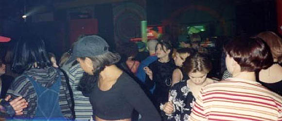
Ravestock '94, Dallas. That is seriously a lot of stripes. And girls.
x-eleven "Ecstasy" 1992 [mp3 removed]
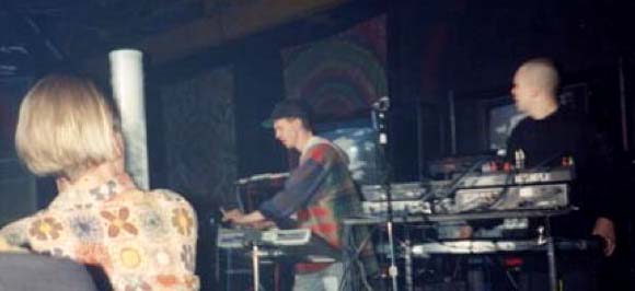
Previous post on x-eleven is here. Since it was written, Gary Wicker has put up some more tracks, including "Ecstasy," the one highlighted above. Not sure where it's going at first, the sampled "ooh" sounds silly, but at the 90 second mark it grabs your attention, and at 120 seconds, when the Larry Heard-ish house part with the synth-flute kicks in and those "oohs" become joyful, stuttering vocal science, it really takes off. Some of the appeal is rooted in time travel but this is among the happiest music you'll hear, and Wicker feeds the retrograde desire to hear lots of arpeggios played at high speed. Haven't checked out Todd Hixon's videos yet, also from the vault, but will--just wanted to get this track up. It's weird, I'm nostalgic for a scene I never participated in, except in my studio listening to these tunes on the radio. I moved to NY the next year and found drum and bass everywhere--right about the time Wicker sold his gear and stopped making x-eleven tracks. "Ecstasy" is earlier--'92. Update, December 2014: The X-Eleven links above are dead but the group has a page on bandcamp.
