View current page
...more recent posts

I like the gallery Foxy Production but it bugs me that they're giving the members of the collective Paper Rad solo shows. It's like saying "Collectives are cool! OK, now let's get back to the valorization of individual geniuses which is what we know and can sell."
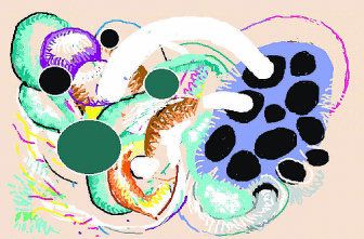
The Paper Rad installation at Pace was amazing. They really rose to the occasion. It's better and stronger than anything we've seen from them individually. Their triangular box installation was minimal but the exterior "painted mural" image with Bart Simpson, and the wall-to-wall video projected on the inside of the box were maximal--it was a perfect balance, very thought out.
Jacob Ciocci's recent solo was good, but on the whole I'm more interested in his (and Paper Rad's) video than the physical work. The video *is* radical, but the objects strike me as standard outsider moves (dolls, thrift store items, accumulations of more detail than the eye can take in...)
Which is not to say I didn't find a lot of compelling things to look at in Ciocci's show. I guess the problem is you want so-called cutting edge work to show you things you haven't seen. The "boy's bedroom" with chock-a-block tchotchkes on the walls we've seen. It's a more psychedelic version of a piece like Ed Kienholz's The Beanery--a claustrophobic enclosed room full of "stuff." The video in Ciocci's bedroom was great; I wanted to move all the stuff out of the way so I could see it.
The video murals in the Pace show were something new. Imagine a giant Rauschenberg or Polke painting with all the layered elements *moving*, each independently of the other. The subject isn't some rarified art substance but the worst and silliest pop culture trash--cheesy animated GIFs downloaded off the internet merging and morphing with abstract Flash patterns and found photographs in a constantly changing allover field: dozens of moving and overlapping Hannah Hoch style collages bubbling in and outside your field of vision. Similar things are going on in Ciocci's physical work, but there's something about forcing it onto a rectangular, pixeled 2-D field that tightens it up, makes the familiar strategies seem unfamiliar. With the objects you are weighted down with all the history of those objects.
Also, it's possible that this collective actually works better...as a collective.


As long as everyone's talking about crack shot Dick Cheney, might as well pile on. From Josh Marshall:
What stuck out to me though is that the owner of the property on which the incident occurred was the person interviewed by the AP. And the property owner, Katharine Armstrong, gave a highly exculpatory recounting of what transpired. Basically, she said the victim, Harry Whittington, snuck up on Cheney, didn't give the appropriate warning. And in any case getting sprayed with shot in the face and half your body isn't that big a deal anyway.They also waited 24 hours to report this, while they worked out a story that didn't make Cheney sound like a complete incompetent moron. I like Armstrong's quote in the New York Times about the physically robust Veep:
But by way of Brad Blog we find that Armstrong is the daughter of the one of the folks who hired Cheney at Halliburton.
''Fortunately, the vice president has got a lot of medical people around him and so they were right there and probably more cautious than we would have been,'' she said. ''The vice president has got an ambulance on call, so the ambulance came.''(hat tips to stephen and bill for the images)

The two-person show I'm in in Dallas, with Saskia Jorda, is reviewed in the Fort Worth Star Telegram. Thanks to Titus O'Brien, the writer (who I have not met) for the nice words. "[Ll]ke Terry Winters on acid - then pixelated" is great.
