View current page
...more recent posts

Bill Schwarz, 99 Bottles of Beer on the Wall, 1986. Exhibited at Pompeii (New York City).
Quoting myself, from the comments:
As for [Brian] Sholis' essay [on Cady Noland], it's kind of the standard academic rubber stamp. He treats Noland as a solitary genius that emerged fully formed into the world. A more interesting essay would place her in the New York scene from the East Village and "Neo Geo" era, with references to artists doing similar work.Thanks to Bill Schwarz for this image, an interesting and amusing piece regardless of whether another artist from the same time period went on to make beer famous.
Sholis mentions that Noland included "work by New York artists" in her Documenta installation. He doesn't say which ones. Maybe she was a little more generous than her critical advocate(s).
I know artist Bill Schwarz, who also emerged out of the East Village scene and was in several Bob Nickas-curated shows, had a minimal style piece called 99 Bottles of Beer on the Wall that predated Noland's brewskis, and the late Steven Parrino had a painting at Metro Pictures of stocks (as in the Colonial era punishment), a motif which Noland also used, in sculpture form.
The great essay still to be written (?) puts Cady Noland in context of radical or nihilist interpretations of Minimalism in the Reagan '80s, with all the connections to her peer group.
- tom moody 5-17-2006 1:25 pm
See also: Bove, Carol
New York Times: "We're not sorry we smeared your gallery, but please accept this tacked-on correction."
A couple of weeks ago Ken Johnson of the Times imputed dark motives to Harlem's Triple Candie gallery for its show of Cady Noland "approximations." These are his lead sentences:
When the artist David Hammons recently rejected an invitation to do a show at the nonprofit exhibition space Triple Candie, the gallery's directors, Shelly Bancroft and Peter Nesbett, did one anyway. They mounted an unauthorized retrospective in the form of photocopies of Mr. Hammons's works taken from books, catalogs and magazines.This "rejection" and "rebuffing" by the respective artists never happened; Hammons didn't respond to a request for a show and Noland was never contacted. I mentioned it here , and NEWSgrist did a good story. By way of follow-up, I just learned that on May 24 the Times added a correction to the end of the article, which amends the basic facts but falls short of an apology for the slur on the gallery's intentions by the "paper of record":
Now, similarly rebuffed by Cady Noland, the influential sculptor known for refusing to cooperate with commercial galleries, Ms. Bancroft and Mr. Nesbett have simulated a Cady Noland exhibition.
Correction: May 24, 2006, Wednesday A brief art review in Weekend on May 12 about ''Cady Noland Approximately'' at the Triple Candie gallery in Harlem referred incorrectly to the genesis of that exhibition and of an earlier one, ''David Hammons: The Unauthorized Retrospective,'' both of which exhibited copies instead of original artworks. Mr. Hammons did not respond to the gallery's efforts to contact him about exhibiting there, and no effort was made to contact Ms. Noland; neither artist rejected an invitation to exhibit at the gallery.So, with the ad hominem argument dissolved in a vitriolic puff of smoke, now the Times will actually review the show and consider the issues of appropriating, "approximating," and doing "photocopy retrospectives" of artists' work, right? Ri-i-ight. And for sure the Village Voice will now apologize for also saying the gallery went "around the artists' wishes" and re-evaluate its slam of the exhibit. R-i-i-ight. Another critic who trashed the show, Brian Sholis (who didn't first see it), took great comfort in the fact that the Times and the Voice validated his judgment. (See his updated "I told you so" post.) Now that those journos' arguments have been revealed as factually tainted, Sholis will be doing a mea culpa, too, right? Ri-i-i-ght.

Mobile recharge station, communication tower, and transformer by Kristin Lucas.
"Algebra 2 Trig" [mp3 removed]
a cappela Sidstation with midi echoes and regular echoes. original composition
"Brakin' (Remix 3--Get Me to Lee Miles But Not So Fast Mix)" [mp3 removed].
This is the same as "Brakin' (Remix 2--Get Me to Lee Miles Mix)" except the second theme doesn't fade in quite so fast. It is a collaborative effort between John Parker and me that hit the cutting room floor for our Toronto collaboration--but that doesn't mean it's not good!
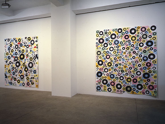
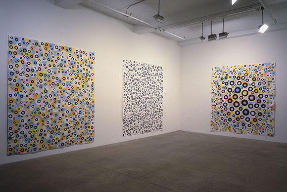
Installation views of (top to bottom, left to right) Greater, Jump, Exhibit 11, White Room, and Bulge; each is MSPaintbrush, photocopies, linen tape [along seams on the reverse], 88 X 78 inches. From my solo exhibit at Derek Eller Gallery, New York, NY, 1998. (photos by Bill Orcutt)
back to main site
YouTube: Curved Air - Back Street Luv
Broadcast - Papercuts
Your assignment today is to compare and contrast these two videos. How are the songs different? Alike? What do the differences say about the time periods in which they were made (early '70s and 2000, respectively)? How are the video styles different? Alike? Do you like the songs? Do you like the Jefferson Airplane? Are psychedelia and anomie compatible states? (hat tip to Three Rivers Online for the Broadcast).
Update, papers have been handed in and here they are, with the "teacher" getting a final word in:
I would rather listen to the music without the video, in both cases.
The Broadcast singer is channeling Dorothy Moscowitz more than Sonja Kristina although after I had to use the internet to remember Dorothy Moscowitz's name, I was amused to see the Wikipedia entry on the United States of America compared them to Curved Air.
- anonymous (guest) 5-26-2006 11:32 am
A comment on video style from 20 seconds of each ... exTREME effects! What will the 2k video look like in 2030? The 70's piece has very "period" effects. The newer piece seems to draw from a broader range of influences than "what's the cool new effect."
As an aside, there are some TV shows that clearly show the production staff that created the original look-and-feel loved their brand new toys.
- mark 5-26-2006 8:43 pm
I think the Broadcast video is pretty stunning. It's meticulously organized, and I like the way the frames within frames are used rhythmically in sync with the music. It's hard to imagine it will date the way the Curved Air is dated, because it relies so much on quotation--the Austin Powers, lava lamp look gone all abstract and clinical.
I hadn't thought about Dorothy Moskowitz or the U.S.A but I should have--that group invented combining psychedelia and anomie, they were doing it in '68. (The literary version of this impulse might be Robert Stone's Dog Soldiers.) The comparisons between the U.S.A. and Curved Air are interesting, icy female singer, the use of violin and synthesizer, and not just synth but "synths that sound like synths"--that go out of tune and climb all around the scale rather than just being used as a spacy organ.
The anomie factor is pretty low with Curved Air, though, I would say they are melancholic/romantic rather than affectless/burned out. Also very ambitious musically. The main reason I liked seeing their video was that I've never actually seen the group play but have listened to Second Album and Phantasmagoria obsessively. This was a later incarnation of the band, post-Phantasmagoria, singing a song off Second Album.
- tom moody 5-28-2006 10:29 am
"artMoving" [mp3 removed]
This song was written last week and performed at my lecture/recital/video screening on May 19, at artMovingProjects in Williamsburg. The instruments are the Sidstation synthesizer and the Vermona analog drum machine, with sequencing in Cubase on my laptop. In a live play situation, some of the settings (Sid patches, individual drum decay and volume) were changed as the song ran--for this .mp3 I recorded it in two overdubbed takes, one for the drums and one for the synth.
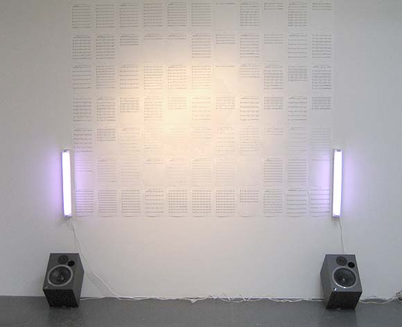
Paul Slocum, Deep House for Symphonic Band and Choir, 2006. Slocum explains on his blog, "Its a dance club hit written for symphonic band and choir. The music plays on the speakers in a loop (about 4 mins long) and the entire score for all the instruments is pinned to the wall between two Sylvania Gro-Lux fluorescents." The music (at www.qotile.net/blog/wp/?p=326) is great; a very full, lush orchestrated sound, compositionally minimal but soulful, like the best deep house on vinyl, but with a Steve Reich vibe in the use of symphonic instruments and voices. I like that the score is presented as a series of abstract marks on the wall, a la Sol LeWitt (lighting by Flavin), but that the marks actually correspond to something you can hear with your own ears, both in real space and virtually, by virtue of being published on the Net.
Updated a couple of times, with more words and a link to the tune.
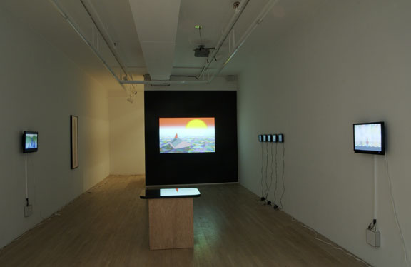
New York Times review of Michael Bell-Smith's show at Foxy Production, 617 West 27th Street (Chelsea), New York, NY, up through June 3:
Michael Bell-Smith operates in the gap between animated cartoons and painting with unusual effectiveness. His short digital loops, shown on small screens or paintinglike wall monitors, portray landscapes, cityscapes, figures and oblique social commentary. But their main concerns are color, space and light, tweaked and amplified by digital technology and restrained animation. Whether we are flying high above an endless suburbia, as in "Some Houses Have Pools," or looking at the artist as he stands in the middle of a Midtown street, as in "Self-Portrait NYC," the excitement lies in grasping the layers of the image and the way they do, or don't, change.This is a nice review but treats the gallery as a walled garden sealed off from the Internet and the street. If anyone's work could benefit from a "digital non-site" analysis it's Bell-Smith's. How much does the imagery and animation derive from gaming, website GIF wallpaper, ringtones, and upload/download culture in general and how much is invented out of whole cloth by the artist? What is the value of putting "gallery brackets" around pop culture ephemera? Is this still Pop Art? Is it relevant to mention Bell-Smith's CD of acapella hiphop hits digitally synchronized with ringtones of the same songs? That he plays in a band? Or the fact that he was recently on a panel called Net Aesthetics 2.0, that considered a gradual tectonic shift in Internet art practice? That he has a blog and is an ardent curator of Internet cult phenomena of every description, with exquisite taste in same? "The gallery" and the "art review" are still excellent places to discuss these kinds of things--particularly how they can be translated into an elegant physical space. It would be good if our top gun critics could stretch just a wee bit.
In the post-Katrina "Continue 2000," a red-caped hero stares at the setting sun from the roof of a house adrift in a flood of shimmering, patchwork color. He is going nowhere, but the sun explodes and the world turns momentarily gray, like an omen.
"Up and Away" scrolls through an encyclopedic array of panoramic horizons city skylines, deserts, mountains, castles, forests, oceans that conjure up dozens of movie genres but are actually downloaded from video games (and are so coarsely pixilated they seem Pointillist, or knitted). Now it is the viewer who goes nowhere: space is deep but never penetrated. It's like watching a deck of cards being shuffled: pick a landscape, any landscape. Mr. Bell-Smith brings new and old and static and mobile into a promising, visually enthralling alignment. ROBERTA SMITH

GIF from fUSION Anomaly enlarged, cropped, sped up


GIF from fUSION Anomaly eight times
Individual GIF from fUSION Anomaly 144 times
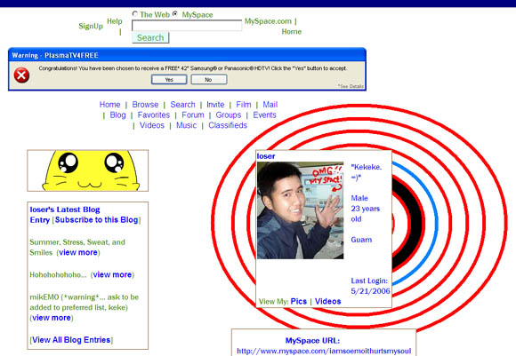
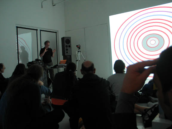
Spreading the acid house gospel... exorcising the demons from the laptop... playing "air theremin"...I forget which. (photo - artMovingProjects) Lecture/Perfomance notes
McCain Criticized by Fellow Graduation Speaker
This is inspiring--from the New York Times article "Graduates at New School Heckle Speech by McCain" (By David M. Herszenhorn, May 20, 2006)
The jeers, boos and insults flew, as caustic as any that angry New Yorkers have hurled inside Madison Square Garden. The objects of derision yesterday, however, were not the hapless New York Knicks, but Senator John McCain, the keynote speaker at the New School graduation, and his host, Bob Kerrey, the university president.I say put the kids in charge, fire the adults.
No sooner had Mr. Kerrey welcomed the audience to the university's 70th commencement than the hoots began to rise through the Theater at Madison Square Garden. Several graduates held up a banner aimed at Mr. McCain, an Arizona Republican and likely 2008 presidential candidate, declaring: "Our commencement is not your platform." Other students and faculty members waved orange fliers with the same message.
Mr. Kerrey, a former Democratic senator from Nebraska, was unapologetic yesterday about inviting Mr. McCain, his friend and fellow Vietnam War veteran, to speak. He noted early in his welcoming remarks that there had been intense media coverage of Mr. McCain's graduation speech last week at Liberty University, headed by the Rev. Jerry Falwell, in which Mr. McCain strongly defended the Iraq war.
"Many predicted that his speech today would not receive as friendly a reception," Mr. Kerrey said. "The expectation is that and that expectation has already been realized that some of you in this audience will act up to protest the senator's appearance."
The first student speaker, Jean Sara Rohe, 21, said she had discarded her original remarks to talk about Mr. McCain.
"The senator does not reflect the ideals upon which this university was founded," she said, to a roaring ovation. "This invitation was a top-down decision that did not take into account the desires and interests of the student body on an occasion that is supposed to honor us above all."
Noting that Mr. McCain had promised to give the same speech at all of his graduation appearances, Ms. Rohe, who was one of two students selected to speak by university deans, attacked his remarks even before he delivered them.
"Senator McCain will tell us today that dissent and disagreement are our civic and moral obligation in times of crisis, and I agree," she said. "I consider this a time of crisis, and I feel obligated to speak."
She continued, "Senator McCain will also tell us about his strong-headed self-assuredness in his youth, which prevented him from hearing the ideas of others, and in so doing he will imply that those of us who are young are too naïve to have valid opinions.
"I am young, and although I don't profess to possess the wisdom that time affords us, I do know that pre-emptive war is dangerous and wrong," she said.
She added, "Osama bin Laden still has not been found, nor have those weapons of mass destruction."
As Mr. McCain came to the lectern, dozens of students and professors stood and turned their backs on him. Many waved their fliers.
Before his speech, Mr. McCain thanked Ms. Rohe "for that CliffsNotes version of my address."
Mr. McCain seemed uneasy, but stuck to his script and did not acknowledge the barbs. As Ms. Rohe had predicted, he spoke about the importance of civil discourse, and he reiterated his defense of the war.
"I believe the benefits of success will justify the costs and risks," he said. The protests grew louder and more frequent as he spoke. Some graduates walked out. Others laughed. When Mr. McCain returned to policy after briefly quoting Yeats, someone shouted, "More poetry!"
At another point, someone yelled, "We're graduating, not voting!"
The heckling continued when Mr. Kerrey returned to the lectern, with one audience member shouting, "You're a war criminal!"
Mr. Kerrey, a Medal of Honor winner, has admitted to leading a mission that resulted in the deaths of 13 to 20 unarmed civilians.
"Drum Machine": Notes for my lecture/performance tonight, Friday, May 19, 8:00 pm, at artMovingProjects, Williamsburg
In the '80s the Roland TR-808 and TB-303, failed drum machine and bass genie, were scarfed up cheap by kids and "acid house" was born.
"People's music" - affordable tech for credible psychedelic party - Dionysian, anti-"control system" - different view of Modernism - apolitical vs opting out - "who controls the pleasure?" (The Man or the kids?)
Current soundmaking tech divides functions of the Drum Machine:
--sound generation is mechanical (voltages or digital signal processing is "sculpted" to make percussive noises)
---composition/sound design is done in the Sequencer
* Grids of MIDI notes - musical Mondrian
* editing of waveforms
Both are visual. Visual artists have a "home court advantage" (ear also helps)
"Drum Machine" video. (May describe, not show--it's a bit somber)
Doubly ironic:
--all sounds are "bent" from conventional drum sounds - spacy, not realistic
--visual elements *do not correspond* to sounds - problematized, anti-MTV
Live performance of 5 demo songs played with a sequencer (on laptop) controlling Vermona drum machine (subbing for TR-909) and Sidstation (subbing for TB-303):
Clip City
Godhopper
Protest Song Variation
Suite 6
ArtMoving (new, composed this week)
Increasing interest in creating sound/image combos. Play the following videos:
--End Notes (w jimpunk)
--Sensor Readings
--Ninja Elements

Detail of architectural rendering for 808 Columbus development, via Curbed. This is pretty how much how most of the New York metropolitan area is looking to me these days. I moved (back) here from Dallas 11 years ago this month, and that city followed me up here. One question I have is, how can New York City have so many banks? Every time a family-owned deli or hardware store closes it is replaced by a bank. My theory, without doing the research, is that the banks are buying the real estate (a la Starbucks), and those people sitting at desks behind the glass windows trying to look busy are just props.
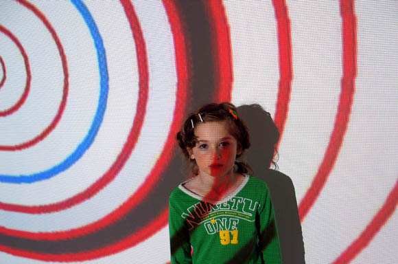
My grandmother went to see my show at artMovingProjects and was transformed into a seven-year-old. (Photo courtesy artMovingProjects.) But seriously, Phase Two of the show is happening Friday night: the music lecture/performance. The plan is to keep the installation up and intact for those who haven't seen it, and just set up a table with my gear. I've adapted some pieces for live performance, which means turning knobs with a meaningful look on my face while the computer does most of the work. I might shake a little bit, too. Also, I'll be showing bigscreen versions of some of my videos, including "Ninja Elements," "Exit Maurice," "Sensor Readings," "End Notes (w/ jimpunk)," and "Guitar Solo." In between pieces I'll be talking about drum machines and "visual artists invading music." The photo below, taken at the opening, is from Tintype (M.River's photo blog). More seniors regressed into tots through the power of the OptiDisc.
Triple Candie currently has a show up of "approximations" of Cady Noland's work. Noland is an influential installation artist who reached the top of the art world and "dropped out" about 10 years ago; the gallery has re-created some of her work, based on documentary sources but without consulting or notifying the self-disappeared artist. The "approximators" also published detailed notes of where they fell short in the installation process, both in finding information and relocating materials. From the press release it is obvious the project was conceived in a spirit of admiration for Noland and an intellectual fascination with "compromised forms of representation"; the eloquent commentary below by Amory Blaine (who I suspect is one of the creators or somehow involved with the project, although the gallery says it doesn't know who s/he is), describes the show as "part ghost story, part lament."
By contrast, critical response has been harsh and negative. Without any evidence to back it up, the New York Times and Village Voice interpreted the phrase "without consulting or notifying the artist" as "done against the artist's wishes" (not the same thing--what are these critics, mind readers? as Atrios would say, time for a blogger ethics panel). The Voice said Noland should "get a lawyer and get medieval on Triple Candie." Another scolding defender of Cady Noland is critic Brian Sholis, who is taken to the cleaners by "Amory Blaine" (a pseudonym from F. Scott Fitzgerald) in a colloquy from Edward Winkleman's blog, which I have reproduced immediately following Sholis' blog post.
BRIAN SHOLIS (from his blog) on Triple Candie's "Cady Noland Approximately" Show:
Far be it from me to police what a gallery chooses to exhibit, but it seems to me that making an exhibition-of-photocopied-reproductions-as-homage in the spirit of one artist [Triple Candie's David Hammons show --tm]an exhibition that leads even the Times to wonder if the artist is involved [but wait--the Voice said Hammons was "livid" --tm]is one thing. It is far different, and less malicious, than re-creating the artworks of an elusive artist, no matter how poorly and with how much transparency. As someone said last night at dinner, "This show cannot even begin to look like a Cady Noland show. Cady has very specific reasons for installing her objects the way she does; the relationships between them are of equal importance to the sculptures themselves. This cannot be re-created by others' hands." Hammons is enigmatic, and his relationship to exhibitions and the market can be seen, in some way, as part of his oeuvre; Noland's relationship with the art world is much closer to a categorical "no." In my mind, the differences between those stances outweigh the similarities described above.
AMORY BLAINE said... (all quotes from this point forward are from a comment thread on Edward Winkleman's blog)
Too bad Brian Sholis has bought in bulk the preciousness that the art market demands in shunning the Triple Candie project. Too bad he thinks that "cognoscenti" and "the public" are one and the same.
>>If these aren't Cady Noland sculptures, and those responsible for creating them aren't willing to claim them as something else (à la Sturtevant, or some such), then what are they?
They're approximations, Brian. One thing that you get to do when you make things in a new way, you get to name the terms. It seems that approximations may have both named and unnamed collaborators.
This show is a gesture whose faults are outweighed by the complexities of its combined virtues. It is part ghost story, part lament. Its honesty might very well be a little too intense for some to handle, but for those with a taste for that, it will taste sweet. That the beginning of Mr. Sholis's blog is laced with a threat of legal action from the artist is plenty to go on. Any writer who's first thoughts of a show include litigation should be put in the stocks. Your Fucking Face, indeed.
4/23/2006 03:12:03 PM
BRIAN SHOLIS said...
I guess I should clarify the first sentence of my post: I was not suggesting that Noland would threaten legal action. In fact, after hearing from people who know her better than I do (I've only met her once, and corresponded with her briefly), I don't think she'll do anything at all in response to the exhibition. When I wrote, ". . . that will be very short-lived if Cady Noland responds to this exhibition the way she has to exhibitions that include artworks she actually made," I was referring to the numerous recent instances in which Noland has harangued gallerists that have chosen to exhibit her work, or convinced dealers who asked for her permission to give up on including her in their shows. It has more to do with respecting Noland's wishes than any legal action. (I know of no instance where she has threatened or taken legal action.)
As I noted at the end of my post, we "need instead to stoke Noland's desire to collaborate with a gallery or institution on an exhibition of her own work." My condemnation of the Triple Candie exhibitionwhich I am eager to seestems more from a disappointment in the Harlem non-profit's misunderstanding of Noland's feelings. I think Noland is one of the most important artists of her generation, and it pains me to think she might slip from our consciousness (hence "Why We Should Talk About Cady Noland"). That Triple Candie's exhibition might increase her reluctance to show her work again is in my mind a true shame.
I have the same desire that Peter and Shelly have. I just feelagain, without yet seeing the exhibitionthat they have gone about achieving it in the wrong way.
Best, Brian
4/25/2006 10:40:23 PM
AMORY BLAINE said...
This trend of caring about artists' feelings is interesting and new. The other trend, however, of writing on things one hasn't seen, is not very new or interesting.
There's nothing complicated in wanting to make something contentious? It's a whole lot more complicated than serving up pablum, or offering something tried-and-true. What irritates me about some of these reactions is the knee-jerk argument of "wrongness". Are you offering that there is some objective "right"? Is that "rightness" comprised of adulation, supplication, inaction, and silent reverence?
No thanks, I don't go to that church.
And I would think that, like the Unauthorized Retrospective, this exhibition was done in the only way that triple candie could do it. In no time, with help from friends, and with very little money. I think that it's a tribute to the currency of her work that a group of people would go out of their way to make a gesture that would attempt to somehow fill the gap of her absence (a futile but encouraging effort) and bring her name out of their throats in a clear and ringing tone. More like a barbaric "Yalp" than Neil Simon's whispered "Cancer".
If anything, this show is an entreaty to Cady Noland. As much a curtain call as "Why We Should Talk About Cady Noland". It's just that it's not words, it's concrete. It's confusing. Damned ambivalent.
Looking at knock-offs is not interesting? Why not? Is it due to an overbearing sense of "the original", of some "authentic" experience? I think it is a reverence for a brand. Then there can be no satisfaction, even if the pieces were 1:1 exact replicas with no observable difference from the products straight from Ms. Noland's studio. What you're after is an interaction with your fetish object. This has absolutely nothing to do with the ideas behind Cady's work. You're only seeing what's not there. Like a petulent child who didn't get exactly what they wanted for Christmas, you're spoiling what fun is to be had for the rest of us. Mature. Adult. Human. Beings.
Boycott Triple Candie? That has got to be the most obscenely stupid thing I have ever heard. What are you going to do? Stop not giving them money? Stop not bringing all your friends to the openings? Stop not helping them install shows? Great. I can't wait to not see you around there anymore. With friends like you, who needs friends?
It saddens me to see fans and writers and critics displaying such a lack of flexibility when it comes to engaging the topic of replication, reproduction, approximation in absentia, ... alternative modes of production, folks. It's not like we haven't been here before. A million goddamn times.
What interests me is how exciting this feels. I haven't been this excited about a show and its ramifications in a very long time.
4/28/2006 06:09:28 PM
BRIAN SHOLIS said...
Hi Amory,
[...] My "caring about the artist's feelings" stems from the ramifications of this exhibition on Noland's desire to continue making (and exhibiting) her own art. What gives me most pause about "CN Approximately" is not the questions of replication, reproduction, and approximately that it raises, but rather this--admittedly nebulous and arguable--negative impact on Noland's production. For those fans of her work who hold on to the hope that she may one day reverse course and exhibit, any narrowing of the horizon of possibility is painful. For this reason I still wish that this show had not taken its current form.
Nonetheless, I agree that the thorny issues brought up by this show are productive complications, ones both exciting and well worth thinking about. I don't, however, think that this was the "only way" Triple Candie could have put the exhibition together. For clarification's sake, I never suggested boycotting the show or that looking at knock-offs is not interesting; I believe those are responses to another person commenting on this post.
At this point I have to recuse myself from further posts on this thread, as I was traveling this weekend and have personal- and work-related obligations this week that will keep me from my usual blog-reading. If you'd like to continue this conversation, however, feel free to write me (my e-mail address is in the right-hand column of the site linked to this profile). I'd be happy to keep talking (although perhaps at a slower pace) . . . especially after I have seen the exhibition.
Best, Brian
5/01/2006 12:52:26 PM
Thanks to NEWSgrist for reBlogging some of my items on Triple Candie's Cady Noland show. The story there is much more cohesive than on my own page, where the posts have been spread out over time, so please check it out.
"Spiritual America"
East Village Storefront
Manhattan
Through May 21
After famously rephotographing Marlboro ads and presenting them as his art, appropriationist Richard Prince has simulated work by photographer Garry Gross, who has freelanced for Playboy in addition to making his own figurative photography. In an East Village storefront that serves as Mr. Prince's gallery, Mr. Prince has installed a rephotographed version of Gross' image of a nude, prepubescent Brooke Shields, retitling it with the same name as the gallery, "Spiritual America."
The show might be seen as a chance to think about an oeuvre that, while mostly unfamiliar to the art world, remains pertinent to what artists like John Currin, Loretta Lux, and Inez van Lamsweerde are doing these days. Unfortunately, it is easier to see it as an attention-seeking stunt. No one in the small cult of cognoscenti that values Mr. Gross' work is going to care about seeing inexact substitutes, and no serious critical reappraisals of his art should be based on Mr. Prince's ersatz object.
The show might raise interesting questions about art and commerce, but Mr. Prince should make it clear whether he is running a gallery or doing his own conceptual art. Otherwise his project comes off as confused, confusing and duplicitous. KEN JOHNSON
My second parody based on Johnson's takedown of Triple Candie's "Cady Noland Approximately"--the first was Sherrie Levine.
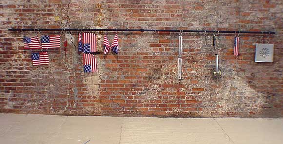

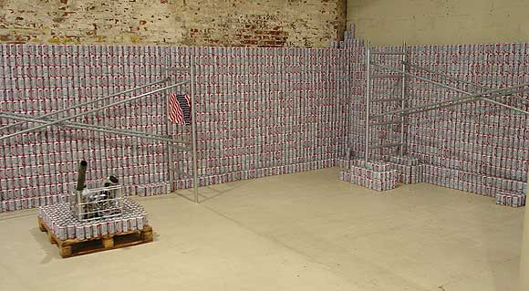
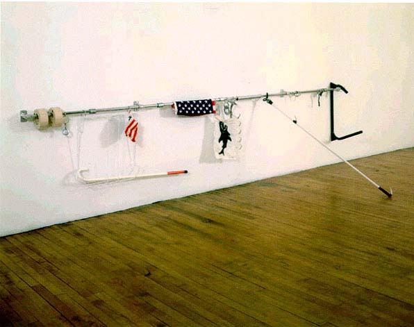
Not everything in Triple Candie's re-created Cady Noland show is so great--the strips of tape holding up the rather dog-eared Oozewald simulation are a poor substitute for thumbtacks (if that's what they originally were), and some of the fabrication looked amateurish, and not in a good way--but the above three pieces are superbly done, if superb is the right word. I took these photos yesterday--I actually saw something very close to the top two works (and met Noland) when she did a large-scale exhibition at the Dallas Museum of Art in '93, and can vouch that these versions are much like what I saw. Which is to say, offhand/slacker and fanatic/Judd/minimal at the same time. The main difference was--is this crucial?--no slick white gallery walls behind them, just Triple Candie's rough brickwork.
The show isn't just about creating a room of uncanny perfect copies, a la Sturtevant's Duchamps. It's also about whether recreating an art based on past ephemera is possible. And of course, whether the participation of the artist is essential in displaying work based on available materials. The artists have published detailed notes of how much or how little they were able to redo given their budget and the vagaries of finding (or re-finding) manufactured items from 20 years ago. They are completely up front in the press release that these pictures are based on, among other things, pictures on the Internet. In his hatchet job on the show, New York Times critic Ken Johnson doesn't mention that the Web was one of the sources used, thus writing out of history the rather important theme of how we rely on Google searches and cyber-facsimiles to give us our sense of history. It's quite possible that the photos above will show up in Google Images next to jpegs of actual Nolands. Is that good? Bad? Johnson doesn't go there.
An odd contradiction in Johnson's review: in the first paragraph he mentions that Triple Candie is a non-profit gallery, and then later says the show "might raise questions about art and commerce" (that is, if the gallerists didn't have such bad motives). He is projecting a set of intentions on them that differs from the ones they announced, and then slamming them for failing (or is it not failing?) to live up to them.
Just for the record, the re-creators are Taylor Davis, Rudy Shepherd and two anonymous artists. This post has been updated as new thoughts occur to me.
Update: Jerry Saltz also bashed the show. Typically, he describes many of the reasons it's interesting and then pronounces it shit. In this case, apparently based on loyalty to Noland and attachment to his memories of first encountering her work. He thinks she should sue the gallery--excuse me, "get a lawyer to get medieval on Triple Candie." He also passes along the insinuation that the gallerists are serially doing shows against artists' wishes, adding the unattributed anecdotal information (i.e., rumor) that David Hammons was "livid" about the show they did of his work. Not livid enough to stop the show in court, though. And is saying the artist didn't like the show the same as saying the gallerists "have gone around an artist's wishes," as Saltz does? As with Johnson, that's a nasty accusation to make without proof.
Update 2: This show is bringing out some conservative reactions in critics. Brian Sholis took the same protective line as Johnson. Like Saltz, he seems to think it threatens or cheapens Noland's legacy. But he hadn't seen the show when he wrote his post--he was reacting to the press release.
Update 3: As bill says, "Real or memorex?"
"Walker Evans Approximately'": Photographs, 1934 to 1956
Artists' Space
Through May 21
Recently artist Sherrie Levine mounted an unauthorized exhibit in the form of "rephotographed" works of photographer Edward Weston, using images taken from books, catalogs and magazines. Weston's estate threatened legal action.
For her next project, Ms. Levine has simulated a Walker Evans exhibition, copying a number of of Mr. Evans' haunting Appalachian realist photographs from the 1930s and '40s, using reproductions in books and magazines as guides. The works on view include the famous photo of a weathered couple on a porch ringed by scrawny urchins, and the curled, beat-up farmer's shoes that have been compared to Van Gogh's genre studies.
The show might be seen as a chance to think about an oeuvre that remains pertinent to what artists like Sally Mann, William Christenberry, and Sebastiao Salgado are doing these days. Unfortunately, it is easier to see it as an attention-seeking stunt. No one who values Mr. Evans' work is going to care about seeing inexact substitutes, and no serious critical judgments about his art should be based on such ersatz objects.
The show might raise interesting questions about art and commerce, but Ms. Levine should make it clear whether she is a photographer or doing her own conceptual art. Otherwise her project comes off as confused, confusing and duplicitous. KEN JOHNSON
That's not really a parody, it's almost word for word what New York Times critic Ken Johnson wrote about Triple Candie's Cady Noland show. Next up, another artist who needs to make it clear what he's doing: Richard Prince.
Ken Johnson of the New York Times yesterday criticized the gallery Triple Candie for its show of Cady Noland re-creations. His review appears to contain significant factual errors, based on what I learned from a call to the gallery. For example, was Cady Noland contacted about the show before they did it? The gallery says no. Johnson says she was, and that she "rebuffed" the gallery. Where did he get this information? Also, he says Triple Candie was similarly rebuffed by David Hammons about doing a show of his work before they went ahead and did it, also apparently not true. These facts are important because Johnson's review reads like a smear job on the gallerists, suggesting they do shows motivated by personal spite. Here's what the Times published:
"Cady Noland Approximately'": Sculptures & Editions, 1984 to 1999
Triple Candie
461 West 126th Street, Harlem
Through May 21
When the artist David Hammons recently rejected an invitation to do a show at the nonprofit exhibition space Triple Candie, the gallery's directors, Shelly Bancroft and Peter Nesbett, did one anyway. They mounted an unauthorized retrospective in the form of photocopies of Mr. Hammons's works taken from books, catalogs and magazines.
Now, similarly rebuffed by Cady Noland, the influential sculptor known for refusing to cooperate with commercial galleries, Ms. Bancroft and Mr. Nesbett have simulated a Cady Noland exhibition. They invited four artists Taylor Davis, Rudy Shepherd and two who asked not to be named to copy 11 of Ms. Noland's darkly acerbic Neo Pop constructions, assemblages and installations from the 1980's and 90's, using reproductions in books and magazines as guides. The works on view include an installation of Budweiser beer cases, steel scaffolding, auto parts and American flag bandannas; a cut-out and perforated figure of Lee Harvey Oswald being shot; and a wooden, silver-painted Minimalist sculpture of stocks, the old instrument of public punishment.
The show might be seen as a chance to think about an oeuvre that, while mostly inaccessible, remains pertinent to what young artists like Banks Violette, Josephine Meckseper and Kelley Walker are doing these days. Unfortunately, it is easier to see it as an attention-seeking stunt. No one who values Ms. Noland's work is going to care about seeing inexact substitutes, and no serious critical judgments about her art should be based on such ersatz objects.
The show might raise interesting questions about art and commerce, but Ms. Bancroft and Mr. Nesbett should make it clear whether they are running a gallery or doing their own conceptual art. Otherwise their project comes off as confused, confusing and duplicitous. KEN JOHNSON
An earlier post I did on Triple Candie's Noland show (more specifically, its intentions announced in the press release) is here. Johnson's review is scolding, judgmental, and apparently inaccurate. His theory that the gallery is motivated primarily by backbiting and "attention-getting" lets him off the hook from actually doing much thinking about the show. Possibly he has a bee in his bonnet about artists appropriating other artists' work. As noted here a year ago, when he reviewed Elaine Sturtevant's Duchamp re-creations at Perry Rubenstein he somewhat dismissively remarked, "They love her in Europe."
Update: This post was revised from its original form. I'm looking at the show this afternoon and hope to post more thoughts later.
Atrios, Juan Cole, and Steve Gilliard are all running ads on their blogs that say "Don't let the government regulate the Internet!" Those ads are paid for by AT&T and other telecommunications companies, using the alias of a fake grassroots group. It is regulation that assures "net neutrality" and creates a level playing field between independent content-providers (like this blog) and the big companies that brought you Fox News and Britney Spears. Ending regulation means no more level playing field.
Also, we've just found out these same TelCos who want to end the Internet as we know it have been selling our personal information to law enforcement agents.
It does seem like a disconnect that there could be a benign part of the government that regulates food and drugs and keeps competition alive in the marketplace and a malignant part of the government that spies on us.
I don't think that's much justification for taking the Telcos' money and helping them spread propaganda, though. It's a bit like the footage in Fahrenheit 9/11 of Al Gore banging the Senate president's gavel repeatedly, to keep the people who voted for him from speaking out about the fraud in the 2000 election he just "lost." Working against your own interests, as it were. Epecially since the issue is so confusing. Most people will assume that those bloggers want the government's "hands off the Internet."
"Acid Casualty" [mp3 removed]
Two of my favorite CDs are 808 State's Newbuild, which is acid house made when A Guy Called Gerald was still in the group and before they "got it down" and started producing club smashes, and the collection Acid Classics, on Trax records, which is all the best stuff from Chicago in 1986-88. I love the intensity of the music and also the "I made it at home" quality. Tried to do something in that spirit here (although the synth used in the "break" is a bit more '92 hardcore rave.) No one can accuse me of being nostalgic for acid house because I had no idea it existed in '88--at least not the wack form you hear on Newbuild. I was on board by the early '90s, but by then the music had already mutated into something else. Interesting to think back to pre-Internet days--how slowly it took scenes to find their way to their potentially most enthusiastic audiences.
Tristero at Hullabaloo has dinner with a "liberal hawk":
"No, no, let me ask you a question. How come you, a musician, maybe a good one, maybe a well-read one, but a musician with no training in affairs of state - how come you of all people were right about Iraq but the most respected, most experienced, most intelligent, most serious thinkers in the United States got it wrong?"We have a liberal hawk who used to post a fair amount here at Digital Media Tree, and I had some lively debates with him during that period when America was going off a cliff. Unlike tristero's hawk, he didn't question my credentials to question the war, but he did a lot of scaremongering. "What if Saddam nuked the Saudi oil fields?" "Saddam or Osama (I forget which boogeyman) wants to establish a New Caliphate and rule the Middle East!" (Or words to that effect.) What it came down to was he believed ex-CIA analyst Kenneth Pollack about Iraq, and I believed ex-UN weapons inspector Scott Ritter, who had been in the country and said it had no weapons of mass destruction. Also, unlike tristero's defensive hawk, the Tree's hawk doesn't continue to defend his judgment. He's just been very quiet the past couple of years. It's a shame--he's a bright, knowledgeable guy and I miss our debates.
"That is a question I ask myself every day, because it scares the daylights out of me," I replied.
My eyes started to tear up and the winter of 02/03 raced through my head. That awful sense of dissociation watching every American media outlet try to outdo its rivals by printing lies, the unspeakable dread as I watched my country willingly go over the abyss. The shock of realizing that nearly everyone I knew had bought the myth of the Good War and that nothing I could say or do, nothing anyone could say or do could change their mind. It was too late.
I tried to say more, but I couldn't, and then the subject changed and the dinner went on.
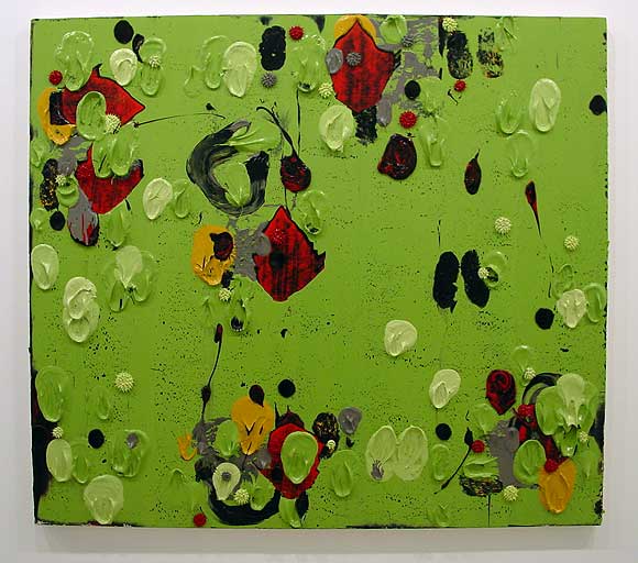
Just got back from Dennis Hollingsworth's opening at Nicole Klagsbrun in Chelsea, where I took this pic of one of Hollingsworth's paintings, and met the artist for the first time. Nice guy, but I knew that from his blog (still a comparative rarity--a generous walk around his life and studio). The photo makes the piece look small, but this is about 4-5 (?) feet wide. I like Dennis's work and have enjoyed watching it evolve on the Web. Nothing like seeing the real thing, though. I think you can get from the photo how sumptuous it is. What you don't get is the complex interplay of layers, and the gritty, gestural quality that invokes Pollock as well as taggers. These aren't facile paintings, you sense a lot gets scraped off before they start working. Earlier posts on Hollingsworth are here and here.
Digital Non-Sites
A few years ago I was in a show in Washington DC called "Digital Sites," which featured artists from the gallery side of things who use the computer in their practice (Albert Oehlen, Matt Mullican, Wayne Gonzales, Marsha Cottrell, etc.)
Response from the art world was flat, as these things usually are--minimal sales as far as I know, a couple of sniping or dismissive reviews. In 1999 I did not yet realize the depth of the "computers do not belong in the art world" conspiracy and couldn't have foreseen that painting would tighten its grip on the market to the extent it has. I mean, I like Dana Schutz's work, but it's just recycled German Expressionism, yet collectors are treating it like spun platinum.
The title "Digital Sites" was good, riffing on the dual meaning of the term "sites"--as in web sites, but also site specificity. The latter had its roots in the practice of earthworks artist Robert Smithson, who also came up with the term "Non-Sites," which are physical pieces, such as minerals from a quarry hauled into the gallery and displayed in a metal container.
Lately in my work, including the solo show that's up now, I've been experimenting with the idea of "Digital Non-Sites." In other words, content that lives and thrives on the Internet, such as animated GIFs, that has a second, qualitatively different life in the gallery. This could either be video or drawings of individual animation frames I've been posting.
That's the theoretical hook anyway. *crickets*
Last night the artist team JODI (Joan Heemskerk and Dirk Paesmans) presented their 2-channel video Max Payne Cheats Only at Electronic Arts Intermix in Chelsea. One of the earlier and still best "net artists," JODI favors anarchy, entropy, and irony over the world-bridging utopianism of much net practice; their site jodi.org famously, creatively dismantles itself (and your browser) as you use it. Max Payne Cheats Only wreaks similar havoc with the realistic "film noir" videogame Max Payne, concerning an Everyman who enters the underworld seeking Charles Bronson-style revenge after a criminal gang kills his family. The JODI version consists entirely of "cheats"--shortcuts and fragments of imagery buried in the code that are widely disseminated via (company sponsored) fan websites. Physics and perspective-flouting manipulations such as: Max walking through a wall when he gets cornered by the bad guys; Max becoming magically bulletproof--but also fun stuff like making the gangster's moll run around naked.
JODI reassembles the cheats' fragments and freaky camera angles with the manic verve of a sadistic child playing with dolls in a Dr. Caligari-like dollhouse, opting for maximum disorientation and grotesqueness. Thus, Max pounds the floor endlessly with a lead pipe, rapidly changing characters run headfirst into the same stretch of wall, the nude moll pirouettes like a ballerina in "bullet time," faces are stripped of skin and muscle leaving gaping, floating dental work. The vids meld the psychic fragmentation of Hannah Hoch's collages, the pointless headbanger repetitions of Paul McCarthy videos, and the claustrophobic worlds-within-worlds of Cronenberg's Videodrome or ExistenZ.
This work appeared a few months ago in PaceWildenstein Gallery's "Breaking and Entering: The Art of the Videogame," which exhibited it incorrectly, we learned. It's meant to be viewed flat on a wall with the audience seated; instead, the gallery displayed it on a cross-shaped wooden partition constructed for another, unshown piece (a four channel video of cars obsessively circling on grass, asphalt, and in the sky). By projecting the 2-channel Max Payne on the four-walled construction (using a couple of backup Payne DVDs to expand the video from two to four projections), PaceWildenstein in effect created a third work, which the artists, who live in Europe, didn't find out about till after the show's end. It's a shame, because the "cars circling" vids, a couple of which were shown last night, would have been impressive in a gallery space. They are repetitive and "ambient" as opposed to long and "linear" and thus more appropriate to show in a physical setting where viewers walk around and are unlikely to stand and watch for long.
A bit of drama: Right at the point in the panel last night when the artists and attendees were mulling over what PaceWildenstein could possibly have been thinking (were they sloppy, high-handed, or both?), someone (a dealer, I was told) angrily interjected from the audience that the speculation and criticisms regarding the gallery were inappropriate. "Of course they were negligent, we don't need to discuss it," he declared. Rather weird. Fun panel--thanks to Caitlin Jones for moderating and EAI and Rhizome.org for hosting this event.
An earlier post on JODI is here.
The fruits of my video and music collaboration with John Parker will be on view this Fri, May 12, in Toronto. The exhibition is Mods and Rockers, curated by Sally McKay as part of digifest 2006: mods:
Artist teams are:And here is the statement for our piece, anti-phallically titled Rodmocker, which will be displayed on two TV screens with an asynchronous music soundtrack on CD, playing through headphones:
* Myfanwy Ashmore & Lorna Mills
* Chandra Bulucon & Andrew J. Paterson
* Rob Cruickshank & Veronica Verkley
* Tom Moody & John Parker
In Britain in the 1960s, mods and rockers frequently clashed in bloody battles. For this exhibition, however, we ask them to merge in the name of art. Four pairs of artists, one Mod and one Rocker per team, will collaborate on art, video and sound works that illuminate the polarities of the partnership.
Tom Moody and John ParkerThe work was composed in public, on this blog, over the span of about a month. The posts are documented on John's site eyekhan.com.
Rather than have some kind of face-off, or rumble, we are merging sensibilities. The collective inner Mod is the high tech influence in the form of some sophisticated audio software and a newish laptop used to edit and burn the video, and the inner Rocker is the low tech source material: 8-Bit-style tunes on an old Mac (some originally composed in the '80s) and animated GIFs by Tom based on MSPaint versions of Web images of John's work.
We're trying for some sort of parity between the audio and visual material. Pixels and square waves are both medium and subject.
If you're in the Toronto area, I hope you will check it out!
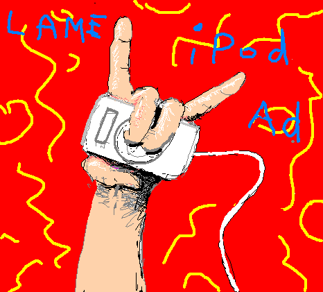
TV sketch artist, documenting the atrocities...
Thor Johnson remixed a piece of mine posted a few months ago:
"Tasteful Triphop (Thorrific Shruti Box Remix)" [mp3 removed].
The original tune is here:
"Tasteful Triphop" [mp3 removed].
Johnson's version is darker and more haunted. It is no longer tasteful, but instead might be described as a combination of Lou Reed's Metal Machine Music and Can's "ethnographic forgery series," with a modern but gritty digital edge.
Johnson also has a new web video (approx 24 MB Flash file), a psychedelic montage of Dick Cheney's recent, much-booed "throwing out the first pitch" photo op with the debated-and-then-quickly-forgotten clip of American soldiers shooting the wounded in Fallujah. The repressed returns to mingle with the banality of evil (that baseball jacket!).
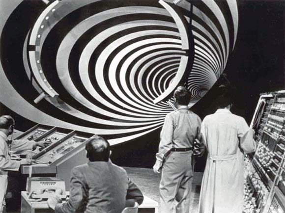
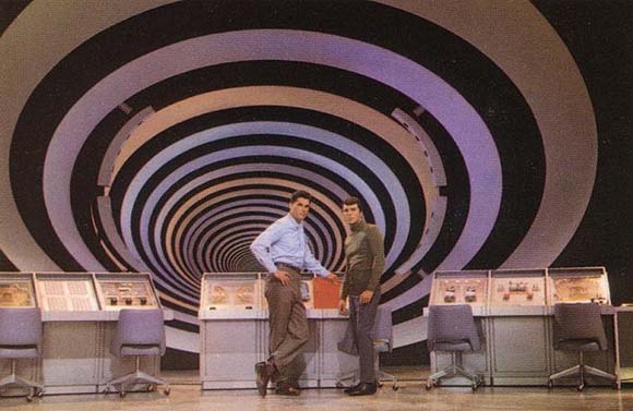
Time Tunnel was a pretty boring Irwin Allen TV series in the '60s where the protagonists go back in time to key moments in history--like, right before John Wilkes Booth is about the assassinate Lincoln--and inevitably face the same paradoxes and moral dilemmas week after the week. But what a set! The concentric rings pulsed while the two time dudes ran through the tunnel. Sometimes there were narrow escapes, like, they had to get out of the tunnel fast, before the universe exploded. [/Spicoli]
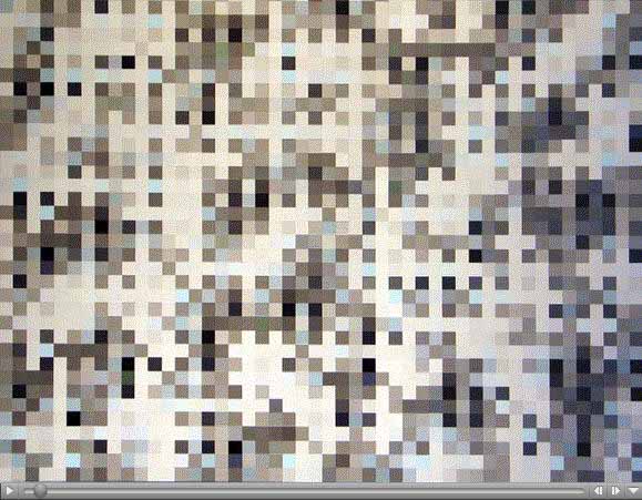
"Grey Grid (Aron Namenwirth)" [.mov file removed -- thanks, Apple -- see GIF version]
This is an animated remix interpretation I did of an acrylic-on-panel painting by Aron Namenwirth. It should be set automatically to loop in your Quicktime player and move very fast. (If not, something's out of whack. But the movement should be irregular--that's "in whack.")
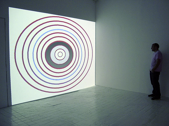
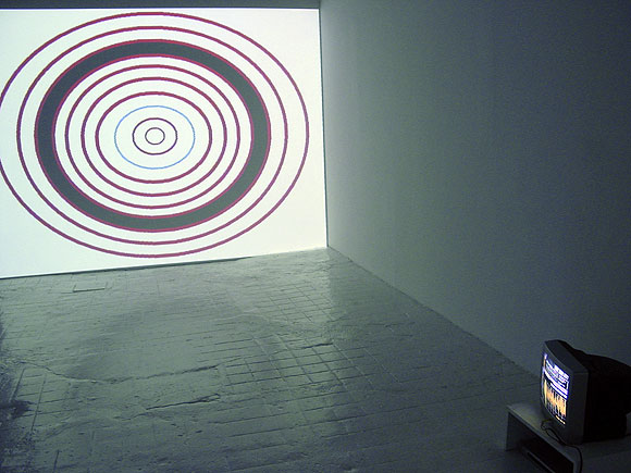
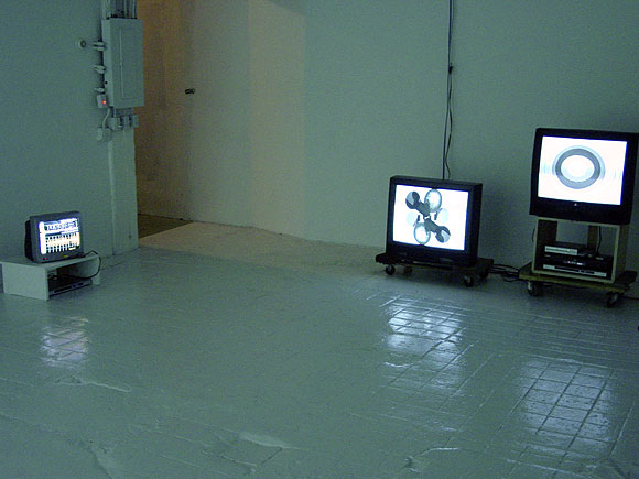
Tom Moody, "Room Sized Animated GIFs," artMovingProjects, NYC. Checklist (with links to Internet versions) and work as installed in the gallery (projected and on assorted monitors)
1. OptiDisc, DVD-R, projection dimensions variable
2. Double Centrifuge, DVD-R
3. Eyeshades, DVD-R
4. Guitar Solo, DVD-R, music by the artist
5. Sensor Readings, DVD-R, music by the artist
Installation Photos
Adam Green on Net Neutrality:
If Net Neutrality is gutted, Google, eBay, and YouTube either pay protection money to companies like AT&T or risk that their sites process slowly on your computer... And the little guy with the next big idea would be muscled out of the marketplace, relegated to the "slow lane" of the information superhighway.Green's post has some links for the little guy to use to help stop the pro-AT&T legislation that is winding through Congress like a big bowel movement. Unlike the fake populist website ex-Clintonista McCurry set up ("Hands Off the Internet"--as in no regulation, even though regulation is what keeps the Internet a level playing field), the various pro-neutrality forces are the real good guys here. Or at least better guys.
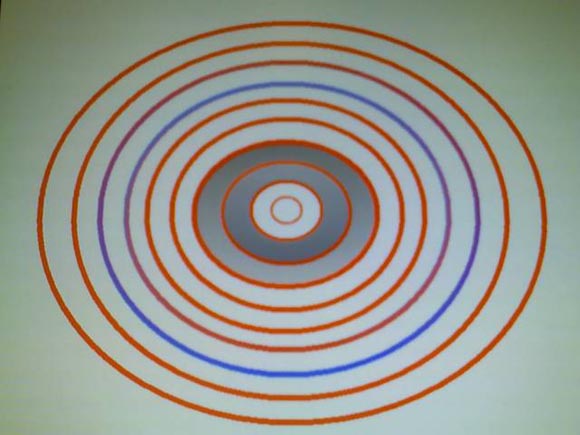
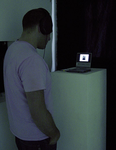
Thanks to whoever sent me this cellphone pic of the OptiDisc installation. This was in my inbox when I got home from the opening last night.
What happened to the "peace dividend"?
From a Salon interview with James Carroll, author of the book House of War (no link to amazon--I'm not part of their blogger payola network, sorry, and sorry for the link to subscription-only Salon; it's all about money these days):
The most important example of the momentum I'm describing in this book, this unchecked momentum, is what happened at the end of the Cold War. Because by the end of the Cold War a massive military machine had been set up and the thing that justified it, our enemy the Soviet Union, disappeared. Yet that machine was not dismantled.For future viewing (haven't seen it, just posting the link): Why We Fight on Google video (not the Frank Capra version).
There's the big clue of the momentum I'm talking about. How is it that in 1990, 1991, 1992, 1993 -- not so long ago -- there was a lot of talk about something called the peace dividend, but it never came? The American military did not significantly change its posture with regard to nuclear weapons, even under Bill Clinton. Why did that happen? It's the great unanswered question. And because it happened that way the responses of George W. Bush to 9/11 have all been extremely and unnecessarily militarist. We responded to 9/11 as though we were in the thick of the Cold War. The great symbol of that is an anecdote from the 9/11 Commission, which is that when we finally scrambled jet fighters to respond that morning, they went out over the Atlantic Ocean looking for incoming attacks from the Soviet Union. The other great symbol is George W. Bush fleeing to the command bunker at Offutt Air Force Base, the Strategic Air Command bunker that had been created by Curtis LeMay. That's the perfect symbol of our problem. It's not so much him I'm faulting here. [Oh, go ahead. -tm] What I'm suggesting is there was this unchecked Niagara current, a current that flows from the Pentagon to the disastrous cliff just ahead of us.

Yes, another plug for my show, opening tonight. No, this skull won't be in it, room sized, it's just to "get your attention." (I got it from an "assorted GIFs page" and scaled it up.) Please join me at artMovingProjects, 116 N. 12th Street, Williamsburg, Brooklyn, 7-9, for some vino and pulsating low-res animations in a variety of sizes, some with sound, some without. I hope to have some pics up by tomorrow. Thanks for the shouts from AFC, MTAA, TONY, and ArtCal.
A helpful "no murder" pledge from Steve Gilliard:
Some bloggers, mostly right wingers, after being embarassed by the conduct of some of their peers, have created a pledge of Online Integrity. Which, if one is aware of the rules of the internet and common decency, is as useful as a third nipple.
One should not have to be told to be decent.
But if we're going to have pledges, I think we need to pledge not to kill other people. Murder is so destructive and if we all agree not to do it, then we can have a better world. Here is the News Blog's 15 point no murder pledge
1. You cannot hire a man to kill your wife in a custody dispute. Murder is not a legal option in marital discord
2. Driving by homes and firing automatic weapons is unacceptable behavior.
3. Ed Gein is not a role model
4. Neither is Jeffery Dahmer
5. You cannot use Saw or Hostel as training films for kidnapping and torturing strangers
6. Axes are for wood, not virginal coeds
7. Just because someone steps on your brand new Nikes, you cannot cut their arteries with a boxcutter
8. Hitchhikers are not deer, you cannot hunt, gut and make jerky of them
9. Killing someone for insurance fraud is unlikely to work, ask Fred MacMurray
10. Farms are not disposal areas for meth dealing bikers on the wrong end of a drug deal. And, no, you can't store the hookers you kidnap and strangle there either
11. Just because you hate your neighbor, you cannot wire C-4 to his engine block, then wait for the explosion. And I know some of you can do just that.Don't.
12. I know your mother in law is annoying . Feeding her seconal and then letting her drive is STILL MURDER. Sure, your hands are clean, more or less, but your actions led to her death
13. Even if he has a gun, if you shoot someone in a home invasion, you've committed murder
14. Even though your wife left you, barging into her parents home, killing everyone inside and driving away is an overreaction.
15. Just because you own a high powered rifle, doesn't mean you can climb to a roof and start picking people off
Now that people understand the rules, they should follow them
"LoopB4YouLeap" [mp3 removed]
The B-4 is a software synthesizer version of the Hammond B-3 organ. Here an insistently stereo-panning riff gets the Glass/Reich/Ratledge treatment; I envision doing more rock-y sorts of things with those notes in the future. And normally when I see the phrase "loop-based musical styles" I reach for my revolver, but it's OK if I do it. Ha ha.
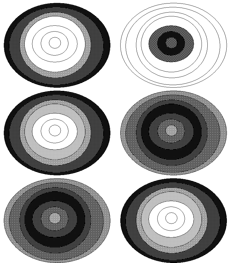
Draft checklist for my exhibition at artMovingProjects, opening Friday, May 5.
1. OptiDisc, DVD-R, projection dimensions variable
2. Double Centrifuge, DVD-R
3. Eyeshades, DVD-R (see above)
4. Guitar Solo, DVD-R, music by the artist
5. Sensor Readings, DVD-R, music by the artist
The e-card for The GIF Show, opening tonight at Rx Gallery in San Francisco, is here. A del.icio.us directory of the works in the show, including my vid "End Notes" (featuring my GIFs and ones I made with jimpunk), is here. Curator Marisa Olson says "Of course, many of these [works in the directory] will look quite different, installed in the gallery... What's not there, as of now, are Tom Moody's drawings, Lovid's fabric pieces, Guthrie Lonergan's gif avatar video, or Paper Rad's "Welcome to My Homeypage" gif video..." (link added to quote)
We began installing my show at artMovingProjects yesterday. I'm approaching this as an experiment and a reality check. The gallery consists of one large-ish white box room, so the decision was made some time ago to show my video work and not my 2-D work (drawings and paintings made with the computer). For reasons of light levels you can't have projected video in the same room with overhead-lit pieces--the two would cancel each other out.
It's ironic to be talking about "my video work" because until a few months ago it didn't exist. I had been doing animations and short films for the Web but never thought much about putting them in a physical space. But I was getting asked to submit videos to things, so I've been scaling up existing vids and thinking more about scale in making new ones.
Up until recently I'd only seen much of this work on the computer or a small TV monitor. Now we're going through the process of seeing how things look large and hearing how the sound works in a big room. It's premature to say where we'll end up Friday, but it's looking like less-is-more is the order of the day. Probably the show will feature only pieces with no sound, and the music lecture performance thing on May 19 will emphasize the "music video" pieces.
The silent pieces are on the peaceful hypnotic looping side--this OptiDisc one is looking like a likely centerpiece. Coincentally Google Images just archived the Net version recently and it's been getting a lot of traffic. The music vids, where my own tunes have some visual accompaniment, are aggressive beyond my hopes on a big scale, as in rock and roll. "Exit Maurice," "Sensor Readings," "End Notes," and "Guitar Solo" do more than "hold the room"--they pretty much grab it by the throat. I'm tempted to have one of these be the "centerpiece," but am kind of leery of videos with soundtracks in a gallery that play over and over. As in, I usually hate it. Still thinking about this.

Two shows opening this week:
Tom Moody, Room Sized Animated GIFsAnd, Rhizome.org Net Art News on The GIF Show*:
artMovingProjects
Williamsburg, Brooklyn, NY
166 North 12th Street
917-301-6680
May 5 - June 25, 2006
Opening: Friday, May 5, 7:00PM - 9:00PM
Music Performance/Lecture: May 19th, 8PM
Note: gallery closed June 8-11
Animated GIFs, the tiny, blinking, often annoying image files that draw your eye to particular parts of a Web page, have been around since the Net's early days. There is a sizeable do-it-yourself culture built up around them, which now includes a second generation of Web and gallery based art using them ironically and/or proactively.
For the past several years, Moody has been drawing GIFs in a simple paint program and posting them on his blog. The gallery will project two of these pulsing, but defiantly lo-fi animations huge on opposing walls of the space. Others will be displayed on monitors scattered on the floor.
The gallery will also feature a lecture/performance by Moody where he will present some of his music. These catchy compositions, made with a combination of old computers such as the Macintosh SE as well as more current soft synths and samplers, have a punchy concision similar to his GIFs. The styles range from videogame Electro to a string quartet piece written for a softsampler. --from ArtCal
The GIF Show, an exhibition opening May 3rd, at San Franciscos Rx Gallery, takes the pulse of what some net surfers call GIF Luv, a recent frenzy of file-sharing and creative muscle-flexing associated with GIFs (Graphic Interchange Format files). Curated by Marisa Olson in a West Coast Rhizome collaboration with Rx, the show presents GIFs and GIF-based videos, prints, readymades, and sculptures by a range of artists, including Cory Arcangel, Peter Baldes, Michael Bell-Smith, Jimpunk, Olia Lialina, Abe Linkoln, Guthrie Lonergan, Lovid, Tom Moody, Paper Rad, Paul Slocum, and Matt Smear (aka 893/umeancompetitor). GIFs have a rich cultural life on the internet and each bears specific stylistic markers. From Myspace graphics to advertising images to porn banners, and beyond, GIFs overcome resolution and bandwidth challenges in their pervasive population of the net. Animated GIFs, in particular, have evolved from a largely cinematic, cell-based form of art practice, and have more recently been incorporated in music videos and employed as stimulating narrative devices on blogs. From the flashy to the minimal, the sonic to the silent, the artists in The GIF Show demonstrate the diversity of forms to be found in GIFs, and many of them comment on the broader social life of these image files. The opening is sure to be just as lively, with music by Eats Tapes and visuals by Nate Boyce. Spread the luv! - Rhizome.orgThe MySpace page for The GIF Show has a lot of new material added.
*Update, 2011: The Rhizome link has been changed to http://rhizome.org/editorial/2006/apr/29/gifs-galore-and-more/
From US News and World Report:
Skewering comedy skit angers Bush and aidesSome kind of personal smear will no doubt be surfacing about Colbert: "not today, not tomorrow, but when he least expects it." Bush is like the character Paul Lazzaro from Kurt Vonnegut's Slaughterhouse Five. Nursing grudges and getting payback is what he's all about.
By Paul Bedard
Posted 5/1/06
Comedy Central star Stephen Colbert's biting routine at the White House Correspondents Association dinner won a rare silent protest from Bush aides and supporters Saturday when several independently left before he finished.
"Colbert crossed the line," said one top Bush aide, who rushed out of the hotel as soon as Colbert finished. Another said that the president was visibly angered by the sharp lines that kept coming.
"I've been there before, and I can see that he is [angry]," said a former top aide. "He's got that look that he's ready to blow."
Colbert's routine was similar to what he does on his show, the Colbert Report, but much longer on the topic of Bush, suggesting that the president is out of touch with reality. Aides and reporters, however, said that it did not overshadow Bush's own funny routine, which featured an impersonator who told the audience what Bush was thinking when he spoke dull speech lines.
In fact, some aides crowed over reports that the president easily bested Colbert in the reviews of both comedy acts.
Today is the third anniversary of Bush's aircraft carrier photo-op. On May 2, 2003, I posted these pics:


I mentioned at the time that "[t]he photo above and left is an Agence France-Presse photo. As documented here, the AP story changed the wording of the banner to make the protesters sound more violent, or desperate: 'Sooner or later US killers we'll kill you.' Hardly any US media ran the above photo, only AP's altered description."
Amazing and sad that after so many Americans and Iraqis have been killed, Bush is still in power and the press is still covering for him.
Matt Stoller at MyDD:
Stephen Colbert's incredible roast, where the room of pompous DC-tards wasn't laughing but everyone else was, has been seen several hundred thousand times on YouTube. The stupid and hackish Bush impersonation, replete with such witticisms as Laura Bush is "hot," isn't even listed. The people choose Colbert.You can thank Stephen here.
And on cue, Elizabeth Bumiller's article on the evening in the New York Times doesn't even mention Colbert, and talks about how Bush stole the show. Amazing. Ridiculous. In a few months, the insiders at the dinner will be claiming that they thought Colbert was terrific, that they were the only one laughing. That's how these people work. They'll hear about the legendary Colbert performance, and they'll rewrite history to make themselves seem savvy enough to "get the joke."
Anyway, it doesn't matter. This is the gasp of the royal pretensions of the punditocracy. And Colbert laid them bare, brutally. Thank you, Stephen.
Update: The New Pravda, I mean, the New York Times, mentioned the Colbert roast five days after the fact, but didn't convey that it was insanely popular on the Net, only that it was generating "controversy" in the "blogosphere."
Update 2: the blackout squad ramps up the aggression level: "public affairs channel" CSPAN claims "copyright" and YouTube pulls the Colbert video. I removed the link I had here to YouTube. It's still floating around--eventually I'll post links.
Paper Rad - teaser for Alfe "fake tv show" cartoon from their upcoming DVD from Load Records.
"There is a nucular war going on and you have the gall to dispute last week's fork audit?"
In other news, RV passed United 93 for box office sales this weekend. When it's all said and done, Americans still have their hearts in the right places. OK, on the strength of that I think we can start saying that the first big 9/11 exploitation film FLOPPED!
Steven Colbert's appearance at the White House Correspondents' Dinner last night was courageous, and great. Using heavy irony in the form of his "Fox News blowhard" persona, he told off Bush to his face, for Iraq, for Katrina, and for spying on U.S. citizens. From Editor & Publisher:
Colbert, who spoke in the guise of his talk show character, who ostensibly supports the president strongly, urged the Bush to ignore his low approval ratings, saying they were based on reality, and reality has a well-known liberal bias.The audience was NOT into it--reactions ranged from nervous titters to chilly silence. Bush was visibly displeased. The major news outlets are already spinning that Colbert went "too far"--wrong, he said everything we wished we could say.
He attacked those in the press who claim that the shake-up at the White House was merely re-arranging the deck chairs on the Titanic. This administration is soaring, not sinking, he said. If anything, they are re-arranging the deck chairs on the Hindenburg.
Colbert told Bush he could end the problem of protests by retired generals by refusing to let them retire. He compared Bush to Rocky Balboa in the Rocky movies, always getting punched in the faceand Apollo Creed is everything else in the world.
Turning to the war, he declared, "I believe that the government that governs best is a government that governs least, and by these standards we have set up a fabulous government in Iraq."
[...]
Colbert also made biting cracks about missing WMDs, photo ops on aircraft carriers and at hurricane disasters, melting glaciers and Vice President Cheney shooting people in the face. He advised the crowd, "if anybody needs anything at their tables, speak slowly and clearly on into your table numbers and somebody from the N.S.A. will be right over with a cocktail. "
Observing that Bush sticks to his principles, he said, "When the president decides something on Monday, he still believes it on Wednesday - no matter what happened Tuesday."
Also lampooning the press, Colbert complained that he was surrounded by the liberal media who are destroying this country, except for Fox News. Fox believes in presenting both sides of the story the presidents side and the vice presidents side." He also reflected on the alleged good old days, when the media was still swallowing the WMD story.
Addressing the reporters, he said, "Let's review the rules. Here's how it works. The president makes decisions, hes the decider. The press secretary announces those decisions, and you people of the press type those decisions down. Make, announce, type. Put them through a spell check and go home. Get to know your family again. Make love to your wife. Write that novel you got kicking around in your head. You know, the one about the intrepid Washington reporter with the courage to stand up to the administration. You know--fiction."
Update: so-called public affairs channel CSPAN claimed "copyright" and YouTube pulled the Colbert video. I removed the link I had here to YouTube. You can find the speech elsewhere. I'll get a link up eventually.
