View current page
...more recent posts
Jim Henley on the McCain Torture Act, just passed by the US Congress:
In many ways the military commissions bill is designed as a Get Out of Jail Free card as much as a plan for the future. Its designed to indemnify government officials and employees against criminal prosecution in US courts for acts theyve already committed, ordered or approved. And thats all well and good for escaping prosecution in the US courts. But British officials have to answer to British and European Union law. The Hague is not going to care that the US Congress decided to arbitrarily define away much of settled international law on the treatment of prisoners. Ive already suggested that this trap still waits [for] American officials once some foreign court wants to spring it, but for officials in other countries its a more pressing worry.
A previous post on computer geeks riffing on Jackson Pollock has been revised, with various editorial changes and the addition of a more Pollocklike Pollock image from jacksonpollock.org.

"Debating" America's "right" to grab citizens of other countries, hold them indefinitely without trial, torture them, and use secret evidence against them (it's all in the congressional pipeline at the moment), Senator Hillary Clinton just called al Qaeda "evil and nihilistic."
This recalls John Goodman's immortal line in The Big Lebowsky: "Nihilists? Fuck me. Say what you will about the tenets of National Socialism, Dude, at least it's an ethos."
Al Qaeda isn't a group of German punks who dress like Kraftwerk. They're militant Islamics who want the US out of Muslim countries. As we all learned a few years ago, they use extreme means not to our liking--as if the US never killed civilians en masse, in sickeningly grisly ways. As for "evil," we know where she got that word. The idiot in chief uses it all the time. Or "idiot"--to quote a recent TV news caption. It's not very helpful for problem solving.
Senator Diane Feinstein refers to the "problem" our government faces of how to "prosecute al Qaeda detainees for war crimes." Since we're not really at war with any nation right now (Iraq, you say? But didn't we invade to help them?), these people are not ours to kidnap and just hold--they have to be prosecuted by the countries where they are citizens. Or extradited to us for trial. Sucks, but it's called "international law."
Update: Just noticed that both New Jersey senators, Menendez and Lautenberg, ostensibly Democrats, voted for the McCain Torture Act. Wtf?
Equinox trailer [YouTube]
On IMDb, the link to the trailer for this 1970 horror film takes you to a trailer for the 1992 Alan Rudolph film of the same name. Good as Rudolph is, his trailer is no match for this. Trivia: in the horror film the word "equinox" is spoken in the 1967 student-made original (it refers to a boundary between good and evil, living and dead) but is never uttered in the 1970 recut.
More on the 1970 Equinox here.
Below are three songs that I'm reposting because all were changed--fleshed out or tightened up--since I first put them up. I'm also listing the software and gear I used, to be ultimately self-indulgent. All were produced in Cubase SE.
"Un-tribal" [mp3 removed] Kontakt 2, Battery, Reaktor Subharmonic, self-sampled Vermona DRM MKII drum machine, Spektral Delay (malfunctioning), LinPlug Alpha
"Anthropos Essentia" [4.8 MB .mp3] Absynth, Spektral Delay, Kontakt 2, DRM MKII, Battery
"Hiphop Snares" [mp3 removed] Miscellaneous drum loops, Waves Enigma, Reaktor Carbon 2, FM7
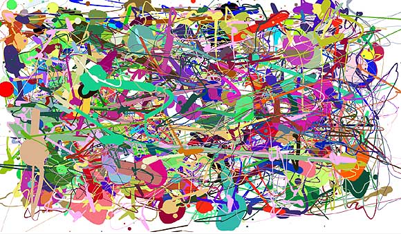
Above is an image I created using a Flash "make your own Jackson Pollock" program created by Miltos Manetas. He didn't design the software, completely--the code is from a downloadable web toy called "splatter" that he appropriated, customized to allow the application of multiple colors, and renamed "jacksonpollock.org." The idea is you can make drippy "Pollocks" by moving your mouse around.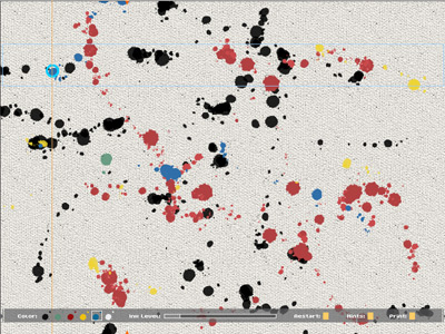
This is a screen shot from another make-your-own Pollock utility, currently on view at vertexList, by C.J. Yeh. Instead of cursor sweeps, you play notes on a keyboard, and Yeh's software translates the tune into Pollockesque colors and drip spacings. These "Pollocks" are more naturalistic than the output from Manetas' repurposed splatter device, reproducing canvas weave texture and avoiding the obnoxious secondary colors.
Pollock is a perennial target for computer geeks. Besides these DIY-Pollock programs (the former insider-ironically smartass, the latter insider-sincerely "deconstructive"), we were recently subjected to a barrage of hype about the computer science prof who could purportedly identify fake Pollocks by measuring drip sizes, fling rates, and so forth. And a few years before that, critic Pepe Karmel used computer analysis of Hans Namuth's studio photos of Pollocks-in-progress* to determine that beneath the convoluted abstraction lay images of the human figure, which Pollock "always drew first."
At the core of this all this computation--cheeky, earnest, or pseudoscientific--lies the assumption, essentially, that Pollock is stupid, and that his art, far from being the "difficult" thing art mavens have built careers defending, is really rather simple. See, you can do one. He's just another "brand." His dripping was so predictable that a machine can recognize it and simulate it. When you get past all the art-crit theory positing the work as "industrial," "oceanic," and "decentralizing," it turns out that deep down Pollock just loved people. In theory circles this is known as "recuperation." You'd have thought it would have happened already with Pollock, but apparently it's still ongoing. Is it possible that computer nerds (including computer nerd artists) are 40 years behind interior decorators? Or--gasp--that there's something about Pollock that's still getting under people's skin?
*see, e.g., Francis V. O'Connor, Ph.D., writing about Karmel's analyis of Number 27, 1950:
Pollock began the work, as Karmel documents, at the bottom left corner of the narrow end of the long canvas, in the area just above where the present signature is, with a drawing in black paint of a large-headed, childlike, striding, humanoid figure. He then filled in the rest of the canvas with other humanoid and animal figures until he had an overall structure of line-drawings on the blank canvas. He used these forms to create a web of hubs radiating black lines, and then covered them with the colors and forms now visible on the surface, with a few of the black lines visible around the edges. It is these black forms around the periphery of the painting that now "work" when the painting is viewed as a vertical composition -- which it was to begin with. I suspect that Pollock thought of the whole enterprise in respect to the little figure with which he began it -- and that determined the greater coherence of the vertical composition. Since he also had a tendency to want to obscure recognizable images with which he probably identified (see Supplement to the JPCR, p. 79), he may have signed it near the figure to accomplish this. Whatever the unknowable inner motivations, the painting self-evidently works best as a vertical, and it ought to be hung that way at the Whitney from now on, along with Namuth's photo proving the precedent.
In fairness to geeks, the Karmel analysis only used a computer technician as a hired gun. The "search for the figure" beneath the paintings' actual stated (surface) premises had more to do with critical conservatism than geeky reduction. If Pollock had drawn an engorged penis before covering it up with abstract patterns, would that have made the work sexual? The point is, he covered it up. The "research" was spurious and ultimately soothing to bourgeois anxieties about art with "no subject." It's mentioned in this post because the computer--which Karmel & Co. used to rectify canvases seen at odd angles in the photographs, the better to perceive those hidden stick men--gave the enterprise a patina of scientific rationality.
Updated after I learned the Manetas piece was a goof on a designer's work--I didn't know the source, but do wish we could get past "canonical artist" jokes.
Updated again Sept. 30 with minor edits and a more Pollocklike Pollock from jacksonpollock.org.


a quick surf around the deviantart.com Pixel Art archive--image filenames contain artists and titles
Ethan Mahmeinntow, "Symbiont" [4.95 MB .mp3] [via] '60s-style harpsichord arpeggio workout with mashed up beats, time and space folding, culminating with backwards drohcisprah.
cato_six, "Little hopin Jam" [2.6 MB .mp3] [via] Explosive, nimble, slighty insane drill and bass rhythms over eerie panning "organ" notes.
Two nice pieces from the Reaktions site. I'm linking directly to the site--don't know if that's considered hotlinking, but I'll keep doing it till someone squawks.
Most meaningless use of a religious icon reference in a press photo: Chip Somodevilla/Getty Images (front page of the New York Times online edition today, a story about Congress's current session concluding without getting much done).
Handlers position these functionaries hoping photographers will grab the bait--in this case making Bush stooge Bill Frist look holy--and they do it every time. "Honey, can you believe I got his head in the dome? I'll win a Pulitzer for this!" "You're a great photographer, Chip."
A memorable moment in Jim Jarmusch's film Dead Man occurs when a bounty hunter falls dead on top of a pattern of concentric sticks from a burned-out campfire, which appear as rays emanating from his head. Just as you're thinking he looks like a religious icon, cannibal desperado Lance Henricksen says "Looks like a goddamned religious icon," and puts his boot down on the bounty hunter's skull, improbably crushing it like a canteloupe.
From WorldChanging:
The media is buzzing over the spinach crisis, caused by an outbreak of the potentially lethal bacterium E. coli O157:H7. A curious yet widespread claim is that, because some of the spinach so far identified as contaminated came from organic farms, organic farming is unsafe. It's a curious claim, because scientists understand pretty well where the O157:H7 is coming from: the bellies of factory-farmed cows. Their manure, as it turns out, is now crawling with the critters. As this New York Times op-ed puts it:The same newspaper that published that editorial has a story today titled "As Children Suffer, Parents Agonize Over Spinach," the purpose of which seems to be scare the living daylights out of anyone with a small child.Where does this particularly virulent strain come from? It's not found in the intestinal tracts of cattle raised on their natural diet of grass, hay and other fibrous forage. No, O157 thrives in a new--that is, recent in the history of animal diets--biological niche: the unnaturally acidic stomachs of beef and dairy cattle fed on grain, the typical ration on most industrial farms. It's the infected manure from these grain-fed cattle that contaminates the groundwater and spreads the bacteria to produce, like spinach, growing on neighboring farms.
In many cases, it crept up with frightening force after what had seemed a harmless, even healthful meal--a spinach salad with walnuts, a sandwich layered with spinach or, as for the Krause family, a baked, boneless, skinless piece of chicken on a small bed of spinach. Then what had seemed a simple bout of diarrhea in the morning often led to a harrowing, bloody race to the emergency room by midnight.This melodramatic article by Monica Davey serves up abundant, clinical, sickening detail about the effects of E Coli, without mentioning anything about causes. ("'In the course of one week, he went from this healthy, lively little boy to a boy in a hospital bed fighting for his life...he turned yellow and gray, literally. It was shocking and terrifying and unbelievable to watch.'") Aside from ghoulish exploitation and a good rubberneck at others' misery, Davey appears, with this contextless story, to want parents to switch their children's diets to Keebler cookies, frozen pizza, and other "safe" foods.
And around the country, some families still wait by bedsides, wondering which foods they could ever again feel safe giving their children, what the government or the spinach industry could have done to protect them, and, most of all, whether their loved ones will ever fully recover.
"Here you think youre feeding your child a great, healthy meal," Dennis Krause said sadly. "But here I was, poisoning him."
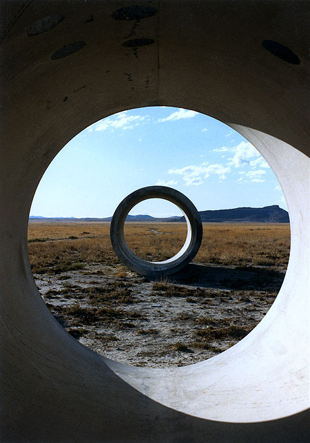
Tyler Green of Modern Art Notes recently reported on his trip to Sun Tunnels, Nancy Holt's earthwork in northern Utah. Sounds like he had a so-so time. Green thinks the work hasn't aged well, and I can't comment on that but am posting these snapshots from a trip my brother and I took there in the '80s, to show the magic Holt's piece is (or was) capable of. I'd be surprised if you couldn't get similar views now, but here's what Green says: "They never came to life, they never became exciting. They seemed too self-consciously monumental, too interested in being pagan totems to artisanal existence. Sun Tunnels is too much a post-industrial Stonehenge-like gesture to succeed as an engaging artwork. While the greatest pieces of land art exist within nature and bring their environment into the artwork--think how the Jetty and the Great Salt Lake co-exist or how Lightning Field is placed within its space--Sun Tunnels rejects its own landscape. Each tunnel looks like it had started to erode (Sun Tunnels was built in 1976) and was later patched so as to maintain its shape. While the Jetty basks in its location, Sun Tunnels seems to fight its off. The Tunnels' roundness is just too jarring, too inappropriate for this landscape. Sun Tunnels is funky cool in an I-was-there kind of way. But that's as far as they get."


Turning to my pics from the '80s, that's me in the middle photo, wearing my high desert button-down shirt, with my brother holding the camera. That's him off in the distance in the third shot. The bottom pic also shows some unfortunate cow pies around the piece at that time. I wrote Holt a letter after our visit and she wasn't too happy to hear about the cattle, but said that unless she fenced the area there was no guarantee the livestock would stay out. In the middle photo, you can see ricochet marks of bullets fired off by local art lovers inside the tubes. ("It blowed up good." "It blowed up real good.") Small wonder Holt has to keep them patched.
Some earthworks, notably Michael Heizer's, are jarring interventions in the landscape, and I'm really not sure what Green means when he says Sun Tunnels fails to "bring the environment within the artwork." Holt positioned the tunnels on the desert flatness so that one sees a different, exquisite mountain vista from each of the four possible vantage points. These distant geologic bulges are framed within the near-mystical concentric circles that appear when you view the tunnels head on--the top photo conveys some of the Magrittean effect. The choice of where to place them wasn't arbitrarily aesthetic, though: the cylinders are aligned with the positions where the sun rises and sets at the solstices (hence the piece's name). She cut smaller rounded holes in the tunnel walls, corresponding to the shapes of stellar constellations, which cast circles of sunlight or moonlight within the darkened tubes. Much like the work of Holt's husband Robert Smithson (this was her first piece after his death, I believe) Sun Tunnels combines analytical modernism--a costly desert construction project the purpose of which is to optically slice and contain the landscape--and pre-scientific, ritual channeling of light from heavenly bodies. Green's phrase "post-industrial Stonehenge" captures the essence but not the excitement. We spent about fourteen hours at the tunnel site, and watched the landscape (and skyscapes) change from afternoon to dusk to darkest night, leaving about 3 am to catch an early morning flight from Salt Lake City. The experience was rich and unforgettable.

An earlier post here rashly declared the Dennis Muren/Jack Woods trash horror classic Equinox, 1970, the "best film ever made." The new Criterion Collection double-disc reissue only makes that assessment more sound. If I ever taught a film course I'd skip Alexander Nevsky and the films of Ernst Lubitsch and start with this. The DVD includes the 1967 original, made by a group of teenagers on a $6500 budget over several years, plus the Jack Harris/Jack Woods theatrical (drive-in) version, which recut the kids' movie and added scenes with the same (but noticeably older) actors. It'd be a great way to show students what can be done with no money and then to demonstrate, shot by shot, how a more experienced filmmaker tightens it up, splices in new dialogue, and even adds a character not in the original. Why is it superb? It has jaw-dropping bad, Plan 9 moments, Night of the Living Dead creepy moments, unexpectedly striking, Ray Harryhausen-style special effects (Muren went on to do Star Wars, Dragonslayer, The Hulk, and many other films not as good as this one), but mostly because it never stops surprising you. The motivation of the characters is baffling throughout, but the plot never loses forward momentum. On the commentary track you hear one of the now-grown-up makers of the original ask, about one of the protagonists in his own movie, "Why did he do that?" and another replies "I don't know--it's one of the mysteries that is Equinox."
As the essay accompanying the DVD notes, the "kids who go in the woods, find a weird book, unleash demons from Hell" plot prefigured Evil Dead by 10 years. Equinox marks the beginning of the modern, Chainsaw type horror film simply because the makers lacked the budget to establish Gothic, haunted house suspense with lavish sets and camera work. Yet the evil is all the more disconcerting for occurring in the absolutely banal context of teenagers having a picnic in the country with a bucket of Kentucky Fried. Much of the dread (and humor) springs from, as someone once described Dario Argento's films, "people behaving strangely for no reason." The characters may have been babes in the woods but the filmmakers weren't: although young, they were movie geeks and in the commentary talk about how they obsessively analyzed films such as Don Siegel's Invasion of the Body Snatchers. Their love of film can be felt in the finished product, which has many edgy and precocious shots.
(Science fiction/fantasy fans should watch for cameos by novelist Fritz Leiber as the elusive "Dr. Waterman.")
Trailer on YouTube.

A few posts back I said the Oskar Fischinger estate wasn't smart to ban the artist's work from YouTube. I said it in a snotty way because it bugs me that finally we have a tool to disseminate "moving thumbnails" of lesser known artists' work, but people won't use it. I can only think it's because they mistake the thumbnails for content and think they're entitled to profit from every sliver of anything connected to an artist's work, to the detriment of "getting the word out." I woke up today and found this comment:
what an incredibly demeaning and rude post. i used to think your blog was cool, but you're getting nasty and rude. i don't think you are very smart anymoreThe commenter doesn't respond to the argument on the table but that's partly my fault. By giving in to the need to vent I handed anyone who might disagree an "out"--they could attack my tone and not the argument. Offered as a cautionary to other bloggers: we are human, we have emotions, but not everything needs to be expressed.
It's been almost impossible to escape the images of Banksy's street-graffiti cartoons on the Net, for the past couple of years. As Paddy suggests, "Internet nerds" have much to do with elevating this artist to the level where he can be collected by Brad Pitt. This post is a mea culpa for reBlogging an image of the work as an Eyebeam reBlogger in '04. I suppose I was impressed by the scale of some of the pieces sprayed on buildings in rundown neighborhoods--as I recall, I reBlogged a giant rat--but I've never really liked the clip-art-cutesy style and dislike the artist's faux-Dickensian handle. One-word artist names are inherently pretentious! As Banksy gets more and more hyped, the ideas get worse and worse.
Update, from the comments:
tim: i disagree on your take on the one-word artist-name. it comes out of the graffiti/street art culture -- the farthest thing from pretentious. it's a way to preserve anonymity.
tom: I've never thought of him as a street artist, but rather a Young British Artist using street vernacular and every other means of sophisticated self-hype to become as famous as Jesus Christ.
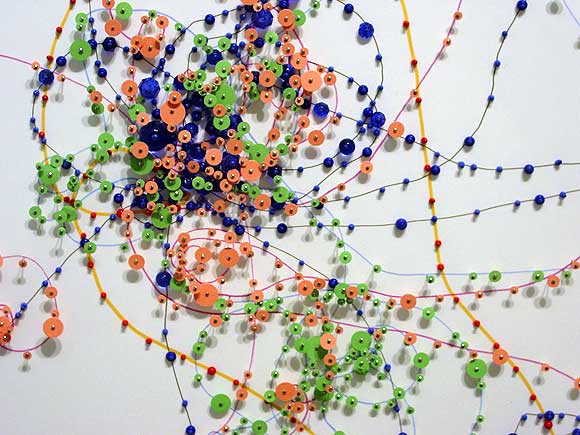
Janice Caswell at Schroeder Romero
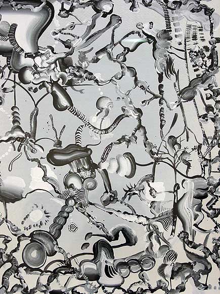
Tomoo Gokita at ATM
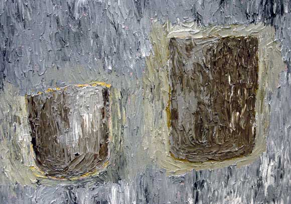
Fox Grimshaw at Marvelli
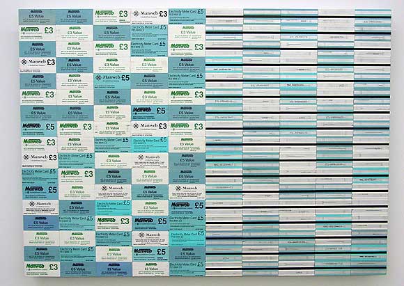
Padraig Timoney at Andrew Kreps
Walking around Chelsea with my camera today--took these shots of artists' work. The Caswell and Grimshaw images are details and the Gokita is heavily cropped. Timoney's materials consist of prepaid electricity cards glued edge to edge on aluminum. Yayoi Kusama did this about 40 years ago with airmail stickers, but still, nice--the fore-and-aft diptych appeals.
Paddy Johnson provided the impetus for the trip today with her slam of Greg Bogin's work as "hopelessly stale." The images of his auto-lacquer-on-canvas paintings looked fine to me but I wanted to see the work in person. It's actually a satisfying combination of videogame-cute, corporate logo-esque designs rendered with California "finish fetish" care (as in John McCracken, surfboards). Definitely a few nods to Stella protractors but only nods--they have rainbows in them, for cryin' out loud. The metal flake paint and airbrush color segues are echt '70s but completely conscious and quietly ironic. And corporate logos, yes, but too eccentric to be real corporate logos--the Bogins wouldn't sit easily in a lobby because they would draw attention away from bland, inferior company signage. And I don't see why Brian Sholis has any obligation to mention Fred Tomaselli in this context. Tomaselli doesn't "own" urethane and in fact, the plastic coating on his paintings has always rung false to me--a way of "bodying up" fragile papier colle for the collectors. Bogin isn't coating collages of Adam and Eve in the garden made out of porn mag cut outs (Tomaselli's most recent content)--thankfully!

If you don't think Bush is planning to start a war with Iran, you don't know Junior. According to a Time cover story, which is greasing the skids for another subscription boostin' war, duking it out with the Iranians "is no longer unthinkable." With breathless excitement, the lapdogs tell us that minesweepers have been put on ready to be sent to the Straits of Hormuz. Folks, before you even have a chance to punish Bush's party in November, the little man is about to let fly. The eagle is about to soar again. So, in the spirit of angry punk impotence which was the only possible political posture in the nightmare Reagan years, I offer this video of Lance Blisters on MIDI guitar, with visuals by Ilan Katin, re-performing John Ashcroft's version of that ridiculous "eagle" song: [15 MB Quicktime .mov]

Below are Quicktime .movs depicting the slicing of four-dimensional stellated polytopes, created by Russell Towle. These are hypnotic, complex patterns, strangely organic for being so hard-edged and geometric. Towle explains: "These may be the first animations ever made of the solid sections of four-dimensional star polytopes. [...] Briefly, plane polygons are two-dimensional polytopes, and polyhedra, three-dimensional polytopes. Where polygons are bounded by line segments, and polyhedra by polygons, a 4-polytope is bounded by polyhedra. Just as we may have any number of planes in three dimensions, in 4-space we may have any number of 3-spaces. Two 3-spaces might be a millionth of an inch apart and yet have no common point (thus the popular idea of parallel universes). It follows that, given a fixed direction in the 4-space, we can take solid sections of objects in the 4-space, perpendicular to that direction. [...] In these animations, a 3-space is passed from one vertex of each star polytope, to the opposite vertex, and sections taken at small intervals. The star polytopes were constructed, and the sections found, using Mathematica 4.0. The sections were rendered in POV-Ray (a freeware ray-tracer)." The screenshot above is from the last .mov, "{5/2,3,5}."
[.mov files removed -- they no longer work in current (2017) browsers -- thanks, Apple!]
[via]
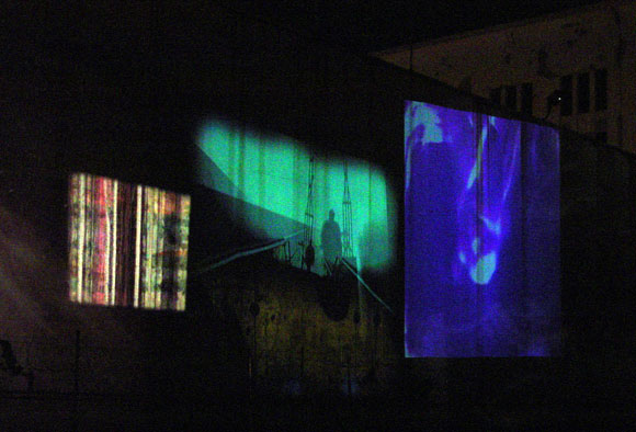
Films and/or vids projected against a Williamsburg building exterior at Secret Project Robot. The one-day-only Monster Island Arts & Music Festival, on Sept. 16, was not notable for its sub-slacker gallery art but the moving images outside really popped.
Update: I found this email from Nick Hallett that explains a bit more about the projections: "NEXT SATURDAY, SEPTEMBER 16th: as part of the MONSTER ISLAND ARTS & MUSIC FESTIVAL, HARKNESS A/V is hosting its one year anniversary. MIGHTY ROBOT, BRADLEY EROS, SETH KIRBY, and TOM DEXTER will join visual forces atop the fortress of Monster Island (in Williamsburg at Metropolitan and Kent), throwing their images onto the giant gas tanks directly across the street. More info to come." Still waiting for that info, but the work looked great.
Update 2: In a subsequent email Hallett added "visiting guest artist: BORIS (from the MODUL8 team)" to the roster.


Red and Green 1-4, 1991, acrylic on canvas, ea. 10 x 8 inches. The red and green* are closer in value than in these photos and vibrate pretty seriously. The "obnoxious Op" factor is critical to these (not previously exhibited) paintings. I had a dream last night about a group of paintings that looked like this--only they were much more elaborate, on shaped panels that followed some of the contours.
*turquoise green, which the camera and possibly your screen makes appear more as a blue.
"Un-tribal" [mp3 removed]
I recycled a riff from "Bass-o-matic" and added some new tunes around and on top of it. Still working with my self-made drum machine samples. I called it "un-tribal" because it has a kind of pounding jungle rhythm but is still inherently geeky.
Update: Took about 50 seconds out of this.
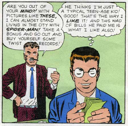
This is not the Onion, this is from CNN:
Air Force chief: Test weapons on testy U.S. mobs"Testy US mobs?" Protesting, say, the Iraq war? Bad immigration bills? An Air Force that wants to cook US citizens for "good public relations"? Michael Wynne would be a great test subject. We could all laugh when he staggers to the ground, incapacitated by painful invisible rays.
POSTED: 7:56 p.m. EDT, September 12, 2006
WASHINGTON (AP) -- Nonlethal weapons such as high-power microwave devices should be used on American citizens in crowd-control situations before being used on the battlefield, the Air Force secretary said Tuesday.
The object is basically public relations. Domestic use would make it easier to avoid questions from others about possible safety considerations, said Secretary Michael Wynne.
"If we're not willing to use it here against our fellow citizens, then we should not be willing to use it in a wartime situation," said Wynne. "(Because) if I hit somebody with a nonlethal weapon and they claim that it injured them in a way that was not intended, I think that I would be vilified in the world press."
The Air Force has paid for research into nonlethal weapons, but he said the service is unlikely to spend more money on development until injury problems are reviewed by medical experts and resolved.
Nonlethal weapons generally can weaken people if they are hit with the beam. Some of the weapons can emit short, intense energy pulses that also can be effective in disabling some electronic devices.

Public sculpture that's actually good: Matthew Geller's Awash, which opened tonight in Collect Pond Park in Lower Manhattan, and will be installed through November 25. It's a "portable fountain" made of sidewalk scaffolding, Plexigas, and PVC pipe. As you sit in the swings, water flows over your head like rain sliding down a loft skylight, and is then recycled through the PVC ductwork and back up through a pump in the water tank. It's romantic, carefree, and absurd at the same time, and the materials are completely unassuming. Last year, Geller's piece Foggy Day--notable for its artificial fog bank in Chinatown's Cortlandt Alley--was criticized by no less than the New York Sun and Fox News as socially dubious "fog art." The site for this new, budgetarily conscious urban earthwork is Collect Pond Park, a bland but historically charged spot across from the Tombs (bounded by Franklin, Leonard, Centre and Lafayette). In Manhattan's early history this was once a beautiful lake called the Collect, which became putrescent with urbanization, was drained, and served as the boggy foundations for the Five Points slum, made famous in The Gangs of New York. Now the land's surrounded by courthouses and other government buildings, and is in bad need of being rescued by something as funky as this. (One thinks also of the World Trade Center kiddie pool memorial--but that wasn't supposed to be funky.)
Re: the twilight photo
Update: photo lightened and color-corrected from the original crepuscular blue; another photo moved to the comments that is still blue but shows the flowing water more clearly. Yes, I fell down in my role of NY art documentarian. I got lost in the Five Points government building maze and the hour was getting later and later...
Update: Here are some better pictures from the LMCC blog:


|
Chris Ashley, Untitled, 20060906, HTML, 250 x 200 pixels
After a run of "auto-pixelated" media imagery combined with abstraction that I wasn't too wild about, Ashley is making pixel art-sized abstractions that are rather tasty. This is one. Minimalism is not dead, it just got smaller. You should peep the code on this one if you can, it goes on forever.Heh, on the Bloglines RSS reader, which consistently makes hash of this page, Ashley's piece reads as...invisible. The caption reads "Very Small Abstractions." Not that small. Bloglines, kindly eat me.
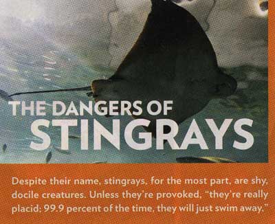
People magazine weighs in on stingrays, post-Irwin.
Thank heavens the 9/11 anniversary is over. "A wounded but resilient America paused to remember a calamitous day," says the New York Times. Oh, poor pitiful us. In the name of "9/11" we invaded and essentially destroyed an entire Mideast country that had nothing to do with the attacks, but it's important that we spend time reflecting and obsessing over our own wounds. The best course now for citizens who really want to respond to that day is to hand Bush his ass on a platter in the next election. No, we don't get to vote against him personally, as if we ever did, but returning the House and Senate to the opposition party at least creates the possibility of putting some brakes on this maniac. Two years of Congressional investigations of various White House misdeeds, hauling one functionary after another from this secretive Administration before righteous Senators and Congressmen to explain their misdeeds, would be delightful. I think we could handle the resulting "paralysis" of our ability to wage elective wars. I know the rest of the world would like a breather from us.


The image at the top was on the front page of the New York Times online edition. I hate to further exploit this woman's grief, but it bugs me that the "pool" in the photo is just a temporary prop assembled for a photo-op, because five years after 9/11/2001 no memorial exists. The photographer who took this picture, and/or the editor(s) who cropped it, are, in effect, liars. The bottom photo is from a series of wide angle shots on the DailyKos website showing the pool without the cropping.

The Huffington Post notes the similarity between the poster for Disney/ABC's pro-Bush propaganda movie, The Path to 9/11, about America's inability to root out the terrorists among us (lurking behind the flag) and the poster for the 1996 TV series Dark Skies, which depicts those terrorists as they really are: lemur-eyed extraterrestrials. Slightly off topic, I was almost late for w*rk today because my train, which enters Manhattan through the gaping hole formerly known as the World Trade Center, was cancelled from 3:30 to 5:00 for a Bush-and-wife wreath-laying photo-op at the former base of the former tower(s). He never misses an opportunity to milk tragedy for political gain. No ill respect meant to the dead--here's hoping that the truth will come out eventually about the events of that horrible day--as opposed to the Administration whitewash and exploitation we've had so far.
Momenta Art, celebrating its 20th anniversary this year, recently moved to a new location at 359 Bedford Ave., between S. 4th and S. 5th in Williamsburg. The gallery consistently serves up engaged, political (or politically-tinged) art and introduces many artists who go on to be exploited by the system, I mean, become stars. One of the great things about New York is there are pockets of cultural life here that resist the prevailing "happy talk" that started with '70s news media and gradually spread to every facet of our society. Momenta is such a pocket. Consider this press release for "The Unhumane Society," opening Friday, September 15, from 6-8 pm:
The work of each of the artists in this exhibition slides easily between the human and the animal world. In a video by Daniel Herskowitz, the artist eavesdrops upon conversations among primatologists. As they discuss group behaviors of lower primates, the group dynamics of the scientists seem not so distant. In Stefaan Dheedenes video an African hunter methodically describes his process of trapping and killing animals. Our attention is displaced by his clinical description of his work punctuated by the diminishing screams of a baby antelope as he clubs it to death. Similarly, in a video by David Burns, a farm family considers the interpersonal relations of their chickens and discuss which chicken must die as the video presents the loser chicken, beheaded and plucked in reverse. In a video by Liselot van der Heijden, the viewer is left alone to commune with the endlessly looping final breath of a dying zebra. Tom Moore also offers a kind of quiet communion. His photographs of primate cages from the Berlin Zoo, also empty of humans (and of animals) document a frighteningly perfect animal habitat that fulfills every need. And Mark Dion's natural history photographs offer the disquietude of our animal curiosity.One is tempted to say, lighten up, guys. For sure no Chelsea gallery would ever send out a press release that disturbingly bleak. (A member of the patron class might get "bummed out" and stop coming in.) But I happen to believe that humanity will have much to answer for vis a vis the rest of nature when we stand before the Immortal Aliens for cosmic judgment, so kudos to Momenta--this sounds great.
The other works in the show slip more precipitously between the human and the animal. Rachel Lowther offers us a sculpture representing the glistening inflated-to-bursting obscene reality that is a rat urinary and genital system after said rat has 'received' excess amounts of testosterone in the form of Perandren. Breyer/P-Orridges absurd, fetishistic sculptural object of a wheeled gumball machine filled with used tampons and topped with a wolfs head suggests the machinistic fetishization of a feminine primal order. Human/animal hybrids are more directly represented in the works of Rita Ackerman and Jason Fox with his painting of a pathetic creature separated from the viewer by a chain-link barrier and her charming, brutal, doe-like vampires. All pretense falls away with the work of Grace Roselli. In her classically rendered painting, a pregnant woman hunches over skeletal human remains in a post apocalyptic sewage-scape; unable to cope with the human world she becomes subsumed in an idealized nightmare of our animal side taking over. As pathological as it is clinical, it is a nightmare that we all share.

Opening tonight at artMovingProjects, 166 N. 12 Street in Williamsburg from 7 to 9 pm, an exhibit by Marcin Ramocki, an artist previously discussed here. He directed the 8 BIT movie that is opening next month at the Museum of Modern Art. Aiming to "sabotage and displace the familiar context of the software interface," the exhibit includes Torcito Portraits, digital animations based on re-purposing the old Macintosh musical program Virtual Drummer, and Anti-Pharmakon, pictured above (photo courtesy artMovingProjects), an interactive installation composed of a treated computer keyboard, CPU and a wall projection. Further explanation will be forthcoming, once I actually see the work.
Also showing in the Project Space is Jillian McDonald's Zombie Makeup, a video documenting the day the artist rode the L train from one end to the other applying George Romero-ish zombie makeup to her face. As the artist says, "Instead of improving my features, like the woman who steadily applies makeup en route to work or play, I become gruesome."
Update: Anti-Pharmakon is an interactive sound piece. When you press a key on the actual keyboard, the corresponding key moves on the projected one, and a recorded sound issues from speakers in the gallery. The "sound bites" are single words or phrases uttered by popular or historical figures, listed here (scroll down)--for example, significant progress (Dick Cheney); Arabs and Israelis (Anwar Sadat); the white men (Malcolm X); and life (George W. Bush). The sounds overlap when multiple keys are pressed, created intermittent cacophony in the gallery, depending on how many are clicked at once.
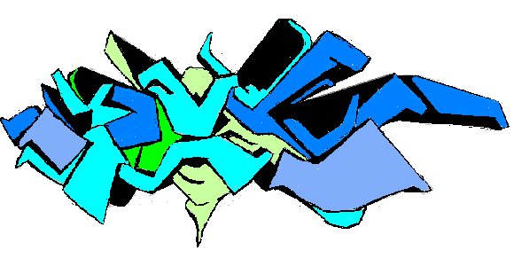
My MSPaintbrush version of the Dex graffiti mural I posted earlier--drawn freehand from the photo. I tried to compensate for the steep angle of the wall in the original shot, but as you can see it still recedes on the left. Oh, well, regardless, I'm bad. Unfortunately I don't know what the tag signified originally and I guarantee I don't now.
How I Spent My (Techno) Summer
Below is the music I made in June, July, and August (and early Sept.) of this year. This is roughly a CD's worth of tunes (approximately 54 minutes). I guess I consider this techno, because I like old school techno, but it's produced for bookshelf speakers or headphones, not necessarily the dance floor. It's not "art" music--it hews pretty close to certain genre conventions and isn't "deconstructing" anything. Except, I suppose, I'm not that interested in typical song composition dynamics where you always have to have a verse, chorus, bridge, break, and reprise. Simplest is best unless you absolutely have to use those dynamics. In any case, the music's not "electronica"--I hate that late '90s marketing word. If that buzzword refers to anything it's a hybrid of electronic dance and Les Baxter/Esquivel-style lounge exotica, and I'm definitely not doing that. "Home computer techno?" That doesn't quite get there either, because the sound is bit fuller than what I think of as the typical "amateur," or pardon me, Garageband sound. Oh, I give up.
Addendum: I also don't like the term "IDM," agreeing with Simon Reynolds that the use of "intelligent" to describe music you make or like is inherently wankerific. I want the music to be dumber, not smarter.
"808 Straight" [mp3 removed]
"Algebra 2 Trig (Beats)" [mp3 removed]
"Anthropos Essentia" [4.8 MB .mp3]
"Amiable Floater" [mp3 removed]
"Aruba '85" [3.1 MB .mp3]
"Bass-o-matic" [mp3 removed]
"Everyone Fights, No One Quits" [mp3 removed]
"Heartbleet" [3.6 MB .mp3]
"Hey" [mp3 removed]
"Hiphop Snares" [mp3 removed]
"More Marching Morons" [mp3 removed]
"Mutator OD Bass (Long Version)" [4.8 MB .mp3]
"Our Rulers From Space" [mp3 removed]
"Pitch Sequences" [mp3 removed]
"Pop Mechanix" [mp3 removed]
"Rubber Elephants" [mp3 removed]
"Sacred Machines Homage" [mp3 removed]
"Teleclysm" [3.3 MB .mp3]
Oskar Fischinger is the late, great abstract animated filmmaker who started his career in Germany and wound up in Hollywood, influencing Disney's Fantasia and countless other works. His style could be described as Art Deco psychedelia, both trippy and very precise. Note to the Fischinger estate. You are not very smart for telling YouTube to remove Motion Study No. 1 from its database. See, there's this thing called "resolution," spelled R-E-S-O-L-U-T-I-O-N. When videos are copied in "low resolution" and presented in "smaller screen sizes" they are not exact copies. What they do is "whet the appetites" of "potential consumers" who will "buy" your videos, thus bringing you "money." This gosh darn consarned newfangled technology thing can really be your friend if you let it.
I ordered the Fischinger videotapes several years ago from Jack Rutberg Fine Arts, to my continuing delight. Rutberg is still offering them for sale, but now some of the works on the tapes are available on DVD from the Center for Visual Music. Here are the contents of that DVD. I have noted with asterisks which films are on the Rutberg tapes. Looks like 3 films are on the DVD that haven't been available before. That's worth 30 bucks, since you're also getting the other films at slightly better quality.
*Also on The Films of Oskar Fischinger Volume 1 (VHS), along with Muratti Gets in the Act and Study No. 8
Spirals
Study no. 6
Study no. 7*
Kreise*
Allegretto*
Radio Dynamics
Motion Painting No. 1*
Wax Experiments**
Spiritual Constructions*
Walking from Munich to Berlin**
**Also on The Films of Oskar Fischinger Volume 2 (VHS), along with Muratti Privat, Study No. 5, Study No. 9, Study No. 12, Composition in Blue, American March, Organic Fragment, Mutoscope Reels, and Muntz TV
According to the Fischinger website, CVM also released a VHS tape in 2004 with the following films: Spirals, Spiritual Constructions, Study 6, Liebesspiel, Radio Dynamics, and Motion Painting No. 1. Liebesspiel is the only piece that is neither on the Rutberg tapes or the DVD.

More Sketch and Swap. I just screen-captured the one above, by some random genius, after I submitted my image of a grandma stepping on a pompadoured guy's head.
It's Mario, of course, with a tiny cap, broad shoulders, and bull neck, kind of like those superhero Marios that popped up about a year ago.
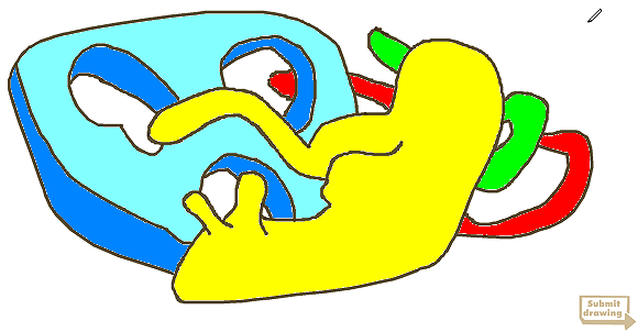
Sally McKay recommended this site where you make a drawing and it disappears into a database and in exchange you get to watch a clip of someone else making a drawing that also disappeared into the database. I flouted the process by capturing my drawing and coloring it in in MSPaint.
LoVid has redesigned their website. I added it to my side links since I plan to go back many times to absorb what's there. They are an exemplar of how to combine so-called new media with so-called traditional art. Completely loose and funky but relentlessly creative and productive, it's as if they don't have time to get hung up on what categories they are or are not falling into. I will probably update this post or do subsequent posts as I look at their site and thoughts occur to me.

Graffitist Dex, from a fund-raising party for the Area space, San Juan, Puerto Rico, via the Miami and Puerto Rico-based online magazine Rotund World. I confess I had deleted the unsolicited email plugging the magazine and then woke up this morning thinking about that graffiti design. Also from Rotund, the two views below of Hector Madera Gonzalez's "Optical Borderline" at Museo de Arte Contemporaneo, San Juan. According to the accompanying article by Rotund editor Joel Weinstein, the installation is a meditation on Puerto Rican residential grillwork. It's interesting to see the Jim Isermann-style wallpapered gallery applied to tropes other than the indigenous US post-Populuxe and post-psychedelic designs, and the neon and accompanying bland video documentation seem to be good additions, based on the photos, at least. (Accents omitted from a's and e's since I'm not sure how well RSS will read them.)


My pieces Vortex 1 and Vortex 2, the title card information for which I posted here, will be in a show opening Friday night, September 8, in Mobile, AL. Here's the Press-Register article about the exhibit:
High concept : Space 301 opens high-tech multimedia show Friday
Sunday, September 03, 2006
By THOMAS B. HARRISON
Arts Editor
Our bold new millennium has brought a sense of impermanence at once terrifying and exhilarating.
New technologies make it possible for artists, writers and musicians to exist in a parallel universe, one foot in the corporeal (physical) world, the other in cyberspace. Sometimes simultaneously.
Hard to imagine a visual arts event with greater contemporary resonance than "Art and Place I: Place as Muse," which opens Friday and runs through Oct. 29 at Space 301 in downtown Mobile.
"This show is innovative on so many levels," says Barclay McConnell, curator for Space 301. "I think it will be very exciting, especially for anyone interested in the (seemingly infinite) creative possibilities of digital technologies and the World Wide Web.
"There will be video-game art and art films including a stop-animation DVD of an artist's homepage as it evolved over several years. [preview .mov from Paul Slocum here]
"Contemporary artists are really pushing the boundaries in terms of medium -- moving away from the traditional such as drawing and painting into using video, computers and the Web in new and unusual ways."
McConnell says "Art and Place" is "full of new media" and has a fascinating concept. This show also marks the debut of guest curator Clayton V. Colvin, creator of the StealthArts Web site and an adjunct instructor at the University of Alabama and UAB in Birmingham.
Based in Birmingham, StealthArts is an "evolving space focused on contemporary art," according to the Web site: www.stealtharts.com. Viewing is by appointment.
"Clayton is a respected and very intelligent young curator bringing something entirely new to Mobile," says McConnell.
In his curatorial statement, Colvin writes:
"As a culture, our concept of place is in flux. We can mean a physical location, a virtual location on the World Wide Web, or a fictional location in a narrative or fantasy. Regardless, we are talking about an environment; a space."
Colvin hopes this exhibition will explore how artists are creating works using place as subject or muse.
"The relationship of individual to location is interestingly entangled with personal experience and identity," he writes.
"A person's relationship to the land can define their character. Its presence may be subconscious, surfacing in quiet thoughts of nostalgia for the pastoral, or in loud symbols of hysterical nationalism.
"It is difficult to imagine an identity without a place, be that a destination in the future, a place of the present, or point of origin."
Colvin selected 20 artists to investigate "how (or if) this relationship changes as the concept of place becomes a synthesis of the virtual and the concrete."
The artists examine the issue by exploring telecommunications and the Internet, globalization, homelessness, journalism, personal memory, hallucination, tourism, genocide, natural disasters and video games, according to Colvin.
Colvin says he is keenly interested in artists who deal with topical issues in both an old-school way through painting and sculpture, as well as artists whose work exists primarily in MySpace pages and jpeg files.
"You have online friends and then real-life friends also," he says. Colvin says he met many of these artists in the 1990s, a convenient point of reference for anyone trying to make sense of the ever-changing concept of "place." Net-art came of age in the '90s and is now being revisited, he says.
He says the diverse range of artwork here is "very contemporary with what artists are doing right now," but as one would expect, it is not a regional exhibition. Some of the artists live and work in the South; others are from New York City, Los Angeles, Texas, Nebraska. One lives in London.
That's a worldwide web of artwork.
Memphis artist Hamlett Dobbins takes a traditional approach by capturing a moment in time, says Colvin. His oil-on-linen panels are titled with the initials of the person with whom he shared those moments, "so for him it's about personal memory."
Paul Slocum of Dallas contributed a stop-animation of his homepage; New York artist Tom Moody's "Vortex 1" was created from inkjet on paper.
Birmingham photographer Ryan Russell (ryanrussell.net), who graduated from UAB in graphic design, shoots photos of rock bands and travels a lot, and his work reflects a life in transit.
His "Photograph From a Delta Airplane" provides the postcard image for the exhibition.
One of the more intriguing artists in the show is Jason Varone (www.varonearts.org) of Brooklyn, N.Y., who attended NYU with Colvin and whose work focuses on telecommunications. "Topology of Technology" is a mixed-media DVD.
Colvin hopes visitors to Space 301 will have a chance to experience these varying perspectives and walk away with new ideas and insights.
"Hopefully it'll strengthen whatever relationship (the viewers) already have to place," he says.
An excerpt from Hubris, a new book about the Iraq war by David Corn and Michael Isikoff:
After the invasion, Dick Cheney's aides desperately sifted through raw intelligence nuggets in search of any evidence that would justify the war. On one occasion they sent the WMD hunters in Iraq a satellite photo that they suspected showed a hiding place for WMDs. But it was only an overhead photo of a watering hole for cows.Mark A, who sent this excerpt, comments: "Mad cow disease. Methane gas bombs. These are WMDs."
Also, I love "after the invasion." Could we somehow put to rest the notion that Cheney is a super-competent bureaucrat? The press still believes this, just as it keeps repeating that the equivocating politician John McCain is a "straight talker." Cheney is a paranoid controller and a vain SOB, but he is not competent. He's a bungler.
"Anthropos Essentia" [4.8 MB .mp3]
The title is copped from A. A. Attanasio's book Centuries, 1997. The A.E. were an earth colony on Mars trying to live "old school"--rejecting ion washes and Simviv (and therefore longevity), growing their own food, and warring with the Cogs (robotic minions of the Silicon Mind). One of the colony members wrote a profound piece of music called the "Datum Surface Raga," which helped the metasapient earthling Rafe von Takawa find spiritual equilibrium, much as the datum surface expresses a kind of average level of the shifting Martian topography. The Anthropos Essentia have a secret that will not be revealed here.
Update: made various edits throughout the song, and it's now shorter in length.
"Bass-o-matic" [mp3 removed]
This is the piece I was describing here, process-wise. All the sounds came from the same model of drum machine, with filtering and other sampler manipulation. Mostly they're my samples, but a few came from a Linplug kit that recorded the same piece of analog gear. One thing I'm happy about is the way the song switches meter several times, getting progressively looser and more "rockin" as it goes along.


I am working on a piece of music that is coming along slowly. I am creating "phat" sounds (to my ear anyway) with a hardware drum machine and sampling them, one hit at a time as well as in loops. The samples are then being loaded into various samplers as "drum kits" which can be played with the same MIDI notes used to trigger the original sounds and loops, in addition to any new notes I want to write. What this is doing is dramatically expanding the range of the drum machine. Besides being able to play polyrhythms it can now treat the drum hits as "pitched material," meaning I can write tunes for the tom-toms and flexible "multi" channel (used to synthesize cowbells and such). When raised or lowered in pitch these no longer sound like drums, but rather unusual synthesizers, which can be further modified with a bevy of effects (compression, phasing, resampling) built into the samplers. My plan is first to write a piece consisting entirely of sounds from the original machine, and then to use the sampled kits as rhythm instruments on subsequent tunes. Slow work, but I'm learning a lot.
Tom Moody
Vortex 1, 2006, a work in three parts:
a. ink jet collage on paper, 19 3/4 X 16 3/4 inches
b. DVD-R, loop of animated GIF
c. Blog History:
http://www.digitalmediatree.com/tommoody/?34049
http://www.digitalmediatree.com/tommoody/?34065
http://www.digitalmediatree.com/tommoody/?34085
http://www.digitalmediatree.com/tommoody/?34135
http://www.digitalmediatree.com/tommoody/?34459
http://www.digitalmediatree.com/tommoody/?37166
http://tommoody.us/images/aug06/andor1photoreal.gif
http://www.digitalmediatree.com/tommoody/?37311
Tom Moody
Vortex 2, 2006, a work in three parts:
a. ink jet collage on paper, 20 3/4 X 16 3/4 inches
b. DVD-R, loop of animated GIF
c. Blog History:
http://www.digitalmediatree.com/tommoody/?34125
http://www.digitalmediatree.com/tommoody/?34145
http://www.digitalmediatree.com/tommoody/?34152
http://tommoody.us/animation/AndOr2_Anim_photoreal.GIF
http://www.digitalmediatree.com/tommoody/?34459
http://www.digitalmediatree.com/tommoody/?34854
http://www.digitalmediatree.com/tommoody/?35330
http://www.digitalmediatree.com/tommoody/?37166
http://www.digitalmediatree.com/tommoody/?37311
http://tommoody.us/images/aug06/andor2photoreal.gif
Hey, progressive bloggers, can you please, please stop using Robert Fisk's name as a verb? The veteran reporter for The Independent has been a staunch, pointedly critical source of news about the Middle East for years, a beacon in the smog of propaganda that passes for reportage on this side of the pond. For reasons that make absolutely no sense (see the comments to this post), warmonger troglodyte bloggers started using his name a while back to mean "assiduously refute a blog post." It has an unpleasant sexual ring, as in "fisting."
To be less precise, Wikipedia defines it as "a point-by-point refutation of a blog entry or a news story." But why should this be associated with Fisk, as opposed to any other journalist? It's not like the term "bowdlerize," meaning censor, which was named for a man named Bowdler, a censor. There is some etymology in the comments: apparently the term originated with Andrew Sullivan or Instacracker, but it is nonsensical, even as a smear. In any case, given that these blowhards mean it as an insult, why would anyone opposed to Bush's various wars want to do that? Robert Fisk is our friend. Jane Hamsher, others, could you please stop using it? It's even worse that writing "ANWR" instead of Alaska National Wildlife Refuge, a trick right out of Frank Luntz's pro-pollution handbook.

devil tail mandala--artist unknown
Trite Image of the Day
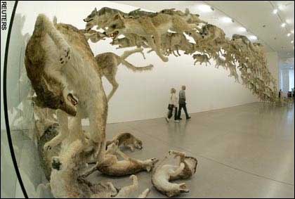
This page respectfully dissents from Regine's and Paddy's granting of Image of the Day status to the above jpeg, and The Telegraph's original designation of it as an "image of the week." That is, assuming those titles carry with them some honorary weight and don't mean "sensational but trite image of the week."
Here's how the Telegraph describes it: "Visitors walk under 'Head On' by Chinese artist Cai Guo-Qiang at the Deutsche Guggenheim in Berlin. The installation consists of a pack of 99 life-sized wolves, fabricated from painted sheepskins and stuffed with hay and metal wires, barreling in a continous stream towards--and into--a glass wall." Regine helpfully adds: "Only the first ones crash into it, but the pack chases after the leader."
The above photo is to art what Steven Spielberg's cinematography is to movies: visually dramatic, epic in scale, pompous, obvious. Actually that's not fair to Spielberg, who's greatest sin is indulging in razzle-dazzle imagemaking that has nothing to do with his plots. For example, why have a long bike chase if ET could levitate the bicycle all along? Because chases are so...cinematic. But the bicycle flying in front of the moon is kind of striking. One or the other--you can't have both. Cai Guo-Qiang faced no such choice. He has created a singular story, the theme of which is "Think for yourself, dude; following others can, like, lead to tragedy." As if that wasn't bad enough, he has his wolves flying through the air like Santa and his eight tiny reindeer. Why? Because it looks dramatic in the gallery. Please.
