View current page
...more recent posts
A few posts back I said the Oskar Fischinger estate wasn't smart to ban the artist's work from YouTube. I said it in a snotty way because it bugs me that finally we have a tool to disseminate "moving thumbnails" of lesser known artists' work, but people won't use it. I can only think it's because they mistake the thumbnails for content and think they're entitled to profit from every sliver of anything connected to an artist's work, to the detriment of "getting the word out." I woke up today and found this comment:
what an incredibly demeaning and rude post. i used to think your blog was cool, but you're getting nasty and rude. i don't think you are very smart anymoreThe commenter doesn't respond to the argument on the table but that's partly my fault. By giving in to the need to vent I handed anyone who might disagree an "out"--they could attack my tone and not the argument. Offered as a cautionary to other bloggers: we are human, we have emotions, but not everything needs to be expressed.
It's been almost impossible to escape the images of Banksy's street-graffiti cartoons on the Net, for the past couple of years. As Paddy suggests, "Internet nerds" have much to do with elevating this artist to the level where he can be collected by Brad Pitt. This post is a mea culpa for reBlogging an image of the work as an Eyebeam reBlogger in '04. I suppose I was impressed by the scale of some of the pieces sprayed on buildings in rundown neighborhoods--as I recall, I reBlogged a giant rat--but I've never really liked the clip-art-cutesy style and dislike the artist's faux-Dickensian handle. One-word artist names are inherently pretentious! As Banksy gets more and more hyped, the ideas get worse and worse.
Update, from the comments:
tim: i disagree on your take on the one-word artist-name. it comes out of the graffiti/street art culture -- the farthest thing from pretentious. it's a way to preserve anonymity.
tom: I've never thought of him as a street artist, but rather a Young British Artist using street vernacular and every other means of sophisticated self-hype to become as famous as Jesus Christ.
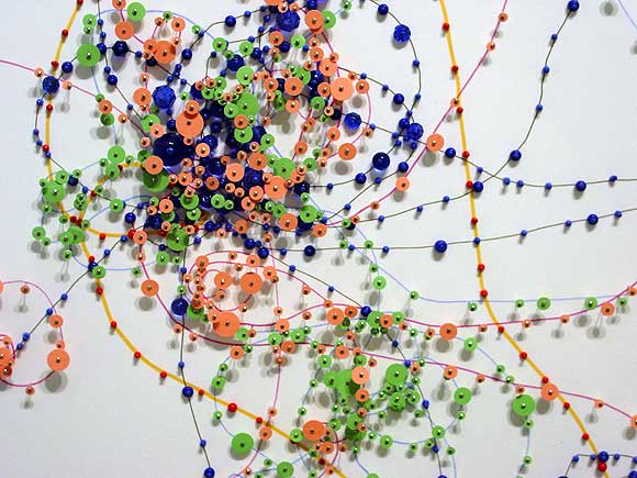
Janice Caswell at Schroeder Romero
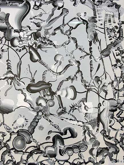
Tomoo Gokita at ATM
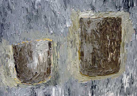
Fox Grimshaw at Marvelli
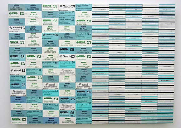
Padraig Timoney at Andrew Kreps
Walking around Chelsea with my camera today--took these shots of artists' work. The Caswell and Grimshaw images are details and the Gokita is heavily cropped. Timoney's materials consist of prepaid electricity cards glued edge to edge on aluminum. Yayoi Kusama did this about 40 years ago with airmail stickers, but still, nice--the fore-and-aft diptych appeals.
Paddy Johnson provided the impetus for the trip today with her slam of Greg Bogin's work as "hopelessly stale." The images of his auto-lacquer-on-canvas paintings looked fine to me but I wanted to see the work in person. It's actually a satisfying combination of videogame-cute, corporate logo-esque designs rendered with California "finish fetish" care (as in John McCracken, surfboards). Definitely a few nods to Stella protractors but only nods--they have rainbows in them, for cryin' out loud. The metal flake paint and airbrush color segues are echt '70s but completely conscious and quietly ironic. And corporate logos, yes, but too eccentric to be real corporate logos--the Bogins wouldn't sit easily in a lobby because they would draw attention away from bland, inferior company signage. And I don't see why Brian Sholis has any obligation to mention Fred Tomaselli in this context. Tomaselli doesn't "own" urethane and in fact, the plastic coating on his paintings has always rung false to me--a way of "bodying up" fragile papier colle for the collectors. Bogin isn't coating collages of Adam and Eve in the garden made out of porn mag cut outs (Tomaselli's most recent content)--thankfully!
