View current page
...more recent posts
Two early '30s Frank Capra movies on TCM last night I'd not seen--American Madness and the better-known Lady for a Day. The former prefigures It's a Wonderful Life with its honest banker (played by the dynamic Walter Huston) who makes loans based on his personal assessment of a borrower's character, as well as a scary "run on the bank" scene where Huston makes a speech to panicked depositors. An amazing montage of faces and voices showing how the rumor spreads leading to the run (marred by a couple of '30s-obligatory but obnoxious racial caricatures) is insanely fast paced and instills a sense of stomach-churning helplessness in the viewer at not being able to stop this human folly. Regarding the speed of the film generally, Capra's IMDb bio offers this intriguing stylistic analysis:
Capra had become convinced that the mass-experience of watching a motion picture with an audience had the psychological effect in individual audience members of slowing down the pace of a film. A film that during shooting and then when viewed on a movieola editing device and on a small screen in a screening room among a few professionals that had seemed normally paced became sluggish when projected on the big screen. While this could have been the result of the projection process blowing up the actors to such large proportions, Capra ultimately believed it was the effect of mass psychology affecting crowds since he also noticed this "slowing down" phenomenon at ball games and at political conventions. Since American Madness dealt with crowds, he feared that the effect would be magnified.
He decided to boost the pace of the film, during the shooting. He did away with characters' entrances and exits that were a common part of cinematic "grammar" in the early 1930s, a survival of the "photoplays" days. Instead, he "jumped" characters in and out of scenes, and jettisoned the dissolves that were also part of cinematic grammar that typically ended scenes and indicated changes in time or locale so as not to make cutting between scenes seem choppy to the audience. Dialogue was deliberately overlapped, a radical innovation in the early talkies, when actors were instructed to let the other actor finish his or her lines completely before taking up their cue and beginning their own lines, in order to facilitate the editing of the sound-track. What he felt was his greatest innovation was to boost the pacing of the acting in the film by a third by making a scene that would normally play in one minute take only 40 seconds.
When all these innovations were combined in his final cut, it made the movie seemed normally paced on the big screen, though while shooting individual scenes, the pacing had seemed exaggerated. It also gave the film a sense of urgency that befitted the subject of a financial panic and a run on a bank. More importantly, it "kept audience attention riveted to the screen," as he said in his autobiography. Except for "mood pieces," Capra subsequently used these techniques in all his films, and he was amused by critics who commented on the "naturalness" of his direction.
More dubious fractal analysis of Pollocks and digs at that goldang modern art from Randy Kennedy of teh NY Times.
two researchers conclude that Dr. Taylors analysis of Pollock paintings is flawed because it did not use a great enough range of box sizes to establish fractal characteristics reliably. Using only the range he did, a childlike drawing like the one made by Ms. Smith-Jones turned out to be, mathematically at least, the equal of a Pollock a notion that would undoubtedly amuse critics who still dismiss his work as childs play.Since when is Rush Limbaugh's opinion relevant?
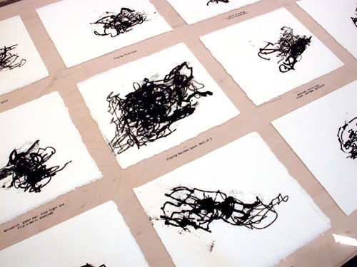
A previous post dealt with several incarnations of the "mousepad drawing"--by Kristin Lucas (1999--photo above), the Eyebeam Open Lab (2006), and Joseph DeLappe (1999-2002). To recap, Lucas inked a mouseball and let it make drawings while she played games, answered email, etc.; the Eyebeam project is a recently-invented "double mouse" that allows anyone to make abstract marks on one screen while doing routine things on another; and the DeLappe is a mouse with various physical pencil and brush extensions that also make mock-gestural drawings. I can't really compare the drawings because I've only seen the Lucas firsthand (they were nice, with an organic Cy Twombly-ish feel belied by the banal origins). However, I'm intrigued by her expressed intentions behind the work in a way I'm not with the other projects. The presence or absence of an underlying rationale goes a long way towards defining whether something is art in the humanist, Western Civ tradition or just an extension of tech practice. Here's what Lucas says about her series:
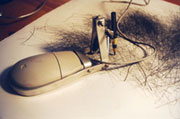
"At the time, I was making work about the influence of programmed environments on my behaviorial patterns (mental and physical). So [in the case of the mousepad drawings] an influence of the virtual recorded in the physical realm. I found the inked mouse drawings looked psychological--their motion cramped, frustrated, oscillating between resisting control by external forces and controlling oneself (like being trapped in an argument with oneself). My drawings are never shown with the tool so they are more about the discovery of what they are and enjoying the irony or sincerity of what the task was. Also factoring in was the scale of a world wide experience reduced to a tiny sheet of paper.By contrast, DeLappe (photos immediately below) seems to be making a broad critique of the pseudoscientific forebears (or cousins) of modern art such as graphology, Freudian analysis, and/or mediumistic "automatic writing" (one supposes--the statements I found on his website don't really explain why he is doing it) by presenting entire suites of work each of which is supposedly influenced by a specific activity such as preparing income taxes, or surfing Museum websites. These sources of anti-inspiration or non-inspiration are exhaustively detailed in the finished display, down to noting the URLs and characteristic colors of art world sites. Unlike Lucas, he presents the mouse as a sculptural object related to the drawings and even lists the brand of the mouse in the description.
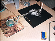
By the time we get to the Eyebeam Open Lab's "9 to 5 Paintings," the idea has been mainstreamed and popularized down to the level of an executive toy, with breezy description to match:
Create art while you work! If you find yourself spending more and more time answering email, and less and less time making art then why not do them both at the same time? Turn your emails, internet browsing, and report writing into digital paintings. 9 to 5 paintings are a visual representation of your daily computing routines.
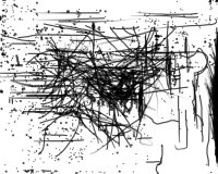
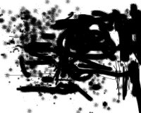
Here it's mainly about the gear, and BAW (bored at work) fun. The introspection and societal critique of Lucas' project has been decanted away, leaving only the absurdity.
Related: techy takes on Pollock.
