View current page
...more recent posts

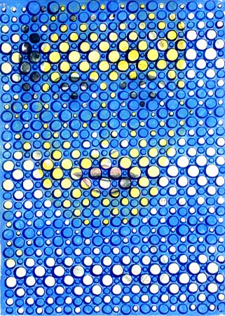
DAVID MORENO
Untitled, 2002; ink on paper; 12.75 x 9.25"
#6 of a suite of 6 (image from Feature Gallery website)
Never seen this piece in person. It might well work better as a web graphic than an object. "Graphic" meaning art, it should be added, but having a particular punch or "read" in the concise, compressed format of a web page. "Accidental enhancement" or "second-level improvement" should be added to the criteria art historians consider in evaluating work.
A breakthrough moment on this score occurred a few years ago when the Museum of Modern Art collected several of Van Gogh's "postman of Arles" paintings for a small group show. The museum couldn't get loans for all of them, so one was represented by a digital reproduction, mounted on a panel so it read like a painting. With its bright, saturated colors, crisp "sharpened" resolution, and excellent lighting, it stole the show--making the others appear dingy, old, and fussed-over.
Addendum to an earlier post: In addition to VVork Annotated, we also need the Anti-VVork. The latter consisting of art projects with no explanation, purpose, socially conscious rationale, tag line, or associated sound bite. It would be art not reducible to or reproducible as photography. It would be private jokes, arcane abstractions, and/or noise with no discernible or announced organizing system. It would be bad art, failed art, non-art (i.e. found things with no original purpose as art), and "embarrassing" art (i.e., too personal, too self-revelatory, too unhip or "square"). It would be expressionistic as opposed to ironic, not the faux expressionism of the current New York painting world but some kind of atavistic, unassimilable emotion. Just trying to think of everything VVork is not. More items will possibly be added.
