View current page
...more recent posts

hat tip to steve
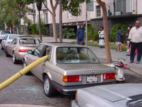
Update: the text originally published here had little to do with the above image. The picture is complete unto itself, a visual one-liner, not requiring a word of explanation or elucidation. (Except that it's a great bit of real-life performance art.) Unfortunately the photo was "vibrating badly" with the one below it on the page, to use curator Walter Hopps' term for two unharmonious paintings in an exhibition hanging. He would sometimes substitute a lesser picture next to the one he considered the masterpiece to remedy this. On the blog another solution is to have a "text buffer"--some random snippet that insulates the two images from each other. Unfortunately including text in the same blog post (out of sheer laziness of not wanting to create an intervening buffer post, which is an involved process) inevitably invites relating such text to the image above it. It was hoped that Paul Virilio's thoughts about "the accident" (yanked from Wikipedia and now moved to the comments) could be read ironically in tandem with the firehose picture, since what it depicts is not an accident--but that's asking a lot in a fast-reading blog scenario. Thanks to K for noting the problem. This meta type text now serves as the buffer. blah blah

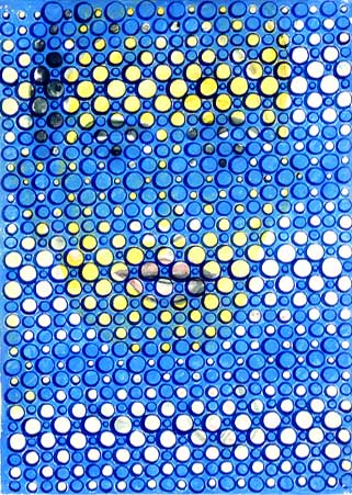
DAVID MORENO
Untitled, 2002; ink on paper; 12.75 x 9.25"
#6 of a suite of 6 (image from Feature Gallery website)
Never seen this piece in person. It might well work better as a web graphic than an object. "Graphic" meaning art, it should be added, but having a particular punch or "read" in the concise, compressed format of a web page. "Accidental enhancement" or "second-level improvement" should be added to the criteria art historians consider in evaluating work.
A breakthrough moment on this score occurred a few years ago when the Museum of Modern Art collected several of Van Gogh's "postman of Arles" paintings for a small group show. The museum couldn't get loans for all of them, so one was represented by a digital reproduction, mounted on a panel so it read like a painting. With its bright, saturated colors, crisp "sharpened" resolution, and excellent lighting, it stole the show--making the others appear dingy, old, and fussed-over.
