View current page
...more recent posts
VVork and XYZ Art
What follows are some comments from a thread about the blog VVork. The commenters are sort of picking on that blog, including me, but there are defenses of it as well. To the extent problems are being identified with a certain type of conceptual art and a certain type of digital art related to it (particularly as represented on the Internet), VVork is a convenient focal point. I've made all the commenters anonymous since this was a casual discussion and people might not have intended for these remarks to be elevated to "formal" status--the identities are all in the thread, I just want to get at the essence of the discussion. Slightly edited--if any commenter wants to amend what's said here let me know.
* VVork makes 'clever' very unappealing, like some disease that art catches when it gets on the Internet... It's usually: "hey, i did X to Y and now it's Z...get it??!" [T]he perfect example ... is that piece where its a choir singing the NASDAQ stock exchange graph as music... Who cares? Is there anything interesting going on beyond the punchline? (..well, perhaps in the larger context of the artist's other work [which we aren't made aware of]?) VVork's format/context is ideal for one punchline after the other.. It's like Boing Boing for conceptual art. Boing Boing is to real life what VVork is to art.. But why reduce others' art into little nuggets that can be easily thrown around and reblogged and put into other random contexts on the net just like any other Internet garbage (i.e. YouTube vids of cats and sloths)??
* VVork is popular because they show lots and lots of pictures of art from around the world without a bunch of commentary. I love that! It's kind of weird how rare it is. But the structure implies a promise it can't fulfill. Unlike, say, magazine editors, bloggers have neither the resources nor the mandate to represent outside of their own cultural constructs. I think the feeling of sickness comes from the fact that we feel like we are seeing some kind of general trend, but really its just some dudes posting pictures. There are masses and masses of other art options, not to VVork's taste, crowding in the wings. If they wrote on the work, the subjective filter would become explicit, but the unique aspect of the site would be gone. If they took submissions it might get closer to an evolutionary model, but without an editorial mandate it would make no significant difference. Maybe a post-your-own art wiki would do it.
* VVork is provincial in the sense that it conveys the impression, through its sheer relentlessness, that anybody in the world can be a player as long as you're making [the type of work we're discussing]. Getting seen on VVork [might be] an alternative to "moving to New York" (which people still do, in large numbers, sorry) but everything starts looking the same because of the lack of criticality within the vehicle itself. It's a blog, as you say, not the Global Museum of Great Art. Just because they are popular does not mean they are an institution that has a responsibility to anyone. As bloggers we are free to put in our two cents about their program and they are free to listen or not as they see fit.
* Seems to be two thingies going on here, one is vvork's presentation ... the other is the.. "X - Y - Z" style of archetype vvork art. the XYZ thing is, to me, natural to computers...the data comes in, who cares from where/as what, you can do something to it, and then the data goes out - also who cares to where/as what. so you wanna take stock market info [x] and turn it [y] into music [z], or you wanna use your atari joystick [x] to change the color and placement of text [y] on a tv screen [z] or you wanna take your whatever "physical computing" sensor interface [x] and use it to turn [y] lights on an off on a building [z]...it's like every single piece ends up being just an iteration of the same translation exercise. i suppose im describing something as much NYU ITP/MIT style art as vvork art, but regardless it's one of the reasons why i don't pay much attention to any of it...and i dont make that stuff [or any interactive art] cos i dont wanna to get stuck using the rest of my life in an attempt to make the "best" XYZ.


The Washington Establishment--Life During Wartime
From the New York Times:
A few nights after he resigned his post as secretary of state two years ago, Colin L. Powell answered a ring at his front door. Standing outside was Prince Bandar, then Saudi Arabias ambassador to the United States, with a 1995 Jaguar. Mr. Powells wife, Alma, had once mentioned that she missed their 1995 Jaguar, which she and her husband had traded in. Prince Bandar had filed that information away, and presented the Powells that night with an identical, 10-year-old model. The Powells kept the car a gift that the State Department said was legal but recently traded it away.From the Daily Howler:
POWELL (10/14/04): Every couple of years, Ted [Koppel] will come by my house on the spur of the moment and we'll sit in the back yard and have a cup of coffee. And he's usually driving one of his hot cars. He always has a fast car of some kind. And so about, oh, four or five years ago, he came by the house and he had this real muscle car, and after we had a cup of coffee and chatted for a while, he says, You've got to take it out and drive it, Colin. You've just got to drive this thing. I want you to feel that power.
I said, Okay, Ted. You want to go with me?
No, you go. I'll just wait right here in front of the house.
And so I go out and up 123 in McLean. I will not tell anyone how fast I was going by the time I hit the CIA turnoff, but it didn't take me long to get there. And I came back around, pulled up in front of my driveway, and felt something go boom. And I got out of the car and the right rear tire was flat. There must have been about two inches of air left in it.
I said, Oh, my gosh, Ted. I'm so sorry. I messed up your car.
And he comes back, Oh, it's okay, it's okay. I've got to go now.
So I went to the back of the car and I looked at the tire. There was no tread on it. The wires were coming through. This guy had sent me out to speed up and down 123 with this car that had no tires on it. And I said, Ted, how much are they paying you at ABC, man? Surely you can do better than this.
Travis Hallenbeck found this online "build-a-face" program that excels at making rather hideous visages, as he has demonstrated. No one can touch


Juan Cole's plan for Iraq: the US announces it's withdrawing but sticks around to help negotiate a settlement. To be sung to the tune of "It's Getting Better" or "I Whistle a Happy Tune."
Saudi Arabia's King Abdullah has credibility with Iraq's Sunnis, especially now that he has denounced the US occupation as illegitimate. They could trust his representations, which would include Saudi development aid in places like Anbar province. Since the Sunnis are the main drivers of violence in Iraq, it is they who must be mollified, bribed, cajoled and threatened into a settlement. The Shiites will have to demobilize the Mahdi Army and Badr Organization as well, and Iran will have to commit to working with the Maliki government to make that happen. A UN peacekeeping force, perhaps with the OIC (where Malaysia recently proffered troops), would be part of the solution.And bunnies and kittens will scamper through the fields...
On the basis of a settlement at Taif II, the US military should then negotiate with provincial authorities a phased withdrawal from the Sunni Arab provinces. The Sunnis will have to understand that this departure is a double-edged sword, since if they continued their guerrilla war, the United States could not protect them from Kurdish or Shiite reprisals. Any UN or OIC presence would be for peacekeeping and could not be depended on for active peace-enforcing. The rewards from neighbors promised at Taif II should be granted in a phased fashion and made dependent on good-faith follow-through by Iraqi leaders.
From all this the Sunni Arabs would get an end to the US occupation--among their main demands--as well as an end to de-Baathification and political marginalization. They would have an important place in the new order and be guaranteed their fair share of the national wealth. Shiites and Kurds would get an end to a debilitating civil war, even if they have to give up some of their maximal demands. The neighbors would avoid a reprise of the destructive Iran-Iraq War of the 1980s, which killed perhaps a million people and deeply damaged regional economies. And by ending its occupation, the United States would go a long way toward repairing its relations with the Arab and Muslim world and thus eliminate one of Al Qaeda's chief recruiting tools. A withdrawal is risky, but on the evidence so far, for the US military to remain in Iraq is a sure recipe for disaster.
Why in the world would the Iraqis ever trust the US government to handle this? They don't want to be plundered and exploited by stateless capital any more than the rest of us do.


Zircon structure - top and side views. From website for Steven Dutch's earth science class at University of Wisconsin - Green Bay (this is his personal site, not the school's--either way, the drawings are great). More (hat tip to Travis)
Sounds like Mike Gravel was the hero of last night's Democrat candidate debates (I didn't watch--just read the postmortems). Interesting to see the differences between antiwar.com's account, which quotes Gravel's plainspoken words skewering the other candidates, and the New York Times version, which hews to the line that he was the "comic relief" and marginalizes his contributions. Dave, in the comments, said he was a bit dotty but his words certainly aren't. Here's the antiwar.com version.
Gravel...got the issues of war and peace exactly right.
Some of these people [the other candidates] frighten me. When you have mainline candidates that turn around and say "there's nothing off the table with respect to Iran. That's code for using nukes, nuclear devices. Ive got to tell you, if I'm President of the United States, there will be no preemptive wars with nuclear devices. In my mind, it's immoral, and its been immoral for the last 50 years as part of American foreign policy.
Moderator Brian Williams then asked Gravel who on this stage worries him so much. Gravel said the top tier candidates worried him.
Gravel first took aim at Joe Biden:
Joe, you have a certain arrogance, you want to tell the Iraqis how to run their country. We should just play "get out." It's their country, they're asking us to leave, and we insist on staying there, why not get out. You hear the statement, "the soldiers will have died in vain." The entire deaths of Vietnam died in vain. You know what's worse than a soldier dying in vain? More soldiers dying in vain.
Gravel slammed fellow Democrats' approach on continuing to fund the war:
Well, first off, understand that this war was lost the day that George Bush invaded Iraq on a fraudulent basis. Understand that. Now with respect to whats going on in the Congress, I'm really embarrassed. So we passed and the media's in a frenzy right today with what has been passed. What has been passed? George Bush communicated over a year ago that he would not get out of Iraq until he left office. Do we not believe him?
Gravels alternative:
How do you get out? You pass the law, not a resolution, a law making it a felony to stay there.
Make the illegal war actually illegal. Thats the ticket!
But the best moment came after Barack Obama said that Iran having nuclear weapons will be a major threat to the US: "They are in the process of obtaining nuclear weapons. I dont think that is disputed by any expert." (At this point, Kucinich interrupted that it is disputed.) Barack continued: "They are the biggest state sponsor of terrorism, with Hezbollah and Hamas." Kucinich continued to interrupt. Obama then talked of the risk of nuclear weapons reaching the hands of terrorists.
Gravel (who happily was next in line) confronted Obama:
Weve sanctioned them [Iran] for 26 years. We scared the bejesus out of them when the President said theyre "evil." These things dont work. We need to recognize them.

artist unknown
"Labyrinth Remixed" [2.8 MB .mp3]
Shorter, digitally rearranged version of ex-Happy the Man keyboardist Kit Watkins' instrumental prog anthem "Labyrinth" (1981). Took what I consider the "essential riff" (four variations of the same tune, plus a bridge) and jettisoned all the classical dynamics, theatrics, and buildups as well as expressive soloing. Reordered the riffs and overlayed them to make new counterpoint, thus turning a progressive rock song into a techno-prog song--kind of sped-up Philip Glass, what I always wanted to hear when I played this. Some excellent "real time" keyboard and drumming being massaged here--but I am interested in the song's "money shot"--structures of the sublime in their most compact form.
A few posts back a "wandering POV of a wandering POV" was discussed--a shaky, panning YouTube video documenting Linda Post's shaky, panning video perambulation through a cornfield. Here's another variation (thx AFC): John Michael Boling's YouTube of a video panning along a block of strip malls. The standard YouTube screen framing the action scrolls slowly from right to left using the "marquee" browser command, making its position on your screen in constant "slow and go" tension with the position of the camera's viewfinder. The video's continuous "tracking shot" is roughly panoramic, whereas the YT starts over at your screen's right as soon as it reaches the left side, creating what feels at times like an impossible folded space.
In both scenarios (James Kalm's Linda Post video isn't a piece per se but an inevitable meta extension of the Post), recursiveness is the watchword, in form (a picture within a picture) and in content: Post's video references cornfield tracking shots (from North by Northwest to Children of the Corn) and Boling's obliquely channels Ed Ruscha's Every Building on the Sunset Strip.
If we had an Adorno he might say such dual recursiveness is a distinguishing feature of 21st Century art, or at the very least Web 2.0 art.

Related / 2 / 3
Another for the XYZ Art list:
"Paul Pfeiffer's Live from Neverland video installation is divided into two separate videos: one soundlessly replaying footage of a televised statement in which Michael Jackson addressed the child-molestation allegations, and a second one featuring a chorus of 80 voices reciting Jacksons monologue in the manner of a Greek chorus. The two videos are brought into further correspondence by means of a subtle re-syncing of Jacksons facial gestures to match the spoken delivery of the chorus, down to every pause, inflection and nuance." (opening at The Project in NY on May 3)
File that one under "choir":
Choir sings NASDAQ average
Choir recites Jackson molestation monologue (or maybe that's ABC art--Jackson 5 joke)
etc
See also New Kids on the Block.
And top 1000 amazon reviewer Newt Gingrich.
Robert Wright on the latest nonsense from the Bush adviser cadre:
Neoconservatives have been airing an explanation for the failure of the Iraq war that's so obvious you'll wonder why you didn't think of it yourself: the war wasnt neoconservative enough.Read the whole post, it's very well argued. That Bolton interview is worth watching. The puffed up little Bantam rooster just deflates when asked tough questions by the incredulous BBC interviewer. (thx jim and dave).
Last week Richard Perle, on "The Charlie Rose Show," echoed what his fellow neocon John Bolton told the BBC last month: We should have turned Iraq over to the Iraqis much sooner. Then, presumably, the power of democracy to blossom pronto in even nutrient-depleted soil--the neocon elan vital--would have kicked in.
Nice try, but they're just digging themselves in deeper. They're highlighting a paradox within the neocon game plan that would have doomed this war even if it had been run competently (enough troops, a dollop of postwar planning, etc.).
On the one hand, we were going to bring democracy to Iraq. On the other hand, we were going to use Iraq as a platform for exercising military power. (Days after Baghdad fell, the neocon Weekly Standard festively titled an article "There's No Place Like Iraq ... for U.S. Military Bases.")
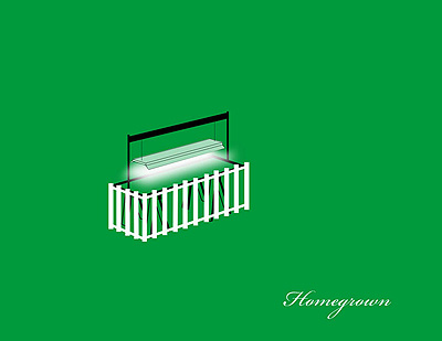
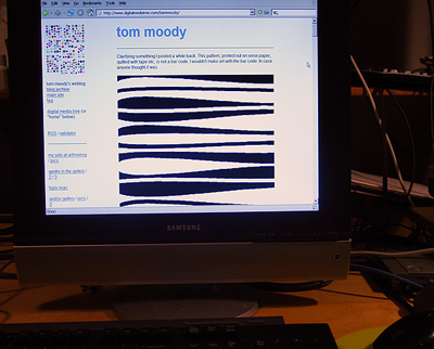
Next month artMovingProjects gallery in Brooklyn exhibits my blog. I'm in the project space; Zoe Sheehan Saldana appears in the main gallery with "an edition of 96 tobacco seedlings (Nicotiana tabacum Burley) under indoor lights," per the press release. More:
BLOGOpening May 19. More as the date approaches.
For the first time a blog is shown in a gallery space. Tom Moody has been posting art, music, animation, art criticism, political commentary, and found internet art on his blog at http://www.digitalmediatree.com/tommoody/ since Feb 2001. For this exhibition artMovingProjects will present his blog as a performance work. During gallery hours a computer terminal in the project space will be dedicated to whatever Moody posts. A mouse and keyboard will also be supplied if viewers want to leave a comment. Anything can happen, and anything can be said. This is an experiment in total freedom.
The Senate majority leader states the obvious:
"This is the message I took to the president," [Harry] Reid said at a news conference.This was considered outrageous in some quarters but it's long overdue. The US can't build competent levies to save New Orleans but somehow enough taxpayer money can be found to start construction of five apartheid walls around Sunni neighborhoods in Baghdad. This colonial adventure needs to end, soon. It's not working. "The troops" can be protected by returning them to their loved ones. Let the Dubai company Halliburton pay for its own hired guns.
"Now I believe myself ... that this war is lost, and that the [escalation] is not accomplishing anything, as indicated by the extreme violence in Iraq yesterday," said Reid, of Nevada.
"I know I was like the odd guy out yesterday at the White House, but at least I told him what he needed to hear, not what he wanted to hear," he added....
Reid said he did not think more U.S. troops could help. "I think it's failed, I say that without any question," he said of the troop increase.

From the Mutant Sounds blog, two LPs by Doris Norton from the mid '80s, Personal Computer and Artificial Intelligence. The first is some pretty classic digital electro: brittle sounding, Italodisco-flavored synth tunes with lightning fast arpeggios, vocod-y vocals, and hard, Simmons "rhythm pad" style drum beats. What's not to like? At times it sounds like what's at the other end of the wormhole from 8-Bit tunes--like we never went through the intervening house and techno eras but just had 20 years of 8-Bit music. In other words, kind of a "so old it's new" sound. I prefer the grooves of Personal Computer to the crazy experimentalism of the second LP but both are interesting--another bit of cyberhistory clanks into place (cross posted to Nasty Nets).


Top: Spider-Man vs Dr. Octopus, still from animation.
Bottom: Silver Surfer, a quick sketch from memory. (To see what he really looks like click here.) He came out more like the Human Torch mixed with Iceman (puddle-man?), and more Miyazaki graphic novel than Kirby comic (self-align with the greats? moi?) but I like the ecstatic quality. I can't remember if he shoots rays or not but he needed a beam. He could be more silvery but it's tedious to make the rounded reflections on this small a scale. I'm sure the inkers hated doing all that chrome back in the day. Another lonely Marvel character, fated to wander the Earth light-millennia from his destroyed home planet, and not to interfere with our affairs except to occasionally save us from his ex-boss Galactus.
Update: Doc Ock just added.


Been awaiting IMDb critic tedg's review of The Black Dahlia, since he "gets" De Palma and it doesn't disappoint. Many commentaries (including this one) talked about the "discovery of the body" scene and the casting of Mia Kirshner but tedg explains them best. First the body:
About 22 minutes into this there is a wonderful crane shot, probably done without artificial assistance, beginning five minutes which is the heart of the overly complex story. It sets up two apparently unrelated threads in the story that interweave from this point. It is of the front of a building where later there will be a shooting, moves up and over the building to look at a vacant lot behind where we see a woman making a gruesome discovery. She runs to the street alongside the building where we see the car of our two cops coming to park in front and engage in a shooting. We move in front of the car to a bicyclist, who plays no role in the story. He brings us to a couple walking down the sidewalk approaching the front of the building where they will encounter our cops. We come down to street height and listen in on their conversation.And Kirshner:
Its masterful. Even if you think everything that follows is a mess, its a glorious mess made glorious by our setting of the knitting needles.
But there's another joy here too. The story no surprise features a film within the film. It's the whole story, there, with elements of that internal film overlapping the main story in three or four significant ways. The star of this inner film, who also is our bisected victim is a character played by Mia Kirshner. She's so much more alive and real than anyone else in the main story, I can only assume it was deliberate and a truly thrilling risk. If you follow film, you'll know her very similar and hugely complex role in "Exotica," a landmark film.

Bloglines, the art-disrespecting RSS reader I use, messed up a Chris Ashley HTML drawing in kind of an interesting way. Originally posted to Nasty Nets.
The video in the previous post re-edits a promotion for a major, arts-supporting retailer, discussed here. The company hires street taggers, or actors playing street taggers, or artists making art that looks like street tagging (not sure which). As documented on the company's video, two taggers have a "paint off" or "paint beef" to see who is the better artist. To a slow-rolling hiphop beat, they start out painting their own individual white cubes like it's a real competition but then they begin painting the air with Adobe Illustrator-ish digital graffiti, then the painting on the cubes comes to life and hovers in the air like cyber-Judy Pfaff room abstractions, and the two cubes merge into a single installation that looks like it was all done by one person. We've neglected to mention that the company's logo appears in the installation and actually zooms out at the viewer.
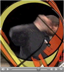
"Art for All" [5.6 MB .mp4]
"Art for Others" [mp3 removed]

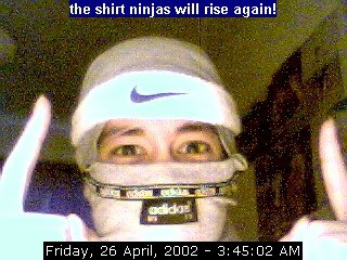
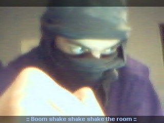
One afterthought on Cindy Sherman vs Webcammers: the comparison made the most sense in the earlier days of cams, when bandwidth and the "state of the art" limited the cammer to a series of still photos. Most of the journalistic focus in say, the late '90s, was on privacy issues and the pics were treated as straightforward documentary "slices of life" rather than what they also were--a string of self-composed photos placing form and content demands on the cammer. A series of fictions that may or may not have related to someone's actual life, and in the case of "sex worker" camming were home-run small businesses. Thus you had playacting, dressing up, and adventurous camera angles just to keep viewers interested, and the record of these performances was a series of individual photos that could be collected, separated from the main stream, passed around the net, etc. The difference between this and Sherman's untitled film stills was just a matter of highbrow vs lowbrow intent, a vastly different collector apparatus, and no critics willing to furrow their brows over the cammers. Some might say that's all the difference in the world but I think the gap is pretty small. In the age of MySpace intro videos Sherman's relevance fades because of the time element. Now instead of postModern tableaux vivants we have basement cinema that refers to other cinema.
I have a college chum teaching at Va Tech, just emailed him after many years to see if he's OK. I'm avoiding TV but guessing the shooter is dominating the news cycle. It's tragic beyond belief and difficult to comprehend how one person could be that alienated and furious. I guess it's inevitable that the Pres had to get involved with this, speechifying and what not. But it makes me sick seeing him in the news photos.
Update: My friend is OK.
Update 2: Firedoglake:
I remember during Columbine there were measures taken to assure that the gunmen's videos and writings didn't get released to the public, and that they did not become cult heros as a result of their actions. It seemed like a bit of decency amidst the mayhem. I really don't know what's to be gained journalistically by [MSNBC] broadcasting the killer's videos other than a ratings bonanza, but it seems quite ghoulish.

Petra Cortright's vvebkm (YouTube) - An Exchange from Paddy Johnson's Blog Comments - Cindy Sherman Reference Partially Explained
Paddy Johnson (Mar. 27, 2007):
Four days ago Tom Moody posted Petra Cortrights webcam video and since then Ive been struggling to articulate why the aesthetics of this piece of go beyond taking a few clip images from the web and slapping them on a video. Unlike a David Shrigley piece, which uses humor so obvious its value requires no explanation, a cam featuring a still figure, dancing pizzas, and falling snow to an electronic beat may require a little more discussion.
Probably the most amusing aspect of this work lies in the fact that its basically a documentation of a live performance, in which you watch someone concentrate on their computer screen for the duration of a song. I realize this comment tends to incite a host of responses most of which begin something to the effect of So why am I looking at this?, and while theres no response to this if you dont find the redundancies of web surfing that so many net artists like to highlight funny, theres also a level of virtuosity in the live arrangement of gifs etc, that needs to be called to attention. Cortrights webcam piece succeeds because her dancing pizzas are unexpected, and the snow and lightening seem almost delicately placed. I know it sounds ridiculous, but you have to spend a lot of time with these seemingly crappy images not only to gain a sensibility for how to use them, but how to read them. Its not that Cortright found the most exquisite buzzing bee and flower on the net, its that she thought to use it, and then did it so well. Its a skill very few people have.
27 Mar 2007 at 9:16 pm1--tom:
These icons may all be defaults that come with the webcam program or host. I dont know for sure. Cortright says in the comments i need to put more curated imagery into this but the defaults were still pretty good!! [Update - Make magazine editor Phillip Torrone plays with the same webcam in this YouTube in what seems more like an extended product promotion for logitech--thx paul)]
So the artistry is mostly in the timing, I think, plus the live nature of the performance, the choice of music (the ceephax is pleasantly spacy), and playing on our expectations of what a cam person is supposed to do. Instead of mugging, pouting, and otherwise playing directly to an imagined audience shes concentrating on the behind-the-scenes work of manipulating the images, which are not particularly sexy. The audience is still staring at her (and one commenter is rather hitting on her with that smile line) but shes only giving you her image and what she does. This relates to Marisa Olsons videos of herself listening to music, too, I think.
My great unwritten essay (or not so great) is on how the camgirl and camboy phenomenon relates to Cindy Sherman and her self-empowering use of her own image to act out media tropes (shes a millionaire and they...have lots of internet friends). Pieces like Cortrights are even more punk than thatas if Sherman were taking photos of herself loading and unloading the camera and setting up the lights instead of being the actress.
27 Mar 2007 at 10:00 pm 2--paddy:
Its true - the timing is done extremely well.
Im not sure Im understanding your comment on Cindy Sherman correctly. Are you saying that work like Cortrights is more punk than Shermans because theres a greater DIY element to it? If so, I suppose theres some element of truth to that, but I suspect Sherman was just as broke when she was in her twenties and making that work, and probably didnt have too much help past the necessities. Does the DIY aspect of it really add that much to this particular piece?
28 Mar 2007 at 12:13 am3--tom:
Punk in the sense of a guitarist keeping her back to the audience while playing rather than doing all the emotive face moves that say Im happy, Im in pain, look at me, love me. Here Cortright is looking down and working.
The early, classic Sherman work was DIY and done on the cheap. Its not her fault she got canonized so early and was forced ever thereafter to work with big budgets.
My point in bringing her up (I think) was how web cammers kind of do what she did early on instinctively. Its personal or self-centric photography, but still a series of media tropes (the working girl, the ingenue, Marilyn etc) Whereas Cortright isnt going thereshes a nerd pushing buttons to summon kitties and pizza slices and you just happen to be watching her.
28 Mar 2007 at 12:43 am4--paddy:
I really like that punk reference.
Interestingly, one of the things I was going to bring up in the post that got lost for whatever reason, was that the piece reminded me of how in the late 90s and early 2000 people would go see DJs spin, and various musicians working with electronics perform, and complain that it was totally dull watching people turn a few nobs for hours on end. Like any good net artist, Cortright knows that about a minute and a half of nob turning is fascinating - do much more than that and youve lost your audience. It makes me feel like the piece builds something positive into a tradition of performance that often suffered from some significant problems just a short time ago.

Ludwig Schwarz - "Three Point Play" [Quicktime .mov]
"How fantastic was that? It might be a bit corny as they say, but if you want to see something really corny, look at this..."
"I can tell you when the wind blows my way/And I know you just got laid." Digital/outsider_art/Sun Ra_Garageband/YouTube_visionary Kathleen Daniel aka Silicious has a new animated song on
James Kalm, the guy on the bike, takes us on a YouTube video tour of Linda Post's exhibition at artMovingProjects in NY. I liked the exhibition, especially the video of hands building a stone fence, projected onto an artificial stone fence (made of old TVs), and also the recursiveness of this YouTube--including a wandering POV of a wandering POV of a cornfield. Goodbye, nature.
Artist and co-gallerist Aron Namenwirth's post on the show is here.
In the interests of disclosure I'll be doing something at the gallery next month and with luck I'll get an even more recursive YouTube.
Faux-Modernist Sculptures from Random Plastiform Dripping


Roxy Paine, SCUMAK (Auto Sculpture Maker), 1999 (hairy jpegs from gallery website)

Albin Karlsson, 2007 (?): "A machine in the roof rotates with a speed of one revolution per hour. Every minute it let one gram of hotglue drop down on the floor.During time a sculpture takes form." [via VVork]
"Duo for Drum Machine and Softsynth" [mp3 removed]
This is in 3/4 time, not that that's that big a deal. I believe all classical music should henceforth be written with current instruments. And defaults. Tired of all these fossils in powdered wigs and their attractive young prodigy front persons. Ick. And no MAX/MSP, either. Put it all up front.
Clarifying something I posted a while back. This pattern, printed out on xerox paper, quilted with tape etc, is not a bar code. I wouldn't make art with the bar code. In case anyone thought it was.


At Diapason in midtown on Thursday, five analog synthesists concocted a fascinating sonic stew for Analogos, an ongoing series of live improvisational jams. This was Analogos 9; unlike 7, featuring small sets with different combinations of the musicians, this was two long pieces by all. The first stopped rather dramatically when a power strip blew (it sounded like an intentional climax), and the second built slowly to a nerve shattering asynchronous finale. For some reason I kept thinking of Ornette Coleman, mixed with the raucous boom of the Velvet Underground playing the psychiatrist's convention in New Jersey (footage of which recently surfaced on YouTube and it's basically metal machine music & Nico). Trying to figure out who did what in all the crisscrossing sound overlays presented a challenge, but one could safely guess that Kabir Carter's newish Moog and Moogerfooger pedals contributed some of the pure, forcefully detuned pitches, that Stefan and Sergei Tcherepnin's battered Serge modulars added a scratchy, popping-patch-cord frisson, that Ed Tomney's EMS Synthi spun out the distinctive whooshes and trilling sequences of that classic instrument--and to be honest, I knew when Michael J. Schumacher's Steiner-Parker Synthacon chimed in mainly because I had a good line of sight to him from my seat on the carpeted floor. It's sort of funny these days that tonality and anything digital could get you kicked out of any club but it's thrilling to hear these vintage sounds revving at full jet engine volume.
The gallery stable for Schmulke Bruengross looks interesting. I want to go there next time I'm in Munich.
Cindy Sherman vs T shirt ninjas
Untitled Film Stills, 1979:


Webcam Ninjas, ca. 2002:






"You Have No Choice (Speedy)" [mp3 removed]
More VVork.
Sally McKay's comment about the blog's specialty--"elegant sculptural installations crafted well from non-precious materials with interesting but tidy content and an unquestioning relationship to art institutions," pretty much nails it. She says she loves/hates the site and that's what I've been saying but the unceasing tide of conceptual projects is starting to get painful. It's depressing because you see artists trying so hard, all over the world, to make their conceptualist schtick--based mostly on '70s premises but with a digital gloss--projects that document well and photograph well and might catch the eye of a curator (or omnibus art blog)--and when you show them all together like this it starts to look like a disease. Please, make it stop (or vary it with some videos of cats and sloths from YouTube)!
Update: The comment thread is now closed (to all but steve, who has magic powers) but worth a read, thanks to all who contributed, will try to synopsize some of what was said for a later post--the topic is bigger than just picking on VVork and gets into by-the-numbers conceptualism and its relation to computer workflow.
Amazon changes "crappy" to "cr*ppy"
In her Salon column Camille Paglia writes about a book that sounds fairly interesting:
Finally, I read a fabulous book last week -- John Lauritsen's "The Man Who Wrote Frankenstein," which will be published in May by the gay-themed Pagan Press, based in Dorchester, Mass. Lauritsen, who is known for his work in gay history and for his heterodox views of the AIDS epidemic, sent me an advance copy, which arrived as I was on my way to midterm exams. Its thesis is that the poet Percy Bysshe Shelley, and not his wife, the feminist idol, Mary Shelley, wrote "Frankenstein" and that the hidden theme of that book is male love.Amazon excerpts this as a review, and changes "crappy" to "cr*ppy." It's OK to take down a feminist idol and suggest for the first time that a major work in the romantic canon has a gay theme and make fun of establishment scholars as long as you don't use potty words.
[...] Lauritsen's book is important not only for its audacious theme but for the devastating portrait it draws of the insularity and turgidity of the current academy. As an independent scholar, Lauritsen is beholden to no one. As a consequence, he can fight openly with myopic professors and, without fear of retribution, condemn them for their inability to read and reason.
This book, which is a hybrid of mystery story, polemic and paean to poetic beauty, shows just how boring literary criticism has become over the past 40 years. I haven't been this exhilarated by a book about literature since I devoured Leslie Fiedler's iconoclastic essays in college back in the 1960s. All that crappy poststructuralism that poured out of universities for so long pretended to challenge power but was itself just the time-serving piety of a status-conscious new establishment. Lauritsen's book shows what true sedition and transgression are all about.
Lauritsen assembles an overwhelming case that Mary Shelley, as a badly educated teenager, could not possibly have written the soaring prose of "Frankenstein" (which has her husband's intensity of tone and headlong cadences all over it) and that the so-called manuscript in her hand is simply one example of the clerical work she did for many writers as a copyist. I was stunned to learn about the destruction of records undertaken by Mary for years after Percy's death in 1822 in a boating accident in Italy. Crucial pages covering the weeks when "Frankenstein" was composed were ripped out of a journal. And Percy Shelley's identity as the author seems to have been known in British literary circles, as illustrated by a Knights Quarterly review published in 1824 that Lauritsen reprints in the appendix.
The stupidity and invested self-interest of prominent literary scholars are lavishly on display here in exchanges reproduced from a Romanticism listserv or in dueling letters to the editor, which Lauritsen forcefully contradicts in acerbic footnotes. This is a funny, wonderful, revelatory book that I hope will inspire ambitious graduate students and young faculty to strike blows for truth in our mired profession, paralyzed by convention and fear. (emphasis supplied)

This jpeg of a print by Ryan McGinness comes from Paddy Johnson's blog. She's talking about the marketing of this image and this artist and it's worth a read to show you the mechanics of the hype and real estate and brand-building. I'm posting it on a slightly different topic, which is the "defaults" school of digital art. This strikes me as a very good example. It's got the flat "Adobe Illustrator look" but this artist doesn't make any bones about it. It's a preset, and he is using it very well. There's no getting around the content, either--any collector who buys the print will be looking through a prison camp fence, stylishly dressed up and tastefully layered as it might be. Several years ago I wrote about an installation by McGinness in a gutted building, soon to be renovated, on Lafayette--it also didn't hide the digital "facture." It was kind of the reverse of the above image--instead of a bleak adornment of a tony loft, the Lafayette show presented slick product logos on the inside of a "pre-owned" structure.
This post could probably read in tandem with one on Nasty Nets showing the similarity of some recent work by abstract/conceptual photographer James Welling and an Adobe Illustrator promotional graphic. Compare and contrast the relations of artists to well-known imaging software.
It could also be read together with my short interchange with a commenter about the use of presets in music (or more specifically the familiar interface Cubase.)
Recently relistened to Slapp Happy's Sort of, a gem from the early '70s that got extremely limited release in the '80s and is apparently available again after many years. Peter Blegvad has a Jonathan Richman/Lou Reed ish voice here and I don't know how to describe Dagmar Krause's except distinctive and pretty--certainly less emphatic on this LP than her later work with Henry Cow. The songs would be called indie today and they don't sound the least bit dated to me--according to the amazon review, at the above link, "Opal use to do a stoked cover of 'Blue Flower' live; their Mazzy Star reincarnation recorded it less successfully about ten years ago and never bothered to credit Slapp Happy." "Small Hands of Stone" and "Little Girls World" are a couple of my favorites. Some members of the German avant group Faust play on a few songs but again, there's nothing particularly prog or even psych about these tunes--some are country-inflected, others Feelies-ish. Solid songwriting, good singing & playing and smart lyrics. Worth grabbing if you come across it.
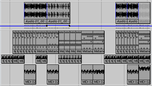
"Placeholder" [mp3 removed]
Dataisnature, April 9:
Sol LeWitt died yesterday. If you have had your eye on Dataisnature for a while, you will have heard his name mentioned a lot on these pages. Just after time of the 'heroic' gestures of Abstract Expression Lewitt conceived of a new language utilising simple impersonal forms in repetition and modulation, often drawing directly onto the wall. The fact that these Conceptual drawings were designed to be painted over solidified Lewitts claims that the 'idea behind the work supersedes the work itself' and that 'The idea becomes the machine that makes the art.' Prophetically for our times Lewitt also said that "Ideas cannot be owned. They belong to whomever understands them."This is a nice tribute and a good explanation of LeWitt's importance. Yet the early sentences on conceptual art were better than the somewhat boring process-based line drawings that resulted from them and those line drawings were better than the later, somewhat tacky ink wash drawings that became permanent fixtures of museums after LeWitt's canonization. Would that it were true that many works were "designed to be painted over." Also, I believe many artists using computers misunderstand LeWitt's relevance to them. The key sentences for me are the first ones:
The works are conceptual and aesthetically pleasing at the same time and Lewitts path eventually lead him to writing instructions for making a piece of art. These instructions meant that his works could be recreated anywhere and more importantly it represented a shift in 'artistic authority' from a centralised model to a distributed one. The idea of 'instruction based art' was incredibly forward thinking when we consider the contemporary practices of digital generative artists and their use of code and algorithms to make 'pictures.' More so the concepts and philosophies dealing with ownership have never been more relevant.
1. Conceptual artists are mystics rather than rationalists. They leap to conclusions that logic cannot reach. 2. Rational judgements repeat rational judgements. 3. Irrational judgements lead to new experience. 4. Formal art is essentially rational. 5. Irrational thoughts should be followed absolutely and logically.As Rosalind Krauss interpreted LeWitt,
the experience of the work goes exactly counter to 'the look of thought,' [which critics such as Donald Kuspit and Suzi Gablik were claiming for it] particularly if thought is understood as classical expressions of logic. For such expressions, whether diagramatic or symbolic, are precisely about the capacity to abbreviate, to adumbrate, to condense, to be able to imply an expansion with only the first two or three terms, to cover vast arithmetic spaces with a few ellipsis points, to use, in short, the notion of et cetera.
[....]
In Variations of Incomplete Open Cubes....what we find is the "system" of compulsion, of the obsessive's unwavering ritual, with its precision, its neatness, its finicky exactitude, covering over an abyss of irrationality.

Krauss compared the "Open Cubes" to the activities of an obsessive-compulsive in a Beckett novel who had an elaborate system for moving "sucking stones" between various pockets and his mouth (see earlier discussion re: Manfred Mohr). Yet many digital artists still fetishize logic and "the look of thought" with artworks based on data analysis and modeling, even more egregiously when the art purports to highlight or "solve" some social condition. (See generally VVork.) LeWitt is not really for them, only a recuperated idea of LeWitt.

GIF by eyekhan, enlarged
Firedoglake hosted a blog chat yesterday with Andrew Cockburn, author of Rumsfeld: His Rise, Fall and Catastrophic Legacy. Here are some quotes:
I spent a lot of time trying to figure out what, if anything, Rumsfeld believes in. The answer seems to be: very little, apart from an overriding desire to dominate each and every human encounter. Otherwise it has been hard to detect any thread of principle.And:
Well of course there was no transformation [of the military], at least not in any positive sense. His major legacy, apart of course from the wreckage inflicted on the army and marines thanks to Iraq, has been to let the budget spiral completely out of control, so that at a time when the Social Security and Medicare bills come due in a big way, we will find ourselves committed to footing the bill for defense obligations -- i.e., weapons programs -- that are militarily irrelevant and years late in entering service.Cockburn also suggests that it might not be wise for Dapper Don to visit Europe any time soon.
Blogs turned 10 this year (we think) and this was discussed on Server Side, here at the Tree. Dave brought up the New York Times' "Diagram of a Blog (sic)," a pitiful attempt to ridicule this upstart medium (or so I see it). Here's the reference in context (edited for length):
The first blogs I stumbled onto were like dull diaries, and everyone knows that a diary is only fun to read when it isn't intended for publication.Happy anniversary, blogs. Still caught in the media's throat, like a hairball.
- L.M. 4-03-2007 2:31 pm
I think most people still think of them as dull diaries. A fairly prominent blogger friend was recently on a sociopolitical panel (I'm not giving away too much) and beforehand the organizer said "it's nice that you keep a diary."
- tom moody 4-03-2007 2:39 pm
I think at least some of it has to do with the word 'blog'. I mean, how can you take that seriously? I remember when Peterme coined it, and the awkwardness of the word was a big reason I liked it. Almost like the practitioners were trying to be as uncool as possible. Around this same time Wired was trying to call them "Me-zines." That's just trying way to hard. Whereas blog sounds like something you might expectorate.
- jim 4-03-2007 4:04 pm
Wasn't me-zines Slate? As much of a problem as I had with "blog" (as you know) "me-zines" was orders of magnitude worse. I never thought about it as being deliberately uncool. Now, for that reason, I like it (6 years out)!
- tom moody 4-03-2007 4:08 pm
"Blog' still sounds uncool! It's like made out of anti-cool teflon or something.
- jim 4-03-2007 4:18 pm
i like when msm has to say "blog" in the context of having been scooped by one. like being beat by a child in chess.
- bill 4-03-2007 5:10 pm
critique of pure idiocy
- dave 4-06-2007 1:38 pm
"[Moqtada al-Sadr]'s fighters are not contesting US forces," says presidential aspirant and war hawk John McCain, a supporter of the Bush troop escalation that is supposedly pacifying Iraq, in a Washington Post editorial today.
From the same paper:
April 7 -- American and Iraqi troops engaged in fierce fighting with Shiite militiamen in southern Iraq on Saturday, the second day of clashes that have raised the specter of a resurgence by the Mahdi Army after weeks of lying low.Update, from the AP: "Al-Sadr Calls for Attacks on U.S. Troops." This can't be, "straight talk" McCain says he is "hiding."
As combat aircraft zoomed overhead, U.S. and Iraqi troops fought the militia in street shootouts and hunted down fighters in house-to-house raids in what the U.S. military said was an attempt to wrest control of the city of Diwaniyah from loyalists of firebrand Shiite cleric Moqtada al-Sadr. It was the third major clash between U.S.-allied forces and the Shiite militia in Diwaniyah in the past eight months.
Paula Scher's "Diagram of a Blog" that appeared as a New York Times editorial cartoon is old-media humor at its unfunniest. It reminded me of a cartoon that ran in the 1910s in response to the first Armory Show. Captioned "The Original Cubist" it depicted an elderly woman sewing a large patchwork quilt. A pundit of the day noted in response to the drawing that "you can't spoof what you don't understand."* At the risk of being more boring explaining what Scher doesn't understand, does she mean "comments to a blog"? They don't go like that if someone makes a half assed effort to moderate. Does she mean the "blogosphere"? The idea that everyone agrees to disagree eventually and nothing gets accomplished in the blog world (as opposed to the newspaper "letter to the editor world") is just so much Cubism. Ask, for example, Senator Jim Webb.
*Per Calvin Tomkins, The World of Marcel Duchamp, 1966.

Getty Images. At the Getty Museum in Los Angeles, Jerome Basquiat (nephew of the '80s painter) explains his work, a grid of solarized lily pads referencing Claude Monet, to a collector, foreground, while the artist's dealer looks on. Behind them, another work depicts raindrops hitting the surface of a pond. (photo via Nasty Nets)
"Helipad" [mp3 removed]
Loud, fast rudimentary techno stomper.
I had a hard time titling this. Originally I wanted to call it "Planck Worm," because I'm re-reading Greg Egan's book Schild's Ladder and liked the name of the weapon designed to cripple the planet-swallowing "novo-vacuum." (I'm making the book sound more space opera than it is.) But it's Egan's juice and I didn't feel like appropriating it. Then I looked up pad in the urban dictionary because I was thinking of some version of "crash pad vs launch pad" and discovered that helicopter pad had a sexual connotation. That cinched it.
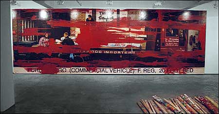


top image: Richard Woods, 1998; bottom two images: Kelley Walker, 2006 and 2004.
From the Artforum Diary:
On Thursday evening, artists Seth Price and Kelley Walker presented their first-ever collaboration, a performance titled Freelance Stenographer, to a capacity crowd at The Kitchen. Receiving special permission from director Debra Singer to "not share very much about the work in advance," many audience members wonderedperhaps nervouslywhether their participation might be required. [subject/verb meltdown] The performance, an exercise in instant archiving and accelerated obsolescence, paired a video with an unassuming stenographer who quietly recorded the evenings dialogue (on-screen and off-) on a machine, which transmitted the results to a nearby laptop. Cutting between band-practice footage of artist friends Emily Sundblad (of Reena Spaulings), Cory Arcangel, and Stefan Tcherepnin captured in a Manhattan recording studio, found clips of the Manhattan skyline, and documentation of an Oskar Schlemmer performance restaged by Debra McCall at The Kitchen in 1981, the artists interspersed readymade aftereffects redolent of their signature work as individuals (Price: picture-in-picture, lens flares; Walker: a decidedly Aquafresh-hued fog). Their manipulations "might look hip or hot today," as Walker told me afterward, "but wont look so good in ten years." ["we're not bad, we're just hastening our irrelevance"]*accents over "e"s in demode and mode not recognized by RSS so deleted
The video evidences the artists' Benjaminian infatuation with the recently outmoded, at one point incorporating an entire music video for a demode Alice Deejay dance anthem that Arcangel finds on YouTube [was Alice Deejay ever mode, precisely?].* "I've watched this like six hundred times," he marvels. At another point, Sonic Youth's "Teenage Riot" serves as the sound track to the salvaged Schlemmer performance (Gen-X audience members involuntarily mouthed the lyrics). "'Teenage Riot' is particular to a moment that we have moved on from," Walker explained. ["sorry, Gen-Xers who thought we liked it"] "And it sounds good when you keep recording it from lower and lower sources," added Price. Singer suggested that, perhaps unbeknownst to the artists, Sonic Youths Kitchen performances probably overlapped with the Schlemmer restaging. [these kids--so ahistorical.]
After screening a few outtakes (featuring the bandmates singing and beating tambourines while drinking beer and Perrier) [emphasis supplied], the artists previewed a work in progress by filmmaker (and friend) Jason Spingarn-Koff that documents the virtual-reality community Second Life, [Oh, no, not Second Life] typically used by homebound gamers to create alternate personas in a fantasy world of computer-generated beach bums and clubbers. Cyber-babe Tee-Dye, Spingarn-Koffs ethnographic subject, is narrated by her single-mother real-world counterpart and navigates Second Lifes virtual galaxy on a trip down memory lane. Directing her avatar to a pulsing dance floor and arming her with nunchakulike glow sticks, the unseen gamer indulges in the same nano-nostalgia as the earlier videos stars when she muses, "We used to rave up here, back in the day . . ." (Indeed, Arcangel appearsas himselfin both works.) [huh?]
When the lights came on, the performance, in a sense, really began. ("The Q and A was the performance," Singer assured me latera concept clearly lost on those audience members who made for the door while the credits rolled.) First question: "Why did you pick this title?" Second [and final?] question: "Is that a stenographer over there?" With her presence formally acknowledged, Price admitted to "feeling uncomfortable" and offered the stenographers name (Casey Klavi) while she continued to type, smiling wanly. The stenographer served to "demystify" (as Walker put it) the art world's dual modes of hype and criticism by publicly recording a process (the Q and A) and producing the transcript as an artwork. During the ensuing reception, while the artists and the on-screen protagonists Arcangel and Tcherepnin mingled with the audience, copies of the transcript were run off on The Kitchens own Xerox machine and distributed. "There were two actors," Singer explained, "the stenographer and the copy machine. But no one asked about the copy machine."
Michael Wang ["I thought it was stupid but they made me cover it"]


GIFs by eyekhan
Correction to an earlier post, which read:
Should galleries not post documentation so people will get off their lazy butts and come to see actual work? Cory Arcangel also addresses this matter in a transcription of a recent talk he gave, but from the reverse vantage point--he describes work he's seen on the Internet to people sitting in "real space" without a computer as an audiovisual aid.A friend noted that I am *completely* wrong about this--Arcangel's text reads like a transcription but is actually anecdotal, semi-stream of consciousness writing about the internet, to be read on the internet, but where links are perversely not used. My friend found this annoyingly unhelpful but I defended it, as someone who has spent six years worrying about whether hyperlinks were broken and/or up to date--after a while you just want to say, "ah--google it yourself." It's possible I may still not be getting this text so any theories are welcome.
Update: I closed this thread but reopened it for some additional commentary that came via email.
Update 2: And then closed it again due to spam.
Paddy Johnson on new media commercial spaces in New York. This is the only interesting topic in the art world right now, since computers rule our world and non-new media art has devolved to the point where a player must be (a) gorgeous, (b) from Columbia University, and (c) painting large but tepid imitations of Umberto Boccioni. Johnson's list of galleries that matter (with intermittent zingers): Foxy Production, artMovingProjects, vertexList, Bryce Wolkowitz ("blinky light art"), bitforms ("shows a lot of crap"), Postmasters, Deitch Projects [(a) (b) and (c) above subsidize Paper Rad/Arcangel? my query, not Johnson's], Team ("founder...has a PhD in film studies"--not a zinger per se), LMAK Projects, and PaceWildenstein ("just kidding").
Related: bitforms vs vertexList clip and save comparison chart.
Such a deal!!!!!!!!
$1.29 for EMI songs on iTunes!!!!!!!
Just read about it in the New York Times. It is good that the artists are being compensated better.
[/sarcasm]

Photo of the hexagonal "atmospheric" structure on Saturn revealed in the Cassini flybys. The hexagon was observed by the Voyagers, just not this clearly, so it's been around at least 20 years. The word atmospheric is in scare quotes because, sisters and brothers, we all know this is an artifact and will quickly rival the Face on Mars as a subject of speculation. The first planetary minimal art piece--a "Saturnwork," if you will. Or perhaps...

Another blog-sized Petra Cortright capture. This work would be really great on a big plasma screen. Just kidding!
"Bass Iterator 2" [mp3 removed]
Done a couple of years ago but never posted (I chose another version). It's more in the art-techno genre before I started caring about musical structure. The "iterations" are all timbral--the notes don't change.
Michael Bell-Smith, "Video Created to Fix Stuck Pixels in Computer Monitors Recast (with Soundtrack and Sunset) as Video to Fix Your Stuck Mind" (link to Quicktime .mov here ). This was posted a while back but I missed it (thanks, paul). Very amusing--excellent title.

Petra Cortright: from Selected System Landscapes:
10
18
Karl Blossfeldt meets Tron by way of pixel art. The image above is a "remix"--apologies to the artist, just wanted something self contained and looping for the blog since most of imagery fills the entire screen. You can page through the presentation, which is somewhat JODI-esque but with more of the cool botanical imagery--by clicking anywhere on the screen. Just singling out a couple of pages I like--for the busy surfer.
