View current page
...more recent posts
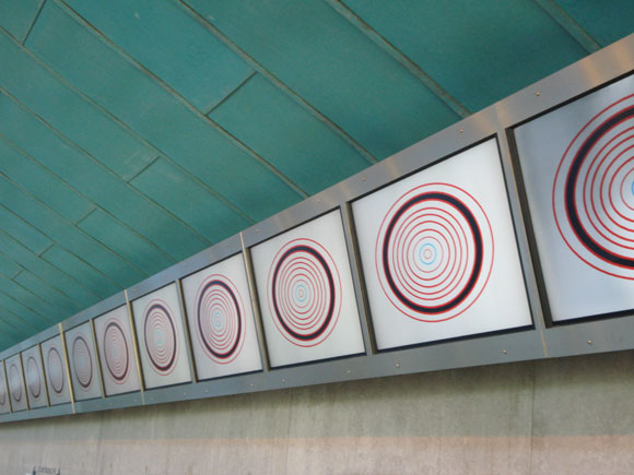
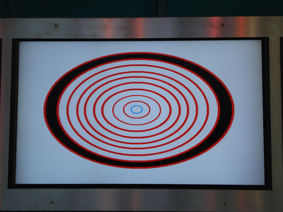
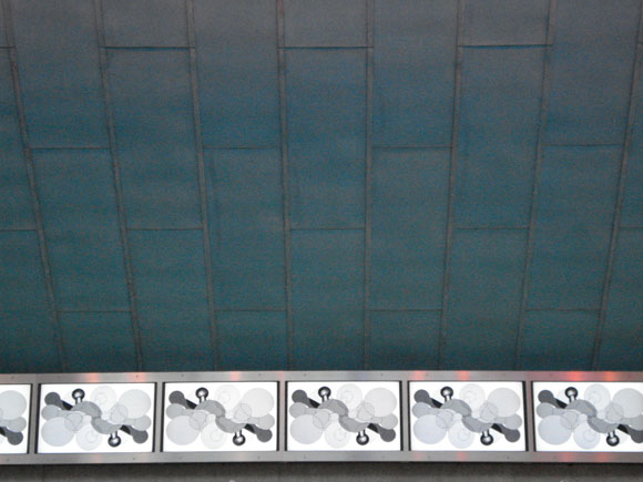
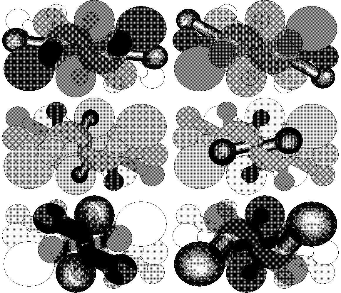
Documentation of my work in the "Fresh NY" show at Threshold Art Space, Perth, Scotland. Eleven of the 22 screens are shown. Photos by exhibition curator Anne Barlow. The OptiDisc GIF below is reduced; clicking on image shows the actual size (of the GIF--the screens are much larger).

return to main site
Currently making the Internet rounds: Hieronymous Bosch action figures. Never warmed to the blow-up Munch scream for museum gift shops, but these are f*ckin funny. How many childhood hours did certain of us kids spend looking at those paintings? Their re-reification as toys was inevitable but not before this moment, somehow.
Update: These are not really action figures. They are art gift figurines from a company called Talaria. The cheeky, inaccurate description comes from irresponsible bloggers and is being passed around by other online ne'er-do-wells desperate for an eyegrabbing tag line.
Will be traveling hither and yon for a few days so my BLOG performance posts will be erratic. Some items are "queued up" waiting for me to hit the post button from wherever I am, and I may be doing some live blogging, but the post times may not always conform to gallery hours. Fascinating, I know. Right up there with drawing other artists' work in MSPaint.
Highly recommended if you can scarf it up:
Sun Ra and his Arkestra
Disco 3000
Saturn CMIJ 78
Saturn Gemini CMIJ 78
Side A:
Disco 3000 (incl. Space is the Place) (Ra)
Side B:
Third Planet (Ra)
Friendly Galaxy (Ra)
Dance of the Cosmo-Aliens (Ra)
Ra--p, org, Crumar Mainman drum box, etc; Michael Ray--tp, voc; John Gilmore--ts, voc; Luqman Ali--d, voc. Italy, 1/78. Side B live. [Stahl and rlc]
A review found online by Paul C.:
Recorded in Italy in 1978 DISCO 3000 stands apart by being a quartet record as well as being from a brief period when Sun Ra was noodling [please, this is not noodling] with the Crumar Mainman keyboard. Playing organ and Moog along with the Mainman's rickey-tickey pre-programmed beats [please, this is not rickey-tickey], DISCO 3000 has a sound unique in the Sun Ra catalog (not counting the equally rare contemporaneous releases MEDIA DREAM & SOUND MIRROR). With the Arkestra stripped down to just Ra, John Gilmore on sax, Michael Ray on electronically manipulated trumpet and drummer Luqman Ali DISCO 3000 gives the listener an excellent chance to hear some of these important sidemen step to the forefront and shine. This impossibly rare release from the Saturn catalog has just recently been resurrected in a small deluxe vinyl pressing from the Italian label Art Yard.
"Dance of the Cosmo-Aliens" is very Can-like--stunning.
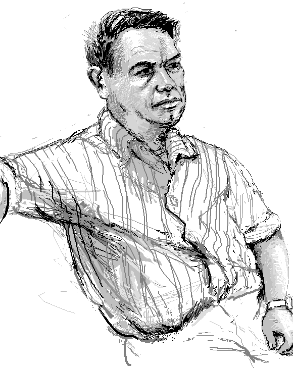

mspaint-ified steve mumford
"Sacred Elephants" [mp3 removed]
This song has several variations: "Piano Three Hands" was the first. This is a Reaktor-ified version with fairly active percussion.
Update: Remixed and reposted in 2013.
New cat bus videos by Anthony Leslie: #5 and #6
These are getting more elaborate (but still artfully clumsy)--watch the first four again and you'll notice. I like the way standard Hollywood editing moves are mimicked and moronified, as in "the chase scene" in #6. (The gimpy perspective on that pistol closeup haunts. Also, note surf music rendition of "Greensleeves" during chase.)
I passed a guy yesterday with a jambox on his bike playing the Cat Bus theme (or close enough).
[hat tip Nasty Nets]

still from gradient squares animation (an earlier version)
This is what some recent art here looks like on a Mac:

(Thanks to g. for making me cry.)


"Greater Powerz" [mp3 removed]
Something for the headphones in the BLOG installation. The rhythms were worked out last July and published as "808 Straight." Decided it needed tunes so I added those.
In the comments to her blog Paddy and I have been discussing a post about a Jerry Saltz review of Walid Raad a while back.
Paddy thinks that might have been one-upmanship, but of who? The point of exposing Jerry's "money graf" was so you could read what he said about Raad without all the BS around it.
Raad has been questioned here before.
Your dysfunctional government at work. According to the Washington Note, Dick Cheney is mad that Bush appears to be softening on Iran and has cooked up a plan on how to get us into war with that nation.
Meanwhile, neocons are meeting in the Bahamas to discuss how to get the US into an Iranian war. All the speakers are having their expenses paid and each gets a 1000 dollar fee. The forces of darkness have more money than we do, people.

BLOG, artMovingProjects, Brooklyn, NY. Installation of this blog in project space as seen on May 26, 2007. Thanks to the gallery for sending this photo--I was hoping to get it up while the space was still officially open so we could have a shot of BLOG on BLOG during BLOG. Oh, well there's always tomorrow. "Insanely self-referential" seems like the logical way to treat this project. Kind of the worst nightmare of people who say blogging is all about ego.


GIFs by Charles Westerman, based on ones I posted earlier (these are enlarged and may fuzz out on Macs, too bad)
Westerman's web page is here.
Update: The fuzziness that was once only a problem for hapless Mac users has now spread to Firefox 3. By default the command to enlarge an image now means "tastefully fuzz out for the rubes."
Update 2: After all browsers including IE 8 and Firefox 3 followed the inferior Apple "involuntary anti-aliasing" model I decided to remake these GIFs as they were originally seen on non-Apple computers.


single GIF by unknown artist displayed four times
An excerpt from Efrain Calderon Jr.'s review of the JODI show at vertexList (edited wiki-style and for length--not too obtrusively I hope):
Taking up most of the space, however, was the multi-monitor "Composite Club." Part of JODI's current "screen grab" period, the piece documents different results obtained from their hacking of Playstation's Eyetoy video game device. Eyetoy incorporates a camera input that has direct effect on gameplay: the software interprets speed of movement, direction of movement, as well as light and dark parameters. Instead of the movements of players JODI substituted popular movies, cartoons, and classic films as camera input.
The end product is a simulacrum so complex Baudrillard might have had a tough time unpacking it. With their recordings of video game programs interacting with prerecorded works, JODI shows us the absurdity of each bit of media as it tries to come to terms with others with totally different value sets and determinations of success or failure. The video game plays against a movie that is unaware that it is playing a game. The game is exposed as nothing more than its own interpretation of various physical stimuli, destroying any suspension of disbelief.
In one screen, for example, the Spider-Man movie was prompted to file the virtual nails of an Eyetoy game "customer." Spidey, doubled in speed, was aided by the director's fast cuts to help trigger the right game response. Though ultimately Spider-Man lost, the game still proclaimed "You met the quota." This might be a comment on modern cinema's box office success even with trite storylines and regurgitated concepts in our "remix"-dominant culture. Most likely though, JODI is exposing the very absurdity of perception and communication. The inability of these different media to interact correctly could apply to our own world. Each person's perception of the same thing is completely unique. Whether each film wins or loses the game is unimportant. The game itself is unimportant, and the fact that it is pre-recorded only points this out further.
As these ideas flooded my head, I realized I could barely make out the sound effects over the chatter of the reception. I tried not to focus on a specific screen of "Composite Club," and as I moved my eyes around I realized that I was as much a part of the "club" as anyone else in the room. Couples and friends were talking and laughing, each enjoying the artwork in completely different ways. Social norms played out at the refreshment table, with lines forming, and polite "thank you's" and "you're welcomes" escaping the guests" lips. Why did one woman choose the Chardonnay over the red wine? Did that blonde really want to talk to that guy? These questions seem just as much a part of "Composite Club" in their absurdity.
Though mass produced, Eyetoy's code is written like any other computer programmed device but its unique code only makes sense to its processors. Similarly, at the core, our ideas are personal and unique, occasionally hacked and exposed by monitors that can reflect our own limits and inabilities in each of our own life long interactive "games."


From the vault: TV static GIF grid, 2003. I posted this earlier today with some links to other artists doing things with fake TV static GIFs but I decided to stop being so damn nice all the time. And let's face it, the idea's been around and has been pretty thoroughly done. I like the way this one interacts across the borders of the grid--it suggests some hidden magic eye message. I find it very hypnotic, myself.
This grid has vertical white stripes on Bloglines, and probably any site that reproduces it that uses CSS and ignores my html commands for it not to have spaces. CSS stands for "clients so stupid"; it's a design language that adds spaces around things because it assumes you don't know what you want for your own web page. If someone else's art you're reblogging specifies no spaces, you have to add a command telling it to ignore the spaces it is putting in. Genius! (The future of the web makes me shudder.)

[thanks to j in jc]
Paul:
" It is conveniently ignored that the only authentic way to best support the troops is to keep them out of dangerous undeclared no-win wars that are politically inspired. Sending troops off to war for reasons that are not truly related to national security and, for that matter, may even damage our security, is hardly a way to patriotically support the troops.
Who are the true patriots, those who conform or those who protest against wars without purpose? How can it be said that blind support for a war, no matter how misdirected the policy, is the duty of a patriot?

The unifying themes of this blog and the artwork depicted here (mine and others') are stated on my main page. That statement was written in 2001 and has only been tweaked slightly since.
I believe any serious artist these days deals with information technology because that's what makes the world go round (at least till the fuel and food runs out and our society resembles New Orleans post-Katrina). The cult of "painting and sculpting" (and the collectors who support it to the tune of billions) is either about burying heads in the dirt or actively denying this prevalent reality through some imagined return to the medieval.
But tech art also has its cult--futuristic assumptions that drive advertising, design, and consumption. That's why the artwork is low-tech here and why mute molecular forms, synthetic cubism, and '80s-style computer graphics are constant themes--all are utopian forms where the bloom is off the flower (kind of like the DHARMA initiative).
Guthrie Lonergan has identified two types of artists using information tech--hackers and "defaults" artists. I'm in the latter camp, using programs pretty much as they were intended and in ways that "blend in" with the wider Web the way a Pop artist's work blended in with commercial culture. The underlying intent is still art, but doesn't announce itself in the language of academic conceptualism or overt geekspeak.

GIF artist unknown
Thanks to Paddy Johnson for the nice write-up of BLOG. The show at artMovingProjects is still ongoing--the gallery is open Thursdays through Sundays 1-6 if you want to read this in a "white cube" setting. I might even be able to come out from inside the pedestal and talk to you. (Recycled joke.) Now that the opening has passed I'm doing the exhibition remotely, from the studio. Kind of like "phoning it in" except it's harder work.
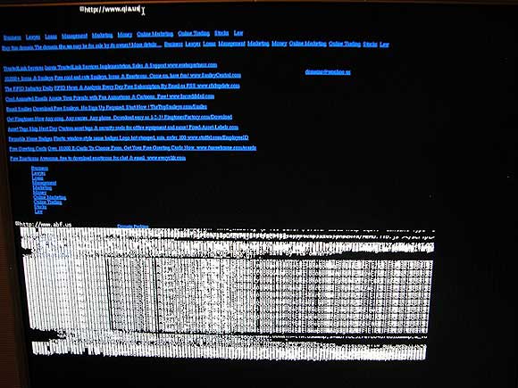
Student essays on JODI's current New York exhibition, from the vertexList blog. Efrain Calderon Jr.'s is especially thorough and helpful and does not read as if it were written at gunpoint. And here are some shots of the JODI opening, also from the vertexList blog. Looking forward to seeing the show this weekend.
A few months back a NY cyber art dealer made a comment here expressing regret that the dealer's space could not show JODI "because of the lack of support for this type of work." In fact, none of Manhattan's supposedly computer-specializing galleries stepped up, despite JODI's cred and long history as Dadaist hacker artists. Fortunately two galleries saw an opportunity: vertexList in Brooklyn and And/Or Gallery in Dallas, which are hosting simultaneous, feed-connected JODI shows. My understanding is that sales of unique and editioned works have been made at both venues, so, so much for that "lack of support."
Update: In the comments, VONA says, "JODI has shown at Pace and a big solo show at Eyebeam in the last few years. Its somewhat of a distortion to imply, as I feel this post does, that they are locked outside a commercial art realm." My reply:
Eyebeam is a non-profit space--not sure how that show was in the commercial realm. As for the Pace exhibit--that's one group show, not much of a commitment. As discussed here, Pace seems to have flubbed that installation, projecting the wrong DVDs on a cross-shaped wooden construction built specifically for another video work.Update 2: Turns out the issue with VONA wasn't that I was distorting the record but that new media artists need to "forget" showing in Chelsea (still the key to wider art world recognition, last I heard--not a guarantee but the place that collectors, curators and writers tend to go to to see art) and I wasn't sufficiently respectful of this aspiration of VONA's.
Anyway, the point of this post is JODI's doing fine in the commercial realm, with galleries outside of Manhattan.

"Yarnstripe" by Petra Cortright.
Your government at work. This is an excerpt from a new book about Duke Cunningham, the recently convicted Republican Congressman from San Diego. (I assume it's this book--hat tip to mark)
...even [briber Brent] Wilkes drew a line on what he would do for the congressman. For one thing, Wilkes was totally disgusted by the hot tub Cunningham put on the boat's deck during the autumn and winter. What repelled Wilkes -- and others invited to the parties -- was both the water Cunningham put in the hot tub and the congressman's penchant for using it while naked, even if everybody else at the party was clothed. Cunningham used water siphoned directly from the polluted Potomac River and never changed it out during the season. "Wilkes thought it was unbelievably dirty and joked if you got in there it would leave a dark water line on your chest," said one person familiar with the parties. "The water was so gross that very few people were willing to get into the hot tub other than Duke and his paramour." That was a reference to Cunningham's most frequently seen girlfriend, a flight attendant who lived in Maryland.
One of these parties started at the Capital Grille with Cunningham ordering his usual filet mignon -- very well done -- with iceberg lettuce salad and White Oak. Wilkes used the dinner to update Cunningham on the appropriations he wanted. Cunningham then took the whole group back to the boat where they drank more wine, sitting on white leather sofas while Cunningham told more war stories. Cunningham then took his clothes off and invited all to join him in the polluted hot tub that was hidden from the neighbors by a white tarp. There were no takers.
Missed the Tarantino/Rodriguez double feature Grindhouse, which did so-so box office and now will be split into two films for non-U.S. distribution. The Tarantino segment "Death-Proof" has been selected for Cannes; Robert Rodriguez's "Planet Terror" hasn't been. Salon (prob. subscription-only, sorry) reports on the "Death-Proof" press conference below. The producers have "restored" the film (or padded it out with cut footage, depending on how you see it) and are releasing it in France as "Boulevard de la mort."
Most strange and striking of all was the moment when [producer Harvey] Weinstein moved in to squelch all further discussion of "Grindhouse," and in the process seemed to deliver a slap-down to Kurt Russell. Most of the participants stayed on message most of the time, meaning that Tarantino insisted that the longer, "Boulevard of Death" version of the film is closer to his original intentions. Russell, who plays impressively evil Stuntman Mike, wasn't having it. "I'm sorry for people who won't get the 'Grindhouse' experience," he said. "That's what it was all about for me. So I prefer the shorter version. Now ['Death Proof' and 'Terror Planet'] are gonna go off and stand on their own, and hopefully you'll enjoy them. But in 20 years, you will want the full 'Grindhouse' experience, because there's nothing else like it."Update: Grindhouse is still playing in the theatre in NY (in Times Square of all places) so I checked it out this afternoon. The Tarantino burned brightly and intelligently (though 'twasn't enough premise for a full length, sorry, France), while Rodriguez's "Planet Terror" paid your standard loving tribute to zombie movies, with an increased disgusting gore quotient. Special effects man Tom Savini plays a small acting role in "PT"; his exploding body prosthetics ruined many an '80s film and Rodriguez has aped them and upped them in the present glopfest. Neither "Death-Proof" nor "PT" particularly evoked '70s grindhouse, aside from the scratched and grainy film stock. Tarantino's bit is a sui generis art movie--Hollywood/gender deconstruction via the theme of "muscle cars and the pros who drive them and go psycho"--and the Rodriguez mostly a subtextless homage to '80s slasher films, a genre still chugging along as late as the '90s (Tales of the Crypt: Demon Knight) and the '00s (the Scream franchise). 2002's Cabin Fever (directed by Eli Roth, who also has a bit part in "Death-Proof"), seemed more authentically '70s to me. In any case, everything about the Rodriguez felt familiar. The gore in the Tarantino happens quickly, doesn't linger, and disturbs infinitely more.
Weinstein held his peace at that moment, but a few minutes later, when another eastern European journalist asked why none of the fake trailers from "Grindhouse" are being shown with "Death Proof," he stepped up to the mike. "We had a great time with the whole 'Grindhouse' thing," he began, in the tones of a man not having any fun at all. "Now European audiences will get to see these new movies by Quentin Tarantino and Robert Rodriguez, and they'll enjoy them much more [than 'Grindhouse']. You'll see Robert Rodriguez making a true Robert Rodriguez movie, you'll see Quentin making a pure-essence Quentin movie. It's a completely different experience. They will dwarf 'Grindhouse,' trust me."

Game image of some top secret unshareable sort. Square Botero.
Spread the Word Iraq Nam is a Kos diary tracking American troop deaths in Iraq while Bush stonewalls and Congress postures and dithers.
IT HAPPENS EVERY TIME I POST stories of the fallen now: I'm accused of being a 'spammer'.
My blog hosts at Blogger. They have algorithms to detect what they call 'spam blogs' -- those that have too many posts or posts that come in too rapid succession. And as I said, at my blog I post stories of the fallen -- the deaths, the remembrances, the memorials, the funerals.
I always post these at the end of the day, after the news and perspectives. Sometimes I've had up to thirty deaths, remembrances, funerals, etc. to post in a single evening. And so Blogger sees my numerous posts made in rapid succession, and thinks spam.
It then produces the dreaded 'word verification' requirement where it assembles a nonsensical sequence of letters in a graphic that has to be retyped in order to continue. I wouldn't mind so much except sometimes it reaches a point where it just locks me out of my blog altogether -- one time for 5 days.
I've developed ways to deal with it. So my problems with Blogger aren't the point -- this is: 15 dead since Friday, 75 so far this month, 104 last month. And where the deaths were one or two or three at a time now they come in sixes and sevens and eights and nines.
Five years into this insanity, and we are way beyond the point of 'mere' troop casualties.
We are literally spamming their deaths.

found on the Depthcore website: "A Trip to the Park" by David Garvin
Wouldn't mind learning this program, whatever it is. The line quality, overall softness, and obvious ease of creating quirky, subjective "psycho-geometries" appeals. It's not that typical Pixar rendered look, even though it's rendered. The artist here is under 20, and this could be a one-off but somehow it feels newer and fresher to me than say, Torben Giehler, who seems stuck in an old labor-intensive paradigm (hard-edged painting--been there!) but is trying to hip it up, computer it up. This looks like it just happened, but could also be from the game world. (A Katamari Damacy-like screenshot will follow to accentuate the point.)


GIF grid by eyekhan
Based on my MSPaintbrush "Waves" drawing.
Hello to all at artMovingProjects today. This continues the series of remote posts to the "terminal" which are also simultaneously viewable on the larger Internet, as part of the performance work BLOG. Aside from routine schmoozing, much of my time at the opening last night was spent explaining (a) how blogs work, (b) how long I've been doing it (six years, three months), and (c) the purpose of showing the blog in the gallery when it could also be consumed at home. Please see earlier posts for writing on some of these issues.

Zoe Sheehan Saldana (umlaut over the "e" and tilded "n" in Saldana), who is showing in the artMovingProjects main space. In her exhibit "Homegrown" she is growing an edition of 96 tobacco seedlings (Nicotiana tabacum Burley) under indoor lights. A webcam showing the seedlings, refreshed every 30 minutes, is here.
Behind her is BLOG, a performance work consisting of the blog you're reading, situated in the gallery's project space for a month. A couple of posts were made during the opening and those of us standing around the terminal from time to time enjoyed reading the comments. I did not put up any cats (or Katz--see comments) but that could happen at any time.
Some gallerygoers chose to use BLOG to explore sidebar links without returning, read up on global warming, and possibly check email--that's part of the art, I guess, but those actions will not be documented.

This is my inaugural post for BLOG, the exhibition. I am at the opening now. Wish you could be here. If anything particularly noteworthy happens in the next two hours I will post about it. In anticipation of a few people standing around wondering what I'm going to do I will also be posting some artwork and possibly a cat.
Good Art of the Day (with Quote)
Joel Holmberg: Scratching Post Vortex and rear-screen-projected sculpture/installation based on same.
"One could criticize young artists in America for attacking trivial subjects when the world is busy coping with the misfortunes inflicted by their country of origin. Yet the solipsism of Scratching Post Vortex doesn't necessarily respect national boundaries--the work's debased Pop values indict all of Western consumer culture, those complicit with Empire or aspiring to be like it. The piece suggests a despairing nexus of humans and what's left of the animal kingdom--overbred domestic pets in a species-depleted world spastically scratching out their frustrations as if on treadmills. Treadmills that grow to encompass other treadmills in a hellish recursive universe of landfill-bound products." --Theodor Adorno
Thanks to ArtCal for the nice advance listing on the "Blog" opening tonight. I will be there and plan to do some "live posting." As explained in this earlier thread on the methodology of the piece:
I see this performance as a lot like the cubicle group show I was in, where I sat in the cube and worked at the computer in my business casual attire: on the opening night, but also during "office hours"--in other words, every day the space was open I came in and worked. The unrented office where that show was held had no net connection and I was channeling "my working conditions circa '95" so I posted about it during non office hours. For BLOG I will also be working during gallery hours, but from home--the posting will be the work, not about the work. (Or both, if I'm feeling "meta.")As for the "how do you sell this?" question:
[...]
I'm going to be performing with changing content, graphics, etc. Not really any different from what I normally do but with an awareness of a specific, physical audience, what will work on the gallery's screen, how to explain to a reader not physically in the gallery what I'm doing and why.
Also I will post any documentation the gallery sends me of how the blog screen appeared on a given day, whether or not anyone looked at it, etc. The gallery will also save each day's posts as documentation.
[T]his'll be structured as a "classic" economic exchange. An agreed amount of funds for an editioned disc with the data for the show (html files for each day's posts plus associated files--images, etc.) and a certificate authenticating the work and the size of the edition.Also, besides the edition, the "terminal" (pedestal/keyboard stand, gear) will be offered as a stand alone work, with the month's posts and associated files burned on a dedicated hard drive.
As for the press release's statement, "For the first time a blog is shown in a gallery space," commenters in the thread mentioned some possible precedents but no serious documentation was put forward of a previous, month long performance work called "Blog." As stated in the thread, I'm open to having a "beef" with anyone on this issue. On some level mine is a protest piece: that blogging has made no serious inroads into the rigid gallery/museum/art mag system of evaluating art and must be physically present in a gallery to have "cred." But it is also the second generation of "net art"--a much more casual and un-self conscious use of available technology as a content delivery system. It may seem paradoxical to say a blog bearing the artist's name is un-self conscious but the scope of this blog has always been bigger than talking about my cat (if I had one). Commenters keep the place lively and interesting, for me and I think others.
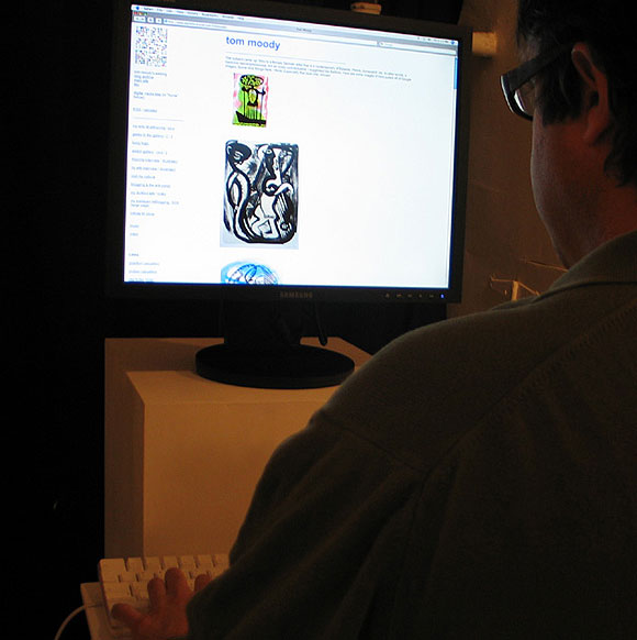
"BLOG," the gallery exhibition, opens tomorrow night in the artMovingProjects project space. Above, artist Aron Namenwirth gives the artwork a test drive. What we have is a dedicated, frequently updated, remote content delivery system in the gallery, clearly visible in the space, which is as interactive as the viewer wants it to be. Using a feature called "comments," one can communicate directly with the artist. The future arrived early.
(Images on screen are by Ina Barfuss, culled from Google as a hybrid activity of appropriation, curation, and journalism.)
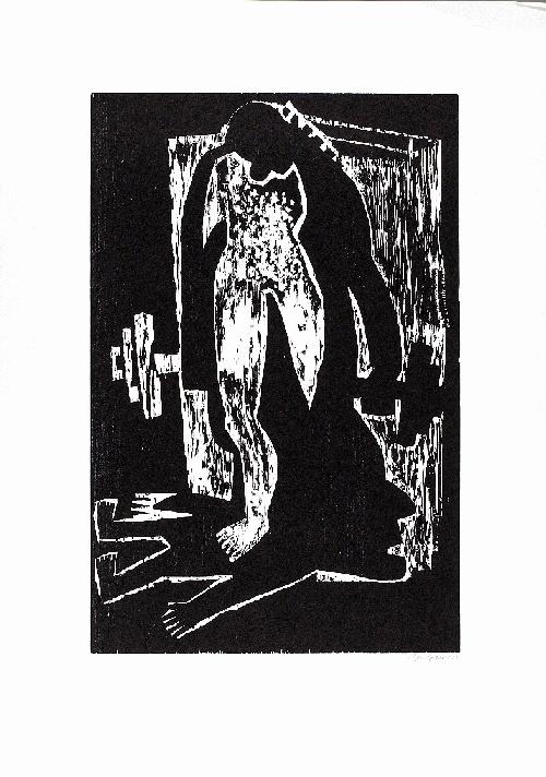
The subject came up: Who is a female German artist that is a contemporary of Baselitz, Penck, Immendorf, etc. In other words, a hardcore neo-expressionist, not an ironic conceptualist. I suggested Ina Barfuss. Here are some images of hers pulled off of Google images. Some nice things here, I think! Especially that blue one, whoah!


So far Mike Gravel on the Democratic side and Ron Paul on the Republican side lead all the candidates in willingness to speak truth instead of poll-tested BS. Watch this YouTube of Paul responding logically and articulately to Rudolph Giuliani's thuggish questioning of his patriotism. Wolf Blitzer, reinforcing the status quo as always, seems to have a hard time wrapping his head around the concept of "blowback."
Good Art of the Day
Joel Holmberg: Scratching Post Vortex and rear-screen-projected sculpture/installation based on same.
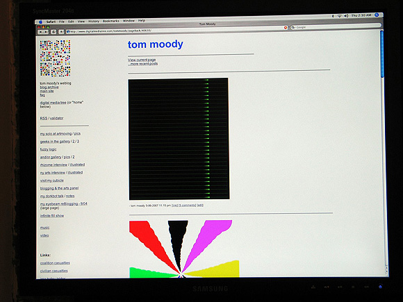
From Time Out New York's Art Listings this week: "Tom Moody, 'BLOG.' Moody's art, music and animations are accessible through a computer terminal; viewers are invited to post comments. artMovingProjects, Brooklyn, Project Space, Sat 19-June 24." (online version) Hope all can come to the opening Saturday. I will be present and will post from the gallery. (more details)
Photo of the "terminal": artMovingProjects
Samurai Quotes from Ghost Dog.
From the Vault: Ghost Dog review(s) and license plate screen shots. (Some serious link rot rectified!)
Completely off topic, but essential: the last 10 or so seconds of every episode of the first season of Star Trek: The Next Generation, assembled by Paul Slocum (Caution: Wesley Crusher in oversized natural fabric (?) top)

A couple of threads on art and religion over at Sally McKay's and L.M.'s blog: here and here. Seems it started with a panel with some art critics saying really stupid stuff like
"A -"We [secularist intellectuals] are very much the white settlers in the fort, completely surrounded ...by the raging hordes of the spiritual outside."...followed by some of McKay's/LM's commenters decrying the art world's hypocritical bias against current religious art when it is only too happy to talk about past religious motivation (Kandinsky, etc.) To David Morgan's question "why do art historians studying art before the modern era give attention to religion, but those writing on fine art since the 19th century often very confidently consider religion irrelevant, even improper to examine?" I responded (cramming together several answers):
B- "That's precisely the point. Well put. That is exactly what's behind the anxiety...about all this religion stuff and what does it have to do with the avant-garde, with contemporary art, real important art. There is an anxiety that we are indeed outnumbered. Jesse Helms attacked the NEA and had great success. We're under siege."
A-"But luckily we're the ones that write the textbooks."
How about: Because art before the modern era is safely in the past, its practitioners long dead, and religion's contribution can be approached analytically without getting some living religious person's knickers in a twist. It's not that religion is irrelevant but let's just say certain zealots have made the topic literally lethal.(image above--possibly the greatest painting ever made--by jonathan borofsky)
As an artist I'm fascinated by fringe religions because the idea of the deity seems to come from the same place as art ideas--as in, some murky, ecstatic place. I like to read and think about those religions but I don't necessarily want to meet these people. As for religions with more established dogma many of those practitioners are reading from a script. Either way, I hate it when someone tries to convert me because a lot of sleazy mind control tricks are used. The practitioner is looking for people who seem depressed and unhappy* because they're more subject to "love bombing" and all that other shite. Ugh. I'm proud to be from a country where the founders steered clear of the various mystery cults in creating our civic charter.
The art world's "bias" against religion isn't just reflex avant gardism. Empirical, Enlightenment principles of rational argument are also at stake. (One who questions whether the Earth really started 6000 years ago is in actual, physical danger today.) But I don't think contemporary art has any duty to defend such principles against the fanatic hordes--just to be aware that talking about current religion (critically or not) involves real risks so it's better to be guarded, or coded, or steer the f*ck clear of it.
*Or in my case because they mistake irony for misery. Thinking of one specific instance where I was sitting drawing a skeleton playing bongos and a woman saw it and tried to get me come to come to her megachurch on the freeway.

The Sunday NY Times had a report about a musician who quit his job and posted a song a day on his blog. One minute journalists are hissing and spitting about "people in their bathrobes" presuming to usurp them and the next they're glorifying the new lifestyle mythos. Didn't read past the first page but it sounded like it was about an individual trying to cope not just with creativity but the stresses of fan adoration, frequent commenters, people music-animating and -remixing his work--in other words, being a one man band of self promotion. Yawn. Not too interested in the problems of someone replicating how the record industry promotes an artist: that is, via behind the scenes stories and a cult of personality. Every musician his own Tigerbeat. As artists using blogs we want transparency but on some level our projects should still be difficult for journalists, not spoonfeeding them stories in terms they already understand. To adapt a favorite quote about art from AbEx painter Adolf Gottlieb: "I'd like more status than I have now, but not at the cost of closing the gap between blogging and the public. I'd like to widen it!"

An earlier post incorrectly stated that Minus Space ("Reductive Art") had added a blog to its website; in fact it has a page of texts in reverse chronological order that it's calling a "log". The page has no permalinks, no comments, no RSS feed, no content management system that I can see (a la Word Press or Blogger). It appears to just be a list.
Yet Minus Space was included by ArtKrush in a recent article on "Art Blogs" and appears on the ArtKrush link list as an "art blog." Maybe ArtKrush can correct that Minus Space is not a "blog" but a "site" a la the dot com era.
Update: The more closely one looks at Minus Space, the more unclear what it is. Not only is it not a "blog," it appears to be a gallery that is repping "reductive artists." Or was, because now the site says "MINUS SPACE IS NOT ACCEPTING SUBMISSIONS AT THIS TIME." Submissions for what? They appear to have a physical "project space" that is intermittently open, which may or may not be the same as the online project space. In the past they sent out email notices of online exhibitions but those are not maintained in any kind of archive. They have a page of "Minus Space Artists" consisting mostly of links to the artists' personal websites (some don't link to anything). If it's a real space gallery it's not much of one and if it's a virtual gallery it's not much of one either. And it's not a blog. So, what is Minus Space?
Update 2: Also this bit of dubious puffery from the site. The end of the ArtKrush article reads: "Check out the complete list of our favorite art, architecture, design, photography, and new media blogs" with a link to over a 100 blogs. The Minus Space press page presents this citation as a quote: "'Favorite Art Blog' --artkrush.com." Bit of a stretch, that.
Josh Marshall on the Fort Dix Six, the US government's latest attempt to say "Look! Over there!":
The Fort Dix Six?
Well, seems they made a jihad training film featuring themselves. But they couldn't figure out how to burn it to a DVD. So they went to a Circuit City and asked the clerk on duty if he could do it for them.
D'oh!
I guess that means these guys probably needed remedial terrorist training.
There also seems to be more than a hint of entrapment in the role the government informant played in helping arrange the planned attack. Back in November one of the plotters called a Philly police officer and told him that he'd been approached by someone [i.e., the government informant] "who was pressuring him to obtain a map of Fort Dix, and that he feared the incident was terrorist-related."
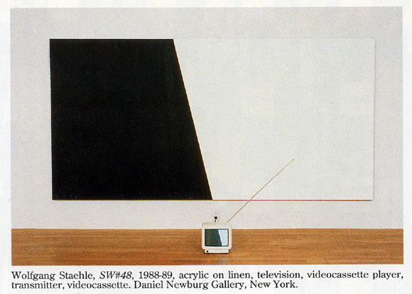
Televised Abstraction, 1988-2007
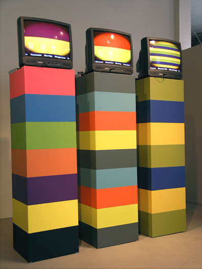
Lorna Mills, L to R: Bletchingly, Infomint, Lucky Hubble 2007, MFD, latex, video (at akau inc., Toronto)
Mills' piece (see this Digital Media Tree page, where we are fortunate to have her posting as L.M.) differs from the Staehle in the choice of "formalist forms" used, a sense of heightened artificiality, the oval masking on the screen, and most significantly the real world content: names of racehorses scrolling across the bottoms of her screens, defamiliarized and exoticized in this context. Also, not sure why Staehle was "broadcasting" to his TV--maybe VCRs on the floor were not the norm in 1988.

More cassette madness: Tone Set, where have you been all my life? Found out about this Tempe Arizona duo from Mutant Sounds. John Carpenter-esque minimal moog meets Negativland sound collage, only it was '81-'82 so the sampling is all done with tape. "Synthpunk" probably is the best term, as it's in the DEVO/Wall of Voodoo camp melodically. The title "Cal's Ranch" refers to Cal Farley's Boys Ranch outside Amarillo TX, and some of the samples have ironically appropriated fundamentalist Christian themes. Also bad movies from late night TV, call-in shows, snippets from Rocky and Bullwinkle, all that stuff you get sued for now. My favorite tracks so far are "The Devil Makes the Loudest Noise" [mp3 removed] and "Out! Out!" but it's all pretty amazing.
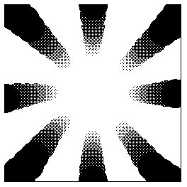
Thanks to Rhizome for reblogging* this recent sketch. I like what happened when the image resized--the center got white hot and edges became black holes. It's more of a graphic this way, but a mysterious one, I think.
Someone asked if the recent uptick here in drawings and animations was because I was showing the blog in the gallery. That hasn't started yet--end of next week. This blog is a place for my artwork and if I had more discipline I would just draw and post sound files. I post text because (a) some images don't look good adjacent to each other and it helps to have a buffer of some kind, but the buffer can't just be filler so I have to write something cogent, and (b) I'm verbose and have to talk about things (even though it means sometimes people get "insulted.") The writing helps me think through what I'm doing and ties it into a larger context of stuff I like and don't like. [/pure egotism]
Update, 2011: The Rhizome link has been changed to http://rhizome.org/editorial/2007/may/9/sketch-monochrome-gradient/.
Irritants of the Day.
1. Jonathan Lethem's descriptions of art in Fortress of Solitude. Don't know if the Abraham Ebdus character is based on Lethem's father, or if Lethem's father is an artist, but the book feels like an elaborate revenge by a son who essentially hates art against a father wholly dedicated to it. Lethem knows just enough about his subjects to be dangerous. He can imitate the style of an Artforum review, describe an avant garde film screening, or string together a narrative of what is happening in an abstract painting or film well enough to make these things sound completely pointless and ridiculous. The book is filled with fake reviews, of art, music, etc--no one can respond to these because they are pure fiction, straw men for the writer's contempt. Lethem has a vicious wit--one wishes it could be turned on people and things that deserve it (Republican politicians, Judith Miller, etc)
2. Minus Space. If Lethem's imagined world of form-only art existed it might be found on this space. A website devoted to "reductive art"? Surely "reduction" is just one technique or strategy an artist might use to get at some significant content--not an end in itself. One might as well create a blog called Blue and only blog blue things. Yet in fact a longstanding cult persists around this "reduction," which has little to do with minimal art practices as described by Robert Smithson or Sol LeWitt (or even Peter Halley) but instead provides a safe haven for late Greenberg disciples proudly entrenched in painting's own greatest area of competence--itself--while the world changes all around them. Not everything on Minus Space is that simplistic, they've added a fair amount of "painting as architectural critique" since the site's inception, but one yearns to pluck the better things one sees there out of the limited context. Many pieces are succulent but the photos are too small; half the time you're not sure what you're looking at and the pleasures you could get from staring at monochrome and shaped canvases are stanched.
Afterthought: Minus Space has changed in the last year or so. It added a blog [wrong--see here] but no longer hosts a deep archive of its past online exhibits. Instead it features links to artists' websites (some of which are Flash--yech.) A link I made to a show they put up online last year (Daniel Gottin) is now dead. Also, the site says it is no longer taking submissions. Perhaps "reductive art" as an organizing principle is petering out. Or Petering to the extent Halley is a mentor for any of these artists.
Update: This quote from Salon's Laura Miller, writing about Don DeLillo, also applies to Lethem: "The weaknesses of Falling Man are DeLillo's long-standing ones. Most of them spring from the fact that he is an essayist at heart, who presumably chose the novel because it is the most exalted and revered literary form of our time -- and DeLillo is not the sort of writer willing to risk being insufficiently exalted and revered." It's so stupid. But it does work. Lethem's Fortress was lauded as the Great American Novel because we need such novels and young writers to write them. Whether or not the form is outmoded or the best vehicle there is a myth machine, an industry, behind it. The art world equivalent is painting, which you have to do, no matter how bad or irrelevant, to be a playa.
Lostblogging (spoilers)
The "end of Dharma" had real power but the leader of the Others is...a chair? Actually the latter revelation had a nice "hold a flashlight up to your face and tell a ghost story" quality to it (a la Jin on the camping trip a few shows back) and shouldn't be knocked too much (That baritone "H-ee-elp me-e"--OMG). Great to see Dharma spokesman Marvin Candle (aka Mark Wickmund) back again on tape explaining the compound's security perimeter. And all the weird class issues raised by the Dharma initiative: Ben's dad as a frustrated "work man," the "hostiles" excluded from the compound, etc. Left hanging after the mass murder of the hippies by poison gas: one guesses this means Ben killed his girlfriend. I kept thinking he would find her body, heightening the tragedy of his betrayal. But we never saw what she looked like as an adult so that wouldn't have worked. Expect more Ben back story.


I've been joking about the free music sites linking to my .mp3 output, some of which are a trifle skanky (pop up heaven). This one is pretty handsome, though. I can remember a day when musicians had to join .mp3 sites and upload to them, hoping someone would stumble on their "wares" in those individual archives. (I suppose MySpace still operates that way--with added social networking functions--but I chafe at the format.) My tunes are definitely getting "out there" despite the randomness of the context, judging from the downloads, particularly in Asia, it seems, and all I'm doing is making tracks and posting them. Money would be nice but "airplay" is great, too--as long as the bandwidth stays manageable (which it has so far). This is niche music anyway and will remain so unless vocals are added and stories of heartache and pain are told.
Can't stop watching the video of earth compared to VV Cephei, an enormous star that if placed where our sun is, would be as large as the orbit of Saturn. The popular computer graphic shows earth next to Neptune, Neptune next to Saturn, then Jupiter, the Sun, Sirius, Pollux, Arcturus, etc all the way up to VV Cephei, like a procession of bigger and bigger schoolyard bullies. It's absolutely humbling to think of that of all that size and power. Astronomers say VY Canis Majoris is even larger. By the way, congratulations to Robert Quimby, a grad student working at the McDonald Observatory in West Texas for spotting the largest supernova yet recorded, fortunately in a galaxy 240 million light years away and therefore during the Permian era of our own history. The exploded star was hypothesized to be 100-200 times heavier than our sun.

I've said this before.
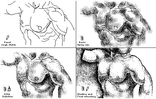
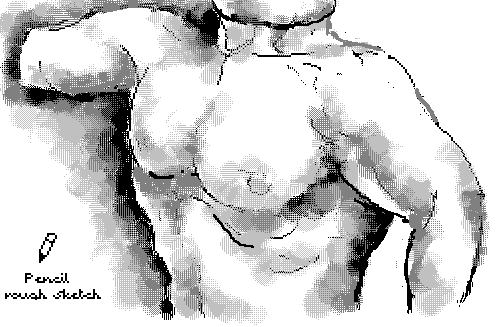
I hate the MSPaint spraycan tool.
Even though I learned some new tricks from Travis such as how to make the spray a wider range of sizes, it doesn't change the fundamentally unaesthetic look of that dot dispersion pattern.
After the subtleties of MSPaintbrush (Paint's superior predecessor that Microsoft ruined), it's like painting with acrylics after learning oils.
With the previous drawing I did everything I could think of either to use the spray proactively or to divert attention from it.
1. Made the surface illusion very flat since you can't depth-model convincingly with that uniform fake pointillist pattern.
2. Tried to think of a surface that's naturally granular, such as "lunar dust."
3. Varied the width of the spray and used some big, fanning sweeps as kind of a wash or glaze--fuggedaboutit.
4. Saved it as a .GIF from the native .BMP to add more of a "grid feel" via the dithering of those grays.
5. Used a blue "intrusion" pattern (an homage to Houston painter Perry House) to confuse the read of the image.
I'm still stuck with that dead-ass, rectangular dot grain. Yeuuchh. (I like the drawing, though.)

Internet Acronyms
AFK - A Fine Kettle
TTYL - To Toss Your Lunch
FTW - Fuck The Wankers
FTSS - Fans Trail Sharon Stone
ASL - Ankylosauruses Should Leave
OTM - Off Track Meddling
YSI? - You Sure Is?
FFS - Free For Seniors
RTFM - Rock the Fother Mucker
originally posted in the Nasty Nets comments but no one said LOL (Let Osama Linger) so I'm putting them here.
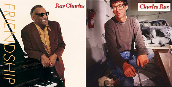
ArtKrush has published a second installment of its "art online" series. (The first was here.) This blog is on the link list as a "new media blog." I'm down with that as long as new media means "the ism that follows and subsumes conceptualism in the history of art" but I do consider this an art blog. Art made with a PC, blog-in-a-gallery, and computercentric reviews notwithstanding, during the last six months the following have been discussed, depicted, or parodied on this page: Charles Ray, Judy Pfaff, Cindy Sherman, Ludwig Schwarz, Roxy Paine, Ryan McGinness, Sol LeWitt, Richard Woods, Kelley Walker, Klaus Mossetig, Allison Smith, David Moreno, Vincent Van Gogh, Triple Candie's "Limelight" exhibit, Miklos Suba, Chris Burden, Fiona Banner, Mark Dagley, Don Voisine, Marc Handelman, The Art Guys, Gary Hill, Doug Aitken, Elaine Sturtevant, Salvador Dali, Claes Oldenburg & Coosje Van Bruggen, Tony Conrad, Ralston Crawford, Ken Lum, Ivan Albright, John Pomara, Jackson Pollock, Matthew Geller.

Comic book movies suck because the writers "humanize" the stories. That's screenwriter code for "take properties originally written for alienated adolescent males and turn them into chick flicks." Marvel in the '60s had heroes with "hang ups" but rarely villains. We never got any back story on what a nice guy Dr. Octopus was before he acquired extra arms. And every Spider-Man fan from the comix days knows the Sandman was a pure crook, a hard case, bad to the bone (or the grain) but listen to what they've done to him. Stephanie Zacharek, in Salon:
And there's a new villain in town, a grown-up Dead End Kid in a stripey jersey named Flint Marko (Thomas Haden Church, in a soulful, solid performance), who has just escaped from prison, motivated solely by his wish to see, and help, his young daughter, who's suffering from a serious illness. While on the run from the police, he stumbles into the center of a particle-physics experiment, which gives him the power to transform himself into a colossus of sand: Sandman.In the comic book a mishap on a beach near a nuke test site turned prison escapee Flint Marko from an asshole into an asshole who could smother you in the quicksand of his own body. Scary! Not anymore:
[Director Sam] Raimi at least manages to make [Spider-Man 3] both huge and human. He also pulls off one of the most beautiful special effects I've ever seen, in any movie, a testament to the ways in which CGI, used right, can actually humanize a film. After Flint Marko -- a criminal who's done all the wrong things for the right reasons -- steps into that whirling particle-physics blender, he's no longer himself: He's a mound of sand, a one-man desert, and before our eyes he tries to re-form himself into some semblance of the man he used to be. As he tries to stand, rivers of sand run from his muscles. His contours take shape, fall away, and then stubbornly rebuild themselves: He's a piece of sculptural poetry, a song of being and becoming, a living, moving Henry Moore statue.That's nicely written (except for the cliches), but it's not the Sandman she's describing. He didn't clutch lockets, he killed your ass.
Eventually, a bigger-than-life creature, an anguished giant, emerges from this hill of sand. He's clutching a locket containing a photo of his little girl, and as he surveys this tiny picture, we know that he's remembering not just the man he used to be, but the man he failed to be. In this one astonishing scene, Raimi and his special-effects artists give us an image redolent of the great beauty, and the gravity, of silent film. Without a word, they sing the ballad of the disappearing man.
the top image Guthrie found and posted to Nasty Nets. The bottom is a panel I redrew in MSPaintbrush (Paint's more sophisticated ancestor). I mean, kitsch is kitsch but anyplace to show off some Paintbrush "skillz."
Thanks much to imagineering for the commentary on the post here comparing Cindy Sherman film stills with webcammer T-shirt ninjas. She (Kristin Posehn) says she realized she "actually spent more time looking at the ninjas." Awesome!
There is a free-form use of text in the ninja pix that is almost like folk art. Even the most flippant text in contemporary art feels heavy in comparison, loaded with significance.Some of my own ruminations on the comparison are here and here. I like imagineering's take on the text part of the campics, which I didn't talk about at all. I may have something to add when I get a minute.
The ninjas are borrowing from print and television marketing models, which almost always have text together with imagery. The ninjas naturally include their own strap lines and slogans. Their pictures are participatory advertisements, not film stills. Maybe this subtly suggests a blurring: to communicate is now to publicize.
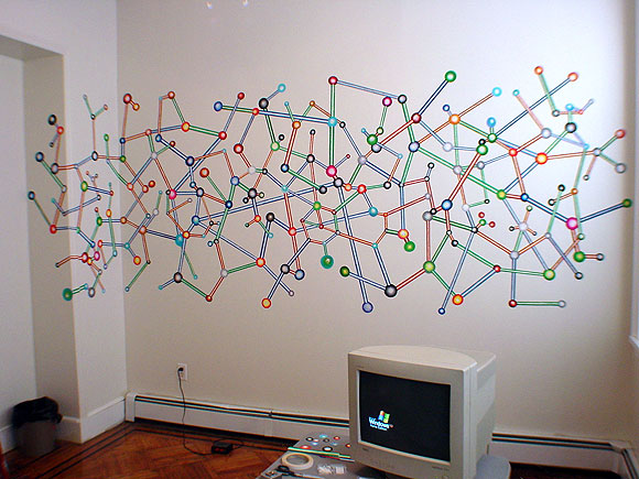
larger (2048 pixels wide - 200 KB)
from 2002, when I still used a CRT
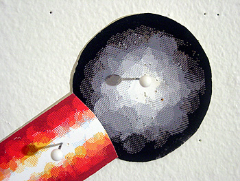
Update: detail below added to show the materials:
A piece that Rick Silva showed at Dorkbot here in NY is now online: Rough Mix [Quicktime .mov] features Silva outdoors with his DJ mixing board doing turntablist moves on rocks, leaves, snow, sand, water: "scratching nature" if you will, treating the landscape as a series of imaginary vinyl LPs to be mixed. In his talk Silva discussed the importance of the hand and touch to the DJ, and here it's as if he's lost nature and is desperately (joyfully?) reconnecting with it by clawing, patting, swiping, rubbing, and scattering it. These seem like the actions of a crazy man since he has no turntables, only an unplugged board resting on various surfaces in the middle of nowhere (a gorgeous mountain landscape), but the piece makes it funny rather than alarming.
Aside from the obsessive performance aspect of it, the work thrills through its use of high-def cinematography but especially through its state-of-the-art collage of electronic sounds. One of Rough Mix's paradoxes is that turntablism is an "analog art" and the piece is about connecting with nature yet the sounds and images are quite distinctively digitally realized, that is, artificial. The abstract "music concrete" recalls urban dance music but densely filtered and "glitched"--imagine skipping CDs reverberating in a dreamy aural haze with the occasional hip hop beat cutting in and out. The timing pulls it together: the piece is long but the quick editing of the music in sync with closeups of Silva's scratching hand, spinning geosat views of the land, and the "surprise factor" of never quite knowing where the mixing board will turn up in the ecstatically empty, Western terrain, keeps you engaged. The DJ is the focal point, a crossing point of the real and the digitally mapped.
America Supports the Arts in Baghdad: Provides Large Unblemished Surface for Artists to Paint On
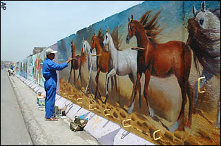
Photo caption from the UK Telegraph: "Local artists display their skills with murals on the blast barriers and concrete walls that dot Baghdad"
Article from the same publication accompanying the above photo:
Anger in Baghdad as Americans finish wallUpdate: Goddam, I'm tired of my tax money going for this shite--from Channel 6 news, Corpus Christi TX: "Construction of the wall has drawn strong criticism from residents who say it is a form of sectarian discrimination. Followers of radical Shiite cleric Muqtada al-Sadr (mook-TAH'-duh ehl SAH'-dur) say they fear Shiite areas in Baghdad, such as Sadr City, will be next to see the U-S-built barriers. Much of the construction is being done at night by troops wearing night-vision goggles." That's just sick, man. We need the money, here, for New Orleans, for anywhere. So corrupt.
American forces have completed construction of a concrete wall around the Baghdad district of Adhamiya despite protests from the Iraqi prime minister and local residents who claim that they are now at the mercy of militants.
The wall was intended to help control the activities of militants in the predominantly Sunni Muslim district. But it remains a bastion of extremist al-Qa'eda linked groups. Parts of the district are so thick with armed militants that they are no-go zones to coalition forces.
Capt Mohammad Jasim, an Iraqi soldier manning a checkpoint on the Adhamiya bridge, said: "The Americans did not listen to us. We think this wall has made the area inside the wall more dangerous for people.
Um Doraid, a middle-aged housewife, said: "We here inside the wall are still as vulnerable as ever."
The tinkertoy stealth fighter that used to be on the Hasbro website is gone. US jingoism has cooled down and now we have world peace. Here is an image of it and an imaginary molecule piece based on it, circa 2002.



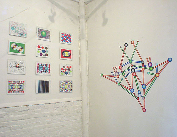
larger detail (904 pixels wide--85 KB)

This blog has had a moratorium on pictures of this knucklehead, believing they add to his cult, but I want to post this one today, "Mission Accomplished Day." The rightwingers love this image because it makes their idol seem manly and the leftwingers took to calling him "Commander Codpiece" because of it, but I recently learned that the groin accentuation is because he forgot to undo his parachute strap.


I posted these photos on May 2, 2003, a day after the "flight stunt," with the caption: "The photo above and left is from Agence France-Presse. As documented here, an AP story changed the wording of the banner to make the protestors sound more violent, or desperate, from 'Sooner or later US killers we'll kick you out' to 'Sooner or later US killers we'll kill you.' Hardly any US media ran the above photo, only AP's altered description." The photo on the left was taken in Fallujah, which the US subsequently flattened. Bush had his little jollies, but it does appear that sooner or later we're going to get kicked out. A chilling video of the aircraft carrier legions deafeningly but mechanically applauding Bush's propagandistic "Mission Accomplished" speech, with Bush's speech edited out, can be seen on YouTube (thx mark).
Four years ago, it seemed like it was only bloggers who thought the US war was wrong. The news media were 100% behind it, so millions of TV-dazzled people across the US were behind it, too. I had an argument with one of my cousins in Dallas when I told him I'd marched against the war. He said, "I've just gotta believe that the government has access to information we don't have and that they made the right decision." Steam was coming out from my collar but what could I say to convince him? "Well, I read a lot of blogs and you are one naive MoFo." Months after the Kay Report concluded that Iraq had no WMDs I was talking to a woman in NY who insisted Saddam was crafty and we just hadn't found where he had buried the weapons yet. It's taken Americans four years to conclude maybe the war wasn't a good idea but still Congress is afraid to end it and Bush and Cheney still haven't been impeached for lying us into it. It is Vietnam all over again.
VVork and XYZ Art
What follows are some comments from a thread about the blog VVork. The commenters are sort of picking on that blog, including me, but there are defenses of it as well. To the extent problems are being identified with a certain type of conceptual art and a certain type of digital art related to it (particularly as represented on the Internet), VVork is a convenient focal point. I've made all the commenters anonymous since this was a casual discussion and people might not have intended for these remarks to be elevated to "formal" status--the identities are all in the thread, I just want to get at the essence of the discussion. Slightly edited--if any commenter wants to amend what's said here let me know.
* VVork makes 'clever' very unappealing, like some disease that art catches when it gets on the Internet... It's usually: "hey, i did X to Y and now it's Z...get it??!" [T]he perfect example ... is that piece where its a choir singing the NASDAQ stock exchange graph as music... Who cares? Is there anything interesting going on beyond the punchline? (..well, perhaps in the larger context of the artist's other work [which we aren't made aware of]?) VVork's format/context is ideal for one punchline after the other.. It's like Boing Boing for conceptual art. Boing Boing is to real life what VVork is to art.. But why reduce others' art into little nuggets that can be easily thrown around and reblogged and put into other random contexts on the net just like any other Internet garbage (i.e. YouTube vids of cats and sloths)??
* VVork is popular because they show lots and lots of pictures of art from around the world without a bunch of commentary. I love that! It's kind of weird how rare it is. But the structure implies a promise it can't fulfill. Unlike, say, magazine editors, bloggers have neither the resources nor the mandate to represent outside of their own cultural constructs. I think the feeling of sickness comes from the fact that we feel like we are seeing some kind of general trend, but really its just some dudes posting pictures. There are masses and masses of other art options, not to VVork's taste, crowding in the wings. If they wrote on the work, the subjective filter would become explicit, but the unique aspect of the site would be gone. If they took submissions it might get closer to an evolutionary model, but without an editorial mandate it would make no significant difference. Maybe a post-your-own art wiki would do it.
* VVork is provincial in the sense that it conveys the impression, through its sheer relentlessness, that anybody in the world can be a player as long as you're making [the type of work we're discussing]. Getting seen on VVork [might be] an alternative to "moving to New York" (which people still do, in large numbers, sorry) but everything starts looking the same because of the lack of criticality within the vehicle itself. It's a blog, as you say, not the Global Museum of Great Art. Just because they are popular does not mean they are an institution that has a responsibility to anyone. As bloggers we are free to put in our two cents about their program and they are free to listen or not as they see fit.
* Seems to be two thingies going on here, one is vvork's presentation ... the other is the.. "X - Y - Z" style of archetype vvork art. the XYZ thing is, to me, natural to computers...the data comes in, who cares from where/as what, you can do something to it, and then the data goes out - also who cares to where/as what. so you wanna take stock market info [x] and turn it [y] into music [z], or you wanna use your atari joystick [x] to change the color and placement of text [y] on a tv screen [z] or you wanna take your whatever "physical computing" sensor interface [x] and use it to turn [y] lights on an off on a building [z]...it's like every single piece ends up being just an iteration of the same translation exercise. i suppose im describing something as much NYU ITP/MIT style art as vvork art, but regardless it's one of the reasons why i don't pay much attention to any of it...and i dont make that stuff [or any interactive art] cos i dont wanna to get stuck using the rest of my life in an attempt to make the "best" XYZ.
