View current page
...more recent posts
Reporting from Washington DC. Checked out the newest addition to the Smithsonian's museums on the Mall: the National Museum of the American Indian. Dramatic yellow adobe modernist building with the obligatory giant atrium, nice for the architect's portfolio but hogging much of what could have been exhibit space. Some wonderful collections of objects such as a show of women's apparel with intricate beadwork and concentric rings of elks' teeth (only two of such teeth per elk, so the more rings the mightier the woman's husband's hunting prowess, according to the video). Unfortunately most floors gave prominence to exhibition design over artwork, presenting crowded mazes of computer-generated text-and-photo spreads and interactive video terminals. Actual artifacts, darkly lit against darker backgrounds, tended to be swallowed up in these seas of typography. Other problems: vague and blandly worded themes ("our people," "our universes"), no clear timelines or sense of geography, avoidance of any kind of overall narrative history. Haven't researched the politics of how the museum came together and what kinds of compromises had to be made (either among tribal interests or to sidestep the U.S.'s sordid past of mass native American disenfranchisement), but the murkiness of the design seemed purposeful. Not to overlook the simple problem of "too many cooks" in the layout or the ever-ascendant tendency of designers to think they're artists and overwhelm the actual artwork on display.
Belatedly posted photos here.
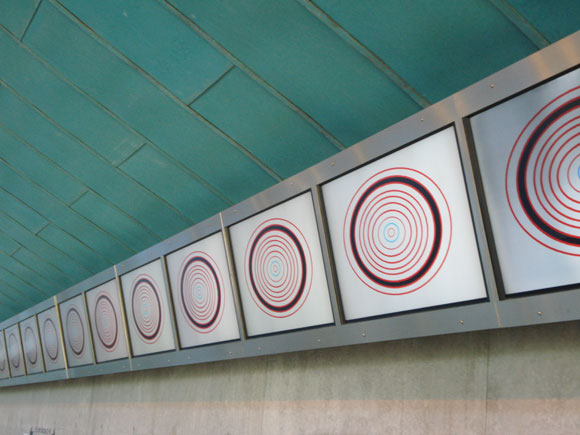
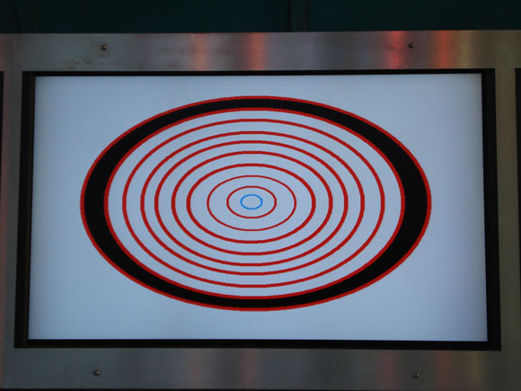
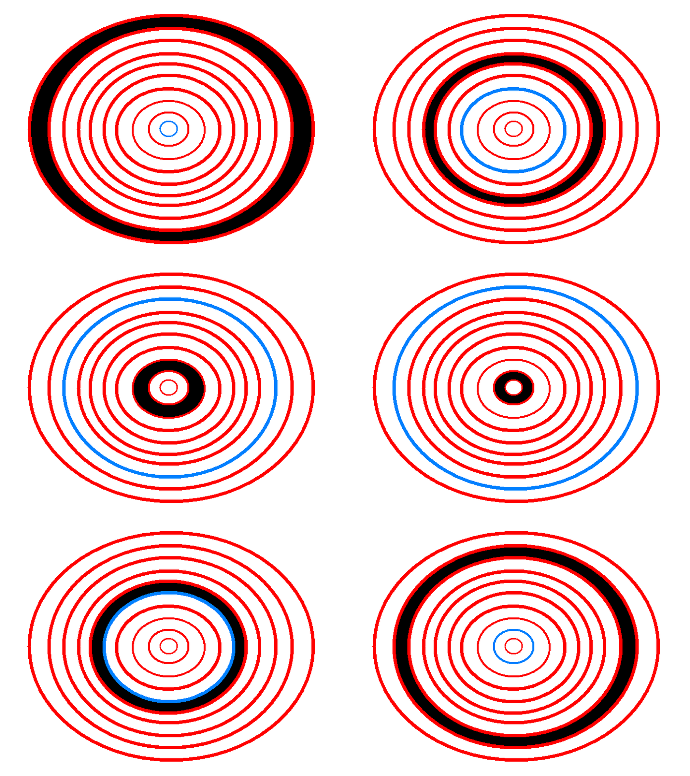
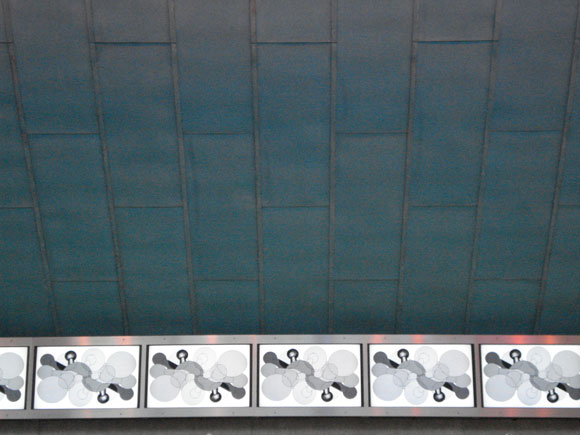
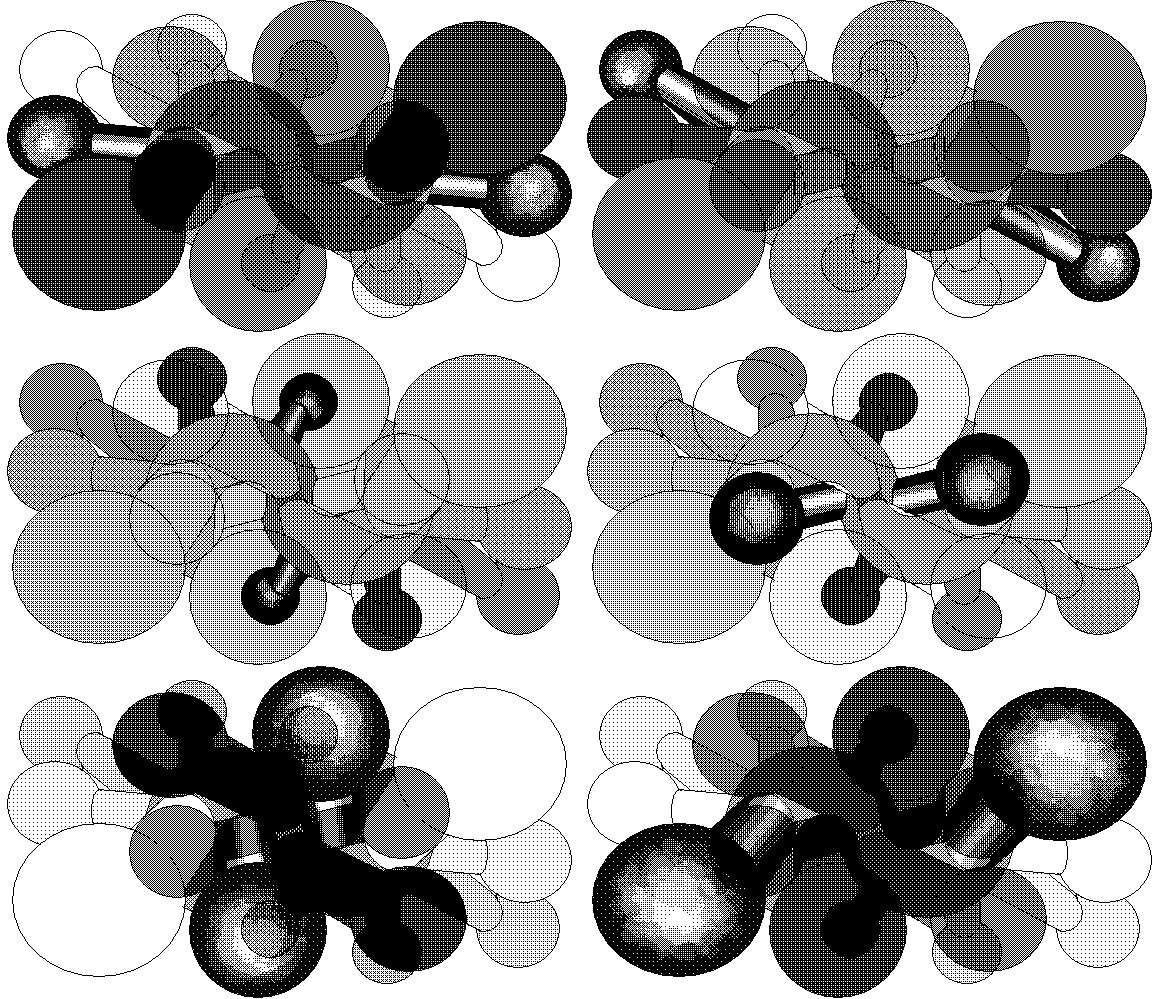
Documentation of my work in the "Fresh NY" show at Threshold Art Space, Perth, Scotland. Eleven of the 22 screens are shown. Photos by exhibition curator Anne Barlow. The OptiDisc GIF below is reduced; clicking on image shows the actual size (of the GIF--the screens are much larger).
return to main site
