View current page
...more recent posts


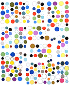
GIF grid by eyekhan
not ideal in RSS readers
Am currently in Charlottesville, VA, attending an anniversary event for the college radio station WTJU, where I DJ'd for several years and enjoyed a couple of bracing years of administrative responsibility (as program director). 'TJU is much like WFMU in NY*, a free form format with knowledgeable volunteers as jocks. When I was in school it was entirely student run and thus a creatively fertile chaos, but it has since hired a station manager who miraculously is not a micromanager and lets the volunteers continue to shape the content. Charlottesville is beautiful but barely recognizable from my student days for all the growth. It has been touted as a perfect city so of course everyone wants to move there.
*metropolitan area
Reporting from Washington DC. Checked out the newest addition to the Smithsonian's museums on the Mall: the National Museum of the American Indian. Dramatic yellow adobe modernist building with the obligatory giant atrium, nice for the architect's portfolio but hogging much of what could have been exhibit space. Some wonderful collections of objects such as a show of women's apparel with intricate beadwork and concentric rings of elks' teeth (only two of such teeth per elk, so the more rings the mightier the woman's husband's hunting prowess, according to the video). Unfortunately most floors gave prominence to exhibition design over artwork, presenting crowded mazes of computer-generated text-and-photo spreads and interactive video terminals. Actual artifacts, darkly lit against darker backgrounds, tended to be swallowed up in these seas of typography. Other problems: vague and blandly worded themes ("our people," "our universes"), no clear timelines or sense of geography, avoidance of any kind of overall narrative history. Haven't researched the politics of how the museum came together and what kinds of compromises had to be made (either among tribal interests or to sidestep the U.S.'s sordid past of mass native American disenfranchisement), but the murkiness of the design seemed purposeful. Not to overlook the simple problem of "too many cooks" in the layout or the ever-ascendant tendency of designers to think they're artists and overwhelm the actual artwork on display.
Belatedly posted photos here.
