Blogging, phase 2.1
Please come visit me at my new blog home at tommoody.us. As of this month, I will no longer be posting new content to digitalmediatree.com/tommoody. Comments are still open here (unless closed due to spam).
The newsreader feed for the new blog is this rss address. Or this one.
The blog you are reading commenced Feb 2001 and culminated, more or less, with BLOG, the exhibition, where it was shown in a gallery as a performance work. That exhibition ended last month, so the past few weeks' posts have been "transitional."
I am keeping all my Digital Media Tree pages online and will be updating many of them (resume, archives, etc)--this is a friendly transition and I look forward to continuing to work with the Tree.
The new blog does not currently have a comment feature enabled but that could change as I adapt to my new environment. Comments have been an important of the current blog and I'll be discussing that more at the new turf.
A parting plug: please check out the CD I just released with earcon (John Parker) at CD Baby, titled Scratch Ambulance. We're really proud of it and think you might enjoy it.
Update, 2013: I hid comments on this blog due to the steady drip of link spam. They were quite active from 2001-2007, trust me, and have all been archived. I may turn them back on periodically to settle an argument about what went down in these dynamic years of the utopian blogosphere. --TM
Update, 2021: CDBaby bit the dust (abandoning all its artists) so I removed that link. Scratch Ambulance is available from many fine mp3-mongers.

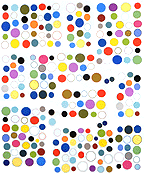
painting by Cynthia Hurley (hat tip mm)
At tommoody.us I just put up some new music, and a post about the '60s beatnik TV horror show host Ghoulardi. It's kind of an experiment, to work with a different format and post items without comments.
Update: More posts have since been added.

An interview with musician and animator Silicious, by Petra Cortright, commissioned by Rhizome.org, is on the Rhizome front page*. Earlier posts on Silicious are here.
I love the music of Silicious' video Georg: like slowed down Giorgio Moroder with call and response vocals, ringing telephones, etc.
Update: Just noticed that Rhizome tabbed the interview "ironic." That is way off base--this is very sincere and emotional work, and I believe Petra and others are sincerely interested in it. "Visionary," "playful," expressionistic," non-status quo," "angsty," "political," "disturbing" are the words I would use. Or "freakedelic," to use Daniel's term.
Update, 2011: The Rhizome link has been changed to http://rhizome.org/editorial/2007/jul/14/interview-with-silicious/
You might have noticed the CBS News story "McCain Backs Bush's Iraq Strategy" on the blogroll to the left for several months now (or maybe not--well, it's been there). Lots of other people linked to the story, too, and now it shows up in the top 10 Google searches if anyone is looking for information about Mr. Flak Vest in the Baghdad Market (aka Mr. Bomb Bomb Iran). It looks like his presidential campaign is tanking with the announcement this week of huge staff departures (yay!) so some blogroll space will now be devoted to another overrated individual aspiring to be the leader of the free world, with the inclusion of the following three articles:
Rudy Giuliani was kicked off the Iraq Study Group because he never showed up for meetings.If the thought of Giuliani as president makes you queasy and you have a blog or links page, you might consider getting the word out by pointing to these mainstream media stories, with the link around the words "Rudy Giuliani."
Rudy Giuliani was the only candidate not invited to speak to the firefighters' presidential forum.
Rudy Giuliani: worse than Bush. (Matt Taibbi article headline in Rolling Stone)
See also: this Firefighters Union video about "Rudy Giuliani: Urban Legend"--it mentions Giuliani's foolishness in locating his mayoral "Command Center" in WTC 7--destroyed on 9/11/01 and forcing him to go operate out in the street (while running away from the danger).
Update: Just noticed an extra "i" in Giuliani in some of the links--duh--fixed now.
Update 2: And here is a review of Wayne Barrett's & Dan Collins' book on the Giuliani myth, Grand Illusion: The Untold Story of Rudy Giuliani and 9/11.
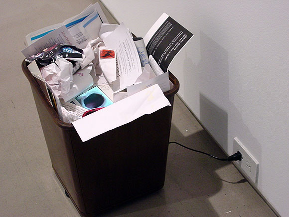
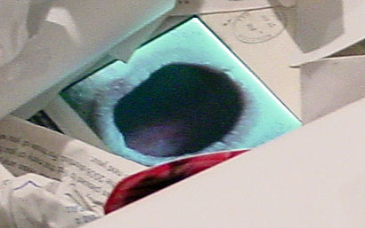
The Art Guys, Waste Stream (Video Trashcan), 2004. Currently on view in the group show "Ready-Made" at the Yvon Lambert Project Space, NY. The mouth in the trashcan strains to maintain its gaping rictus in the jittery video loop; the effect of looking down into the trash-lined "bunghole" is obscene in the best Bataillean sense. The show contains few actual ready-mades; this is an art gallery after all, and people want to see craft. Cady Noland, for example, is represented by one of her late fabricated aluminum cutout pieces and not her early found junk.
"Grow a Brain 2" [mp3 removed -- a remixed version of this track is now on Bandcamp]
Some nasty drum and bass for a nice summer's day.
Update: A couple of minor tweaks designed to take even more advantage of the (extremely) basic melodic content!
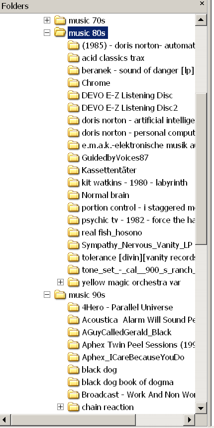
After one of my occasional anti-iTunes rants a friend asked me what I did for a content management system. He thinks one of the benefits of iTunes is that it organizes your soundfiles and you can search and create playlists within this data. Myself, I don't keep any permanent playlists (except a master file of music I wrote). For recreational listening I assemble temporary playlists piecemeal, picking and choosing songs from folders I've created on my hard drive. I use Winamp to find and play the files and save the playlists. Unlike iTunes, Winamp will stream them from anywhere on your PC (maybe iTunes has changed, but you used to have to resave all your music to a special iTunes folder).
My folders are organized roughly chronologically (by decade) and alphabetically within each decade. Thus I can visualize the entire collection and also think about relationships within it (once a rock critic always a rock critic--pity me). This scheme makes me less reliant on someone else's bad metadata from the individual tunes--a real problem with iTunes in my opinion. I do a fair amount of pruning--whereas I had a hard time deaccessioning CDs and vinyl I'm pretty merciless with mp3s. If it's not floating my boat it's not taking up space on my hard drive. As the collection gets larger I'll start breaking the decades down into years. Oh, and the folders also contain jpegs of covers and other info. The entire schmear is backed up on a separate hard drive.
Excuse this nerdy indulgence but I wanted to put forward a model different from the one Steve Jobs expects you to use as part of his entertainment colonization scheme.
Also, as I mentioned I don't use a portable mp3 player (headphones bug my ears) but if I did I would just move songs out of these folders and wipe them from the player when I was tired of listening to them. DIY, baby, DIY.
"VCJS (Slow)" [mp3 removed]
This is "Vox Computational (Japan Square)" at half-speed, minus about 30 seconds of the drum break.
Not every song is going to get the DJ Screw treatment, but this one works pretty well, I think, as a "romilar dub" piece.

"Vox Computational (Japan Square)" [mp3 removed]
A variation on a tune previously posted. I like the "compuvox" preset but it was so full-bodied it was masking things in the mix. This one has lighter leads and is a bit longer so I could hear some of the percussion stuff I liked. It's sort of stiff and halting by design. The arpeggios at the beginning are kind of an experiment.
In a previous post I mentioned my and John Parker's Scratch Ambulance CD was being marketed through iTunes. This led to a friendly email wondering why I'd changed my mind about iTunes. I haven't!
The company we used to press the CD also helps the artist market the work through a number of different indie and non-indie sources, one of which is iTunes. It's gonna be a couple of weeks before it's available.
I still don't have iTunes on my computer and still dislike it. I just don't dislike it enough to prevent a few pennies possibly coming my way by withholding my music from it.
I've never used a portable stereo type device (headphones hurt my ears) but I also like the idea of DRM-less sound files being freely distributable outside a monolithic single-company scheme.
On my computer I have Winamp, which takes files from my own foldering system.
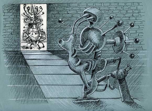
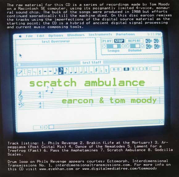
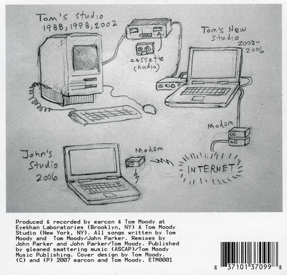
These are front and back scans of the CD cover for Scratch Ambulance, a music collaboration between John Parker (under his earcon alias) and me. The release has been "pressed" and in the next few weeks will be offered on iTunes and wherever fine alterna-CDs are sold. I designed the cover and John mastered the tunes. I'm happy with how it turned out. As the front cover explains, these are John's remixes of tunes I wrote on my old Mac SE from the late '80s until it died a few years ago. It is instrumental electro, a mix of old and new sounds, but more a present day artifact than a paean to the '80s. The idea was to preserve what was worth preserving from what we call "ancient digital signal processing" and composing software written circa 1984. The original music isn't archivally respected but rather sampled and used as mashup material, with many of the original melodies and harmonies still lingering. Also the files were passed back and forth on the Net so both of us are adding current material to the mixes.

GIF by Ryuko Azuma
See also these color-inverted telegraph poles
Thanks to Philip Shropshire for introducing me to this artist's blog.
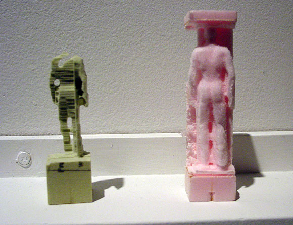
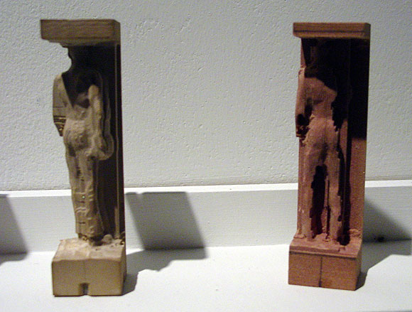
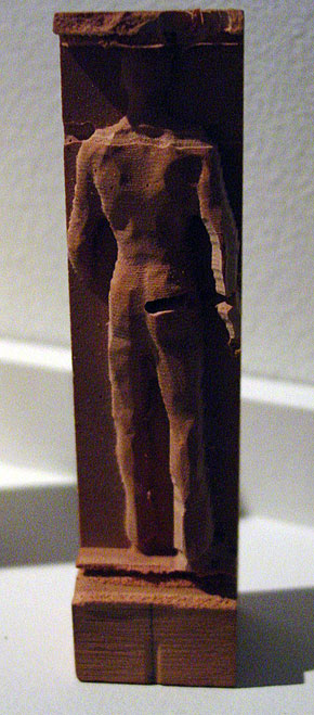
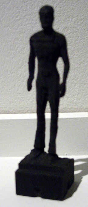

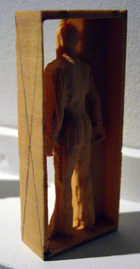
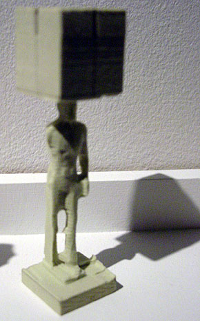
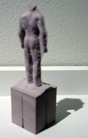
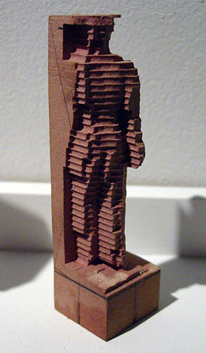
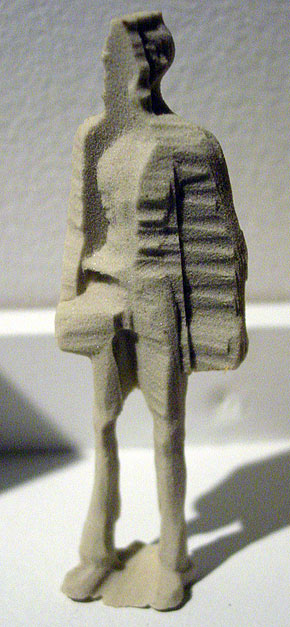
Figures by Mike Beradino at vertexList, Brooklyn, NY (show ended yesterday). An abject and rather intriguing response to Karin Sander and others working with rapid prototyping (3D printing) technology. These are made using some kind of (modified?) CNC milling, a reductive technique, but according to the gallery, extrusion (additive) techniques are also employed. Beradino puts different materials (styrofoam, wood, etc.) into the mill for computer guided laser carving, and there is also hand carving on some of the figures, I'm told. Instead of Sander's little everyman and everywoman miniatures, which relate to "life," Beradino's model is an avatar downloaded from the virtual world du jour Second Life--originally a smooth, Silver Surfer style humanoid--along with whatever artifacts and extraneous data come with the 3-D image file. Hence the cubes and frames attached to the figure and imperfect or grotesque forms. Beradino's statement suggests he takes steps to exacerbate the digital noise (see below).
(sorry about the odd sizes/focuses of my photos and the sketchiness of the info--these are rough notes and can be revised/corrected)
Karin Sander's work circa 1998 was always discussed in terms that exalted technology and the rigorousness of her process;
 this text from i8 Gallery in Iceland [dead link to text removed], for example, could be from a tech start-up's prospectus:
Karin Sander's 1:10 is a series of three-dimensional figures that are essentially reproductions of people, fully dressed, rendered one-tenth life-size in plastic acrylic. Each figure was created by a three-step process that begins with an elaborate, 360-degree computer-driven scanning apparatus that uses up to twenty cameras to produce a 3D data file describing in minute detail the appearance, posture, and clothes of the sitter. After seeing the scan represent-ed as a 3D wire model on a computer monitor, the sitter can have the technicians redo it. The final, sitter-approved data file is then sent to another company, which uses it to produce the actual 3D figure by feeding the data into a computer-driven extruder that sprays out thin layers of plastic acrylic, each representing a horizontal cross-section of the subject's body. When the figure is finished, it is sent to an airbrush technician, who colors it according to snapshots made by technicians at the time of the original scan. Curiously, at no point in this process is Sander herself physically present. Other than accepting or (very rarely) rejecting the final product, she chooses to make no decisions concerning how the sitters will be depicted. Some subjects arrive with suitcases of clothes at the company in Kaiserslautern, Germany, that does the original scans. What they wear and how they are depicted is wholly their decision, not the artist's.Beradino seems more interested in how the tech breaks down: "My works are physical recursions, between the digital and physical. These recursions are similar to a feed back loop such as a microphone next to a speaker. The speaker output signal becomes the input of the microphone and so on and so on. An object is created then digitized then produced then digitized then produced." This introduction of random, subjective, "wild" variables into a process that's supposed to be about creating near-perfect copies is much appreciated by this viewer, as is the celebration of the do-it-yourself factor, in contrast to the oppressive '80s/early '90s art model of mediating between corporate teams as a form of social sculpture with a well crafted collectible bauble as a result. Sander's work was considered paradoxically human or humanistic for all its mediated facture. Beradino's figures also have a quality of melancholy or pathos but it is the pathos of the cyborg, and a failed one at that, a reading only implicit (or repressed) in the Sander, which for all its rigor involved a fair amount of tweaking by "professionals" to get "right."

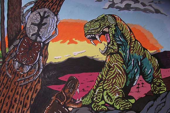


Details of photos from the blog Anaba a while back--the subject is an "outsider artist" mural done in the employee break room of a chain grocery store in upstate NY, depicting the history and future of life on Earth. (It took me two years to figure out how to enlarge and save flickr photos--duh.) My earlier post on this is here. Great use of color, as L.M. noted. Very anime-like. Regarding the third photo down, it's hard to imagine that an intelligence will rise 200,000,000 years hence to rival the one that put Kraft Crumbelievable and Ocean Spray high fructose in schools.
Update: the comments have an etymology of the vampire bats eating a whatsit image at the top. Demanding a clear chain of attribution from the first vampire bat to the last break room, the commenter asks why I didn't give the mural artist's name. Here's what I wrote two years ago:
It's beautiful work, but I'll let Anaba tell you its location and the name of the creator. I know we all fantasize about fame and fortune allowing people to quit their day jobs, but employers aren't Medicis (at least for very long). Projects like this usually exist only in the tiniest cracks of the ownership society. So why am I blabbing? Probably the same reason Anaba is: I want you to see those human-sized vampire bats eating that wolf-lizard, and the scrofulous Lovecraftian obscenity on the right engulfing that forest of fleshy pseudopods, which could be prescient glimpses of the future of life on Earth, or a stark allegory of present day emotions. (Not mine, of course!)
Claire Corey, ink on watercolor paper (Iris), 1995-1996:


The following article about group blogs, blogging-as-performance, and an emerging digital aesthetic or anti-aesthetic was published in the Irish Times for July 2, 2007:
Beyond Art and Design
Haydn ShaughnessyI wonder how many artists agree with this statement. "I reached a point as a critic and as an artist when it seemed like to be a painter everyone had a studio trick that they kept to themselves to differentiate their work." So says Tom Moody, one of the Web's more influential art bloggers and practitioners.
It seems to me honest and accurate and applies not just to painting. Everywhere we turn we're being asked to differentiate ourselves, not just as artists but through what we wear and how we do our jobs. Moody is speaking though for a generation who feel liberated by new technology, for a group that has gone beyond the frustration of trying to find minor points of uniqueness. Up until a week ago his was the first blog to be exhibited as an artwork at artmovingprojects in Brooklyn, New York. Artmoving projects made Moody's blog a live installation. Even if you haven't embraced blogs yet you'd be tempted to say: Wow, with or without exclamation mark! The blog as installation is yet another example of how virtual, simulated and real environments are blurring.
On his blog a few days ago Moody provided a shortlist of group art blogs (see below), the online equivalent of the cooperative studio. These groups collectively raise an important question about the aesthetics of art born digital.
"As a painter I felt there was no ground left to be broken," says Moody. "And we're faced with these other digital tools which are new and have a lot of potential but don't, we don't, have any kind of aesthetic."
A loose aesthetic for digital art is emerging though? What norms, practice, and social and visual aspirations might inform digital art? I had Tom on the phone recently chewing over that issue.
A growing number of artists are using blogs to display their work (we recently featured Chris Ashley here on Convergence Culture, an artist who blogs an image a day). The Internet allows artists to connect quickly with each other and one result of that is they create cooperative blogs, just like some choose to open cooperative galleries. But as Tom Moody points out the chemistry of cooperation can be better. There's little financial overhead and there's no sense that cooperation is a necessary evil. But here's the interesting part.
In posting to a group blog, says Moody, you make a judgment about the work you would not like to show on your own blog. [1]
Through that act you are implicitly helping to form an aesthetic. It's not that you post to the group blog work you are not identified with at all. But you are saying something about your choices.
The underlying statement is that the artist has different artistic identities. Somewhere in the judgment about where your work belongs lie unarticulated statements about the nature and purpose of digital art. This emergent theory of digital aesthetics absolutely suits the medium. The judgments are not articulated but they are out on show.
The lack of an aesthetic is not the only problem facing digital artists. Galleries are reluctant to exhibit their work because as yet there are few collectors and no secondary market. And there is a suspicion. A digital art work when reproduced on paper can be reproduced indefinitely. Old fashioned prints created by master printers were at least authenticated by a third party. The unease that galleries and collectors feel are important practicalities.
Just like conceptual art thirty years ago digital art needs bold collectors who will buy knowing that a selection of these works will grow exponentially in value. But to be attracted that far, you sense a collector needs to know there are underlying disciplines at work, purpose and coherence that is at least comparable with their previous experience, a sense that a generation of artists, rather than the odd maverick, is pushing the medium, and confidence that the practitioners are not simply going to fade away..
To get that far the artists themselves need to start articulating the kind of purpose that resonates with a sense of destiny. Many digital artists, or performance artists who use digital media to get works into print, recoil from the idea that they can game themselves up into a "movement". Nonetheless when I put it to Tom he acknowledged: "More and more. I think the artists I'm working with and collaborating with are moving in the same direction."
Another problem for the digital artist is that many of the tools of the trade were created for designers Microsoft Paint [2] and Photoshop are two prime examples. Websites that showcase art made from these tools, particularly the influential Rhizome, an atheist's Bible of new media art, are to Moody's way of thinking, pushing a design aesthetic rather than an artistic one. [3] I'm not wholly sure that I agree with him, or that digital art should separate itself from design, but the point proven is that articulating the digital aesthetic is still a work in progress.
Group art blogs:
http://www.supercentral.org/wordpress/
http://doublehappiness.ilikenicethings.com/ [4]
References courtesy Tom Moody: http://www.digitalmediatree.com/tommoody/
Artmovingprojects: http://www.artmovingprojects.com/
Rhizome: http://www.rhizome.org/
MY NOTES/AFTERTHOUGHTS TO THE ABOVE:
1. I can't take credit for this line of thought. It was first articulated by Nasty Nets member Marisa Olson on her blog: "[Nasty Nets has] been a nice place for me to follow thoughts I might otherwise censor or drop, and to make and post work I'd not likely post elsewhere..." The idea that an anti-aesthetic emerges from everyone on the site doing this is something I've kicked around with various members.
2. MSPaint isn't really a program designers use, it's an amateur program that ships with every edition of Windows. Adobe Illustrator would be a better example.
3. Whoops--if I said that it's not what I meant. Rhizome is an art site. Rhizome and Eyebeam often feature projects on their reBlog pages that I consider more in the nature of design problems (robot alarm clocks that roll away from you when you try to hit snooze, to use an example from Eyebeam). But it isn't accurate to say that Rhizome "pushes a design aesthetic rather than an artistic one." If anything, it's the notions of conceptual art embodied in digital practice that I find problematic, when they take the form of what some of us have called XYZ art.
4. Not all of these blogs--or individual posts on the blogs--are based on an aesthetic of "what I don't show on my own blog." Everyone has different motivations for what and where they post and I make no claim to speak for everyone on these sites.

Comments to this page appear to be experiencing technical difficulties (i.e., no comments are showing up). Please stand by.
Update: fixed, thanks jB!
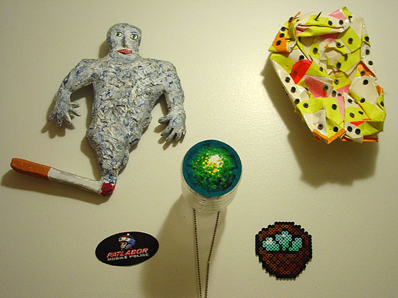
My kitchen wall, up near the ceiling. Clockwise from top left: Thor Johnson, John Parker, Mondo Mondo Trading Post, Patlabor Mobile Police patch. The thing in the middle is mine.
This is the obligatory "light posting for the next few days" post--summer is here and I'm going outside.
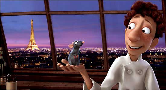
"Ratatouille is a nearly flawless piece of popular art," writes A. O. Scott of the New York Times, in a review accompanied by this picture:
Stephanie Zacharek in Salon calls it "one of the most beautiful animated pictures I've ever seen," in a review accompanied by this picture:
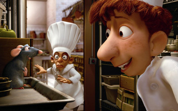
Any student or critic of art, popular or unpopular, knows why these statements are wrong and what's missing from these images and these movies (also Shrek, the Incredibles, Toy Story, and the rest): line. For reasons mostly of budget and a kind of unthinking rush to modernize, filmmakers have thrown out possibly the central tool in the history of visual expression, and replaced it with tricks of sfumato and chiaroscuro that give objects a rounded, "realistic" look but make everything in the frame bulbous and doughy. It would be like making music with no "attack transients" (sharp sounds at the beginning of notes that give them their texture and bite)--all music would become billowy and ersatz, like New Age music. Years after photography mooted realistic painting in the world of portraits and "scenes," these Tinseltown hacks persist in imitating photographic depth, using computer short cuts, and the results are often simply grotesque (see above--eyes without lashes that are merely encircled by reptilian lids).
It's not a fluke that Toy Story "pioneer" Jon Lasseter worships Japanese animator Hayao Miyazaki and has given his films a boost in the US. It's guilt from a fast food franchise owner at all the excellent cuisine he's displaced. Miyazaki is a poet of line.
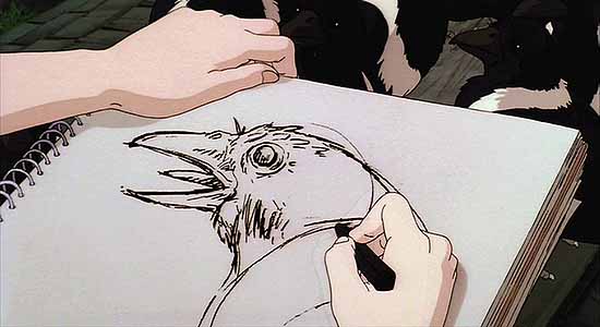

So expressive! Whereas Pixar and its offspring have the smooth, slightly frozen look of '70s album cover illustration done with an airbrush:
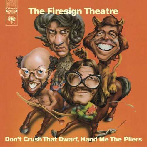
A topic for another day: the Pixar movies are also the embodiment of Disney Values. The plucky little guy triumphs over adversity and learns a valuable lesson. Whereas in real life plucky little guys have boots in their faces all over town, while the big entities (such as entertainment conglomerates) grow more and more dominant.
