View current page
17 matchs for bitstreams:
View current page
...more recent posts
Below is Paddy Johnson's review of Cory Arcangel's "...participatory culture" show at Team Gallery last year. While critical, it is ultimately respectful and merely expresses what many thought about the show but were too cautious to say for fear of jinxing the first non-sucky computer artist to break through to art world recognition. Including me, even though I felt the show was a step back to the "BitStreams" era. I'm bringing it up now because recent writing about the artist seems to be adopting a strangely defensive or belligerent tone--it's as if you have declare whether you're for or against him, and I think we need to get over this. This review was not reBlogged by Eyebeam or Rhizome, the main new media sites, which also seems like a partisan and slightly juvenile snub. The issues are worth discussing.
I have been spending a lot of time thinking about how to discuss New Media artist Cory Arcangels new exhibition, subtractions, modifications, addenda, and other recent contributions to participatory culture at Team Gallery, and its not the exercise in fun it usually is. Writing about my friends is great when Ive only got compliments to bestow, but its another ball of wax when I leave their exhibition with a mental list of artists who have done similar work.Dont get me wrong, subtractions, modifications, addenda, and other recent contributions to participatory culture, isnt entirely derivative, nor is it a bad show per say, but it does inspire a number of questions, that arent easily resolved. Probably the strongest work in the show is Untitled Translation Exercise, a modified version of Dazed and Confused, a film by Richard Linklater, which now features the redubbed voices of Indian actors performing the screenplay in English. The original movie is a coming of age story about a group of American high schools students experiencing the anxiety, boredom, and fervor of teenage years, so Arcangels choice to outsource the dialogue, both heightens the viewers sense of what it means to be American, and reflects the development of new industries in the United States.
Youd think these ideas would be enough to stamp the piece as good and be done with it, but I cant reconcile the feeling that the decision to outsource the films dialogue isnt entirely resolved. There are simply too many loose ends at play here. What does the work gain by outsourcing labor that has already been completed? Was it necessary to make a feature length movie? Does the films narrative support the alteration? These questions dont come up in Woody Allens similarly conceived, Whats Up Tiger Lily, a 1966 film whereby the director purchased a Japanese spy movie, removed the sound track and replaced it with his own. Clearly the two films are different, but you cant say the approach doesnt, at the very least, merit comparison.
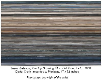
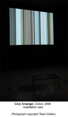
The other video based works in the exhibition do not invite specific film references the way Untitled Translation Exercise does, but they do seem awfully close to work that has already been made. Arcangels Colors for example, extends pixels line by line in the Dennis Hopper movie by the same name to create a moving vertical pattern reminiscent of New Media artist Jason Salavons The Top Grossing Film of All Time 1×1. Exhibited in 2001 at the Whitneys exhibition Bitstreams, the artist uses the average color of each frame in the movie Titanic, and arranges them in a digital c-print to follow the narrative sequence they would have appeared in. I suspect the programs each artist wrote to create their work were difficult to execute, but unlike the work of Salavon, those with even a small amount of website construction experience will be familiar with the technique of expanding pixels, and subsequently wont find the Arcangel manipulation all that interesting. Even without this knowledge, I imagine many viewers will still be left wondering what the point of the alteration is (other than to create a moderately attractive picture).
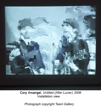
The reason these issues exist in this work, as with Untitled (After Lucier), a video loop of the Beatles on The Ed Sullivan show which compresses and loses image quality with each repetition, is that in each case, the content is subservient to the technology. And unfortunately, just as painting about painting is dull, so is tech art about tech. The thing is, Arcangel knows this, so despite the fact that some of the work in this show falls short, I have trouble believing that the exhibition is some sort of sign of things to come. Two weeks ago at Vertexlist, the artist performed pieces from his record The Bruce Springsteen Born To Run Glockenspiel Addendum (also part of his show), and while, I cant claim to understand why the record needed to be a remix album (the artist composed five Glockenspiel pieces for the Bruce Springsteen album Born to Run, in addition to the three Springsteen had already written, matched them to the time count of the music, and removed the original music), his performance demonstrated his usual brilliance. There was a charming awkwardness to his playing, which made the piece at once humble, moving, and strangely funny. In fact, it was so enjoyable, that the thought occurred to me that while subtractions, modifications, addenda, and other recent contributions to participatory culture, isnt the best thing the artist has ever done, if he had thrown a performance into his show, nobody would have ever known the difference.

Saturday, Jan. 28 is the last day of "Breaking and Entering: Art and the Videogame" at PaceWildenstein. Planning to go later today; have held off for two reasons: (1) really more interested in videogames for the music and the visual shortcuts than thinking about them as an art movement; and (2) For blue chip PaceWildenstein, final resting place for nearly-dead canonical artists, to jump on this particular bandwagon is a bit like watching your pot-bellied, combed-over high school chemistry teacher "krumping."
But I want to see the Cory Arcangel installation above: that image looks drop dead gorgeous to me, and I can't believe the artnet reviewer's mildly sniping take on this.
The normally dynamic Cory Arcangel offers a large, static projection of a video game fighter jet and clouds to complement a primitive "found video game" displayed on a small portable laptop. Titled Bomb Iraq, the game depicts a crudely drawn bomb that the user can bring nearer to an outline of Iraq by pressing the arrow keys. Its inclusion is fine as a document of Americas meat-headed relation to the Middle East, but does nothing interesting with it -- except to prove that video games can be used as found objects just like everything else."A static projection of a video and clouds"? Hello, mural painting? James Rosenquist's F-111, maybe? And would it be worth mentioning that the laptop game, originally found on a Mac in a garage sale (see GIF below for a taste), dates to the first Gulf War? That's fifteen years of meat-headedness! Arcangel's pretty post-found object, I'd say. Is this bit of brain-damaged DIY propaganda really in the same category as the arch, Francophone disquisition of say, a Duchamp snow shovel? Perhaps, considered with the wall mural, it's actually a straight-up political statement, reportage from the frontiers of TV-addled suburbia. Maybe when I see the work I won't wonder about any of this. If I'm wrong I'll fess up.
The artnet article by Ben Davis, about current tech art, is otherwise good: it covers Dorkbot and the Superlowrez show at vertexList, in addition to "Breaking and Entering." I like what he said about the inclusive, curious spirit of Dorkbot as opposed to the regular art world's closed-mouth competitiveness (my phrasing). More about that in a later post.

Update: Just saw the show and the Arcangel piece is definitely not "static": the clouds scroll and the jet engines shoot bitchin' flames (that move). One good thing about nearly-dead canonical artists is they generate lots of cash to throw at artist projects. Paper Rad's hyperkinetic video was especially effective in a museum-scale installation. And Jon Haddock's real-world tragedy Sims illustrations looked much better in a huge wall-sized grid than the scattering that were in the Whitney's "BitStreams" show. I was feeling kind of bad about the comb-over reference till I got to the gallery and was met at the door by a big security guard, who lurked not so discreetly while I was looking at the show. Stuffy atmosphere or what?
Update 2: Changed "rich, near-dead white guys" to "nearly-dead canonical artists" since this whole videogame art trend, at least as represented at Pace, while arguably youthful, is very white. I'm keeping the krumping reference because it captures the scene-killing absurdity of what Pace tried to do here.
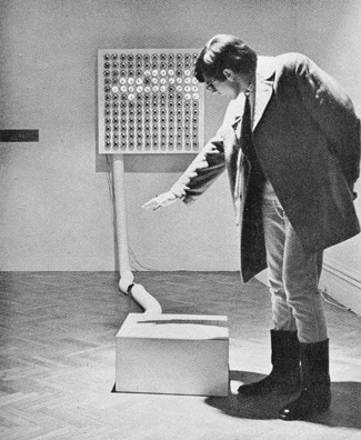
Juan Downey and Fred Pitts, Against Shadows, 1968
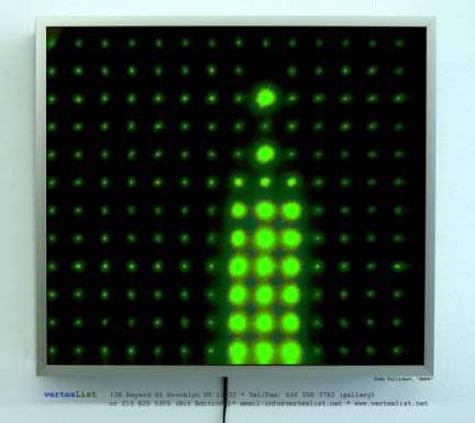
Jude Tallichet, EMPR, 2005, on view in the Superlowrez exhibit at vertexList in Brooklyn.
"Superlowrez" is an editioned series of Jim Campbell-like, or ahem, Downey-and-Pitts-like LED boxes. The 8 invited artists had the next-to-impossible task of distinguishing themselves as unique creative entities with a pallette consisting solely of a 12 X 14 pixel matrix, 8 levels of brightness for each pixel, and 1984 frames of animation (what each lightbox's chip holds). One of the more phallo-logo-ideographically punchy works, Tallichet's EMPR, is based on Warhol's Empire State Building film. The rest tended to blur together in the viewer's mind--in fact the 8 boxes looked like a rather handsome (if derivative) solo show. Lots of Space Invader-y looking stuff, as you might gather.
The sheer insurmountability and inadvertent bubble-popping anti-pretentiousness of the project reminded me of a piece from the '80s--PM Summer's 100 Photographers (Aborted). In that work, Summer gave a polaroid SX-70 camera to a range of different photographers--artists, art directors, photojournalists, product photographers, paparazzi--and asked them to photograph a small locked wooden box with a slot in the top. The polaroid was dropped in the slot and at the end of the project, the photos were removed and exhibited in a grid with no indication of authorship. It was amusing and sad to see how everyone struggled to be "original" with such a limited set of parameters: shooting the box from the ground looking up (check--several), shooting it blurry (bunch of those), extreme closeups (you bet), all black, all white, and not very many more strategems. Sorry to cast the pall of despair on the vertexList project, but I found the sociology, and the way the boxes got fractionally more interesting through learning the anecdotes and back stories about what each one actually was, to be more compelling than the visuals themselves. And since I'm in the "experience trumps narrative" camp--that's a criticism. Now, if I'd done one it would have been kick ass. No it wouldn't.
A friend emailed to say he finds the synth sounds I'm using to be a little too much like factory presets--what come packaged with the instrument before any user programming. He says he's not sure if it's "the lack of layering, or that they're dry and don't have many filter/pitch/mod/etc controls." He likes the "Guitar Solo" video, though. I replied:
Thanks for the suggestions. I haven't made any pretense on the page of using anything other than presets. My feeling is MSPaintbrush is one big preset, and your suggestions would be like telling me I should use more layering and effects in Photoshop, to try to be more naturalistic and painterly. Not saying I'm not listening and won't absorb some of [the ideas in your email], but I like things straightforward and stupid. The guitar solo was a total one-off, I had just bought Kontakt and started turning as many knobs as I could find--it started getting distorted. The piece got more interesting when I started chopping the notes up and repeating them in a Wav editor. There's really no layering. It's just off the shelf distortion and brute surgery.
But I'm interested in the compositions being some basic, minimal, easily apprehended structure as opposed to building up a lot of texture in the sound. In "Clip City" I meant to contrast the subtle drumming with that dorky keyboard arpeggio I wrote and played absolutely dry on the Sidstation. The thought of doing a fluid, Basic Channel type drum track appealed to me, but then I just rebelled. The only analogy I can come up with is bad painting. Why would you want to do something bad when you can do something well? (A dealer once asked me that.) On "Permanent Chase" I added a little chorus effect to soften the Sid, but it's totally preset city. I really like the sounds those Swedish guys programmed! I've been lurking on some electronic music chatboards and am amazed by some of the complex things people are doing with drum programming etc. But I find the glitchy granular sound overrefined and boring. My favorite techno music is blindingly obvious. I think maybe I don't care about layering and quantizing because I like to hear all the instruments, and I like machines to sound like machines. Kraftwerk always appealed to me because it was wind up music, like looking at the inside of a watch and seeing how the gears move.
My friend replied that part of his confusion about the music was "that it's kind of sitting somewhere between german trance and a more minimal conceptual sound work, and I guess my personal preference would be for it to be a little more one way or the other." I'm abbreviating his comments, which were fairly detailed in how the music could go in either direction. I appreciate the suggestions but I'm resisting, as I explained in my emailed reply:
I guess my feeling is "german trance" and "minimal conceptual sound work" are both known genres, with their own sets of conventions, but the space between the two is maybe not to so mapped out. I'm not just trying to turn your criticism into a compliment. I think all my best work occupies that awkward middle ground between "failed commercial art" and "conceptualism with imagery too stupid to look at."
Where I'm still a little uncertain is, do I really need to learn to make good trance with all those subtleties you mentioned, or is it possible to fail at it for artistic purposes with only a working half-knowledge?
Part of me would like to be a club star with German girls putting their hands in the air, which is maybe why the music gets better without being entirely there as dance music. I keep working at it because I like it.
But trance is basically a dead art form. What is the point of getting really good at it?
Sounds like maybe the one that's bugging you the most is "Lysergic Interlude"? Those are definitely presets, from the Linplug Alpha softsynth: one is called "club run." I can hear everything you're criticizing about its lack of subtlety, but at the end of the day I just like that wind-up music box feel. (I subtitled it "Ice Cream Dude Sells E" because it sounds like an ice cream truck to me.) And there's almost nothing conceptual about it.
Anyway, I know the music's not perfect. I'm just leery about improving it too much because I don't know how relevant or valid "good" techno is at this point. I also feel the deconstructive art things (with sustained loops etc) are either too familiar or not fun. (Not saying [your piece you described in the email] is bad--I'm sure it's great.) There was a lot of finesse in the music in the Whitney's BitStreams show but not one composition had a beat or a melody. My hope is to keep working in the middle ground and a few good things will emerge from that process
And is if that wasn't enough, I added in a later email:
The bigger philosophical issue for me is the same issue I faced as an visual art student years ago. I had a teacher who left a note in my portfolio at semester-end saying I needed to "face very squarely" whether I was a cartoonist or an artist, because he saw the former winning out most of the time. Arguably he was right and that's why I [am where I am today], ha ha. As for making "good" techno--part of me wants to, but part of me wants to stay innocent and incorporate the misconceptions, fixes and workarounds of the self-taught musician into the final product, which loiters irritably halfway between trance and conceptual art. (The musical equivalent of my paintings, maybe.) BTW, the recent songs that matter the most to me are "Posse on Greenwich," "Glitch Western," and "Robollywood," none of which are actually that trancy.

Juan Downey and Fred Pitts, Against Shadows, 1968, plywood, Formica, and electronic parts (photo by Shunk-Kender from Frank J. Malina's Kinetic Art: Theory and Practice, 1974). It's as simple as it looks: a grid of photocells on the formica cube responds to shadows and mimics them in reverse on the wall screen. The klutziness of it (e.g., that huge conduit) is, I believe, intentional. Downey's conceptualist-style statement for the work is still refreshing:
"If the choice were given to me, I would pick complete inaction for my entire life. Nevertheless, I persist in the activity of building electronic sculptures because:
Their existence or destruction is irrelevant to the life of them.Such a contrast with the Whitney's "BitStreams" show, where all the art had to have a purpose, and/or the curator killed it with pedantic overexplanation.
They cause people to play.
They make people aware of the vast number of different kinds of energy in the universe.
They are ephemeral. This is part of a new development in the history of art: to create works that are not supposed to last for a long time.
They pose a problem for the collectors of art objects.
They create the illusion that the public can participate in the work of art. Actually we are still spectators mystified by the order that makes the world grow and move, although, we pretend we are determining what happens to us.
It is fun to talk with friends about them.
They imitate aspects of movement in life. Art is more concerned with thinking about what people experience than with producing objects.
They make people aware of lively relations between different kinds of things.
Children like them.
Sometimes they produce a reversal of natural phenomena, for example, as demonstrated by the sculpture Against Shadows."
In case you haven't heard, curator Larry Rinder is leaving the Whitney Museum, not for another power-position in the art world but to return to the school from whence he came in California. Wow, can we have the last three years back? "BitStreams," "The 2002 Biennial," "The American Effect"--critically panned, enervating shows (or reportedly enervating; the picture of the superheroes in wheelchairs with IV drips, etc., did not inspire a $1.50 card-swipe for a trip uptown to see the last of the three).
The "whoops--never mind" of the Rinder years happened because of the Backlash Effect. Former director David Ross's supposedly "wild" programming (e.g. "Black Male") scared some trustees, so they hired "dapper fuddy duddy" Maxwell Anderson, as Slate.com described him (also now departed), as director. Anderson hired Rinder, who had served on the curatorial team for the bland 2000 Biennial. Despite a near-universally acknowledged mediocre eye, Rinder received much adoring press from non-critic journos, for reasons that remain mysterious. All that publicity, so little to publicize.
Just a few more thoughts on this Net Art thing (hey, someone has to do this, if the Times won't).
1. Early Net Art was made by software writers who knew their way around the enabling programs, hence the prevalence of flow charts, clickable steps, etc built into the art. Now, more artists are just working with the tools (image-making, sound-making software) and using the Net as a delivery system. This newer work is less about commenting on, reproducing or "deconstructing" the tools, or the Net itself--although those concerns do (and should) linger, since proprietary programs are controlling and kind of evil.
2. Early Net Art was made in a era of limited bandwidth, hence all the ASCII drawings and text-based art.
3. Bandwidth-hogging current Art on the Net (as opposed to Net Art) is aimed at an "elite net" of broadband users.
4. For a few examples of non/anti/post Net Art please see the links column to the left and my revised BitStreams roster.
Left: my lo-res, "remixed" clip of Rebecca Allen's Kraftwerk video Musique Non Stop, a pop-cultural landmark from 1986. The video was actually completed in 1983-4; Allen visited Kling Klang studios and hung out with Ralf, Florian, et al in Dusseldorf. They shipped their dummy heads to New York and she did the computer modeling at the Institute of Technology there. No slouch, Allen is another pioneer figure sadly overlooked in the Whitney's lousy "BitStreams" exhibition. Check out her website, which now has streaming video of some of her other projects, including the video wall for the Palladium in 1985, Twyla Tharp's "Catherine Wheel" projections, and more recent work such as "Bush Soul #3" (no, not that Bush), where clever science fictional extrapolation manages to overcome the overall new age-y aura.
This is the third in an informal series of posts called "Wireframe Aesthetics." Part 1 (John Carpenter, Tron, Stephen Hendee) is here and and Part 2 (all Tron, all the time) is here.
In the earlier thread on whether Ron Mueck is really still a Muppeteer, Sally gave some examples of things we'd miss out on with a narrowly drawn definition of "artist." One is "guitar solos as art performance," referring to a certain Cory Arcangel piece. But the art wasn't really the guitar solo, it was a mock power point lecture about hyperspecialized internet communities, in this case electric guitar nerds who devote whole sites and chatboards to legendary guitarists and famous solos. Arcangel took many of the technical details in the lecture from such sites, and then surprised the audience, at the end of the performance, with his prowess in playing Van Halen's "Eruption" solo note for note. The event combined visuals, talk, and music. Is the art world big enough to embrace this? I'd say yes. But what if Whitney curator Larry Rinder went to Williamsburg, heard a guitarist he liked, and invited him to play his instrument at the museum, as art?
Rinder is actually one of the worst offenders in the "I have the power to make you an artist" game. The 2001 Biennial included Samuel Mockbee's Rural Studio, which applied cutting edge design and economizing principles to housing for the disadvantaged in rural Alabama. The designs (captured in photos and models) were nice, but wouldn't this have been more meaningful in an architectural context? Also, could the NY museum audience ever really "get" the work without directly experiencing it? Rinder also bestowed Chris Ware's comix with the magic art aura, mounting the individual pages on the walls, behind glass, as drawings. But who's going to read all those pages in a museum gallery? There's an ideal form for viewing that kind of material--it's called the "comic book." The inclusion of Ware and Mockbee meant two less slots for validating folks who have been working away as visual artists, and who are possibly even expert at projects meant to be experienced in a gallery-type space.
Sally also mentions Damien Hirst's cut-up cow as something that perhaps took a wrong turn on the way to the natural history museum (my phrasing). Should it be banned from the art arena? No, because it's very self-consciously aware of how it fits in the chain of postwar art movements, referencing Minimalist seriality, the (Robert) Smithsonian critique of 19th Century museological and taxonomic principles, even animal gore a la the Viennese actionists...much of which ground (round) had already been covered in the '60s with Paul Thek's "meat in a vitrine" pieces, only not so literally. That's Hirst. But again, if a curator had a fishtank shipped over from an aquarium because he thought the tank-designer was an artist...
UPDATE: Some may remember my "revised BitStreams" roster included all kinds of folks outside the art world, which may seem like a contradiction. My point there was that in the case of emerging "digital culture," which is so new and undefined, you have to look elsewhere to find a technical yardstick and context. Rinder did that a bit in "BitStreams," he just picked crappy examples. Does that mean people who make title sequences for movies are artists? No, just that you ought to take them into account when evaluating whether, say, Jeremy Blake is any good.
When is a graveyard not a graveyard? Answer: when it's a porno set! The title of the above photo, by Laura Carton, is www.ebonyplayas.com--no, I'm not kidding. Other images by her are here, all pretty innocuous and bearing titles of x-rated websites. These are some of the best (wittiest, most patiently executed) examples I've come across of the "erased porn" genre, a kind of deliberate, art world cousin of those altered news photos the papers keep palming off on us. Each originally had, let's just say, a human figure or figures in it, but they've been removed in a photo program so you're left with a kind of empty stage for smutty-minded projection. To do them requires getting inside the image and matching colors and textures and light--basically making a photorealist painting, a skill similar to that of an "inpainter" who restores missing chunks of old masters. By removing all the hot action, the pictures become quirky vernacular photography, as much a catalog of the archetypes and tropes of "place" as Cindy Sherman's were of "feminine roles." The porn charges up the innocent or banal location, and Carton taps the residual energy.
I referred to what she does as a genre; here are a few more examples. The first is proto-porn: Kathy Grove's erasure of Thomas Hart Benton's pin-up nude from his painting Susanna and the Elders, leaving only the old codger staring at her blanket on the grassy riverbank. Istvan Szilasi, a Hungarian artist working in New York, and Arizona artist Jon Haddock (scroll down pictures at left), however, are doing work somewhat similar to Carton's. Szilasi doesn't attempt to hide the fact that he's removing figures, he's almost expressionistically sloppy in his use of Photoshop tools. I find his approach pretty amusing. Judging by the Kent State/Vietnam photos in the Whitney's "BitStreams" show, Haddock attempts to hide the erasure, but poorly--the telltale marks of the rubber stamp or "clone tool" are obvious, and not in a good way. Carton's images aren't infallible (almost nothing in Photoshop is), but they pass the "close enough" test when printed and laminated on Plex. On a content level, Haddock's porn photos are just a record of tacky motel interiors--there's none of the sense you get with Carton's work that porn is a strange mirror for the "normal" side of life: the everyday world of recreation, communications, plumbing, TV repair, dentistry, and, um, cemetery caretaking.
Revising "BitStreams" (a curatorial thought-experiment in progress)
"BitStreams" was the Whitney Museum's big "computer art" show in 2001. Like the Matthew Barney exhibit at the Guggenheim this year, it was an inexplicable hit with the general public but few artists I know (including many so-called computer artists) liked it. One problem was the curator tried to float a bunch of "discoveries" from the Bay Area and elsewhere that didn't measure up to the exacting standards of us rough, tough New Yorkers. The show suffered from a kind of mid-30-something parochialism, favoring a bunch of earnest data-crunchers the same approximate age as the curator over younger artists with a much more instinctive handle on the medium and also interesting pioneers, like Nancy Burson. And finally, it's tricky to include so-called pop culture in a so-called high art show but let's face it, there's stuff out there kicking the art world's sedentary ass. (George Bush helped word this post.) I wrote about the show here but continue to think of work that would have improved it. Some of the revisions below are tongue in cheek but most aren't:
John Klima ecosystm Joe McKay Color Game
DJ Spooky DJ Assault
Marina Rosenfeld Monotrona
Jeremy Blake videos Cory Arcangel Data Diaries and Clouds
Paintings "based on" the computer Paintings made with the computer
Lew Baldwin milkmilklemonade.net JODI % MY DESKTOP
Paul Pfeiffer Paper Rad
Jason Salavon The Top Grossing Film of All Time Jason Salavon Golem
John Simon LoVid
Planet of the Apes with sod Planet of the Apes without sod
The Spacewürm Scanner
Lutz Bacher dealercam 100 random camgirls/guys - videowall - nudity
Sally Elesby mouse drawings Kristin Lucas mousepad drawings
Jim Campbell Ambiguous Icon #5 (Running Falling) BEIGE ASCII hotdogs
Richard Devine Dynamix II
Jordan Crandall Matt & Mike Chapman
Inez Van Lamsweerde Me Kissing Vinoodh (Passionately) and/or Jon "Clone Tool" Haddock's Kent State/Vietnam backgrounds Laura Carton erased p0rn images
Jon Haddock Sims Tributes Creepy Clown
etc etc
JODI's current installation % MY DESKTOP at Eyebeam Atelier raises everyday machine disfunction to the level of the sublime. Occupying one long wall in Eyebeam's cavernous raw space, four standard computer screen desktops are projected side by side: two Windows on the left and two Apples on the right. The screens tower over the viewer at about ten feet in height. Invisible users appear to click the menus and desktop icons in real time, but what you see are actually recordings of these activities, presumably on DVD. To stand before the screens is to be immersed in an elegant chaos.
On the far left, a user attempts to move groups of icons to other positions on the same desktop. The new positions don't "take," but instead leave grey silhouettes, which gradually become cumulative, tangled masses of icon-shadows. In the middle left, the user methodically clicks unintelligible lists of wingdings, opening dialogue boxes full of more wingdings, and so on. In the middle right, sound files are randomly triggered, filling the space with a cacophony of clicks, martial arts grunts, and punching noises. And way over on the right, the letters underneath icons become long, conjoined strings of verbal gobbledegook, which are superimposed again and again.
There's nary a pigment stroke in sight, but the scale and handling of these pieces is very painterly, specifically Abstract Expressionist. JODI's process of cyber-vandalism--tinkering with browser software and then further abusing it through excessive, mindless icon-clicking--recalls strategies of "creative destruction" familiar from the work of the de Kooning generation (build up, wipe away, leave a residue, build up again...) It's also a cyber-critique, specifically playing on our legitimate fears that information-processing technology will break down when we're using it the hardest.
The messy visual record of "incorrect," panic-stricken choices is the kind of disobedient, Dionysian use of the computer sadly lacking in "BitStreams," the Whitney Museum's 2001 survey of computer art. If % My DESKTOP could have somehow been included in that exhibit, the focus and tone would have dramatically shifted from the utopian magic of thinking machines to their ad hoc, poorly-understood nature. With its size, ambition, and (refreshing) lack of reverence, it would have been a much stronger centerpiece than, say, ecosystm, John Klima's gee-whiz videogame salute to the raptor-eat-raptor world of global capital.
Nancy Burson was a digital imaging pioneer (art gallery variety) and her omission from the Whitney's BitStreams show last year was just one more example of that show's 30-something parochialism. That said, she kind of lost her way when she started taking photos of people with craniofacial deformities (can you say...exploitation?), and looking back at her classic work, it appears that the tech world has passed her by. Nowadays anyone with Photoshop can combine a man's face with a gibbon's (e.g., Will Self's Great Apes book cover from a few years ago), or give someone a bulbous forehead. And I always thought her "aging software" was a bit of a scam--taking what a police sketch artist does intuitively and dressing it up with pseudoscientific bells and whistles. Nevertheless, her morph of Reagan and Brezhnev (with a pinch of Thatcher, Mitterand, and Deng) is still a grabber. Also noteworthy is her Ordinaires CD cover, where the nine band members merge into a blandly smiling whole.
A website for her current retrospective is here, slow-loading Flash intro and all.
A few more images have been added to my slide show of low end graphics collage pieces. I've spent the last few weeks writing and revising my article on digital art, and am about ready to send it off. Sample quote: "[D]oubts continue to haunt digital work. New York Times critic Michael Kimmelman questioned its long-term viability in his 'BitStreams' review, fretting that 'today's hardware and operating systems, the digital equipment artists use, will be replaced shortly by a new generation of equipment.' That may be true, although you hear less and less about the doubling of computer power predicted by Moore's Law these days. What Kimmelman doesn't say is that imaging software hasn't changed fundamentally since the early '80s, when Apple added MacPaint to the desktop interface developed by Xerox PARC (Palo Alto Research Center). Nowadays, programs are pixel-based (Adobe Photoshop) or vector-based (Adobe Illustrator), they involve either layering (Photoshop again) or mapping textures onto polygonal armatures (a la Pixar and Industrial Light & Magic), but you still have the same combination of drawing board, tool menus, and spectrum bar that you did twenty years ago. Programmers and engineers have refined these basics, added more depth and memory, improved printing and screen technology, but haven't radically rethought how images are made. Until that happens, resolution remains largely a matter of taste, which the best artists know how to use proactively."
Jed Perl, art critic for the New Republic, is a scold in the old Hilton Kramer, "art's-going-down-the-toilet" mold, but reactionary criticism can be useful for focusing your thoughts. He gives "BitStreams" at the Whitney serious consideration, and then comes to the same conclusion that the NY Times and Village Voice did: so-called "computer art" hasn't arrived yet. Here's his pitch: "Art has for centuries now been more or less a realm unto itself, dominated by technologies which are distinctive precisely because they are throwbacks to a time when just about everything was handmade. The computer artist means to merge two distinctive modern sensibilities, two very different ways of thinking about creativity. Artistic thinking is cyclical. Scientific thinking is progressivist. The desire to bring technologies derived from the fast-forward world of science into the world of art is a perfectly understandable one, but it is a utopian desire, a desire to reunite what was long ago broken apart. Computer art remains a sort of pipe dream. It's the pipe dream of the moment." Perl is confusing artistic motivation with curatorial aspiration here: if you read the hype on "BitStreams," it's full of future-centric utopian claims (that's what my satirical 1969 news clipping makes fun of), but if you look at the art, you find that most of it is neither forward nor backward-looking, but focused intently on the present. My main problem with the show, in fact, is that it's too full of sound-bite-friendly, grad school-style critiques of "power relations" or "the media" (an eternal '80s nightmare from which we can't seem to wake up). Having said that, however, I don't think you can accuse the artists of using the computer just to be current. Most of them are doing so because it allows them to say things they couldn't say by more antiquated means. Worshipping the future may be problematic, but saying that art must always cycle back to the cave painting era is just as obnoxious.
Back up to the Whitney tonight for a panel on digital sound art. (I'm working on an article on "Bitstreams" and other recent digital shows, so a lot of the notes are going here). The panelists played excerpts from their work and/or performed, and then fielded questions.
Elliott Sharp used a small microphone attached by a cable to his laptop to make a pocket symphony of white noise/metal machine music. He held the mike in the air to pick up room sounds, twirled it like a lasso, dangled it over the keyboard, and hummed into it, but the sounds coming out of the speakers bore no resemblance to the sounds you'd expect to be produced from such activities. He constantly clicked buttons on the laptop, changing the texture of the sounds as he performed, from clicks to roars to feedback honks--all very downtown and "no wave" and enjoyable.
John Hudak presented "nature sounds as minimalist music": field recordings of crickets time-stretched into ambient washes. The lecture part of his segment was so timid and halting that I noticed the critic next to me writing "MINIMALIST SPEAKER" in her notebook.
The highlight of west coast artist Pamela Z's segment was a brief demonstration of the "body synth": a group of sensors attached to her arms that turned muscle flexion and extension (i.e. dance movements) into synthesized hiccups, trills, and Art of Noise-style vocal stabs. This could have been bad, but it was quite charming and unpredictable. Marina Rosenfeld played a live recording of her 17-woman band Sheer Frost, consisting of 12 guitar players (hitting the fretboards with nail polish bottles in accordance with a strict score of basic "moves") and 5 laptop players reinterpreting the performance in real time. This wasn't so good--it reminded me of Fred Frith's late-'70s experimental period when he was using a light bulb as a slide and refusing to do anything virtuosic.
Last, the inevitable DJ Spooky (with shaved head) treated the audience to a mad whirl of self-promotion (passing out stickers and LPs), name-dropping of French critics and American jazz musicians, and video-game style graphics from his laptop. The guy really talks the talk--"the net mirrors the street; as above, so below," "architecture is frozen music," and so forth--but does he walk the walk? I liked one loop where a brief flurry of typography on the screen was accompanied by steroid-enhanced Smith Corona sounds, but I was not convinced by his manifestation of "dub architecture": wireframe images of a 3-D graffiti tag writhing above glass-and-aluminum balconies. He brags about his club dates but he's really a creature of museums, wowing curators with drum-and-bass and hip-hop quotations. I would have enjoyed him more if he wasn't so pedantic: "Have you ever heard of [so-and-so]? You haven't ? Well, he invented the record sleeve!"
I made my debut at the Whitney Museum today. Well, in the sense that anyone could who attends the "Data Dynamics" portion of the "BitStreams" exhibition. Maciej Wisniewski's netomat (TM) wraps around three walls and projects large, floating, overlapping images (and text fragments) on a floor-to-ceiling scale. You sit down at a keyboard and type in a word or phrase, then netomat searches the web, pulls up words and pictures corresponding to what you typed, and blows them up to enormous size on the darkened gallery walls. This is real Exploratorium, Montreal Expo '70-type stuff, of limited artistic interest but fine for fifteen minutes of farting around. The brochure describes the software as "a new audio-visual language designed specifically to explore the unexplored internet," but that's just hype. Essentially netomat is a search engine, not that different from Google; instead of giving you a list of "hits" it goes directly to the sites and starts grabbing words and pictures. The program then enlarges the sampled content, colorizes it, layers it over other content, and causes the sampled snippets to creep inexorably around the walls. Also, there is another terminal nearby, so it's possible for you and another viewer to display two sets of information and have a slow-motion "image duel" (which sounds exciting, but it isn't really). When I came in, the walls were full of Jennifer Love Hewitt photos and various unrelated ad banners. I lamely typed in "Frankenstein" and about four minutes later, pictures of Boris Karloff and Gene Wilder began to surface (the program also found a really poorly-rendered boltneck that reminded me of a Jim Shaw drawing). The woman next to me didn't speak English well but quickly caught on, typing in "Wharhol." I suggested deleting the "h," and soon images of Andy appeared, superimposed over Boris. Opportunistically I typed in "'Tom Moody' +artist," hoping a choice pic might show up; instead I got the words "Op Art in the 90s by Tom Moody (originally published in VERY Magazine #3)" (which I recognized from the Abaton Book Company website), printed in purple and emblazoned across thirty feet of wall. Unfortunately the museum was closing up, so I didn't get a chance to use "katie holmes nude naked no clothes" (an actual search request from a site that logs such things) to test the kidproofing software.
