View current page
...more recent posts
Sue de Beer, Making Out With Myself, 1997, color video short.
Sue de Beer, whose work will be appearing in the 2004 Whitney Biennial, started her career with some fairly blunt, often violent imagery, circling around the theme of the doppelganger. (An essay I did on Heidi 2, her collaboration with Laura Parnes, fills in some background.) She is fascinated by the late-90s high-school shootings and adolescent trauma in general. Her 2-channel video installation last year at Postmasters, Hans und Grete, featured a male and female actor, each of whom played two parts: a Gothic and a "normal" teen. Highlights include a sex scene with giggle-inducing prosthetic ejaculation, the bloody dismemberment of a stuffed dog, and some seriously wack guitar playing, taking place mostly on charmingly handmade sets littered with heavy metal posters and bits of Teutonic kitsch such as plastic garden gnomes. Two stock "bored teenagers in class" scenes used sampled teacher-student dialogue taken from Nightmare on Elm Street (a discussion of Shakespeare) and Halloween (a much headier colloquy on Thomas Costain and free will with brainy Jamie Lee Curtis nailing the answers). The video shifts back and forth between good kids and bad kids, all of whom seem equally alienated, with much mawkish diary reading and eventually, gunshots.
An issue de Beer wrestles with is the impossibility of a true outsider stance, in a world where goth, punk, and goth-punk moves are heavily recycled, researched, and marketed. Like an art world version of Quentin Tarantino, who equates film and life, she makes no distinction between real teens and media teens, and the boredom we sometimes feel listening to/watching their existential dilemmas mirrors the vacuity of popular entertainment, from coming of age films to reality TV. It made little difference to me to learn that the parts of the script were taken from writings as diverse as Ulrike Meinhof's and Kip Kinkel's; it all sounded like bad TV dialogue of "disaffected youth" to me. Whether the kids shoot up a school or become CEO of Raytheon, they (we) all wade out of the same sludgepool of media cliches. The banality of the dialogue is belied, however, by de Beer's complex mise en scene mixing game imagery/sounds, cult insignia, scrambled architectural references, and pop culture bric-a-brac from both sides of the Atlantic.
De Beer's next work shows signs of brightening up: perhaps her trajectory will be the reverse of Cindy Sherman's ingenues-to-vomit trail. Below is an image from a new installation titled The Dark Hearts, "a nostalgic romp through punk coming-of-age in suburban America. Part road movie, part Mike Mills romance, the loose narrative revolves around two teenagers sneaking out of their parents' house to go prowl the neighborhood." Looking forward to seeing where they go (and she goes).
Shown here is Lord Norman Foster's original proposal for the Hearst Tower completion project (see previous post). While very much in the spirit of Belgium's Atomium museum, which resembles a giant molecule, Lord Foster's design was even more radical, taking into account environmental and social engineering concepts unknown to the earlier Modernist architects from whom he draws obvious inspiration. The left hand picture shows the building in warm weather, in the so-called "erectile" state, taking advantage of solar energy and prevailing breezes in the summer to cool the interior. In the right-hand, or "cocoon" state, shown as a greatly simplified computer model, the building reconfigures itself in the winter months, through an ingenious system of moving floors and flexible outer panels, to a squat, easier-to-heat shape. The entire building is open plan, which means Hearst employees would have a seasonal scramble to claim new work space in the reconfigured structure, thus breaking down rigid social hierarchies and territorial codes not just in two dimensions but three, possibly four.
On viewing the design, Hearst executives were not kind, offering comments ranging from "are you insane?" to "lose the Christmas ornaments." To satisfy corporate higher-ups, the overt molecular reference and shapeshifting design were removed, leaving a futuristic-looking but merely decorative shell. Despite the structure's incongruity with 75 year-old Art Deco "base" that is to support it, the watered-down project sailed easily past the Landmark Commission.
Artist Bill Schwarz refers to a certain type of architectural addition as "spaceships settled on rooftops." Above is a picture of the one that will "finish" the Hearst building at 8th Ave. and 56th Street in Manhattan. Construction was halted during the Depression (I'd previously heard it was during World War II due to steel shortages), and "resumed," with a slightly different plan, this year. I believe the original five-story deco structure is in the historic registry--it always looked oddly truncated, but if it's going to be a "base" for something, dear God, why does it have to be this? A compendium of articles here calls it a "lava lamp," but I think I prefer "geodesic sock puppet."
UPDATE: According to some of the linked articles, the "base" was built by Joseph Urban in 1928 and the structure never completed because of the onset of the Depression and the decline in William Randolph Hearst's personal fortunes. It was designated a Landmark in 1988, which means the Landmark Commission actually signed off on this turkey of a "completion" project!
UPDATE: I want to be as clear as I can about why I find this design ludicrous. I'm not opposed to "parabuildings"--Herbert Muschamp's intellectually dishonest term for add-ons usually motivated by greed or vanity, but sometimes just to pay the mortgage--nor am I some Prince Charles purist who hates Modernist-style architecture. The Hearst building is like mixing stripes and plaids though. Not only is the combination of building styles jarring and ugly, the Modernist top is a sham. The "Fuller-esque" structure serves no practical purpose, it's just modern-looking cladding over your standard post-and-lintel box.

The hiphop years: detail of F-Factor 2.

![]()
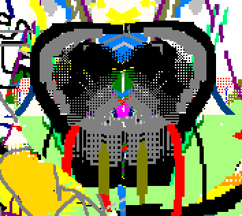
"Pixel Monster - Faier" by pixelthork at 400 X 350 pixels
Below are some Flash claymations (and one cartoon) by Prikedelik. Incredibly crude clay figures act out the artist's raging id in a perfectly ordinary apartment setting. Against background scenery consisting of books, papers, cigarette packs, and computer hardware, these lumpen, miniature superheroes dance, fight, and try their best to survive the blind forces of nature. Much of it's mindless slapstick ("cautious," "repressed," or "anal-retentive" are not words you would use to describe this work) but like the best slapstick it's funny. Turning on the speakers is recommended as the accompanying music--heavy on the electronic club anthems--is choice. Some shorts are interactive, so if you see a command like "Dance" or "Die" be sure to click it. Animations load quickly on broadband; not sure about dialup.
| Death to the Blue King! Destiny (interactive cartoon) |
Congratulations to Sue de Beer, Cory Arcangel/BEIGE, and James Siena for getting picked for the Whitney Biennial this year. Other names I appreciated seeing on the list were Erick Swenson, Yayoi Kusama, and Richard Prince, although you couldn't find a more unrelated group of artists. I had a longer post written with my thoughts on this year's lineup, but I just don't feel comfortable second-guessing the choices. Well, yes I do, to the extent I don't understand the inclusion of Robert Mangold, Paul McCarthy, Robert Longo, or Elizabeth Peyton. The institutional politics and horse-trading that go into such a high-profile project weaken it considerably, and one always wishes it would say more. Sometimes the curating's just bad: Larry Rinder might have pulled off his "high tech/primitive" duality last time if he'd picked more compelling art. Anyway, I was glad to see some people in it this year whose work I really like.
UPDATE: Someone asked to see a list of the artists; it now appears in the comments to this post.
