View current page
...more recent posts

Digital Nendo (Digital Clay) - 3D Bitmap program from '97 by Hideki Nakazawa. Be sure to check out the animated screen shots. I haven't downloaded the program--the Japanese online store is a bit daunting to this lazy American surfer--but would be interested in seeing any gifs made with it. That "octopus ink" is awe-inspiring. [via]
Notes on the 2004 Whitney Biennial
1. If you like work made with a jigsaw, painted, and stuck at right angles to the wall, this is your Biennial.
2. Started on the 2nd floor and worked up to 4. "Is this the fey, twee Biennial or just the fey, twee floor?" ("Fey": everything from Banks Violette's black, stalagmite-infested drumkit to Elizabeth Peyton's pale, perpetually red-lipped popstars; "twee": the preponderance of little craftsy cut out-y things in the show. Sensitive boys meet sensitive girls and ignore each other for their respective playworlds.)
3. Stood gaping at Assume Vivid Astro Focus' busy, businesslike post-psychedelic installation for a long time and finally said, though gritted teeth, "I don't like this."
4. Bad painting, and not in a good way: Mel Bochner's happy, colorful "word art" channelling Jessica Diamond, Kay Rosen, et al. Laura Owens' fake-zany, fake-clumsy giant tree with birds, etc.: uggh. Cameron Martin: boring!
6. Too many installations!
7. Wanted, for curatorial malpractice: Shamim Monin, Chrissie Iles, Debra Singer. Crime: Placing Cory Arcangel/BEIGE Nintendo clouds piece next to brilliantly lit mirrored room, washing out the lower right corner of the video projection. If they did this to a Barnett Newman they'd have old men with cigarettes hanging off their lower lips and romantic stubble sending them critical letters the rest of their lives.
8. Too clever by half: Golan Levin's interactive piece on the popularity of numbers. Does "3" beat "89908" for the most uses out there in the world? And what are those uses? Scroll and see! If this is a satire of the computer nerd's relentless drive to quantify everything, it's pretty good; if it's a celebration of that same tendency it's the world's most elaborate executive toy.
9. Having said all this mean stuff, the show was still fun: better cumulatively than object by object. Even mass infantile regression beats Larry Rinder's earnest, tedious 2002 effort. It helped seeing it with a large audience of toddlers, teens and bus-tour seniors: through their eyes, it was an adventure. If only that sense of awe & enthusiasm could be piped into Chelsea's dreary classist environment.
10. Best of show: the films and videos. Sue de Beer's two-channel piece, discussed here earlier, works even better in a small room than it did in Postmasters' big cube. It was great to see the Jack Goldstein loop, an undersea travelogue missing only a Film Board of Canada soundtrack and boomy male voice saying "When lava pours out of the sea mount, islands are formed..." For positive things about these and other artists, please see Sally McKay's report.
UPDATE: Here's one explanation for all the "youthful exuberance." I'm told that in setting up studio visits outside NY, the curators asked to see "young artists." That sounds like pimp talk. Hypothetical local museum director: "Are you looking for someone good?" "No, we're looking for someone young."

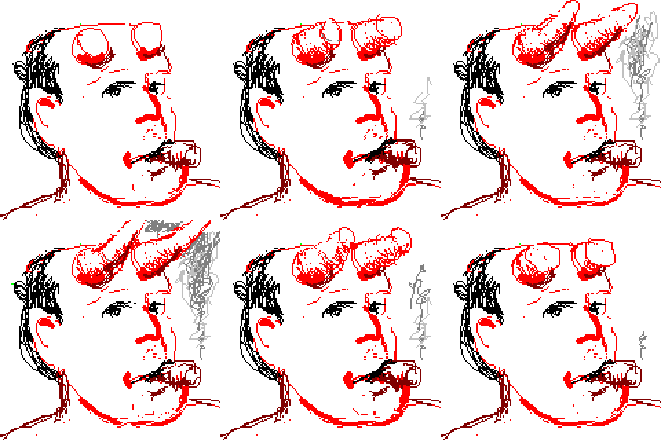
Ralf Hutter of Kraftwerk. The second most influential pop group after the Beatles is touring in support of Tour de France Soundtracks, their first CD of new material in 18 years. While not as aggressive, funky, or strange as their earlier work, it's good: kind of shimmery and ambient and yes, they can still write hooks. "Vitamin," "La Forme" and the remixed 80s hiphop classic "Tour De France" are quite hummable. They sound as if they spent all those years tracking down every trace of hiss and hum in their studio and then carefully mastered every millisecond because it's an amazingly clean, refined production. One thing they still have over the generation of electronic dance musicians they inspired is great technical finesse, and I'm guessing machines expensive enough to produce sounds and textures beyond the budgets of most basement producers. They don't flaunt it, though; the music is very understated. More tour photos in addition to the ones above, by Swedish photographer Henrik Larrson, are here. A review of the Brixton Academy show is here. |


Proposal for Abstract Expressionist Wall Projection (Party at Bill Gates')
"Knowledge Transfer"=Train Your Indian Replacement
Here's a sickening story, from USA Today, explaining how job outsourcing works. You get a pink slip, and are offered one more paycheck and some increased severance if you will train your replacement. A new employee, who will be working for about one-fifteenth of your pay, is flown over from India or China for a few weeks, and you get to teach him or her how to do your job. This is called "knowledge transfer."
UPDATE: I removed my angry comment about this story because it didn't make me feel any better. Suffice it to say, labor issues are growing steadily worse as society becomes more mobile and faceless. You cant picket the big factory on the hill because nobody knows precisely where the owners are anymore. And by having security guards escort you out when you're laid off, employers never see your face or feel any consequences of their actions.
UPDATE: See the comment to this post for more on the mechanics of "knowledge transfer."

From Aaron in Japan, the website of a Japanese-speaking Canadian working for Hitachi in Yokohama. Many affectionate bad english quotes, a Dance Dance Revolution page, photos. Almost as good as traveling there.
Just a few more thoughts on this Net Art thing (hey, someone has to do this, if the Times won't).
1. Early Net Art was made by software writers who knew their way around the enabling programs, hence the prevalence of flow charts, clickable steps, etc built into the art. Now, more artists are just working with the tools (image-making, sound-making software) and using the Net as a delivery system. This newer work is less about commenting on, reproducing or "deconstructing" the tools, or the Net itself--although those concerns do (and should) linger, since proprietary programs are controlling and kind of evil.
2. Early Net Art was made in a era of limited bandwidth, hence all the ASCII drawings and text-based art.
3. Bandwidth-hogging current Art on the Net (as opposed to Net Art) is aimed at an "elite net" of broadband users.
4. For a few examples of non/anti/post Net Art please see the links column to the left and my revised BitStreams roster.


