View current page
...more recent posts

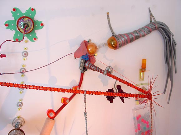
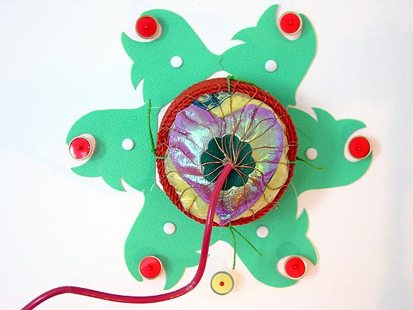
Details from an installation by John Parker at The Front Room, Williamsburg, Brooklyn. The compacted, obsessively joined household materials somewhat recall Sarah Sze's early work but with more of a playful, Digimon vibe. I actually prefer Parker's sense of geometric pattern and general all-around oddness using twisty ties, wire, tape, wood screws, electrical hardware, light bulbs, plastic bags, etc. Other artists working in the "geometric assemblage" vein include Lucky de Bellevue and the British artist Daniel Coombs, excellently documented on James Hyde's site. Last day for the Parker show is tomorrow, Sunday, May 30. Gallery info is here. More of my installation pics are here. Parker is also a musician; my review of a recent show of his playing with The Man From Planet Risk is here.

Lynn Cazabon at Schroeder Romero, Williamsburg, Brooklyn. This very painterly looking image is actually a photograph, and the subject of the photo is a film. What you are looking at is a long strip of film that has been unspooled from its canister and arranged in looping, floral patterns, then photographed edge-on. The large digital photoprint is mounted as if it were a projector screen. Other works in the show are done similarly; all are (16mm?) films recently discarded or de-accessioned from a public collection (the Pratt Library in Baltimore). I kind of hate Cazabon's implication that "pretty, formal work" is what you do with a dead or rapidly-becoming-obsolete medium--in other words, make intricate filigrees for what she calls film's "casket" or "memento mori." Pretty patterns can also be vital, as we shall see in the next post. Another thing this work perversely brought to mind was the old Echoplex analog tape delay, which had a similar (if not as baroque) looping of tape inside its guts, to make cool spaced-out sounds back in the 60s and 70s. That's obsolete, too, but fondly remembered, as this google search page shows. [hat tip to bloggy for reminding me to see the Cazabon show]
This post by the Blogger Formerly Known as Calpundit links to a video of US soldiers in a helicopter machine-gunning three Iraqis into bloody piles of meat. You can't see the meat because it's a pixelated black and white image--looks just like a cool video game, or a Tom Clancy movie. Two of the Iraqis are killed instantly. Another crawls out from under a truck and starts a kind of agonized, flopping roll across the ground--obviously he's wounded and unable to stand. One of the soldiers calmly says "hit him," and we see him also splattered by gunfire from the helicopter.
I'm not sure which is more disgusting, the video or the fact that Kevin Drum and the majority of commenters on his blog
can't make up their minds if what we're seeing is bad or good. Since the US invaded Iraq without cause, thus making an insurgency against foreign occupiers justified in the eyes of most of the world, it's hard to understand how Drum's obviously well-educated, center-left commenters can say things like "it's war" or "they're just kids" about this cold blooded killing, especially of
the wounded man. Those pilots did have another option: it's called flying back to base and saying "I don't want to do this shit anymore." Call me naive, but there it is.

work in progress
 "Oh boy...Lugia. Quite possibly the cheapest Pokémon since the Amnesia Mewtwo of the RBY days, Lugia is capable of taking out 2/3 of a rival trainer's team before they have time to realize what is happening. With a 358 Defense, a 406 Special Defense and the ability to Recover at will, Lugia is quite simply VERY hard to kill. Does it really matter what your offensive stats look like if you have all the time in the world to whittle your opponent down whilst they fruitlessly whale away at your well nigh impenetrable defenses?"
 Illus: Lugia Flies High, by Krystal Ishida.
Just a couple of quick observations on the Susan Sontag New York Times Magazine essay on the Abu Ghraib photos. She talks as if the photos were exclusively private pics that soldiers were passing around, and relates the activity to webcams, internet p0rn, school hazings, etc. Some of that's valid pop-sociological speculation, but it's also been reported that the picture-taking was officially encouraged, used to humiliate and blackmail the sexually prim Iraqis. ("What do you want from me?" "Ve vant...ze information. Do you want ze family to see zese pictures?") Her "soldiers running amuck with cameras" argument plays into the government propaganda that a few unsupervised crazies were behind the prison torture. Also, she talks about our "quite justified" invasion of Afghanistan, something lefties love to throw as a sop to the right to make complaints about Iraq seem reasonable. Justifed how? By not catching Bin Laden? By jumpstarting the heroin trade over there again? Killing and bombing for women's rights? That war wasn't the right response to 9/11 any more than Iraq was. It was just to make the majority of Americans feel better after the government failed them on 9/11, by bombing some Muslims.
[UPDATE - this post has been completely rewritten since its original appearance.]
In his May 21, 2004 column, the New York Times' Frank Rich mentions the "Let Them Eat Cake" quote of our time--Barbara Bush's statement in a "Good Morning America" interview given a few days before the commencement of Iraq War (March 18, 2003). She and the first President Bush discussed the invasion from the armchair perspective of two old folks sittin' around the house:
DIANE SAWYER, ABC NEWS: (OC) You said that, that Mrs. Bush at one point had said to the two of you, don't watch too much TV. You may be watching too much TV.The "him" she's apparently talking about in that last sentence is Bush Junior, who doesnt seem to be suffering much in a clip from Michael Moore's new film Fahrenheit 9/11, as Rich noted--it's the much linked-to video where he clowns around as he is being made up for his televised announcement of the Iraq invasion. When I first read the Barbara Bush quote months ago, I didn't realize she was talking about her son, though. She uses "he" a couple of times, referring to her husband, and it seemed weird for her to be talking about "watching him suffer" with Bush the Elder sitting right next to her. (Maybe if I wasted my own beautiful mind watching more TV, I wouldn't have to parse these nuances from internet transcripts.) At any rate, my initial reaction to Rich's column was that he'd read it wrong, which I unfortunately blurted out in the first published version of this post. But I guess she is fussing over her poor suffering son, so lonely at the top. Privately she probably wants to knock him upside the head for embarrassing the family.FORMER FIRST LADY BARBARA BUSH, UNITED STATES: No question.
DIANE SAWYER, ABC NEWS: (OC) You do watch?
FORMER FIRST LADY BARBARA BUSH, UNITED STATES: I watch none. He sits and listens and I read books, because I know perfectly well that, don't take offense, that 90 percent of what I hear on television is supposition, when we're talking about the news. And he's not, not as understanding of my pettiness about that. But why should we hear about body bags, and deaths, and how many, what day it's gonna happen, and how many this or what do you suppose? Or, I mean, it's, it's not relevant. So, why should I waste my beautiful mind on something like that. And watch him suffer.

Two good shows glimpsed at the Chelsea Concrete Outlet Mall yesterday: Tony Feher at D'Amelio Terras and Tal R at LFL. One is sculpture, the other painting; both are relatively unmediated, primal, happy work. But here, let's let the NY Times' Ken Johnson deaden Feher's show for us:
Tony Feher makes wryly poetic and visually enchanting sculptures from the least promising of materials. His palette includes plastic and glass bottles and bottle caps, foam packing material, bent wire, fruit baskets, soda stacking crates, Windex and other colored liquids, marbles, colored string, crushed aluminum foil and stones. What he does with these and other materials requires no manual skill. He puts disparate things together or performs simple operations that produce something surprisingly more than the sum of its mundane parts.To put it a bit more casually, Feher has a super-light touch and an eye for putting together cast-off, post-consumer items so that they "pop."1 This show is less precious and more humorous than others I've seen by him. As for Tal R's work, the "mundane parts" are his influences, which are all right up front: Emil Nolde, Matisse cutouts, Art Brut. But there's something fairly "Chelsea Hotel ca. 1979" (i.e., punk) in the slashing, childlike way the paint is applied. Not visible in the jpegs is all the collaging with fabric, sticky-notes, magazine cutouts, etc. This is the type of work Donald Baechler might have done 20 years ago if he didn't have so much finesse. Here's an image:

1. I shouldn't pick on Johnson; his heart seems to be in the right place and he gave me a good review once. It's just that too often you feel in his prose the crushing weight of all the shows he has to write up. I couldn't handle that pace, even if I did want to give up my creative career to be a full-time critic, which I don't.

