View current page
...more recent posts
"Reel for Omniverters" [mp3 removed]
A friend commented that he likes the music I wrote for the Macintosh SE better than what I'm doing now, because what I'm doing now is "dance music." I disagree that anything written in the last six months is particularly danceable, although I use a lot of dance tropes because I love it. FWIW, "Reel for Omniverters" is more in the old style of writing, just with newer instruments.
Technical crap: this piece uses Cubase to control three synths, one "outboard" and two virtual. I spent a frustrating week trying to adapt my writing method to the Cubase environment and finally gave up. In Cubase, staff notes are contained within "parts" on a timeline, and you can't cut and paste notes, only parts. Which means constantly moving in and out of the parts to write. So what I did here was write the whole thing for piano in my notation program, which allows one to easily move notes around on any number of staffs, and then saved it as a MIDI file, which I imported into Cubase and used to play the instruments. So, why not just use the notation program to play the synths? Because it's limited to its own (conventional sounding) virtual instruments and its MIDI control isn't very good. Cubase is more compatible with the virtual instrument environment. Because the next step is to eliminate the use of Cubase's "house synths" and import (or control) better sounding ones.
UPDATE: Bonus--piano version [mp3 removed]
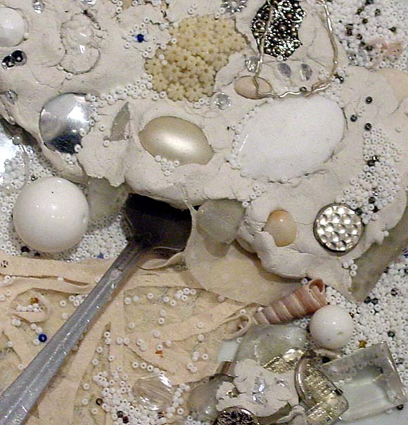
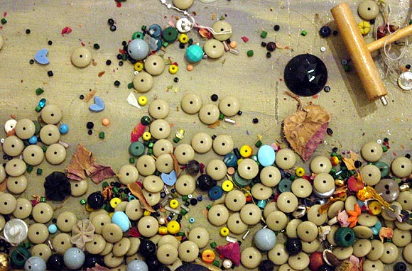
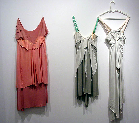
Went back in to look at Leif Ritchey's show today. The show is indeed overhung. Ritchey has one foot in the fashion world and his dresses are dresses, not sculptures. And beautiful, no? That's not to say they shouldn't be shown in a gallery, only that some effort should be made to establish a context. They lost oomph packed into a crowded room with the artist's paintings (not his strongest work) and assemblage sculptures. The sculptures, too, needed breathing room and context. These photos are my attempt to present the work in a more minimal way, at least as minimal as a blog page can be. The top two images are details, aiming the camera straight down at the horizontal surfaces of two different pieces. They are severely cropped, speaking of no context, but it was these areas that haunted me after the opening and this is my way of getting a good look at them. The image of the dresses is how I would present the dresses: Soho style, with a lot of white space around them so you can see them. I thought it was old or scavenged material but the gallery says no--it's just the way the artist handles and distresses the fabric(s).
A few quick movie notes. The Missouri Breaks ran on AMC last night. Marlon Brando in the granny dress yelling out "Smoked meat!" after he has torched the horse thieves' shack and burned a couple of them up is one of the stranger movie moments. His stalking and creative murder of the thieves (and his own eventual throat-slitting at the hands of good bad guy Jack Nicholson) looks back to the "weird late '60s/early '70s Western" tradition of Greaser's Palace and forward to the Jason Vorhees, Freddy Krueger school of meaningless '80s mayhem. Forgot that this was a Thomas McGuane script. God, he had good, short run in moviedom.
Watched The Aviator on the big screen yesterday looking for the tedg independent roving camera eye. You notice it in the scene where Howard Hughes and Katherine Hepburn first have sex. The camera precedes them into the study, has a look around, then turns back to find them already on the sofa langorously making out. The movie could be pitched as "The Carpetbaggers meets A Beautiful Mind." It's folded in the sense that we compare it to those other films and also complete it with our knowledge that Hughes will end as he does in James Ellroy's American Tabloid, an evil behind-the-scenes web spinner. (Webs literally begin appearing in the room in this movie.) Nauseating Hollywood mythmaking mingles with psycho soap opera throughout, but the flying scenes are bravura, especially the one where Hughes crashes the test plane into an upscale Hollywood neighborhood. Spoiler: the last lines--Hughes in a sweaty obsessive/compulsive fugue state, involuntarily mouthing the words "The Wave of the Future...The Wave of the Future..." do much to rescue the film from reassuring Ron Howard Land.
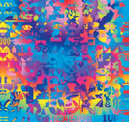
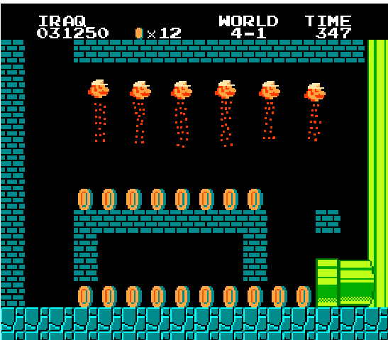
The previous post on the Arcangel + Paper Rad Super Mario Movie has been updated with some background info and technical detail. Above is the poster, compressed down to 66KB and stripped of the exhibit info and Deitch logo. This Flash-flavored image is more Paper Rad doing Beige, while the movie is more Beige doing Paper Rad. (Nerdy fan parsing.)
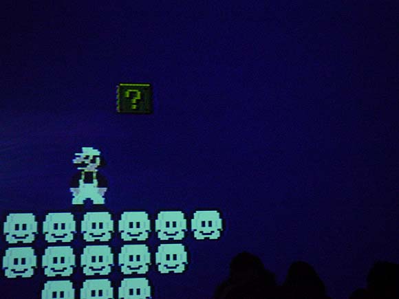
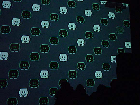
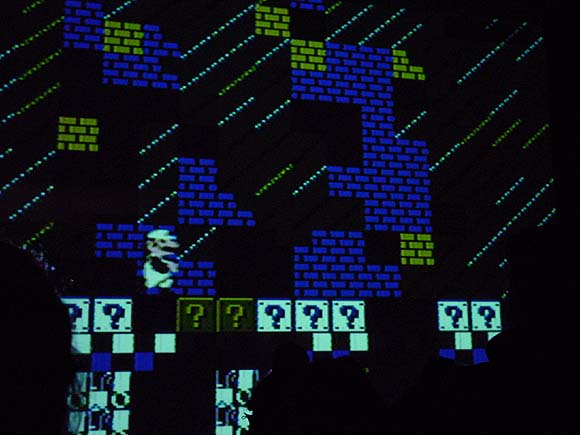
Above: bootleg over-the-crowd shots of Super Mario Movie, a wall-projected, altered Nintendo cartridge by Cory Arcangel and Paper Rad, tonight, Jan. 15, at Jeffrey Deitch. The image was impressively huge (16+ feet from floor to ceiling?) and the sound sublimely 8-bit-raspy. The plot: Mario's cartridge universe starts to break down because it's "been in a closet for 20 years." A blue creature takes him on a spiritual voyage via magic pixel carpet (the Paper Rad influence) culminating in a "rave" featuring some tasty allover patterns and intense gatling gun electro--I think it was right after the happy-hardcore smileys above, at any rate the screen text announced "This is the rave." Excellent work; hundreds of person hours of poking in sprites on the hacked cartridge paid off. It was nice to see the "twice the psychedelia" concept realized on such a large scale. (As discussed in this earlier post [scroll down], by generating the blinking geometric grids at the microchip level, as opposed to plugging values in some off-the-shelf lightshow program, Arcangel takes advantage of the cartridge's ability to sync up with the tv raster at a 60 lines per second refresh rate, which is twice as fast as video [32 lines per second]. Hence, twice the psychedelia.) As explained in a "making of" video at Deitch, the Paper Rad crew submitted drawings and animation routines that Arcangel then laboriously converted to code and burned on the cartridge's chip, but his artistic hand is prominent in it as well: the collaboration successfully melds the BEIGE and Rad sensibilities. (The source code is posted on the four walls of the gallery's front room for the geek-minded.)
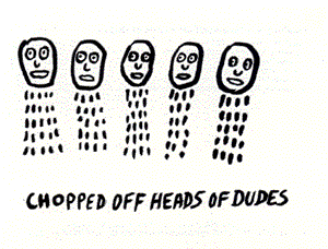
Below, a "deleted frame" that came to me via the miracle of the internet, but that bears a suspicious resemblance to Noah Lyon's "Chopped Off Heads of Dudes" and is captioned superheadsofstate.gif. Another internet authentication mystery and reminder of the grim world outside the cyber funhouse. Impeach Bush!
Bill found this wikipedia entry on fictional chemical substances. Everything you need to know about Adamantium, Balthorium, Cavorite, Dilithium, Illudium Phosdex, Kryptonite, Mithril, Upsidaisium, Vibranium, Thorium, Corbomite, Ferrocrete, Flubber, Herculite, Ice-9, Imipolex G, Plasteel, Puppeteer Hull Material, Scrith, Vespene Gas, and much, much more.
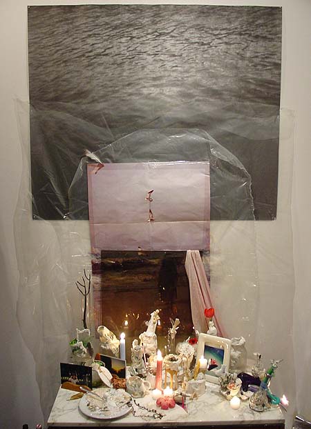
Leif Ritchey, ATM Gallery, 170 Avenue B, NYC, through Feb. 13. This work is probably the antithesis of what this page is into--it's in the vein of assemblage, expressionism, Rauschenberg, Cornell & combing through trashbins and thriftstores, as opposed to Minimalism, pop, artificiality, and the questionably sincere. Nevertheless one can't help but respond to many of the elegant, intimate aspects of Ritchey's installations and sculptures, which were described earlier here and which can be found lurking in crevices or down near the baseboards of this ATM show--abstract tangles of ripped and resewn bricabrac, accumulations of costume jewelry as intricate as Peter Greenaway place settings, a strip of fabric painted with a skunk stripe of plaster and curled inside a striped plastic box. The show could have been edited drastically, but again, that might be missing the point. A running theme of dresses hanging on hangars and wadded female apparel stuffed in boxes added a kink factor, or at the very least a Miss Havisham factor of faded, disappointed sexuality.* Dense accumulations of fetishistic found and altered objects invoke Michael Tracy, an ur-Catholic artist from the Texas border briefly in vogue in the 80s, and at worst, Arman's stuffing of detritus into Plexi cubes.
Insider detail: one might recognize the black and white photo in the piece above as the Felix Gonzales-Torres edition offered as a takeaway at the MOMA-Q(uee)NS opening a couple of years ago, still bearing traces of being rolled up and flattened, as most were.** The soul of Chelsea minimalism meets the essence of East Village maximalism, with the shrine of plaster-smeared objects providing an elegiac link.
Ritchey's video and music may actually be his most successful form of urban collage: the "Flatbush Windows" VHS described in the earlier post still haunts, and this track [mp3 removed] from a recent 4-song CD-R takes the noise jam into the realm of strolling big city cool. Think detuned portable radio, where every station plays house or funk.
*UPDATE: Learned on a return visit that Ritchey makes the clothing himself, and the show somewhat indiscriminately mingles his fashion work (which is quite good) with his assemblage work, hence my confusion. More on my second visit soon.
**UPDATE 2: A Major Art Personage visiting the gallery today didn't recognize the Gonzales-Torres until I dweebily pointed it out.
More pics, commentary, and discussion here and here.
Photo of the surface of Saturn's moon Titan, from the probe that (obviously) successfully penetrated the dense "smoggy" atmosphere today. I'm amazed--didn't expect to see anything that looked like a "surface." Not pictured is the alien from Tralfamadore who has been waiting centuries for his spare part to arrive (Vonnegut in-joke.)
