View current page
...more recent posts
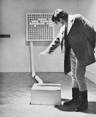
Juan Downey and Fred Pitts, Against Shadows, 1968, plywood, Formica, and electronic parts (photo by Shunk-Kender from Frank J. Malina's Kinetic Art: Theory and Practice, 1974). It's as simple as it looks: a grid of photocells on the formica cube responds to shadows and mimics them in reverse on the wall screen. The klutziness of it (e.g., that huge conduit) is, I believe, intentional. Downey's conceptualist-style statement for the work is still refreshing:
"If the choice were given to me, I would pick complete inaction for my entire life. Nevertheless, I persist in the activity of building electronic sculptures because:
Their existence or destruction is irrelevant to the life of them.Such a contrast with the Whitney's "BitStreams" show, where all the art had to have a purpose, and/or the curator killed it with pedantic overexplanation.
They cause people to play.
They make people aware of the vast number of different kinds of energy in the universe.
They are ephemeral. This is part of a new development in the history of art: to create works that are not supposed to last for a long time.
They pose a problem for the collectors of art objects.
They create the illusion that the public can participate in the work of art. Actually we are still spectators mystified by the order that makes the world grow and move, although, we pretend we are determining what happens to us.
It is fun to talk with friends about them.
They imitate aspects of movement in life. Art is more concerned with thinking about what people experience than with producing objects.
They make people aware of lively relations between different kinds of things.
Children like them.
Sometimes they produce a reversal of natural phenomena, for example, as demonstrated by the sculpture Against Shadows."
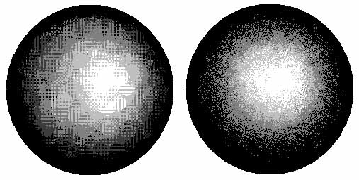
MSPaintbrush vs. MSPaint: A Refresher
Some kid out there on the internet mentioned my artwork and told his readers that I "apparently use MSPaint." In context, the "apparently" reads like a slightly disdainful qualifier, as in, "I can't see it myself, and in any case I don't think it's a particularly great use of MSPaint, but that's what the guy says--I'm just telling you." Of course I don't share the ambivalent feelings but do think it's time to trot out an earlier post where I explained the difference between MSPaintbrush (which rules) and MSPaint (which I use occasionally even though it's inferior).
Regarding the orange things going up in Central Park: The collective vanity of "Christo and Jeanne-Claude" is bottomless. Perhaps their only value as artists is exposing and exploiting weaknesses in "the system" that allows projects such as theirs to happen. It would be nice to think they were ironic, and knew the physical art was just fodder for a Hans Haacke-like provocation. No such luck, though.

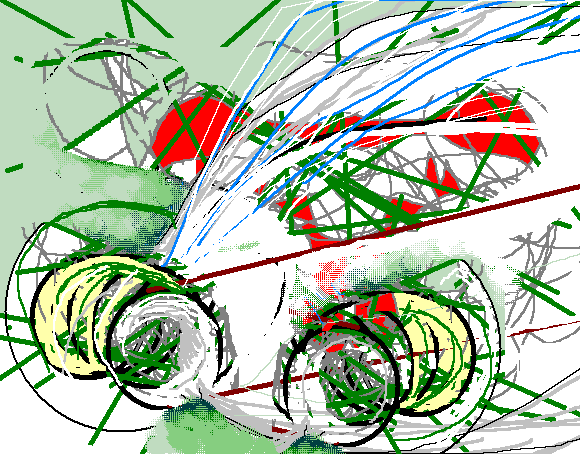
Bug7, MSPaintbrush

Surge Drawing (Black Stripes), MSPaintbrush

New York Times Ad Model (2002), MSPaintbrush drawing
Too Much Failure Around Here
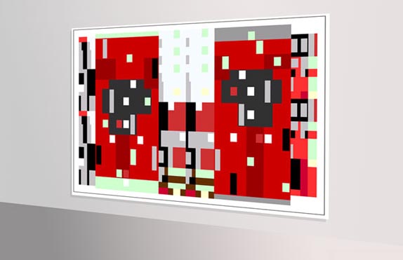
Inspired by Gary Wicker's tribute to his "failed" old school techno group x-eleven, Paul Slocum of Tree Wave pulled out his tapes of techno music he made in the '90s and posted some tracks here. The following excerpt from "v tide" is one of my favorite bits from the page: [mp3 removed]. Slocum thinks it's "standard minimal house" but not everyone can make a good track. I give it an "A" for the vocal physics (minced Diana Ross) and the organ stab that kind of drops out in the middle like a sampler memory error even though it probably isn't. This is pretty sublime music, and people need to stop talking about stuff being failed. Slightly off topic, Chris Ashley recently shrank a perfectly good, Stephen Westfall-ish HTML drawing with non-contiguous linear elements because he said it was failed and that's just ridiculous. Below: one of Ashley's HTML compositions installed in a virtual gallery.
