View current page
...more recent posts
Having criticized Donald Kuspit's essay on digital art for metaphorical overreach and bad choices of work to champion, let's offer a few words of defense. Kuspit's supposedly dense artspeak can't be blamed for Damien Hirst's cut-up cows, a connection one commenter attempts to make. Kuspit believes in nothing if not the natural and the vital over cheeky sensationalism, which, again, Hirst practices only in part. Aligning Kuspit and Hirst is like saying "Greenberg, in his defense of Mary Kelly..." Compared to say, Derrida's writing, Kuspit's language cribbed from psychoanalyis isn't that dense. It's just wordy.
More vexing is current Eyebeam reBlogger Sarah Cook's tarring of Kuspit as a supporter of form over content. ("Seurat's pointilism makes him the first digital artist? An art critic caught up on form yet again. --sarah") Check out what Kuspit says about Seurat, though:
Seurat was the first artist to understand that vibrating sensations are structured in themselves as well as details in a visual structure. [That sounds tautological but we're coming in mid-argument.] To be a really modern artist, a scientific artist, meant to make these structures -- the hidden code of color, as it were -- visible. The more visible the coded matrix of sensations became, the more hallucinatory the representation seems, which is what happens in La Grande Jatte. Indeed, the more structured the vividness of the sensations seemed, the more the picture was totalized as an eternal pattern of vibrating sensations, the more ghost-like the objects represented seemed.If this is formalism, let's have more of it! Sounds like good drugs, to me. The problem with Kuspit's essay is he has found no modern equivalent artist worthy of waxing this eloquent about. That kind of rush, at least for now, can mainly be found in cinematic credit sequences, electronic music made in the likes of Reaktor, and some of the braincrunching Flash videos available for the downloading out there on the Internerd, to use a Gothamist term. Artists will catch up with these pioneering digital works eventually.
La Grande Jatte brings representation into greater question than [Manet's] Music in the Tuileries Gardens. Seurats pulverization of representation into a matrix, systematically organized, suggests that doubt and suspicion of representation are built into La Grande Jatte. Perspective continues to buttress the scene, like a backbone, but the perspective is beginning to buckle and flatten -- collapse -- under the enormous weight of the pulsing sensations. Seurats painting is a catastrophe in the making, a virtual apocalypse, indeed, the first picture that explicitly presents itself as a virtual reality, and that "argues" that reality is always virtual -- never really real, or, if one wants, it argues that the virtual is the really real. His figures are full-fledged phantoms, delicate, thin gossamers, no longer clumsy, thick patches.
Looking at La Grande Jatte, we are witnessing the death of the order of objects and the birth of the matrix of sensations as a unified field.
--reposted with minor edits, which means the URL changed, whoops.
Digital art duo MTAA link to a Donald Kuspit article that makes some over the top claims for digital work. I haven't studied the essay in depth but agree with about half the premise ("digital art is the new art; code is the new subject") and practically none of the examples. Now MTAA is duking it out in their comments with an anonymous meanie who makes the obvious argument that art has to have that undefinable something regardless of the medium and then backs it up with ad hominem attacks on MTAA's twhid. Guys, don't give that fellow too much of your brain power. (Like I follow that advice with rude anonymous commenters.) More on the Kuspit soon--it's surprising he wrote this because he's usually the spokesman for the Healing Power of Art and fecund interiority over bloodless conceptualism. Possibly he's in full contrarian mode but then his principles are never rock-solid.
Update: The Kuspit piece is disappointing. He bases his link between early Modernist painting and the computer on squishy metaphors of pixeled space that leap across several decades and don't take into account photographic grain, TV rasterizing and other developments that came between Seurat and the first computer art in the 60s. "Code" is also used in a broad metaphorical sense so it could mean almost any systematic approach to art. The only current digital work he discusses in depth is Michael Somoroff's video Query (2004), which is more of that damn art about art, riffing on Duchamp's and Richter's famous nudes descending staircases by subjecting them to the inevitable high-tech imaging analysis. Ugh.
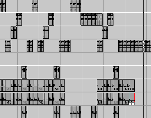
"Unfriendly Satellites" [mp3 removed]. This is partially a remix of another blogger's .mp3--only a couple of snippets of gnarly analog (?) noise yanked out of a much longer but very interesting tune. That's all I'm saying for the moment. The pretty-sounding refrain is a snatch from a Kontakt FX sample called "3 Friendly Satellites," a great title for an evocative bit of sound. The samples were timestretched to fit the sequencer grid and treated with a few Cubase insert effects. The drum-and-bassy rhythms are done in Intakt, a beat-slicing instrument. As long as we're revealing trade secrets (ha), here's the rundown on the previously-posted "1987" [4.7 MB .mp3]: the Vermona drum hits were downloaded off the internets, trimmed in a .wav editor, and further tweaked in Battery. The main chorded theme is done with Reaktor's Titan synth (my favorite so far), and the rising, slightly scary bass chords are done with another softsynth called the Linplug Alpha, a real gem of an instrument. OK, that's it for advertising consumer products. It's all software and I'm still the music-creator, right?
Update: snipped a few bars of "Unfriendly" near the end. There's redundant and then there's redundant. Update 2: took almost 30 seconds out near the end. Same reason. Update 3: added 5 seconds back in for a thrilling (or at least logical) climax and took a screen shot.
The New York Times editorial page struck again today with a stupid navel gazer about blogging. The Daily Howler nails it, as usual:
DEEP THOUGHTS BY JACK HANDY: Someone decided it was time to wax eloquent. So the Times began to ponder the Net. In the process, someone even wrote this:The Times harped on the sheer staggering number of blogs, as if to say, they're like mayflies, and could never be as important as centralized, edited media. Reality check: some blogs are better than others, some are better than the mainstream press, most disappear after a few weeks--which ones do you think Times worries about enough to try to trivialize?NEW YORK TIMES EDITORIAL (8/5/05): It's natural enough to think of the growth of the blogosphere as a merely technical phenomenon. But it's also a profoundly human phenomenon, a way of expanding and, in some sense, reifying the ephemeral daily conversation that humans engage in.Hmm, we quickly found ourselves wondering. Have we been engaged in a profoundly human phenomenon, a way of expanding and, in some sense, reifying the ephemeral daily conversation that humans engage in?
We gave it some thought, and then we replied: In a sensebut not as such!
The growth of the blogosphere is a profoundly human phenomenon, a way of expanding and, in some sense, reifying the ephemeral daily conversation that humans engage in? In fact, blogs became necessary when the perfumed royals of mainstream media began to write, think, cogitate and generally waste time like that.
A PREDICTION: This sentence will gain the most ridicule: Perhaps the strongest indicator of the importance of blogdom [is] the extent to which media outlets are creating blogsor bloglike manifestationsof their own. As weve long saidif these lords of self-importance didnt exist, no one could ever dream them up.
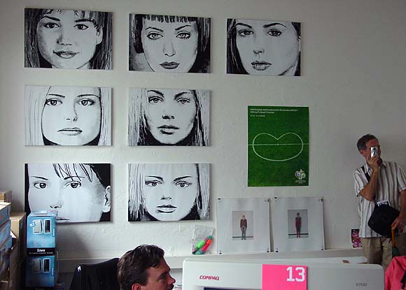
Some pieces of mine hanging in the curator's office at Lothringer Dreizehn, an art space located at Lothringer Strasse 13 in Munich. The curator, Courtenay Smith, originally showed the work in her gallery homeroom. Hand drawn using the old computer program MSPaintbrush, the images of what I would call everyday media women were shown a couple of times in New York in the late '90s. I emailed a set of .BMP files to Smith in 2000 and she printed them on a medical plotter and "stretched" (i.e., folded) the paper on canvas stretchers. Her set actually looks better than the ones I printed here in the States.
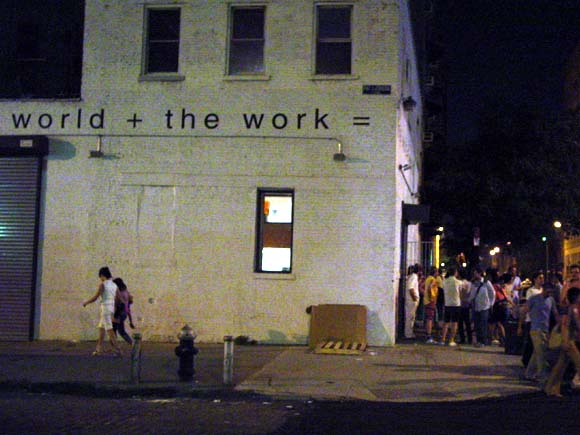
NY Cops Crash Gavin Brown Afterparty
Mellow Crowd Shouted At, Sent Home by New York's Finest at "Drunk vs. Stoned 2" Exhibition Post-Opening Barbecue
Things have been bad, civil-liberties-wise, after 9/11 and the Republican Convention mass arrests, but the cops seriously need to find more productive uses of their time. Tonight several plainclothes entered a private party on the rooftop deck above Gavin Brown's Leroy Street gallery, ostensibly alarmed by seeing a few bottles on the sidewalk. They caught Brown holding a baggie, grabbed him by the arm and led him out of the party, then got angry when a smart aleck guest allegedly threw a hot dog at them. Before arresting Brown on a minor possession charge, they forced him to stand up in front of his guests like an errant schoolboy and ask "who threw the hot dog." I shit you not. When no guilty hot dog thrower came forward, they kicked everyone out of the party. One cop violently slammed shut the barbecue grill and another of the little bullies (for some reason they were all short) stood on a bench and announced "Whoever is the last to leave comes out in handcuffs." Everyone there, which included some art world personages, filed out in a state of shock. Amazing to think that New York was once called "Fun City."
Update: Here's the NY Post Page Six version, which of course takes the cops' side; I edited my post based on some of this info:
DRUNK, STONED AND CUFFED FUN-loving art gallerist Gavin Brown managed to get buzzed while building a buzz for his new show, "Drunk vs. Stoned 2." The British bad boy was arrested Thursday night for possession of a small bag of pot at the raucous opening of the exhibition at his Greenwich Street gallery, which was transformed into a "Deadwood"-style saloon complete with swinging doors and a jug band performance. All that old-time revelry resulted in empty beer bottles littering the street in front of the space, which spurred cops to investigate. After they crashed the party and spotted Brown holding a bag of pot, officers brought him outside. "They were being very cool until someone threw a hot dog out the window at them," Brown told us. "It basically broke the good will. That's when they put me in handcuffs." Empty beer bottles, marijuana and flying hot dogs would seem perfectly natural at a show featuring work by legendary counterculture cartoonist R. Crumb. According to a press release hyping the show, the "two most familiar forms of intoxicated transcendence are examined through a clouded lens, blurred by pot smoke and beer goggles."Oh, yeah, someone threw a hot dog, poor babies, and "held a bag of pot," I guess that's a good reason to threaten a hundred or so well behaved partygoers with arrest. As for the beer bottles--what New York street doesn't have bottles lying around? Check out the photo--see all the bottles? I don't either. The mess was nothing noticeable, and this was not a wild party, sorry to be boring and put a damper on a bad boy's legend-building.
I got to see some of Paul McCarthy's early work--which I've always been mildly curious about--at the Haus Der Kunst in Munich this week. Unlike US art institutions, which filter art for the delicate sensibilities of small children, Victorian grandmothers, and Newt Gingrich, European museums don't protect viewers from the sight of icky penises and soiled butt cheeks. Like Charles Ray, who we mostly think of now as a conceptual sculptor, McCarthy comes from the late 60s/early 70s performance art-meets-black and white documentary photo tradition, which famously produced Chris Burden, Vito Acconci, et al. The earliest McCarthy works on view were Earth art-style pieces such as "Rolling a Bowling Ball Down a Mountain" and "Flying From Salt Lake City to LA," documented with rigorous photo grids. Later, McCarthy entered the body art canon with the performances "Painting Lines on the Wall Using My Face and One Shoulder" and "Plastering My Head and One Arm into the Wall." (All titles are approximate.)
By the mid 70s, he had snapped and begun producing his signature work, which could be succinctly described as "Writhing Around Half Naked in Meat and Assorted Condiments." The actual title of his breakthrough video is Sailor's Meat/Sailor's Delight, 1974, which Paper Magazine describes thusly:
...McCarthy donned a pair of woman's see-through panties, blue eye shadow and a blonde wig and proceeded to straddle a queen-sized bed smothered in raw hamburger meat and catsup. From there he went on to rub raw flesh across his chest and penis, mimic sexual intercourse with a jar of mayonnaise and a makeshift phallus, and urinate on a piece of sausage before shoving it down his throat. If that weren't enough, he ended the piece by smashing a bottle on the floor and walking barefoot on the shards of glass.I watched most of this vid at the Haus Der Kunst, sitting on a seat in the main gallery with all this kinky sexual imagery right out there in plain view. There were no furtive darkened rooms for creepy behavior as in the US, but headphones did protect the other museumgoers from McCarthy's disturbing grunts and Deliverance-like squeals. Damn, the early 70s were an interestingly depraved time, partly owing to the end of the sexual revolution that conservatives are always complaining about, partly because the median age of the US population was about 22 and cranky oldsters were not allowed to run the show, as they do now. John Waters had the jump on McCarthy by several years for the filming of antisocial, antipodean behavior--check out the "rosary job" in Multiple Maniacs (1970) to see how far courageous filmmakers won't go now. The main difference was Waters hadn't entered the art world yet--McCarthy's work came out of a fairly disciplined, non-theatrical tradition of testing visual boundaries. Lack of pacing and production values were built into this type of video. Not sure what my point is here, except to say that to the extent LA wants to claim McCarthy as some kind of art world response to the film industry, there were far more maverick filmmakers anticipating what he did.
The Haus Der Kunst featured recent video and sculpture by McCarthy, much of it centered around a lunatic inversion of Disney's "Pirates of the Caribbean" theme park ride. The screaming, pissing, and rolling in Hershey's syrup is a group romp these days, with larger budgets and casts. I like the artist's later work OK, probably more so in a public context, in Europe, than at Luhring Augustine, where the faux-tony exclusiveness of the Chelsea gallery environment tends to suck all life out of art. Stlll, it's fascinating to see how artists got where they got--to experience the original jarring moments that made their reputations, as opposed to the professional, institutionally-supported continuation of those moments.

Below are some raw notes towards the essay I'm writing on Kara Hammond's work. These will change as as the writing is fleshed out. The image above is Tyvek Beach House, oil on canvas, 2005.
Kara Hammond describes the imagery in her paintings and drawings as "scenes of everyday human existence." Thats as good a summary as youre likely to find of this straightforward but strangely varied collection of suburban homes, airport buildings, storage sheds, space vehicles, office complexes, freeway ramps, trash receptacles, outdoor toilets, and other artifacts of the consumer-inflected landscape.
The work is "post-" quite a few things, to use a bit of art historical jargon. They are post-commodity art in the sense that they are not preaching about humankinds intrusions into the natural environment but merely recording them as factually as possible. They are post-appropriation in that the recording more or less takes for granted arts manipulation of signs, and the curious relationships that arise when painterly subjectivity meets the photographic record.
But the term post- usually implies a residue of what came before, and one still sees a skeptical, theoretical bent at work in these placid, some might say traditional-looking subjects. Images as reductive and open-ended as haikus on the individual level reveal their critical drift when seen cumulatively.
