View current page
...more recent posts
"Brakin' (Remix 3--Get Me to Lee Miles But Not So Fast Mix)" [mp3 removed].
This is the same as "Brakin' (Remix 2--Get Me to Lee Miles Mix)" except the second theme doesn't fade in quite so fast. It is a collaborative effort between John Parker and me that hit the cutting room floor for our Toronto collaboration--but that doesn't mean it's not good!
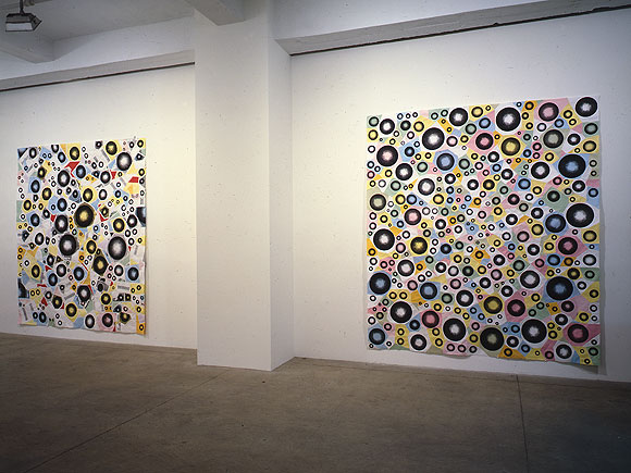
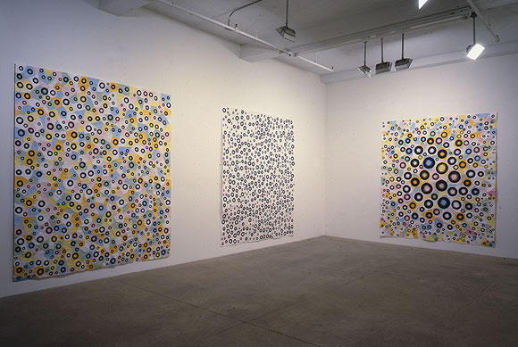
Installation views of (top to bottom, left to right) Greater, Jump, Exhibit 11, White Room, and Bulge; each is MSPaintbrush, photocopies, linen tape [along seams on the reverse], 88 X 78 inches. From my solo exhibit at Derek Eller Gallery, New York, NY, 1998. (photos by Bill Orcutt)
back to main site
YouTube: Curved Air - Back Street Luv
Broadcast - Papercuts
Your assignment today is to compare and contrast these two videos. How are the songs different? Alike? What do the differences say about the time periods in which they were made (early '70s and 2000, respectively)? How are the video styles different? Alike? Do you like the songs? Do you like the Jefferson Airplane? Are psychedelia and anomie compatible states? (hat tip to Three Rivers Online for the Broadcast).
Update, papers have been handed in and here they are, with the "teacher" getting a final word in:
I would rather listen to the music without the video, in both cases.
The Broadcast singer is channeling Dorothy Moscowitz more than Sonja Kristina although after I had to use the internet to remember Dorothy Moscowitz's name, I was amused to see the Wikipedia entry on the United States of America compared them to Curved Air.
- anonymous (guest) 5-26-2006 11:32 am
A comment on video style from 20 seconds of each ... exTREME effects! What will the 2k video look like in 2030? The 70's piece has very "period" effects. The newer piece seems to draw from a broader range of influences than "what's the cool new effect."
As an aside, there are some TV shows that clearly show the production staff that created the original look-and-feel loved their brand new toys.
- mark 5-26-2006 8:43 pm
I think the Broadcast video is pretty stunning. It's meticulously organized, and I like the way the frames within frames are used rhythmically in sync with the music. It's hard to imagine it will date the way the Curved Air is dated, because it relies so much on quotation--the Austin Powers, lava lamp look gone all abstract and clinical.
I hadn't thought about Dorothy Moskowitz or the U.S.A but I should have--that group invented combining psychedelia and anomie, they were doing it in '68. (The literary version of this impulse might be Robert Stone's Dog Soldiers.) The comparisons between the U.S.A. and Curved Air are interesting, icy female singer, the use of violin and synthesizer, and not just synth but "synths that sound like synths"--that go out of tune and climb all around the scale rather than just being used as a spacy organ.
The anomie factor is pretty low with Curved Air, though, I would say they are melancholic/romantic rather than affectless/burned out. Also very ambitious musically. The main reason I liked seeing their video was that I've never actually seen the group play but have listened to Second Album and Phantasmagoria obsessively. This was a later incarnation of the band, post-Phantasmagoria, singing a song off Second Album.
- tom moody 5-28-2006 10:29 am
"artMoving" [mp3 removed]
This song was written last week and performed at my lecture/recital/video screening on May 19, at artMovingProjects in Williamsburg. The instruments are the Sidstation synthesizer and the Vermona analog drum machine, with sequencing in Cubase on my laptop. In a live play situation, some of the settings (Sid patches, individual drum decay and volume) were changed as the song ran--for this .mp3 I recorded it in two overdubbed takes, one for the drums and one for the synth.
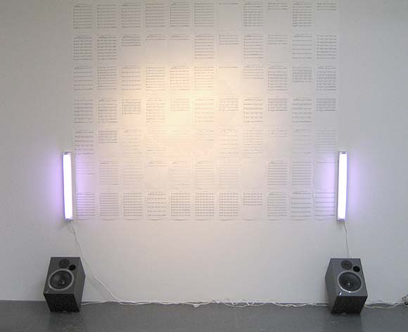
Paul Slocum, Deep House for Symphonic Band and Choir, 2006. Slocum explains on his blog, "Its a dance club hit written for symphonic band and choir. The music plays on the speakers in a loop (about 4 mins long) and the entire score for all the instruments is pinned to the wall between two Sylvania Gro-Lux fluorescents." The music (at www.qotile.net/blog/wp/?p=326) is great; a very full, lush orchestrated sound, compositionally minimal but soulful, like the best deep house on vinyl, but with a Steve Reich vibe in the use of symphonic instruments and voices. I like that the score is presented as a series of abstract marks on the wall, a la Sol LeWitt (lighting by Flavin), but that the marks actually correspond to something you can hear with your own ears, both in real space and virtually, by virtue of being published on the Net.
Updated a couple of times, with more words and a link to the tune.
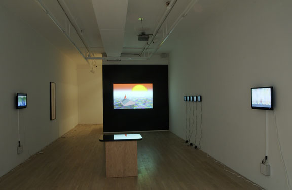
New York Times review of Michael Bell-Smith's show at Foxy Production, 617 West 27th Street (Chelsea), New York, NY, up through June 3:
Michael Bell-Smith operates in the gap between animated cartoons and painting with unusual effectiveness. His short digital loops, shown on small screens or paintinglike wall monitors, portray landscapes, cityscapes, figures and oblique social commentary. But their main concerns are color, space and light, tweaked and amplified by digital technology and restrained animation. Whether we are flying high above an endless suburbia, as in "Some Houses Have Pools," or looking at the artist as he stands in the middle of a Midtown street, as in "Self-Portrait NYC," the excitement lies in grasping the layers of the image and the way they do, or don't, change.This is a nice review but treats the gallery as a walled garden sealed off from the Internet and the street. If anyone's work could benefit from a "digital non-site" analysis it's Bell-Smith's. How much does the imagery and animation derive from gaming, website GIF wallpaper, ringtones, and upload/download culture in general and how much is invented out of whole cloth by the artist? What is the value of putting "gallery brackets" around pop culture ephemera? Is this still Pop Art? Is it relevant to mention Bell-Smith's CD of acapella hiphop hits digitally synchronized with ringtones of the same songs? That he plays in a band? Or the fact that he was recently on a panel called Net Aesthetics 2.0, that considered a gradual tectonic shift in Internet art practice? That he has a blog and is an ardent curator of Internet cult phenomena of every description, with exquisite taste in same? "The gallery" and the "art review" are still excellent places to discuss these kinds of things--particularly how they can be translated into an elegant physical space. It would be good if our top gun critics could stretch just a wee bit.
In the post-Katrina "Continue 2000," a red-caped hero stares at the setting sun from the roof of a house adrift in a flood of shimmering, patchwork color. He is going nowhere, but the sun explodes and the world turns momentarily gray, like an omen.
"Up and Away" scrolls through an encyclopedic array of panoramic horizons city skylines, deserts, mountains, castles, forests, oceans that conjure up dozens of movie genres but are actually downloaded from video games (and are so coarsely pixilated they seem Pointillist, or knitted). Now it is the viewer who goes nowhere: space is deep but never penetrated. It's like watching a deck of cards being shuffled: pick a landscape, any landscape. Mr. Bell-Smith brings new and old and static and mobile into a promising, visually enthralling alignment. ROBERTA SMITH

GIF from fUSION Anomaly enlarged, cropped, sped up


GIF from fUSION Anomaly eight times
