View current page
...more recent posts
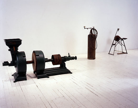
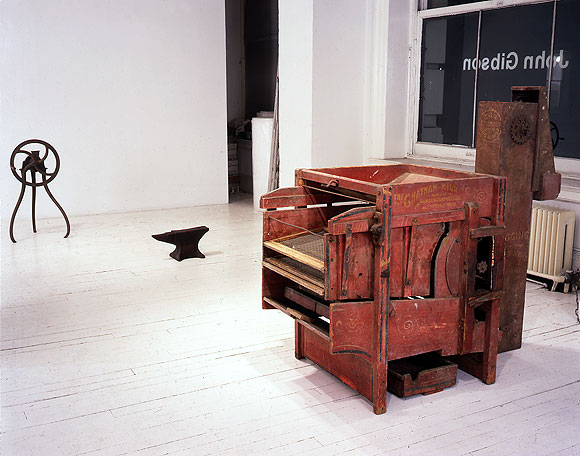
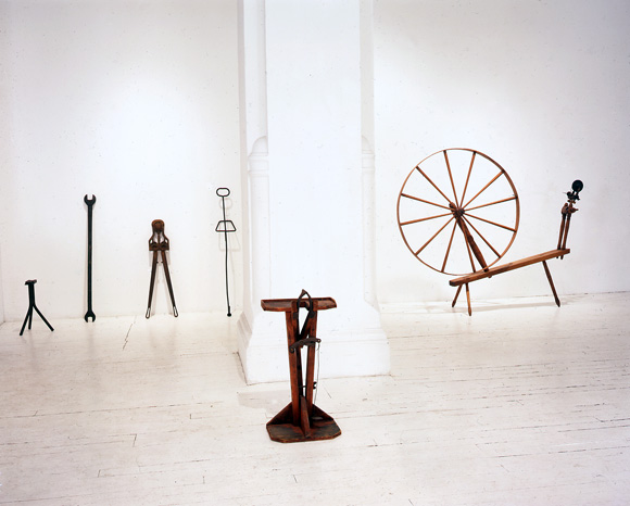
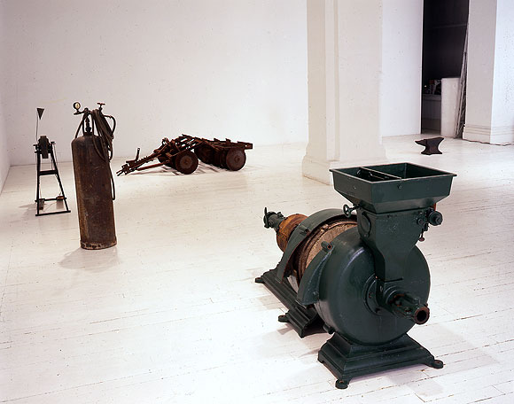
Bill Schwarz, installation views of solo show at John Gibson gallery, New York, 1995 (photos by Sylvie Ball). While the artist Cady Noland made urban detritus (machine parts, flags, key chains, beer cans) the focus of her found object/scatter installations, her contemporary Bill Schwarz, who was included in a number of Robert Nickas-curated shows around the time she was coming to prominence, took the more radical and I would say Robert Smithsonesque step of looking to the American heartland for appropriation subject matter. For this show at Gibson he trucked a selection of rusty, not-quite-obsolescent farm machinery into the white cube of the gallery and arranged it tastefully, a la MOMA curator Alfred Barr's "art of design" shows.
I say radical for a couple of reasons. In a way there's nothing more alien to a cosmopolitan New Yorker than these implements from red states, as we now call l them. Much of the equipment is obscure to the urbanite and seems completely divorced from function, yet is a matter of life and death to the (pre-agribusiness) farmer hacking a living out of the land. The exhibit follows the core principles of what Smithson called the "non-site"--a real place in the world transplanted into the white cube. The show is also "difficult" because of flirtation with kitsch far more threatening to refined urban sensibilities than Noland's Canal Street, dollar store ephemera: these battered, time-patinaed harrows and spinning wheels can be found all over the heartland tucked away in antique stores, used as flower pots, and so forth. The difference is the "Barr treatment" Schwarz gives them; the objects are arranged for maximum formal elegance, so that they resemble shows of mid-20th Century modernist sculpture, much as Barr arranged tools and machine parts, deliberately pointing up their affinities to Brancusi, the Cubists, et al.
The price of radicalism can be obscurity. The Gibson show was reviewed in Artforum and other publications but the work is not in museum collections. Now that we have the Net, it's possible for shows to be seen in a fleshed-out way that a back-of-the-mag Artforum review accompanied a single tiny picture could never convey. These images are completely relevant with Cady Noland back in the news, with the media attacking the "appropriators of the appropriator."

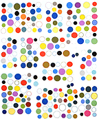
Bill Schwarz, 99 Bottles of Beer on the Wall, 1986. Exhibited at Pompeii (New York City).
Quoting myself, from the comments:
As for [Brian] Sholis' essay [on Cady Noland], it's kind of the standard academic rubber stamp. He treats Noland as a solitary genius that emerged fully formed into the world. A more interesting essay would place her in the New York scene from the East Village and "Neo Geo" era, with references to artists doing similar work.Thanks to Bill Schwarz for this image, an interesting and amusing piece regardless of whether another artist from the same time period went on to make beer famous.
Sholis mentions that Noland included "work by New York artists" in her Documenta installation. He doesn't say which ones. Maybe she was a little more generous than her critical advocate(s).
I know artist Bill Schwarz, who also emerged out of the East Village scene and was in several Bob Nickas-curated shows, had a minimal style piece called 99 Bottles of Beer on the Wall that predated Noland's brewskis, and the late Steven Parrino had a painting at Metro Pictures of stocks (as in the Colonial era punishment), a motif which Noland also used, in sculpture form.
The great essay still to be written (?) puts Cady Noland in context of radical or nihilist interpretations of Minimalism in the Reagan '80s, with all the connections to her peer group.
- tom moody 5-17-2006 1:25 pm
See also: Bove, Carol
New York Times: "We're not sorry we smeared your gallery, but please accept this tacked-on correction."
A couple of weeks ago Ken Johnson of the Times imputed dark motives to Harlem's Triple Candie gallery for its show of Cady Noland "approximations." These are his lead sentences:
When the artist David Hammons recently rejected an invitation to do a show at the nonprofit exhibition space Triple Candie, the gallery's directors, Shelly Bancroft and Peter Nesbett, did one anyway. They mounted an unauthorized retrospective in the form of photocopies of Mr. Hammons's works taken from books, catalogs and magazines.This "rejection" and "rebuffing" by the respective artists never happened; Hammons didn't respond to a request for a show and Noland was never contacted. I mentioned it here , and NEWSgrist did a good story. By way of follow-up, I just learned that on May 24 the Times added a correction to the end of the article, which amends the basic facts but falls short of an apology for the slur on the gallery's intentions by the "paper of record":
Now, similarly rebuffed by Cady Noland, the influential sculptor known for refusing to cooperate with commercial galleries, Ms. Bancroft and Mr. Nesbett have simulated a Cady Noland exhibition.
Correction: May 24, 2006, Wednesday A brief art review in Weekend on May 12 about ''Cady Noland Approximately'' at the Triple Candie gallery in Harlem referred incorrectly to the genesis of that exhibition and of an earlier one, ''David Hammons: The Unauthorized Retrospective,'' both of which exhibited copies instead of original artworks. Mr. Hammons did not respond to the gallery's efforts to contact him about exhibiting there, and no effort was made to contact Ms. Noland; neither artist rejected an invitation to exhibit at the gallery.So, with the ad hominem argument dissolved in a vitriolic puff of smoke, now the Times will actually review the show and consider the issues of appropriating, "approximating," and doing "photocopy retrospectives" of artists' work, right? Ri-i-ight. And for sure the Village Voice will now apologize for also saying the gallery went "around the artists' wishes" and re-evaluate its slam of the exhibit. R-i-i-ight. Another critic who trashed the show, Brian Sholis (who didn't first see it), took great comfort in the fact that the Times and the Voice validated his judgment. (See his updated "I told you so" post.) Now that those journos' arguments have been revealed as factually tainted, Sholis will be doing a mea culpa, too, right? Ri-i-i-ght.

Mobile recharge station, communication tower, and transformer by Kristin Lucas.
"Algebra 2 Trig" [mp3 removed]
a cappela Sidstation with midi echoes and regular echoes. original composition
"Brakin' (Remix 3--Get Me to Lee Miles But Not So Fast Mix)" [mp3 removed].
This is the same as "Brakin' (Remix 2--Get Me to Lee Miles Mix)" except the second theme doesn't fade in quite so fast. It is a collaborative effort between John Parker and me that hit the cutting room floor for our Toronto collaboration--but that doesn't mean it's not good!
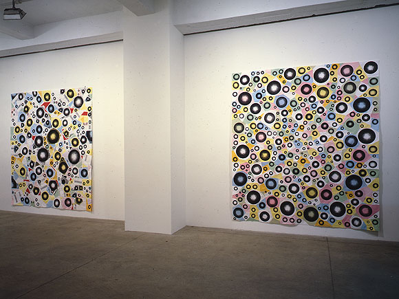
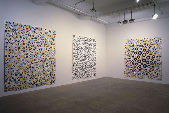
Installation views of (top to bottom, left to right) Greater, Jump, Exhibit 11, White Room, and Bulge; each is MSPaintbrush, photocopies, linen tape [along seams on the reverse], 88 X 78 inches. From my solo exhibit at Derek Eller Gallery, New York, NY, 1998. (photos by Bill Orcutt)
back to main site
YouTube: Curved Air - Back Street Luv
Broadcast - Papercuts
Your assignment today is to compare and contrast these two videos. How are the songs different? Alike? What do the differences say about the time periods in which they were made (early '70s and 2000, respectively)? How are the video styles different? Alike? Do you like the songs? Do you like the Jefferson Airplane? Are psychedelia and anomie compatible states? (hat tip to Three Rivers Online for the Broadcast).
Update, papers have been handed in and here they are, with the "teacher" getting a final word in:
I would rather listen to the music without the video, in both cases.
The Broadcast singer is channeling Dorothy Moscowitz more than Sonja Kristina although after I had to use the internet to remember Dorothy Moscowitz's name, I was amused to see the Wikipedia entry on the United States of America compared them to Curved Air.
- anonymous (guest) 5-26-2006 11:32 am
A comment on video style from 20 seconds of each ... exTREME effects! What will the 2k video look like in 2030? The 70's piece has very "period" effects. The newer piece seems to draw from a broader range of influences than "what's the cool new effect."
As an aside, there are some TV shows that clearly show the production staff that created the original look-and-feel loved their brand new toys.
- mark 5-26-2006 8:43 pm
I think the Broadcast video is pretty stunning. It's meticulously organized, and I like the way the frames within frames are used rhythmically in sync with the music. It's hard to imagine it will date the way the Curved Air is dated, because it relies so much on quotation--the Austin Powers, lava lamp look gone all abstract and clinical.
I hadn't thought about Dorothy Moskowitz or the U.S.A but I should have--that group invented combining psychedelia and anomie, they were doing it in '68. (The literary version of this impulse might be Robert Stone's Dog Soldiers.) The comparisons between the U.S.A. and Curved Air are interesting, icy female singer, the use of violin and synthesizer, and not just synth but "synths that sound like synths"--that go out of tune and climb all around the scale rather than just being used as a spacy organ.
The anomie factor is pretty low with Curved Air, though, I would say they are melancholic/romantic rather than affectless/burned out. Also very ambitious musically. The main reason I liked seeing their video was that I've never actually seen the group play but have listened to Second Album and Phantasmagoria obsessively. This was a later incarnation of the band, post-Phantasmagoria, singing a song off Second Album.
- tom moody 5-28-2006 10:29 am
