View current page
3 matchs for net+art+diagram:
View current page
...more recent posts

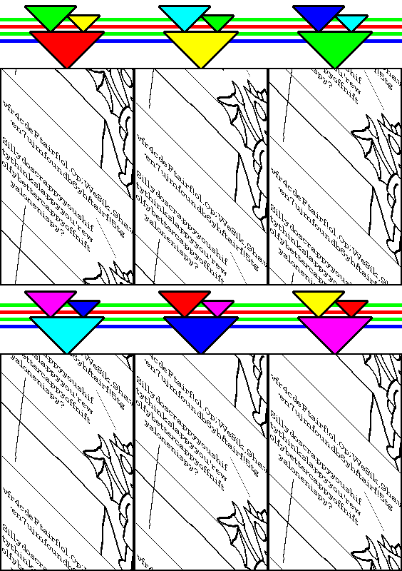
More imagery lifted (or re-lifted) from http://castlezzt.net, which Michael Bell-Smith found and which Paul Slocum describes as an "amazing mile long webzine thing" with the caveat that it's "probably not good for weak of computer or slow of internet." Go experience it yourself, it definitely poses a challenge to Abe Linkoln's complex net art diagram in the browser-busting department and is chockablock with interesting found (?) and concocted (?) imagery. (And did I mention that it's also juvenile and incoherent?) Rather than trying to recreate the experience here, I've just plucked out a couple of nuggets from the original maximalist context. Some nice new animations have recently been posted.

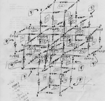
Below is my own reconfiguration of the "MTAA simple" and "Linkoln complex" net art diagrams, a stab at representing graphically the point I was trying to make in a (somewhat rewritten) previous post. File this under art criticism (or trainspotting), not art.
We're continuing to discuss that dumb New York Times article about Net Art here. There has been a sea change that the writer completely missed--an influx of artists redefining the medium, not so much through browser-dismantling code a la Jodi.org, but testing the limits of how much a window can hold, like turning an amplifier up to 11. These largely basement producers handle Net graphics in a painterly or expressionistic way, cocking a half-appreciative, half-horrified eye on all the weird content out there on the Internet. The phenomenon isn't about marketing (yet) but rather thrives within the Net's potlatch or "gift economy" of upload exchange. Artists put up simple animations made with .GIFs or Flash, with sound or without, as well as appropriate, resize and mutate found .GIFs and jpegs, attacking visual phenomena the way a junglist attacks sound (to make an electronic music analogy). Rebellious defacement and smartass humor trump the tedious academic-cum-Sol LeWittoid pallette of earlier net practice. In the Times thread Sally sums up the first generation of self-defined Net Art as "long-loading, find-the-place-to-click-me narratives packed with theoretically correct reference to the body or lack thereof." There are just too many sites resembling university sociology projects, rarely repaying the time you invest in them, illustrated with diagrams like this one from 1997:
 .
.
It's not that MTAA is humorless, but their art is very much about pointing and clicking and following steps, rather than just having raw sensation flooding into your browser. For an example of the latter, check out this remix of the above diagram by Abe Linkoln, one of the bloggers at 544x378(WebTV). Talk about the Oedipal slaying of a forerunner. Here's another piece from the WebTV site (I think also by Linkoln). This was done by searching "544 X 378" in Google Images, picking a blurry, faintly appalling image out of a page full of possibilities (in this case a random dork in a mask sitting at his computer), then adding a kind of Sigmar Polke screen of "plus" signs as a shifting psychedelic overlay. This use of dimensions to search for images has the randomness of a drive-by shooting. Or check out this .GIF by jimpunk, an image both sublime and gritty, resembling a sleek physics demo that appears to be destroying its own background:

With more of this happening, the Whitney might think about setting up those terminals again!
UPDATE: My own reconfiguration of the "MTAA simple" and "Linkoln complex" net art diagrams is here.
UPDATE, 2012: The GIF I thought was posted by Linkoln was, in fact, posted by Linkoln (then called Abe W. Linkoln), on March 15, 2004 (permalink to the post doesn't work).

