View current page
...more recent posts

David Szafranski, Captain Freedom, mixed media on canvas. More from this series here.
Data Is Nature has a great essay on biological and mathematical parallels to Szafranski's paintings.
Carl Ostendarp wallpaper--based on a Dr. Seussoid painting of his from Google Images. Ostendarp once told me was interested in the work of painter Ralph Humphrey, and you can certainly see some connections. I'm not so wild about Humphrey's polychromatic, imagistic shaped canvases from the early '80s (especially the pebbly texture), but the more restrained work from the '60s and early '70s looks nice, from the website, at least. It occupies a territory somewhere between the Myron Stout/Leon Polk Smith school of abstraction and what would later be called "New Image" painting (Susan Rothenberg, Neil Jenney, et al). Ostendarp's wrinkle is adding more media-aware, boomer-centric cartoon iconography, such as these Dr. Seuss hands, to that milieu. His paintings are notable for their flatness and lack of inflection--the dry application of flashe paint on linen is antithetical to the buoyant, comedic imagery. Perhaps this contradiction is what led Marxist critic Joshua Decter to write the Artforum review that "destroyed Ostendarp's career" (at least that was the buzz circa 1995, when I first moved to New York). It may also just be that Decter had a lousy eye, a gift for tendentious review-writing, and too much damn power at the time.



If you are looking at this on Bloglines you will see vertical strips of white space between the columns. That is not intended; I know we can't control how browsers read html (or RSS) but I'm not too keen on automated blog readers that change images from the way they appear on their original pages. I'm happy if you're looking at this blog on Bloglines but want you to know that it's an inaccurate view of my page and recommend clicking through occasionally.
Recommended: Paddy Johnson's takedown of the New York Times' "Screens" blog, for the crimes of banality, bogus ironic distance, and, least pardonable of all, light posting. Blogging is a particular knack; not everyone has it and not everyone is driven to post every day. As Steve Gilliard has often pointed out, going to the "right" schools and meeting the "right" people was a prerequisite for success under the old media, gatekeeper model. Once you schmoozed or credentialed your way into one of those gigs, it was yours to command and audiences were yours to bore forever. With blogging anyone with talent can find an audience without going through the usual career abasement, but the downside, if it is one, is you're only as good as your last party. But whether the itch to blog waxes or wanes, it's supposed to be about your passion(s). It's not about rattling off a long list of current video formats and trends ("web video, viral video, user-driven video, custom interactive video, embedded video ads, web-based VOD, broadband television, diavlogs, vcasts, vlogs, video podcasts, mobisodes, webisodes, mashups and more"), as the "Screens" blogger does, and then apologizing for it by breezily calling it all "senseless" (as in, "we make sense of the senseless"). That just won't wash when people are hungry for information, amusement, and some kind of honest context.
A recording of my bookstore talk with Ed Halter last Wednesday, along with some photos, has been posted here. We discuss Halter's book From Sun Tzu to Xbox: War and Video Games (Thunder's Mouth Press/Avalon, 2006) and the author takes some questions from the audience. The .mp3 lasts about an hour and it's a good, clear recording, so I recommend it as a lively, information-packed introduction to some of the themes and ideas in the book.
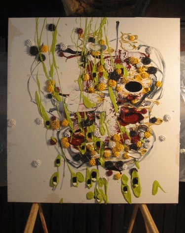
New Dennis Hollingsworth painting. It's a beaut. I like the suggestion of a head, the unfinished Ryman-esque quality of the edges, and the physics-flouting, flying-off-the-canvas dynamism of the paint. The sensuousness of that thick buttery substance communicates even in pixel form. Yum.
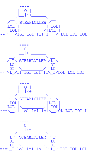
ascii artist unknown
"808 Straight" [mp3 removed]
Some dancefloor-type beats. A mix of hardware and software instruments, analog and digital, but entirely electronic: every sound originated as a voltage.
I haven't been following the Grime scene that closely, but after listening a bit to this site that bloggy recommended, I think I'm in the ballpark with what I'm doing here. I need a fuller bass sound, though, and more dubby beats (that's all). My main influences are still electro, acid house, and a kind of prog sensibility. I'm not that "street." I'd like to work on that.
This dubstep track "Midnight Request Line" by Skream is excellent.
Update: bumped the volume on "808 Straight" slightly.
Variety, July 20, 2020: Linklater to Give Scanner "Makeunder" Using Original Footage
"It hasn't held up over the years," admits the sexagenarian erstwhile slacker Richard Linklater, now one of Hollywood's leading directors, speaking of his 2006 film A Scanner Darkly. "I don't know why I let them talk me into using those damn filters for everything," he says. "That digital rotoscoping technique was momentarily cool in the early '00s, but let's face it, it made Winona Ryder look cretinous in some shots. Her features were sliding all over her face. Woody, too," he adds, referring to the late Woody Harrelson, who also played "Munson" in Kingpin.
Film fans agree. "The rotoscoping technique was just wrong for that material," says blogger Joe Chip, who had a brief cameo in the film. "Take the scene where Keanu Reeves addresses the Rotary Club," Chip says. "He's wearing a suit that digitally scrambles his features, masking his identity. It's a dramatic, surreal effect, but the problem is, with that rotoscoping technique, everyone in the room looks like they're wearing a scramble suit."
That scene and others are being re-edited to remove the digital effects except where they're needed to advance the plot--such as in the "hallucination sequences" where Reeves imagines his housemates as giant insects. Other film buffs are ecstatic about the proposed changes. "Robert Downey, Jr. did some of his best work in the picture," says director Arnold Kott. "It was a riff on his creep in Altman's Short Cuts, and you hated to see his talent buried under all that faux-artistic, Photoshop-like filtering."
But others don't think the changes will make any difference. "Linklater and Dick weren't the right fit," says Bruno Bluthgeld, a scholar of Philip K. Dick, whose book the movie was based on. "Scanner was an interesting mistake the way Cronenberg's Crash was. The novels were rooted in their eras, and just as the Swinging London sexual licentiousness of the J.G.Ballard book made no sense in the post-AIDS '90s, Scanner was a tale of the late '60s/early '70s, when a generation came down off a psychotropic high and got gobsmacked by harder stuff. This was an anachronism in 2006, when the drug blight du jour was meth labs in the sticks. And not that it should matter, but the rootless addiction hell Dick went through isn't comparable to Linklater's student experiences crashing on couches in Austin, TX."
We'll know soon enough: the newly scrubbed Scanner is due out in 2021.
